What is factoextra?
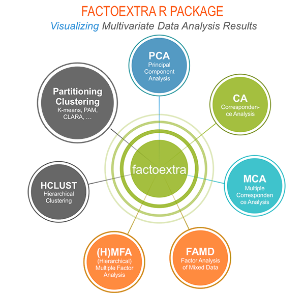
factoextra is an R package making easy to extract and visualize the output of multivariate data analyses, including:
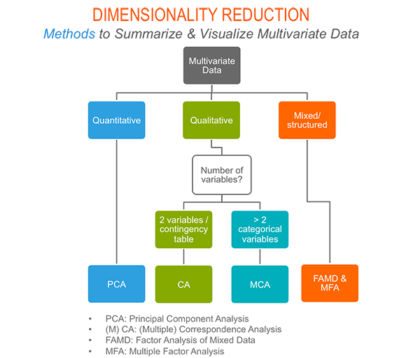
Principal Component Analysis (PCA), which is used to summarize the information contained in a continuous (i.e, quantitative) multivariate data by reducing the dimensionality of the data without loosing important information.
Correspondence Analysis (CA), which is an extension of Principal Component Analysis suited to analyse a large contingency table formed by two qualitative variables (or categorical data).
Multiple Correspondence Analysis (MCA), which is an adaptation of CA to a data table containing more van two categorical variables.
Multiple Factor Analysis (MFA) dedicated to datasets where variables are organized into groups.
Hierarchical Multiple Factor Analysis (HMFA): An extension of MFA in a situation where the data are organized into a hierarchical structure.
There are a number of R packages to perform PCA, CA, MCA, MFA and HMFA in R (FactoMineR, ade4, stats, ca, MASS). However the result is presented differently according to the used packages.
The R package factoextra has flexible and easy-to-use methods to extract quickly, in a human readable standard data format, the analysis results from the different packages mentioned above.
It produces ggplot2-based elegant data visualization with less typing.
- It contains also many functions facilitating clustering analysis and visualization.
The official online documentation of factoextra is available at http://www.sthda.com/english/rpkgs/factoextra for more information and examples.
Why should I use factoextra?
factoextra can handle the results of PCA, CA, MCA, MFA and HMFA from several packages, for extracting and visualizing the most important information contained in your data.
- After PCA, CA, MCA, MFA and HMFA, the most important row/column variables can be highlighted using :
- their cos2 values : information about their qualities of the representation on the factor map
- their contributions to the definition of the principal dimensions
If you want to do this, there is no other package, use factoextra, its simple.
- PCA and MCA are used sometimes for prediction problems : This means that we can predict the coordinates of new supplementary variables (quantitative and qualitative) and supplementary individuals using the information provided by the previously performed PCA. This can be done easily using FactoMineR and this issue is described also, step by step, using the built-in R functions prcomp().
If you want to make predictions with PCA and to visualize the position of the supplementary variables/individuals on the factor map using ggplot2 : then factoextra can help you. Its quick, write less and do more
If you use ade4 and FactoMineR (the most used R packages for factor analyses) and you want to make easily a beautiful ggplot2 visualization: then use factoextra, its flexible, it has methods for these packages and more.
Several functions from different packages are available in R for performing PCA, CA or MCA. However, The components of the output vary from package to package.
No matter the used packages, factoextra can give you a human understandable output.
How to install and load factoextra?
- factoextra can be installed from CRAN as follow:
install.packages("factoextra")- Or, install the latest version from Github
# Install
if(!require(devtools)) install.packages("devtools")
devtools::install_github("kassambara/factoextra")- Load factoextra as follow :
library("factoextra")Main functions in factoextra package
See the online documentation (http://www.sthda.com/english/rpkgs/factoextra) for a complete list. To read more about a given function, click on the corresponding link in the tables below.
Visualizing the outputs of dimension reduction analyses
| Functions | Description |
|---|---|
| fviz_eig (or fviz_eigenvalue) | Extract and visualize the eigenvalues/variances of dimensions. |
| fviz_pca | Graph of individuals/variables from the output of Principal Component Analysis (PCA). |
| fviz_ca | Graph of column/row variables from the output of Correspondence Analysis (CA). |
| fviz_mca) | Graph of individuals/variables from the output of Multiple Correspondence Analysis (MCA). |
| fviz_mfa | Graph of individuals/variables from the output of Multiple Factor Analysis (MFA). |
| fviz_hmfa | Graph of individuals/variables from the output of Hierarchical Multiple Factor Analysis (HMFA). |
| fviz_cos2 | Visualize the quality of the representation of the row/column variable from the results of PCA, CA, MCA functions. |
| fviz_contrib | Visualize the contributions of row/column elements from the results of PCA, CA, MCA functions. |
Extracting data from the outputs of dimension reduction analyses
| Functions | Description |
|---|---|
| get_eigenvalue | Extract and visualize the eigenvalues/variances of dimensions. |
| get_pca | Extract all the results (coordinates, squared cosine, contributions) for the active individuals/variables from Principal Component Analysis (PCA) outputs. |
| get_ca | Extract all the results (coordinates, squared cosine, contributions) for the active column/row variables from Correspondence Analysis outputs. |
| get_mca | Extract results from Multiple Correspondence Analysis outputs. |
| get_mfa | Extract results from Multiple Factor Analysis outputs. |
| get_hmfa | Extract results from Hierarchical Multiple Factor Analysis outputs. |
| facto_summarize | Subset and summarize the output of factor analyses. |
Enhanced clustering analysis and visualization
| Functions | Description |
|---|---|
| dist(fviz_dist, get_dist) | Enhanced Distance Matrix Computation and Visualization. |
| get_clust_tendency | Assessing Clustering Tendency. |
| fviz_nbclust(fviz_gap_stat) | Determining and Visualizing the Optimal Number of Clusters. |
| fviz_dend | Enhanced Visualization of Dendrogram |
| fviz_cluster | Visualize Clustering Results |
| fviz_silhouette | Visualize Silhouette Information from Clustering. |
| hcut | Computes Hierarchical Clustering and Cut the Tree |
| hkmeans (hkmeans_tree, print.hkmeans) | Hierarchical k-means clustering. |
| eclust | Visual enhancement of clustering analysis |
Read more about clustering here: Cluster Analysis in R - Unsupervised Machine Learning.
Dimension reduction and factoextra
Principal component analysis
- Data: iris [Built-in R base dataset]
- Computing with FactoMineR::PCA()
- Visualize with factoextra::fviz_pca()
If you want to learn more about computing and interpreting principal component analysis, read this tutorial: Principal Component Analysis (PCA). Here, we provide only a quick start guide.
- Loading data
data(iris)
head(iris)
## Sepal.Length Sepal.Width Petal.Length Petal.Width Species
## 1 5.1 3.5 1.4 0.2 setosa
## 2 4.9 3.0 1.4 0.2 setosa
## 3 4.7 3.2 1.3 0.2 setosa
## 4 4.6 3.1 1.5 0.2 setosa
## 5 5.0 3.6 1.4 0.2 setosa
## 6 5.4 3.9 1.7 0.4 setosa- Principal component analysis
# The variable Species (index = 5) is removed before PCA
library("FactoMineR")
res.pca <- PCA(iris[, -5], graph = FALSE)- Extract and visualize eigenvalues/variances:
# Extract eigenvalues/variances
get_eig(res.pca)
## eigenvalue variance.percent cumulative.variance.percent
## Dim.1 2.91849782 72.9624454 72.96245
## Dim.2 0.91403047 22.8507618 95.81321
## Dim.3 0.14675688 3.6689219 99.48213
## Dim.4 0.02071484 0.5178709 100.00000# Visualize eigenvalues/variances
fviz_eig(res.pca, addlabels=TRUE, hjust = -0.3)+
theme_minimal()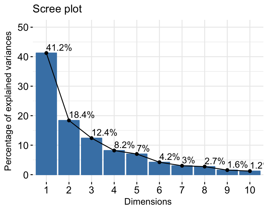
4.Extract and visualize results for variables:
# Extract the results for variables
var <- get_pca_var(res.pca)
var
## Principal Component Analysis Results for variables
## ===================================================
## Name Description
## 1 "$coord" "Coordinates for the variables"
## 2 "$cor" "Correlations between variables and dimensions"
## 3 "$cos2" "Cos2 for the variables"
## 4 "$contrib" "contributions of the variables"# Coordinates of variables
head(var$coord)## Dim.1 Dim.2 Dim.3 Dim.4
## Sepal.Length 0.8901688 0.36082989 -0.27565767 -0.03760602
## Sepal.Width -0.4601427 0.88271627 0.09361987 0.01777631
## Petal.Length 0.9915552 0.02341519 0.05444699 0.11534978
## Petal.Width 0.9649790 0.06399985 0.24298265 -0.07535950# Contribution of variables
head(var$contrib)## Dim.1 Dim.2 Dim.3 Dim.4
## Sepal.Length 27.150969 14.24440565 51.777574 6.827052
## Sepal.Width 7.254804 85.24748749 5.972245 1.525463
## Petal.Length 33.687936 0.05998389 2.019990 64.232089
## Petal.Width 31.906291 0.44812296 40.230191 27.415396# Graph of variables: default plot
fviz_pca_var(res.pca, col.var = "steelblue")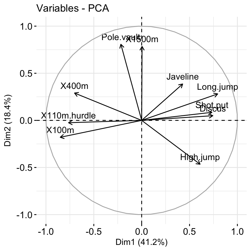
Its possible to control variable colors using their contributions to the principal axes:
# Control variable colors using their contributions
# Use gradient color
fviz_pca_var(res.pca, col.var="contrib")+
scale_color_gradient2(low="white", mid="blue",
      high="red", midpoint = 96) +
theme_minimal()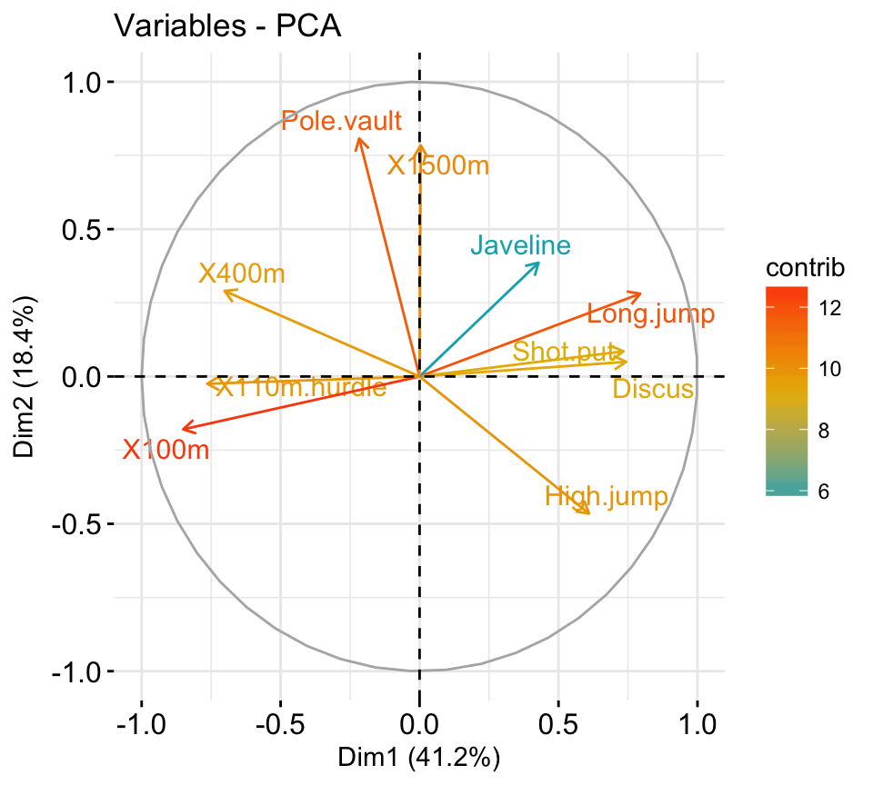
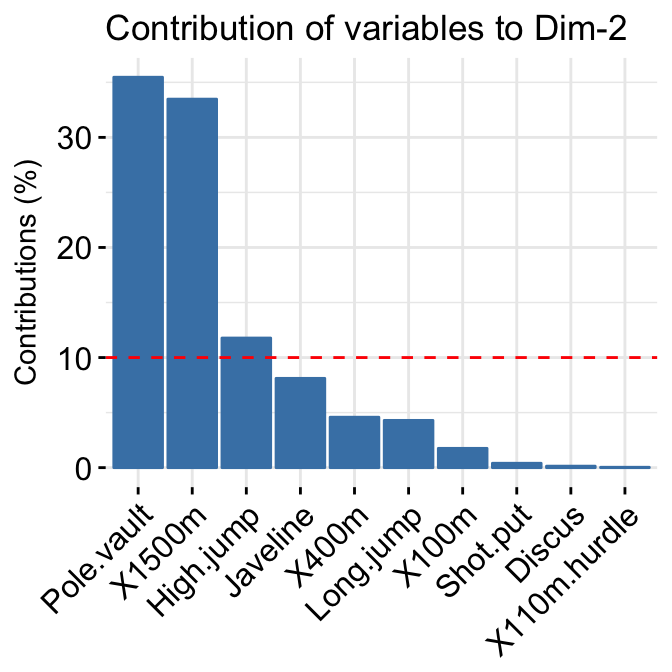
- Variable contributions to the principal axes:
# Variable contributions on axis 1
fviz_contrib(res.pca, choice="var", axes = 1 )+
  labs(title = "Contributions to Dim 1")

# Variable contributions on axes 1 + 2
fviz_contrib(res.pca, choice="var", axes = 1:2)+
  labs(title = "Contributions to Dim 1+2")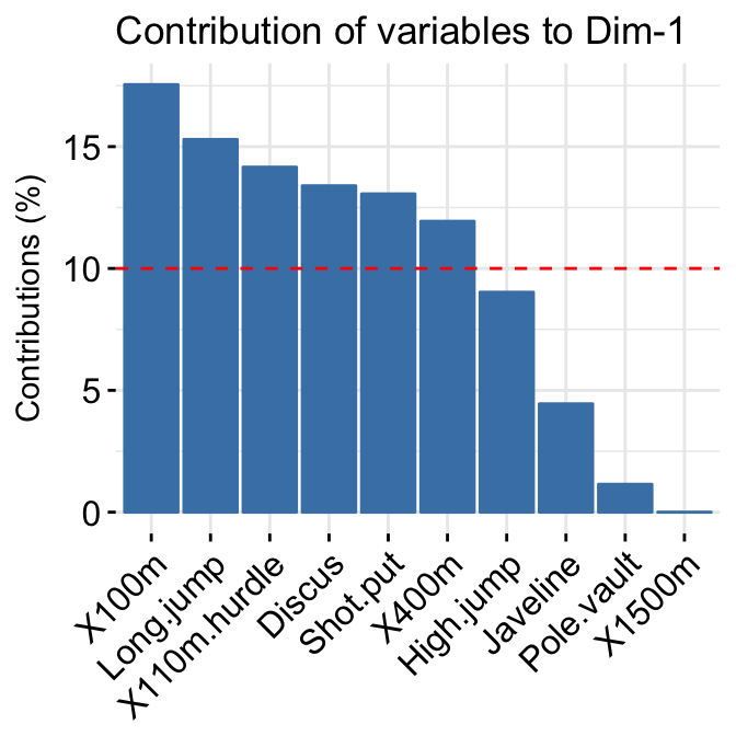
- Extract and visualize results for individuals:
# Extract the results for individuals
ind <- get_pca_ind(res.pca)
ind
## Principal Component Analysis Results for individuals
## ===================================================
## Name Description
## 1 "$coord" "Coordinates for the individuals"
## 2 "$cos2" "Cos2 for the individuals"
## 3 "$contrib" "contributions of the individuals"# Coordinates of individuals
head(ind$coord)## Dim.1 Dim.2 Dim.3 Dim.4
## 1 -2.264703 0.4800266 -0.12770602 -0.02416820
## 2 -2.080961 -0.6741336 -0.23460885 -0.10300677
## 3 -2.364229 -0.3419080 0.04420148 -0.02837705
## 4 -2.299384 -0.5973945 0.09129011 0.06595556
## 5 -2.389842 0.6468354 0.01573820 0.03592281
## 6 -2.075631 1.4891775 0.02696829 -0.00660818# Graph of individuals
# 1. Use repel = TRUE to avoid overplotting
# 2. Control automatically the color of individuals using the cos2
# cos2 = the quality of the individuals on the factor map
# Use points only
# 3. Use gradient color
fviz_pca_ind(res.pca, repel = TRUE, col.ind = "cos2")+
scale_color_gradient2(low="blue", mid="white",
high="red", midpoint=0.6)+
theme_minimal()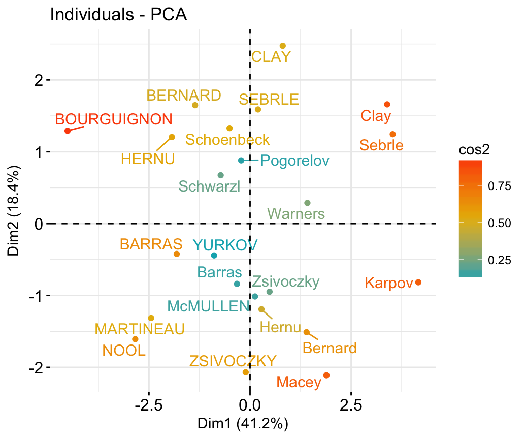
# Color by groups: habillage=iris$Species
# Show points only: geom = "point"
p <- fviz_pca_ind(res.pca, geom = "point",
    habillage=iris$Species, addEllipses=TRUE,
    ellipse.level= 0.95)+ theme_minimal()
print(p)
# Change group colors manually
# Read more: http://www.sthda.com/english/wiki/ggplot2-colors
p + scale_color_manual(values=c("#999999", "#E69F00", "#56B4E9"))+
 scale_fill_manual(values=c("#999999", "#E69F00", "#56B4E9"))+
theme_minimal() 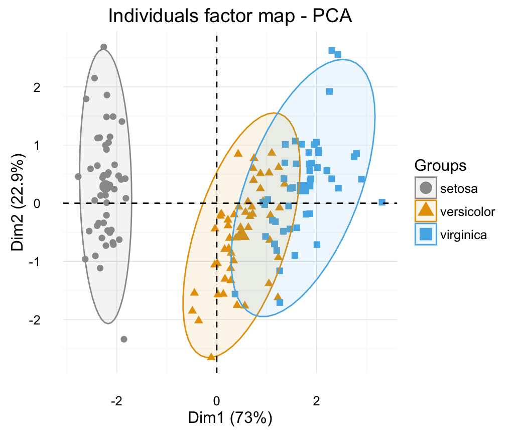
# Biplot of individuals and variables
# ++++++++++++++++++++++++++
# Only variables are labelled
 fviz_pca_biplot(res.pca,  label="var", habillage=iris$Species,
      addEllipses=TRUE, ellipse.level=0.95) +
  theme_minimal()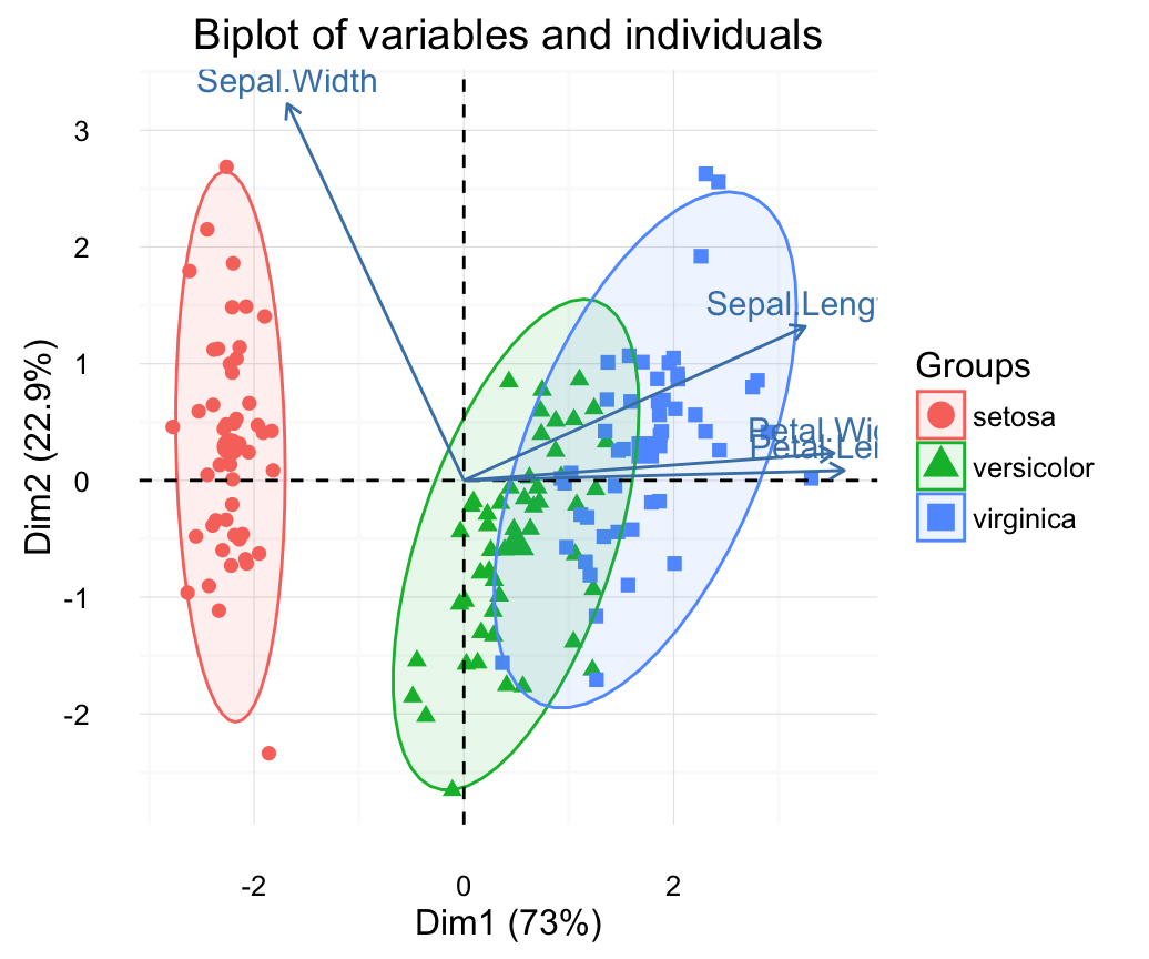
Correspondence analysis
- Data: housetasks [in factoextra]
- Computing with FactoMineR::CA()
- Visualize with factoextra::fviz_ca()
If you want to learn more about computing and interpreting correspondence analysis, read this tutorial: Correspondence Analysis (CA). Here, we provide only a quick start guide.
 # 1. Loading data
data("housetasks")
head(housetasks)
## Wife Alternating Husband Jointly
## Laundry 156 14 2 4
## Main_meal 124 20 5 4
## Dinner 77 11 7 13
## Breakfeast 82 36 15 7
## Tidying 53 11 1 57
## Dishes 32 24 4 53 # 2. Computing CA
library("FactoMineR")
res.ca <- CA(housetasks, graph = FALSE)
# 3. Extract results for row/column variables
# ++++++++++++++++++++++++++++++++
# Result for row variables
get_ca_row(res.ca)## Correspondence Analysis - Results for rows
## ===================================================
## Name Description
## 1 "$coord" "Coordinates for the rows"
## 2 "$cos2" "Cos2 for the rows"
## 3 "$contrib" "contributions of the rows"
## 4 "$inertia" "Inertia of the rows"# Result for column variables
get_ca_col(res.ca)## Correspondence Analysis - Results for columns
## ===================================================
## Name Description
## 1 "$coord" "Coordinates for the columns"
## 2 "$cos2" "Cos2 for the columns"
## 3 "$contrib" "contributions of the columns"
## 4 "$inertia" "Inertia of the columns"# 4. Visualize row/column variables
# ++++++++++++++++++++++++++++++++
# Visualize row contributions on axes 1
fviz_contrib(res.ca, choice ="row", axes = 1)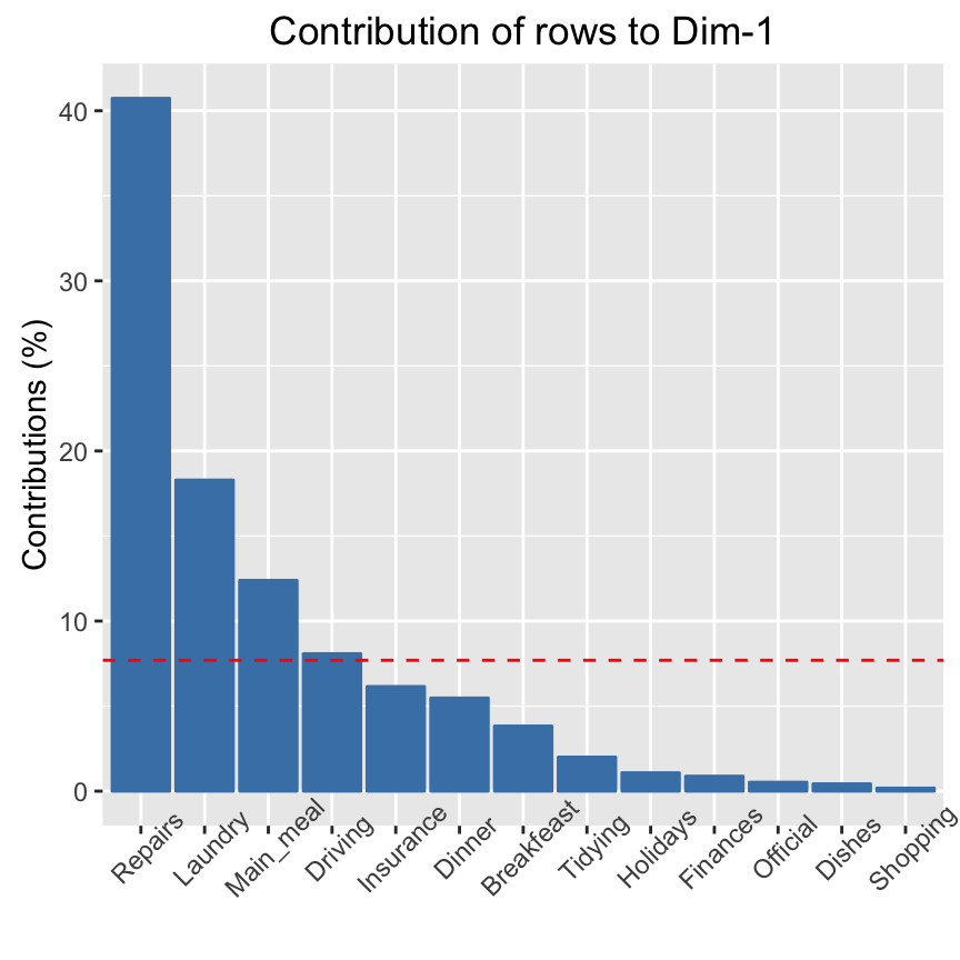
# Visualize column contributions on axes 1
fviz_contrib(res.ca, choice ="col", axes = 1)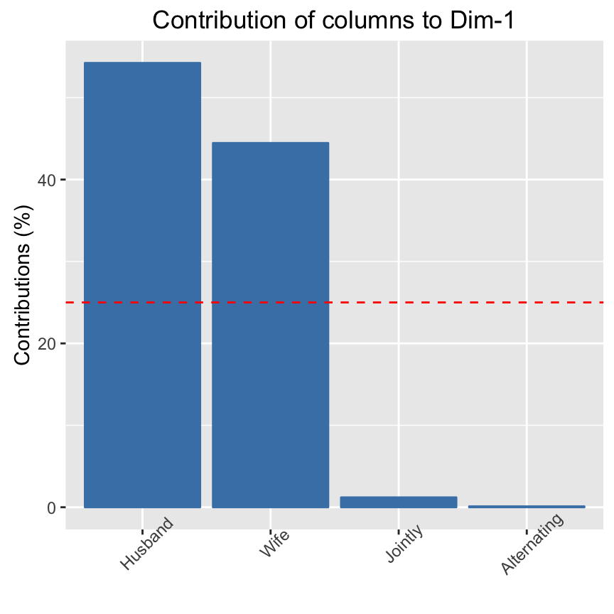
# 5. Graph of row variables
fviz_ca_row(res.ca, repel = TRUE)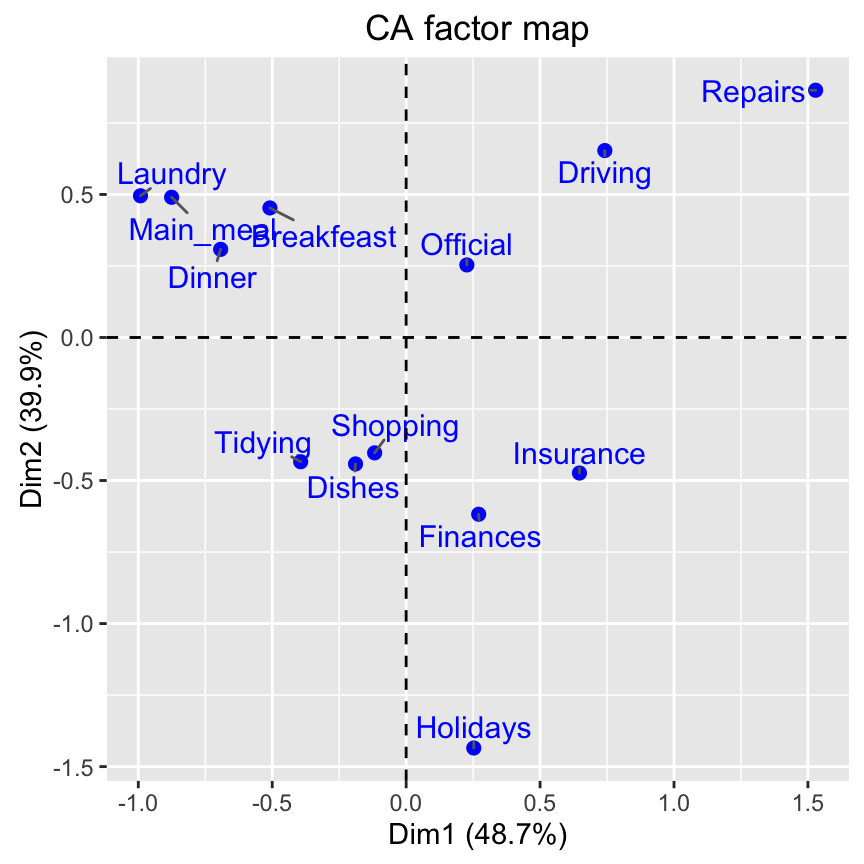
# Graph of column points
fviz_ca_col(res.ca)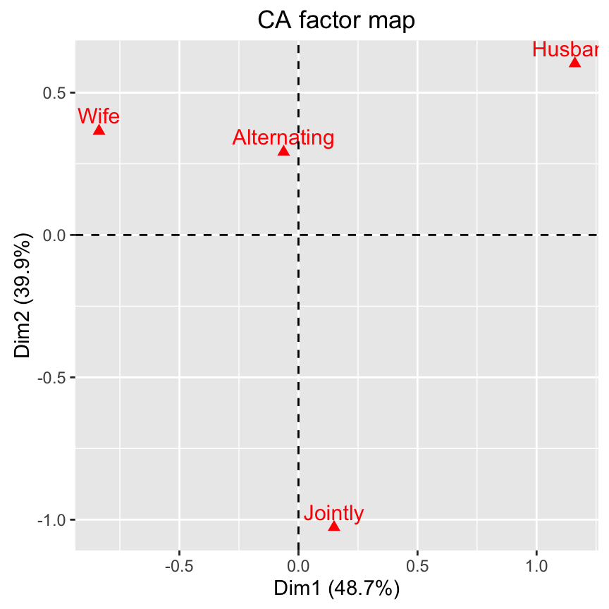
# Biplot of rows and columns
fviz_ca_biplot(res.ca, repel = TRUE)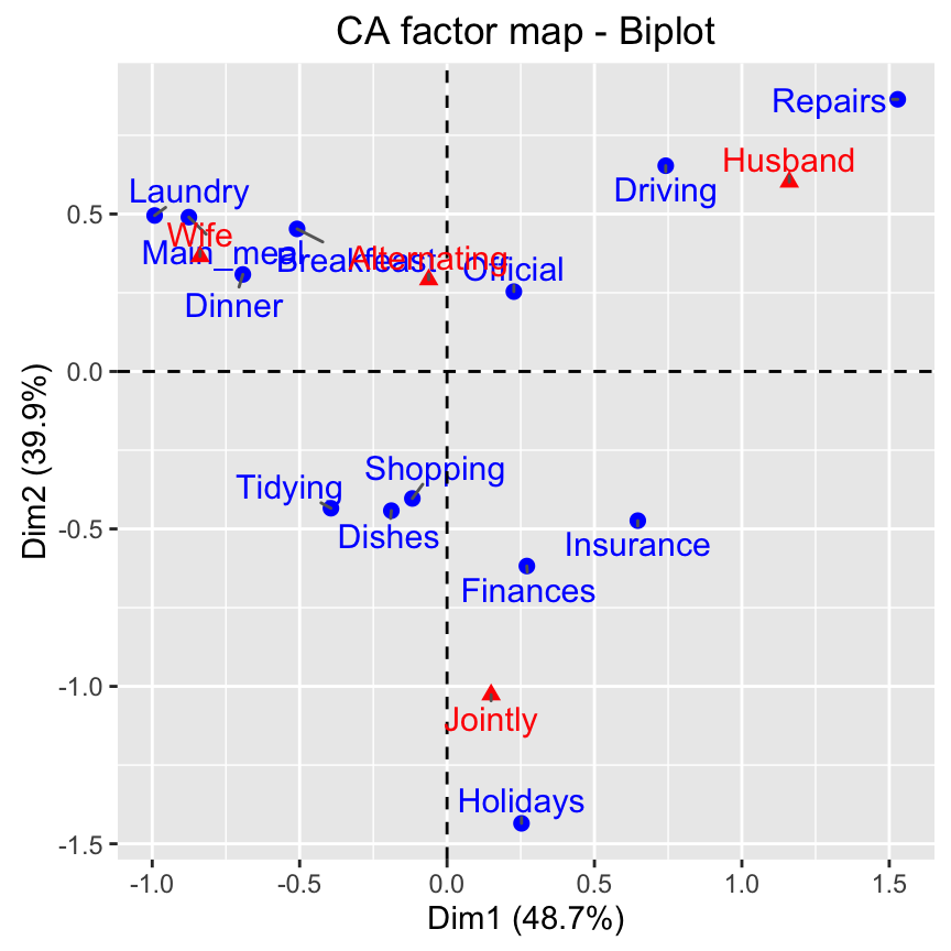
Multiple correspondence analysis
- Data: poison [in factoextra]
- Computing with FactoMineR::MCA()
- Visualize with factoextra::fviz_mca()
If you want to learn more about computing and interpreting multiple correspondence analysis, read this tutorial: Multiple Correspondence Analysis (MCA). Here, we provide only a quick start guide.
- Computing MCA:
library(FactoMineR)
data(poison)
res.mca <- MCA(poison, quanti.sup = 1:2,
quali.sup = 3:4, graph=FALSE)- Extract results for variables and individuals:
# Extract the results for variable categories
get_mca_var(res.mca)

# Extract the results for individuals
get_mca_ind(res.mca)- Contribution of variables and individuals to the principal axes:
# Visualize variable categorie contributions on axes 1
fviz_contrib(res.mca, choice ="var", axes = 1)

# Visualize individual contributions on axes 1
# select the top 20
fviz_contrib(res.mca, choice ="ind", axes = 1, top = 20)- Graph of individuals
# Color by groups
# Add concentration ellipses
# Use repel = TRUE to avoid overplotting
grp <- as.factor(poison[, "Vomiting"])
fviz_mca_ind(res.mca, col.ind = "blue", habillage = grp,
             addEllipses = TRUE, repel = TRUE)+
   theme_minimal()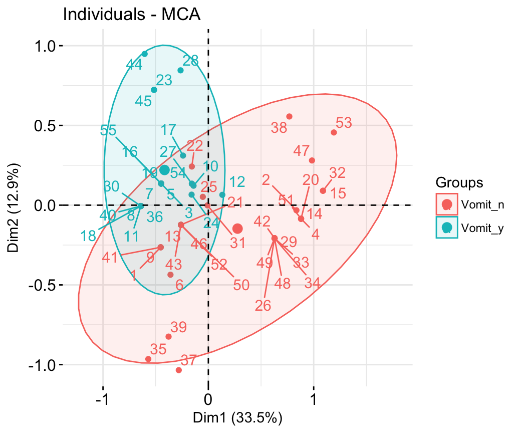
- Graph of variable categories:
fviz_mca_var(res.mca, repel = TRUE)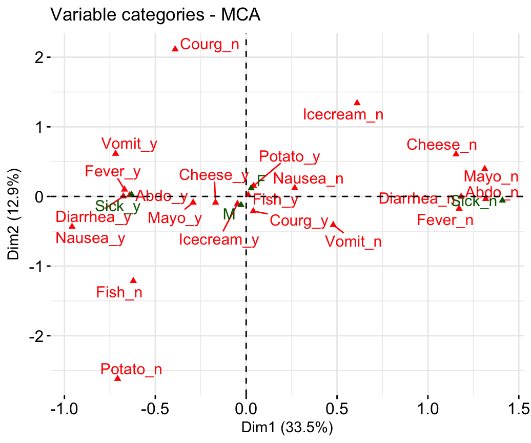
Its possible to select only some variables:
# Select the top 10 contributing variable categories
fviz_mca_var(res.mca, select.var = list(contrib = 10))
# Select by names
fviz_mca_var(res.mca,
select.var= list(name = c("Courg_n", "Fever_y", "Fever_n")))- Biplot of individuals and variables:
fviz_mca_biplot(res.mca, repel = TRUE)+
  theme_minimal()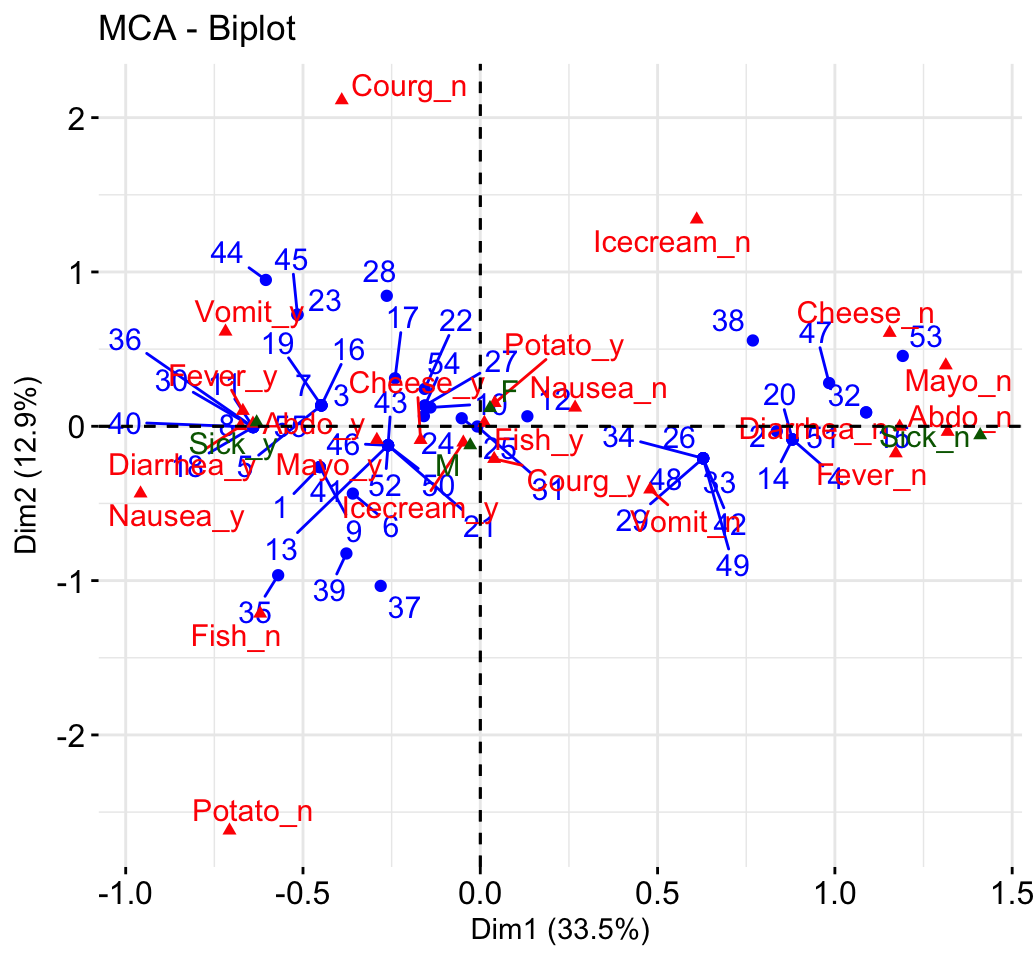
# Select the top 30 contributing individuals
# And the top 10 variables
fviz_mca_biplot(res.mca,
               select.ind = list(contrib = 30),
               select.var = list(contrib = 10))
Multiple factor analysis
- Data: wine [in factoextra]
- Computing with FactoMineR::MFA()
- Visualize with factoextra::fviz_mfa()
If you want to learn more about computing and interpreting multiple factor analysis, read this tutorial: Multiple Factor Analysis (MCA). Here, we provide only a quick start guide.
- Computing MFA:
library(FactoMineR)
data(wine)
res.mfa <- MFA(wine, group=c(2,5,3,10,9,2), type=c("n",rep("s",5)),
               ncp=5, name.group=c("orig","olf","vis","olfag","gust","ens"),
num.group.sup=c(1,6), graph=FALSE)- Graph of individuals:
fviz_mfa_ind(res.mfa)
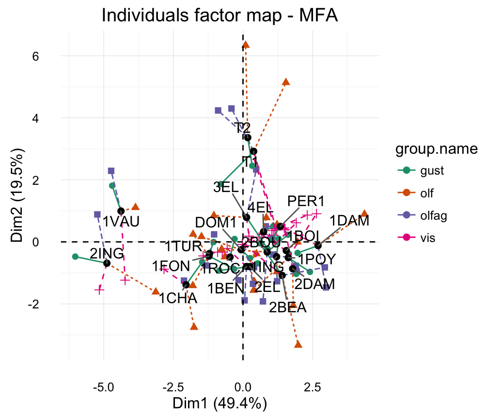
# Graph of partial individuals (starplot)
fviz_mfa_ind_starplot(res.mfa, col.partial = "group.name",
                      repel = TRUE)+
  scale_color_brewer(palette = "Dark2")+
  theme_minimal()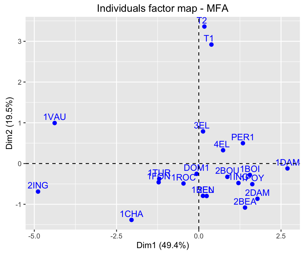
- Graph of quantitative variables:
fviz_mfa_quanti_var(res.mfa)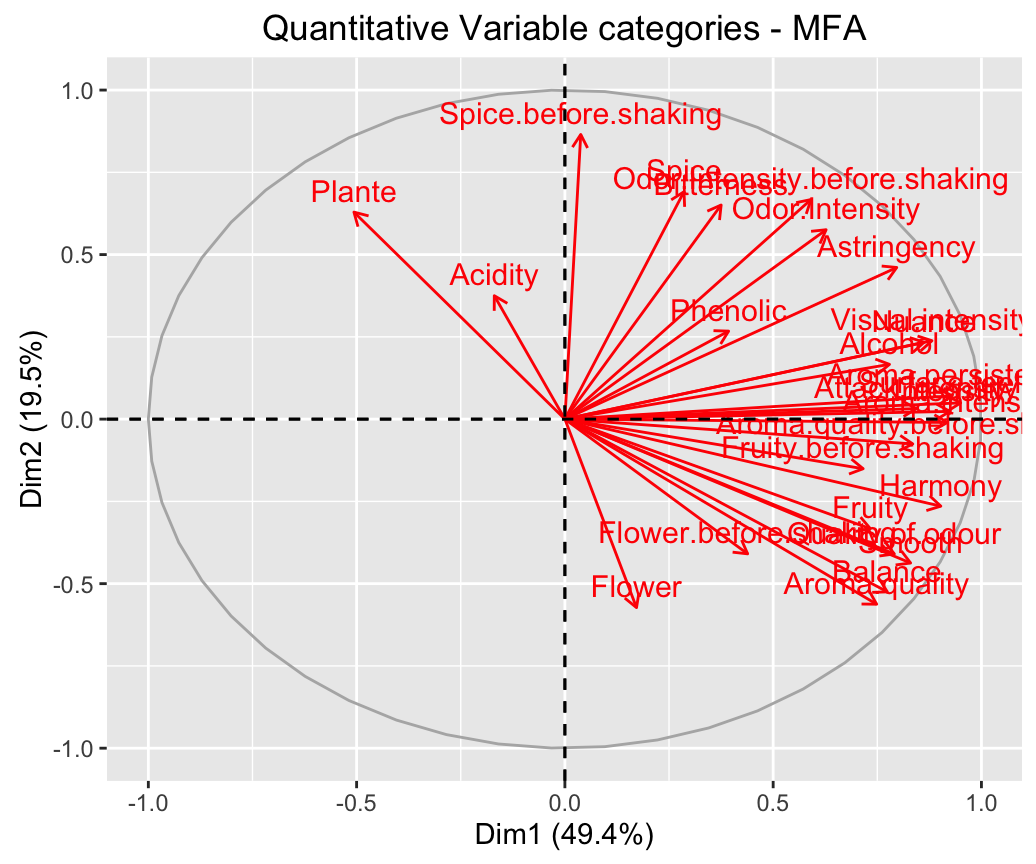
Cluster analysis and factoextra
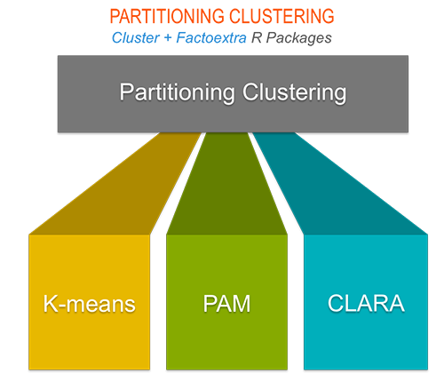
Partitioning clustering
# 1. Loading and preparing data
data("USArrests")
df <- scale(USArrests)

# 2. Compute k-means
set.seed(123)
km.res <- kmeans(scale(USArrests), 4, nstart = 25)

# 3. Visualize
library("factoextra")
fviz_cluster(km.res, data = df)+theme_minimal()+
  scale_color_manual(values = c("#00AFBB","#2E9FDF", "#E7B800", "#FC4E07"))+
  scale_fill_manual(values = c("#00AFBB","#2E9FDF", "#E7B800", "#FC4E07")) +
  labs(title= "Partitioning Clustering Plot")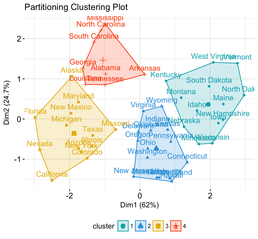
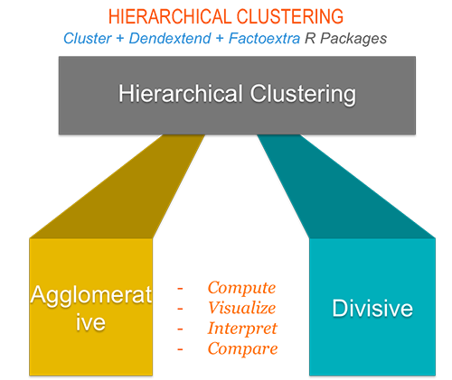
Hierarchical clustering
library("factoextra")
# Compute hierarchical clustering and cut into 4 clusters
res <- hcut(USArrests, k = 4, stand = TRUE)

# Visualize
fviz_dend(res, rect = TRUE, cex = 0.5,
          k_colors = c("#00AFBB","#2E9FDF", "#E7B800", "#FC4E07"))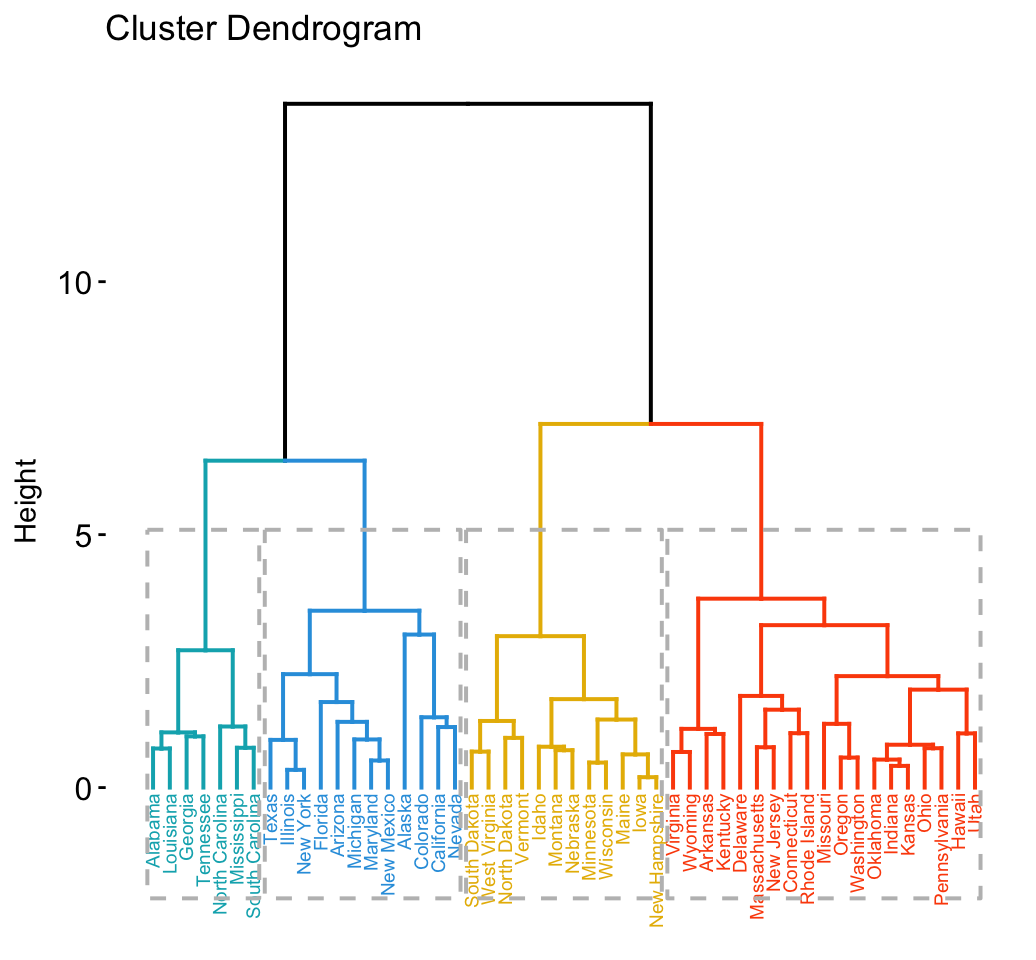
Determine the optimal number of clusters
# Optimal number of clusters for k-means
library("factoextra")
my_data <- scale(USArrests)
fviz_nbclust(my_data, kmeans, method = "gap_stat")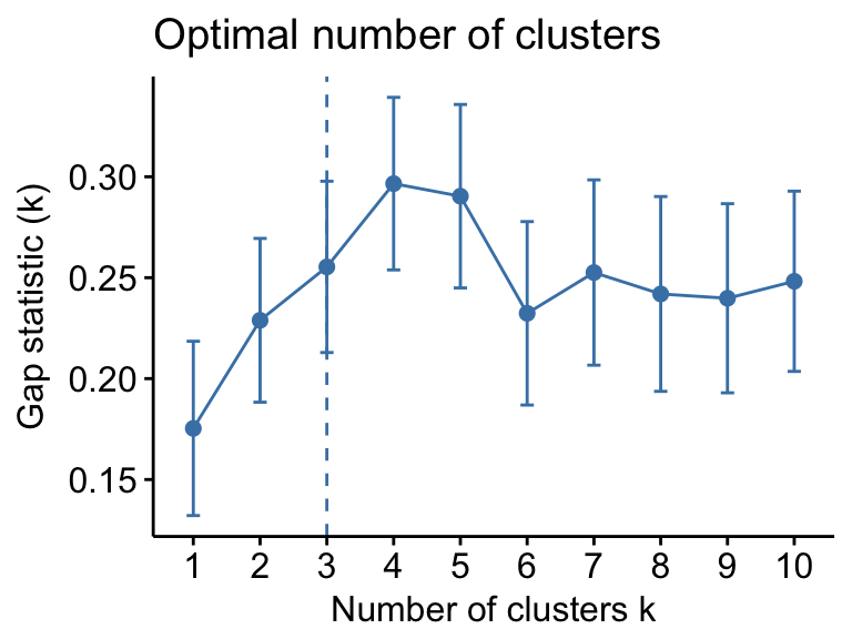
Going further
Infos
This analysis has been performed using R software (ver. 3.2.4) and factoextra (ver. 1.0.3)