ggpubr is great for data visualization and very easy to use for non-“R programmer”. It makes easy to simply produce an elegant ggplot2-based graphs. Read more about ggpubr: ggpubr .
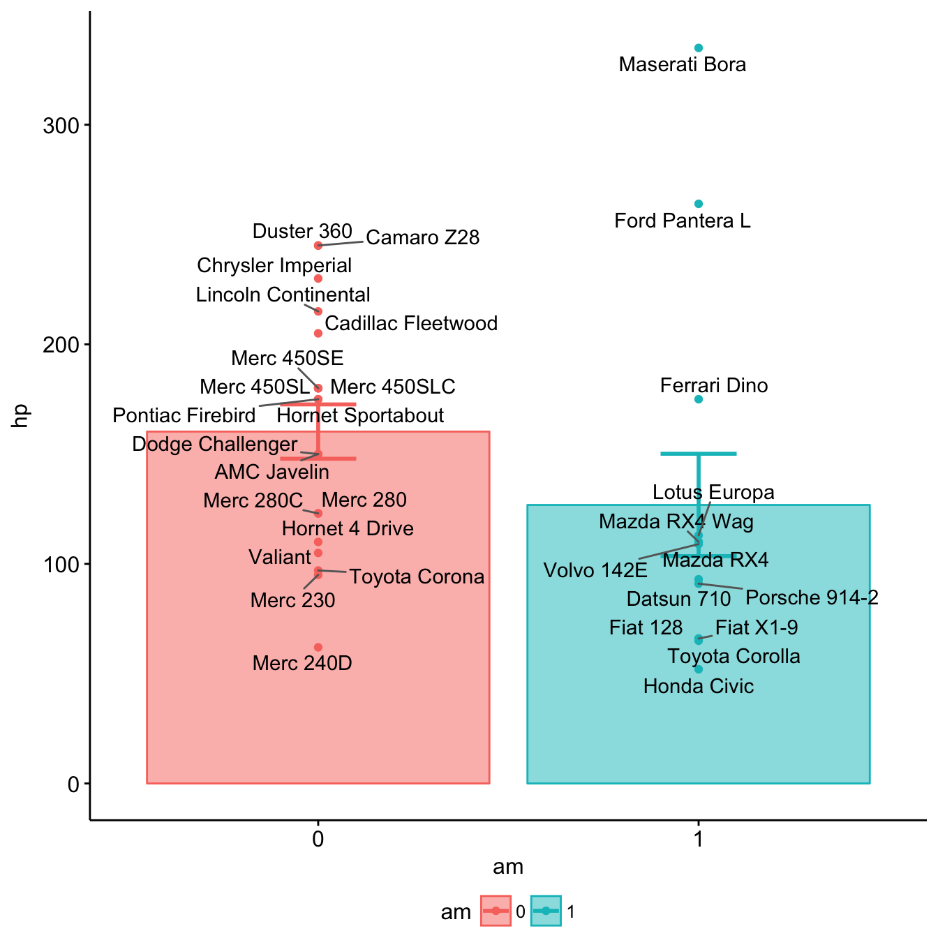
Here we demonstrate how to plot easily a barplot of group means +/- standard error with individual observations.
Example data sets
d <- as.data.frame(mtcars[, c("am", "hp")])
d$rowname <- rownames(d)
head(d)
## am hp rowname
## Mazda RX4 1 110 Mazda RX4
## Mazda RX4 Wag 1 110 Mazda RX4 Wag
## Datsun 710 1 93 Datsun 710
## Hornet 4 Drive 0 110 Hornet 4 Drive
## Hornet Sportabout 0 175 Hornet Sportabout
## Valiant 0 105 ValiantInstall ggpubr
The latest version of ggpubr can be installed as follow:
# Install ggpubr
if(!require(devtools)) install.packages("devtools")
devtools::install_github("kassambara/ggpubr")
Bar plot of group means with individual informations
- Plot y = “hp” by groups x = “am”
- Add mean +/- standard error and individual points: add = c(“mean_se”, “point”). Allowed values are one or the combination of: “none”, “dotplot”, “jitter”, “boxplot”, “point”, “mean”, “mean_se”, “mean_sd”, “mean_ci”, “mean_range”, “median”, “median_iqr”, “median_mad”, “median_range”.
- Color and fill by groups: color = “am”, fill = “am”
- Add row names as labels.
library(ggpubr)
# Bar plot of group means + points
ggbarplot(d, x = "am", y = "hp",
          add = c("mean_se", "point"),
          color = "am", fill = "am", alpha = 0.5)+
  ggrepel::geom_text_repel(aes(label = rowname))
Bar plot of Group Means with Individual Observations