This article describes how to create easily basic and ordered bar plots using ggplot2 based helper functions available in the ggpubr R package. We’ll also present some modern alternatives to bar plots, including lollipop charts and cleveland’s dot plots.
Note that, the approach to build a bar plot, using ggplot2 standard verbs, has been described in our previous article available at: ggplot2 barplots : Quick start guide.
You might be also interested by the following articles:
Bar plots and modern alternatives
Contents:
Prerequisites
Required R package
You need to install the R package ggpubr (version >= 0.1.3), to easily create ggplot2-based publication ready plots.
Install from CRAN:
install.packages("ggpubr")Or, install the latest developmental version from GitHub as follow:
if(!require(devtools)) install.packages("devtools")
devtools::install_github("kassambara/ggpubr")
Load ggpubr:
library(ggpubr)Basic bar plots
Create a demo data set:
df <- data.frame(dose=c("D0.5", "D1", "D2"),
                 len=c(4.2, 10, 29.5))
print(df)
dose len
1 D0.5 4.2
2 D1 10.0
3 D2 29.5Basic bar plots:
# Basic bar plots with label
p <- ggbarplot(df, x = "dose", y = "len",
color = "black", fill = "lightgray")
p
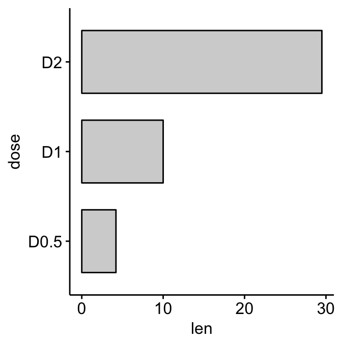
# Rotate to create horizontal bar plots
p + rotate()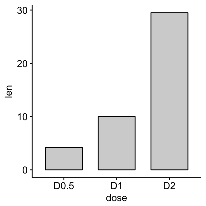
Bar plots and modern alternatives
Change fill and outline colors by groups:
ggbarplot(df, x = "dose", y = "len",
   fill = "dose", color = "dose", palette = "jco")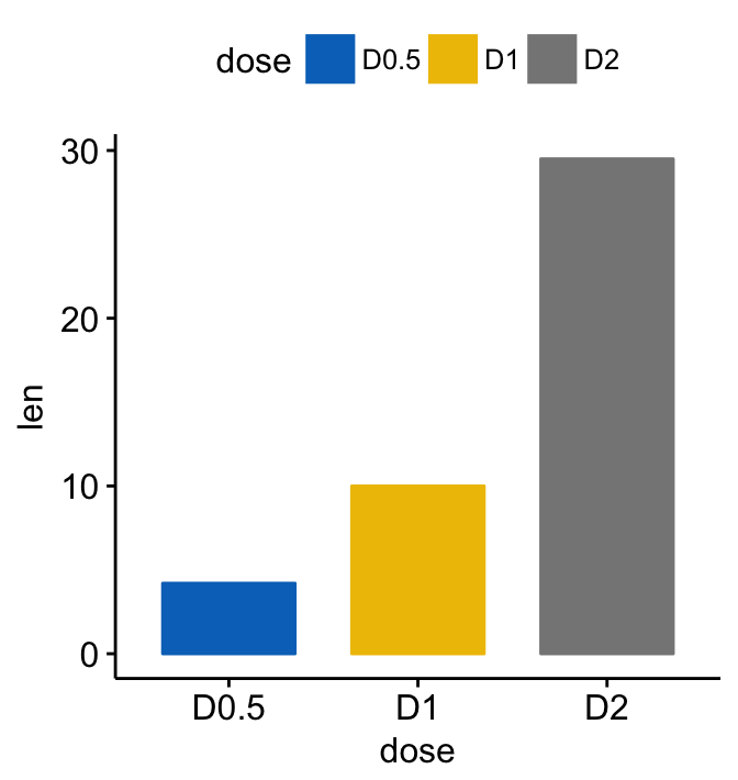
Bar plots and modern alternatives
Multiple grouping variables
Create a demo data set:
df2 <- data.frame(supp=rep(c("VC", "OJ"), each=3),
                  dose=rep(c("D0.5", "D1", "D2"),2),
                  len=c(6.8, 15, 33, 4.2, 10, 29.5))
print(df2)
supp dose len
1 VC D0.5 6.8
2 VC D1 15.0
3 VC D2 33.0
4 OJ D0.5 4.2
5 OJ D1 10.0
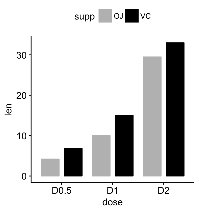
6 OJ D2 29.5Plot y = “len” by x = “dose” and change color by a second group: “supp”
# Stacked bar plots, add labels inside bars
ggbarplot(df2, x = "dose", y = "len",
  fill = "supp", color = "supp",
  palette = c("gray", "black"),
  label = TRUE, lab.col = "white", lab.pos = "in")

# Change position: Interleaved (dodged) bar plot
ggbarplot(df2, x = "dose", y = "len",
          fill = "supp", color = "supp",
          palette = c("gray", "black"),
          position = position_dodge(0.9))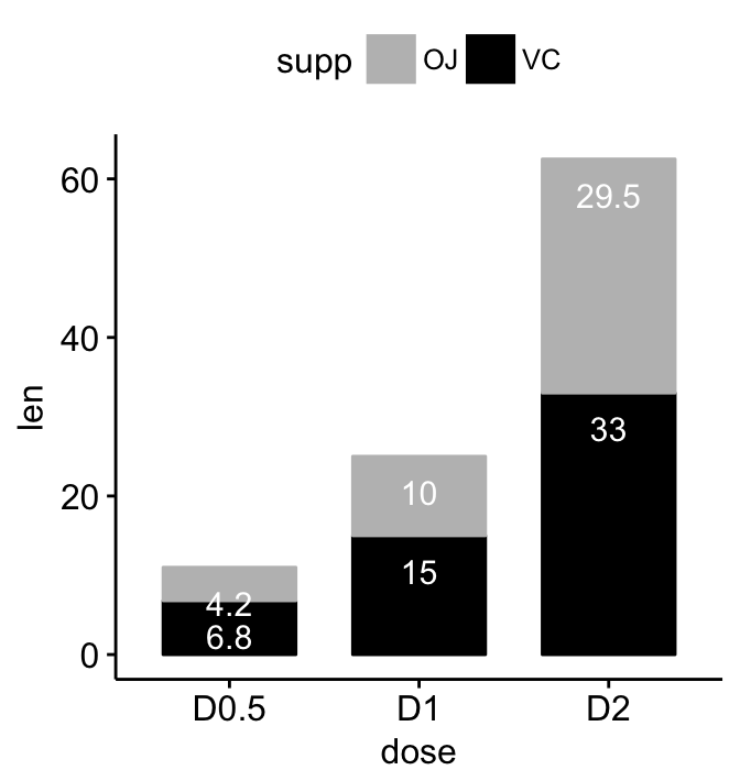
Bar plots and modern alternatives
Ordered bar plots
Load and prepare data:
# Load data
data("mtcars")
dfm <- mtcars
# Convert the cyl variable to a factor
dfm$cyl <- as.factor(dfm$cyl)
# Add the name colums
dfm$name <- rownames(dfm)
# Inspect the data
head(dfm[, c("name", "wt", "mpg", "cyl")])
name wt mpg cyl
Mazda RX4 Mazda RX4 2.620 21.0 6
Mazda RX4 Wag Mazda RX4 Wag 2.875 21.0 6
Datsun 710 Datsun 710 2.320 22.8 4
Hornet 4 Drive Hornet 4 Drive 3.215 21.4 6
Hornet Sportabout Hornet Sportabout 3.440 18.7 8
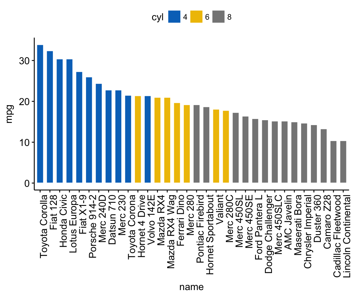
Valiant Valiant 3.460 18.1 6Create ordered bar plots. Change the fill color by the grouping variable “cyl”. Sorting will be done globally, but not by groups.
ggbarplot(dfm, x = "name", y = "mpg",
          fill = "cyl",               # change fill color by cyl
          color = "white",            # Set bar border colors to white
          palette = "jco",            # jco journal color palett. see ?ggpar
          sort.val = "desc",          # Sort the value in dscending order
          sort.by.groups = FALSE,     # Don't sort inside each group
          x.text.angle = 90           # Rotate vertically x axis texts
          )
Bar plots and modern alternatives
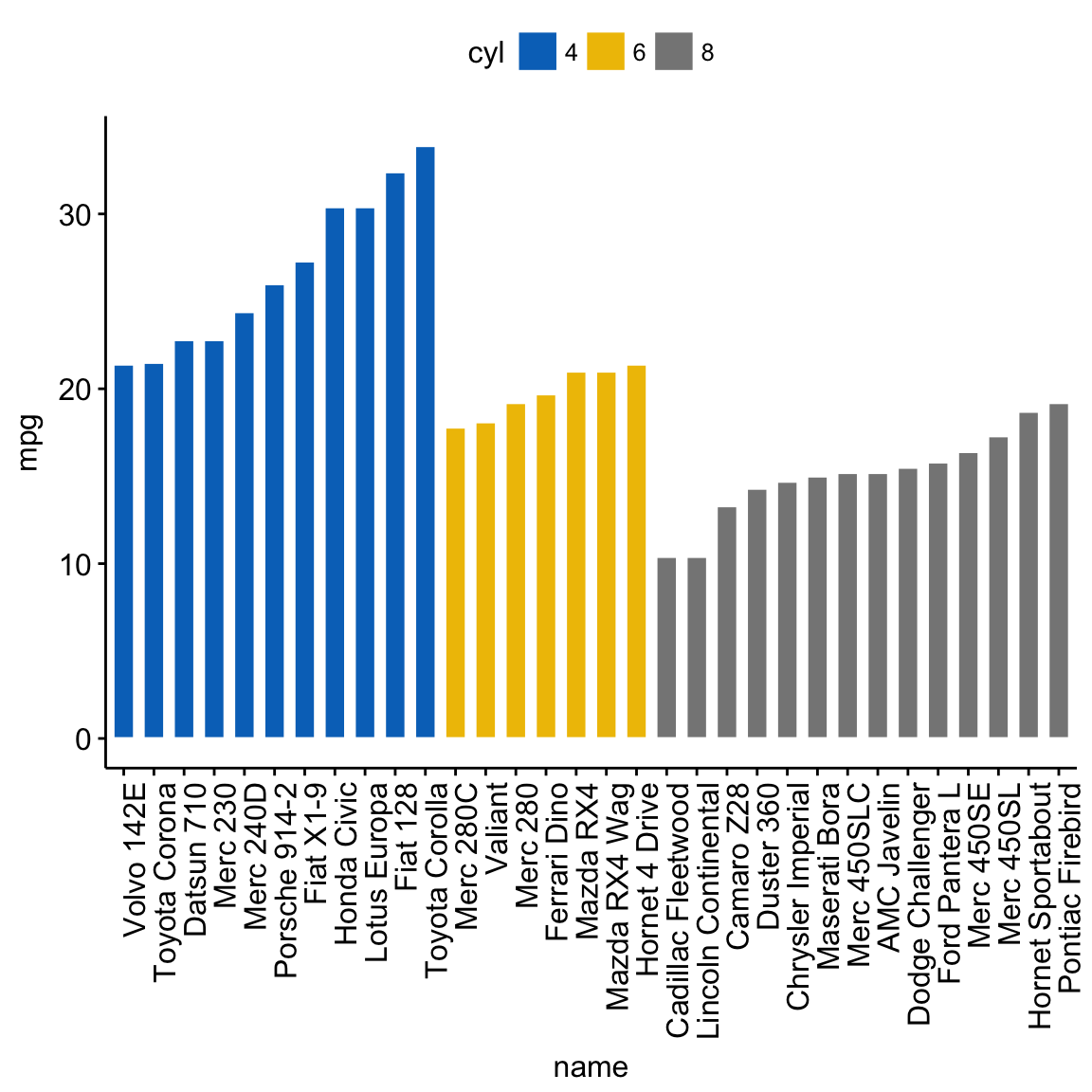
Sort bars inside each group. Use the argument sort.by.groups = TRUE.
ggbarplot(dfm, x = "name", y = "mpg",
          fill = "cyl",               # change fill color by cyl
          color = "white",            # Set bar border colors to white
          palette = "jco",            # jco journal color palett. see ?ggpar
          sort.val = "asc",           # Sort the value in dscending order
          sort.by.groups = TRUE,      # Sort inside each group
          x.text.angle = 90           # Rotate vertically x axis texts
          )
Bar plots and modern alternatives
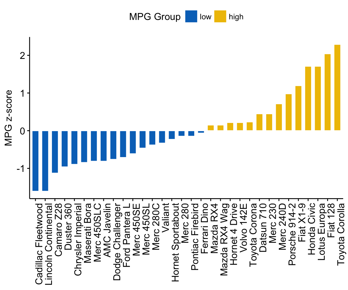
Deviation graphs
The deviation graph shows the deviation of quantitative values to a reference value. In the R code below, we’ll plot the mpg z-score from the mtcars data set.
Calculate the z-score of the mpg data:
# Calculate the z-score of the mpg data
dfm$mpg_z <- (dfm$mpg -mean(dfm$mpg))/sd(dfm$mpg)
dfm$mpg_grp <- factor(ifelse(dfm$mpg_z < 0, "low", "high"),
                     levels = c("low", "high"))
# Inspect the data
head(dfm[, c("name", "wt", "mpg", "mpg_z", "mpg_grp", "cyl")])
name wt mpg mpg_z mpg_grp cyl
Mazda RX4 Mazda RX4 2.620 21.0 0.1508848 high 6
Mazda RX4 Wag Mazda RX4 Wag 2.875 21.0 0.1508848 high 6
Datsun 710 Datsun 710 2.320 22.8 0.4495434 high 4
Hornet 4 Drive Hornet 4 Drive 3.215 21.4 0.2172534 high 6
Hornet Sportabout Hornet Sportabout 3.440 18.7 -0.2307345 low 8
Valiant Valiant 3.460 18.1 -0.3302874 low 6Create an ordered bar plot, colored according to the level of mpg:
ggbarplot(dfm, x = "name", y = "mpg_z",
          fill = "mpg_grp",           # change fill color by mpg_level
          color = "white",            # Set bar border colors to white
          palette = "jco",            # jco journal color palett. see ?ggpar
          sort.val = "asc",           # Sort the value in ascending order
          sort.by.groups = FALSE,     # Don't sort inside each group
          x.text.angle = 90,          # Rotate vertically x axis texts
          ylab = "MPG z-score",
          xlab = FALSE,
          legend.title = "MPG Group"
          )
Bar plots and modern alternatives
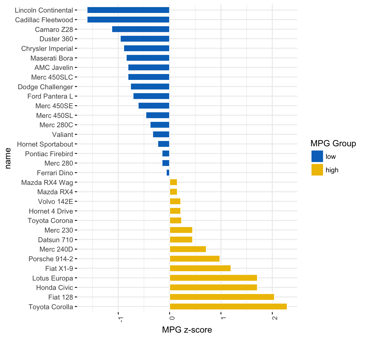
Rotate the plot: use rotate = TRUE and sort.val = “desc”
ggbarplot(dfm, x = "name", y = "mpg_z",
          fill = "mpg_grp",           # change fill color by mpg_level
          color = "white",            # Set bar border colors to white
          palette = "jco",            # jco journal color palett. see ?ggpar
          sort.val = "desc",          # Sort the value in descending order
          sort.by.groups = FALSE,     # Don't sort inside each group
          x.text.angle = 90,          # Rotate vertically x axis texts
          ylab = "MPG z-score",
          legend.title = "MPG Group",
          rotate = TRUE,
          ggtheme = theme_minimal()
          )
Bar plots and modern alternatives
Alternatives to bar plots
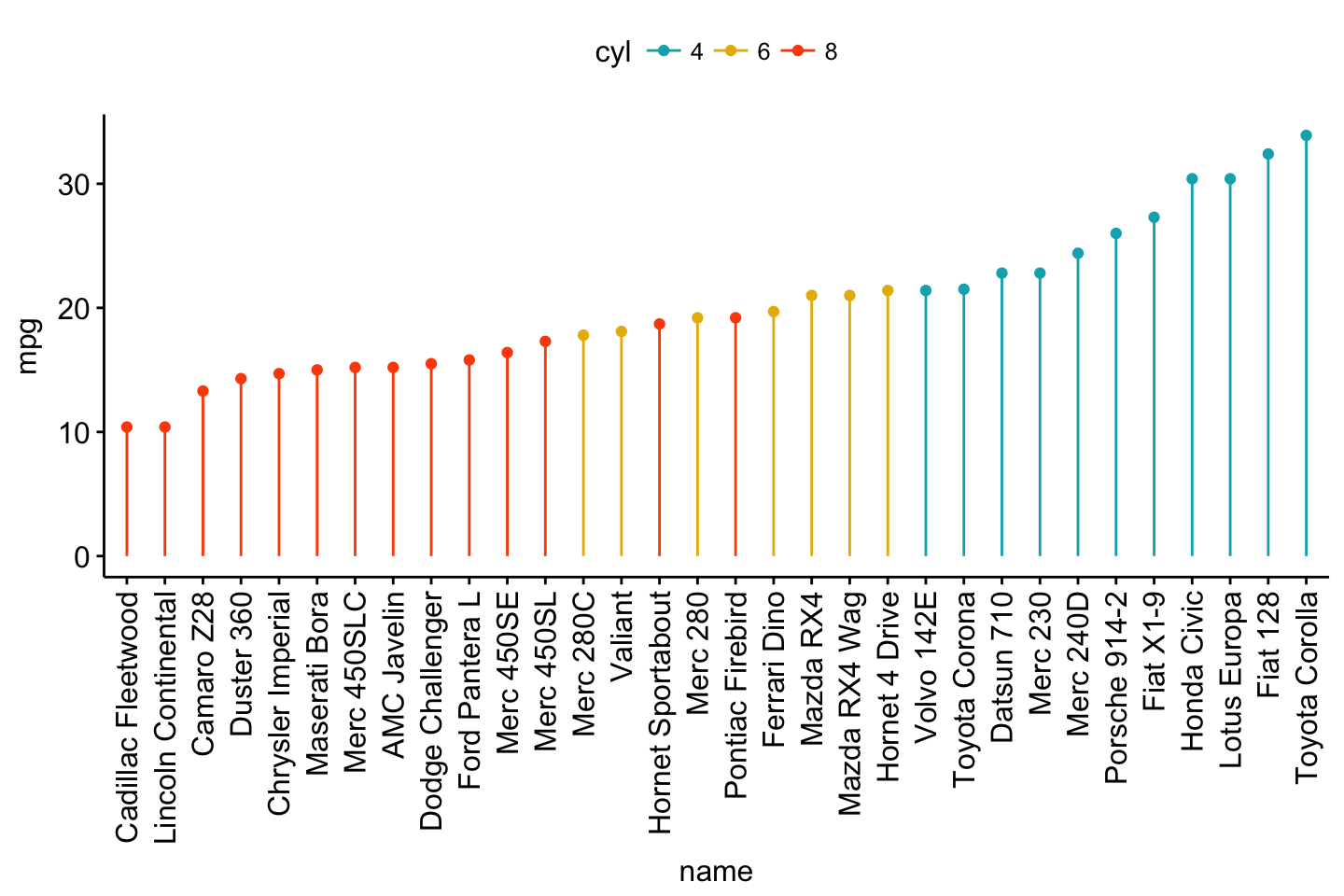
Lollipop chart
Lollipop chart is an alternative to bar plots, when you have a large set of values to visualize.
Lollipop chart colored by the grouping variable “cyl”:
ggdotchart(dfm, x = "name", y = "mpg",
           color = "cyl",                                # Color by groups
           palette = c("#00AFBB", "#E7B800", "#FC4E07"), # Custom color palette
           sorting = "ascending",                        # Sort value in descending order
           add = "segments",                             # Add segments from y = 0 to dots
           ggtheme = theme_pubr()                        # ggplot2 theme
           )
Bar plots and modern alternatives
- Sort in descending order. sorting = “descending”.
- Rotate the plot vertically, using rotate = TRUE.
- Sort the mpg value inside each group by using group = “cyl”.
- Set dot.size to 6.
- Add mpg values as label. label = “mpg” or label = round(dfm$mpg).
ggdotchart(dfm, x = "name", y = "mpg",
           color = "cyl",                                # Color by groups
           palette = c("#00AFBB", "#E7B800", "#FC4E07"), # Custom color palette
           sorting = "descending",                       # Sort value in descending order
           add = "segments",                             # Add segments from y = 0 to dots
           rotate = TRUE,                                # Rotate vertically
           group = "cyl",                                # Order by groups
           dot.size = 6,                                 # Large dot size
           label = round(dfm$mpg),                        # Add mpg values as dot labels
           font.label = list(color = "white", size = 9,
                             vjust = 0.5),               # Adjust label parameters
           ggtheme = theme_pubr()                        # ggplot2 theme
           )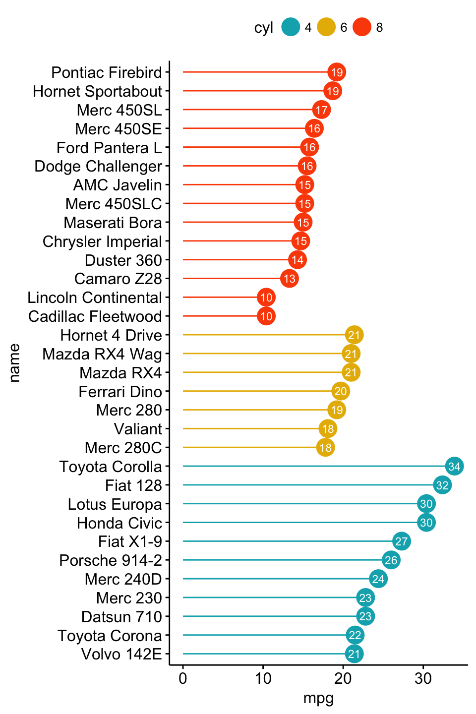
Bar plots and modern alternatives
Deviation graph:
- Use y = “mpg_z”
- Change segment color and size: add.params = list(color = “lightgray”, size = 2)
ggdotchart(dfm, x = "name", y = "mpg_z",
           color = "cyl",                                # Color by groups
           palette = c("#00AFBB", "#E7B800", "#FC4E07"), # Custom color palette
           sorting = "descending",                       # Sort value in descending order
           add = "segments",                             # Add segments from y = 0 to dots
           add.params = list(color = "lightgray", size = 2), # Change segment color and size
           group = "cyl",                                # Order by groups
           dot.size = 6,                                 # Large dot size
           label = round(dfm$mpg_z,1),                        # Add mpg values as dot labels
           font.label = list(color = "white", size = 9,
                             vjust = 0.5),               # Adjust label parameters
           ggtheme = theme_pubr()                        # ggplot2 theme
           )+
  geom_hline(yintercept = 0, linetype = 2, color = "lightgray")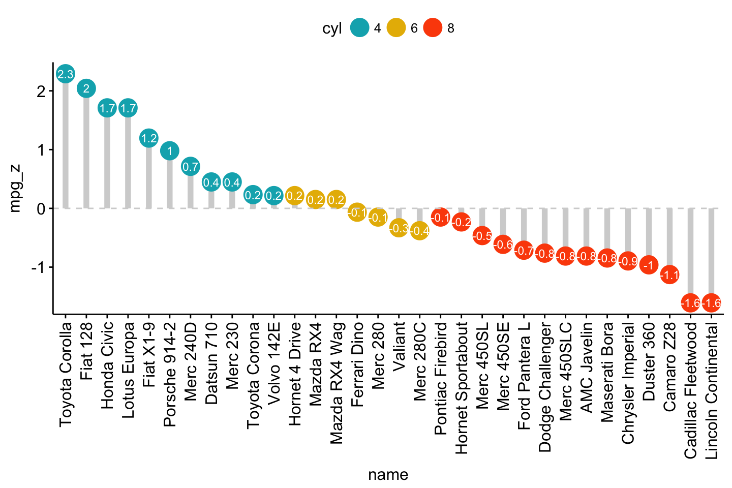
Bar plots and modern alternatives
Cleveland’s dot plot
Color y text by groups. Use y.text.col = TRUE.
ggdotchart(dfm, x = "name", y = "mpg",
           color = "cyl",                                # Color by groups
           palette = c("#00AFBB", "#E7B800", "#FC4E07"), # Custom color palette
           sorting = "descending",                       # Sort value in descending order
           rotate = TRUE,                                # Rotate vertically
           dot.size = 2,                                 # Large dot size
           y.text.col = TRUE,                            # Color y text by groups
           ggtheme = theme_pubr()                        # ggplot2 theme
           )+
  theme_cleveland()                                      # Add dashed grids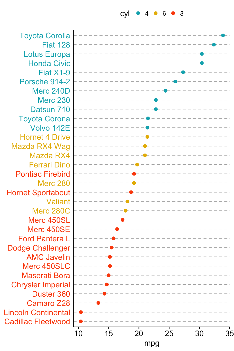
Bar plots and modern alternatives
Infos
This analysis has been performed using R software (ver. 3.3.2) and ggpubr (ver. 0.1.4).