ggfortify extends ggplot2 for plotting some popular R packages in a unified way.
The following R packages and functions are covered:
| Package name | Functions |
|---|---|
| base | matrix and table |
| cluster | clara, fanny and pam |
| changepoint | cpt |
| dlm | dlmFilter and dlmSmooth |
| fGarch | fGARCH |
| forecast | bats, forecast, ets and nnetar |
| fracdiff | fracdiff |
| glmnet | glmnet |
| KFAS | KFS and signal |
| lfda | klfda and self |
| MASS | isoMDS and sammon |
| stats | acf, ar, Arima, smdscale, decomposed.ts, density, fractanal, glm, HoltWinters, kmeans, lm, prcomp, princomp, spec, stepfun, stl and ts |
| survival | survfit and survfit.cox |
| strucchange | breakpoints and breakpointsfull |
| timeSeries | timeSeries |
| tseries | irts |
| vars | varprd |
| xts | xts |
| zoo | zooreg |
Installation
ggfortify can be installed from GitHub or CRAN:
# Github
if(!require(devtools)) install.packages("devtools")
devtools::install_github("sinhrks/ggfortify")
# CRAN
install.packages("ggfortify")Loading ggfortify
library("ggfortify")Plotting matrix
The function autoplot.matrix() is used:
autoplot(object, geom = "tile")- object: an object of class matrix
- geom: allowed values are tile (for heatmap) or point (for scatter plot)
The *mtcars** data set is used in the example below.
df <- mtcars[, c("mpg", "disp", "hp", "drat", "wt")]
df <- as.matrix(df)
Plot a heatmap:
# Heatmap
autoplot(scale(df))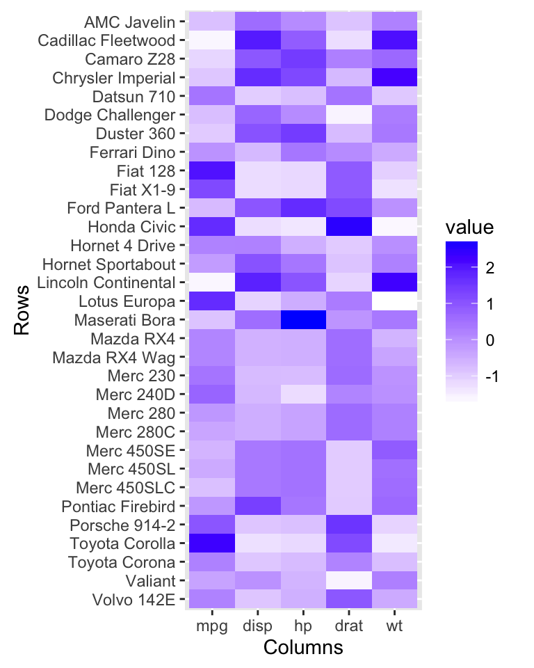
Plot a scatter plot: The data should be a matrix with 2 columns named V1 and V2. The R code below plots mpg by wt. We start by renaming column names.
# Extract the data
df2 <- df[, c("wt", "mpg")]
colnames(df2) <- c("V1", "V2")

# Scatter plot
autoplot(df2, geom = 'point') +
  labs(x = "mpg", y = "wt")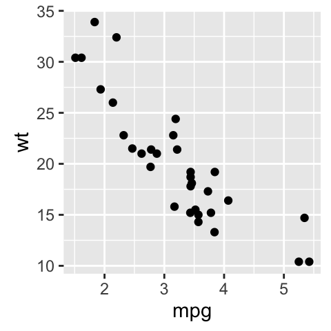
Plotting diagnostics for LM and GLM
The function autoplot.lm() is used to plot diagnostic plots for LM and GLM [in stats package].
autoplot(object, which = c(1:3, 5))- object: stats::lm instance
- which: If a subset of the plots is required, specify a subset of the numbers 1:6.
- ncol and nrow allows you to specify the number of subplot columns and rows.
Diagnostic plots for Linear Models (LM)
iris data set is used for computing the linear model
# Compute a linear model
m <- lm(Petal.Width ~ Petal.Length, data = iris)

# Create the plot
autoplot(m, which = 1:6, ncol = 2, label.size = 3)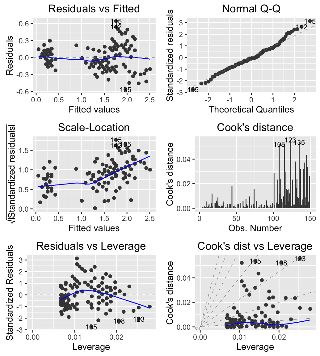
# Change the color by groups (species)
autoplot(m, which = 1:6, label.size = 3, data = iris,
         colour = 'Species')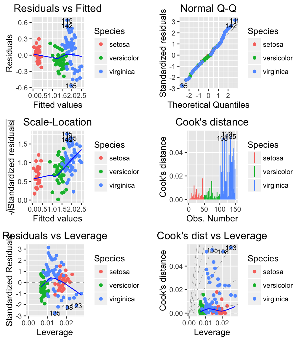
Diagnostic plots with Generalized Linear Models (GLM)
USArrests data set is used.
# Compute a generalized linear model
m <- glm(Murder ~ Assault + UrbanPop + Rape,
         family = gaussian, data = USArrests)

# Create the plot
# Change the theme and colour
autoplot(m, which = 1:6, ncol = 2, label.size = 3,
         colour = "steelblue") + theme_bw()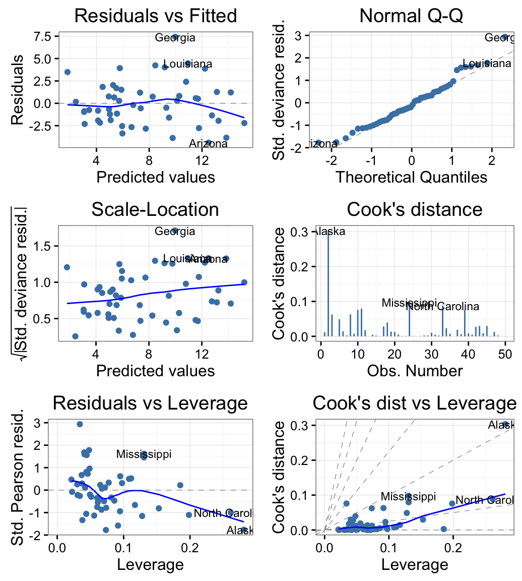
Plotting time series
Plotting ts objects
- Data set: AirPassengers
- R Function: autoplot.ts()
autoplot(AirPassengers)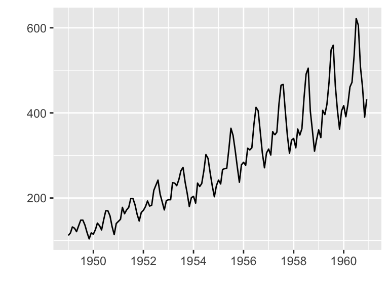
The function autoplot() can handle also other time-series-likes packages, including:
- zoo::zooreg()
- xts::xts()
- timeSeries::timSeries()
- tseries::irts()
- forecast::forecast()
- vars:vars()
Plotting with changepoint package
The changepoint package provides a simple approach for identifying shifts in mean and/or variance in a time series.
ggfortify supports cpt object in changepoint package.
library(changepoint)
autoplot(cpt.meanvar(AirPassengers))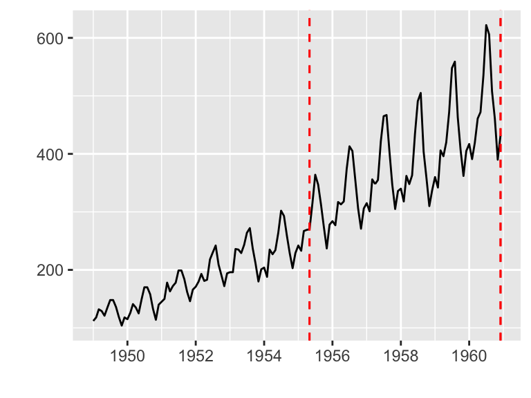
Plotting with strucchange package
strucchange is an R package for detecting jumps in data.
Data set: Nile
library(strucchange)
autoplot(breakpoints(Nile ~ 1))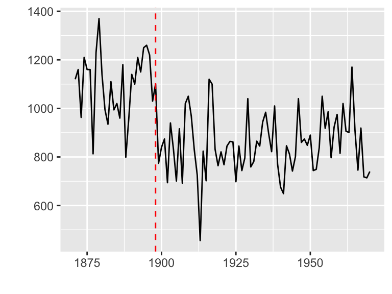
Plotting PCA (Principal Component Analysis)
- Data set: iris
- Function: autoplot.prcomp()
# Prepare the data
df <- iris[, -5]

# Principal component analysis
pca <- prcomp(df, scale. = TRUE)

# Plot
autoplot(pca, loadings = TRUE, loadings.label = TRUE,
         data = iris, colour = 'Species')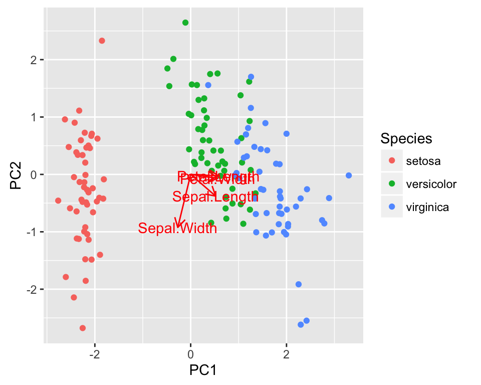
Plotting K-means
- Data set: USArrests
- Function: autoplot.kmeans()
The original data is required as kmeans object doesnt store original data. Samples will be colored by groups (clusters).
autoplot(kmeans(USArrests, 3), data = USArrests,
         label = TRUE, label.size = 3, frame = TRUE)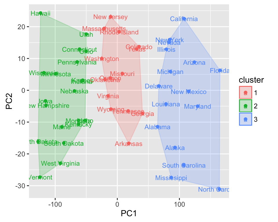
Plotting cluster package
ggfortify supports cluster::clara, cluster::fanny and cluster::pam classes. These functions return object containing original data, so there is no need to pass original data explicitly.
The R code below shows an example for pam() function:
library(cluster)
autoplot(pam(iris[-5], 3), frame = TRUE, frame.type = 'norm')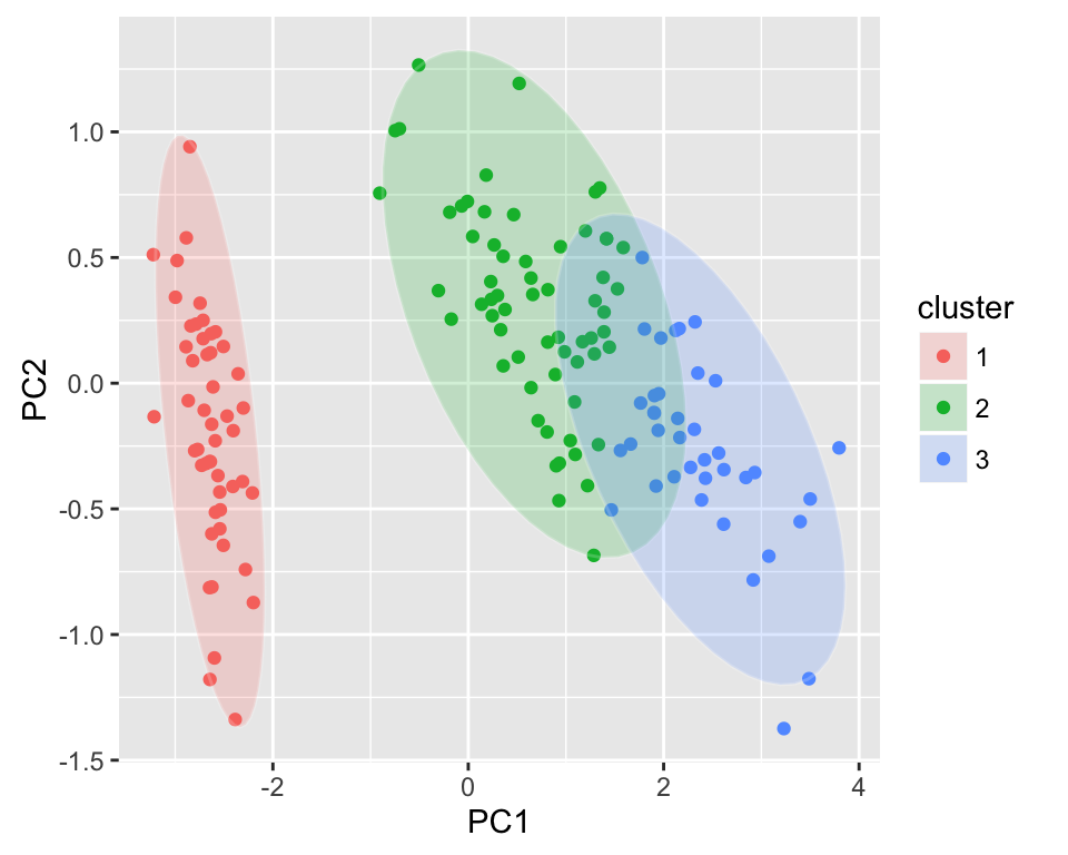
Plotting Local Fisher Discriminant Analysis
library(lfda)
# Local Fisher Discriminant Analysis (LFDA)
model <- lfda(iris[,-5], iris[, 5], 4, metric="plain")
autoplot(model, data = iris, frame = TRUE, frame.colour = 'Species')
Plotting survival curves
library(survival)
fit <- survfit(Surv(time, status) ~ sex, data = lung)
autoplot(fit)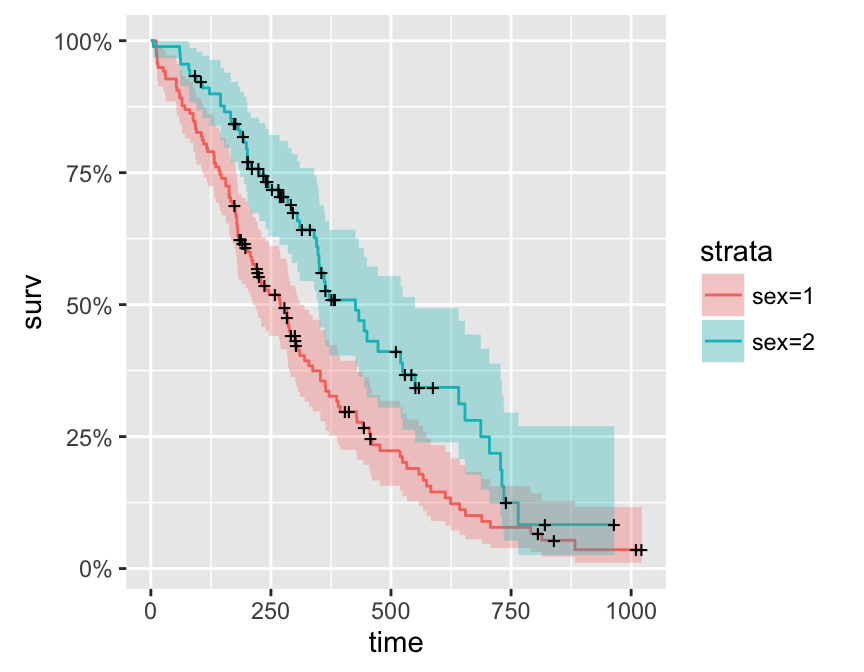
Learn more
Infos
This analysis has been performed using R software (ver. 3.2.1) and ggplot2 (ver. 1.0.1)