GGally extends ggplot2 by providing several functions including:
- ggcor(): for pairwise correlation matrix plot
- ggpairs(): for scatterplot plot matrix
- ggsurv(): for survival plot
Installation
GGally can be installed from GitHub or CRAN:
# Github
if(!require(devtools)) install.packages("devtools")
devtools::install_github("ggobi/ggally")
# CRAN
install.packages("GGally")Loading GGally package
library("GGally")ggcorr(): Plot a correlation matrix
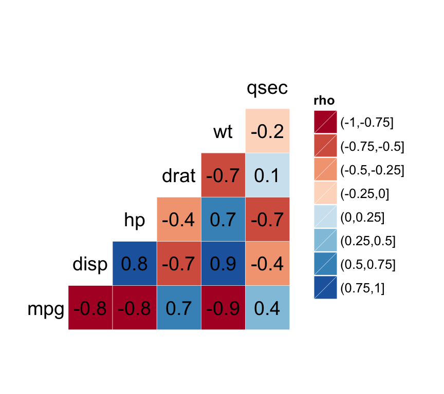
The function ggcorr() draws a correlation matrix plot using ggplot2.
The simplified format is:
ggcorr(data, palette = "RdYlGn", name = "rho",
label = FALSE, label_color = "black", ...)- data: a numerical (continuous) data matrix
- palette: a ColorBrewer palette to be used for correlation coefficients. Default value is RdYlGn.
- name: a character string used for legend title.
- label: logical value. If TRUE, the correlation coefficients are displayed on the plot.
- label_color: color to be used for the correlation coefficient
The function ggcorr() can be used as follow:
# Prepare some data
df <- mtcars[, c(1,3,4,5,6,7)]

# Correlation plot
ggcorr(df, palette = "RdBu", label = TRUE)
Read also: ggplot2 correlation matrix heatmap
ggpairs(): ggplot2 matrix of plots
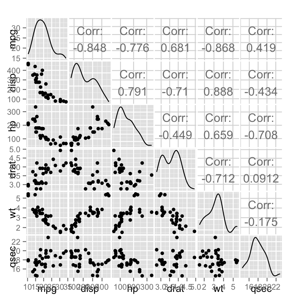
The function ggpairs() produces a matrix of scatter plots for visualizing the correlation between variables.
The simplified format is:
ggpairs(data, columns = 1:ncol(data), title = "",
axisLabels = "show", columnLabels = colnames(data[, columns]))- data: data set. Can have both numerical and categorical data.
- columns: columns to be used for the plots. Default is all columns.
- title: title for the graph
- axisLabels: Allowed values are either show to display axisLabels, internal for labels in the diagonal plots, or none for no axis labels
- columnLabels: label names to be displayed. Defaults to names of columns being used.
ggpairs(df)
ggsurv(): Plot survival curve using ggplot2
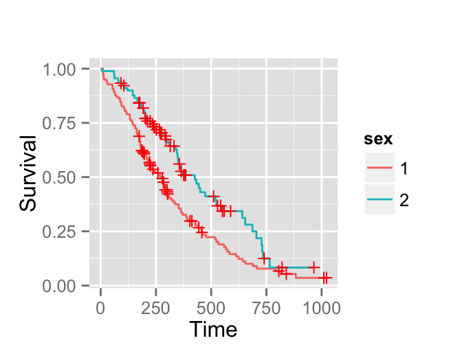
The function ggsurv() can be used to produces Kaplan-Meier plots using ggplot2 .
The simplified format is:
ggsurv(s, surv.col = "gg.def", plot.cens = TRUE, cens.col = "red",
xlab = "Time", ylab = "Survival", main = "")- s: an object of class survfit
- surv.col: color of the survival estimate. The default value is black for one stratum; default ggplot2 colors for multiple strata. It can be also a vector containing the color names for each stratum.
- plot.cens: logical value. If TRUE, marks the censored observations.
- cens.col: color of the points that mark censored observations.
- xlab, ylab: label of x-axis and y-axis, respectively
- main: the plot main title
Data
Well use lung data from the package survival:
require(survival)
data(lung, package = "survival")
head(lung[, 1:5])
## inst time status age sex
## 1 3 306 2 74 1
## 2 3 455 2 68 1
## 3 3 1010 1 56 1
## 4 5 210 2 57 1
## 5 1 883 2 60 1
## 6 12 1022 1 74 1The data above includes:
- time: Survival time in days
- status: censoring status 1 = censored, 2 = dead
- sex: Male = 1; Female = 2
In the next section well plot the survival curves of male and female.
Survival curves
require("survival")
# Fit survival functions
surv <- survfit(Surv(time, status) ~ sex, data = lung)

# Plot survival curves
surv.p <- ggsurv(surv)
surv.p
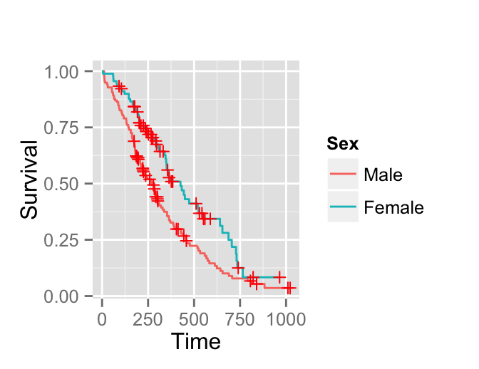
Its possible to change the legend of the plot as follow:
require(ggplot2)
surv.p + guides(linetype = FALSE) +
scale_colour_discrete(name   = 'Sex', breaks = c(1,2),
                      labels = c('Male', 'Female'))
Infos
This analysis has been performed using R software (ver. 3.2.1) and ggplot2 (ver. 1.0.1)