- 1 plot.hclust(): R base function
- 2 plot.dendrogram() function
- 3 Phylogenetic trees
- 4 ggdendro package : ggplot2 and dendrogram
- 5 dendextend package: Extending Rs dendrogram functionality
- 5.1 Chaining
- 5.2 Installation and loading
- 5.3 How to change a dendrogram
- 5.4 Create a simple dendrogram
- 5.5 Change labels
- 5.6 Change the points of a dendrogram nodes/leaves
- 5.7 Change the color of branches
- 5.8 Adding colored rectangles
- 5.9 Adding colored bars
- 5.10 ggplot2 integration
- 5.11 pvclust and dendextend
- 6 Infos
A variety of functions exists in R for visualizing and customizing dendrogram. The aim of this article is to describe 5+ methods for drawing a beautiful dendrogram using R software.
We start by computing hierarchical clustering using the data set USArrests:
# Load data
data(USArrests)

# Compute distances and hierarchical clustering
dd <- dist(scale(USArrests), method = "euclidean")
hc <- hclust(dd, method = "ward.D2")
1 plot.hclust(): R base function
As you already know, the standard R function plot.hclust() can be used to draw a dendrogram from the results of hierarchical clustering analyses (computed using hclust() function).
A simplified format is:
plot(x, labels = NULL, hang = 0.1,
     main = "Cluster dendrogram", sub = NULL,
xlab = NULL, ylab = "Height", ...)- x: an object of the type produced by hclust()
- labels: A character vector of labels for the leaves of the tree. The default value is row names. if labels = FALSE, no labels are drawn.
- hang: The fraction of the plot height by which labels should hang below the rest of the plot. A negative value will cause the labels to hang down from 0.
- main, sub, xlab, ylab: character strings for title.
# Default plot
plot(hc)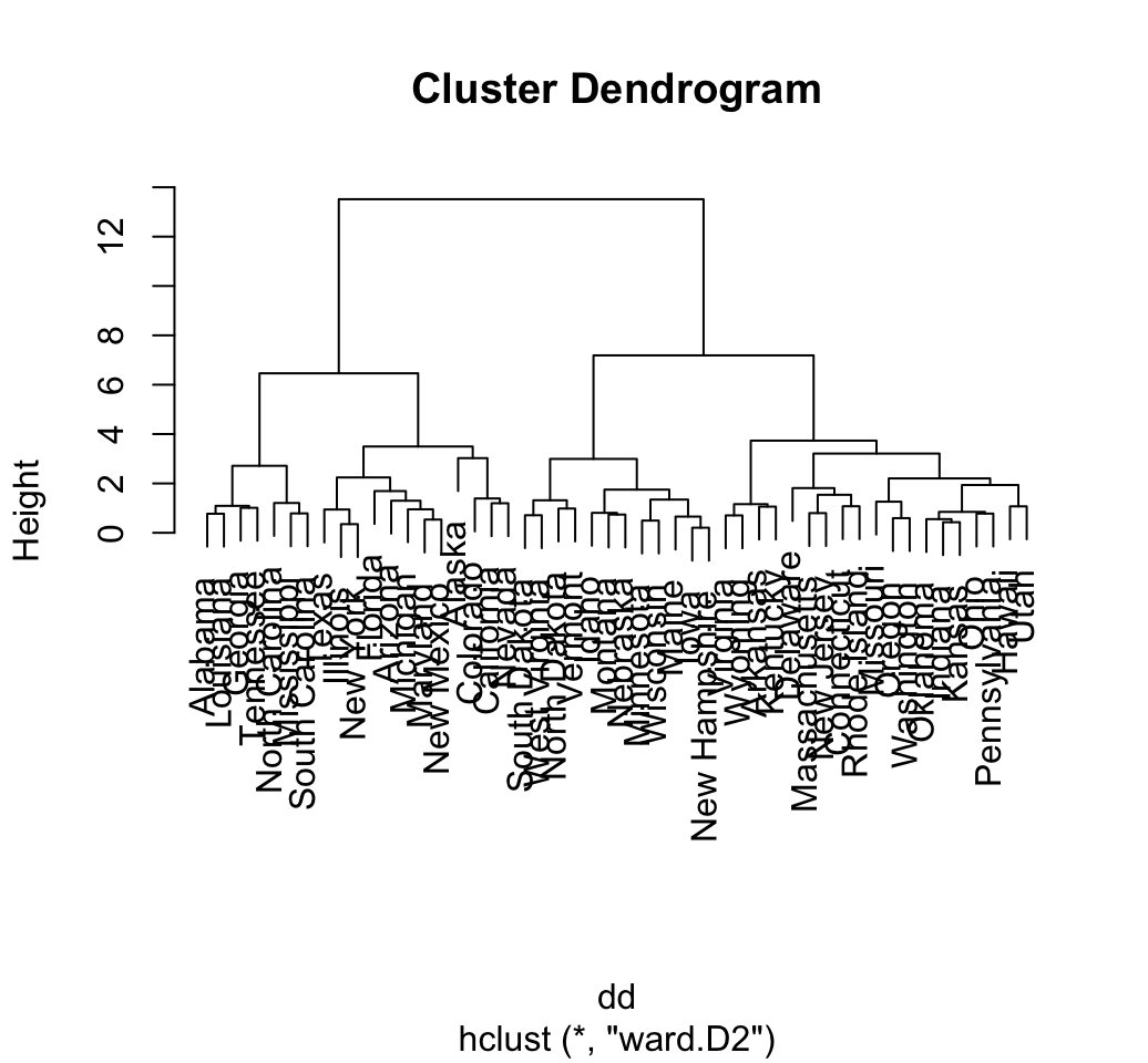
# Put the labels at the same height: hang = -1
plot(hc, hang = -1, cex = 0.6)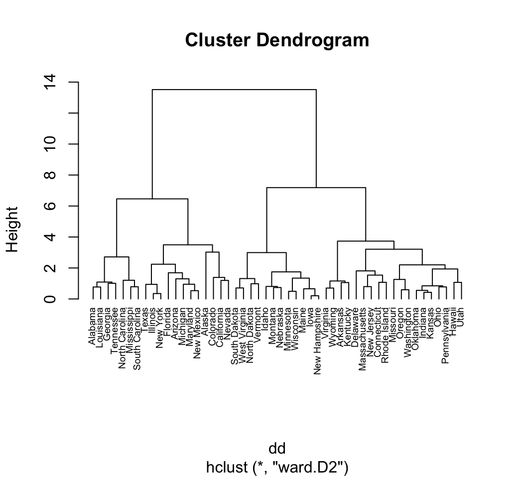
2 plot.dendrogram() function
In order to visualize the result of a hierarchical clustering analysis using the function plot.dendrogram(), we must firstly convert it as a dendrogram.
The format of the function plot.dendrogram() is:
plot(x, type = c("rectangle", "triangle"), horiz = FALSE)- x: an object of class dendrogram
- type of plot. Possible values are rectangle or triangle
- horiz: logical indicating if the dendrogram should be drawn horizontally or no
# Convert hclust into a dendrogram and plot
hcd <- as.dendrogram(hc)
# Default plot
plot(hcd, type = "rectangle", ylab = "Height")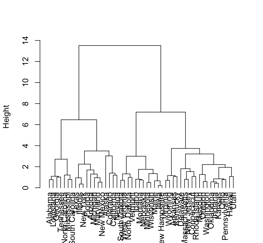
# Triangle plot
plot(hcd, type = "triangle", ylab = "Height")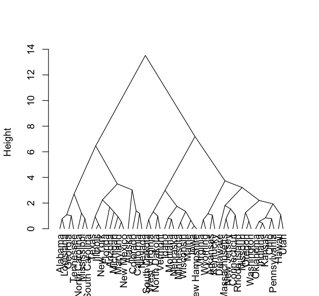
# Zoom in to the first dendrogram
plot(hcd, xlim = c(1, 20), ylim = c(1,8))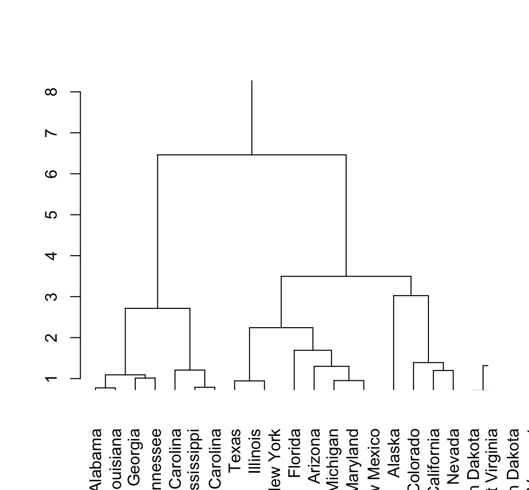
The above dendrogram can be customized using the arguments:
- nodePar: a list of plotting parameters to use for the nodes (see ?points). Default value is NULL. The list may contain components named pch, cex, col, xpd, and/or bg each of which can have length two for specifying separate attributes for inner nodes and leaves.
- edgePar: a list of plotting parameters to use for the edge segments (see ?segments). The list may contain components named col, lty and lwd (for the segments). As with nodePar, each can have length two for differentiating leaves and inner nodes.
- leaflab: a string specifying how leaves are labeled. The default perpendicular write text vertically; textlike writes text horizontally (in a rectangle), and none suppresses leaf labels.
# Define nodePar
nodePar <- list(lab.cex = 0.6, pch = c(NA, 19),
                cex = 0.7, col = "blue")
# Customized plot; remove labels
plot(hcd, ylab = "Height", nodePar = nodePar, leaflab = "none")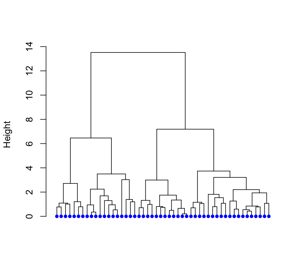
# Horizontal plot
plot(hcd,  xlab = "Height",
     nodePar = nodePar, horiz = TRUE)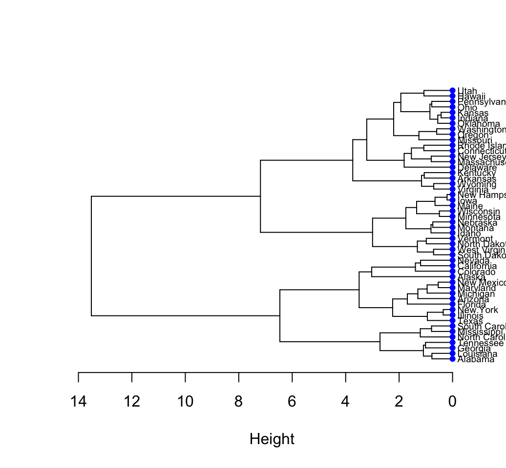
# Change edge color
plot(hcd,  xlab = "Height", nodePar = nodePar,
     edgePar = list(col = 2:3, lwd = 2:1))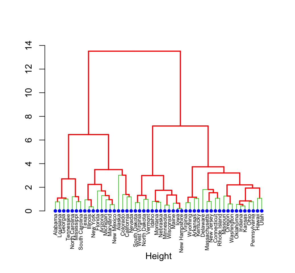
3 Phylogenetic trees
The package ape (Analyses of Phylogenetics and Evolution) can be used to produce a more sophisticated dendrogram.
The function plot.phylo() can be used for plotting a dendrogram. A simplified format is:
plot(x, type = "phylogram", show.tip.label = TRUE,
     edge.color = "black", edge.width = 1, edge.lty = 1,
tip.color = "black")- x: an object of class phylo
- type: the type of phylogeny to be drawn. Possible values are: phylogram (the default), cladogram, fan, unrooted and radial
- show.tip.label: if true labels are shown
- edge.color, edge.width, edge.lty: line color, width and type to be used for edge
- tip.color: color used for labels
# install.packages("ape")
library("ape")
# Default plot
plot(as.phylo(hc), cex = 0.6, label.offset = 0.5)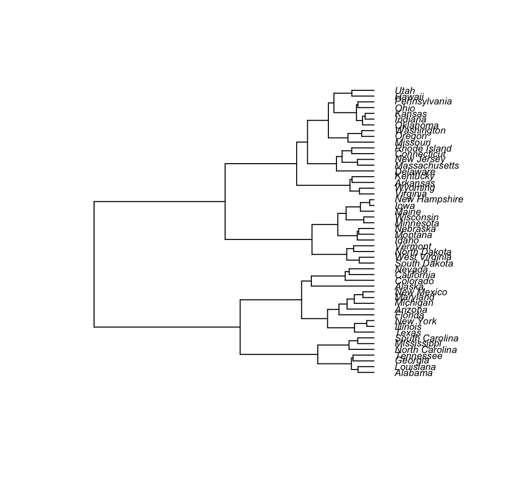
# Cladogram
plot(as.phylo(hc), type = "cladogram", cex = 0.6,
     label.offset = 0.5)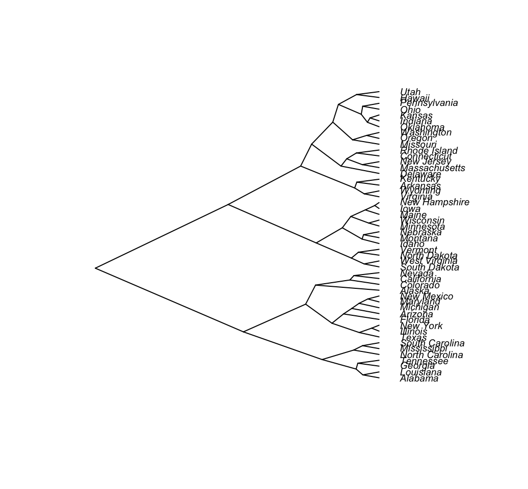
# Unrooted
plot(as.phylo(hc), type = "unrooted", cex = 0.6,
     no.margin = TRUE)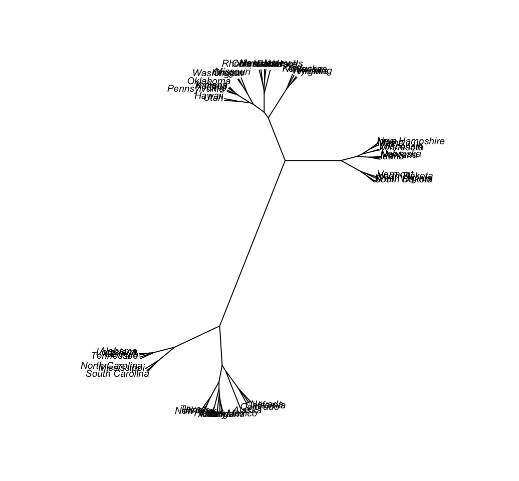
# Fan
plot(as.phylo(hc), type = "fan")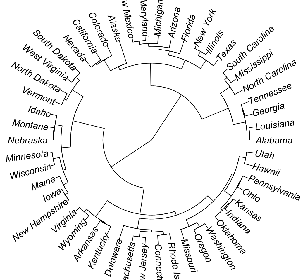
# Radial
plot(as.phylo(hc), type = "radial")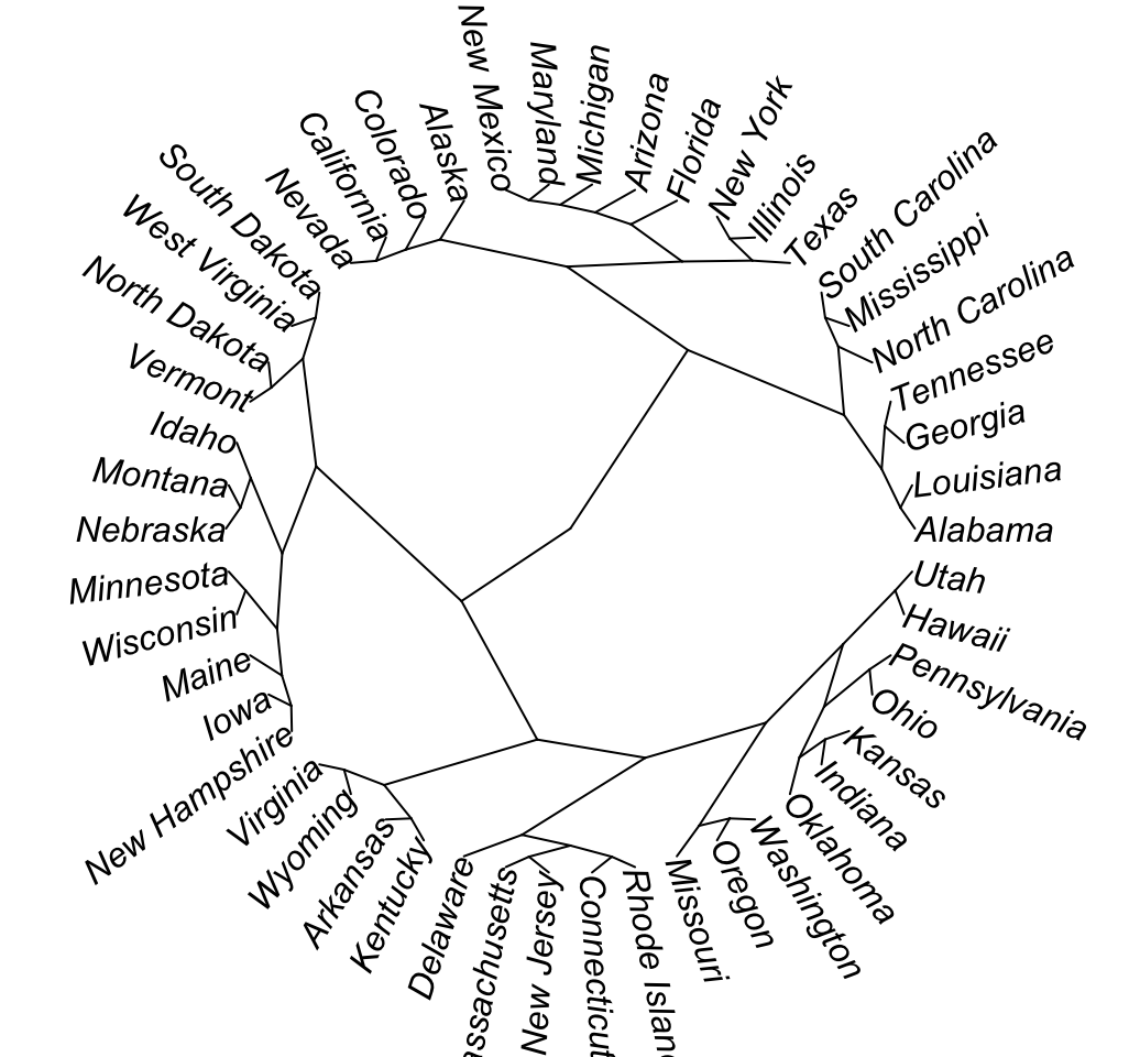
# Cut the dendrogram into 4 clusters
colors = c("red", "blue", "green", "black")
clus4 = cutree(hc, 4)
plot(as.phylo(hc), type = "fan", tip.color = colors[clus4],
     label.offset = 1, cex = 0.7)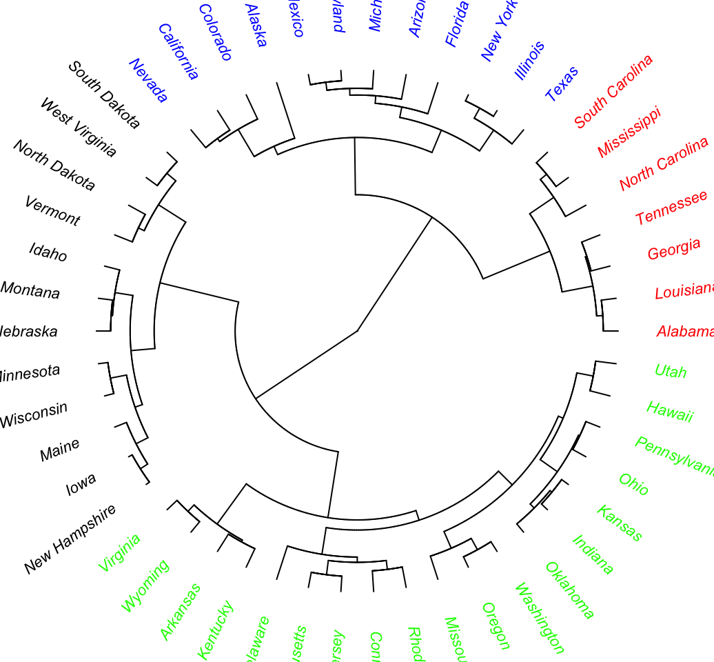
# Change the appearance
# change edge and label (tip)
plot(as.phylo(hc), type = "cladogram", cex = 0.6,
     edge.color = "steelblue", edge.width = 2, edge.lty = 2,
     tip.color = "steelblue")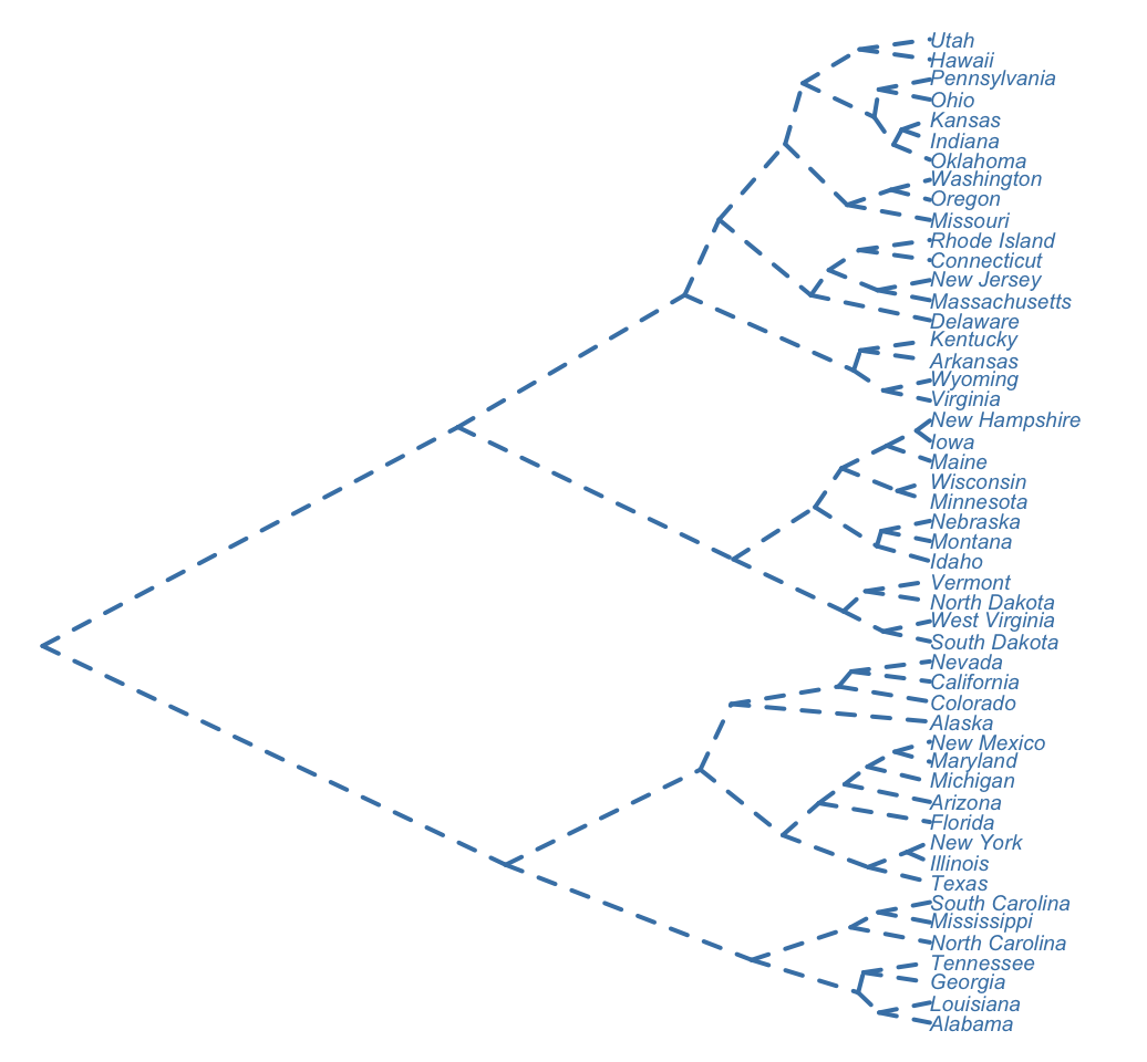
4 ggdendro package : ggplot2 and dendrogram
The R package ggdendro can be used to extract the plot data from dendrogram and for drawing a dendrogram using ggplot2.
4.1 Installation and loading
ggdendro can be installed as follow:
install.packages("ggdendro")ggdendro requires the package ggplot2. Make sure that ggplot2 is installed and loaded before using ggdendro.
Load ggdendro as follow:
library("ggplot2")
library("ggdendro")
4.2 Visualize dendrogram using ggdendrogram() function
The function ggdendrogram() creates dendrogram plot using ggplot2.
# Visualization using the default theme named theme_dendro()
ggdendrogram(hc)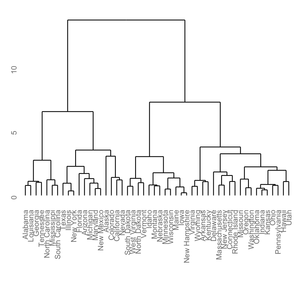
# Rotate the plot and remove default theme
ggdendrogram(hc, rotate = TRUE, theme_dendro = FALSE)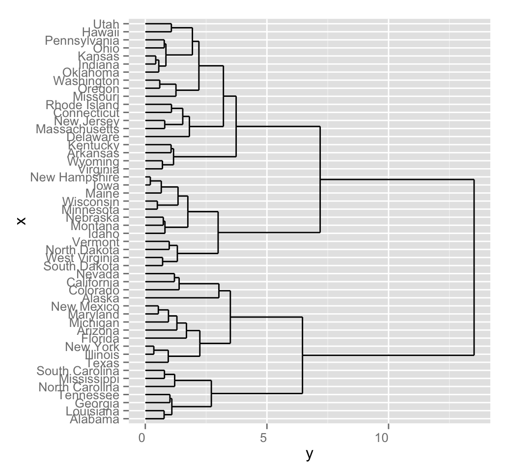
4.3 Extract dendrogram plot data
The function dendro_data() can be used for extracting the data. It returns a list of data frames which can be extracted using the functions below:
- segment(): To extract the data for dendrogram line segments
- label(): To extract the labels
# Build dendrogram object from hclust results
dend <- as.dendrogram(hc)

# Extract the data (for rectangular lines)
# Type can be "rectangle" or "triangle"
dend_data <- dendro_data(dend, type = "rectangle")
# What contains dend_data
names(dend_data)
## [1] "segments" "labels" "leaf_labels" "class"# Extract data for line segments
head(dend_data$segments)## x y xend yend
## 1 19.771484 13.516242 8.867188 13.516242
## 2 8.867188 13.516242 8.867188 6.461866
## 3 8.867188 6.461866 4.125000 6.461866
## 4 4.125000 6.461866 4.125000 2.714554
## 5 4.125000 2.714554 2.500000 2.714554
## 6 2.500000 2.714554 2.500000 1.091092# Extract data for labels
head(dend_data$labels)## x y label
## 1 1 0 Alabama
## 2 2 0 Louisiana
## 3 3 0 Georgia
## 4 4 0 Tennessee
## 5 5 0 North Carolina
## 6 6 0 Mississippidend_data can be used to draw a customized dendrogram using ggplot2:
# Plot line segments and add labels
p <- ggplot(dend_data$segments) +
  geom_segment(aes(x = x, y = y, xend = xend, yend = yend))+
  geom_text(data = dend_data$labels, aes(x, y, label = label),
            hjust = 1, angle = 90, size = 3)+
  ylim(-3, 15)
print(p)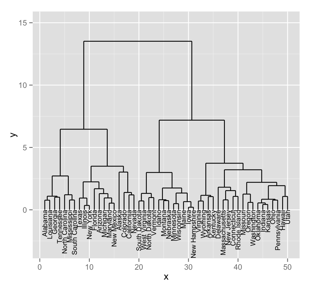
5 dendextend package: Extending Rs dendrogram functionality
The package dendextend contains many functions for changing the appearance of a dendrogram and for comparing dendrograms.
In this section well use the chaining operator (%>%) to simplify our code.
5.1 Chaining
The chaining operator (%>%) turns x %>% f(y) into f(x, y) so you can use it to rewrite multiple operations such that they can be read from left-to-right, top-to-bottom. For instance, the results of the two R codes below are equivalent.
Standard R code for creating a dendrogram:
data <- scale(USArrests)
dist.res <- dist(data)
hc <- hclust(dist.res, method = "ward.D2")
dend <- as.dendrogram(hc)
plot(dend)
R code for creating a dendrogram using chaining operator:
dend <- USArrests[1:5,] %>% # data
        scale %>% # Scale the data
        dist %>% # calculate a distance matrix,
        hclust(method = "ward.D2") %>% # Hierarchical clustering
        as.dendrogram # Turn the object into a dendrogram.
plot(dend)
5.2 Installation and loading
Install the stable version as follow:
install.packages('dendextend')Loading:
library(dendextend)5.3 How to change a dendrogram
The function set() can be used to change the parameters with dendextend.
The format is:
set(object, what, value)- object: a dendrogram object
- what: a character indicating what is the property of the tree that should be set/updated
- value: a vector with the value to set in the tree (the type of the value depends on the what).
Possible values for the argument what include:
| Value for the argument what | Description |
|---|---|
| labels | set the labels |
| labels_colors and labels_cex | Set the color and the size of labels, respectively |
| leaves_pch, leaves_cex and leaves_col | set the point type, size and color for leaves, respectively |
| nodes_pch, nodes_cex and nodes_col | set the point type, size and color for nodes, respectively |
| hang_leaves | hang the leaves |
| branches_k_color | color the branches |
| branches_col, branches_lwd , branches_lty | Set the color, the line width and the line type of branches, respectively |
| by_labels_branches_col, by_labels_branches_lwd and by_labels_branches_lty | Set the color, the line width and the line type of branches with specific labels, respectively |
| clear_branches and clear_leaves | Clear branches and leaves, respectively |
5.4 Create a simple dendrogram
# Create a dendrogram and plot it
dend <- USArrests[1:5,] %>%  scale %>%
        dist %>% hclust %>% as.dendrogram

dend %>% plot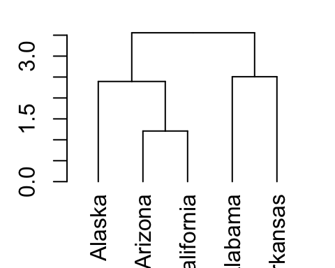
# Get the labels of the tree
labels(dend)
## [1] "Alaska" "Arizona" "California" "Alabama" "Arkansas"5.5 Change labels
This section describes how to change label names as well as the color and the size for labels.
# Change the labels, and then plot:
dend %>% set("labels", c("a", "b", "c", "d", "e")) %>% plot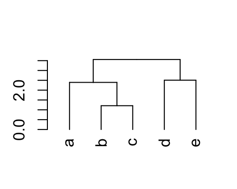
# Change color and size for labels
dend %>% set("labels_col", c("green", "blue")) %>% # change color
  set("labels_cex", 2) %>% # Change size
  plot(main = "Change the color \nand size") # plot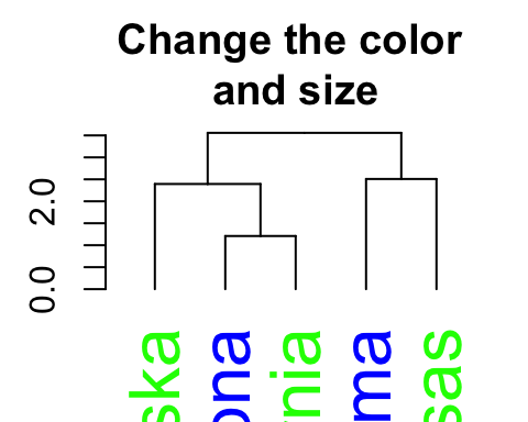
# Color labels by specifying the number of cluster (k)
dend %>% set("labels_col", value = c("green", "blue"), k=2) %>%
          plot(main = "Color labels \nper cluster")
abline(h = 2, lty = 2)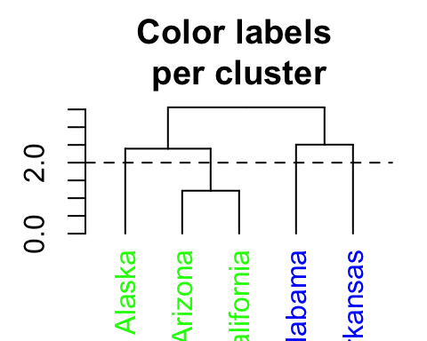
In the R code above, the value of color vectors are too short. Hence, its recycled.
5.6 Change the points of a dendrogram nodes/leaves
# Change the type, the color and the size of node points
# +++++++++++++++++++++++++++++
dend %>% set("nodes_pch", 19) %>%  # node point type
  set("nodes_cex", 2) %>%  # node point size
  set("nodes_col", "blue") %>% # node point color
  plot(main = "Node points")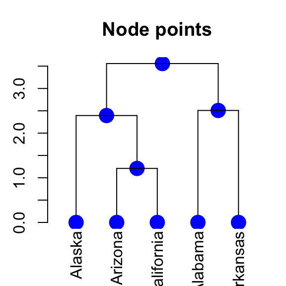
# Change the type, the color and the size of leave points
# +++++++++++++++++++++++++++++
dend %>% set("leaves_pch", 19) %>%  # node point type
  set("leaves_cex", 2) %>%  # node point size
  set("leaves_col", "blue") %>% # node point color
  plot(main = "Leaves points")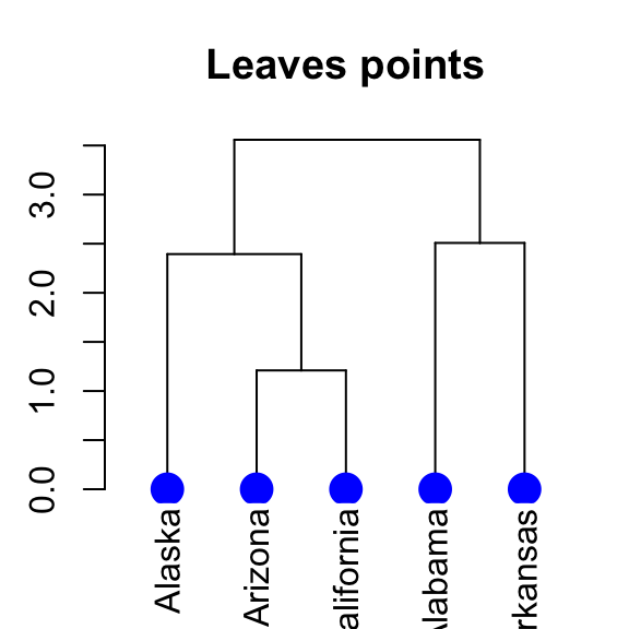
# Specify different point types and colors for each leave
dend %>% set("leaves_pch", c(17, 18, 19)) %>%  # node point type
  set("leaves_cex", 2) %>%  # node point size
  set("leaves_col", c("blue", "red", "green")) %>% #node point color
  plot(main = "Leaves points")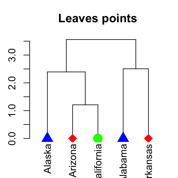
5.7 Change the color of branches
The color for branches can be controlled using k-means clustering:
# Default colors
dend %>% set("branches_k_color", k = 2) %>%
  plot(main = "Default colors")

# Customized colors
dend %>% set("branches_k_color",
             value = c("red", "blue"), k = 2) %>%
   plot(main = "Customized colors")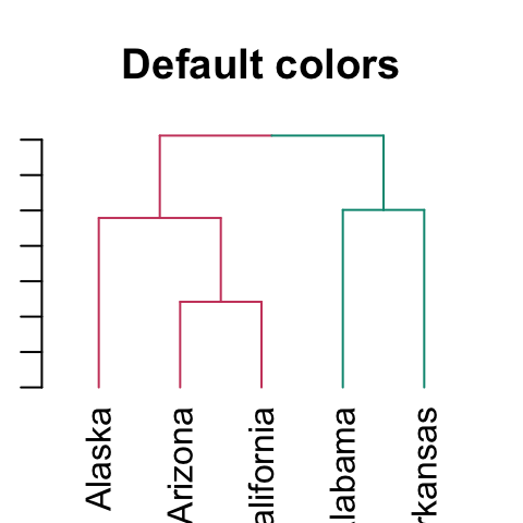
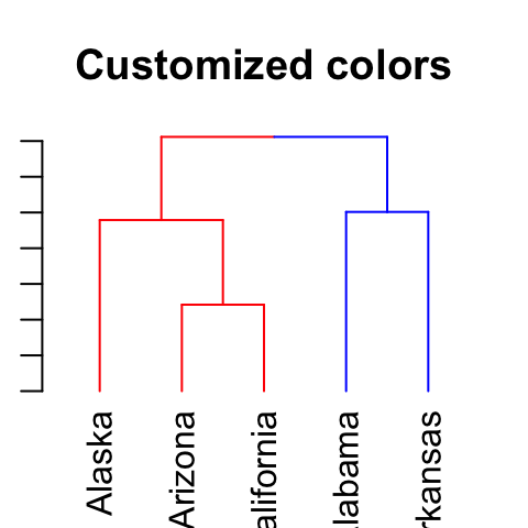
Its also possible to use the function color_branches().
5.8 Adding colored rectangles
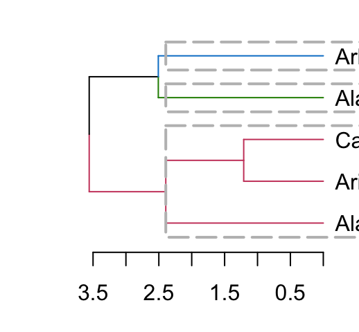
Clusters can be highlighted by adding colored rectangles. This is done using the rect.dendrogram() function (modeled based on the rect.hclust() function). One advantage of rect.dendrogram over rect.hclust, is that it also works on horizontally plotted trees:
# Vertical plot
dend %>% set("branches_k_color", k = 3) %>% plot
dend %>% rect.dendrogram(k=3, border = 8, lty = 5, lwd = 2)

# Horizontal plot
dend %>% set("branches_k_color", k = 3) %>% plot(horiz = TRUE)
dend %>% rect.dendrogram(k = 3, horiz = TRUE, border = 8, lty = 5, lwd = 2)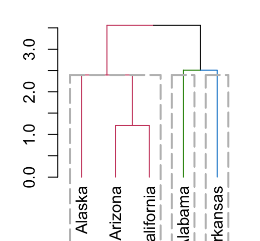
5.9 Adding colored bars
This is useful for annotating the items in the clusters:
grp <- c(1,1,1, 2,2)
k_3 <- cutree(dend,k = 3, order_clusters_as_data = FALSE)
# The FALSE above makes sure we get the clusters in the order of the
# dendrogram, and not in that of the original data. It is like:
# cutree(dend, k = 3)[order.dendrogram(dend)]

the_bars <- cbind(grp, k_3)

dend %>% set("labels", "") %>% plot
colored_bars(colors = the_bars, dend = dend)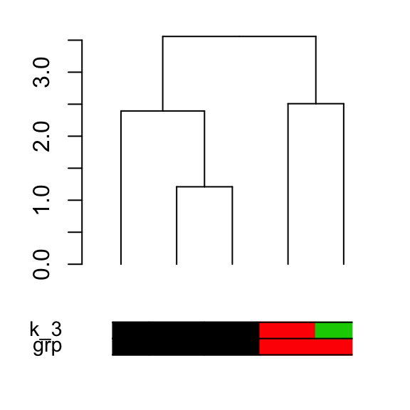
5.10 ggplot2 integration
The following 2 steps are used:
- Transform a dendrogram into a ggdend object using as.ggdend() function
- Make the plot using the function ggplot()
dend <- iris[1:30,-5] %>% scale %>% dist %>%
   hclust %>% as.dendrogram %>%
   set("branches_k_color", k=3) %>% set("branches_lwd", 1.2) %>%
   set("labels_colors") %>% set("labels_cex", c(.9,1.2)) %>%
   set("leaves_pch", 19) %>% set("leaves_col", c("blue", "red"))
# plot the dend in usual "base" plotting engine:
plot(dend)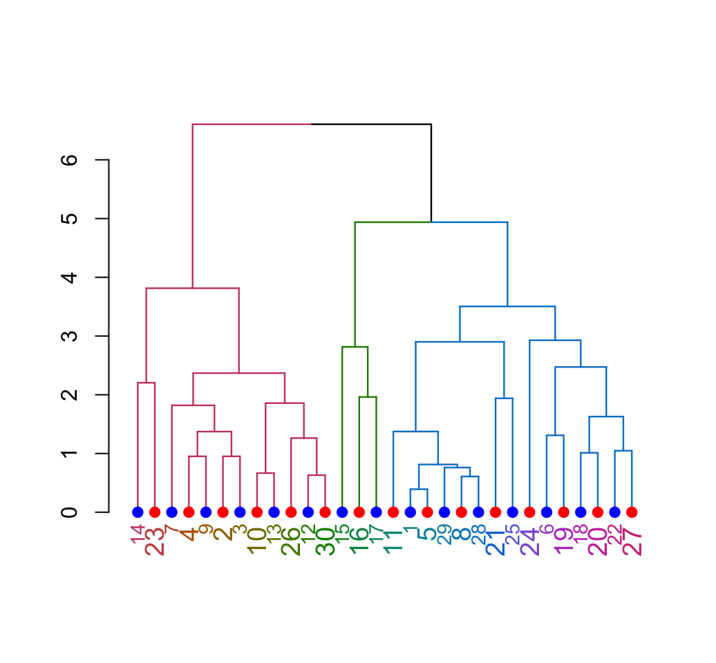
Produce the same plot in ggplot2 using the function:
library(ggplot2)
# Rectangle dendrogram using ggplot2
ggd1 <- as.ggdend(dend)
ggplot(ggd1) 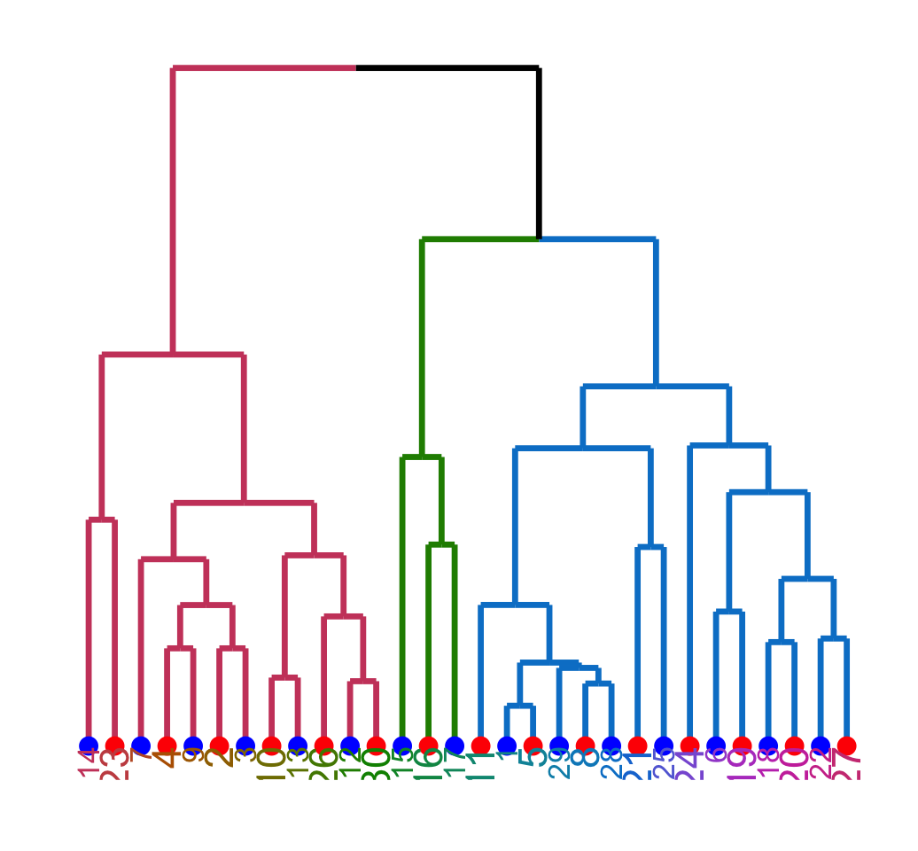
# Change the theme to the default ggplot2 theme
ggplot(ggd1, horiz = TRUE, theme = NULL) 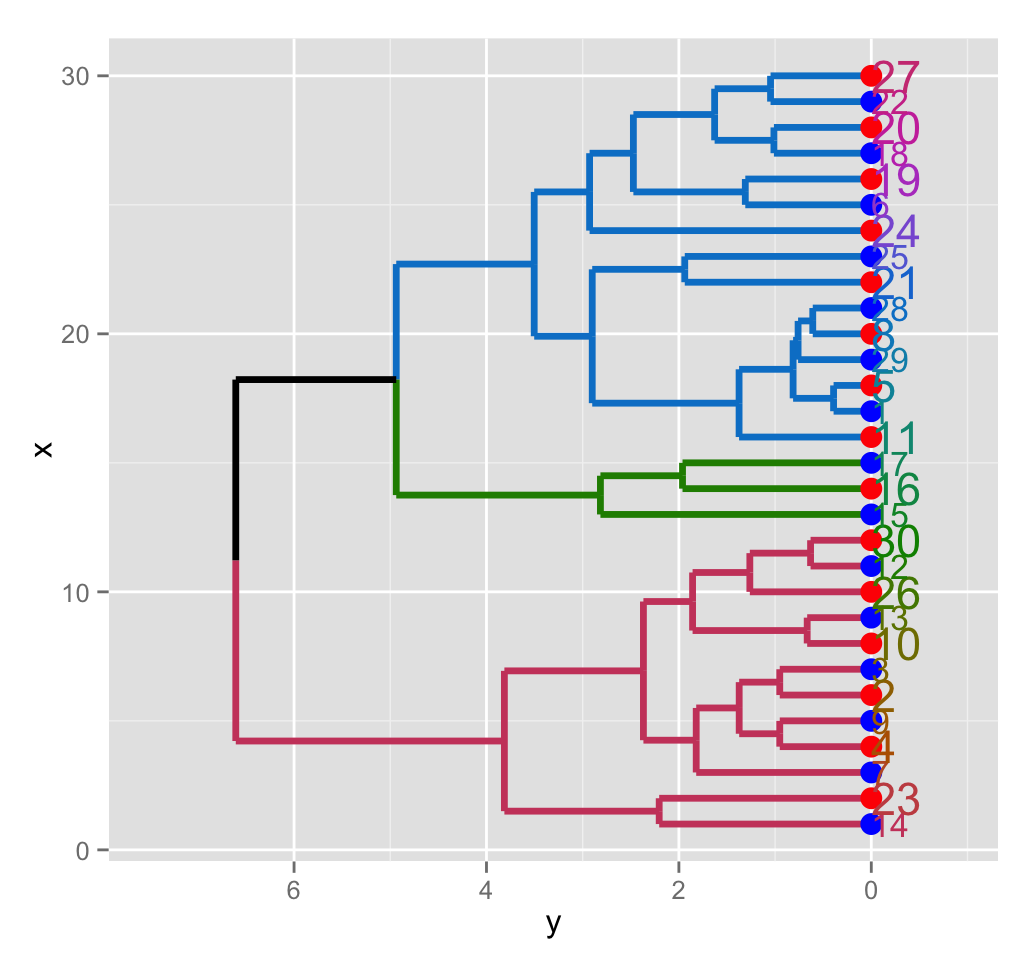
# Theme minimal
ggplot(ggd1, theme = theme_minimal()) 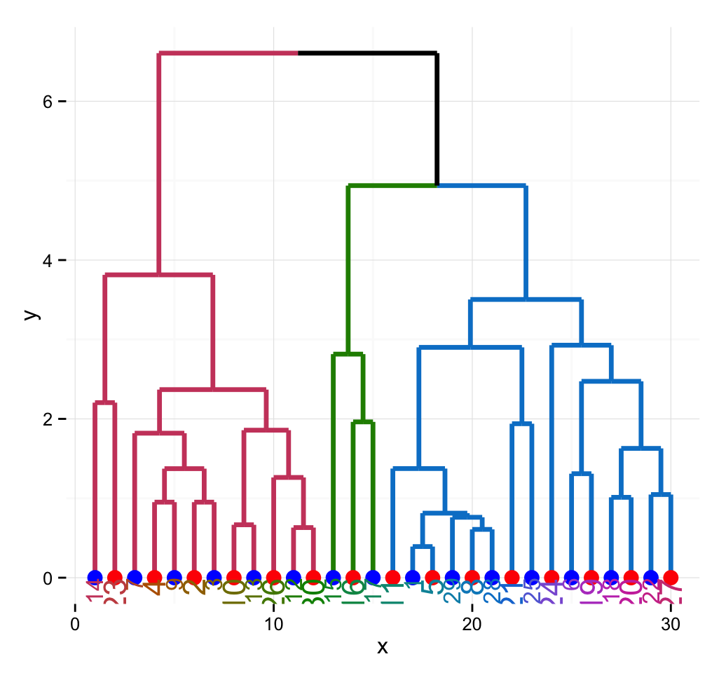
# Create a radial plot and remove labels
ggplot(ggd1, labels = FALSE) +
  scale_y_reverse(expand = c(0.2, 0)) +
  coord_polar(theta="x")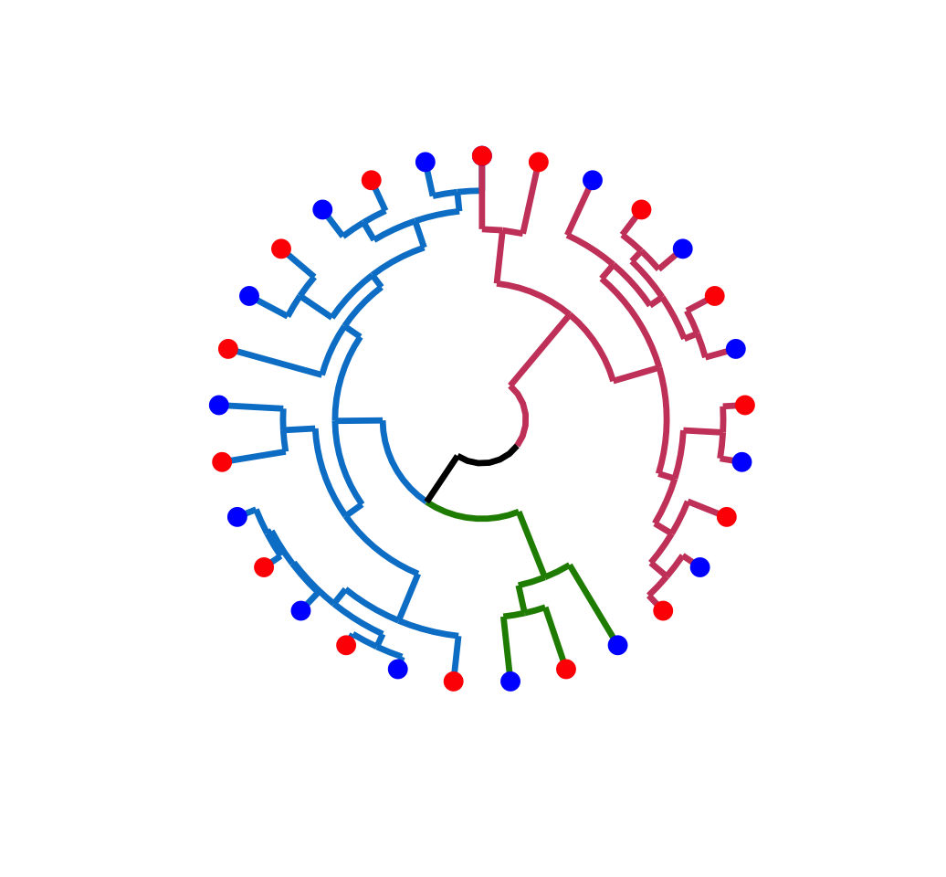
5.11 pvclust and dendextend
The package dendextend can be used to enhance many packages including pvclust. Recall that, pvclust is for calculating p-values for hierarchical clustering.
pvclust can be used as follow:
library(pvclust)
data(lung) # 916 genes for 73 subjects
set.seed(1234)
result <- pvclust(lung[1:100, 1:10], method.dist="cor",
                  method.hclust="average", nboot=10)
## Bootstrap (r = 0.5)... Done.
## Bootstrap (r = 0.6)... Done.
## Bootstrap (r = 0.7)... Done.
## Bootstrap (r = 0.8)... Done.
## Bootstrap (r = 0.9)... Done.
## Bootstrap (r = 1.0)... Done.
## Bootstrap (r = 1.1)... Done.
## Bootstrap (r = 1.2)... Done.
## Bootstrap (r = 1.3)... Done.
## Bootstrap (r = 1.4)... Done.# Default plot of the result
plot(result)
pvrect(result)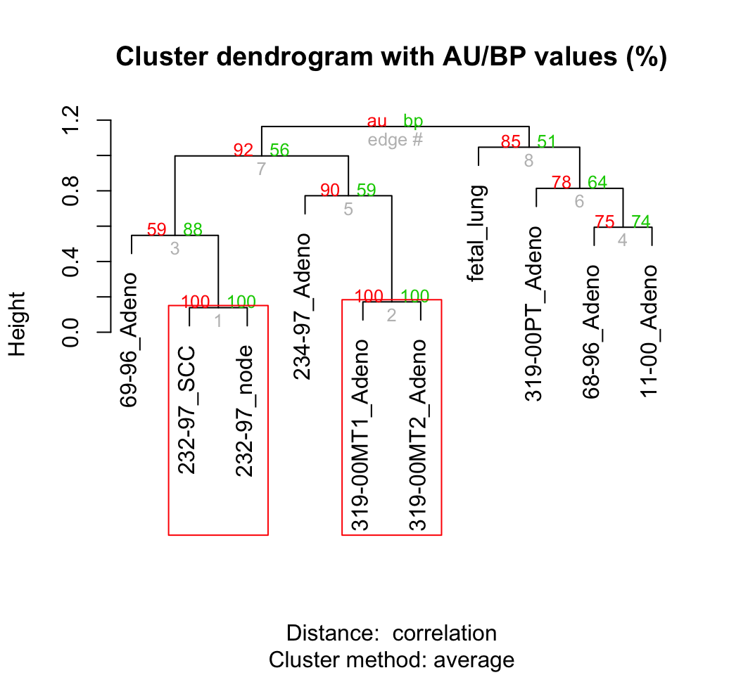
# pvclust and dendextend
result %>% as.dendrogram %>%
  set("branches_k_color", k = 2, value = c("purple", "orange")) %>%
  plot
result %>% text
result %>% pvrect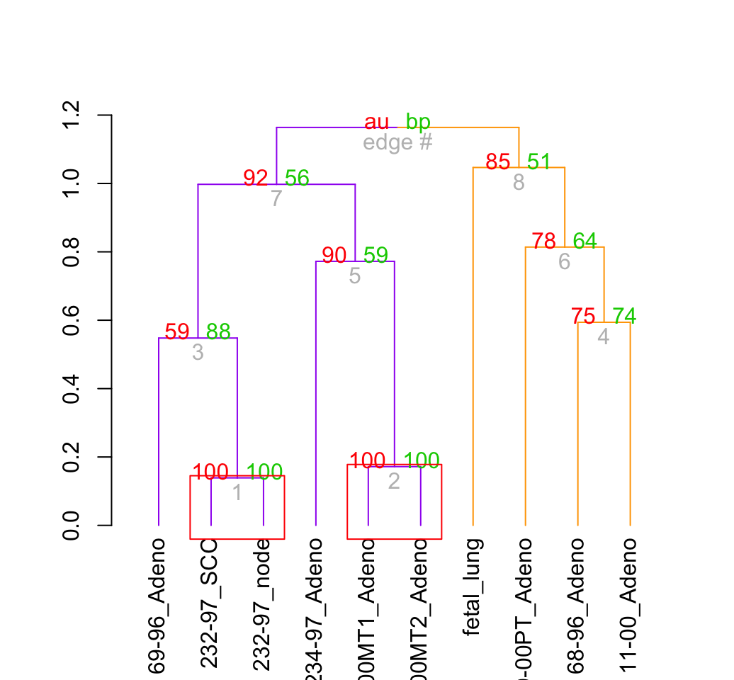
6 Infos
This analysis has been performed using R software (ver. 3.2.1)