- How this article is organized?
- Required packages
- Load FactoMineR and factoextra
- Data format: Contingency tables
- Exploratory data analysis (EDA)
- Correspondence analysis (CA)
- Summary of CA outputs
- Interpretation of CA outputs
- Biplot of rows and columns
- Correspondence analysis using supplementary rows and columns
- Filter CA results
- Dimension description
- CA and outliers
- Infos
Correspondence analysis (CA) is an extension of Principal Component Analysis (PCA) suited to handle qualitative variables (or categorical data).
CA is used to analyze frequencies formed by categorical data (i.e, contengency table) and it provides factor scores (coordinates) for both the rows and the columns of contingency table. These coordinates are used to visualize graphically the association between row and column variables in the contingency table.
This article describes how to compute and interpret a correspondence analysis using FactoMineR and factoextra R packages.
The mathematical procedures of CA has been described in my previous tutorial. In the current tutorial, well focus on the practical application and interpretation of correspondence analysis rather than the mathematical and statistical details.
How this article is organized?
This article contains mainly 5 important parts:
- Part I describes the exploratory data analysis tools for contingency tables
- Part II shows how to use FactoMineR package for computing correspondence analysis (CA)
- Part III is a step-by-step guide for interpreting and visualizing the output of CA
- Part IV provides an explanation about symmetric and asymmetric biplot. This section is very important and well see why.
- Part V covers how to apply correspondence analysis using supplementary rows and colums. This is important, if you want to make predictions with CA.
The last sections of this guide describe also how to filter CA result in order to keep only the most contributing variables. Finally, well see how to deal with outliers.
Required packages
There are many functions from different packages in R, to perform correspondence analysis:
- CA [in FactoMineR package]
- ca() [in ca package]
- dudi.coa() [in ade4 package]
- corresp() [in MASS package]
In this tutorial, FactoMineR(for computing CA) and factoextra (for CA visualization) packages are used.
Note that, no matter what function you decide to use for computing CA, the output can be visualized using the R functions available in factoextra package, as described in the next sections.
FactoMineR and factoextra R packages can be installed as follow :
install.packages("FactoMineR")

# install.packages("devtools")
devtools::install_github("kassambara/factoextra")
Note that, for factoextra a version >= 1.0.2 is required for this tutorial. If its already installed on your computer, you should re-install it to have the most updated version.
Load FactoMineR and factoextra
library("FactoMineR")
library("factoextra")
Data format: Contingency tables
Well use the data sets housetasks [in factoextra]
data(housetasks)
# head(housetasks)
An image of the data is shown below:
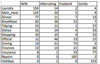
The data is a contingency table containing 13 housetasks and their repartition in the couple:
- rows are the different tasks
- values are the frequencies of the tasks done :
- by the wife only
- alternatively
- by the husband only
- or jointly
Exploratory data analysis (EDA)
Most of the EDA methods presented here (graphical matrix, mosaic/association plots and Chi-square statistic), have been already described in my previous tutorial: correspondence analysis basics.
If youre already familiar with these approaches, you can skip this section.
Visual inspection
The above contingency table is not very large. Therefore, its easy to visually inspect and interpret row and column profiles:
- Its evident that, the housetasks - Laundry, Main_Meal and Dinner - are more frequently done by the Wife.
- Repairs and driving are dominantly done by the husband
- Holidays are frequently associated with the column jointly
Visualize a contingency table using graphical matrix
Its also possible to visualize a contingency table using the function balloonplot() [in gplots package]. This function draws a graphical matrix where each cell contains a dot whose size reflects the relative magnitude of the corresponding component.
To execute the R code below, you should install the package gplots: install.packages(gplots).
library("gplots")
# 1. convert the data as a table
dt <- as.table(as.matrix(housetasks))
# 2. Graph
balloonplot(t(dt), main ="housetasks", xlab ="", ylab="",
            label = FALSE, show.margins = FALSE)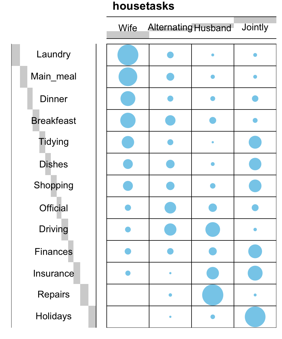
Note that, row and column sums are printed by default in the bottom and right margins, respectively. These values can be hidden using the argument show.margins = FALSE.
Mosaic / association plots
The function mosaicplot() from the built-in R package garphics can be used also to visualize a contingency table.
library("graphics")
mosaicplot(dt, shade = TRUE, las=2,
           main = "housetasks")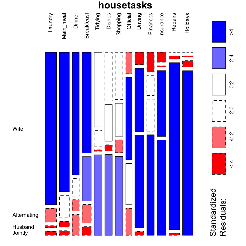
- The argument shade is used to color the graph
- The argument las = 2 produces vertical labels
The surface of an element of the mosaic reflects the relative magnitude of its value.
- Blue color indicates that the observed value is higher than the expected value if the data were random
- Red color specifies that the observed value is lower than the expected value if the data were random
From this mosaic plot, it can be seen that the housetasks Laundry, Main_meal, Dinner and breakfeast (blue color) are mainly done by the wife in our example.
Its also possible to use the package vcd to make a mosaic plot (function mosaic()) or an association plot (function assoc()).
# install.packages("vcd")
library("vcd")
# plot just a subset of the table
assoc(head(dt), shade = T, las=3)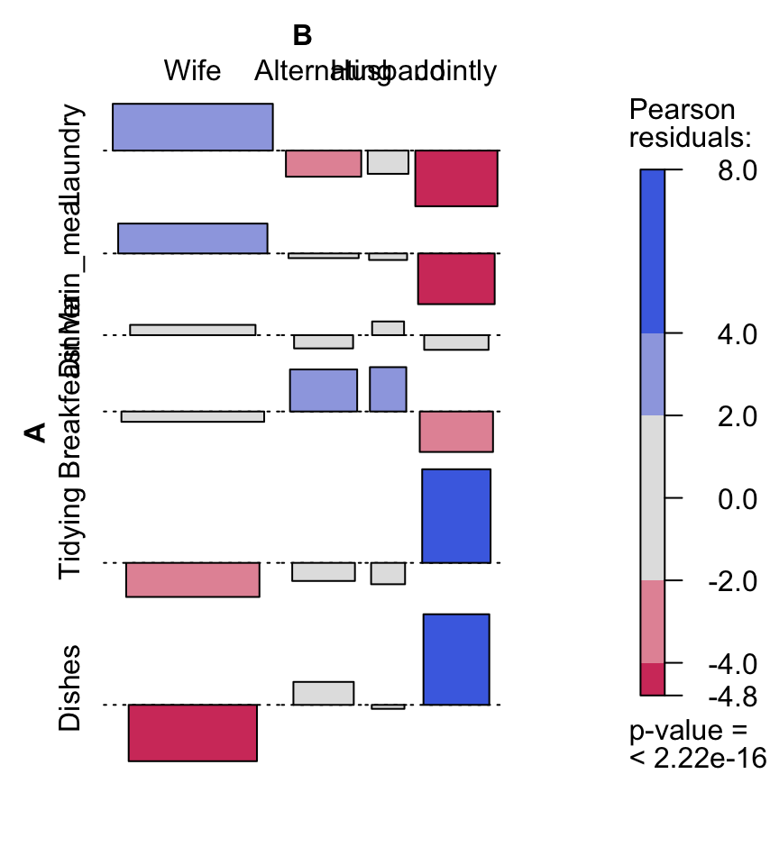
Chi-square statistic
Another method to analyse a frequency table is to use the Chi-square test of independence. The Chi-square test evaluates whether there is a significant dependence between row and column categories.
Chi-square statistic can be easily computed using the function chisq.test() as follow:
chisq <- chisq.test(housetasks)
chisq
    Pearson's Chi-squared test

data:  housetasks
X-squared = 1944.456, df = 36, p-value < 2.2e-16
In our example, the row and the column variables are statistically significantly associated (p-value = 0).
Read more: correspondence analysis basics
Correspondence analysis (CA)
The EDA methods described in the previous sections are useful only for small contingency table. For a large contingency table, statistical approaches, such as CA, are required to reduce the dimension of the data without loosing the most important information. In other words, CA is used to graphically visualize row points and column points in a low dimensional space.
The function CA() [in FactoMineR package] can be used. A simplified format is :
CA(X, ncp = 5, graph = TRUE)- X : a data frame (contingency table)
- ncp : number of dimensions kept in the final results.
- graph : a logical value. If TRUE a graph is displayed.
Example of usage :
res.ca <- CA(housetasks, graph = FALSE)The output of the function CA() is a list including :
print(res.ca)**Results of the Correspondence Analysis (CA)**
The row variable has 13 categories; the column variable has 4 categories
The chi square of independence between the two variables is equal to 1944.456 (p-value = 0 ).
*The results are available in the following objects:
name description
1 "$eig" "eigenvalues"
2 "$col" "results for the columns"
3 "$col$coord" "coord. for the columns"
4 "$col$cos2" "cos2 for the columns"
5 "$col$contrib" "contributions of the columns"
6 "$row" "results for the rows"
7 "$row$coord" "coord. for the rows"
8 "$row$cos2" "cos2 for the rows"
9 "$row$contrib" "contributions of the rows"
10 "$call" "summary called parameters"
11 "$call$marge.col" "weights of the columns"
12 "$call$marge.row" "weights of the rows" The object that is created using the function CA() contains many informations found in many different lists and matrices. These values are described in the next sections.
Summary of CA outputs
The function summary.CA() is used to print a summary of correspondence analysis results:
summary(object, nb.dec = 3, nbelements = 10,
ncp = TRUE, file ="", ...)- object: an object of class CA
- nb.dec: number of decimal printed
- nbelements: number of row/column variables to be written. To have all the elements, use nbelements = Inf.
- ncp: Number of dimensions to be printed
- file: an optional file name for exporting the summaries.
Print the summary of the CA analysis for the dimensions 1 and 2:
summary(res.ca, nb.dec = 2, ncp = 2)
Call:
rmarkdown::render("factominer-correspondance-analysis.Rmd", encoding = "UTF-8")

The chi square of independence between the two variables is equal to 1944.456 (p-value =  0 ).

Eigenvalues
                      Dim.1  Dim.2  Dim.3  Dim.4
Variance               0.54   0.45   0.13   0.00
% of var.             48.69  39.91  11.40   0.00
Cumulative % of var.  48.69  88.60 100.00 100.00

Rows (the 10 first)
               Dim.1    ctr   cos2    Dim.2    ctr   cos2
Laundry     |  -0.99  18.29   0.74 |   0.50   5.56   0.18 |
Main_meal   |  -0.88  12.39   0.74 |   0.49   4.74   0.23 |
Dinner      |  -0.69   5.47   0.78 |   0.31   1.32   0.15 |
Breakfeast  |  -0.51   3.82   0.50 |   0.45   3.70   0.40 |
Tidying     |  -0.39   2.00   0.44 |  -0.43   2.97   0.54 |
Dishes      |  -0.19   0.43   0.12 |  -0.44   2.84   0.65 |
Shopping    |  -0.12   0.18   0.06 |  -0.40   2.52   0.75 |
Official    |   0.23   0.52   0.05 |   0.25   0.80   0.07 |
Driving     |   0.74   8.08   0.43 |   0.65   7.65   0.34 |
Finances    |   0.27   0.88   0.16 |  -0.62   5.56   0.84 |

Columns
               Dim.1    ctr   cos2    Dim.2    ctr   cos2
Wife        |  -0.84  44.46   0.80 |   0.37  10.31   0.15 |
Alternating |  -0.06   0.10   0.00 |   0.29   2.78   0.11 |
Husband     |   1.16  54.23   0.77 |   0.60  17.79   0.21 |
Jointly     |   0.15   1.20   0.02 |  -1.03  69.12   0.98 |
The result of the function summary() contains the chi-square statistic and 3 tables:
- Table 1 - Eigenvalues: table 1 contains the variances and the percentage of variances retained by each dimension.
- Table 2 contains the coordinates, the contribution and the cos2 (quality of representation [in 0-1]) of the first 10 active row variables on the dimensions 1 and 2.
- Table 3 contains the coordinates, the contribution and the cos2 (quality of representation [in 0-1]) of the first 10 active column variables on the dimensions 1 and 2.
Note that,
- to export the summary into a file use summary(res.ca, file =myfile.txt)
- to display the summary of more than 10 elements, use the argument nbelements in the function summary()
Interpretation of CA outputs
Significance of the association between rows and columns
To interpret correspondence analysis, the first step is to evaluate whether there is a significant dependency between the rows and columns.
There are two methods to inspect the significance:
- Using the trace
- Using the Chi-square statistic
The trace is the the total inertia of the table (i.e, the sum of the eigenvalues). The square root of the trace is interpreted as the correlation coefficient between rows and columns.
The correlation coefficient is calculated as follow:
eig <- get_eigenvalue(res.ca)
trace <- sum(eig$eigenvalue)
cor.coef <- sqrt(trace)
cor.coef
[1] 1.055907Note that, as a rule of thumb 0.2 is the threshold above which the correlation can be considered as important (Bendixen 1995, 576; Healey 2013, 289-290).
In our example, the correlation coefficient is 1.0559074 indicating a strong association between row and column variables.
A more rigorous method is to use the chi-square statistic for examining the association. This appears at the top of the report generated by the function summary.CA(). A high chi-square statistic means strong link between row and column variables.
In our example, the association is highly significant (chi-square: 1944.456, p = 0).
Note that, the chi-square statistics = trace * n, where n is the grand total of the table (total frequency); see the R code below:
# Chi-square statistics
chi2 <- trace*sum(as.matrix(housetasks))
chi2
[1] 1944.456# Degree of freedom
df <- (nrow(housetasks) - 1) * (ncol(housetasks) - 1)
# P-value
pval <- pchisq(chi2, df = df, lower.tail = FALSE)
pval[1] 0Eigenvalues and scree plot
How many dimensions are sufficient for the data interpretation?
The number of dimensions to retain in the solution can be determined by examining the table of eigenvalues.
As mentioned above, trace is the total sum of eigenvalues. For a given axis, the ratio of the axis eigenvalue to the trace is called the percentage of variance (or total inertia or chi-square value) explained by that axis.
The proportion of variances retained by the different dimensions (axes) can be extracted using the function get_eigenvalue()[in factoextra] as follow :
eigenvalues <- get_eigenvalue(res.ca)
head(round(eigenvalues, 2))
eigenvalue variance.percent cumulative.variance.percent
Dim.1 0.54 48.69 48.69
Dim.2 0.45 39.91 88.60
Dim.3 0.13 11.40 100.00
Dim.4 0.00 0.00 100.00There is no rule of thumb to choose the number of dimension to keep for the data interpretation. It depends on the research question and the researchers need. For example, if you are satisfied with 80% of the total inertia explained then use the number of dimensions necessary to achieve that.
Another method is to visually inspect the scree plot in which dimensions are ordered decreasingly according the amount of explained inertia.
The function fviz_screeplot() [in factoextra package] can be used to draw the scree plot (the percentages of inertia explained by the CA dimensions):
fviz_screeplot(res.ca)
The point at which the scree plot shows a bend (so called elbow) can be considered as indicating an optimal dimensionality.
Its also possible to calculate an average eigenvalue above which the axis should be kept in the solution.
Our data contains 13 rows and 4 columns.
If the data were random, the expected value of the eigenvalue for each axis would be 1/(nrow(housetasks)-1) = 1/12 = 8.33% in terms of rows.
Likewise, the average axis should account for 1/(ncol(housetasks)-1) = 1/3 = 33.33% in terms of the 4 columns.Any axis with a contribution larger than the maximum of these two percentages should be considered as important and included in the solution for the interpretation of the data (see, Bendixen 1995, 577).
The R code below, draws the scree plot with a red dashed line specifying the average eigenvalue:
fviz_screeplot(res.ca) +
 geom_hline(yintercept=33.33, linetype=2, color="red")
According to the graph above, only dimensions 1 and 2 should be used in the solution. The dimension 3 explains only 11.4% of the total inertia which is below the average eigeinvalue (33.33%) and too little to be kept for further analysis.
Note that, you can use more than 2 dimensions. However, the supplementary dimensions are unlikely to contribute significantly to the interpretation of nature of the association between the rows and columns.
Dimensions 1 and 2 explain approximately 48.7% and 39.9% of the total inertia respectively. This corresponds to a cumulative total of 88.6% of total inertia retained by the 2 dimensions.
The higher the retention, the more subtlety in the original data is retained in the low-dimensional solution (Mike Bendixen, 2003).
Read more about eigenvalues and screeplot: Eigenvalues data visualization
CA scatter plot: Biplot of row and column variables
The function plot.CA()[in FactoMineR] can be used to plot the coordinates of rows and columns presented in the correspondence analysis output.
A simplified format is :
plot.CA(x, axes = c(1,2), col.row = "blue", col.col = "red")- x : An object of class CA
- axes : A numeric vector of length 2 specifying the component to plot variables
- col.row, col.col : colors for rows and columns respectively
FactoMineR base graph for CA:
plot(res.ca)
Its also possible to use the function fviz_ca_biplot()[in factoextra package] to draw a nice looking plot:
fviz_ca_biplot(res.ca)
# Change the theme
fviz_ca_biplot(res.ca) +
  theme_minimal()
Read more about fviz_ca_biplot(): fviz_ca_biplot
The graph above is called symetric plot and shows a global pattern within the data. Rows are represented by blue points and columns by red triangles.
The distance between any row points or column points gives a measure of their similarity (or dissimilarity).
Row points with similar profile are closed on the factor map. The same holds true for column points.
This graph shows that :
- housetasks such as dinner, breakfeast, laundry are done more often by the wife
- Driving and repairs are done by the husband
Symetric plot represents the row and column profiles simultaneously in a common space (Bendixen, 2003). In this case, only the distance between row points or the distance between column points can be really interpreted.
The distance between any row and column items is not meaningful! You can only make a general statements about the observed pattern.
- In order to interpret the distance between column and row points, the column profiles must be presented in row space or vice-versa. This type of map is called asymmetric biplot and is discussed at the end of this article.
The next step for the interpretation is to determine which row and column variables contribute the most in the definition of the different dimensions retained in the model.
Row variables
The function get_ca_row()[in factoextra] is used to extract the results for row variables. This function returns a list containing the coordinates, the cos2, the contribution and the inertia of row variables:
row <- get_ca_row(res.ca)
row
Correspondence Analysis - Results for rows
===================================================
Name Description
1 "$coord" "Coordinates for the rows"
2 "$cos2" "Cos2 for the rows"
3 "$contrib" "contributions of the rows"
4 "$inertia" "Inertia of the rows" Coordinates of rows
head(row$coord) Dim 1 Dim 2 Dim 3
Laundry -0.9918368 0.4953220 -0.31672897
Main_meal -0.8755855 0.4901092 -0.16406487
Dinner -0.6925740 0.3081043 -0.20741377
Breakfeast -0.5086002 0.4528038 0.22040453
Tidying -0.3938084 -0.4343444 -0.09421375
Dishes -0.1889641 -0.4419662 0.26694926The data indicate the coordinates of each row point in each dimension (1, 2 and 3)
Use the function fviz_ca_row() [in factoextra] to visualize only row points:
# Default plot
fviz_ca_row(res.ca)
Its possible to change the color and the shape of the row points using the arguments col.row and shape.row as follow:
fviz_ca_row(res.ca, col.row="steelblue", shape.row = 15)Note that, its also possible to make the graph of rows only using FactoMineR base graph. The argument invisible is used to hide the column points:
# Hide columns
plot(res.ca, invisible="col")
Read more about fviz_ca_row(): fviz_ca_row
Contribution of rows to the dimensions
The contribution of rows (in %) to the definition of the dimensions can be extracted as follow:
head(row$contrib) Dim 1 Dim 2 Dim 3
Laundry 18.2867003 5.563891 7.968424
Main_meal 12.3888433 4.735523 1.858689
Dinner 5.4713982 1.321022 2.096926
Breakfeast 3.8249284 3.698613 3.069399
Tidying 1.9983518 2.965644 0.488734
Dishes 0.4261663 2.844117 3.634294The row variables with the larger value, contribute the most to the definition of the dimensions.
Its possible to use the function corrplot to highlight the most contributing variables for each dimension:
library("corrplot")
corrplot(row$contrib, is.corr=FALSE)
The function fviz_contrib()[in factoextra] can be used to draw a bar plot of row contributions:
# Contributions of rows on Dim.1
fviz_contrib(res.ca, choice = "row", axes = 1)
If the row contributions were uniform, the expected value would be 1/nrow(housetasks) = 1/13 = 7.69%.
- The red dashed line on the graph above indicates the expected average contribution. For a given dimension, any row with a contribution larger than this threshold could be considered as important in contributing to that dimension.
It can be seen that the row items Repairs, Laundry, Main_meal and Driving are the most important in the definition of the first dimension.
# Contributions of rows on Dim.2
fviz_contrib(res.ca, choice = "row", axes = 2)
The row items Holidays and Repairs contribute the most to the dimension 2.
# Total contribution on Dim.1 and Dim.2
fviz_contrib(res.ca, choice = "row", axes = 1:2)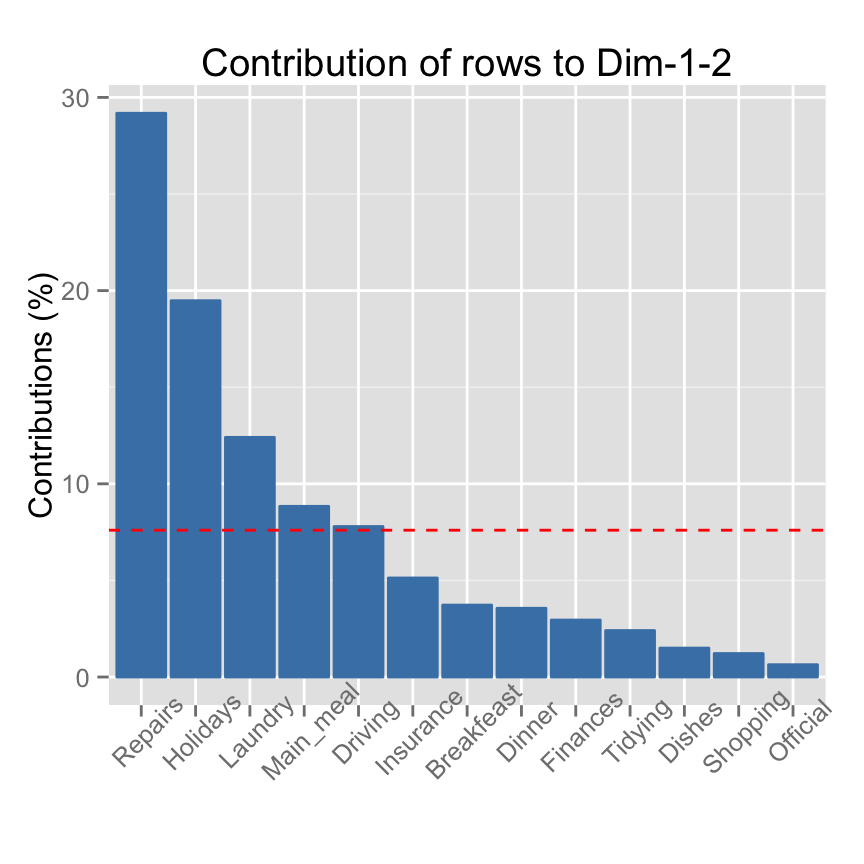
The total contribution of a row, on explaining the variations retained by Dim.1 and Dim.2, is calculated as follow : (C1 * Eig1) + (C2 * Eig2).
C1 and C2 are the contributions of the row to dimensions 1 and 2, respectively. Eig1 and Eig2 are the eigenvalues of dimensions 1 and 2, respectively.
The expected average contribution of a row for Dim.1 and Dim.2 is : (7.69 * Eig1) + (7.69 * Eig2) = (7.690.54) + (7.690.44) = 7.53%If your data contains many row items, the top contributing rows can be displayed as follow:
fviz_contrib(res.ca, choice = "row", axes = 1, top = 5)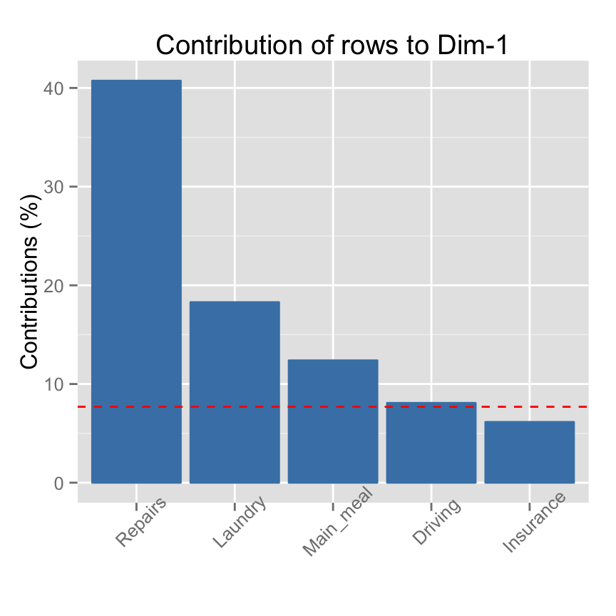
Read more about fviz_contrib(): fviz_contrib
A second option is to draw a scatter plot of row points and to highlight rows according to the amount of their contributions. The function fviz_ca_row() is used.
Note that, using factoextra package, the color or the transparency of the row variables can be automatically controlled by the value of their contributions, their cos2, their coordinates on x or y axis.
# Control row point colors using their contribution
# Possible values for the argument col.row are :
  # "cos2", "contrib", "coord", "x", "y"
fviz_ca_row(res.ca, col.row = "contrib")
# Change the gradient color
fviz_ca_row(res.ca, col.row="contrib")+
scale_color_gradient2(low="white", mid="blue",
                      high="red", midpoint=10)+theme_minimal()
The scatter plot is also helpful to highlight the most important row variables in the determination of the dimensions.
In addition we can have an idea of what pole of the dimensions the row categories are actually contributing to.
It is evident that row categories Repair and Driving have an important contribution to the positive pole of the first dimension, while the categories Laundry and Main_meal have a major contribution to the negative pole of the first dimension; etc, .
In other words, dimension 1 is mainly defined by the opposition of Repair and Driving (positive pole), and Laundry and Main_meal (negative pole).Its also possible to control automatically the transparency of rows by their contributions. The argument alpha.row is used:
# Control the transparency of rows using their contribution
# Possible values for the argument alpha.var are :
  # "cos2", "contrib", "coord", "x", "y"
fviz_ca_row(res.ca, alpha.row="contrib")+
  theme_minimal()
Its possible to select and display only the top contributing row as illustrated in the R code below.
# Select the top 5 contributing rows
fviz_ca_row(res.ca, alpha.row="contrib", select.row=list(contrib=5))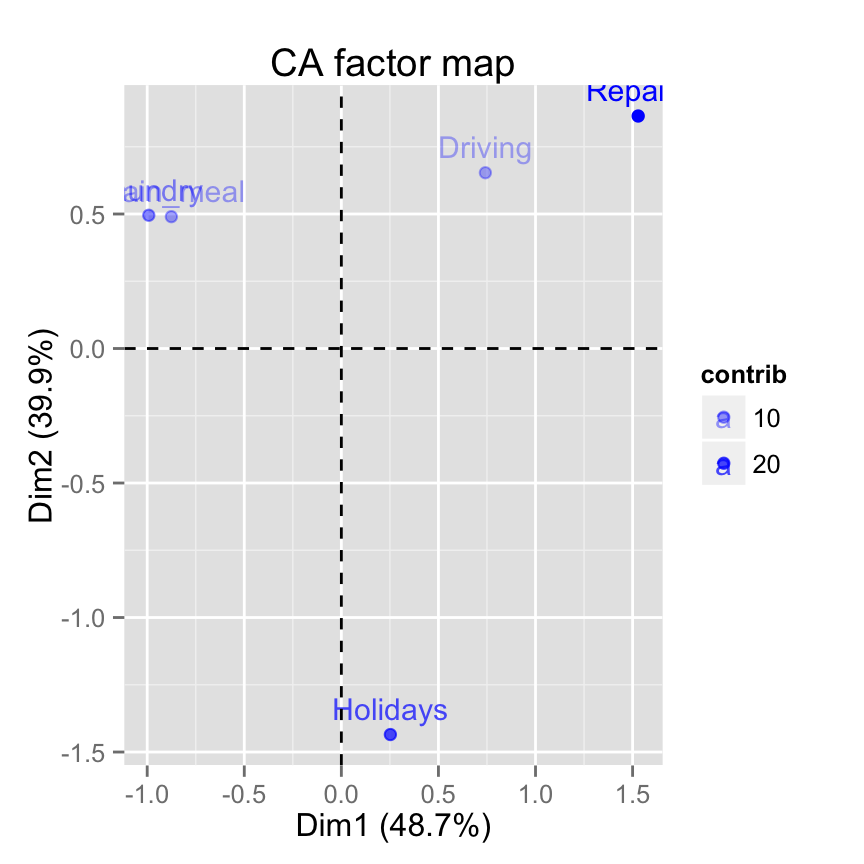
Row/column selections are discussed in details in the next sections
The contribution of row/column variables can be visualized using the so-called contribution biplots (discussed in the last sections of this article).
Read more about fviz_ca_row(): fviz_ca_row
Cos2 : The quality of representation of rows
The result of the analysis shows that, the contingency table has been successfully represented in low dimension space using correspondence analysis. The two dimensions 1 and 2 are sufficient to retain 88.6% of the total inertia contained in the data.
However, not all the points are equally well displayed in the two dimensions.
The quality of representation of the rows on the factor map is called the squared cosine (cos2) or the squared correlations.
The cos2 measures the degree of association between rows/columns and a particular axis.
The cos2 of rows can be extracted as follow:
head(row$cos2) Dim 1 Dim 2 Dim 3
Laundry 0.7399874 0.1845521 0.07546047
Main_meal 0.7416028 0.2323593 0.02603787
Dinner 0.7766401 0.1537032 0.06965666
Breakfeast 0.5049433 0.4002300 0.09482670
Tidying 0.4398124 0.5350151 0.02517249
Dishes 0.1181178 0.6461525 0.23572969The values of the cos2 are comprised between 0 and 1.
The sum of the cos2 for rows on all the CA dimensions is equal to one.
The quality of representation of a row or column in n dimensions is simply the sum of the squared cosine of that row or column over the n dimensions.
If a row item is well represented by two dimensions, the sum of the cos2 is closed to one.
For some of the row items, more than 2 dimensions are required to perfectly represent the data.
Visualize the cos2 of rows using corrplot:
library("corrplot")
corrplot(row$cos2, is.corr=FALSE)
The function fviz_cos2()[in factoextra] can be used to draw a bar plot of rows cos2:
# Cos2 of rows on Dim.1 and Dim.2
fviz_cos2(res.ca, choice = "row", axes = 1:2)
Note that, all row points except Official are well represented by the first two dimensions. This implies that the position of the point corresponding the item Official on the scatter plot should be interpreted with some caution. A higher dimensional solution is probably necessary for the item Official.
Read more about fviz_cos2(): fviz_cos2
Column varables
The function get_ca_col()[in factoextra] is used to extract the results for column variables. This function returns a list containing the coordinates, the cos2, the contribution and the inertia of columns variables:
col <- get_ca_col(res.ca)
col
Correspondence Analysis - Results for columns
===================================================
Name Description
1 "$coord" "Coordinates for the columns"
2 "$cos2" "Cos2 for the columns"
3 "$contrib" "contributions of the columns"
4 "$inertia" "Inertia of the columns" The result for columns gives the same information as described for rows. For this reason, Ill just displayed the result for columns in this section without commenting.
Coordinates of columns
head(col$coord) Dim 1 Dim 2 Dim 3
Wife -0.83762154 0.3652207 -0.19991139
Alternating -0.06218462 0.2915938 0.84858939
Husband 1.16091847 0.6019199 -0.18885924
Jointly 0.14942609 -1.0265791 -0.04644302Use the function fviz_ca_col() [in factoextra] to visualize only column points:
fviz_ca_col(res.ca)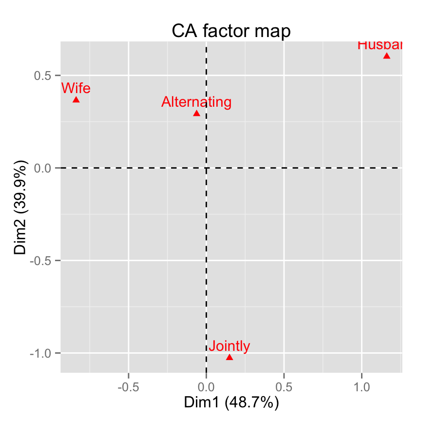
Note that, its also possible to make the graph of columns only using FactoMineR base graph.The argument invisible is used to hide the rows on the factor map:
# Hide rows
plot(res.ca, invisible="row")
Read more about fviz_ca_col(): fviz_ca_col
Contribution of columns to the dimensions
head(col$contrib) Dim 1 Dim 2 Dim 3
Wife 44.462018 10.312237 10.8220753
Alternating 0.103739 2.782794 82.5492464
Husband 54.233879 17.786612 6.1331792
Jointly 1.200364 69.118357 0.4954991Note that, you can use the previously mentioned corrplot() function to visualize the contribution of columns.
Use the function fviz_contrib() [in factoextra] to visualize column contributions on dimensions 1+2:
fviz_contrib(res.ca, choice = "col", axes = 1:2)
If the column contributions were uniform, the expected value would be 1/ncol(housetasks) = 1/4 = 25%.
- The expected average contribution (reference line) of a column for Dim.1 and Dim.2 is : (25 * Eig1) + (25 * Eig2) = (25 * 0.54) + (25 * 0.44) = 24.5%.
Draw a scatter plot of column points and highlight columns according to the amount of their contributions. The function fviz_ca_col() [in factoextra] is used:
# Control column point colors using their contribution
# Possible values for the argument col.col are :
  # "cos2", "contrib", "coord", "x", "y"
fviz_ca_col(res.ca, col.col="contrib")+
scale_color_gradient2(low="white", mid="blue",
                      high="red", midpoint=24.5)+theme_minimal()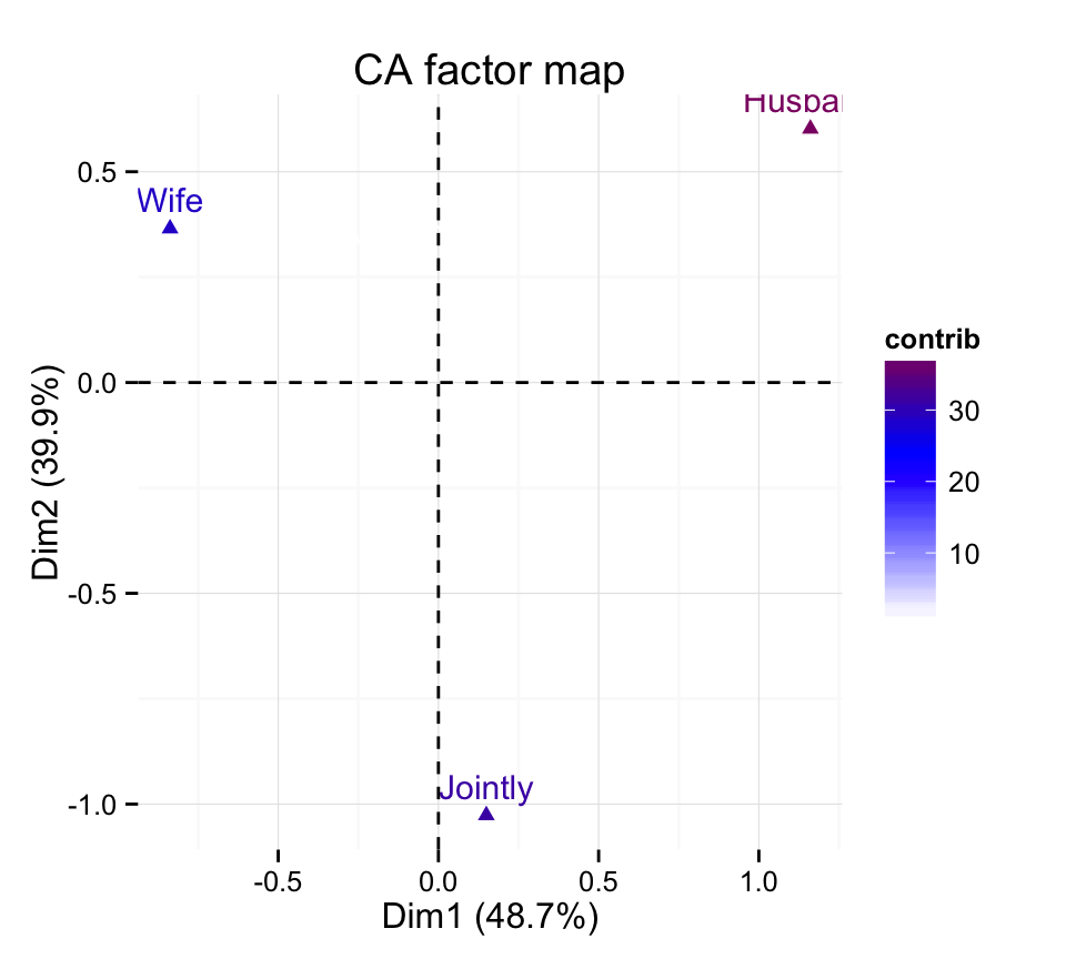
Note that, its also possible to control automatically the transparency of columns by their contributions using the argument alpha.col:
# Control the transparency of rows using their contribution
# Possible values for the argument alpha.col are :
  # "cos2", "contrib", "coord", "x", "y"
fviz_ca_col(res.ca, alpha.col="contrib")
Cos2 : The quality of representation of columns
head(col$cos2) Dim 1 Dim 2 Dim 3
Wife 0.801875947 0.1524482 0.045675847
Alternating 0.004779897 0.1051016 0.890118521
Husband 0.772026244 0.2075420 0.020431728
Jointly 0.020705858 0.9772939 0.002000236Note that, the value of the cos2 is between 0 and 1. A cos2 closed to 1 corresponds to a column/row variables that are well represented on the factor map.
The function fviz_cos2() [in factoextra] can be used to draw a bar plot of columns cos2:
# Cos2 of columns on Dim.1 and Dim.2
fviz_cos2(res.ca, choice = "col", axes = 1:2)
Note that, only the column item Alternating is not very well displayed on the first two dimensions. The position of this item must be interpreted with caution in the space formed by dimensions 1 and 2.
Biplot of rows and columns
Symmetric biplot
As mentioned above, the standard plot of correspondence analysis is a symmetric biplot in which both rows (blue points) and columns (red triangles) are represented in the same space using the principal coordinates. These coordinates represent the row and column profiles. In this case, only the distance between row points or the distance between column points can be really interpreted.
With symmetric plot, the inter-distance between rows and columns cant be interpreted. Only a general statements can be made about the pattern.
fviz_ca_biplot(res.ca)+
  theme_minimal()
Remove the points from the graph, use texts only :
fviz_ca_biplot(res.ca, geom="text")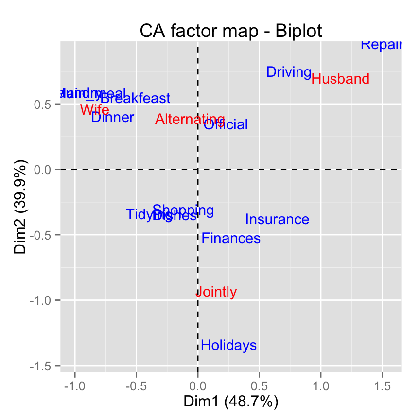
Note that, allowed values for the argument geom are the combination of :
- point to show only points (dots)
- text to show only labels
- c(point, text) to show both types
Note that, in order to interpret the distance between column points and row points, the simplest way is to make an asymmetric plot (Bendixen, 2003). This means that, the column profiles must be presented in row space or vice-versa.
Read more about fviz_ca_biplot(): fviz_ca_biplot
Asymmetric biplot for correspondence analysis
To make an asymetric plot, rows (or columns) points are plotted from the standard co-ordinates (S) and the profiles of the columns (or the rows) are plotted from the principale coordinates (P) (Bendixen 2003).
For a given axis, the standard and principle co-ordinates are related as follows:
P = sqrt(eigenvalue) X S
- P: the principal coordinate of a row (or a column) on the axis
- eigenvalue: the eigenvalue of the axis
Depending on the situation, other types of display can be set using the argument map for the function fviz_ca_biplot()[in factoextra]. This is inspired from ca package (Michael Greenacre).
The allowed options for the argument map are:
- rowprincipal or colprincipal - these are the so-called asymmetric biplots, with either rows in principal coordinates and columns in standard coordinates, or vice versa (also known as row-metric-preserving or column-metric-preserving respectively).
- rowprincipal: columns are represented in row space
- colprincipal: rows are represented in column space
symbiplot - both rows and columns are scaled to have variances equal to the singular values (square roots of eigenvalues), which gives a symmetric biplot but does not preserve row or column metrics.
- rowgab or colgab: Asymetric maps proposed by Gabriel & Odoroff (1990):
- rowgab: rows in principal coordinates and columns in standard coordinates multiplied by the mass.
- colgab: columns in principal coordinates and rows in standard coordinates multiplied by the mass.
- rowgreen or colgreen: The so-called contribution biplots showing visually the most contributing points (Greenacre 2006b).
- rowgreen: rows in principal coordinates and columns in standard coordinates multiplied by square root of the mass.
- colgreen: columns in principal coordinates and rows in standard coordinates multiplied by the square root of the mass.
The R code below draw a standard asymetric biplot:
fviz_ca_biplot(res.ca, map ="rowprincipal", arrow = c(TRUE, TRUE))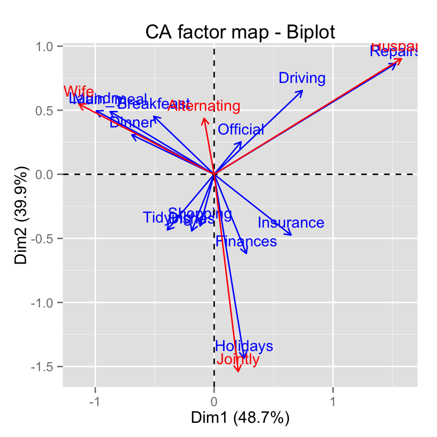
The argument arrows is a vector of two logicals specifying if the plot should contain points (FALSE, default) or arrows (TRUE). First value sets the rows and the second value sets the columns.
If the angle between two arrows is acute, then their is a strong association between the corresponding row and column.
To interpret the distance between rows and and a column you should perpendicularly project row points on the column arrow.Contribution biplot
In correspondence analysis, biplot is a graphical display of rows and columns in 2 or 3 dimensions.
In the standard symmetric biplot (mentioned in the previous sections), its difficult to know the most contributing points to the solution of the CA.
Michael Greenacre proposed a new scaling displayed (called contribution biplot) which incorporates the contribution of points. In this display, points that contribute very little to the solution, are close to the center of the biplot and are relatively unimportant to the interpretation.
A contribution biplot can be drawn using the argument map = rowgreen or map = colgreen.
Firstly, you have to decide whether to analyse the contributions of rows or columns to the definition of the axes.
In our example well interpret the contribution of rows to the axes. The argument map =colgreen is used. In this case, remember that columns are in principal coordinates and rows in standard coordinates multiplied by the square root of the mass. For a given row, the square of the new coordinate on an axis i is exactly the contribution of this row to the inertia of the axis i.
fviz_ca_biplot(res.ca, map ="colgreen",
               arrow = c(TRUE, FALSE))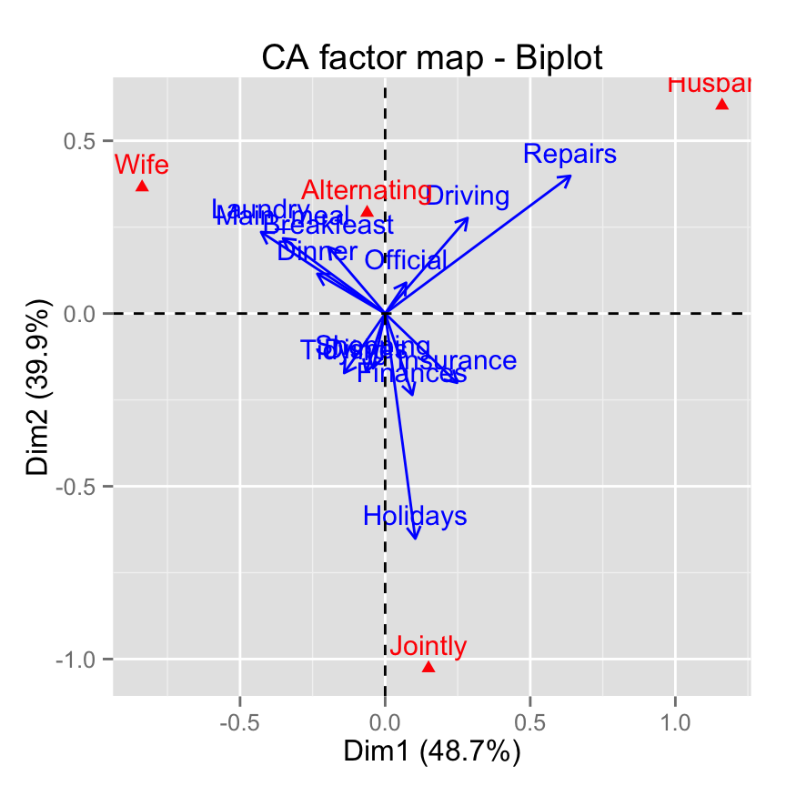
In the graph above, the position of the column profile points is unchanged relative to that in the conventional biplot. However, the distances of the row points from the plot origin are related to their contributions to the two-dimensional factor map.
The closer an arrow is (in terms of angular distance) to an axis the greater is the contribution of the row category on that axis relative to the other axis. If the arrow is halfway between the two, its row category contributes to the two axes to the same extent.
It is evident that row category Repairs have an important contribution to the positive pole of the first dimension, while the categories Laundry and Main_meal have a major contribution to the negative pole of the first dimension;
Dimension 2 is mainly defined by the row category Holidays.
- The row category Driving contributes to the two axes to the same extent.
Plot rows or columns only
Its also possible to draw the rows or columns only using the function fviz_ca_biplot() (instead of using fviz_ca_row() and fviz_ca_col)
Plot rows only by hiding the columns (invisible =col):
fviz_ca_biplot(res.ca, invisible = "col")+
  theme_minimal()
Plot columns only by hiding the rows (invisible =row):
fviz_ca_biplot(res.ca, invisible = "row")+
  theme_minimal()
Correspondence analysis using supplementary rows and columns
Data
Well use the data set children [in FactoMineR package]. It contains 18 rows and 8 columns:
data(children)
# head(children)
The data used here is a contingency table describing the answers given by different categories of people to the following question: What are the reasons that can make hesitate a woman or a couple to have children?
Only some of the rows and columns will be used to perform the correspondence analysis (CA).
The coordinates of the remaining (supplementary) rows/columns on the factor map will be predicted after the CA.In CA terminology, our data contains :
- Active rows (rows 1:14) : Rows that are used during the correspondence analysis.
- Supplementary rows (row.sup 15:18) : The coordinates of these rows will be predicted using the CA informations and parameters obtained with active rows/columns
- Active columns (columns 1:5) : Columns that are used for the correspondence analysis.
- Supplementary columns (col.sup 6:8) : As supplementary rows, the coordinates of these columns will be predicted also.
CA with supplementary rows/columns
As mentioned above, supplementary rows and columns are not used for the definition of the principal dimensions. Their coordinates are predicted using only the informations provided by the performed CA on active rows/columns.
To specify supplementary rows/columns, the function CA()[in FactoMineR] can be used as follow :
CA(X,  ncp = 5, row.sup = NULL, col.sup = NULL,
graph = TRUE)- X : a data frame (contingency table)
- row.sup : a numeric vector specifying the indexes of the supplementary rows
- col.sup : a numeric vector specifying the indexes of the supplementary columns
- ncp : number of dimensions kept in the final results.
- graph : a logical value. If TRUE a graph is displayed.
Example of usage :
res.ca <- CA (children, row.sup = 15:18, col.sup = 6:8,
              graph = FALSE)
The summary of the CA is :
summary(res.ca, nb.dec = 2, ncp = 2)
Call:
rmarkdown::render("factominer-correspondance-analysis.Rmd", encoding = "UTF-8")

The chi square of independence between the two variables is equal to 98.80159 (p-value =  9.748064e-05 ).

Eigenvalues
                      Dim.1  Dim.2  Dim.3  Dim.4  Dim.5
Variance               0.04   0.01   0.01   0.01   0.00
% of var.             57.04  21.13  11.76  10.06   0.00
Cumulative % of var.  57.04  78.17  89.94 100.00 100.00

Rows (the 10 first)
                      Dim.1   ctr  cos2   Dim.2   ctr  cos2
money               | -0.12  4.55  0.43 |  0.02  0.37  0.01 |
future              |  0.18 17.57  0.72 | -0.10 14.59  0.22 |
unemployment        | -0.21 22.62  0.87 | -0.07  6.78  0.10 |
circumstances       |  0.40  6.27  0.58 |  0.33 11.54  0.40 |
hard                | -0.25  2.99  0.88 |  0.07  0.59  0.06 |
economic            |  0.35 12.00  0.48 |  0.32 26.60  0.40 |
egoism              |  0.06  0.68  0.07 | -0.03  0.34  0.01 |
employment          | -0.14  2.62  0.16 |  0.22 17.55  0.41 |
finances            | -0.24  2.79  0.28 | -0.21  5.69  0.21 |
war                 |  0.22  2.17  0.75 | -0.07  0.69  0.09 |

Columns
                      Dim.1   ctr  cos2   Dim.2   ctr  cos2
unqualified         | -0.21 25.11  0.68 | -0.08 10.08  0.10 |
cep                 | -0.14 18.30  0.64 |  0.06  8.08  0.11 |
bepc                |  0.11  6.76  0.31 | -0.03  1.25  0.02 |
high_school_diploma |  0.27 37.98  0.76 | -0.12 20.10  0.15 |
university          |  0.23 11.86  0.31 |  0.32 60.49  0.59 |

Supplementary rows
                      Dim.1 cos2   Dim.2 cos2
comfort             |  0.21 0.07 |  0.70 0.78 |
disagreement        |  0.15 0.13 |  0.12 0.09 |
world               |  0.52 0.88 |  0.14 0.07 |
to_live             |  0.31 0.14 |  0.50 0.37 |

Supplementary columns
                      Dim.1  cos2   Dim.2  cos2
thirty              |  0.11  0.14 | -0.06  0.04 |
fifty               | -0.02  0.01 |  0.05  0.09 |
more_fifty          | -0.18  0.29 | -0.05  0.02 |
For the supplementary rows/columns, the coordinates and the quality of representation (cos2) on the factor maps are displayed. They dont contribute to the dimensions.
Make a biplot of rows and columns
FactomineR base graph:
plot(res.ca)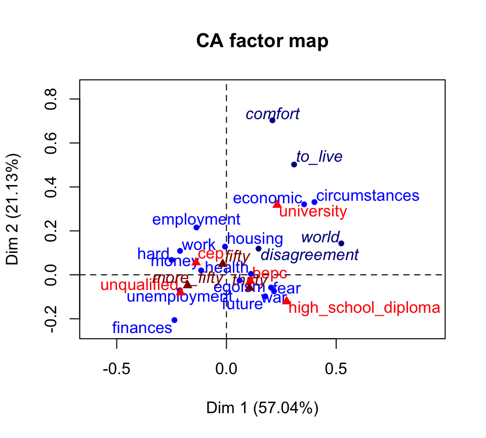
- Active rows are in blue
- Supplementary rows are in darkblue
- Columns are in red
- Supplementary columns are in darkred
Use factoextra:
fviz_ca_biplot(res.ca) +
  theme_minimal()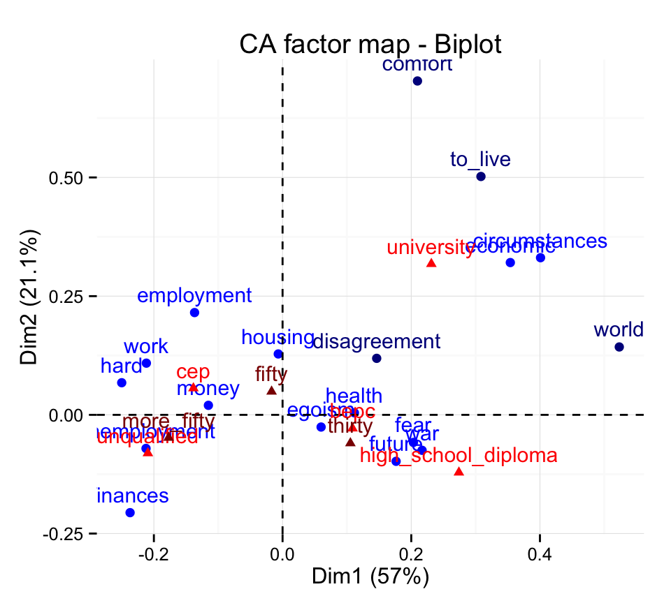
Its also possible to hide supplementary rows and columns using the argument invisible:
fviz_ca_biplot(res.ca, invisible = c("row.sup", "col.sup") ) +
  theme_minimal()
The argument invisible is also available in FactoMineR base graph.
Visualize supplementary rows
All the results (coordinates and cos2) for the supplementary rows can be extracted as follow :
res.ca$row.sup$coord
Dim 1 Dim 2 Dim 3 Dim 4
comfort 0.2096705 0.7031677 0.07111168 0.3071354
disagreement 0.1462777 0.1190106 0.17108916 -0.3132169
world 0.5233045 0.1429707 0.08399269 -0.1063597
to_live 0.3083067 0.5020193 0.52093397 0.2557357
$cos2
Dim 1 Dim 2 Dim 3 Dim 4
comfort 0.06892759 0.77524032 0.007928672 0.14790342
disagreement 0.13132177 0.08692632 0.179649183 0.60210272
world 0.87587685 0.06537746 0.022564054 0.03618163
to_live 0.13899699 0.36853645 0.396830367 0.09563620Factor map for rows :
fviz_ca_row(res.ca) +
  theme_minimal()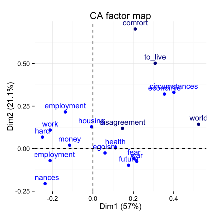
Supplementary rows are shown in darkblue color.
Visualize supplementary columns
Factor map for columns:
fviz_ca_col(res.ca) +
  theme_minimal()
Supplementary columns are shown in darkred.
The results for supplementary columns can be extracted as follow :
res.ca$col.sup$coord
Dim 1 Dim 2 Dim 3 Dim 4
thirty 0.10541339 -0.05969594 -0.10322613 0.06977996
fifty -0.01706444 0.04907657 -0.01568923 -0.01306117
more_fifty -0.17706810 -0.04813788 0.10077299 -0.08517528
$cos2
Dim 1 Dim 2 Dim 3 Dim 4
thirty 0.1375601 0.04411543 0.131910759 0.060278490
fifty 0.0108695 0.08990298 0.009188167 0.006367804
more_fifty 0.2860989 0.02114509 0.092666735 0.066200714Filter CA results
If you have many row/column variables, its possible to visualize only some of them using the arguments select.row and select.col.
select.col, select.row: a selection of columns/rows to be drawn. Allowed values are NULL or a list containing the arguments name, cos2 or contrib:
- name: is a character vector containing column/row names to be drawn
- cos2: if cos2 is in [0, 1], ex: 0.6, then columns/rows with a cos2 > 0.6 are drawn
- if cos2 > 1, ex: 5, then the top 5 active columns/rows and top 5 supplementary columns/rows with the highest cos2 are drawn
- contrib: if contrib > 1, ex: 5, then the top 5 columns/rows with the highest cos2 are drawn
# Visualize rows with cos2 >= 0.8
fviz_ca_row(res.ca, select.row = list(cos2 = 0.8))
# Top 5 active rows and 5 suppl. rows with the highest cos2
fviz_ca_row(res.ca, select.row = list(cos2 = 5))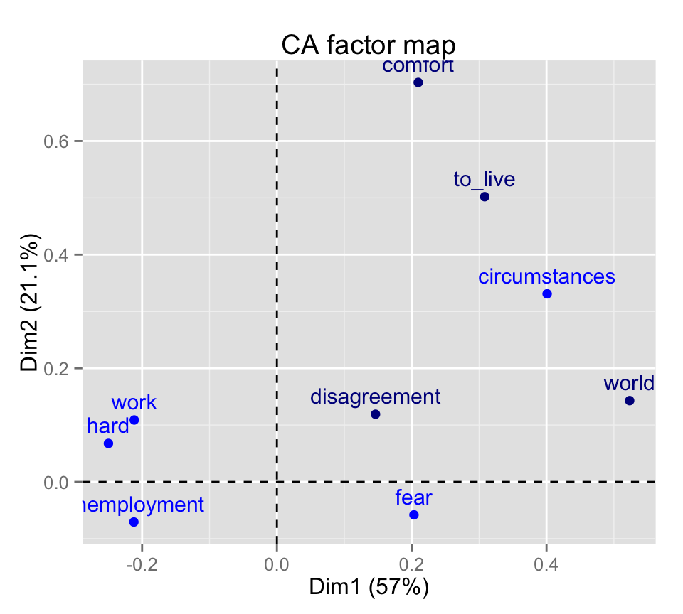
The top 5 active rows and the top 5 supplementary rows are shown.
# Select by names
name <- list(name = c("employment", "fear", "future"))
fviz_ca_row(res.ca, select.row = name)
#top 5 contributing rows and columns
fviz_ca_biplot(res.ca, select.row = list(contrib = 5),
               select.col = list(contrib = 5)) +
  theme_minimal()
Supplementary rows/columns are not shown because they dont contribute to the construction of the axes.
Dimension description
The function dimdesc() [in FactoMineR] can be used to identify the most correlated variables with a given dimension.
A simplified format is :
dimdesc(res, axes = 1:2, proba = 0.05)- res : an object of class CA
- axes : a numeric vector specifying the dimensions to be described
- prob : the significance level
Example of usage :
res.desc <- dimdesc(res.ca, axes = c(1,2))
# Description of dimension 1
res.desc$`Dim 1`
$row
coord
hard -0.249984356
finances -0.236995598
unemployment -0.212227692
work -0.211677086
employment -0.136754598
money -0.115267468
housing -0.006680991
egoism 0.059889455
health 0.111651752
disagreement 0.146277736
future 0.176449413
fear 0.203347917
comfort 0.209670471
war 0.216824026
to_live 0.308306674
economic 0.353963920
circumstances 0.400922001
world 0.523304472
$col
coord
unqualified -0.20931790
more_fifty -0.17706810
cep -0.13857658
fifty -0.01706444
thirty 0.10541339
bepc 0.10875778
university 0.23123279
high_school_diploma 0.27403930# Description of dimension 2
res.desc$`Dim 2`$row
coord
finances -0.20598461
future -0.09786326
war -0.07466267
unemployment -0.07071770
fear -0.05806796
egoism -0.02566733
health 0.00429124
money 0.02004613
hard 0.06765048
work 0.10888448
disagreement 0.11901056
housing 0.12824218
world 0.14297067
employment 0.21539408
economic 0.32072390
circumstances 0.33098674
to_live 0.50201935
comfort 0.70316769
$col
coord
high_school_diploma -0.12134373
unqualified -0.08072742
thirty -0.05969594
more_fifty -0.04813788
bepc -0.02848299
fifty 0.04907657
cep 0.05604703
university 0.31785751CA and outliers
If one or more outliers are present in the contingency table, they can dominate the interpretation the axes (Bendixen M. 2003).
Outliers are points that have high absolute co-ordinate values and high contributions. They are represented, on the graph, very far from the centroïd. In this case, the remaining row/column points tend to be tightly clustered in the graph which become difficult to interpret.
In the CA output, the coordinates of row/column points represent the number of standard deviations the row/column is away from the barycentre (Bendixen M. 2003).
Outliers are points that are are at least one standard deviation away from the barycentre. They contribute also, significantly to the interpretation to one pole of an axis (Bendixen M. 2003).
There are no apparent outliers in our data.
If there are outliers in the data, they must be suppressed or treated as supplementary points when re-running the correspondence analysis.
Infos
This analysis has been performed using R software (ver. 3.1.2), FactoMineR (ver. 1.29) and factoextra (ver. 1.0.2)
References and further reading:
- Bendixen M.1995, Compositional perceptual mapping using chi-squared tree analysis and Correspondence Analysis, «Journal of Marketing Management», 11, 571-581.
- Bendixen M. 2003, A Practical Guide to the Use of Correspondence Analysis in Marketing Research, Marketing Bulletin, 2003, 14, Technical Note 2. http://marketing-bulletin.massey.ac.nz/V14/MB_V14_T2_Bendixen.pdf
- G Alberti, An R Script to Facilitate Correspondence Analysis. A Guide to the Use and the Interpretation of Results from an Archaeological Perspective, in Archeologia e Calcolatori 24 2013, 25-53. http://soi.cnr.it/archcalc/indice/PDF24/02_Alberti.pdf
- Greenacre M.. Contribution biplots. http://www.econ.upf.edu/docs/papers/downloads/1162.pdf
- Healey J.F. 2013, The Essentials of Statistics. A Tool for Social Research, 3rded., Belmont, Wadsworth.
- Laura Doey and Jessica Kurta. Correspondence Analysis applied to psychological research. Tutorials in Quantitative Methods for Psychology 2011, Vol. 7(1), p. 5-14. http://www.tqmp.org/RegularArticles/vol07-1/p005/p005.pdf
- François Husson. FactomineR. http://factominer.free.fr