Correspondence Analysis (CA) is an adaptation of Principal Component Analysis used to analyse a contingency (or frequency) table formed by two qualitative variables.
A comprehensive guide for CA computing, analysis and visualization has been provided in my previous post: Correspondence Analysis in R: The Ultimate Guide for the Analysis, the Visualization and the Interpretation.
The basic idea and the mathematical procedures of correspondence analysis are covered here: Correspondence analysis basics
This current R tutorial describes how to compute CA using R software and ade4 package.
Required packages
The R packages ade4(for computing CA) and factoextra (for CA visualization) are used.
They can be installed as follow :
install.packages("ade4")

# install.packages("devtools")
devtools::install_github("kassambara/factoextra")
Note that, for factoextra a version >= 1.0.2 is required for this tutorial. If its already installed on your computer, you should re-install it to have the most updated version.
Load ade4 and factoextra
library("ade4")
library("factoextra")
Data format: Contingency tables
Well use the data sets housetasks taken from the package ade4.
data(housetasks)
# head(housetasks)
An image of the data is shown below:
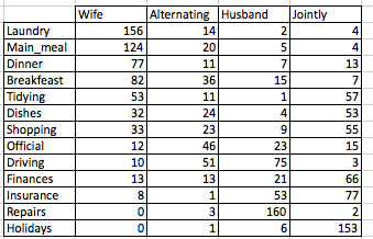
The data is a contingency table containing 13 housetasks and their repartition in the couple :
- rows are the different tasks
- values are the frequencies of the tasks done :
- by the wife only
- alternatively
- by the husband only
- or jointly
Note that, its possible to visualize a contingency table using the functions: balloonplot() [in gplots package], mosaicplot() [in graphics package], assoc() [in vcd package].
To learn more about these functions, read this article: Correspondence Analysis in R: The Ultimate Guide for the Analysis, the Visualization and the InterpretationCorrespondence analysis (CA)
The function dudi.coa() [in ade4 package] can be used. A simplified format is :
dudi.coa(df, scannf = TRUE, nf = 2)- df : a data frame (contingency table)
- scannf : a logical value specifying whether the eigenvalues bar plot should be displayed
- nf : number of dimensions kept in the final results.
Example of usage:
res.ca <- dudi.coa(housetasks, scannf = FALSE, nf = 5)Eigenvalues and scree plot
Extract the eigenvalues
Eigenvalues measure the amount of variation retained by a principal axis :
summary(res.ca)Class: coa dudi
Call: dudi.coa(df = housetasks, scannf = FALSE, nf = 5)
Total inertia: 1.115
Eigenvalues:
Ax1 Ax2 Ax3
0.5429 0.4450 0.1270
Projected inertia (%):
Ax1 Ax2 Ax3
48.69 39.91 11.40
Cumulative projected inertia (%):
Ax1 Ax1:2 Ax1:3
48.69 88.60 100.00 You can also use the function get_eigenvalue() [in factoextra package] to extract the eigenvalues :
eig.val <- get_eigenvalue(res.ca)
head(eig.val)
eigenvalue variance.percent cumulative.variance.percent
Dim.1 0.5428893 48.69222 48.69222
Dim.2 0.4450028 39.91269 88.60491
Dim.3 0.1270484 11.39509 100.00000Make a scree plot using ade4 base graphics
The function screeplot() can be used to draw the amount of inertia (variance) retained by the dimensions.
A simplified format is:
screeplot(x, ncps = length(x$eig), type = c("barplot", "lines"))- x : an object of class dudi
- ncps : the number of components to be plotted
- type : the type of plot
Example of usage :
screeplot(res.ca, main ="Screeplot - Eigenvalues")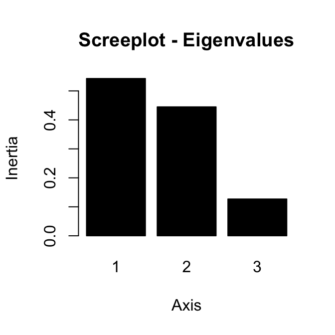
~89% of the information contained in the data are retained by the first two dimensions.
Make the scree plot using factoextra
Its also possible to use the function fviz_screeplot() [in factoextra] to make the scree plot. In the R code below, well draw the percentage of variances retained by each component :
fviz_screeplot(res.ca, ncp=3)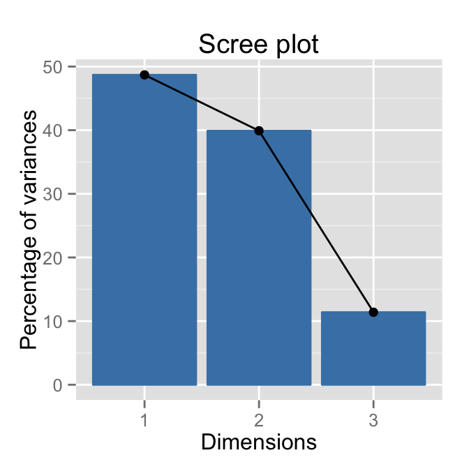
Read more about eigenvalues and screeplot: Eigenvalues data visualization
CA scatter plot: Biplot of row and column variables
The function scatter() or biplot() can be used as follow :
# Remove the scree plot (posieig ="none")
scatter(res.ca, posieig = "none")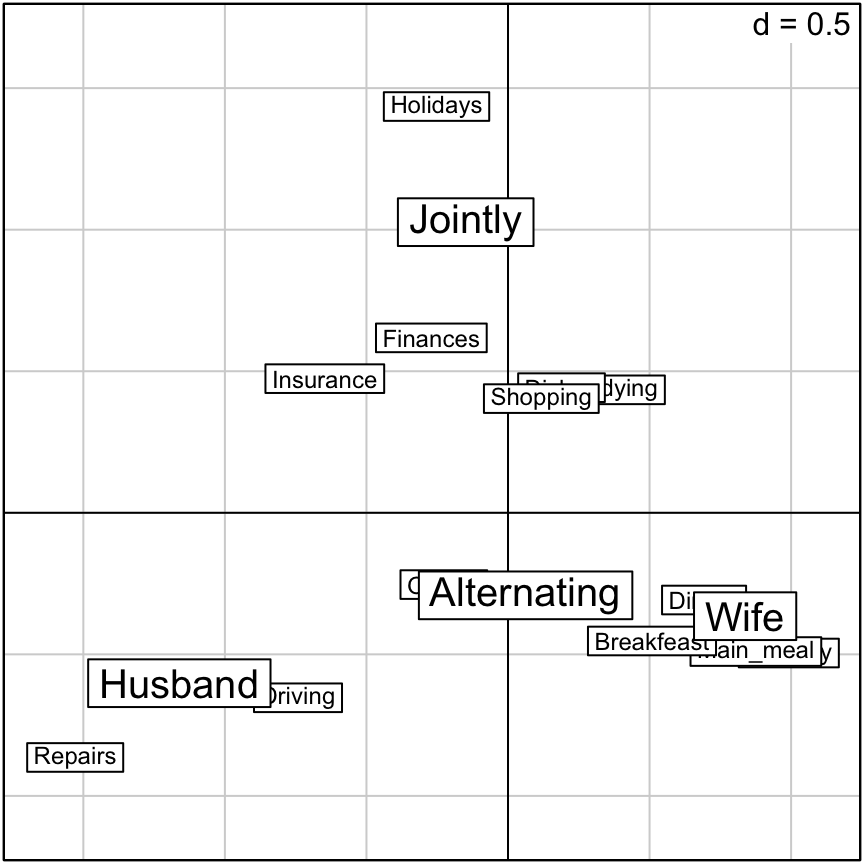
NULLBy default, the scree plot is displayed on the scatter plot. The argument posieig =none is used to remove the scree plot.
Note that, if you want to remove row or column labels the argument clab.row = 0 or clab.col = 0 can be used.
Biplot can be drawn using the combination of the two functions below :
- s.label() to plot rows or columns as points
- s.arrow() to add rows or columns as arrows
# Plot of rows as points
s.label(res.ca$li, xax = 1, yax = 2)
# Add column variables as arrows
s.arrow(res.ca$co, add.plot = TRUE)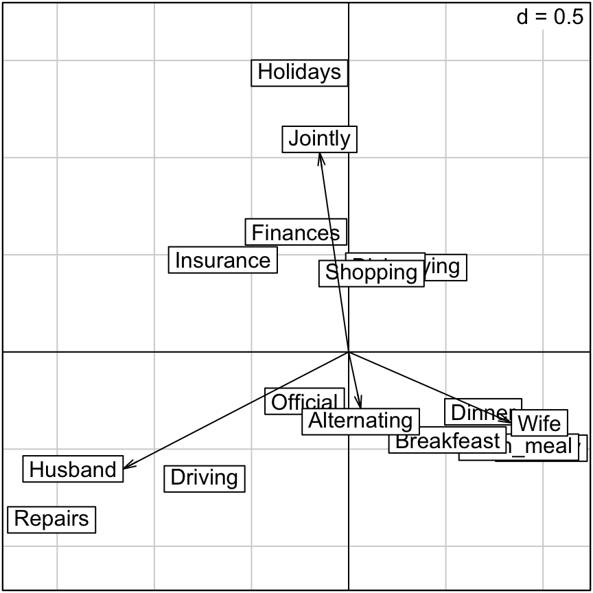
Its also possible to use the function fviz_ca_biplot()[in factoextra package] to draw a nice looking plot:
fviz_ca_biplot(res.ca)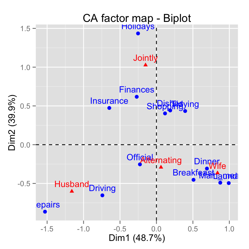
# Change the theme
fviz_ca_biplot(res.ca) +
  theme_minimal()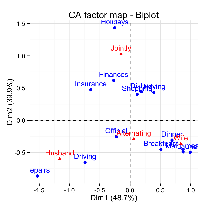
The graph above is called symetric plot representing row and column profiles. Rows are represented by blue points and columns by red triangles.
Read more about fviz_ca_biplot(): fviz_ca_biplot
Row variables
The simplest way is to use the function get_ca_row() [in factoextra] to extract the results for row variables. This function returns a list containing the coordinates, the cos2 and the contribution of row variables:
row <- get_ca_row(res.ca)
row
Correspondence Analysis - Results for rows
===================================================
Name Description
1 "$coord" "Coordinates for the rows"
2 "$cos2" "Cos2 for the rows"
3 "$contrib" "contributions of the rows"
4 "$inertia" "Inertia of the rows" # Print the coordinates
head(row$coord) Dim.1 Dim.2 Dim.3
Laundry 0.9918368 -0.4953220 -0.31672897
Main_meal 0.8755855 -0.4901092 -0.16406487
Dinner 0.6925740 -0.3081043 -0.20741377
Breakfeast 0.5086002 -0.4528038 0.22040453
Tidying 0.3938084 0.4343444 -0.09421375
Dishes 0.1889641 0.4419662 0.26694926In the next section, Ill show how to extract row coordinates, cos2 and contribution using ade4 base code.
Coordinates of rows
The coordinates of the rows on the factor map are :
head(res.ca$li) Axis1 Axis2 Axis3
Laundry 0.9918368 -0.4953220 -0.31672897
Main_meal 0.8755855 -0.4901092 -0.16406487
Dinner 0.6925740 -0.3081043 -0.20741377
Breakfeast 0.5086002 -0.4528038 0.22040453
Tidying 0.3938084 0.4343444 -0.09421375
Dishes 0.1889641 0.4419662 0.26694926Use the function fviz_ca_row() [in factoextra package] to visualize only row points:
# Default plot
fviz_ca_row(res.ca)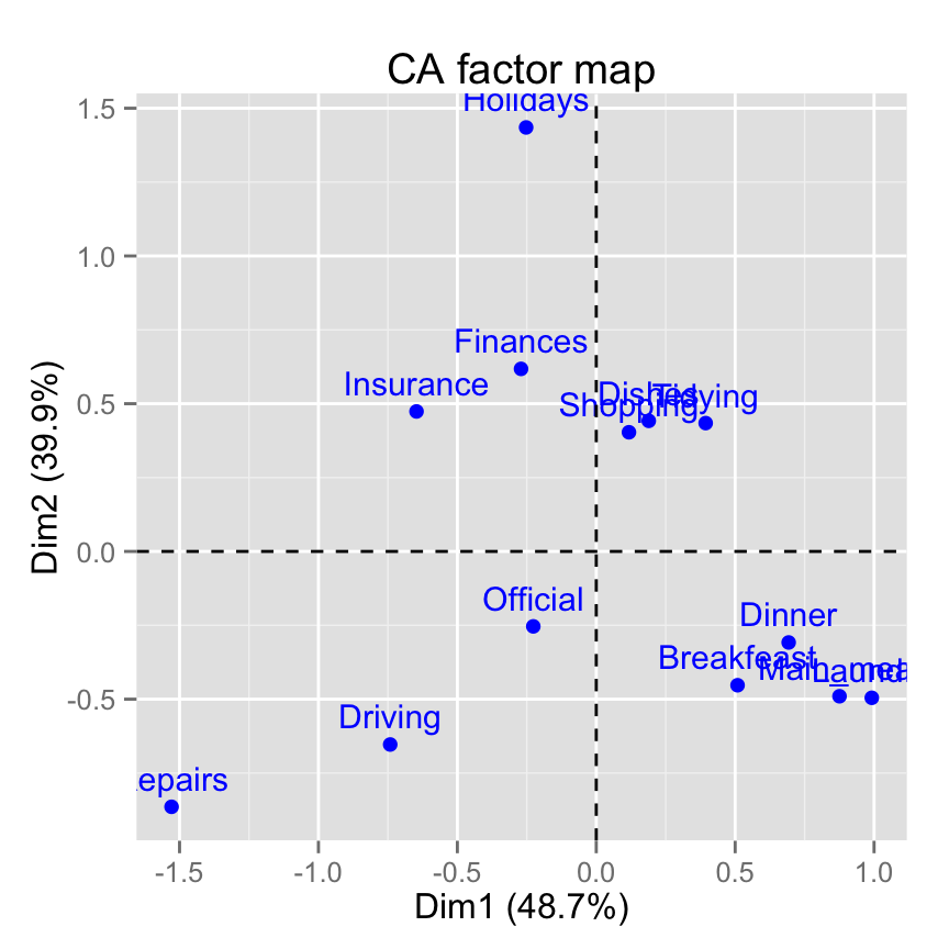
Note that, its also possible to plot rows only using the ade4 base graph:
s.label(res.ca$li, xax = 1, yax = 2)Contribution of rows to the dimensions
The cos2 and the contributions of rows / columns are calculated using the function inertia.dudi() as follow :
inertia <- inertia.dudi(res.ca, row.inertia = TRUE,
                        col.inertia = TRUE)
Note that, the contributions and the cos2 are printed in 1/10 000. The sign is the sign of the coordinates.
The contributions can be printed in % as follow :
# absolute contribution of columns
contrib <- inertia$col.abs/100
head(contrib)
Comp1 Comp2 Comp3
Wife 44.46 10.31 10.82
Alternating 0.10 2.78 82.55
Husband 54.23 17.79 6.13
Jointly 1.20 69.12 0.50Recall that, as mentioned above, the simplest way is to use the function get_ca_row() [in factoextra package]. It provides a list of matrices containing all the results for the active rows(coordinates, squared cosine and contributions).
row <- get_ca_row(res.ca)
row
Correspondence Analysis - Results for rows
===================================================
Name Description
1 "$coord" "Coordinates for the rows"
2 "$cos2" "Cos2 for the rows"
3 "$contrib" "contributions of the rows"
4 "$inertia" "Inertia of the rows" # Row contributions
row$contrib Dim.1 Dim.2 Dim.3
Laundry 18.29 5.56 7.97
Main_meal 12.39 4.74 1.86
Dinner 5.47 1.32 2.10
Breakfeast 3.82 3.70 3.07
Tidying 2.00 2.97 0.49
Dishes 0.43 2.84 3.63
Shopping 0.18 2.52 2.22
Official 0.52 0.80 36.94
Driving 8.08 7.65 18.60
Finances 0.88 5.56 0.06
Insurance 6.15 4.02 5.25
Repairs 40.73 15.88 16.60
Holidays 1.08 42.45 1.21The row category with the largest value, contribute the most to the definition of the dimensions.
The function fviz_contrib()[in factoextra] can be used to visualize the most important row variables:
# Contributions of rows on Dim.1
fviz_contrib(res.ca, choice = "row", axes = 1)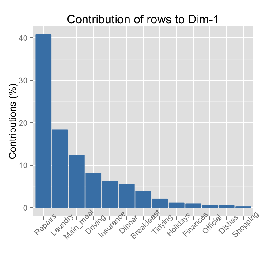
The red dashed line represents the expected average row contributions if the contributions were uniform: 1/nrow(housetasks) = 1/13 = 7.69%.
- For a given dimension, any row with a contribution above this threshold could be considered as important in contributing to that dimension.
The row items Repairs, Laundry, Main_meal and Driving contribute the most in the definition of the first axis.
# Contributions of rows on Dim.2
fviz_contrib(res.ca, choice = "row", axes = 2)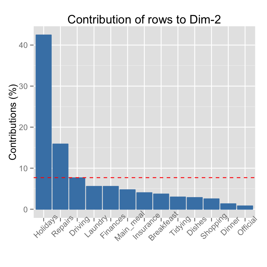
Read more about fviz_contrib(): fviz_contrib
Using factoextra package, the color of rows can be automatically controlled by the value of their contributions
fviz_ca_row(res.ca, col.row="contrib")+
scale_color_gradient2(low="white", mid="blue",
                      high="red", midpoint=10)+theme_minimal()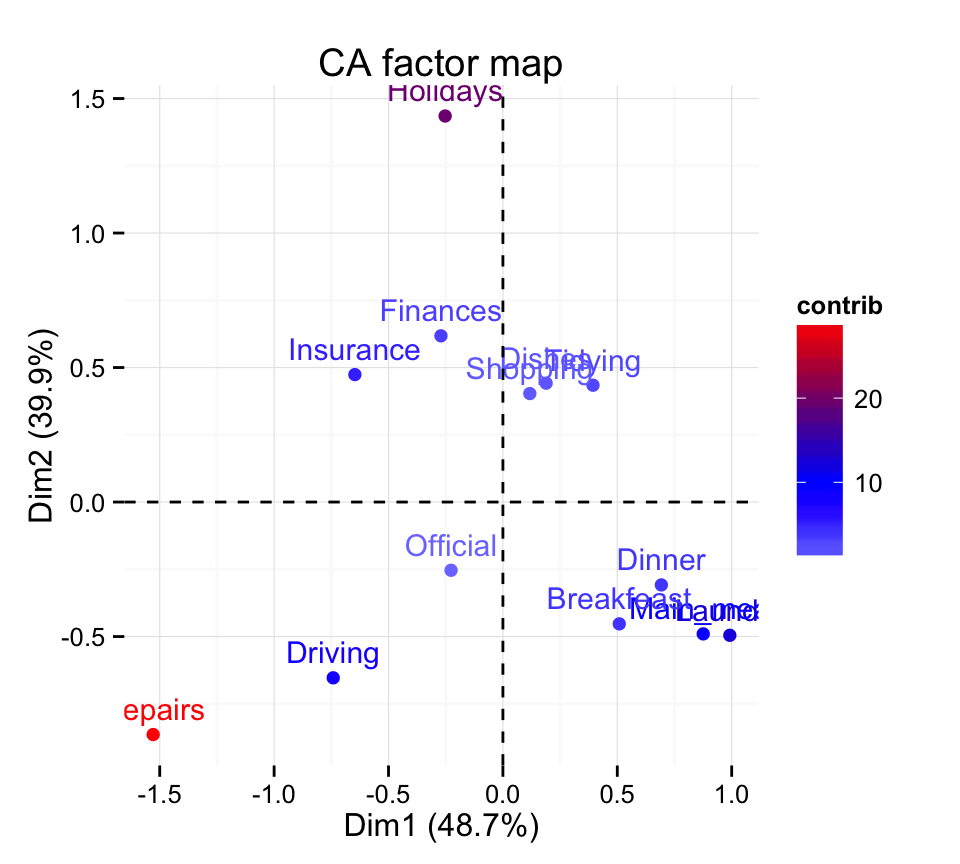
The graph above highlight the most important rows in the correspondence analysis solution.
Read more about fviz_ca_row(): fviz_ca_row
Cos2 : quality of representation of rows on the factor map
- A high cos2 indicates a good representation of the rows on the factor map.
- A low cos2 indicates that the variable is not perfectly represented by the principal dimensions.
The cos2 of the rows are (factoextra code) :
head(row$cos2) Dim.1 Dim.2 Dim.3
Laundry 0.7400 0.1846 0.0755
Main_meal 0.7416 0.2324 0.0260
Dinner 0.7766 0.1537 0.0697
Breakfeast 0.5049 0.4002 0.0948
Tidying 0.4398 0.5350 0.0252
Dishes 0.1181 0.6462 0.2357Note that, the ade4 code is:
# relative contributions of rows
cos2 <- abs(inertia$row.rel/10000)
head(cos2)
The values of the cos2 are comprised between 0 and 1.
The function fviz_cos2()[in factoextra] can be used to draw a bar plot of rows cos2:
# Cos2 of rows on Dim.1 and Dim.2
fviz_cos2(res.ca, choice = "row", axes = 1:2)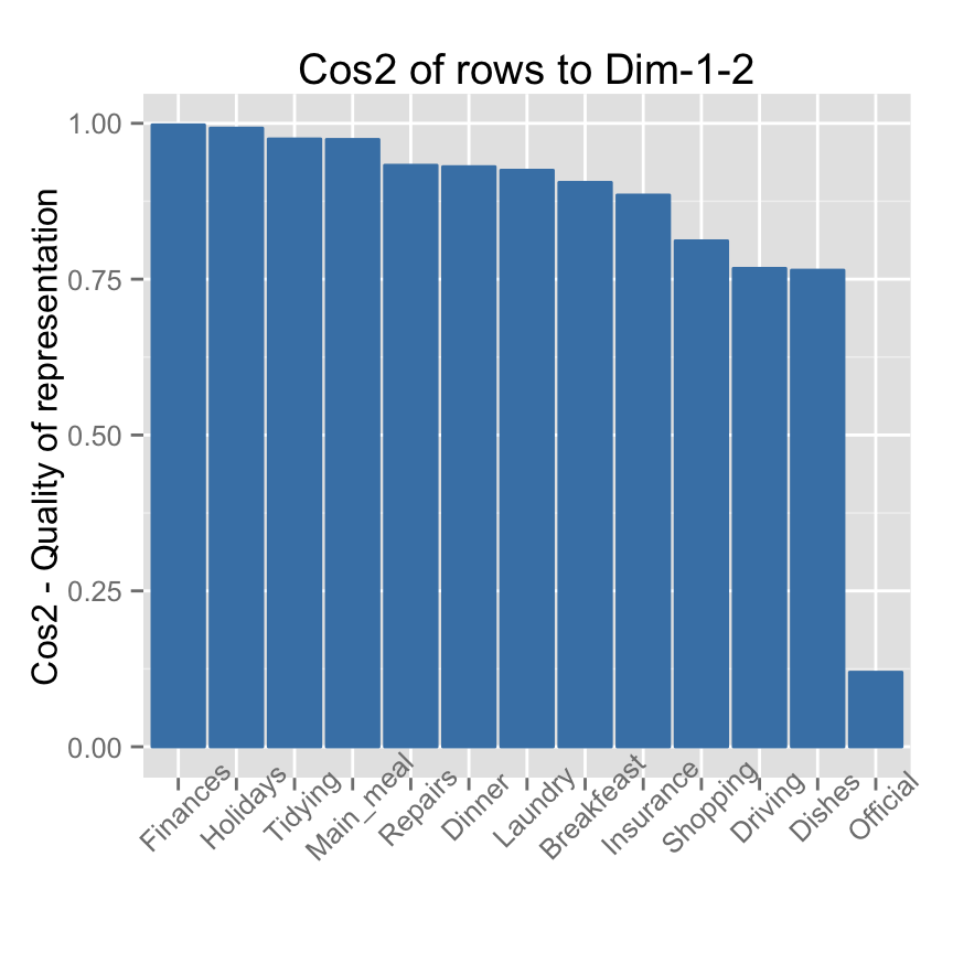
Note that, all row points except Official are well represented by the first two dimensions. The position of the point corresponding the item Official on the scatter plot should be interpreted with some caution.
Using factoextra package, the color of rows can be automatically controlled by the value of their cos2.
fviz_ca_row(res.ca, col.row="cos2")+
scale_color_gradient2(low="white", mid="blue",
      high="red", midpoint=0.5) + theme_minimal()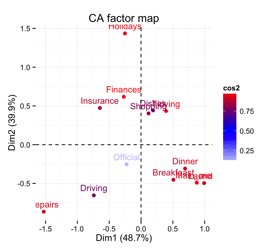
Read more about fviz_cos2(): fviz_cos2
Column variables
The function get_ca_col()[in factoextra] is used to extract the results for column variables. This function returns a list containing the coordinates, the cos2 and the contribution of columns variables:
col <- get_ca_col(res.ca)
col
Correspondence Analysis - Results for columns
===================================================
Name Description
1 "$coord" "Coordinates for the columns"
2 "$cos2" "Cos2 for the columns"
3 "$contrib" "contributions of the columns"
4 "$inertia" "Inertia of the columns" # Coordinates
col$coord Dim.1 Dim.2 Dim.3
Wife 0.83762154 -0.3652207 -0.19991139
Alternating 0.06218462 -0.2915938 0.84858939
Husband -1.16091847 -0.6019199 -0.18885924
Jointly -0.14942609 1.0265791 -0.04644302The result for columns gives the same information as described for rows. For this reason, Ill just displayed the result for columns in this section without commenting.
Coordinates of columns
The coordinates of the columns on the factor maps can be extracted as follow :
# ade4 code
head(res.ca$co)
Comp1 Comp2 Comp3
Wife 0.83762154 -0.3652207 -0.19991139
Alternating 0.06218462 -0.2915938 0.84858939
Husband -1.16091847 -0.6019199 -0.18885924
Jointly -0.14942609 1.0265791 -0.04644302Use the function fviz_ca_col() [in factoextra] to visualize only column points:
fviz_ca_col(res.ca)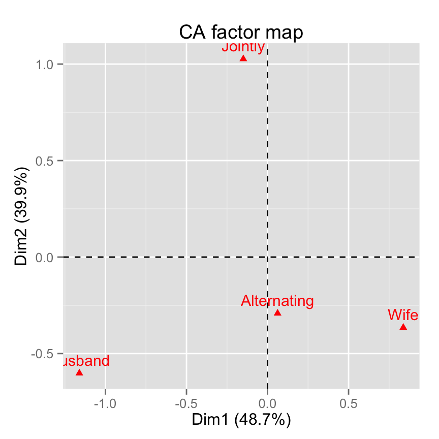
Note that, its also possible to plot columns only using the ade4 base graph:
s.label(res.ca$co, xax = 1, yax = 2)Contribution of columns
The contributions can be printed in % as follow :
# absolute contributions of columns
# ade4 code
contrib <- inertia$col.abs/100
head(contrib)
Comp1 Comp2 Comp3
Wife 44.46 10.31 10.82
Alternating 0.10 2.78 82.55
Husband 54.23 17.79 6.13
Jointly 1.20 69.12 0.50Its simple to use the function get_ca_col() [from factoextra package]. factoextra provides, a list of matrices containing all the results for the active columns (coordinates, squared cosine and contributions)./span>
columns <- get_ca_col(res.ca)
columns
Correspondence Analysis - Results for columns
===================================================
Name Description
1 "$coord" "Coordinates for the columns"
2 "$cos2" "Cos2 for the columns"
3 "$contrib" "contributions of the columns"
4 "$inertia" "Inertia of the columns" # Contributions of columns
head(columns$contrib) Dim.1 Dim.2 Dim.3
Wife 44.46 10.31 10.82
Alternating 0.10 2.78 82.55
Husband 54.23 17.79 6.13
Jointly 1.20 69.12 0.50Use the function fviz_contrib()[factoextra package] to visualize the most contributing columns :
# Contributions of columns on Dim.1
fviz_contrib(res.ca, choice = "col", axes = 1)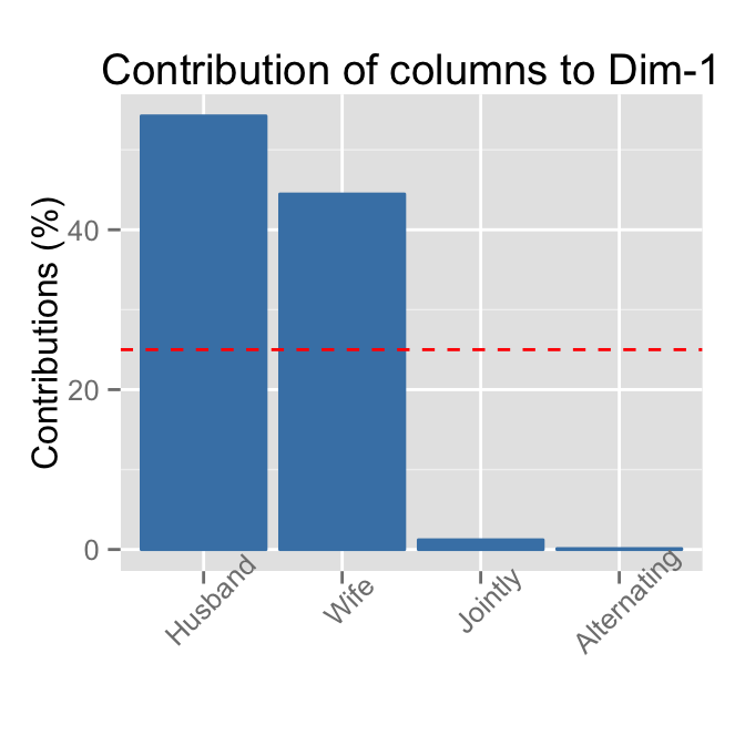
# Contributions of columns on Dim.2
fviz_contrib(res.ca, choice = "col", axes = 2)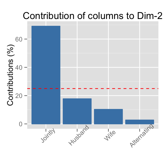
Read more about fviz_contrib(): fviz_contrib
Draw a scatter plot of column points and highlight columns according to the amount of their contributions. The function fviz_ca_col() [in factoextra] is used:
# Control column point colors using their contribution
# Possible values for the argument col.col are :
  # "cos2", "contrib", "coord", "x", "y"
fviz_ca_col(res.ca, col.col="contrib")+
scale_color_gradient2(low="white", mid="blue",
                      high="red", midpoint=24.5)+theme_minimal()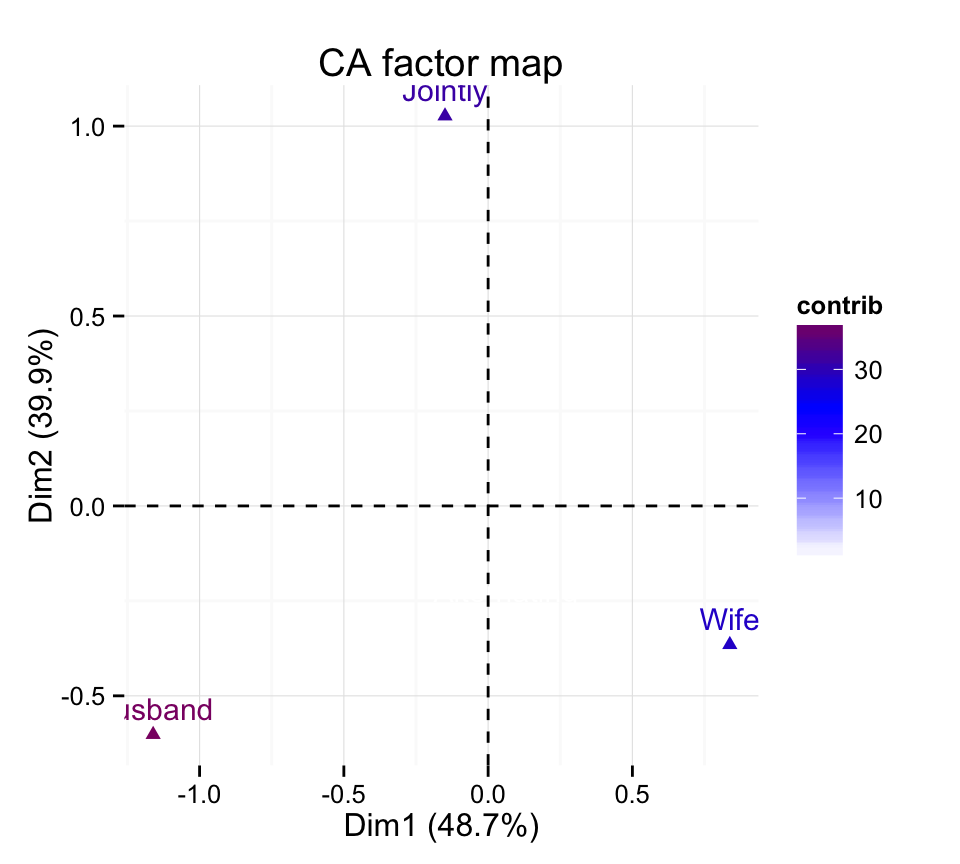
Cos2 : The quality of representation of columns
# relative contributions of columns
cos2 <- abs(inertia$col.rel)/10000
head(cos2)
Comp1 Comp2 Comp3 con.tra
Wife 0.8019 0.1524 0.0457 0.2700
Alternating 0.0048 0.1051 0.8901 0.1057
Husband 0.7720 0.2075 0.0204 0.3421
Jointly 0.0207 0.9773 0.0020 0.2823The function fviz_cos2()[in factoextra] can be used to draw a bar plot of columns cos2:
# Cos2 of columns on Dim.1 and Dim.2
fviz_cos2(res.ca, choice = "col", axes = 1:2)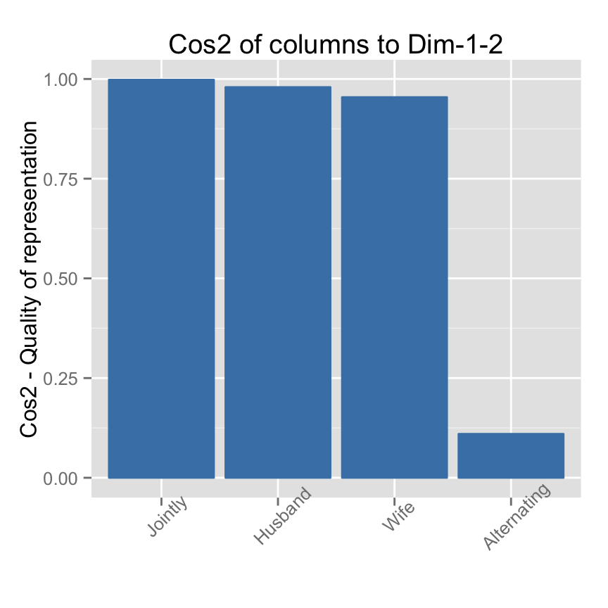
Note that, only the column item Alternating is not very well displayed on the first two dimensions. The position of this item must be interpreted with caution in the space formed by dimensions 1 and 2.
Read more about fviz_cos2(): fviz_cos2
Correspondence analysis using supplementary rows and columns
Data
Well use the data set children available on STHDA website. It contains 18 rows and 8 columns:
ff <- "http://www.sthda.com/sthda/RDoc/data/ca-children.txt"
children <- read.table(file = ff, sep ="\t",
                       header = TRUE, row.names = 1)
The data used here is a contingency table describing the answers given by different categories of people to the following question: What are the reasons that can make hesitate a woman or a couple to have children? (source of the data: FactoMineR package)
Only some of the rows and columns will be used to compute the correspondence analysis (CA).
The coordinates of the remaining (supplementary) rows/columns on the factor map will be predicted after the CA.In CA terminology, our data contains :
- Active rows (rows 1:14) : Rows that are used during the correspondence analysis.
- Supplementary rows (row.sup 15:18) : The coordinates of these rows will be predicted using the CA informations and parameters obtained with active rows/columns
- Active columns (columns 1:5) : Columns that are used for the correspondence analysis.
- Supplementary columns (col.sup 6:8) : As supplementary rows, the coordinates of these columns will be predicted also.
R functions
The functions suprow() and supcol() [in ade4 package] are used to calculate the coordinates of supplementary rows and columns, respectively.
The simplified formats are :
# For supplementary rows
suprow(x, Xsup)

# For supplementary columns
supcol(x, Xsup)
Supplementary rows
# Data for the supplementary rows
row.sup <- children[15:18, 1:5, drop = FALSE]
head(row.sup)
unqualified cep bepc high_school_diploma university
comfort 2 4 3 1 4
disagreement 2 8 2 5 2
world 1 5 4 6 3
to_live 3 3 1 3 4STEP 1/2 - CA using active rows/columns:
d.active <- children[1:14, 1:5]
res.ca <- dudi.coa(d.active, scannf = FALSE, nf =5)
STEP 2/2 - Predict the coordinates of the supplementary rows:
row.sup.ca <- suprow(res.ca, row.sup)
names(row.sup.ca)
[1] "tabsup" "lisup" # coordinates
row.sup.coord <- row.sup.ca$lisup
head(row.sup.coord) Axis1 Axis2 Axis3 Axis4
comfort 0.2096705 0.7031677 0.07111168 0.3071354
disagreement 0.1462777 0.1190106 0.17108916 -0.3132169
world 0.5233045 0.1429707 0.08399269 -0.1063597
to_live 0.3083067 0.5020193 0.52093397 0.2557357How to visualize supplementary rows on the factor map?
The function fviz_add() is used :
# Plot of active rows
p <- fviz_ca_row(res.ca)
# Add supplementary rows
fviz_add(p, row.sup.coord, color ="darkgreen")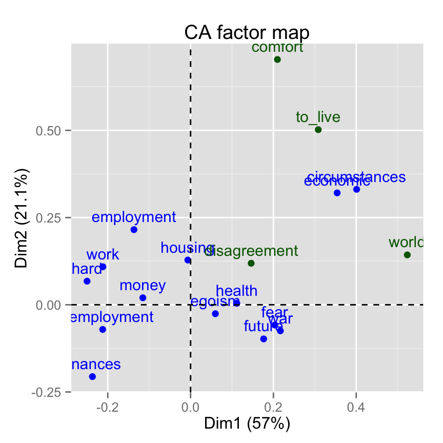
Supplementary columns
# Data for the supplementary quantitative variables
col.sup <- children[1:14, 6:8, drop = FALSE]
head(col.sup)
thirty fifty more_fifty
money 59 66 70
future 115 117 86
unemployment 79 88 177
circumstances 9 8 5
hard 2 17 18
economic 18 19 17Recall that, rows 15:18 are supplementary rows. We dont want them in this current analysis. This is why, I extracted only rows 1:14.
Predict the coordinates of the supplementary columns :
col.sup.ca <- supcol(res.ca, col.sup)
names(col.sup.ca)
[1] "tabsup" "cosup" # coordinates
col.sup.coord <- col.sup.ca$cosup
head(col.sup.coord) Comp1 Comp2 Comp3 Comp4
thirty 0.10541339 -0.05969594 -0.10322613 0.06977996
fifty -0.01706444 0.04907657 -0.01568923 -0.01306117
more_fifty -0.17706810 -0.04813788 0.10077299 -0.08517528Visualize supplementary columns on the factor map using factoextra :
# Plot of active columns
p <- fviz_ca_col(res.ca)
# Add supplementary active variables
fviz_add(p, col.sup.coord , color ="darkgreen")
Further reading
To learn more about CA, read this article: Correspondence Analysis in R: The Ultimate Guide for the Analysis, the Visualization and the Interpretation
Infos
This analysis has been performed using R software (ver. 3.1.2), ade4 (ver. 1.6-2) and factoextra (ver. 1.0.2)