Introduction
ggplot2 is a powerful R package to produce elegant graphics. Its implemented by Hadley Wickham. The gg in ggplot2 means Grammar of Graphics, a graphic concept which describes plots by using a grammar.
Two main functions are available in ggplot2 package : a qplot() and ggplot() functions.
- qplot() is a quick plot function which is easy to use for simple plots.
- The ggplot() function use the powerful grammar of graphics to build plot piece by piece.
According to ggplot2 concept, a plot can be divide in different fundamental parts : Plot <- data + Aesthetics + Geometry.
- data is a data frame
- Aesthetics is used to indicate x and y variables. It can also be used to control the color, the size or the shape of a point, the height of a bar, etc
..
- Geometry corresponds to the type of graphics (histogram, box plot, line plot, density plot, dot plot, .)
This document describes how to create and customize different types of graphs using ggplot2. Many examples of code and graphics are provided.
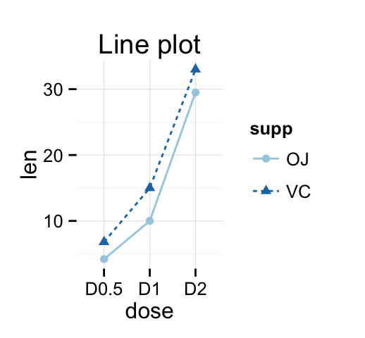
Some examples of graphs, described in this document, are shown below:




Install and load ggplot2 package
# Installation
install.packages('ggplot2')
# Loading
library(ggplot2)
Data format
The data must be a data.frame (columns are variables and rows are observations).
The data set mtcars is used in the examples below:
data(mtcars)
df <- mtcars[, c("mpg", "cyl", "wt")]
head(df)
## mpg cyl wt
## Mazda RX4 21.0 6 2.620
## Mazda RX4 Wag 21.0 6 2.875
## Datsun 710 22.8 4 2.320
## Hornet 4 Drive 21.4 6 3.215
## Hornet Sportabout 18.7 8 3.440
## Valiant 18.1 6 3.460mtcars : Motor Trend Car Road Tests.
Description: The data comprises fuel consumption and 10 aspects of automobile design and performance for 32 automobiles (1973 - 74 models).
Format: A data frame with 32 observations on 3 variables.
- [, 1] mpg Miles/(US) gallon
- [, 2] cyl Number of cylinders
- [, 3] wt Weight (lb/1000)
Quick plot : qplot()
The function qplot() is very similar to the basic plot() function from the R base package. It can be used to create and combine easily different types of plots. However, it remains less flexible than the function ggplot().
This chapter provides a brief introduction to qplot(). Concerning the function ggplot(), many articles are available at the end of this web page for creating and customizing different plots using ggplot().
Usage
A simplified format of qplot() is :
qplot(x, y=NULL, data, geom="auto",
xlim = c(NA, NA), ylim =c(NA, NA))- x : x values
- y : y values (optional)
- data : data frame to use (optional).
- geom : Character vector specifying geom to use. Defaults to point if x and y are specified, and histogram if only x is specified.
- xlim, ylim: x and y axis limits
Other arguments including main, xlab, ylab and log can be used also:
- main: Plot title
- xlab, ylab: x and y axis labels
- log: which variables to log transform. Allowed values are x, y or xy
Scatter plots
Basic scatter plots
The plot can be created using data from either numeric vectors or a data frame:
# Use data from numeric vectors
x <- 1:10; y = x*x
# Basic plot
qplot(x,y)

# Add line
qplot(x, y, geom=c("point", "line"))

# Use data from a data frame
qplot(mpg, wt, data=mtcars)


Scatter plots with linear fits
The option smooth is used to add a smoothed line with its standard error:
# Smoothing
qplot(mpg, wt, data = mtcars, geom = c("point", "smooth"))

# Regression line
qplot(mpg, wt, data = mtcars, geom = c("point", "smooth"),
      method="lm")

To draw a regression line the argument method = lm is used in combination with geom = smoth.
The allowed values for the argument method includes:
- method = loess: This is the default value for small number of observations. It computes a smooth local regression. You can read more about loess using the R code ?loess.
- method =lm: It fits a linear model. Note that, its also possible to indicate the formula as formula = y ~ poly(x, 3) to specify a degree 3 polynomial.
Linear fits by groups
The argument color is used to tell R that we want to color the points by groups:
# Linear fits by group
qplot(mpg, wt, data = mtcars, color = factor(cyl),
      geom=c("point", "smooth"),
      method="lm")
Change scatter plot colors
Points can be colored according to the values of a continuous or a discrete variable. The argument colour is used.
# Change the color by a continuous numeric variable
qplot(mpg, wt, data = mtcars, colour = cyl)

# Change the color by groups (factor)
df <- mtcars
df[,'cyl'] <- as.factor(df[,'cyl'])
qplot(mpg, wt, data = df, colour = cyl)

# Add lines
qplot(mpg, wt, data = df, colour = cyl,
      geom=c("point", "line"))


Note that you can also use the following R code to generate the second plot :
qplot(mpg, wt, data=df, colour= factor(cyl))Change the shape and the size of points
Like color, the shape and the size of points can be controlled by a continuous or discrete variable.
# Change the size of points according to
  # the values of a continuous variable
qplot(mpg, wt, data = mtcars, size = mpg)

# Change point shapes by groups
qplot(mpg, wt, data = mtcars, shape = factor(cyl))

Scatter plot with texts
The argument label is used to specify the texts to be used for each points:
qplot(mpg, wt, data = mtcars, label = rownames(mtcars),
      geom=c("point", "text"),
      hjust=0, vjust=0)
Bar plot
Its possible to draw a bar plot using the argument geom = bar.
If you want y to represent counts of cases, use stat = bin and dont map a variable to y. If you want y to represent values in the data, use stat = identity.
# y represents the count of cases
qplot(mpg, data = mtcars, geom = "bar")

# y represents values in the data
index <- 1:nrow(mtcars)
qplot(index, mpg, data = mtcars,
      geom = "bar", stat = "identity")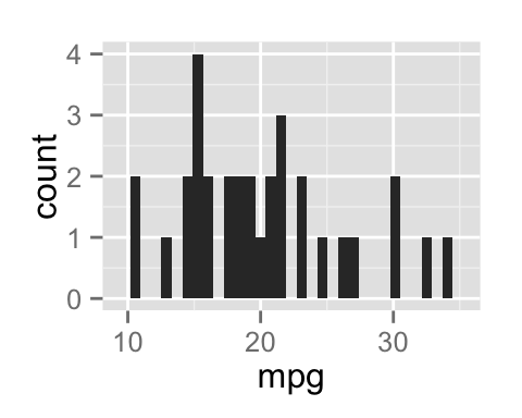

Change bar plot fill color
# Order the data by cyl and then by mpg values
df <- mtcars[order(mtcars[, "cyl"], mtcars[, "mpg"]),]
df[,'cyl'] <- as.factor(df[,'cyl'])
index <- 1:nrow(df)

# Change fill color by group (cyl)
qplot(index, mpg, data = df,
      geom = "bar", stat = "identity", fill = cyl)
Box plot, dot plot and violin plot
PlantGrowth data set is used in the following example :
head(PlantGrowth)## weight group
## 1 4.17 ctrl
## 2 5.58 ctrl
## 3 5.18 ctrl
## 4 6.11 ctrl
## 5 4.50 ctrl
## 6 4.61 ctrl- geom = boxplot: draws a box plot
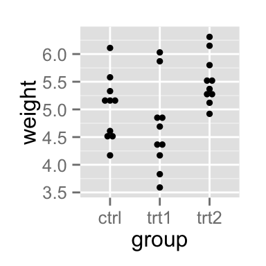
- geom = dotplot: draws a dot plot. The supplementary arguments stackdir = center and binaxis = y are required.
- geom = violin: draws a violin plot. The argument trim is set to FALSE
To draw a box plot, the argument geom = boxplot is used:
# Basic box plot from a numeric vector
x <- "1"
y <- rnorm(100)
qplot(x, y, geom="boxplot")

# Basic box plot from data frame
qplot(group, weight, data = PlantGrowth,
      geom=c("boxplot"))

# Dot plot
qplot(group, weight, data = PlantGrowth,
      geom=c("dotplot"),
      stackdir = "center", binaxis = "y")

# Violin plot
qplot(group, weight, data = PlantGrowth,
      geom=c("violin"), trim = FALSE)


Change the color by groups:
# Box plot from a data frame
# Add jitter and change fill color by group
qplot(group, weight, data = PlantGrowth,
      geom=c("boxplot", "jitter"), fill = group)

# Dot plot
qplot(group, weight, data = PlantGrowth,
      geom = "dotplot", stackdir = "center", binaxis = "y",
      color = group, fill = group)

Histogram and density plots
The histogram and density plots are used to display the distribution of data.
Generate some data
The R code below generates some data containing the weights by sex (M for male; F for female):
set.seed(1234)
mydata = data.frame(
        sex = factor(rep(c("F", "M"), each=200)),
        weight = c(rnorm(200, 55), rnorm(200, 58)))
head(mydata)
## sex weight
## 1 F 53.79293
## 2 F 55.27743
## 3 F 56.08444
## 4 F 52.65430
## 5 F 55.42912
## 6 F 55.50606Histogram plot
# Basic histogram
qplot(weight, data = mydata, geom = "histogram")

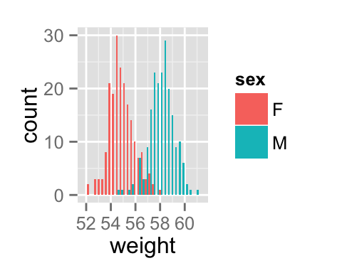
# Change histogram fill color by group (sex)
qplot(weight, data = mydata, geom = "histogram",
    fill = sex, position = "dodge")
Density plot
# Basic density plot
qplot(weight, data = mydata, geom = "density")

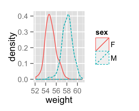
# Change density plot line color by group (sex)
# change line type
qplot(weight, data = mydata, geom = "density",
    color = sex, linetype = sex)
Main titles and axis labels
Titles can be added to the plot as follow:
qplot(weight, data = mydata, geom = "density",
      xlab = "Weight (kg)", ylab = "Density",
      main = "Density plot of Weight")
Introduction to ggplot()
As mentioned above, there are two main functions in ggplot2 package for generating graphics:
- The quick and easy-to-use function: qplot()
- The more powerful and flexible function to build the plot piece by piece: ggplot
This section describes briefly how to use the function ggplot().
Recall that, the concept of ggplot divides a plot in different fundamental parts: plot = data + Aesthetics + geometry
- data: a data frame. Columns are variables
- Aesthetics is used to specify the x and y variables. It can also be used to control the color, the size or the shape of a point, the height of a bar, etc
..
- Geometry corresponds to the type of graphics (histogram, boxplot, line, density, dotplot, bar, )
To demonstrate how the function ggplot() works, well draw a scatter plot:
# Basic scatter plot
ggplot(data = mtcars, aes(x = wt, y = mpg)) +
  geom_point()

# Change the point size, and shape
ggplot(mtcars, aes(x = wt, y = mpg)) +
  geom_point(size = 2, shape = 23)

The function ggplot() is intensively used in the articles available at the end of this page.
Infos
This analysis was performed using R (ver. 3.1.2) and ggplot2 (ver 1.0.0).