Previously, we described the essentials of R programming and provided quick start guides for importing data into R.
Here, well describe how to create mean plots with confidence intervals in R.
Pleleminary tasks
Launch RStudio as described here: Running RStudio and setting up your working directory
Prepare your data as described here: Best practices for preparing your data and save it in an external .txt tab or .csv files
Import your data into R as described here: Fast reading of data from txt|csv files into R: readr package.
Here, well use the R built-in ToothGrowth data set.
Data
head(ToothGrowth)## len supp dose
## 1 4.2 VC 0.5
## 2 11.5 VC 0.5
## 3 7.3 VC 0.5
## 4 5.8 VC 0.5
## 5 6.4 VC 0.5
## 6 10.0 VC 0.5Plot group means
The function plotmeans() [in gplots package] can be used.
library(gplots)
# Plot the mean of teeth length by dose groups
plotmeans(len ~ dose, data = ToothGrowth, frame = FALSE)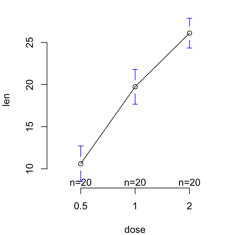
# Add mean labels (mean.labels = TRUE)
# Remove line connection (connect = FALSE)
plotmeans(len ~ dose, data = ToothGrowth, frame = FALSE,
          mean.labels = TRUE, connect = FALSE)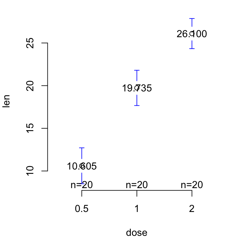
See also
Infos
This analysis has been performed using R statistical software (ver. 3.2.4).