Previously, we described the essentials of R programming and provided quick start guides for importing data into R.
Here, well describe how to draw a Cleveland dot plot in R.
Pleleminary tasks
Launch RStudio as described here: Running RStudio and setting up your working directory
Prepare your data as described here: Best practices for preparing your data and save it in an external .txt tab or .csv files
Import your data into R as described here: Fast reading of data from txt|csv files into R: readr package.
Here, well use the R built-in mtcars data set.
Data
Well use mtcars data sets. We start by ordering the data set according to mpg variable.
mtcars <- mtcars[order(mtcars$mpg), ]R base function: dotchart()
The function dotchart() is used to draw a cleveland dot plot.
dotchart(x, labels = NULL, groups = NULL,
gcolor = par("fg"), color = par("fg"))- x: numeric vector or matrix
- labels: a vector of labels for each point.
- groups: a grouping variable indicating how the elements of x are grouped.
- gcolor: color to be used for group labels and values.
- color: the color(s) to be used for points and labels.
Dot chart of one numeric vector
# Dot chart of a single numeric vector
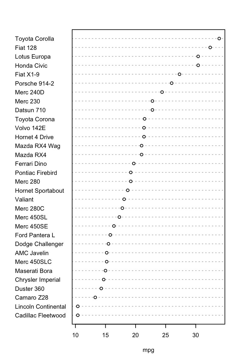
dotchart(mtcars$mpg, labels = row.names(mtcars),
         cex = 0.6, xlab = "mpg")
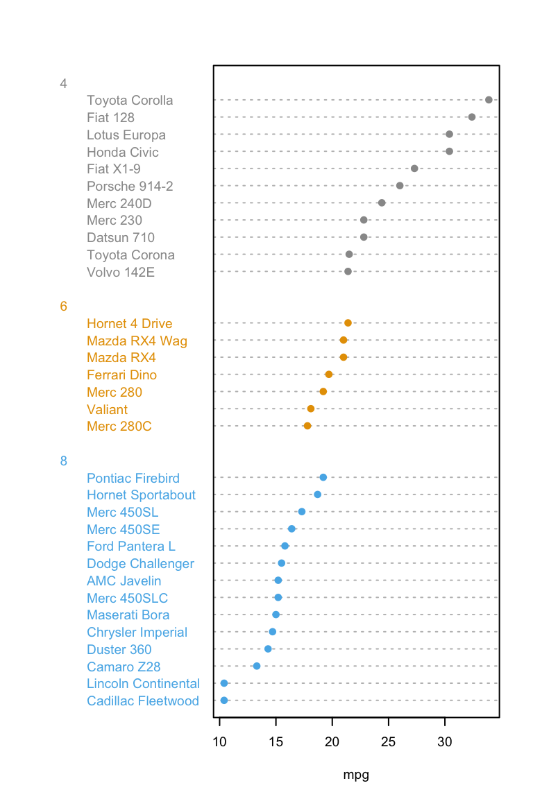
# Plot and color by groups cyl
grps <- as.factor(mtcars$cyl)
my_cols <- c("#999999", "#E69F00", "#56B4E9")
dotchart(mtcars$mpg, labels = row.names(mtcars),
         groups = grps, gcolor = my_cols,
         color = my_cols[grps],
         cex = 0.6,  pch = 19, xlab = "mpg")
Dot chart of a matrix
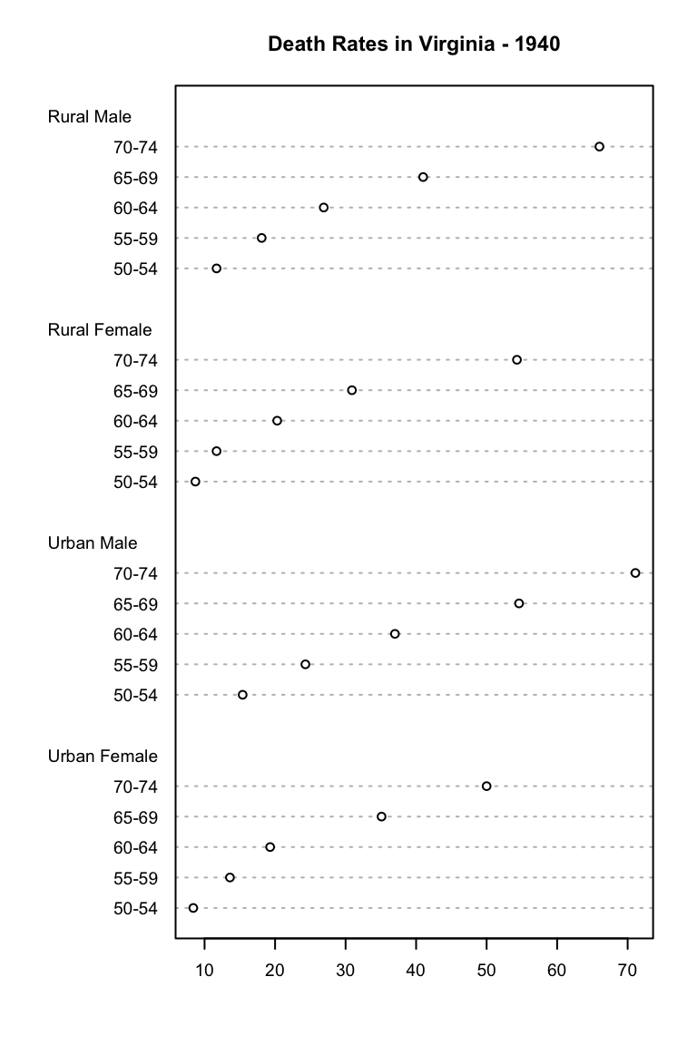
dotchart(VADeaths, cex = 0.6,
         main = "Death Rates in Virginia - 1940")
See also
Infos
This analysis has been performed using R statistical software (ver. 3.2.4).