This article provides a quick start guide to change and customize Rgraphical parameters, including:
- adding titles, legends, texts, axis and straight lines
- changing axis scales, plotting symbols, line types and colors
For each of these graphical parameters, you will learn the simplified format of the R functions to use and some examples.
Add and customize titles
How this chapter is organized?
- Change main title and axis labels
- title colors
- The font style for titles
- Change the font size
- Use the title() function
- Customize the titles using par() function.
Read more > Add titles to a plot in R software.
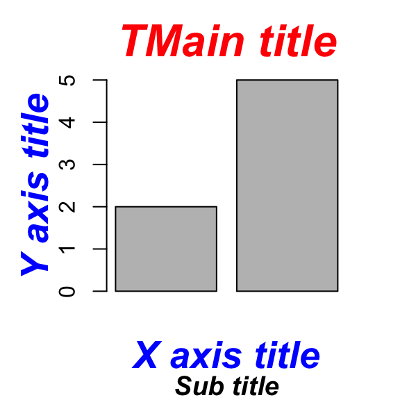
Plot titles can be specified either directly to the plotting functions during the plot creation or by using the title() function (to add titles on an existing plot).
# Add titles
barplot(c(2,5), main="Main title",
        xlab="X axis title",
        ylab="Y axis title",
        sub="Sub-title",
        col.main="red", col.lab="blue", col.sub="black")

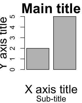
# Increase the size of titles
barplot(c(2,5), main="Main title",
        xlab="X axis title",
        ylab="Y axis title",
        sub="Sub-title",
        cex.main=2, cex.lab=1.7, cex.sub=1.2)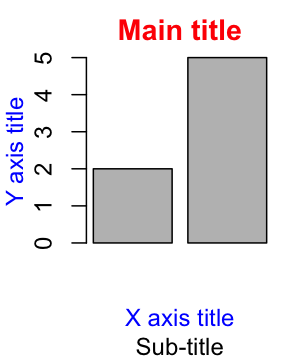
Read more > Add titles to a plot in R software.
Add legends
How this chapter is organized?
- R legend function
- Title, text font and background color of the legend box
- Border of the legend box
- Specify legend position by keywords
Read more > Add legends to plots
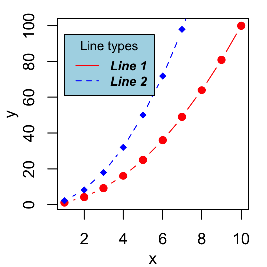
The legend() function can be used. A simplified format is :
legend(x, y=NULL, legend, col)- x and y : the co-ordinates to be used for the legend. Keywords can also be used for x : bottomright, bottom, bottomleft, left, topleft, top, topright, right and center.
- legend : the text of the legend
- col : colors of lines and points beside the text for legends
# Generate some data
x<-1:10; y1=x*x; y2=2*y1
# First line plot
plot(x, y1, type="b", pch=19, col="red", xlab="x", ylab="y")
# Add a second line
lines(x, y2, pch=18, col="blue", type="b", lty=2)
# Add legends
legend("topleft", legend=c("Line 1", "Line 2"),
       col=c("red", "blue"), lty=1:2, cex=0.8)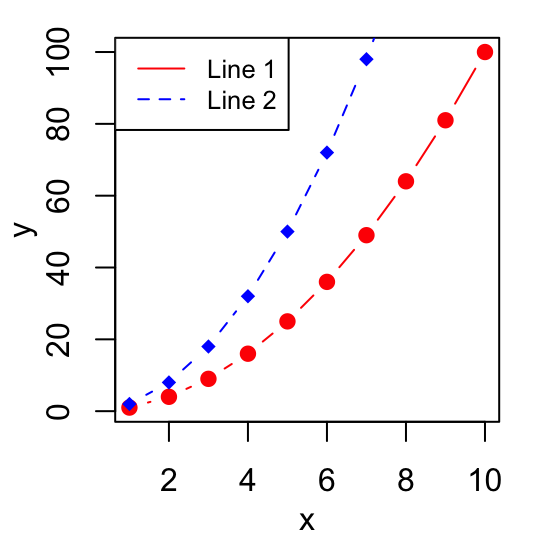
Read more > Add legends to plots
Add texts
How this chapter is organized?
- Add texts within the graph
- Add text in the margins of the graph
- Add mathematical annotation to a plot
Read more > Add text to a plot
To add a text to a plot in R, the text() function [to draw a text inside the plotting area] and mtext()[to put a text in one of the four margins of the plot] function can be used.
A simplified format for text() is :
text(x, y, labels)- x and y are the coordinates of the texts
- labels : vector of texts to be drawn
plot(cars[1:10,], pch=19)
text(cars[1:10,],  row.names(cars[1:10,]),
cex=0.65, pos=1,col="red") 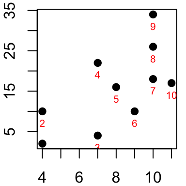
Read more > Add text to a plot
Add straight lines
How this chapter is organized?
- Add a vertical line
- Add an horizontal line
- Add regression line
Read more > abline R function : An easy way to add straight lines to a plot using R software
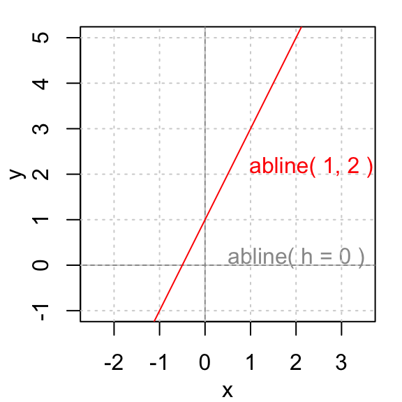
The R function abline() can be used to add straight lines (vertical, horizontal or regression lines) to a graph.
A simplified format is :
abline(a=NULL, b=NULL, h=NULL, v=NULL, ...)- a, b : single values specifying the intercept and the slope of the line
- h : the y-value(s) for horizontal line(s)
- v : the x-value(s) for vertical line(s)
# Add horizontal and vertical lines
#++++++++++++++++++++++++++++++++++
plot(cars, pch=19)
abline(v=15, col="blue") # Add vertical line
# Add horizontal line, change line color, size and type
abline(h=60, col="red", lty=2, lwd=3)

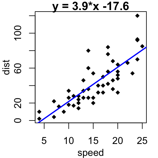
# Fit regression line
#++++++++++++++++++++++++++++++++++
require(stats)
reg<-lm(dist ~ speed, data = cars)
coeff=coefficients(reg)
# equation of the regression line :
eq = paste0("y = ", round(coeff[2],1), "*x ", round(coeff[1],1))
plot(cars, main=eq, pch=18)
abline(reg, col="blue", lwd=2)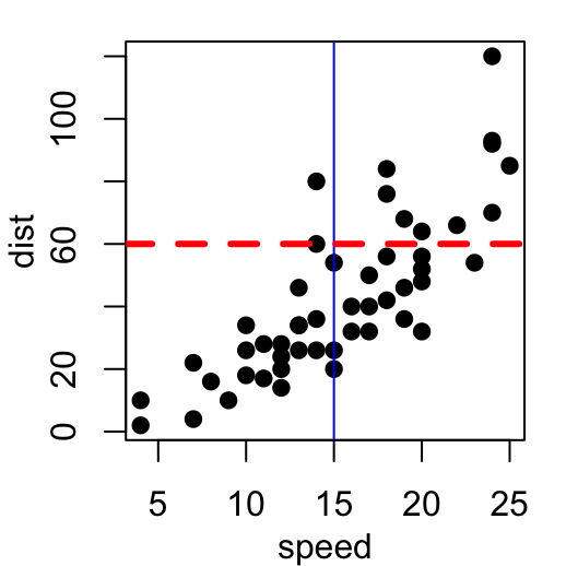
Read more > abline R function : An easy way to add straight lines to a plot using R software
Add an axis to a plot
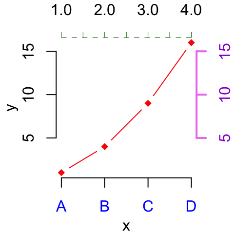
axis() function can be used.
A simplified format is :
axis(side, at=NULL, labels=TRUE)- side : the side of the graph the axis is to be drawn on; Possible values are 1(below), 2(left), 3(above) and 4(right).
- at: the points at which tick-marks are to be drawn.
- labels: vector of texts for the labels of tick-marks.
x<-1:4; y=x*x
plot(x, y, pch=18, col="red", type="b",
     frame=FALSE, xaxt="n") # Remove x axis
axis(1, 1:4, LETTERS[1:4], col.axis="blue")
axis(3, col = "darkgreen", lty = 2, lwd = 0.5)
axis(4, col = "violet", col.axis = "dark violet", lwd = 2)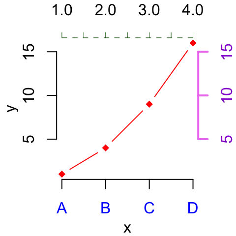
Read more > Add an axis to a plot with R software.
Change axis scale : minimum, maximum and log scale
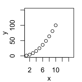
xlim and ylim arguments can be used to change the limits for x and y axis. Format : xlim = c(min, max); ylim = c(min, max).
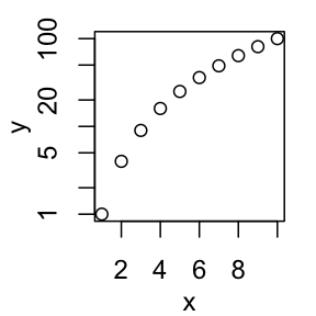
log transformation can be performed using the parameters : log=x, log=y or log=xy.
x<-1:10; y=x*x
plot(x, y) # Simple graph
plot(x, y, xlim=c(1,15), ylim=c(1,150))# Enlarge the scale
plot(x, y, log="y")# Log scale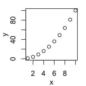
Read more > Axis scale in R software : minimum, maximum and log scale.
Customize tick mark labels
- Color, font style and font size of tick mark labels :
- Orientation of tick mark labels
- Hide tick marks
- Change the string rotation of tick mark labels
- Use the par() function
x<-1:10; y<-x*x
# Simple graph
plot(x, y)
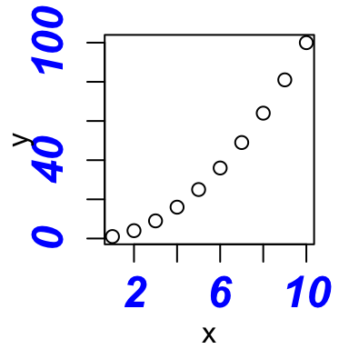
# Custom plot : blue text, italic-bold, magnification
plot(x,y, col.axis="blue", font.axis=4, cex.axis=1.5)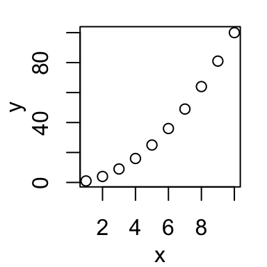
Read more > Customize tick mark labels.
Change plotting symbols
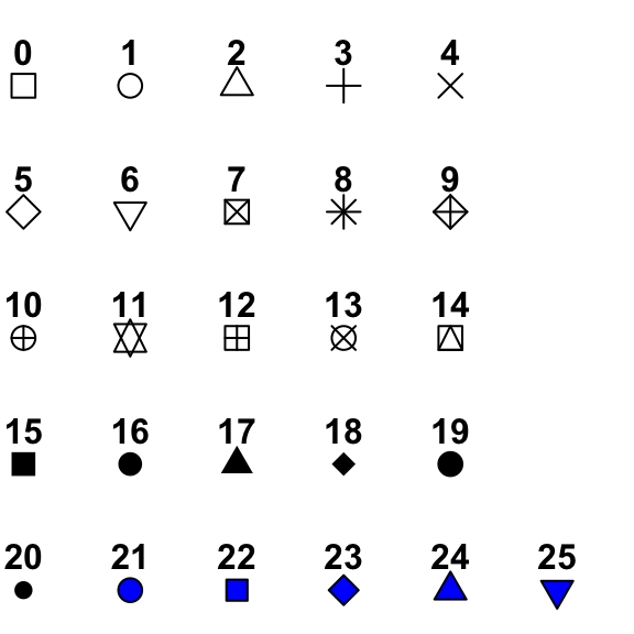
The following points symbols can be used in R :
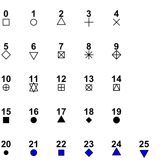
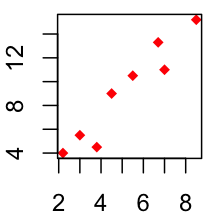
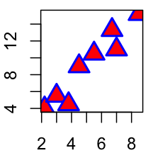
Point symbols can be changed using the argument pch.
x<-c(2.2, 3, 3.8, 4.5, 7, 8.5, 6.7, 5.5)
y<-c(4, 5.5, 4.5, 9, 11, 15.2, 13.3, 10.5)
# Change plotting symbol using pch
plot(x, y, pch = 19, col="blue")
plot(x, y, pch = 18, col="red")
plot(x, y, pch = 24, cex=2, col="blue", bg="red", lwd=2)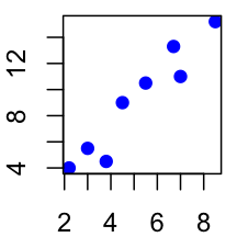
Read more > R plot pch symbols : The different point shapes available in R.
Change line types
The following line types are available in R :
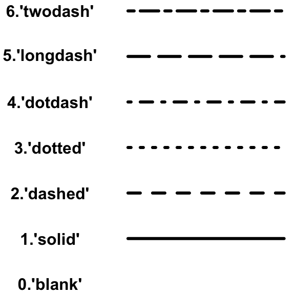
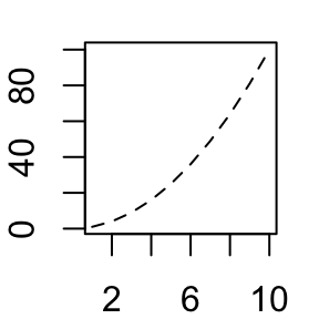
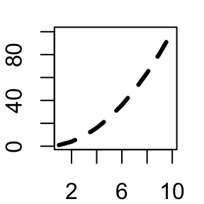
Line types can be changed using the graphical parameter lty.
x=1:10; y=x*x
plot(x, y, type="l") # Solid line (by default)
plot(x, y, type="l", lty="dashed")# Use dashed line type
plot(x, y, type="l", lty="dashed", lwd=3)# Change line width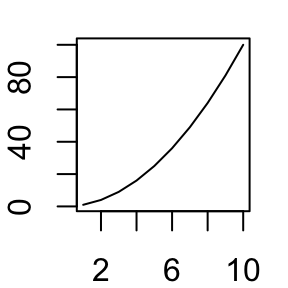
Read more > Line types in R : lty.
Change colors
- Built-in color names in R
- Specifying colors by hexadecimal code
- Using RColorBrewer palettes
- Use Wes Anderson color palettes
- Create a vector of n contiguous colors
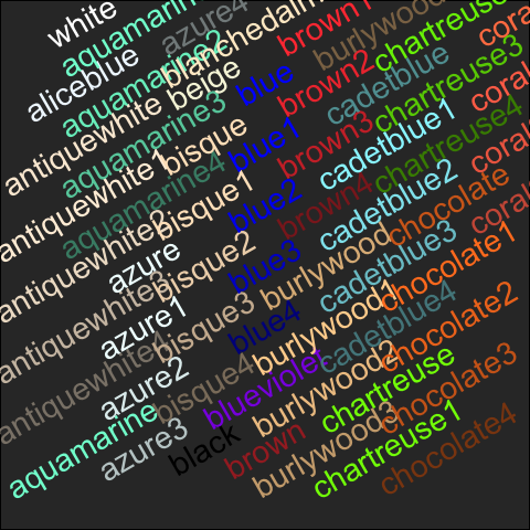
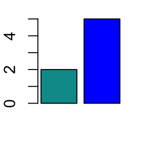
Colors can be specified by names (e.g col=red) or with hexadecimal code (e.gcol = #FFCC00).
# use color names
barplot(c(2,5), col=c("blue", "red"))
# use hexadecimal color code
barplot(c(2,5), col=c("#009999", "#0000FF"))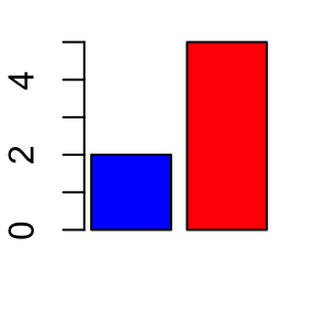
Hexadecimal color charts :
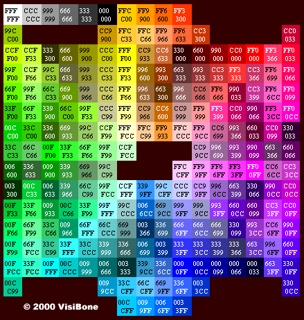
(Source: http://www.visibone.com)
RColorBrewer package can also be used to create a nice looking color palettes. Read our article : Colors in R.
Read more > Colors in R.
Infos
This analysis has been performed using R statistical software (ver. 3.2.4).
