Previously, we described the essentials of R programming and provided quick start guides for importing data into R.
This chapter contains articles describring how to visualize data using R base graphs.
How this chapter is organized?
Creating and saving graphs
- Creating graphs
- Saving graphs
- File formats for exporting plots
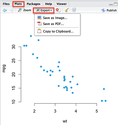
Read more: > Creating and Saving Graphs in R.
Scatter plots
- R base scatter plot: plot()
- Enhanced scatter plots: car::scatterplot()
- 3D scatter plots
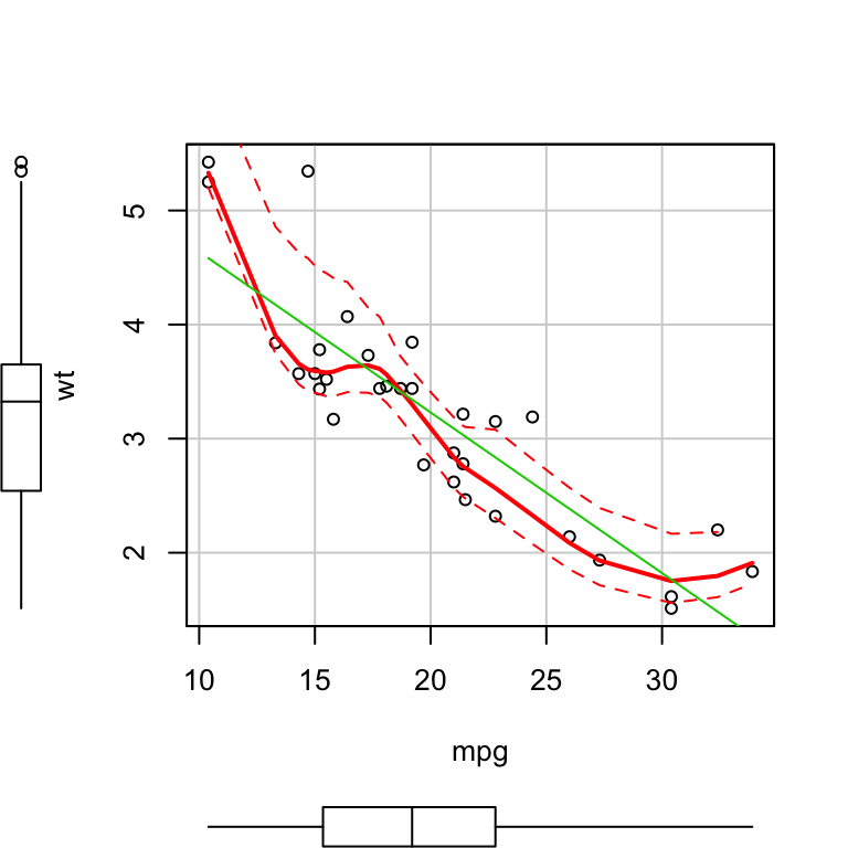
Read more: > Scatter Plots.
Scatter plot matrices
- R base scatter plot matrices: pairs()
- Use the R package psych
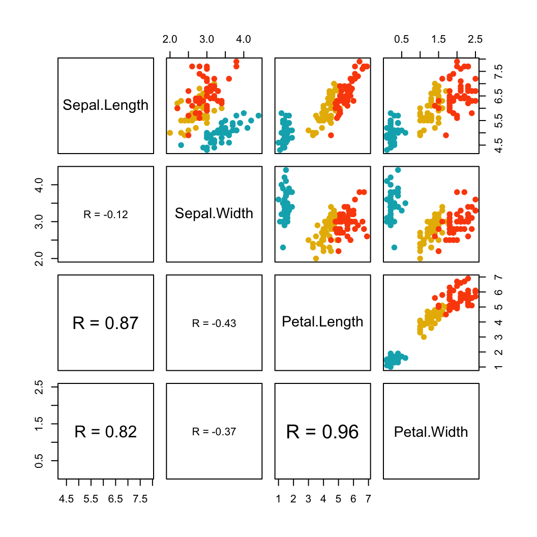
Read more > Scatter Plot Matrices.
Box plots
- R base box plots: boxplot()
- Box plot with the number of observations: gplots::boxplot2()
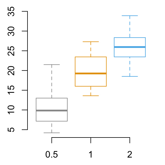
Read more > Box Plots.
Bar plots
- Basic bar plots
- Change group names
- Change color
- Change main title and axis labels
- Stacked bar plots
- Grouped bar plots
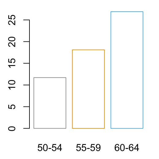
Read more > Bar Plots.
Line plots
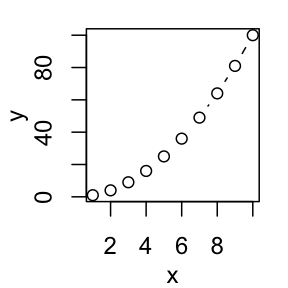
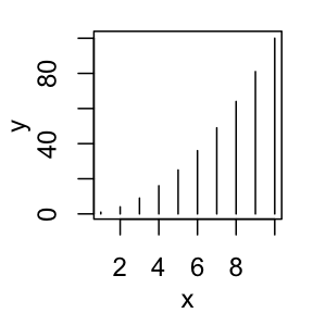
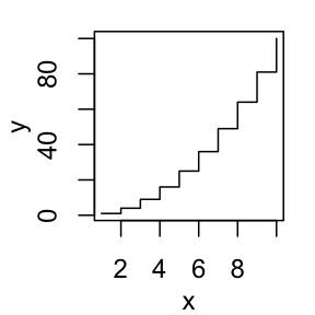
- R base functions: plot() and lines()
- Basic line plots
- Plots with multiple lines
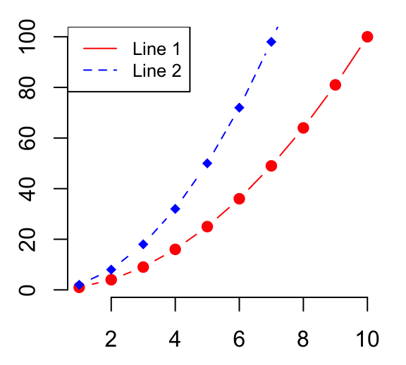
Read more > Line Plots.
Pie charts
- Create basic pie charts: pie()
- Create 3D pie charts: plotix::pie3D()
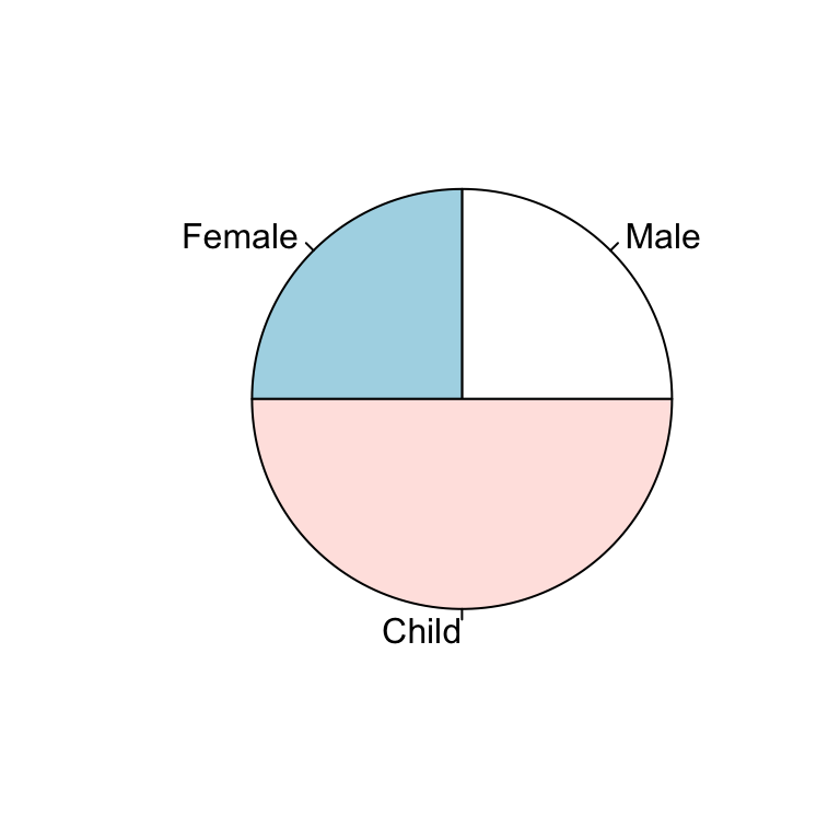
Read more > Pie Charts.
Histogram and density plots
- Create histogram plots: hist()
- Create density plots: density()
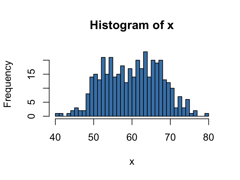
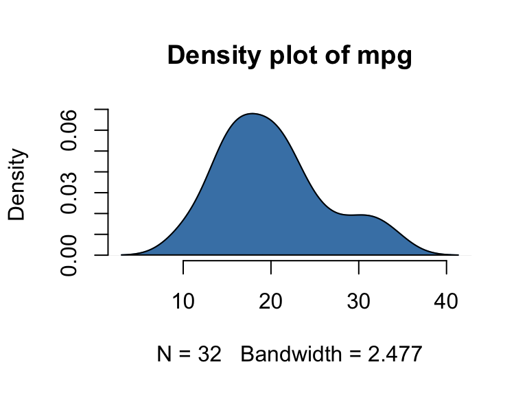
Read more > Histogram and Density Plots.
Dot charts
- R base function: dotchart()
- Dot chart of one numeric vector
- Dot chart of a matrix
mtcars <- mtcars[order(mtcars$mpg), ]
# Plot and color by groups cyl
grps <- as.factor(mtcars$cyl)
my_cols <- c("#999999", "#E69F00", "#56B4E9")
dotchart(mtcars$mpg, labels = row.names(mtcars),
         groups = grps, gcolor = my_cols,
         color = my_cols[grps],
         cex = 0.6,  pch = 19, xlab = "mpg")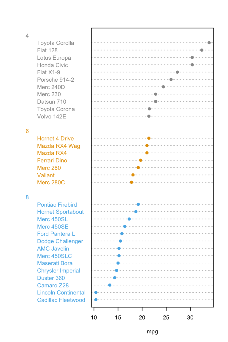
Read more > Dot charts.
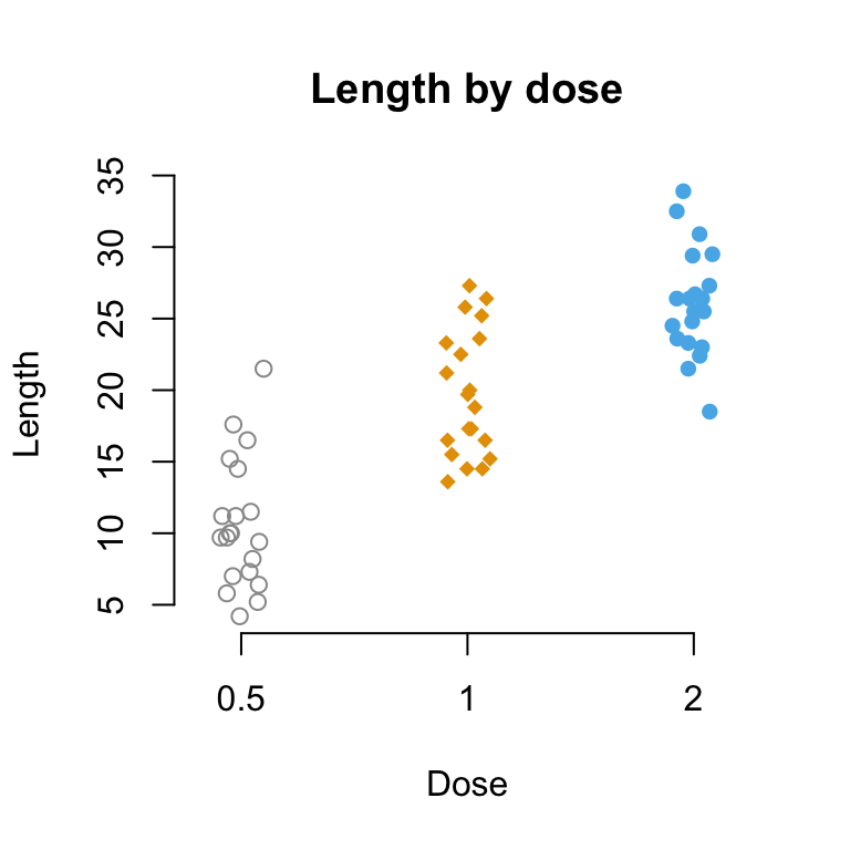
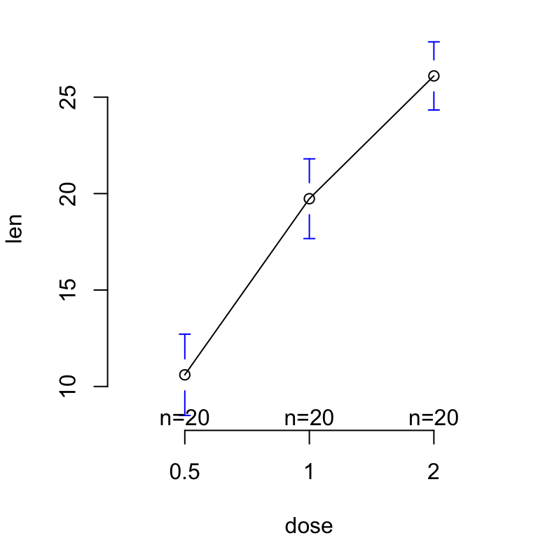
Plot group means and confidence intervals
R base graphical parameters
- Add and customize titles
- Add legends
- Add texts
- Add straight lines
- Add an axis to a plot
- Change axis scale : minimum, maximum and log scale
- Customize tick mark labels
- Change plotting symbols
- Change line types
- Change colors
Read more > R base graphical Parameters.
See also
Infos
This analysis has been performed using R statistical software (ver. 3.2.4).
