Quantcast
Channel: Easy Guides
Viewing all 183 articles
Browse latest View live

Principal component analysis in R : prcomp() vs. princomp() - R software and data mining

$
0
0


The basics of Principal Component Analysis (PCA) have been already described in my previous article : PCA basics.

This R tutorial describes how to perform a Principal Component Analysis (PCA) using the built-in R functions prcomp() and princomp().

You will learn how to :

  • determine the number of components to retain for summarizing the information in your data
  • calculate the coordinates, the cos2 and the contribution of variables
  • calculate the coordinates, the cos2 and the contribution of individuals
  • interpret the correlation circle of PCA
  • make a prediction with PCA

Packages in R for principal component analysis

There are two general methods to perform PCA in R :

  • Spectral decomposition which examines the covariances / correlations between variables
  • Singular value decomposition which examines the covariances / correlations between individuals

The singular value decomposition method is the preferred analysis for numerical accuracy.

There are several functions from different packages for performing PCA :

  • The functions prcomp() and princomp() from the built-in R stats package
  • PCA() from FactoMineR package. Read more here : PCA with FactoMineR
  • dudi.pca() from ade4 package. Read more here : PCA with ade4

The functions prcomp() and princomp() are described in the next section.

prcomp() and princomp() functions

The function princomp() uses the spectral decomposition approach.

The functions prcomp() and PCA()[FactoMineR] use the singular value decomposition (SVD).

According to R help, SVD has slightly better numerical accuracy. Therefore, prcomp() is the preferred function.

The simplified format of these 2 functions are :

prcomp(x, scale = FALSE)

princomp(x, cor = FALSE, scores = TRUE)

  1. Arguments for prcomp() :
  • x : a numeric matrix or data frame
  • scale : a logical value indicating whether the variables should be scaled to have unit variance before the analysis takes place
  1. Arguments for princomp() :
  • x : a numeric matrix or data frame
  • cor : a logical value. If TRUE, the data will be centered and scaled before the analysis
  • scores : a logical value. If TRUE, the coordinates on each principal component are calculated


The elements of the outputs returned by the functions prcomp() and princomp() includes :

prcomp() nameprincomp() nameDescription
sdevsdevthe standard deviations of the principal components
rotationloadingsthe matrix of variable loadings (columns are eigenvectors)
centercenterthe variable means (means that were substracted)
scalescalethe variable standard deviations (the scalings applied to each variable )
xscoresThe coordinates of the individuals (observations) on the principal components.

In the following sections, we’ll focus only on the function prcomp()

Install factoextra for visualization

The package factoextra is used for the visualization of the principal component analysis results.

factoextra can be installed and loaded as follow :

# install.packages("devtools")
devtools::install_github("kassambara/factoextra")

# load
library("factoextra")

Prepare the data

We’ll use the data sets decathlon2 from the package factoextra :

library("factoextra")
data(decathlon2)

This data is a subset of decathlon data in FactoMineR package

As illustrated below, the data used here describes athletes’ performance during two sporting events (Desctar and OlympicG). It contains 27 individuals (athletes) described by 13 variables :

principal component analysis data


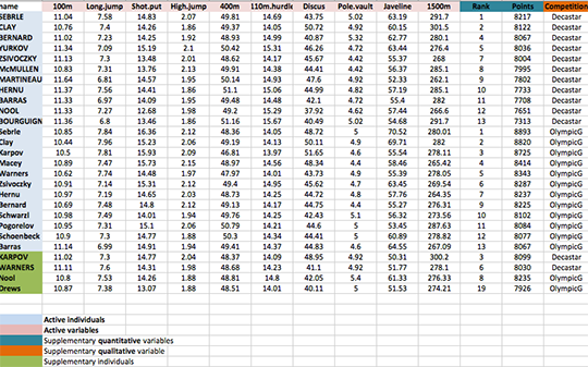
Only some of these individuals and variables will be used to perform the principal component analysis (PCA).

The coordinates of the remaining individuals and variables on the factor map will be predicted after the PCA.


In PCA terminology, our data contains :


  • Active individuals (in blue, rows 1:23) : Individuals that are used during the principal component analysis.
  • Supplementary individuals (in green, rows 24:27) : The coordinates of these individuals will be predicted using the PCA information and parameters obtained with active individuals/variables
  • Active variables (in pink, columns 1:10) : Variables that are used for the principal component analysis.
  • Supplementary variables : As supplementary individuals, the coordinates of these variables will be predicted also.
  • Supplementary continuous variables : Columns 11 and 12 corresponding respectively to the rank and the points of athletes.
  • Supplementary qualitative variables : Column 13 corresponding to the two athletic meetings (2004 Olympic Game or 2004 Decastar). This factor variables will be used to color individuals by groups.


Extract only active individuals and variables for principal component analysis:

decathlon2.active <- decathlon2[1:23, 1:10]
head(decathlon2.active[, 1:6])
          X100m Long.jump Shot.put High.jump X400m X110m.hurdle
SEBRLE    11.04      7.58    14.83      2.07 49.81        14.69
CLAY      10.76      7.40    14.26      1.86 49.37        14.05
BERNARD   11.02      7.23    14.25      1.92 48.93        14.99
YURKOV    11.34      7.09    15.19      2.10 50.42        15.31
ZSIVOCZKY 11.13      7.30    13.48      2.01 48.62        14.17
McMULLEN  10.83      7.31    13.76      2.13 49.91        14.38

Use the R function prcomp() for PCA

res.pca <- prcomp(decathlon2.active, scale = TRUE)

The values returned, by the function prcomp(), are :

names(res.pca)
[1] "sdev"     "rotation" "center"   "scale"    "x"       
  1. sdev : the standard deviations of the principal components (the square roots of the eigenvalues)
head(res.pca$sdev)
[1] 2.0308159 1.3559244 1.1131668 0.9052294 0.8375875 0.6502944
  1. rotation : the matrix of variable loadings (columns are eigenvectors)
head(unclass(res.pca$rotation)[, 1:4])
                    PC1         PC2        PC3         PC4
X100m        -0.4188591  0.13230683 -0.2708996  0.03708806
Long.jump     0.3910648 -0.20713320  0.1711752 -0.12746997
Shot.put      0.3613881 -0.06298590 -0.4649778  0.14191803
High.jump     0.3004132  0.34309742 -0.2965280  0.15968342
X400m        -0.3454786 -0.21400770 -0.2547084  0.47592968
X110m.hurdle -0.3762651  0.01824645 -0.4032525 -0.01866477
  1. center, scale : the centering and scaling used, or FALSE

Variances of the principal components

The variance retained by each principal component can be obtained as follow :

# Eigenvalues
eig <- (res.pca$sdev)^2

# Variances in percentage
variance <- eig*100/sum(eig)

# Cumulative variances
cumvar <- cumsum(variance)

eig.decathlon2.active <- data.frame(eig = eig, variance = variance,
                     cumvariance = cumvar)
head(eig.decathlon2.active)
        eig  variance cumvariance
1 4.1242133 41.242133    41.24213
2 1.8385309 18.385309    59.62744
3 1.2391403 12.391403    72.01885
4 0.8194402  8.194402    80.21325
5 0.7015528  7.015528    87.22878
6 0.4228828  4.228828    91.45760

Note that, you can use the function summary() to extract the eigenvalues and variances from an object of class prcomp.

summary(res.pca)

You can also use the package factoextra. It’s simple :

library("factoextra")
eig.val <- get_eigenvalue(res.pca)
head(eig.val)
      eigenvalue variance.percent cumulative.variance.percent
Dim.1  4.1242133        41.242133                    41.24213
Dim.2  1.8385309        18.385309                    59.62744
Dim.3  1.2391403        12.391403                    72.01885
Dim.4  0.8194402         8.194402                    80.21325
Dim.5  0.7015528         7.015528                    87.22878
Dim.6  0.4228828         4.228828                    91.45760

What mean eigenvalues ?

Recall that eigenvalues measures the variability retained by each PC. It’s large for the first PC and small for the subsequent PCs.

The importance of princpal components (PCs) can be visualized with a scree plot.

Scree plot using base graphics :

barplot(eig.decathlon2.active[, 2], names.arg=1:nrow(eig.decathlon2.active), 
       main = "Variances",
       xlab = "Principal Components",
       ylab = "Percentage of variances",
       col ="steelblue")
# Add connected line segments to the plot
lines(x = 1:nrow(eig.decathlon2.active), 
      eig.decathlon2.active[, 2], 
      type="b", pch=19, col = "red")

Principal component analysis - R software and data mining

~60% of the information (variances) contained in the data are retained by the first two principal components.

Scree plot using factoextra :

fviz_screeplot(res.pca, ncp=10)

Principal component analysis - R software and data mining

It’s also possible to visualize the eigenvalues instead of the variances :

fviz_screeplot(res.pca, ncp=10, choice="eigenvalue")

Principal component analysis - R software and data mining

Read more about fviz_screeplot.

How to determine the number of components to retain?

  • An eigenvalue> 1 indicates that PCs account for more variance than accounted by one of the original variables in standardized data. This is commonly used as a cutoff point for which PCs are retained.
  • You can also limit the number of component to that number that accounts for a certain fraction of the total variance. For example, if you are satisfied with 80% of the total variance explained then use the number of components to achieve that.

Note that, a good dimension reduction is achieved when the the first few PCs account for a large proportion of the variability (80-90%).

Graph of variables : The correlation circle

A simple method to extract the results, for variables, from a PCA output is to use the function get_pca_var() [factoextra]. This function provides a list of matrices containing all the results for the active variables (coordinates, correlation between variables and axes, squared cosine and contributions)

var <- get_pca_var(res.pca)
var
Principal Component Analysis Results for variables
 ===================================================
  Name       Description                                    
1 "$coord"   "Coordinates for the variables"                
2 "$cor"     "Correlations between variables and dimensions"
3 "$cos2"    "Cos2 for the variables"                       
4 "$contrib" "contributions of the variables"               
# Coordinates of variables
var$coord[, 1:4]
                    Dim.1       Dim.2       Dim.3       Dim.4
X100m        -0.850625692  0.17939806 -0.30155643  0.03357320
Long.jump     0.794180641 -0.28085695  0.19054653 -0.11538956
Shot.put      0.733912733 -0.08540412 -0.51759781  0.12846837
High.jump     0.610083985  0.46521415 -0.33008517  0.14455012
X400m        -0.701603377 -0.29017826 -0.28353292  0.43082552
X110m.hurdle -0.764125197  0.02474081 -0.44888733 -0.01689589
Discus        0.743209016 -0.04966086 -0.17652518  0.39500915
Pole.vault   -0.217268042 -0.80745110 -0.09405773 -0.33898477
Javeline      0.428226639 -0.38610928 -0.60412432 -0.33173454
X1500m        0.004278487 -0.78448019  0.21947068  0.44800961

In this section I’ll show you, step by step, how to calculate the coordinates, the cos2 and the contribution of variables.

Coordinates of variables on the principal components

The correlation between variables and principal components is used as coordinates. It can be calculated as follow :

Variable correlations with PCs = loadings * the component standard deviations.

# Helper function : 
# Correlation between variables and principal components
var_cor_func <- function(var.loadings, comp.sdev){
  var.loadings*comp.sdev
  }

# Variable correlation/coordinates
loadings <- res.pca$rotation
sdev <- res.pca$sdev

var.coord <- var.cor <- t(apply(loadings, 1, var_cor_func, sdev))
head(var.coord[, 1:4])
                    PC1         PC2        PC3         PC4
X100m        -0.8506257  0.17939806 -0.3015564  0.03357320
Long.jump     0.7941806 -0.28085695  0.1905465 -0.11538956
Shot.put      0.7339127 -0.08540412 -0.5175978  0.12846837
High.jump     0.6100840  0.46521415 -0.3300852  0.14455012
X400m        -0.7016034 -0.29017826 -0.2835329  0.43082552
X110m.hurdle -0.7641252  0.02474081 -0.4488873 -0.01689589

Graph of variables using R base graph

# Plot the correlation circle
a <- seq(0, 2*pi, length = 100)
plot( cos(a), sin(a), type = 'l', col="gray",
      xlab = "PC1",  ylab = "PC2")

abline(h = 0, v = 0, lty = 2)

# Add active variables
arrows(0, 0, var.coord[, 1], var.coord[, 2], 
      length = 0.1, angle = 15, code = 2)

# Add labels
text(var.coord, labels=rownames(var.coord), cex = 1, adj=1)

Principal component analysis - R software and data mining

Graph of variables using factoextra

fviz_pca_var(res.pca)

Principal component analysis - R software and data mining

Read more about the function fviz_pca_var() : Graph of variables - Principal Component Analysis

How to interpret the correlation plot?

The graph of variables shows the relationships between all variables :

  • Positively correlated variables are grouped together.
  • Negatively correlated variables are positioned on opposite sides of the plot origin (opposed quadrants).
  • The distance between variables and the origine measures the quality of the variables on the factor map. Variables that are away from the origin are well represented on the factor map.

Cos2 : quality of representation for variables on the factor map

The cos2 of variables are calculated as the squared coordinates : var.cos2 = var.coord * var.coord

var.cos2 <- var.coord^2
head(var.cos2[, 1:4])
                   PC1          PC2        PC3          PC4
X100m        0.7235641 0.0321836641 0.09093628 0.0011271597
Long.jump    0.6307229 0.0788806285 0.03630798 0.0133147506
Shot.put     0.5386279 0.0072938636 0.26790749 0.0165041211
High.jump    0.3722025 0.2164242070 0.10895622 0.0208947375
X400m        0.4922473 0.0842034209 0.08039091 0.1856106269
X110m.hurdle 0.5838873 0.0006121077 0.20149984 0.0002854712

Using factoextra package, the color of variables can be automatically controlled by the value of their cos2.

fviz_pca_var(res.pca, col.var="contrib")+
scale_color_gradient2(low="white", mid="blue", 
      high="red", midpoint=55) + theme_minimal()

Principal component analysis - R software and data mining

Contributions of the variables to the principal components

The contribution of a variable to a given principal component is (in percentage) : (var.cos2 * 100) / (total cos2 of the component)

comp.cos2 <- apply(var.cos2, 2, sum)

contrib <- function(var.cos2, comp.cos2){var.cos2*100/comp.cos2}

var.contrib <- t(apply(var.cos2,1, contrib, comp.cos2))
head(var.contrib[, 1:4])
                   PC1        PC2       PC3         PC4
X100m        17.544293  1.7505098  7.338659  0.13755240
Long.jump    15.293168  4.2904162  2.930094  1.62485936
Shot.put     13.060137  0.3967224 21.620432  2.01407269
High.jump     9.024811 11.7715838  8.792888  2.54987951
X400m        11.935544  4.5799296  6.487636 22.65090599
X110m.hurdle 14.157544  0.0332933 16.261261  0.03483735

Highlight the most important (i.e, contributing) variables :

fviz_pca_var(res.pca, col.var="contrib") +
scale_color_gradient2(low="white", mid="blue", 
      high="red", midpoint=50) + theme_minimal()

Principal component analysis - R software and data mining

You can also use the function fviz_contrib() described here : Principal Component Analysis: How to reveal the most important variables in your data?

Graph of individuals

Coordinates of individuals on the principal components

ind.coord <- res.pca$x
head(ind.coord[, 1:4])
                 PC1        PC2        PC3         PC4
SEBRLE     0.1912074 -1.5541282 -0.6283688  0.08205241
CLAY       0.7901217 -2.4204156  1.3568870  1.26984296
BERNARD   -1.3292592 -1.6118687 -0.1961500 -1.92092203
YURKOV    -0.8694134  0.4328779 -2.4739822  0.69723814
ZSIVOCZKY -0.1057450  2.0233632  1.3049312 -0.09929630
McMULLEN   0.1185550  0.9916237  0.8435582  1.31215266

Cos2 : quality of representation for individuals on the principal components

To calculate the cos2 of individuals, 2 simple steps are required :

  1. Calculate the square distance between each individual and the PCA center of gravity
  • d2 = [(var1_ind_i - mean_var1)/sd_var1]^2 + …+ [(var10_ind_i - mean_var10)/sd_var10]^2 + …+..
  1. Calculate the cos2 = ind.coord^2/d2
# Compute the square of the distance between an individual and the
# center of gravity
center <- res.pca$center
scale<- res.pca$scale
getdistance <- function(ind_row, center, scale){
  return(sum(((ind_row-center)/scale)^2))
  }
d2 <- apply(decathlon2.active,1,getdistance, center, scale)

# Compute the cos2
cos2 <- function(ind.coord, d2){return(ind.coord^2/d2)}
ind.cos2 <- apply(ind.coord, 2, cos2, d2)
head(ind.cos2[, 1:4])
                  PC1        PC2         PC3         PC4
SEBRLE    0.007530179 0.49747323 0.081325232 0.001386688
CLAY      0.048701249 0.45701660 0.143628117 0.125791741
BERNARD   0.197199804 0.28996555 0.004294015 0.411819183
YURKOV    0.096109800 0.02382571 0.778230322 0.061812637
ZSIVOCZKY 0.001574385 0.57641944 0.239754152 0.001388216
McMULLEN  0.002175437 0.15219499 0.110137872 0.266486530

The sum of each row is 1, if we consider the 10 components

Contribution of individuals to the princial components

The contribution of individuals (in percentage) to the principal components can be computed as follow :

100 * (1 / number_of_individuals)*(ind.coord^2 / comp_sdev^2)

# Contributions of individuals
contrib <- function(ind.coord, comp.sdev, n.ind){
  100*(1/n.ind)*ind.coord^2/comp.sdev^2
}

ind.contrib <- t(apply(ind.coord,1, contrib, 
                       res.pca$sdev, nrow(ind.coord)))
head(ind.contrib[, 1:4])
                 PC1        PC2        PC3         PC4
SEBRLE    0.03854254  5.7118249  1.3854184  0.03572215
CLAY      0.65814114 13.8541889  6.4600973  8.55568792
BERNARD   1.86273218  6.1441319  0.1349983 19.57827284
YURKOV    0.79686310  0.4431309 21.4755770  2.57939100
ZSIVOCZKY 0.01178829  9.6816398  5.9748485  0.05231437
McMULLEN  0.01481737  2.3253860  2.4967890  9.13531719

Note that the sum of all the contributions per column is 100

Graph of individuals : base graph

plot(ind.coord[,1], ind.coord[,2], pch = 19,  
     xlab="PC1 - 41.2%",ylab="PC2 - 18.4%")
abline(h=0, v=0, lty = 2)
text(ind.coord[,1], ind.coord[,2], labels=rownames(ind.coord),
        cex=0.7, pos = 3)

Principal component analysis - R software and data mining

Biplot of individuals and variables :

biplot(res.pca, cex = 0.8, col = c("black", "red") )

Principal component analysis - R software and data mining

Graph of individuals : factoextra

Extract the results for the individuals

factoextra provides, with less code, a list of matrices containing all the results for the active individuals (coordinates, square cosine, contributions).

ind <- get_pca_ind(res.pca)
ind
Principal Component Analysis Results for individuals
 ===================================================
  Name       Description                       
1 "$coord"   "Coordinates for the individuals" 
2 "$cos2"    "Cos2 for the individuals"        
3 "$contrib" "contributions of the individuals"
# Coordinates for individuals
head(ind$coord[, 1:4])
               Dim.1      Dim.2      Dim.3       Dim.4
SEBRLE     0.1912074 -1.5541282 -0.6283688  0.08205241
CLAY       0.7901217 -2.4204156  1.3568870  1.26984296
BERNARD   -1.3292592 -1.6118687 -0.1961500 -1.92092203
YURKOV    -0.8694134  0.4328779 -2.4739822  0.69723814
ZSIVOCZKY -0.1057450  2.0233632  1.3049312 -0.09929630
McMULLEN   0.1185550  0.9916237  0.8435582  1.31215266

Graph of individuals using factoextra


Note that, in the R code below, the argument data is required only when res.pca is an object of class princomp or prcomp (two functions from the built-in Rstats package).

In other words, if res.pca is a result of PCA functions from FactoMineR or ade4 package, the argument data can be omitted.

Yes, factoextra can also handle the output of FactoMineR and ade4 packages.


Default individuals factor map :

fviz_pca_ind(res.pca)

Principal component analysis - R software and data mining

Control automatically the color of individuals using the cos2 values (the quality of the individuals on the factor map) :

fviz_pca_ind(res.pca, col.ind="cos2") +
scale_color_gradient2(low="white", mid="blue", 
    high="red", midpoint=0.50) + theme_minimal()

Principal component analysis - R software and data mining

Read more about fviz_pca_ind() : Graph of individuals - principal component analysis

Make a biplot of individuals and variables :

fviz_pca_biplot(res.pca,  geom = "text") +
  theme_minimal()

Principal component analysis - R software and data mining

Read more about fviz_pca_biplot() : Biplot of individuals and variables - principal component analysis

Prediction using Principal Component Analysis

Supplementary quantitative variables

As described above, the data sets decathlon2 contain some supplementary continuous variables at columns 11 and 12 corresponding respectively to the rank and the points of athletes.

# Data for the supplementary quantitative variables
quanti.sup <- decathlon2[1:23, 11:12, drop = FALSE]
head(quanti.sup)
          Rank Points
SEBRLE       1   8217
CLAY         2   8122
BERNARD      4   8067
YURKOV       5   8036
ZSIVOCZKY    7   8004
McMULLEN     8   7995

Recall that, rows 24:27 are supplementary individuals. We don’t want them in this current analysis. This is why, I extracted only rows 1:23.

In this section we’ll see how to calculate the predicted coordinates of these two variables using the information provided by the previously performed principal component analysis.

2 simples steps are required :

  1. Calculate the correlation between each supplementary quantitative variables and the principal components
  2. Make a factor map of all variables (active and supplementary ones) to visualize the position of the supplementary variables

The R code below can be used :

# Calculate the correlations between supplementary variables
# and the principal components
ind.coord <- res.pca$x
quanti.coord <- cor(quanti.sup, ind.coord)
head(quanti.coord[, 1:4])
              PC1         PC2        PC3         PC4
Rank   -0.7014777  0.24519443  0.1834294  0.05575186
Points  0.9637075 -0.07768262 -0.1580225 -0.16623092
# Variable factor maps
#++++++++++++++++++
# Plot the correlation circle
a <- seq(0, 2*pi, length = 100)
plot( cos(a), sin(a), type = 'l', col="gray",
      xlab = "PC1",  ylab = "PC2")
abline(h = 0, v = 0, lty = 2)
# Add active variables
var.coord <- get_pca_var(res.pca)$coord
arrows(0 ,0, x1=var.coord[,1], y1 = var.coord[,2], 
       col="black", length = 0.09)
text(var.coord[,1], var.coord[,2],
     labels=rownames(var.coord), cex=0.8)
# Add supplementary quantitative variables
arrows(0 ,0, x1= quanti.coord[,1], y1 = quanti.coord[,2], 
       col="blue", lty =2, length = 0.09)
text(quanti.coord[,1], quanti.coord[,2],
     labels=rownames(quanti.coord), cex=0.8, col ="blue")

Principal component analysis - R software and data mining

It’s also possible to make the graph of variables using factoextra:

# Plot of active variables
p <- fviz_pca_var(res.pca)
# Add supplementary active variables
fviz_add(p, quanti.coord, color ="blue", geom="arrow")

Principal component analysis - R software and data mining

# get the cos2 of the supplementary quantitative variables
(quanti.coord^2)[, 1:4]
             PC1         PC2        PC3        PC4
Rank   0.4920710 0.060120310 0.03364635 0.00310827
Points 0.9287322 0.006034589 0.02497110 0.02763272

Supplementary qualitative variables

The data sets decathlon2 contain a supplementary qualitative variable at columns 13 corresponding to the type of competitions.

Qualitative variable can be helpful for interpreting the data and for coloring individuals by groups :

# Data for the supplementary qualitative variables
quali.sup <- as.factor(decathlon2[1:23, 13])
head(quali.sup)
[1] Decastar Decastar Decastar Decastar Decastar Decastar
Levels: Decastar OlympicG

Color individuals by groups :

fviz_pca_ind(res.pca, 
  habillage = quali.sup, addEllipses = TRUE, ellipse.level = 0.68) +
  theme_minimal()

Principal component analysis - R software and data mining

Note that, the argument habillage is used to specify the variable containing the groups of individuals

It’s very easy to get the coordinates for the levels of a supplementary qualitative variables. The helper function below can be used :

# Return the coordinates of a group levels
# x : coordinate of individuals on x axis
# y : coordinate of indiviuals on y axis
get_coord_quali<-function(x, y, groups){
  data.frame(
    x= tapply(x, groups, mean),
    y = tapply(y, groups, mean)
  )
}

Calculate the coordinates on components 1 and 2 :

coord.quali <- get_coord_quali(ind.coord[,1], ind.coord[,2],
                               groups = quali.sup)
coord.quali
                 x          y
Decastar -1.313921 -0.1191322
OlympicG  1.204428  0.1092046

Supplementary individuals

The data sets decathlon2 contain some supplementary individuals from row 24 to 27.

# Data for the supplementary individuals
ind.sup <- decathlon2[24:27, 1:10, drop = FALSE]
ind.sup[, 1:6]
        X100m Long.jump Shot.put High.jump X400m X110m.hurdle
KARPOV  11.02      7.30    14.77      2.04 48.37        14.09
WARNERS 11.11      7.60    14.31      1.98 48.68        14.23
Nool    10.80      7.53    14.26      1.88 48.81        14.80
Drews   10.87      7.38    13.07      1.88 48.51        14.01

Remember that, columns 11:13 are supplementary variables. We don’t want them in this current analysis. This is why, I extracted only columns 1:10. I used also the argument drop = FALSE to preserve the type of the data (which is a data.frame).

In this section we’ll see how to predict the coordinates of the supplementary individuals using only the information provided by the previously performed principal component analysis.

A simple function to predict the coordinates of new individuals data

One simple approach is to use the function predict() from the built-in R stats package :

ind.sup.coord <- predict(res.pca, newdata = ind.sup)
ind.sup.coord[, 1:4]
               PC1         PC2       PC3        PC4
KARPOV   0.7772521 -0.76237804 1.5971253  1.6863286
WARNERS -0.3779697  0.11891968 1.7005146 -0.6908084
Nool    -0.5468405 -1.93402211 0.4724184 -2.2283706
Drews   -1.0848227 -0.01703198 2.9818031 -1.5006207

Calculate the predicted coordinates by hand

2 simples steps are required :

  1. Center and scale the values for the supplementary individuals using the center and the scale of the PCA
  2. Calculate the predicted coordinates by multiplying the scaled values with the eigenvectors (loadings) of the principal components.

The R code below can be used :

# Centering and scaling the supplementary individuals
scale_func <- function(ind_row, center, scale){
  (ind_row-center)/scale
}

ind.scaled <- t(apply(ind.sup, 1, scale_func, res.pca$center, res.pca$scale))

# Coordinates of the individividuals
pca.loadings <- res.pca$rotation
coord_func <- function(ind, loadings){
  r <- loadings*ind
  r <- apply(r, 2, sum)
  r
}

ind.sup.coord <- t(apply(ind.scaled, 1, coord_func, pca.loadings ))
ind.sup.coord[, 1:4]
               PC1         PC2       PC3        PC4
KARPOV   0.7772521 -0.76237804 1.5971253  1.6863286
WARNERS -0.3779697  0.11891968 1.7005146 -0.6908084
Nool    -0.5468405 -1.93402211 0.4724184 -2.2283706
Drews   -1.0848227 -0.01703198 2.9818031 -1.5006207

Make a factor map including the supplementary individuals using factoextra

# Plot of active individuals
p <- fviz_pca_ind(res.pca)
# Add supplementary individuals
fviz_add(p, ind.sup.coord, color ="blue")

Principal component analysis - R software and data mining

Infos

This analysis has been performed using R software (ver. 3.1.2) and factoextra (ver. 1.0.2)

Read more :


Correspondence analysis basics - R software and data mining

$
0
0


Correspondence analysis (CA) is an extension of Principal Component Analysis (PCA) suited to analyze frequencies formed by qualitative variables (i.e, contingency table).

This R tutorial describes the idea and the mathematical procedures of Correspondence Analysis (CA) using R software.

The mathematical procedures of CA are complex and require matrix algebra.

In this tutorial, I put a lot of effort into writing all the formula in a very simple format so that every beginner can understand the methods.

Required package

FactoMineR(for computing CA) and factoextra (for CA visualization) packages are used.

These packages can be installed as follow :

install.packages("FactoMineR")

# install.packages("devtools")
devtools::install_github("kassambara/factoextra")

Load FactoMineR and factoextra

library("FactoMineR")
library("factoextra")

Data format: Contingency tables

We’ll use the data set housetasks[in factoextra]

data(housetasks)
head(housetasks)
           Wife Alternating Husband Jointly
Laundry     156          14       2       4
Main_meal   124          20       5       4
Dinner       77          11       7      13
Breakfeast   82          36      15       7
Tidying      53          11       1      57
Dishes       32          24       4      53

An image of the data is shown below:

Data format correspondence analysis


The data is a contingency table containing 13 housetasks and their repartition in the couple :

  • rows are the different tasks
  • values are the frequencies of the tasks done:
  • by the wife only
  • alternatively
  • by the husband only
  • or jointly


As the above contingency table is not very large, with a quick visual examination it can be seen that:

  • The house tasks Laundry, Main_Meal and Dinner are dominant in the column Wife
  • Repairs are dominant in the column Husband
  • Holidays are dominant in the column Jointly

Visualize a contingency table using graphical matrix

To easily interpret the contingency table, a graphical matrix can be drawn using the function balloonplot() [in gplots package]. In this graph, each cell contains a dot whose size reflects the relative magnitude of the value it contains.

library("gplots")
# 1. convert the data as a table
dt <- as.table(as.matrix(housetasks))
# 2. Graph
balloonplot(t(dt), main ="housetasks", xlab ="", ylab="",
            label = FALSE, show.margins = FALSE)

Correspondence analysis basics - R software and data mining

For a very large contingency table, the visual interpretation would be very hard. Other methods are required such as correspondence analysis.

I will describe step by step many tools and statistical approaches to visualize, analyse and interpret a contingency table.

Row sums and column sums

Row sums (row.sum) and column sums (col.sum) are called row margins and column margins, respectively. They can be calculated as follow:

# Row margins
row.sum <- apply(housetasks, 1, sum)
head(row.sum)
   Laundry  Main_meal     Dinner Breakfeast    Tidying     Dishes 
       176        153        108        140        122        113 
# Column margins
col.sum <- apply(housetasks, 2, sum)
head(col.sum)
       Wife Alternating     Husband     Jointly 
        600         254         381         509 
# grand total
n <- sum(housetasks)

The grand total is the total sum of all values in the contingency table.

The contingency table with row and column margins are shown below:

Wife

Alternating

Husband

Jointly

TOTAL

Laundry

156

14

2

4

176

Main_meal

124

20

5

4

153

Dinner

77

11

7

13

108

Breakfeast

82

36

15

7

140

Tidying

53

11

1

57

122

Dishes

32

24

4

53

113

Shopping

33

23

9

55

120

Official

12

46

23

15

96

Driving

10

51

75

3

139

Finances

13

13

21

66

113

Insurance

8

1

53

77

139

Repairs

0

3

160

2

165

Holidays

0

1

6

153

160

TOTAL

600

254

381

509

1744

  • Row margins: light gray
  • Column margins: light blue
  • The grand total (the total of all values in the table): pink

Row variables

To compare rows, we can analyse their profiles in order to identify similar row variables.

Row profiles

The profile of a given row is calculated by taking each row point and dividing by its margin (i.e, the sum of all row points). The formula is:


\[ row.profile = \frac{row}{row.sum} \]


For example the profile of the row point Laundry/wife is P = 156/176 = 88.6%.

The R code below can be used to compute row profiles:

row.profile <- housetasks/row.sum
# head(row.profile)

Wife

Alternating

Husband

Jointly

TOTAL

Laundry

0.88636364

0.079545455

0.011363636

0.02272727

1

Main_meal

0.81045752

0.130718954

0.032679739

0.02614379

1

Dinner

0.71296296

0.101851852

0.064814815

0.12037037

1

Breakfeast

0.58571429

0.257142857

0.107142857

0.05000000

1

Tidying

0.43442623

0.090163934

0.008196721

0.46721311

1

Dishes

0.28318584

0.212389381

0.035398230

0.46902655

1

Shopping

0.27500000

0.191666667

0.075000000

0.45833333

1

Official

0.12500000

0.479166667

0.239583333

0.15625000

1

Driving

0.07194245

0.366906475

0.539568345

0.02158273

1

Finances

0.11504425

0.115044248

0.185840708

0.58407080

1

Insurance

0.05755396

0.007194245

0.381294964

0.55395683

1

Repairs

0.00000000

0.018181818

0.969696970

0.01212121

1

Holidays

0.00000000

0.006250000

0.037500000

0.95625000

1

TOTAL

0.34403670

0.145642202

0.218463303

0.29185780

1

In the table above, the row TOTAL (in light blue) is called the average row profile (or marginal profile of columns or column margin)

The average row profile is computed as follow:


\[ average.rp = \frac{column.sum}{grand.total} \]


For example, the average row profile is : (600/1744, 254/1744, 381/1744, 509/1744). It can be computed in R as follow:

# Column sums
col.sum <- apply(housetasks, 2, sum)
# average row profile = Column sums / grand total
average.rp <- col.sum/n 
average.rp
       Wife Alternating     Husband     Jointly 
  0.3440367   0.1456422   0.2184633   0.2918578 

Distance (or similarity) between row profiles

If we want to compare 2 rows (row1 and row2), we need to compute the squared distance between their profiles as follow:


\[ d^2(row_1, row_2) = \sum{\frac{(row.profile_1 - row.profile_2)^2}{average.profile}} \]


This distance is called Chi-square distance.

For example the distance between the rows Laundry and Main_meal are:

\[ d^2(Laundry, Main\_meal) = \frac{(0.886-0.810)^2}{0.344} + \frac{(0.0795-0.131)^2}{0.146} + ... = 0.036 \]

The distance between Laundry and Main_meal can be calculated as follow in R:

# Laundry and Main_meal profiles
laundry.p <- row.profile["Laundry",]
main_meal.p <- row.profile["Main_meal",]
# Distance between Laundry and Main_meal
d2 <- sum(((laundry.p - main_meal.p)^2) / average.rp)
d2
[1] 0.03684787

The distance between Laundry and Driving is:

# Driving profile
driving.p <- row.profile["Driving",]
# Distance between Laundry and Driving
d2 <- sum(((laundry.p - driving.p)^2) / average.rp)
d2
[1] 3.772028

Note that, the rows Laundry and Main_meal are very close (d2 ~ 0.036, similar profiles) compared to the rows Laundry and Driving (d2 ~ 3.77)

You can also compute the squared distance between each row profile and the average row profile in order to view rows that are the most similar or different to the average row.

Squared distance between each row profile and the average row profile


\[ d^2(row_i, average.profile) = \sum{\frac{(row.profile_i - average.profile)^2}{average.profile}} \]


The R code below computes the distance from the average profile for all the row variables:

d2.row <- apply(row.profile, 1, 
        function(row.p, av.p){sum(((row.p - av.p)^2)/av.p)}, 
        average.rp)
as.matrix(round(d2.row,3))
            [,1]
Laundry    1.329
Main_meal  1.034
Dinner     0.618
Breakfeast 0.512
Tidying    0.353
Dishes     0.302
Shopping   0.218
Official   0.968
Driving    1.274
Finances   0.456
Insurance  0.727
Repairs    3.307
Holidays   2.140

The rows Repairs, Holidays, Laundry and Driving have the most different profiles from the average profile.

Distance matrix

In this section the squared distance is computed between each row profile and the other rows in the contingency table.

The result is a distance matrix (a kind of correlation or dissimilarity matrix).

The custom R function below is used to compute the distance matrix:

## data: a data frame or matrix; 
## average.profile: average profile
dist.matrix <- function(data, average.profile){
   mat <- as.matrix(t(data))
    n <- ncol(mat)
    dist.mat<- matrix(NA, n, n)
    diag(dist.mat) <- 0
    for (i in 1:(n - 1)) {
        for (j in (i + 1):n) {
            d2 <- sum(((mat[, i] - mat[, j])^2) / average.profile)
            dist.mat[i, j] <- dist.mat[j, i] <- d2
        }
    }
  colnames(dist.mat) <- rownames(dist.mat) <- colnames(mat)
  dist.mat
}

Compute and visualize the distance between row profiles. The package corrplot is required for the visualization. It can be installed as follow: install.packages(“corrplot”).

# Distance matrix
dist.mat <- dist.matrix(row.profile, average.rp)
dist.mat <-round(dist.mat, 2)
# Visualize the matrix
library("corrplot")
corrplot(dist.mat, type="upper",  is.corr = FALSE)

Correspondence analysis basics - R software and data mining

The size of the circle is proportional to the magnitude of the distance between row profiles.

When the data contains many categories, correspondence analysis is very useful to visualize the similarity between items.

Row mass and inertia

The Row mass (or row weight) is the total frequency of a given row. It’s calculated as follow:


\[ row.mass = \frac{row.sum}{grand.total} \]


row.sum <- apply(housetasks, 1, sum)
grand.total <- sum(housetasks)
row.mass <- row.sum/grand.total
head(row.mass)
   Laundry  Main_meal     Dinner Breakfeast    Tidying     Dishes 
0.10091743 0.08772936 0.06192661 0.08027523 0.06995413 0.06479358 

The Row inertia is calculated as the row mass multiplied by the squared distance between the row and the average row profile:


\[ row.inertia = row.mass * d^2(row) \]


  • The inertia of a row (or a column) is the amount of information it contains.
  • The total inertia is the total information contained in the data table. It’s computed as the sum of rows inertia (or equivalently, as the sum of columns inertia)


# Row inertia
row.inertia <- row.mass * d2.row
head(row.inertia)
   Laundry  Main_meal     Dinner Breakfeast    Tidying     Dishes 
0.13415976 0.09069235 0.03824633 0.04112368 0.02466697 0.01958732 
# Total inertia
sum(row.inertia)
[1] 1.11494

The total inertia corresponds to the amount of the information the data contains.

Row summary

The result for rows can be summarized as follow:

row <- cbind.data.frame(d2 = d2.row, mass = row.mass, inertia = row.inertia)
round(row,3)
              d2  mass inertia
Laundry    1.329 0.101   0.134
Main_meal  1.034 0.088   0.091
Dinner     0.618 0.062   0.038
Breakfeast 0.512 0.080   0.041
Tidying    0.353 0.070   0.025
Dishes     0.302 0.065   0.020
Shopping   0.218 0.069   0.015
Official   0.968 0.055   0.053
Driving    1.274 0.080   0.102
Finances   0.456 0.065   0.030
Insurance  0.727 0.080   0.058
Repairs    3.307 0.095   0.313
Holidays   2.140 0.092   0.196

Column variables

Column profiles

These are calculated in the same way as the row profiles table.

The profile of a given column is computed as follow:


\[ col.profile = \frac{col}{col.sum} \]


The R code below can be used to compute column profile:

col.profile <- t(housetasks)/col.sum
col.profile <- as.data.frame(t(col.profile))
# head(col.profile)

Wife

Alternating

Husband

Jointly

TOTAL

Laundry

0.26000000

0.055118110

0.005249344

0.007858546

0.10091743

Main_meal

0.20666667

0.078740157

0.013123360

0.007858546

0.08772936

Dinner

0.12833333

0.043307087

0.018372703

0.025540275

0.06192661

Breakfeast

0.13666667

0.141732283

0.039370079

0.013752456

0.08027523

Tidying

0.08833333

0.043307087

0.002624672

0.111984283

0.06995413

Dishes

0.05333333

0.094488189

0.010498688

0.104125737

0.06479358

Shopping

0.05500000

0.090551181

0.023622047

0.108055010

0.06880734

Official

0.02000000

0.181102362

0.060367454

0.029469548

0.05504587

Driving

0.01666667

0.200787402

0.196850394

0.005893910

0.07970183

Finances

0.02166667

0.051181102

0.055118110

0.129666012

0.06479358

Insurance

0.01333333

0.003937008

0.139107612

0.151277014

0.07970183

Repairs

0.00000000

0.011811024

0.419947507

0.003929273

0.09461009

Holidays

0.00000000

0.003937008

0.015748031

0.300589391

0.09174312

TOTAL

1.00000000

1.000000000

1.000000000

1.000000000

1.00000000

In the table above, the column TOTAL is called the average column profile (or marginale profile of rows)

The average column profile is calculated as follow:


\[ average.cp = row.sum/grand.total \]


For example, the average column profile is : (176/1744, 153/1744, 108/1744, 140/1744, …). It can be computed in R as follow:

# Row sums
row.sum <- apply(housetasks, 1, sum)
# average column profile= row sums/grand total
average.cp <- row.sum/n 
head(average.cp)
   Laundry  Main_meal     Dinner Breakfeast    Tidying     Dishes 
0.10091743 0.08772936 0.06192661 0.08027523 0.06995413 0.06479358 

Distance (similarity) between column profiles

If we want to compare columns, we need to compute the squared distance between their profiles as follow:


\[ d^2(col_1, col_2) = \sum{\frac{(col.profile_1 - col.profile_2)^2}{average.profile}} \]


For example the distance between the columns Wife and Husband are:

\[ d^2(Wife, Husband) = \frac{(0.26-0.005)^2}{0.10} + \frac{(0.21-0.013)^2}{0.09} + ... + ... = 4.05 \]

The distance between Wife and Husband can be calculated as follow in R:

# Wife and Husband profiles
wife.p <- col.profile[, "Wife"]
husband.p <- col.profile[, "Husband"]
# Distance between Wife and Husband
d2 <- sum(((wife.p - husband.p)^2) / average.cp)
d2
[1] 4.050311

You can also compute the squared distance between each column profile and the average column profile

Squared distance between each column profile and the average column profile


\[ d^2(col_i, average.profile) = \sum{\frac{(col.profile_i - average.profile)^2}{average.profile}} \]


The R code below computes the distance from the average profile for all the column variables

d2.col <- apply(col.profile, 2, 
        function(col.p, av.p){sum(((col.p - av.p)^2)/av.p)}, 
        average.cp)
round(d2.col,3)
       Wife Alternating     Husband     Jointly 
      0.875       0.809       1.746       1.078 

Distance matrix

# Distance matrix
dist.mat <- dist.matrix(t(col.profile), average.cp)
dist.mat <-round(dist.mat, 2)
dist.mat
            Wife Alternating Husband Jointly
Wife        0.00        1.71    4.05    2.93
Alternating 1.71        0.00    2.67    2.58
Husband     4.05        2.67    0.00    3.70
Jointly     2.93        2.58    3.70    0.00
# Visualize the matrix
library("corrplot")
corrplot(dist.mat, type="upper", order="hclust", is.corr = FALSE)

Correspondence analysis basics - R software and data mining

column mass and inertia

The column mass(or column weight) is the total frequency of each column. It’s calculated as follow:


\[ col.mass = \frac{col.sum}{grand.total} \]


col.sum <- apply(housetasks, 2, sum)
grand.total <- sum(housetasks)
col.mass <- col.sum/grand.total
head(col.mass)
       Wife Alternating     Husband     Jointly 
  0.3440367   0.1456422   0.2184633   0.2918578 

The column inertia is calculated as the column mass multiplied by the squared distance between the column and the average column profile:


\[ col.inertia = col.mass * d^2(col) \]


col.inertia <- col.mass * d2.col
head(col.inertia)
       Wife Alternating     Husband     Jointly 
  0.3010185   0.1178242   0.3813729   0.3147248 
# total inertia
sum(col.inertia)
[1] 1.11494

Recall that the total inertia corresponds to the amount of the information the data contains. Note that, the total inertia obtained using column profile is the same as the one obtained when analyzing row profile. That’s normal, because we are analyzing the same data with just a different angle of view.

Column summary

The result for rows can be summarized as follow:

col <- cbind.data.frame(d2 = d2.col, mass = col.mass, 
                        inertia = col.inertia)
round(col,3)
               d2  mass inertia
Wife        0.875 0.344   0.301
Alternating 0.809 0.146   0.118
Husband     1.746 0.218   0.381
Jointly     1.078 0.292   0.315

Association between row and column variables

When the contingency table is not very large (as above), it’s easy to visually inspect and interpret row and column profiles:

  • It’s evident that, the housetasks - Laundry, Main_Meal and Dinner - are more frequently done by the “Wife”.
  • Repairs and driving are dominantly done by the husband
  • Holidays are more frequently taken jointly

Larger contingency table is complex to interpret visually and several methods are required to help to this process.

Another statistical method that can be applied to contingency table is the Chi-square test of independence.

Chi-square test

Chi-square test issued to examine whether rows and columns of a contingency table are statistically significantly associated.

  • Null hypothesis (H0): the row and the column variables of the contingency table are independent.
  • Alternative hypothesis (H1): row and column variables are dependent

For each cell of the table, we have to calculate the expected value under null hypothesis.

For a given cell, the expected value is calculated as follow:


\[ e = \frac{row.sum * col.sum}{grand.total} \]

The Chi-square statistic is calculated as follow:


\[ \chi^2 = \sum{\frac{(o - e)^2}{e}} \]

  • o is the observed value
  • e is the expected value


This calculated Chi-square statistic is compared to the critical value (obtained from statistical tables) with \(df = (r - 1)(c - 1)\) degrees of freedom and p = 0.05.

  • r is the number of rows in the contingency table
  • c is the number of column in the contingency table

If the calculated Chi-square statistic is greater than the critical value, then we must conclude that the row and the column variables are not independent of each other. This implies that they are significantly associated.

Note that, Chi-square test should only be applied when the expected frequency of any cell is at least 5.

Chi-square statistic can be easily computed using the function chisq.test() as follow:

chisq <- chisq.test(housetasks)
chisq

    Pearson's Chi-squared test

data:  housetasks
X-squared = 1944.456, df = 36, p-value < 2.2e-16

In our example, the row and the column variables are statistically significantly associated(p-value = 0)

Note that, while Chi-square test can help to establish dependence between rows and the columns, the nature of the dependency is unknown.

The observed and the expected counts can be extracted from the result of the test as follow:

# Observed counts
chisq$observed
           Wife Alternating Husband Jointly
Laundry     156          14       2       4
Main_meal   124          20       5       4
Dinner       77          11       7      13
Breakfeast   82          36      15       7
Tidying      53          11       1      57
Dishes       32          24       4      53
Shopping     33          23       9      55
Official     12          46      23      15
Driving      10          51      75       3
Finances     13          13      21      66
Insurance     8           1      53      77
Repairs       0           3     160       2
Holidays      0           1       6     153
# Expected counts
round(chisq$expected,2)
            Wife Alternating Husband Jointly
Laundry    60.55       25.63   38.45   51.37
Main_meal  52.64       22.28   33.42   44.65
Dinner     37.16       15.73   23.59   31.52
Breakfeast 48.17       20.39   30.58   40.86
Tidying    41.97       17.77   26.65   35.61
Dishes     38.88       16.46   24.69   32.98
Shopping   41.28       17.48   26.22   35.02
Official   33.03       13.98   20.97   28.02
Driving    47.82       20.24   30.37   40.57
Finances   38.88       16.46   24.69   32.98
Insurance  47.82       20.24   30.37   40.57
Repairs    56.77       24.03   36.05   48.16
Holidays   55.05       23.30   34.95   46.70

As mentioned above the Chi-square statistic is 1944.456196.

Which are the most contributing cells to the definition of the total Chi-square statistic?

If you want to know the most contributing cells to the total Chi-square score, you just have to calculate the Chi-square statistic for each cell:

\[ r = \frac{o - e}{\sqrt{e}} \]

The above formula returns the so-called Pearson residuals (r) for each cell (or standardized residuals)

Cells with the highest absolute standardized residuals contribute the most to the total Chi-square score.

Pearson residuals can be easily extracted from the output of the function chisq.test():

round(chisq$residuals, 3)
             Wife Alternating Husband Jointly
Laundry    12.266      -2.298  -5.878  -6.609
Main_meal   9.836      -0.484  -4.917  -6.084
Dinner      6.537      -1.192  -3.416  -3.299
Breakfeast  4.875       3.457  -2.818  -5.297
Tidying     1.702      -1.606  -4.969   3.585
Dishes     -1.103       1.859  -4.163   3.486
Shopping   -1.289       1.321  -3.362   3.376
Official   -3.659       8.563   0.443  -2.459
Driving    -5.469       6.836   8.100  -5.898
Finances   -4.150      -0.852  -0.742   5.750
Insurance  -5.758      -4.277   4.107   5.720
Repairs    -7.534      -4.290  20.646  -6.651
Holidays   -7.419      -4.620  -4.897  15.556

Let’s visualize Pearson residuals using the package corrplot:

library(corrplot)
corrplot(chisq$residuals, is.cor = FALSE)

Correspondence analysis basics - R software and data mining

For a given cell, the size of the circle is proportional to the amount of the cell contribution.

The sign of the standardized residuals is also very important to interpret the association between rows and columns as explained in the block below.


  1. Positive residuals are in blue. Positive values in cells specify an attraction (positive association) between the corresponding row and column variables.
  • In the image above, it’s evident that there are an association between the column Wife and the rows Laundry, Main_meal.
  • There is a strong positive association between the column Husband and the row Repair
  1. Negative residuals are in red. This implies a repulsion (negative association) between the corresponding row and column variables. For example the column Wife are negatively associated (~ “not associated”) with the row Repairs. There is a repulsion between the column Husband and, the rows Laundry and Main_meal


Note that, correspondence analysis is just the singular value decomposition of the standardized residuals. This will be explained in the next section.

The contribution (in %) of a given cell to the total Chi-square score is calculated as follow:


\[ contrib = \frac{r^2}{\chi^2} \]


  • r is the residual of the cell
# Contibution in percentage (%)
contrib <- 100*chisq$residuals^2/chisq$statistic
round(contrib, 3)
            Wife Alternating Husband Jointly
Laundry    7.738       0.272   1.777   2.246
Main_meal  4.976       0.012   1.243   1.903
Dinner     2.197       0.073   0.600   0.560
Breakfeast 1.222       0.615   0.408   1.443
Tidying    0.149       0.133   1.270   0.661
Dishes     0.063       0.178   0.891   0.625
Shopping   0.085       0.090   0.581   0.586
Official   0.688       3.771   0.010   0.311
Driving    1.538       2.403   3.374   1.789
Finances   0.886       0.037   0.028   1.700
Insurance  1.705       0.941   0.868   1.683
Repairs    2.919       0.947  21.921   2.275
Holidays   2.831       1.098   1.233  12.445
# Visualize the contribution
corrplot(contrib, is.cor = FALSE)

Correspondence analysis basics - R software and data mining

The relative contribution of each cell to the total Chi-square score give some indication of the nature of the dependency between rows and columns of the contingency table.

It can be seen that:

  1. The column “Wife” is strongly associated with Laundry, Main_meal, Dinner
  2. The column “Husband” is strongly associated with the row Repairs
  3. The column jointly is frequently associated with the row Holidays

From the image above, it can be seen that the most contributing cells to the Chi-square are Wife/Laundry (7.74%), Wife/Main_meal (4.98%), Husband/Repairs (21.9%), Jointly/Holidays (12.44%).

These cells contribute about 47.06% to the total Chi-square score and thus account for most of the difference between expected and observed values.

This confirms the earlier visual interpretation of the data. As stated earlier, visual interpretation may be complex when the contingency table is very large. In this case, the contribution of one cell to the total Chi-square score becomes a useful way of establishing the nature of dependency.

Chi-square statistic and the total inertia

As mentioned above, the total inertia is the amount of the information contained in the data table.

It’s called \(\phi^2\) (squared phi) and is calculated as follow:


\[ \phi^2 = \frac{\chi^2}{grand.total} \]


phi2 <- as.numeric(chisq$statistic/sum(housetasks))
phi2
[1] 1.11494

The square root of \(\phi^2\) are called trace and may be interpreted as a correlation coefficient(Bendixen, 2003). Any value of the trace > 0.2 indicates a significant dependency between rows and columns (Bendixen M., 2003)

Graphical representation of a contingency table: Mosaic plot

Mosaic plot is used to visualize a contingency table in order to examine the association between categorical variables.

The function mosaicplot() [in garphics package] can be used.

library("graphics")
# Mosaic plot of observed values
mosaicplot(housetasks,  las=2, col="steelblue",
           main = "housetasks - observed counts")

Correspondence analysis basics - R software and data mining

# Mosaic plot of expected values
mosaicplot(chisq$expected,  las=2, col = "gray",
           main = "housetasks - expected counts")

Correspondence analysis basics - R software and data mining

In these plots, column variables are firstly splited (vertical split) and then row variables are splited(horizontal split). For each cell, the height of bars is proportional to the observed relative frequency it contains:

\[ \frac{cell.value}{column.sum} \]

The blue plot, is the mosaic plot of the observed values. The gray one is the mosaic plot of the expected values under null hypothesis.

If row and column variables were completely independent the mosaic bars for the observed values (blue graph) would be aligned as the mosaic bars for the expected values (gray graph).

It’s also possible to color the mosaic plot according to the value of the standardized residuals:

mosaicplot(housetasks, shade = TRUE, las=2,main = "housetasks")

Correspondence analysis basics - R software and data mining

  • The argument shade is used to color the graph
  • The argument las = 2 produces vertical labels

  • This plot clearly show you that Laundry, Main_meal, Dinner and Breakfeast are more often done by the “Wife”.
  • Repairs are done by the Husband


G-test: Likelihood ratio test

The G–test of independence is an alternative to the chi-square test of independence, and they will give approximately the same conclusion.

The test is based on the likelihood ratio defined as follow:


\[ ratio = \frac{o}{e} \]


  • o is the observed value
  • e is the expected value under null hypothesis

This likelihood ratio, or its logarithm, can be used to compute a p-value. When the logarithm of the likelihood ratio is used, the statistic is known as a log-likelihood ratio statistic.

This test is called G-test or likelihood ratio test or maximum likelihood statistical significance test) and can be used in situations where Chi-square tests were previously recommended.

The G-test is generally defined as follow:


\[ G = 2 * \sum{o * log(\frac{o}{e})} \]


  • o is the observed frequency in a cell
  • e is the expected frequency under the null hypothesis
  • log is the natural logarithm
  • The sum is taken over all non-empty cells.


The distribution of G is approximately a chi-squared distribution, with the same number of degrees of freedom as in the corresponding chi-squared test:


\[df = (r - 1)(c - 1)\]


  • r is the number of rows in the contingency table
  • c is the number of column in the contingency table

The commonly used Pearson Chi-square test is, in fact, just an approximation of the log-likelihood ratio on which the G-tests are based.

Remember that, the Chi-square formula is:

\[ \chi^2 = \sum{\frac{(o - e)^2}{e}} \]


Likelihood ratio test in R

The functions likelihood.test()[in Deducer package] or G.test()[in RVAideMemoire] can be used to perform a G-test on a contingency table.

We’ll use the package RVAideMemoire which can be installed as follow : install.packages(“RVAideMemoire”).

The function G.test() work as chisq.test():

library("RVAideMemoire")
gtest <- G.test(as.matrix(housetasks))
gtest

    G-test

data:  as.matrix(housetasks)
G = 1907.658, df = 36, p-value < 2.2e-16

Interpret the association between rows and columns using likelihood ratio

To interpret the association between the rows and the columns of the contingency table, the likelihood ratio can be used as an index (i):


\[ ratio = \frac{o}{e} \]


For a given cell,

  • If ratio > 1, there is an “attraction” (association) between the corresponding column and row
  • If ratio < 1, there is a “repulsion” between the corresponding column and row

The ratio can be calculated as follow:

ratio <- chisq$observed/chisq$expected
round(ratio,3)
            Wife Alternating Husband Jointly
Laundry    2.576       0.546   0.052   0.078
Main_meal  2.356       0.898   0.150   0.090
Dinner     2.072       0.699   0.297   0.412
Breakfeast 1.702       1.766   0.490   0.171
Tidying    1.263       0.619   0.038   1.601
Dishes     0.823       1.458   0.162   1.607
Shopping   0.799       1.316   0.343   1.570
Official   0.363       3.290   1.097   0.535
Driving    0.209       2.519   2.470   0.074
Finances   0.334       0.790   0.851   2.001
Insurance  0.167       0.049   1.745   1.898
Repairs    0.000       0.125   4.439   0.042
Holidays   0.000       0.043   0.172   3.276

Note that, you can also use the R code : gtest$observed/gtest$expected

The package corrplot can be used to make a graph of the likelihood ratio:

corrplot(ratio, is.cor = FALSE)

Correspondence analysis basics - R software and data mining

The image above confirms our previous observations:

  • The rows Laundry, Main_meal and Dinner are associated with the column Wife
  • Repairs are done more often by the Husband
  • Holidays are taken Jointly

Let’s take the log(ratio) to see the attraction and the repulsion in different colors:

  • If ratio < 1 => log(ratio) < 0 (negative values) => red color
  • If ratio > 1 = > log(ratio) > 0 (positive values) => blue color

We’ll also add a small value (0.5) to all cells to avoid log(0):

corrplot(log2(ratio + 0.5), is.cor = FALSE)

Correspondence analysis basics - R software and data mining

Correspondence analysis

Correspondence analysis (CA) is required for large contingency table.

It used to graphically visualize row points and column points in a low dimensional space.

CA is a dimensional reduction method applied to a contingency table. The information retained by each dimension is called eigenvalue.

The total information (or inertia) contained in the data is called phi (\(\phi^2\)) and can be calculated as follow:


\[ \phi^2 = \frac{\chi^2}{grand.total} \]


For a given axis, the eigenvalue (\(\lambda\)) is computed as follow:


\[ \lambda_{axis} = \sum{\frac{row.sum}{grand.total} * row.coord^2} \]


Or equivalently


\[ \lambda_{axis} = \sum{\frac{col.sum}{grand.total} * col.coord^2} \]


  • row.coord and col.coord are the coordinates of row and column variables on the axis.

The association index between a row and column for the principal axes can be computed as follow:


\[ i = 1 + \sum{\frac{row.coord * col.coord}{\sqrt{\lambda}}} \]

  • \(\lambda\) is the eigenvalue of the axes
  • The sum denotes the sum for all axis


If there is an attraction the corresponding row and column coordinates have the same sign on the axes. If there is a repulsion the corresponding row and column coordinates have different signs on the axes. A high value indicates a strong attraction or repulsion

CA - Singular value decomposition of the standardized residuals

Correspondence analysis (CA) is used to represent graphically the table of distances between row variables or between column variables.

CA approach includes the following steps:

  • STEP 1. Compute the standardized residuals

The standardized residuals (S) is:

\[ S = \frac{o - e}{\sqrt{e}} \]

In fact, S is just the square roots of the terms comprising \(\chi^2\) statistic.

STEP II. Compute the singular value decomposition (SVD) of the standardized residuals.

Let M be: \(M = \frac{1}{sqrt(grand.total)} \times S\)

SVD means that we want to find orthogonal matrices U and V, together with a diagonal matrix \(\Delta\), such that:


\[ M = U \Delta V^T \]


(Phillip M. Yelland, 2010)

  • \(U\) is a matrix containing row eigenvectors
  • \(\Delta\) is the diagonal matrix. The numbers on the diagonal of the matrix are called singular values (SV). The eigenvalues are the squared SV.
  • \(V\) is a matrix containing column eigenvectors

The eigenvalue of a given axis is:


\[ \lambda = \delta^2 \]


  • \(\delta\) is the singular value

The coordinates of row variables on a given axis are:


\[ row.coord = \frac{U * \delta }{\sqrt{row.mass}} \]


The coordinates of columns are:


\[ col.coord = \frac{V * \delta }{\sqrt{col.mass}} \]


Compute SVD in R:

# Grand total
n <- sum(housetasks)
# Standardized residuals
residuals <- chisq$residuals/sqrt(n)
# Number of dimensions
nb.axes <- min(nrow(residuals)-1, ncol(residuals)-1)
# Singular value decomposition
res.svd <- svd(residuals, nu = nb.axes, nv = nb.axes)
res.svd
$d
[1] 7.368102e-01 6.670853e-01 3.564385e-01 1.012225e-16

$u
             [,1]        [,2]        [,3]
 [1,] -0.42762952 -0.23587902 -0.28228398
 [2,] -0.35197789 -0.21761257 -0.13633376
 [3,] -0.23391020 -0.11493572 -0.14480767
 [4,] -0.19557424 -0.19231779  0.17519699
 [5,] -0.14136307  0.17221046 -0.06990952
 [6,] -0.06528142  0.16864510  0.19063825
 [7,] -0.04189568  0.15859251  0.14910925
 [8,]  0.07216535 -0.08919754  0.60778606
 [9,]  0.28421536 -0.27652950  0.43123528
[10,]  0.09354184  0.23576569  0.02484968
[11,]  0.24793268  0.20050833 -0.22918636
[12,]  0.63820133 -0.39850534 -0.40738669
[13,]  0.10379321  0.65156733 -0.11011902

$v
            [,1]       [,2]       [,3]
[1,] -0.66679846 -0.3211267 -0.3289692
[2,] -0.03220853 -0.1668171  0.9085662
[3,]  0.73643655 -0.4217418 -0.2476526
[4,]  0.10956112  0.8313745 -0.0703917
sv <- res.svd$d[1:nb.axes] # singular value
u <-res.svd$u
v <- res.svd$v

Eigenvalues and screeplot

# Eigenvalues
eig <- sv^2
# Variances in percentage
variance <- eig*100/sum(eig)
# Cumulative variances
cumvar <- cumsum(variance)

eig<- data.frame(eig = eig, variance = variance,
                     cumvariance = cumvar)
head(eig)
        eig variance cumvariance
1 0.5428893 48.69222    48.69222
2 0.4450028 39.91269    88.60491
3 0.1270484 11.39509   100.00000
barplot(eig[, 2], names.arg=1:nrow(eig), 
       main = "Variances",
       xlab = "Dimensions",
       ylab = "Percentage of variances",
       col ="steelblue")
# Add connected line segments to the plot
lines(x = 1:nrow(eig), eig[, 2], 
      type="b", pch=19, col = "red")

Correspondence analysis basics - R software and data mining

How many dimensions to retain?:

  1. The maximum number of axes in the CA is :

\[ nb.axes = min( r-1, c-1) \]


r and c are respectively the number of rows and columns in the table.

  1. Use elbow method

Row coordinates

We can use the function apply to perform arbitrary operations on the rows and columns of a matrix.

A simplified format is:

apply(X, MARGIN, FUN, ...)
  • x: a matrix
  • MARGIN: allowed values can be 1 or 2. 1 specifies that we want to operate on the rows of the matrix. 2 specifies that we want to operate on the column.
  • FUN: the function to be applied
  • …: optional arguments to FUN
# row sum
row.sum <- apply(housetasks, 1, sum)
# row mass
row.mass <- row.sum/n

# row coord = sv * u /sqrt(row.mass)
cc <- t(apply(u, 1, '*', sv)) # each row X sv
row.coord <- apply(cc, 2, '/', sqrt(row.mass))
rownames(row.coord) <- rownames(housetasks)
colnames(row.coord) <- paste0("Dim.", 1:nb.axes)
round(row.coord,3)
            Dim.1  Dim.2  Dim.3
Laundry    -0.992 -0.495 -0.317
Main_meal  -0.876 -0.490 -0.164
Dinner     -0.693 -0.308 -0.207
Breakfeast -0.509 -0.453  0.220
Tidying    -0.394  0.434 -0.094
Dishes     -0.189  0.442  0.267
Shopping   -0.118  0.403  0.203
Official    0.227 -0.254  0.923
Driving     0.742 -0.653  0.544
Finances    0.271  0.618  0.035
Insurance   0.647  0.474 -0.289
Repairs     1.529 -0.864 -0.472
Holidays    0.252  1.435 -0.130
# plot
plot(row.coord, pch=19, col = "blue")
text(row.coord, labels =rownames(row.coord), pos = 3, col ="blue")
abline(v=0, h=0, lty = 2)

Correspondence analysis basics - R software and data mining

Column coordinates

# Coordinates of columns
col.sum <- apply(housetasks, 2, sum)
col.mass <- col.sum/n
# coordinates sv * v /sqrt(col.mass)
cc <- t(apply(v, 1, '*', sv))
col.coord <- apply(cc, 2, '/', sqrt(col.mass))
rownames(col.coord) <- colnames(housetasks)
colnames(col.coord) <- paste0("Dim", 1:nb.axes)
head(col.coord)
                   Dim1       Dim2        Dim3
Wife        -0.83762154 -0.3652207 -0.19991139
Alternating -0.06218462 -0.2915938  0.84858939
Husband      1.16091847 -0.6019199 -0.18885924
Jointly      0.14942609  1.0265791 -0.04644302
# plot
plot(col.coord, pch=17, col = "red")
text(col.coord, labels =rownames(col.coord), pos = 3, col ="red")
abline(v=0, h=0, lty = 2)

Correspondence analysis basics - R software and data mining

Biplot of rows and columns to view the association

xlim <- range(c(row.coord[,1], col.coord[,1]))*1.1
ylim <- range(c(row.coord[,2], col.coord[,2]))*1.1
# Plot of rows
plot(row.coord, pch=19, col = "blue", xlim = xlim, ylim = ylim)
text(row.coord, labels =rownames(row.coord), pos = 3, col ="blue")
# plot off columns
points(col.coord, pch=17, col = "red")
text(col.coord, labels =rownames(col.coord), pos = 3, col ="red")
abline(v=0, h=0, lty = 2)

Correspondence analysis basics - R software and data mining

You can interpret the distance between rows points or between column points but the distance between column points and row points are not meaningful.

Diagnostic

Recall that, the total inertia contained in the data is:


\[ \phi^2 = \frac{\chi^2}{n} = 1.11494 \]


Our two-dimensional plot captures about 88% of the total inertia of the table.

Contribution of rows and columns

The contributions of a rows/columns to the definition of a principal axis are :


\[ row.contrib = \frac{row.mass * row.coord^2}{eigenvalue} \]


\[ col.contrib = \frac{col.mass * col.coord^2}{eigenvalue} \]


Contribution of rows in %

# contrib <- row.mass * row.coord^2/eigenvalue
cc <- apply(row.coord^2, 2, "*", row.mass)
row.contrib <- t(apply(cc, 1, "/", eig[1:nb.axes,1])) *100
round(row.contrib, 2)
           Dim.1 Dim.2 Dim.3
Laundry    18.29  5.56  7.97
Main_meal  12.39  4.74  1.86
Dinner      5.47  1.32  2.10
Breakfeast  3.82  3.70  3.07
Tidying     2.00  2.97  0.49
Dishes      0.43  2.84  3.63
Shopping    0.18  2.52  2.22
Official    0.52  0.80 36.94
Driving     8.08  7.65 18.60
Finances    0.88  5.56  0.06
Insurance   6.15  4.02  5.25
Repairs    40.73 15.88 16.60
Holidays    1.08 42.45  1.21
corrplot(row.contrib, is.cor = FALSE)

Correspondence analysis basics - R software and data mining

Contribution of columns in %

# contrib <- col.mass * col.coord^2/eigenvalue
cc <- apply(col.coord^2, 2, "*", col.mass)
col.contrib <- t(apply(cc, 1, "/", eig[1:nb.axes,1])) *100
round(col.contrib, 2)
             Dim1  Dim2  Dim3
Wife        44.46 10.31 10.82
Alternating  0.10  2.78 82.55
Husband     54.23 17.79  6.13
Jointly      1.20 69.12  0.50
corrplot(col.contrib, is.cor = FALSE)

Correspondence analysis basics - R software and data mining

Quality of the representation

The quality of the representation is called COS2.

The quality of the representation of a row on an axis is:


\[ row.cos2 = \frac{row.coord^2}{d^2} \]


  • row.coord is the coordinate of the row on the axis
  • \(d^2\) is the squared distance from the average profile

Recall that the distance between each row profile and the average row profile is:


\[ d^2(row_i, average.profile) = \sum{\frac{(row.profile_i - average.profile)^2}{average.profile}} \]


row.profile <- housetasks/row.sum
head(round(row.profile, 3))
            Wife Alternating Husband Jointly
Laundry    0.886       0.080   0.011   0.023
Main_meal  0.810       0.131   0.033   0.026
Dinner     0.713       0.102   0.065   0.120
Breakfeast 0.586       0.257   0.107   0.050
Tidying    0.434       0.090   0.008   0.467
Dishes     0.283       0.212   0.035   0.469
average.profile <- col.sum/n
head(round(average.profile, 3))
       Wife Alternating     Husband     Jointly 
      0.344       0.146       0.218       0.292 

The R code below computes the distance from the average profile for all the row variables

d2.row <- apply(row.profile, 1, 
                function(row.p, av.p){sum(((row.p - av.p)^2)/av.p)}, 
                average.rp)
head(round(d2.row,3))
   Laundry  Main_meal     Dinner Breakfeast    Tidying     Dishes 
     1.329      1.034      0.618      0.512      0.353      0.302 

The cos2 of rows on the factor map are:

row.cos2 <- apply(row.coord^2, 2, "/", d2.row)
round(row.cos2, 3)
           Dim.1 Dim.2 Dim.3
Laundry    0.740 0.185 0.075
Main_meal  0.742 0.232 0.026
Dinner     0.777 0.154 0.070
Breakfeast 0.505 0.400 0.095
Tidying    0.440 0.535 0.025
Dishes     0.118 0.646 0.236
Shopping   0.064 0.748 0.189
Official   0.053 0.066 0.881
Driving    0.432 0.335 0.233
Finances   0.161 0.837 0.003
Insurance  0.576 0.309 0.115
Repairs    0.707 0.226 0.067
Holidays   0.030 0.962 0.008

visualize the cos2:

corrplot(row.cos2, is.cor = FALSE)

Correspondence analysis basics - R software and data mining

Cos2 of columns


\[ col.cos2 = \frac{col.coord^2}{d^2} \]


col.profile <- t(housetasks)/col.sum
col.profile <- t(col.profile)
#head(round(col.profile, 3))

average.profile <- row.sum/n
#head(round(average.profile, 3))

The R code below computes the distance from the average profile for all the column variables

d2.col <- apply(col.profile, 2, 
        function(col.p, av.p){sum(((col.p - av.p)^2)/av.p)}, 
        average.profile)
#round(d2.col,3)

The cos2 of columns on the factor map are:

col.cos2 <- apply(col.coord^2, 2, "/", d2.col)
round(col.cos2, 3)
             Dim1  Dim2  Dim3
Wife        0.802 0.152 0.046
Alternating 0.005 0.105 0.890
Husband     0.772 0.208 0.020
Jointly     0.021 0.977 0.002

visualize the cos2:

corrplot(col.cos2, is.cor = FALSE)

Correspondence analysis basics - R software and data mining

Supplementary rows/columns

The supplementary row coordinates


\[ sup.row.coord = sup.row.profile * \frac{v}{\sqrt{col.mass}} \]


# Supplementary row
sup.row <- as.data.frame(housetasks["Dishes",, drop = FALSE])
# Supplementary row profile
sup.row.sum <- apply(sup.row, 1, sum)
sup.row.profile <- sweep(sup.row, 1, sup.row.sum, "/")
# V/sqrt(col.mass)
vv <- sweep(v, 1, sqrt(col.mass), FUN = "/")
# Supplementary row coord
sup.row.coord <- as.matrix(sup.row.profile) %*% vv
sup.row.coord
             [,1]      [,2]      [,3]
Dishes -0.1889641 0.4419662 0.2669493
## COS2 = coor^2/Distance from average profile
d2.row <- apply(sup.row.profile, 1, 
        function(row.p, av.p){sum(((row.p - av.p)^2)/av.p)}, 
        average.rp)
sup.row.cos2 <- sweep(sup.row.coord^2, 1, d2.row, FUN = "/")

Packages in R

There are many packages for CA:

  • FactoMineR
  • ade4
  • ca
library(FactoMineR)
res.ca <- CA(housetasks, graph = F)
# print
res.ca
**Results of the Correspondence Analysis (CA)**
The row variable has  13  categories; the column variable has 4 categories
The chi square of independence between the two variables is equal to 1944.456 (p-value =  0 ).
*The results are available in the following objects:

   name              description                   
1  "$eig"            "eigenvalues"                 
2  "$col"            "results for the columns"     
3  "$col$coord"      "coord. for the columns"      
4  "$col$cos2"       "cos2 for the columns"        
5  "$col$contrib"    "contributions of the columns"
6  "$row"            "results for the rows"        
7  "$row$coord"      "coord. for the rows"         
8  "$row$cos2"       "cos2 for the rows"           
9  "$row$contrib"    "contributions of the rows"   
10 "$call"           "summary called parameters"   
11 "$call$marge.col" "weights of the columns"      
12 "$call$marge.row" "weights of the rows"         
# eigenvalue
head(res.ca$eig)[, 1:2]
        eigenvalue percentage of variance
dim 1 5.428893e-01           4.869222e+01
dim 2 4.450028e-01           3.991269e+01
dim 3 1.270484e-01           1.139509e+01
dim 4 5.119700e-33           4.591904e-31
# barplot of percentage of variance
barplot(res.ca$eig[,2], names.arg = rownames(res.ca$eig))

Correspondence analysis basics - R software and data mining

# Plot row points
plot(res.ca, invisible ="col")

Correspondence analysis basics - R software and data mining

# Plot column points
plot(res.ca, invisible ="col")

Correspondence analysis basics - R software and data mining

# Biplot of rows and columns
plot(res.ca)

Correspondence analysis basics - R software and data mining

Infos

This analysis has been performed using R software (ver. 3.1.2), FactoMineR (ver. 1.29) and factoextra (ver. 1.0.2)

ggplot2 - Easy way to mix multiple graphs on the same page - R software and data visualization

$
0
0


To arrange multiple ggplot2 graphs on the same page, the standard R functions - par() and layout() - cannot be used.

This R tutorial will show you, step by step, how to put several ggplots on a single page.

The functions grid.arrange()[in the package gridExtra] and plot_grid()[in the package cowplot], will be used.

Install and load required packages

Install and load the package gridExtra

install.packages("gridExtra")
library("gridExtra")

Install and load the package cowplot

cowplot can be installed as follow:

install.packages("cowplot")

OR

as follow using devtools package (devtools should be installed before using the code below):

devtools::install_github("wilkelab/cowplot")

Load cowplot:

library("cowplot")

Prepare some data

ToothGrowth data is used :

df <- ToothGrowth
# Convert the variable dose from a numeric to a factor variable
df$dose <- as.factor(df$dose)
head(df)
##    len supp dose
## 1  4.2   VC  0.5
## 2 11.5   VC  0.5
## 3  7.3   VC  0.5
## 4  5.8   VC  0.5
## 5  6.4   VC  0.5
## 6 10.0   VC  0.5

Cowplot: Publication-ready plots

The cowplot package is an extension to ggplot2 and it can be used to provide a publication-ready plots.

Basic plots

library(cowplot)
# Default plot
bp <- ggplot(df, aes(x=dose, y=len, color=dose)) +
  geom_boxplot() + 
  theme(legend.position = "none")
bp

# Add gridlines
bp + background_grid(major = "xy", minor = "none")

ggplot2 arrange multiple graphs on the same page, R software and data visualizationggplot2 arrange multiple graphs on the same page, R software and data visualization

Recall that, the function ggsave()[in ggplot2 package] can be used to save ggplots. However, when working with cowplot, the function save_plot() [in cowplot package] is preferred. It’s an alternative to ggsave with a better support for multi-figur plots.

save_plot("mpg.pdf", plot.mpg,
          base_aspect_ratio = 1.3 # make room for figure legend
          )

Arranging multiple graphs using cowplot

# Scatter plot
sp <- ggplot(mpg, aes(x = cty, y = hwy, colour = factor(cyl)))+ 
  geom_point(size=2.5)
sp

# Bar plot
bp <- ggplot(diamonds, aes(clarity, fill = cut)) +
  geom_bar() +
  theme(axis.text.x = element_text(angle=70, vjust=0.5))
bp

ggplot2 arrange multiple graphs on the same page, R software and data visualizationggplot2 arrange multiple graphs on the same page, R software and data visualization

Combine the two plots (the scatter plot and the bar plot):

plot_grid(sp, bp, labels=c("A", "B"), ncol = 2, nrow = 1)

ggplot2 arrange multiple graphs on the same page, R software and data visualization

The function draw_plot() can be used to place graphs at particular locations with a particular sizes. The format of the function is:

draw_plot(plot, x = 0, y = 0, width = 1, height = 1)
  • plot: the plot to place (ggplot2 or a gtable)
  • x: The x location of the lower left corner of the plot.
  • y: The y location of the lower left corner of the plot.
  • width, height: the width and the height of the plot

The function ggdraw() is used to initialize an empty drawing canvas.

plot.iris <- ggplot(iris, aes(Sepal.Length, Sepal.Width)) + 
  geom_point() + facet_grid(. ~ Species) + stat_smooth(method = "lm") +
  background_grid(major = 'y', minor = "none") + # add thin horizontal lines 
  panel_border() # and a border around each panel
# plot.mpt and plot.diamonds were defined earlier
ggdraw() +
  draw_plot(plot.iris, 0, .5, 1, .5) +
  draw_plot(sp, 0, 0, .5, .5) +
  draw_plot(bp, .5, 0, .5, .5) +
  draw_plot_label(c("A", "B", "C"), c(0, 0, 0.5), c(1, 0.5, 0.5), size = 15)

ggplot2 arrange multiple graphs on the same page, R software and data visualization

grid.arrange: Create and arrange multiple plots

The R code below creates a box plot, a dot plot, a violin plot and a stripchart (jitter plot) :

library(ggplot2)
# Create a box plot
bp <- ggplot(df, aes(x=dose, y=len, color=dose)) +
  geom_boxplot() + 
  theme(legend.position = "none")

# Create a dot plot
# Add the mean point and the standard deviation
dp <- ggplot(df, aes(x=dose, y=len, fill=dose)) +
  geom_dotplot(binaxis='y', stackdir='center')+
  stat_summary(fun.data=mean_sdl, mult=1, 
                 geom="pointrange", color="red")+
   theme(legend.position = "none")

# Create a violin plot
vp <- ggplot(df, aes(x=dose, y=len)) +
  geom_violin()+
  geom_boxplot(width=0.1)

# Create a stripchart
sc <- ggplot(df, aes(x=dose, y=len, color=dose, shape=dose)) +
  geom_jitter(position=position_jitter(0.2))+
  theme(legend.position = "none") +
  theme_gray()

Combine the plots using the function grid.arrange() [in gridExtra] :

library(gridExtra)
grid.arrange(bp, dp, vp, sc, ncol=2, 
             main="Multiple plots on the same page")

ggplot2 arrange multiple graphs on the same page, R software and data visualization

Add a common legend for multiple ggplot2 graphs

This can be done in four simple steps :

  1. Create the plots : p1, p2, ….
  2. Save the legend of the plot p1 as an external graphical element (called a “grob” in Grid terminology)
  3. Remove the legends from all plots
  4. Draw all the plots with only one legend in the right panel

To save the legend of a ggplot, the helper function below can be used :

library(gridExtra)
get_legend<-function(myggplot){
  tmp <- ggplot_gtable(ggplot_build(myggplot))
  leg <- which(sapply(tmp$grobs, function(x) x$name) == "guide-box")
  legend <- tmp$grobs[[leg]]
  return(legend)
}

(The function above is derived from this forum. )

# 1. Create the plots
#++++++++++++++++++++++++++++++++++
# Create a box plot
bp <- ggplot(df, aes(x=dose, y=len, color=dose)) +
  geom_boxplot()

# Create a violin plot
vp <- ggplot(df, aes(x=dose, y=len, color=dose)) +
  geom_violin()+
  geom_boxplot(width=0.1)+
  theme(legend.position="none")

# 2. Save the legend
#+++++++++++++++++++++++
legend <- get_legend(bp)

# 3. Remove the legend from the box plot
#+++++++++++++++++++++++
bp <- bp + theme(legend.position="none")

# 4. Arrange ggplot2 graphs with a specific width
grid.arrange(bp, vp, legend, ncol=3, widths=c(2.3, 2.3, 0.8))

ggplot2 arrange multiple graphs on the same page, R software and data visualization

Scatter plot with marginal density plots

Step 1/3. Create some data :

set.seed(1234)
x <- c(rnorm(500, mean = -1), rnorm(500, mean = 1.5))
y <- c(rnorm(500, mean = 1), rnorm(500, mean = 1.7))
group <- as.factor(rep(c(1,2), each=500))
df2 <- data.frame(x, y, group)
head(df2)
##             x          y group
## 1 -2.20706575 -0.2053334     1
## 2 -0.72257076  1.3014667     1
## 3  0.08444118 -0.5391452     1
## 4 -3.34569770  1.6353707     1
## 5 -0.57087531  1.7029518     1
## 6 -0.49394411 -0.9058829     1

Step 2/3. Create the plots :

# Scatter plot of x and y variables and color by groups
scatterPlot <- ggplot(df2,aes(x, y, color=group)) + 
  geom_point() + 
  scale_color_manual(values = c('#999999','#E69F00')) + 
  theme(legend.position=c(0,1), legend.justification=c(0,1))


# Marginal density plot of x (top panel)
xdensity <- ggplot(df2, aes(x, fill=group)) + 
  geom_density(alpha=.5) + 
  scale_fill_manual(values = c('#999999','#E69F00')) + 
  theme(legend.position = "none")

# Marginal density plot of y (right panel)
ydensity <- ggplot(df2, aes(y, fill=group)) + 
  geom_density(alpha=.5) + 
  scale_fill_manual(values = c('#999999','#E69F00')) + 
  theme(legend.position = "none")

Create a blank placeholder plot :

blankPlot <- ggplot()+geom_blank(aes(1,1))+
  theme(
    plot.background = element_blank(), 
   panel.grid.major = element_blank(),
   panel.grid.minor = element_blank(), 
   panel.border = element_blank(),
   panel.background = element_blank(),
   axis.title.x = element_blank(),
   axis.title.y = element_blank(),
   axis.text.x = element_blank(), 
   axis.text.y = element_blank(),
   axis.ticks = element_blank(),
   axis.line = element_blank()
     )

Step 3/3. Put the plots together:

Arrange ggplot2 with adapted height and width for each row and column :

library("gridExtra")
grid.arrange(xdensity, blankPlot, scatterPlot, ydensity, 
        ncol=2, nrow=2, widths=c(4, 1.4), heights=c(1.4, 4))

ggplot2 arrange multiple graphs on the same page, R software and data visualization

Create a complex layout using the function viewport()

The different steps are :

  1. Create plots : p1, p2, p3, ….
  2. Move to a new page on a grid device using the function grid.newpage()
  3. Create a layout 2X2 - number of columns = 2; number of rows = 2
  4. Define a grid viewport : a rectangular region on a graphics device
  5. Print a plot into the viewport
# Move to a new page
grid.newpage()

# Create layout : nrow = 2, ncol = 2
pushViewport(viewport(layout = grid.layout(2, 2)))

# A helper function to define a region on the layout
define_region <- function(row, col){
  viewport(layout.pos.row = row, layout.pos.col = col)
} 

# Arrange the plots
print(scatterPlot, vp=define_region(1, 1:2))
print(xdensity, vp = define_region(2, 1))
print(ydensity, vp = define_region(2, 2))

ggplot2 arrange multiple graphs on the same page, R software and data visualization

Insert an external graphical element inside a ggplot

The function annotation_custom() [in ggplot2] can be used for adding tables, plots or other grid-based elements. The simplified format is :

annotation_custom(grob, xmin, xmax, ymin, ymax)

  • grob: the external graphical element to display
  • xmin, xmax : x location in data coordinates (horizontal location)
  • ymin, ymax : y location in data coordinates (vertical location)


The different steps are :

  1. Create a scatter plot of y = f(x)
  2. Add, for example, the box plot of the variables x and y inside the scatter plot using the function annotation_custom()

As the inset box plot overlaps with some points, a transparent background is used for the box plots.

# Create a transparent theme object
transparent_theme <- theme(
 axis.title.x = element_blank(),
 axis.title.y = element_blank(),
 axis.text.x = element_blank(), 
 axis.text.y = element_blank(),
 axis.ticks = element_blank(),
 panel.grid = element_blank(),
 axis.line = element_blank(),
 panel.background = element_rect(fill = "transparent",colour = NA),
 plot.background = element_rect(fill = "transparent",colour = NA))

Create the graphs :

p1 <- scatterPlot # see previous sections for the scatterPlot

# Box plot of the x variable
p2 <- ggplot(df2, aes(factor(1), x))+
  geom_boxplot(width=0.3)+coord_flip()+
  transparent_theme

# Box plot of the y variable
p3 <- ggplot(df2, aes(factor(1), y))+
  geom_boxplot(width=0.3)+
  transparent_theme

# Create the external graphical elements
# called a "grop" in Grid terminology
p2_grob = ggplotGrob(p2)
p3_grob = ggplotGrob(p3)

# Insert p2_grob inside the scatter plot
xmin <- min(x); xmax <- max(x)
ymin <- min(y); ymax <- max(y)
p1 + annotation_custom(grob = p2_grob, xmin = xmin, xmax = xmax, 
                       ymin = ymin-1.5, ymax = ymin+1.5)

ggplot2 arrange multiple graphs on the same page, R software and data visualization

# Insert p3_grob inside the scatter plot
p1 + annotation_custom(grob = p3_grob,
                       xmin = xmin-1.5, xmax = xmin+1.5, 
                       ymin = ymin, ymax = ymax)

ggplot2 arrange multiple graphs on the same page, R software and data visualization

If you have a solution to insert, at the same time, both p2_grob and p3_grob inside the scatter plot, please let me a comment. I got some errors trying to do this…

Mix table, text and ggplot2 graphs

The functions below are required :

  • tableGrob() [in the package gridExtra] : for adding a data table to a graphic device
  • splitTextGrob() [in the package RGraphics] : for adding a text to a graph

Make sure that the package RGraphics is installed.

library(RGraphics)
library(gridExtra)

# Table
p1 <- tableGrob(head(ToothGrowth))

# Text
text <- "ToothGrowth data describes the effect of Vitamin C on tooth growth in Guinea pigs.  Three dose levels of Vitamin C (0.5, 1, and 2 mg) with each of two delivery methods [orange juice (OJ) or ascorbic acid (VC)] are used."
p2 <- splitTextGrob(text)

# Box plot
p3 <- ggplot(df, aes(x=dose, y=len)) + geom_boxplot()

# Arrange the plots on the same page
grid.arrange(p1, p2, p3, ncol=1)

ggplot2 arrange multiple graphs on the same page, R software and data visualization

Infos

This analysis has been performed using R software (ver. 3.1.2) and ggplot2 (ver. 1.0.0)

ggplot2 - Introduction

$
0
0

Introduction

ggplot2 is a powerful R package to produce elegant graphics. It’s implemented by Hadley Wickham. The gg in ggplot2 means Grammar of Graphics, a graphic concept which describes plots by using a “grammar”.

Two main functions are available in ggplot2 package : a qplot() and ggplot() functions.

  • qplot() is a quick plot function which is easy to use for simple plots.
  • The ggplot() function use the powerful grammar of graphics to build plot piece by piece.

According to ggplot2 concept, a plot can be divide in different fundamental parts : Plot <- data + Aesthetics + Geometry.

  • data is a data frame
  • Aesthetics is used to indicate x and y variables. It can also be used to control the color, the size or the shape of a point, the height of a bar, etc…..
  • Geometry corresponds to the type of graphics (histogram, box plot, line plot, density plot, dot plot, ….)

This document describes how to create and customize different types of graphs using ggplot2. Many examples of code and graphics are provided.

Some examples of graphs, described in this document, are shown below:

ggplot2 - R software and data visualizationggplot2 - R software and data visualizationggplot2 - R software and data visualizationggplot2 - R software and data visualizationggplot2 - R software and data visualizationggplot2 - R software and data visualizationggplot2 - R software and data visualizationggplot2 - R software and data visualizationggplot2 - R software and data visualizationggplot2 - R software and data visualizationggplot2 - R software and data visualization

Install and load ggplot2 package

# Installation
install.packages('ggplot2')
# Loading
library(ggplot2)

Data format

The data must be a data.frame (columns are variables and rows are observations).

The data set mtcars is used in the examples below:

data(mtcars)
df <- mtcars[, c("mpg", "cyl", "wt")]
head(df)
##                    mpg cyl    wt
## Mazda RX4         21.0   6 2.620
## Mazda RX4 Wag     21.0   6 2.875
## Datsun 710        22.8   4 2.320
## Hornet 4 Drive    21.4   6 3.215
## Hornet Sportabout 18.7   8 3.440
## Valiant           18.1   6 3.460


mtcars : Motor Trend Car Road Tests.

Description: The data comprises fuel consumption and 10 aspects of automobile design and performance for 32 automobiles (1973 - 74 models).

Format: A data frame with 32 observations on 3 variables.

  • [, 1] mpg Miles/(US) gallon
  • [, 2] cyl Number of cylinders
  • [, 3] wt Weight (lb/1000)


Quick plot : qplot()

The function qplot() is very similar to the basic plot() function from the R base package. It can be used to create and combine easily different types of plots. However, it remains less flexible than the function ggplot().

This chapter provides a brief introduction to qplot(). Concerning the function ggplot(), many articles are available at the end of this web page for creating and customizing different plots using ggplot().

Usage

A simplified format of qplot() is :

qplot(x, y=NULL, data, geom="auto", 
      xlim = c(NA, NA), ylim =c(NA, NA))

  • x : x values
  • y : y values (optional)
  • data : data frame to use (optional).
  • geom : Character vector specifying geom to use. Defaults to “point” if x and y are specified, and “histogram” if only x is specified.
  • xlim, ylim: x and y axis limits


Other arguments including main, xlab, ylab and log can be used also:

  • main: Plot title
  • xlab, ylab: x and y axis labels
  • log: which variables to log transform. Allowed values are “x”, “y” or “xy”

Scatter plots

Basic scatter plots

The plot can be created using data from either numeric vectors or a data frame:

# Use data from numeric vectors
x <- 1:10; y = x*x
# Basic plot
qplot(x,y)

# Add line
qplot(x, y, geom=c("point", "line"))

# Use data from a data frame
qplot(mpg, wt, data=mtcars)

ggplot2 - R software and data visualizationggplot2 - R software and data visualizationggplot2 - R software and data visualization

Scatter plots with linear fits

The option smooth is used to add a smoothed line with its standard error:

# Smoothing
qplot(mpg, wt, data = mtcars, geom = c("point", "smooth"))

# Regression line
qplot(mpg, wt, data = mtcars, geom = c("point", "smooth"),
      method="lm")

ggplot2 - R software and data visualizationggplot2 - R software and data visualization

To draw a regression line the argument method = “lm” is used in combination with geom = “smoth”.

The allowed values for the argument method includes:

  • method = “loess”: This is the default value for small number of observations. It computes a smooth local regression. You can read more about loess using the R code ?loess.
  • method =“lm”: It fits a linear model. Note that, it’s also possible to indicate the formula as formula = y ~ poly(x, 3) to specify a degree 3 polynomial.

Linear fits by groups

The argument color is used to tell R that we want to color the points by groups:

# Linear fits by group
qplot(mpg, wt, data = mtcars, color = factor(cyl),
      geom=c("point", "smooth"),
      method="lm")

ggplot2 - R software and data visualization

Change scatter plot colors

Points can be colored according to the values of a continuous or a discrete variable. The argument colour is used.

# Change the color by a continuous numeric variable
qplot(mpg, wt, data = mtcars, colour = cyl)

# Change the color by groups (factor)
df <- mtcars
df[,'cyl'] <- as.factor(df[,'cyl'])
qplot(mpg, wt, data = df, colour = cyl)

# Add lines
qplot(mpg, wt, data = df, colour = cyl,
      geom=c("point", "line"))

ggplot2 - R software and data visualizationggplot2 - R software and data visualizationggplot2 - R software and data visualization


Note that you can also use the following R code to generate the second plot :

qplot(mpg, wt, data=df, colour= factor(cyl))


Change the shape and the size of points

Like color, the shape and the size of points can be controlled by a continuous or discrete variable.

# Change the size of points according to 
  # the values of a continuous variable
qplot(mpg, wt, data = mtcars, size = mpg)

# Change point shapes by groups
qplot(mpg, wt, data = mtcars, shape = factor(cyl))

ggplot2 - R software and data visualizationggplot2 - R software and data visualization

Scatter plot with texts

The argument label is used to specify the texts to be used for each points:

qplot(mpg, wt, data = mtcars, label = rownames(mtcars), 
      geom=c("point", "text"),
      hjust=0, vjust=0)

ggplot2 - R software and data visualization

Bar plot

It’s possible to draw a bar plot using the argument geom = “bar”.

If you want y to represent counts of cases, use stat = “bin” and don’t map a variable to y. If you want y to represent values in the data, use stat = “identity”.

# y represents the count of cases
qplot(mpg, data = mtcars, geom = "bar")

# y represents values in the data
index <- 1:nrow(mtcars)
qplot(index, mpg, data = mtcars, 
      geom = "bar", stat = "identity")

ggplot2 - R software and data visualizationggplot2 - R software and data visualization

Change bar plot fill color

# Order the data by cyl and then by mpg values
df <- mtcars[order(mtcars[, "cyl"], mtcars[, "mpg"]),]
df[,'cyl'] <- as.factor(df[,'cyl'])
index <- 1:nrow(df)

# Change fill color by group (cyl)
qplot(index, mpg, data = df, 
      geom = "bar", stat = "identity", fill = cyl)

ggplot2 - R software and data visualization

Box plot, dot plot and violin plot

PlantGrowth data set is used in the following example :

head(PlantGrowth)
##   weight group
## 1   4.17  ctrl
## 2   5.58  ctrl
## 3   5.18  ctrl
## 4   6.11  ctrl
## 5   4.50  ctrl
## 6   4.61  ctrl
  • geom = “boxplot”: draws a box plot
  • geom = “dotplot”: draws a dot plot. The supplementary arguments stackdir = “center” and binaxis = “y” are required.
  • geom = “violin”: draws a violin plot. The argument trim is set to FALSE

To draw a box plot, the argument geom = “boxplot” is used:

# Basic box plot from a numeric vector
x <- "1"
y <- rnorm(100)
qplot(x, y, geom="boxplot")

# Basic box plot from data frame
qplot(group, weight, data = PlantGrowth, 
      geom=c("boxplot"))

# Dot plot
qplot(group, weight, data = PlantGrowth, 
      geom=c("dotplot"), 
      stackdir = "center", binaxis = "y")

# Violin plot
qplot(group, weight, data = PlantGrowth, 
      geom=c("violin"), trim = FALSE)

ggplot2 - R software and data visualizationggplot2 - R software and data visualizationggplot2 - R software and data visualizationggplot2 - R software and data visualization

Change the color by groups:

# Box plot from a data frame
# Add jitter and change fill color by group
qplot(group, weight, data = PlantGrowth, 
      geom=c("boxplot", "jitter"), fill = group)

# Dot plot
qplot(group, weight, data = PlantGrowth, 
      geom = "dotplot", stackdir = "center", binaxis = "y",
      color = group, fill = group)

ggplot2 - R software and data visualizationggplot2 - R software and data visualization

Histogram and density plots

The histogram and density plots are used to display the distribution of data.

Generate some data

The R code below generates some data containing the weights by sex (M for male; F for female):

set.seed(1234)
mydata = data.frame(
        sex = factor(rep(c("F", "M"), each=200)),
        weight = c(rnorm(200, 55), rnorm(200, 58)))
head(mydata)
##   sex   weight
## 1   F 53.79293
## 2   F 55.27743
## 3   F 56.08444
## 4   F 52.65430
## 5   F 55.42912
## 6   F 55.50606

Histogram plot

# Basic histogram
qplot(weight, data = mydata, geom = "histogram")

# Change histogram fill color by group (sex)
qplot(weight, data = mydata, geom = "histogram",
    fill = sex, position = "dodge")

ggplot2 - R software and data visualizationggplot2 - R software and data visualization

Density plot

# Basic density plot
qplot(weight, data = mydata, geom = "density")

# Change density plot line color by group (sex)
# change line type
qplot(weight, data = mydata, geom = "density",
    color = sex, linetype = sex)

ggplot2 - R software and data visualizationggplot2 - R software and data visualization

Main titles and axis labels

Titles can be added to the plot as follow:

qplot(weight, data = mydata, geom = "density",
      xlab = "Weight (kg)", ylab = "Density", 
      main = "Density plot of Weight")

ggplot2 - R software and data visualization

Introduction to ggplot()

As mentioned above, there are two main functions in ggplot2 package for generating graphics:

  • The quick and easy-to-use function: qplot()
  • The more powerful and flexible function to build the plot piece by piece: ggplot

This section describes briefly how to use the function ggplot().

Recall that, the concept of ggplot divides a plot in different fundamental parts: plot = data + Aesthetics + geometry

  • data: a data frame. Columns are variables
  • Aesthetics is used to specify the x and y variables. It can also be used to control the color, the size or the shape of a point, the height of a bar, etc…..
  • Geometry corresponds to the type of graphics (histogram, boxplot, line, density, dotplot, bar, …)

To demonstrate how the function ggplot() works, we’ll draw a scatter plot:

# Basic scatter plot
ggplot(data = mtcars, aes(x = wt, y = mpg)) + 
  geom_point()

# Change the point size, and shape
ggplot(mtcars, aes(x = wt, y = mpg)) +
  geom_point(size = 2, shape = 23)

ggplot2 - R software and data visualizationggplot2 - R software and data visualization

The function ggplot() is intensively used in the articles available at the end of this page.

Infos

This analysis was performed using R (ver. 3.1.2) and ggplot2 (ver 1.0.0).

ade4 and factoextra : Correspondence Analysis - R software and data mining

$
0
0


Correspondence Analysis (CA) is an adaptation of Principal Component Analysis used to analyse a contingency (or frequency) table formed by two qualitative variables.

A comprehensive guide for CA computing, analysis and visualization has been provided in my previous post: Correspondence Analysis in R: The Ultimate Guide for the Analysis, the Visualization and the Interpretation.

The basic idea and the mathematical procedures of correspondence analysis are covered here: Correspondence analysis basics

This current R tutorial describes how to compute CA using R software and ade4 package.

Required packages

The R packages ade4(for computing CA) and factoextra (for CA visualization) are used.

They can be installed as follow :

install.packages("ade4")

# install.packages("devtools")
devtools::install_github("kassambara/factoextra")

Note that, for factoextra a version >= 1.0.2 is required for this tutorial. If it’s already installed on your computer, you should re-install it to have the most updated version.

Load ade4 and factoextra

library("ade4")
library("factoextra")

Data format: Contingency tables

We’ll use the data sets housetasks taken from the package ade4.

data(housetasks)
# head(housetasks)

An image of the data is shown below:

Data format correspondence analysis


The data is a contingency table containing 13 housetasks and their repartition in the couple :

  • rows are the different tasks
  • values are the frequencies of the tasks done :
  • by the wife only
  • alternatively
  • by the husband only
  • or jointly


Note that, it’s possible to visualize a contingency table using the functions: balloonplot() [in gplots package], mosaicplot() [in graphics package], assoc() [in vcd package].

To learn more about these functions, read this article: Correspondence Analysis in R: The Ultimate Guide for the Analysis, the Visualization and the Interpretation


Correspondence analysis (CA)

The function dudi.coa() [in ade4 package] can be used. A simplified format is :

dudi.coa(df, scannf = TRUE, nf = 2)

  • df : a data frame (contingency table)
  • scannf : a logical value specifying whether the eigenvalues bar plot should be displayed
  • nf : number of dimensions kept in the final results.


Example of usage:

res.ca <- dudi.coa(housetasks, scannf = FALSE, nf = 5)

Eigenvalues and scree plot

Extract the eigenvalues

Eigenvalues measure the amount of variation retained by a principal axis :

summary(res.ca)
Class: coa dudi
Call: dudi.coa(df = housetasks, scannf = FALSE, nf = 5)

Total inertia: 1.115

Eigenvalues:
    Ax1     Ax2     Ax3 
 0.5429  0.4450  0.1270 

Projected inertia (%):
    Ax1     Ax2     Ax3 
  48.69   39.91   11.40 

Cumulative projected inertia (%):
    Ax1   Ax1:2   Ax1:3 
  48.69   88.60  100.00 

You can also use the function get_eigenvalue() [in factoextra package] to extract the eigenvalues :

eig.val <- get_eigenvalue(res.ca)
head(eig.val)
      eigenvalue variance.percent cumulative.variance.percent
Dim.1  0.5428893         48.69222                    48.69222
Dim.2  0.4450028         39.91269                    88.60491
Dim.3  0.1270484         11.39509                   100.00000

Make a scree plot using ade4 base graphics

The function screeplot() can be used to draw the amount of inertia (variance) retained by the dimensions.

A simplified format is:

screeplot(x, ncps = length(x$eig), type = c("barplot", "lines"))

  • x : an object of class dudi
  • ncps : the number of components to be plotted
  • type : the type of plot


Example of usage :

screeplot(res.ca, main ="Screeplot - Eigenvalues")

ade4 and factoextra : correspondence analysis - R software and data mining

~89% of the information contained in the data are retained by the first two dimensions.

Make the scree plot using factoextra

It’s also possible to use the function fviz_screeplot() [in factoextra] to make the scree plot. In the R code below, we’ll draw the percentage of variances retained by each component :

fviz_screeplot(res.ca, ncp=3)

ade4 and factoextra : correspondence analysis - R software and data mining

Read more about eigenvalues and screeplot: Eigenvalues data visualization

CA scatter plot: Biplot of row and column variables

The function scatter() or biplot() can be used as follow :

# Remove the scree plot (posieig ="none")
scatter(res.ca, posieig = "none")

ade4 and factoextra : correspondence analysis - R software and data mining

NULL

By default, the scree plot is displayed on the scatter plot. The argument posieig =“none” is used to remove the scree plot.

Note that, if you want to remove row or column labels the argument clab.row = 0 or clab.col = 0 can be used.

Biplot can be drawn using the combination of the two functions below :

  • s.label() to plot rows or columns as points
  • s.arrow() to add rows or columns as arrows
# Plot of rows as points
s.label(res.ca$li, xax = 1, yax = 2)
# Add column variables as arrows
s.arrow(res.ca$co, add.plot = TRUE)

ade4 and factoextra : correspondence analysis - R software and data mining

It’s also possible to use the function fviz_ca_biplot()[in factoextra package] to draw a nice looking plot:

fviz_ca_biplot(res.ca)

ade4 and factoextra : correspondence analysis - R software and data mining

# Change the theme
fviz_ca_biplot(res.ca) +
  theme_minimal()

ade4 and factoextra : correspondence analysis - R software and data mining

The graph above is called symetric plot representing row and column profiles. Rows are represented by blue points and columns by red triangles.

Read more about fviz_ca_biplot(): fviz_ca_biplot

Row variables

The simplest way is to use the function get_ca_row() [in factoextra] to extract the results for row variables. This function returns a list containing the coordinates, the cos2 and the contribution of row variables:

row <- get_ca_row(res.ca)
row
Correspondence Analysis - Results for rows
 ===================================================
  Name       Description                
1 "$coord"   "Coordinates for the rows" 
2 "$cos2"    "Cos2 for the rows"        
3 "$contrib" "contributions of the rows"
4 "$inertia" "Inertia of the rows"      
# Print the coordinates
head(row$coord)
               Dim.1      Dim.2       Dim.3
Laundry    0.9918368 -0.4953220 -0.31672897
Main_meal  0.8755855 -0.4901092 -0.16406487
Dinner     0.6925740 -0.3081043 -0.20741377
Breakfeast 0.5086002 -0.4528038  0.22040453
Tidying    0.3938084  0.4343444 -0.09421375
Dishes     0.1889641  0.4419662  0.26694926

In the next section, I’ll show how to extract row coordinates, cos2 and contribution using ade4 base code.

Coordinates of rows

The coordinates of the rows on the factor map are :

head(res.ca$li)
               Axis1      Axis2       Axis3
Laundry    0.9918368 -0.4953220 -0.31672897
Main_meal  0.8755855 -0.4901092 -0.16406487
Dinner     0.6925740 -0.3081043 -0.20741377
Breakfeast 0.5086002 -0.4528038  0.22040453
Tidying    0.3938084  0.4343444 -0.09421375
Dishes     0.1889641  0.4419662  0.26694926

Use the function fviz_ca_row() [in factoextra package] to visualize only row points:

# Default plot
fviz_ca_row(res.ca)

ade4 and factoextra : correspondence analysis - R software and data mining


Note that, it’s also possible to plot rows only using the ade4 base graph:

s.label(res.ca$li, xax = 1, yax = 2)


Contribution of rows to the dimensions

The cos2 and the contributions of rows / columns are calculated using the function inertia.dudi() as follow :

inertia <- inertia.dudi(res.ca, row.inertia = TRUE,
                        col.inertia = TRUE)

Note that, the contributions and the cos2 are printed in 1/10 000. The sign is the sign of the coordinates.

The contributions can be printed in % as follow :

# absolute contribution of columns
contrib <- inertia$col.abs/100
head(contrib)
            Comp1 Comp2 Comp3
Wife        44.46 10.31 10.82
Alternating  0.10  2.78 82.55
Husband     54.23 17.79  6.13
Jointly      1.20 69.12  0.50

Recall that, as mentioned above, the simplest way is to use the function get_ca_row() [in factoextra package]. It provides a list of matrices containing all the results for the active rows(coordinates, squared cosine and contributions).

row <- get_ca_row(res.ca)
row
Correspondence Analysis - Results for rows
 ===================================================
  Name       Description                
1 "$coord"   "Coordinates for the rows" 
2 "$cos2"    "Cos2 for the rows"        
3 "$contrib" "contributions of the rows"
4 "$inertia" "Inertia of the rows"      
# Row contributions
row$contrib
           Dim.1 Dim.2 Dim.3
Laundry    18.29  5.56  7.97
Main_meal  12.39  4.74  1.86
Dinner      5.47  1.32  2.10
Breakfeast  3.82  3.70  3.07
Tidying     2.00  2.97  0.49
Dishes      0.43  2.84  3.63
Shopping    0.18  2.52  2.22
Official    0.52  0.80 36.94
Driving     8.08  7.65 18.60
Finances    0.88  5.56  0.06
Insurance   6.15  4.02  5.25
Repairs    40.73 15.88 16.60
Holidays    1.08 42.45  1.21

The row category with the largest value, contribute the most to the definition of the dimensions.

The function fviz_contrib()[in factoextra] can be used to visualize the most important row variables:

# Contributions of rows on Dim.1
fviz_contrib(res.ca, choice = "row", axes = 1)

ade4 and factoextra : correspondence analysis - R software and data mining


  • The red dashed line represents the expected average row contributions if the contributions were uniform: 1/nrow(housetasks) = 1/13 = 7.69%.

  • For a given dimension, any row with a contribution above this threshold could be considered as important in contributing to that dimension.


The row items Repairs, Laundry, Main_meal and Driving contribute the most in the definition of the first axis.

# Contributions of rows on Dim.2
fviz_contrib(res.ca, choice = "row", axes = 2)

ade4 and factoextra : correspondence analysis - R software and data mining

Read more about fviz_contrib(): fviz_contrib

Using factoextra package, the color of rows can be automatically controlled by the value of their contributions

fviz_ca_row(res.ca, col.row="contrib")+
scale_color_gradient2(low="white", mid="blue", 
                      high="red", midpoint=10)+theme_minimal()

ade4 and factoextra : correspondence analysis - R software and data mining

The graph above highlight the most important rows in the correspondence analysis solution.

Read more about fviz_ca_row(): fviz_ca_row

Cos2 : quality of representation of rows on the factor map

  • A high cos2 indicates a good representation of the rows on the factor map.
  • A low cos2 indicates that the variable is not perfectly represented by the principal dimensions.

The cos2 of the rows are (factoextra code) :

head(row$cos2)
            Dim.1  Dim.2  Dim.3
Laundry    0.7400 0.1846 0.0755
Main_meal  0.7416 0.2324 0.0260
Dinner     0.7766 0.1537 0.0697
Breakfeast 0.5049 0.4002 0.0948
Tidying    0.4398 0.5350 0.0252
Dishes     0.1181 0.6462 0.2357

Note that, the ade4 code is:

# relative contributions of rows
cos2 <- abs(inertia$row.rel/10000)
head(cos2)

The values of the cos2 are comprised between 0 and 1.

The function fviz_cos2()[in factoextra] can be used to draw a bar plot of rows cos2:

# Cos2 of rows on Dim.1 and Dim.2
fviz_cos2(res.ca, choice = "row", axes = 1:2)

ade4 and factoextra : correspondence analysis - R software and data mining

Note that, all row points except Official are well represented by the first two dimensions. The position of the point corresponding the item Official on the scatter plot should be interpreted with some caution.

Using factoextra package, the color of rows can be automatically controlled by the value of their cos2.

fviz_ca_row(res.ca, col.row="cos2")+
scale_color_gradient2(low="white", mid="blue", 
      high="red", midpoint=0.5) + theme_minimal()

ade4 and factoextra : correspondence analysis - R software and data mining

Read more about fviz_cos2(): fviz_cos2

Column variables

The function get_ca_col()[in factoextra] is used to extract the results for column variables. This function returns a list containing the coordinates, the cos2 and the contribution of columns variables:

col <- get_ca_col(res.ca)
col
Correspondence Analysis - Results for columns
 ===================================================
  Name       Description                   
1 "$coord"   "Coordinates for the columns" 
2 "$cos2"    "Cos2 for the columns"        
3 "$contrib" "contributions of the columns"
4 "$inertia" "Inertia of the columns"      
# Coordinates
col$coord
                  Dim.1      Dim.2       Dim.3
Wife         0.83762154 -0.3652207 -0.19991139
Alternating  0.06218462 -0.2915938  0.84858939
Husband     -1.16091847 -0.6019199 -0.18885924
Jointly     -0.14942609  1.0265791 -0.04644302

The result for columns gives the same information as described for rows. For this reason, I’ll just displayed the result for columns in this section without commenting.

Coordinates of columns

The coordinates of the columns on the factor maps can be extracted as follow :

# ade4 code
head(res.ca$co)
                  Comp1      Comp2       Comp3
Wife         0.83762154 -0.3652207 -0.19991139
Alternating  0.06218462 -0.2915938  0.84858939
Husband     -1.16091847 -0.6019199 -0.18885924
Jointly     -0.14942609  1.0265791 -0.04644302

Use the function fviz_ca_col() [in factoextra] to visualize only column points:

fviz_ca_col(res.ca)

ade4 and factoextra : correspondence analysis - R software and data mining


Note that, it’s also possible to plot columns only using the ade4 base graph:

s.label(res.ca$co, xax = 1, yax = 2)


Contribution of columns

The contributions can be printed in % as follow :

# absolute contributions of columns
# ade4 code
contrib <- inertia$col.abs/100
head(contrib)
            Comp1 Comp2 Comp3
Wife        44.46 10.31 10.82
Alternating  0.10  2.78 82.55
Husband     54.23 17.79  6.13
Jointly      1.20 69.12  0.50

It’s simple to use the function get_ca_col() [from factoextra package]. factoextra provides, a list of matrices containing all the results for the active columns (coordinates, squared cosine and contributions)./span>

columns <- get_ca_col(res.ca)
columns
Correspondence Analysis - Results for columns
 ===================================================
  Name       Description                   
1 "$coord"   "Coordinates for the columns" 
2 "$cos2"    "Cos2 for the columns"        
3 "$contrib" "contributions of the columns"
4 "$inertia" "Inertia of the columns"      
# Contributions of columns
head(columns$contrib)
            Dim.1 Dim.2 Dim.3
Wife        44.46 10.31 10.82
Alternating  0.10  2.78 82.55
Husband     54.23 17.79  6.13
Jointly      1.20 69.12  0.50

Use the function fviz_contrib()[factoextra package] to visualize the most contributing columns :

# Contributions of columns on Dim.1
fviz_contrib(res.ca, choice = "col", axes = 1)

ade4 and factoextra : correspondence analysis - R software and data mining

# Contributions of columns on Dim.2
fviz_contrib(res.ca, choice = "col", axes = 2)

ade4 and factoextra : correspondence analysis - R software and data mining

Read more about fviz_contrib(): fviz_contrib

Draw a scatter plot of column points and highlight columns according to the amount of their contributions. The function fviz_ca_col() [in factoextra] is used:

# Control column point colors using their contribution
# Possible values for the argument col.col are :
  # "cos2", "contrib", "coord", "x", "y"
fviz_ca_col(res.ca, col.col="contrib")+
scale_color_gradient2(low="white", mid="blue", 
                      high="red", midpoint=24.5)+theme_minimal()

ade4 and factoextra : correspondence analysis - R software and data mining

Cos2 : The quality of representation of columns

# relative contributions of columns
cos2 <- abs(inertia$col.rel)/10000
head(cos2)
             Comp1  Comp2  Comp3 con.tra
Wife        0.8019 0.1524 0.0457  0.2700
Alternating 0.0048 0.1051 0.8901  0.1057
Husband     0.7720 0.2075 0.0204  0.3421
Jointly     0.0207 0.9773 0.0020  0.2823

The function fviz_cos2()[in factoextra] can be used to draw a bar plot of columns cos2:

# Cos2 of columns on Dim.1 and Dim.2
fviz_cos2(res.ca, choice = "col", axes = 1:2)

ade4 and factoextra : correspondence analysis - R software and data mining

Note that, only the column item Alternating is not very well displayed on the first two dimensions. The position of this item must be interpreted with caution in the space formed by dimensions 1 and 2.

Read more about fviz_cos2(): fviz_cos2

Correspondence analysis using supplementary rows and columns

Data

We’ll use the data set children available on STHDA website. It contains 18 rows and 8 columns:

ff <- "http://www.sthda.com/sthda/RDoc/data/ca-children.txt"
children <- read.table(file = ff, sep ="\t", 
                       header = TRUE, row.names = 1)

Data format correspondence analysis

The data used here is a contingency table describing the answers given by different categories of people to the following question: What are the reasons that can make hesitate a woman or a couple to have children? (source of the data: FactoMineR package)


Only some of the rows and columns will be used to compute the correspondence analysis (CA).

The coordinates of the remaining (supplementary) rows/columns on the factor map will be predicted after the CA.


In CA terminology, our data contains :


  • Active rows (rows 1:14) : Rows that are used during the correspondence analysis.
  • Supplementary rows (row.sup 15:18) : The coordinates of these rows will be predicted using the CA informations and parameters obtained with active rows/columns
  • Active columns (columns 1:5) : Columns that are used for the correspondence analysis.
  • Supplementary columns (col.sup 6:8) : As supplementary rows, the coordinates of these columns will be predicted also.


R functions

The functions suprow() and supcol() [in ade4 package] are used to calculate the coordinates of supplementary rows and columns, respectively.

The simplified formats are :

# For supplementary rows
suprow(x, Xsup)

# For supplementary columns
supcol(x, Xsup)

Supplementary rows

# Data for the supplementary rows
row.sup <- children[15:18, 1:5, drop = FALSE]
head(row.sup)
             unqualified cep bepc high_school_diploma university
comfort                2   4    3                   1          4
disagreement           2   8    2                   5          2
world                  1   5    4                   6          3
to_live                3   3    1                   3          4

STEP 1/2 - CA using active rows/columns:

d.active <- children[1:14, 1:5]
res.ca <- dudi.coa(d.active, scannf = FALSE, nf =5)

STEP 2/2 - Predict the coordinates of the supplementary rows:

row.sup.ca <- suprow(res.ca, row.sup)
names(row.sup.ca)
[1] "tabsup" "lisup" 
# coordinates 
row.sup.coord <- row.sup.ca$lisup
head(row.sup.coord)
                 Axis1     Axis2      Axis3      Axis4
comfort      0.2096705 0.7031677 0.07111168  0.3071354
disagreement 0.1462777 0.1190106 0.17108916 -0.3132169
world        0.5233045 0.1429707 0.08399269 -0.1063597
to_live      0.3083067 0.5020193 0.52093397  0.2557357

How to visualize supplementary rows on the factor map?

The function fviz_add() is used :

# Plot of active rows
p <- fviz_ca_row(res.ca)
# Add supplementary rows
fviz_add(p, row.sup.coord, color ="darkgreen")

ade4 and factoextra : correspondence analysis - R software and data mining

Supplementary columns

# Data for the supplementary quantitative variables
col.sup <- children[1:14, 6:8, drop = FALSE]
head(col.sup)
              thirty fifty more_fifty
money             59    66         70
future           115   117         86
unemployment      79    88        177
circumstances      9     8          5
hard               2    17         18
economic          18    19         17

Recall that, rows 15:18 are supplementary rows. We don’t want them in this current analysis. This is why, I extracted only rows 1:14.

Predict the coordinates of the supplementary columns :

col.sup.ca <- supcol(res.ca, col.sup)
names(col.sup.ca)
[1] "tabsup" "cosup" 
# coordinates 
col.sup.coord <- col.sup.ca$cosup
head(col.sup.coord)
                 Comp1       Comp2       Comp3       Comp4
thirty      0.10541339 -0.05969594 -0.10322613  0.06977996
fifty      -0.01706444  0.04907657 -0.01568923 -0.01306117
more_fifty -0.17706810 -0.04813788  0.10077299 -0.08517528

Visualize supplementary columns on the factor map using factoextra :

# Plot of active columns
p <- fviz_ca_col(res.ca)
# Add supplementary active variables
fviz_add(p, col.sup.coord , color ="darkgreen")

ade4 and factoextra : correspondence analysis - R software and data mining

Infos

This analysis has been performed using R software (ver. 3.1.2), ade4 (ver. 1.6-2) and factoextra (ver. 1.0.2)

Correspondence Analysis in R: The Ultimate Guide for the Analysis, the Visualization and the Interpretation - R software and data mining

$
0
0


Correspondence analysis (CA) is an extension of Principal Component Analysis (PCA) suited to handle qualitative variables (or categorical data).

CA is used to analyze frequencies formed by categorical data (i.e, contengency table) and it provides factor scores (coordinates) for both the rows and the columns of contingency table. These coordinates are used to visualize graphically the association between row and column variables in the contingency table.

This article describes how to compute and interpret a correspondence analysis using FactoMineR and factoextra R packages.

The mathematical procedures of CA has been described in my previous tutorial. In the current tutorial, we’ll focus on the practical application and interpretation of correspondence analysis rather than the mathematical and statistical details.

How this article is organized?

This article contains mainly 5 important parts:

  • Part I describes the exploratory data analysis tools for contingency tables
  • Part II shows how to use FactoMineR package for computing correspondence analysis (CA)
  • Part III is a step-by-step guide for interpreting and visualizing the output of CA
  • Part IV provides an explanation about symmetric and asymmetric biplot. This section is very important and we’ll see why.
  • Part V covers how to apply correspondence analysis using supplementary rows and colums. This is important, if you want to make predictions with CA.

The last sections of this guide describe also how to filter CA result in order to keep only the most contributing variables. Finally, we’ll see how to deal with outliers.

Required packages

There are many functions from different packages in R, to perform correspondence analysis:

  • CA [in FactoMineR package]
  • ca() [in ca package]
  • dudi.coa() [in ade4 package]
  • corresp() [in MASS package]

In this tutorial, FactoMineR(for computing CA) and factoextra (for CA visualization) packages are used.

Note that, no matter what function you decide to use for computing CA, the output can be visualized using the R functions available in factoextra package, as described in the next sections.

FactoMineR and factoextra R packages can be installed as follow :

install.packages("FactoMineR")

# install.packages("devtools")
devtools::install_github("kassambara/factoextra")

Note that, for factoextra a version >= 1.0.2 is required for this tutorial. If it’s already installed on your computer, you should re-install it to have the most updated version.

Load FactoMineR and factoextra

library("FactoMineR")
library("factoextra")

Data format: Contingency tables

We’ll use the data sets housetasks [in factoextra]

data(housetasks)
# head(housetasks)

An image of the data is shown below:

Data format correspondence analysis


The data is a contingency table containing 13 housetasks and their repartition in the couple:

  • rows are the different tasks
  • values are the frequencies of the tasks done :
  • by the wife only
  • alternatively
  • by the husband only
  • or jointly


Exploratory data analysis (EDA)

Most of the EDA methods presented here (graphical matrix, mosaic/association plots and Chi-square statistic), have been already described in my previous tutorial: correspondence analysis basics.

If you’re already familiar with these approaches, you can skip this section.

Visual inspection

The above contingency table is not very large. Therefore, it’s easy to visually inspect and interpret row and column profiles:

  • It’s evident that, the housetasks - Laundry, Main_Meal and Dinner - are more frequently done by the “Wife”.
  • Repairs and driving are dominantly done by the husband
  • Holidays are frequently associated with the column “jointly”

Visualize a contingency table using graphical matrix

It’s also possible to visualize a contingency table using the function balloonplot() [in gplots package]. This function draws a graphical matrix where each cell contains a dot whose size reflects the relative magnitude of the corresponding component.

To execute the R code below, you should install the package gplots: install.packages(“gplots”).

library("gplots")
# 1. convert the data as a table
dt <- as.table(as.matrix(housetasks))
# 2. Graph
balloonplot(t(dt), main ="housetasks", xlab ="", ylab="",
            label = FALSE, show.margins = FALSE)

Correspondence analysis, visualization and interpretation - R software and data mining

Note that, row and column sums are printed by default in the bottom and right margins, respectively. These values can be hidden using the argument show.margins = FALSE.

Mosaic / association plots

The function mosaicplot() from the built-in R package garphics can be used also to visualize a contingency table.

library("graphics")
mosaicplot(dt, shade = TRUE, las=2,
           main = "housetasks")

Correspondence analysis, visualization and interpretation - R software and data mining

  • The argument shade is used to color the graph
  • The argument las = 2 produces vertical labels

The surface of an element of the mosaic reflects the relative magnitude of its value.

  • Blue color indicates that the observed value is higher than the expected value if the data were random
  • Red color specifies that the observed value is lower than the expected value if the data were random

From this mosaic plot, it can be seen that the housetasks Laundry, Main_meal, Dinner and breakfeast (blue color) are mainly done by the wife in our example.

It’s also possible to use the package vcd to make a mosaic plot (function mosaic()) or an association plot (function assoc()).

# install.packages("vcd")
library("vcd")
# plot just a subset of the table
assoc(head(dt), shade = T, las=3)

Correspondence analysis, visualization and interpretation - R software and data mining

Chi-square statistic

Another method to analyse a frequency table is to use the Chi-square test of independence. The Chi-square test evaluates whether there is a significant dependence between row and column categories.

Chi-square statistic can be easily computed using the function chisq.test() as follow:

chisq <- chisq.test(housetasks)
chisq

    Pearson's Chi-squared test

data:  housetasks
X-squared = 1944.456, df = 36, p-value < 2.2e-16

In our example, the row and the column variables are statistically significantly associated (p-value = 0).

Read more: correspondence analysis basics

Correspondence analysis (CA)

The EDA methods described in the previous sections are useful only for small contingency table. For a large contingency table, statistical approaches, such as CA, are required to reduce the dimension of the data without loosing the most important information. In other words, CA is used to graphically visualize row points and column points in a low dimensional space.

The function CA() [in FactoMineR package] can be used. A simplified format is :

CA(X, ncp = 5, graph = TRUE)

  • X : a data frame (contingency table)
  • ncp : number of dimensions kept in the final results.
  • graph : a logical value. If TRUE a graph is displayed.


Example of usage :

res.ca <- CA(housetasks, graph = FALSE)

The output of the function CA() is a list including :

print(res.ca)
**Results of the Correspondence Analysis (CA)**
The row variable has  13  categories; the column variable has 4 categories
The chi square of independence between the two variables is equal to 1944.456 (p-value =  0 ).
*The results are available in the following objects:

   name              description                   
1  "$eig"            "eigenvalues"                 
2  "$col"            "results for the columns"     
3  "$col$coord"      "coord. for the columns"      
4  "$col$cos2"       "cos2 for the columns"        
5  "$col$contrib"    "contributions of the columns"
6  "$row"            "results for the rows"        
7  "$row$coord"      "coord. for the rows"         
8  "$row$cos2"       "cos2 for the rows"           
9  "$row$contrib"    "contributions of the rows"   
10 "$call"           "summary called parameters"   
11 "$call$marge.col" "weights of the columns"      
12 "$call$marge.row" "weights of the rows"         

The object that is created using the function CA() contains many informations found in many different lists and matrices. These values are described in the next sections.

Summary of CA outputs

The function summary.CA() is used to print a summary of correspondence analysis results:

summary(object, nb.dec = 3, nbelements = 10, 
        ncp = TRUE, file ="", ...)

  • object: an object of class CA
  • nb.dec: number of decimal printed
  • nbelements: number of row/column variables to be written. To have all the elements, use nbelements = Inf.
  • ncp: Number of dimensions to be printed
  • file: an optional file name for exporting the summaries.


Print the summary of the CA analysis for the dimensions 1 and 2:

summary(res.ca, nb.dec = 2, ncp = 2)

Call:
rmarkdown::render("factominer-correspondance-analysis.Rmd", encoding = "UTF-8") 

The chi square of independence between the two variables is equal to 1944.456 (p-value =  0 ).

Eigenvalues
                      Dim.1  Dim.2  Dim.3  Dim.4
Variance               0.54   0.45   0.13   0.00
% of var.             48.69  39.91  11.40   0.00
Cumulative % of var.  48.69  88.60 100.00 100.00

Rows (the 10 first)
               Dim.1    ctr   cos2    Dim.2    ctr   cos2  
Laundry     |  -0.99  18.29   0.74 |   0.50   5.56   0.18 |
Main_meal   |  -0.88  12.39   0.74 |   0.49   4.74   0.23 |
Dinner      |  -0.69   5.47   0.78 |   0.31   1.32   0.15 |
Breakfeast  |  -0.51   3.82   0.50 |   0.45   3.70   0.40 |
Tidying     |  -0.39   2.00   0.44 |  -0.43   2.97   0.54 |
Dishes      |  -0.19   0.43   0.12 |  -0.44   2.84   0.65 |
Shopping    |  -0.12   0.18   0.06 |  -0.40   2.52   0.75 |
Official    |   0.23   0.52   0.05 |   0.25   0.80   0.07 |
Driving     |   0.74   8.08   0.43 |   0.65   7.65   0.34 |
Finances    |   0.27   0.88   0.16 |  -0.62   5.56   0.84 |

Columns
               Dim.1    ctr   cos2    Dim.2    ctr   cos2  
Wife        |  -0.84  44.46   0.80 |   0.37  10.31   0.15 |
Alternating |  -0.06   0.10   0.00 |   0.29   2.78   0.11 |
Husband     |   1.16  54.23   0.77 |   0.60  17.79   0.21 |
Jointly     |   0.15   1.20   0.02 |  -1.03  69.12   0.98 |

The result of the function summary() contains the chi-square statistic and 3 tables:

  • Table 1 - Eigenvalues: table 1 contains the variances and the percentage of variances retained by each dimension.
  • Table 2 contains the coordinates, the contribution and the cos2 (quality of representation [in 0-1]) of the first 10 active row variables on the dimensions 1 and 2.
  • Table 3 contains the coordinates, the contribution and the cos2 (quality of representation [in 0-1]) of the first 10 active column variables on the dimensions 1 and 2.

Note that,

  • to export the summary into a file use summary(res.ca, file =“myfile.txt”)
  • to display the summary of more than 10 elements, use the argument nbelements in the function summary()


Interpretation of CA outputs

Significance of the association between rows and columns

To interpret correspondence analysis, the first step is to evaluate whether there is a significant dependency between the rows and columns.

There are two methods to inspect the significance:

  1. Using the trace
  2. Using the Chi-square statistic

The trace is the the total inertia of the table (i.e, the sum of the eigenvalues). The square root of the trace is interpreted as the correlation coefficient between rows and columns.

The correlation coefficient is calculated as follow:

eig <- get_eigenvalue(res.ca)
trace <- sum(eig$eigenvalue) 
cor.coef <- sqrt(trace)
cor.coef
[1] 1.055907

Note that, as a rule of thumb 0.2 is the threshold above which the correlation can be considered as important (Bendixen 1995, 576; Healey 2013, 289-290).

In our example, the correlation coefficient is 1.0559074 indicating a strong association between row and column variables.

A more rigorous method is to use the chi-square statistic for examining the association. This appears at the top of the report generated by the function summary.CA(). A high chi-square statistic means strong link between row and column variables.

In our example, the association is highly significant (chi-square: 1944.456, p = 0).


Note that, the chi-square statistics = trace * n, where n is the grand total of the table (total frequency); see the R code below:

# Chi-square statistics
chi2 <- trace*sum(as.matrix(housetasks))
chi2
[1] 1944.456
# Degree of freedom
df <- (nrow(housetasks) - 1) * (ncol(housetasks) - 1)
# P-value
pval <- pchisq(chi2, df = df, lower.tail = FALSE)
pval
[1] 0


Eigenvalues and scree plot

How many dimensions are sufficient for the data interpretation?

The number of dimensions to retain in the solution can be determined by examining the table of eigenvalues.

As mentioned above, trace is the total sum of eigenvalues. For a given axis, the ratio of the axis eigenvalue to the trace is called the percentage of variance (or total inertia or chi-square value) explained by that axis.

The proportion of variances retained by the different dimensions (axes) can be extracted using the function get_eigenvalue()[in factoextra] as follow :

eigenvalues <- get_eigenvalue(res.ca)
head(round(eigenvalues, 2))
      eigenvalue variance.percent cumulative.variance.percent
Dim.1       0.54            48.69                       48.69
Dim.2       0.45            39.91                       88.60
Dim.3       0.13            11.40                      100.00
Dim.4       0.00             0.00                      100.00
Eigenvalues correspond to the amount of information retained by each axis. Dimensions are ordered decreasingly and listed according to the amount of variance explained in the solution. Dimension 1 explains the most variance in the solution, followed by dimension 2 and so on.

There is no “rule of thumb” to choose the number of dimension to keep for the data interpretation. It depends on the research question and the researcher’s need. For example, if you are satisfied with 80% of the total inertia explained then use the number of dimensions necessary to achieve that.

Another method is to visually inspect the scree plot in which dimensions are ordered decreasingly according the amount of explained inertia.

The function fviz_screeplot() [in factoextra package] can be used to draw the scree plot (the percentages of inertia explained by the CA dimensions):

fviz_screeplot(res.ca)

Correspondence analysis, visualization and interpretation - R software and data mining

The point at which the scree plot shows a bend (so called “elbow”) can be considered as indicating an optimal dimensionality.

It’s also possible to calculate an average eigenvalue above which the axis should be kept in the solution.


Our data contains 13 rows and 4 columns.

If the data were random, the expected value of the eigenvalue for each axis would be 1/(nrow(housetasks)-1) = 1/12 = 8.33% in terms of rows.

Likewise, the average axis should account for 1/(ncol(housetasks)-1) = 1/3 = 33.33% in terms of the 4 columns.


Any axis with a contribution larger than the maximum of these two percentages should be considered as important and included in the solution for the interpretation of the data (see, Bendixen 1995, 577).

The R code below, draws the scree plot with a red dashed line specifying the average eigenvalue:

fviz_screeplot(res.ca) +
 geom_hline(yintercept=33.33, linetype=2, color="red")

Correspondence analysis, visualization and interpretation - R software and data mining

According to the graph above, only dimensions 1 and 2 should be used in the solution. The dimension 3 explains only 11.4% of the total inertia which is below the average eigeinvalue (33.33%) and too little to be kept for further analysis.

Note that, you can use more than 2 dimensions. However, the supplementary dimensions are unlikely to contribute significantly to the interpretation of nature of the association between the rows and columns.

Dimensions 1 and 2 explain approximately 48.7% and 39.9% of the total inertia respectively. This corresponds to a cumulative total of 88.6% of total inertia retained by the 2 dimensions.

The higher the retention, the more subtlety in the original data is retained in the low-dimensional solution (Mike Bendixen, 2003).

Read more about eigenvalues and screeplot: Eigenvalues data visualization

CA scatter plot: Biplot of row and column variables

The function plot.CA()[in FactoMineR] can be used to plot the coordinates of rows and columns presented in the correspondence analysis output.

A simplified format is :

plot.CA(x, axes = c(1,2), col.row = "blue", col.col = "red")

  • x : An object of class CA
  • axes : A numeric vector of length 2 specifying the component to plot variables
  • col.row, col.col : colors for rows and columns respectively


FactoMineR base graph for CA:

plot(res.ca)

Correspondence analysis, visualization and interpretation - R software and data mining

It’s also possible to use the function fviz_ca_biplot()[in factoextra package] to draw a nice looking plot:

fviz_ca_biplot(res.ca)

Correspondence analysis, visualization and interpretation - R software and data mining

# Change the theme
fviz_ca_biplot(res.ca) +
  theme_minimal()

Correspondence analysis, visualization and interpretation - R software and data mining

Read more about fviz_ca_biplot(): fviz_ca_biplot

The graph above is called symetric plot and shows a global pattern within the data. Rows are represented by blue points and columns by red triangles.

The distance between any row points or column points gives a measure of their similarity (or dissimilarity).

Row points with similar profile are closed on the factor map. The same holds true for column points.


This graph shows that :

  • housetasks such as dinner, breakfeast, laundry are done more often by the wife
  • Driving and repairs are done by the husband
  • ……


  • Symetric plot represents the row and column profiles simultaneously in a common space (Bendixen, 2003). In this case, only the distance between row points or the distance between column points can be really interpreted.

  • The distance between any row and column items is not meaningful! You can only make a general statements about the observed pattern.

  • In order to interpret the distance between column and row points, the column profiles must be presented in row space or vice-versa. This type of map is called asymmetric biplot and is discussed at the end of this article.


The next step for the interpretation is to determine which row and column variables contribute the most in the definition of the different dimensions retained in the model.

Row variables

The function get_ca_row()[in factoextra] is used to extract the results for row variables. This function returns a list containing the coordinates, the cos2, the contribution and the inertia of row variables:

row <- get_ca_row(res.ca)
row
Correspondence Analysis - Results for rows
 ===================================================
  Name       Description                
1 "$coord"   "Coordinates for the rows" 
2 "$cos2"    "Cos2 for the rows"        
3 "$contrib" "contributions of the rows"
4 "$inertia" "Inertia of the rows"      

Coordinates of rows

head(row$coord)
                Dim 1      Dim 2       Dim 3
Laundry    -0.9918368  0.4953220 -0.31672897
Main_meal  -0.8755855  0.4901092 -0.16406487
Dinner     -0.6925740  0.3081043 -0.20741377
Breakfeast -0.5086002  0.4528038  0.22040453
Tidying    -0.3938084 -0.4343444 -0.09421375
Dishes     -0.1889641 -0.4419662  0.26694926

The data indicate the coordinates of each row point in each dimension (1, 2 and 3)

Use the function fviz_ca_row() [in factoextra] to visualize only row points:

# Default plot
fviz_ca_row(res.ca)

Correspondence analysis, visualization and interpretation - R software and data mining

It’s possible to change the color and the shape of the row points using the arguments col.row and shape.row as follow:

fviz_ca_row(res.ca, col.row="steelblue", shape.row = 15)

Note that, it’s also possible to make the graph of rows only using FactoMineR base graph. The argument invisible is used to hide the column points:

# Hide columns
plot(res.ca, invisible="col") 


Read more about fviz_ca_row(): fviz_ca_row

Contribution of rows to the dimensions

The contribution of rows (in %) to the definition of the dimensions can be extracted as follow:

head(row$contrib)
                Dim 1    Dim 2    Dim 3
Laundry    18.2867003 5.563891 7.968424
Main_meal  12.3888433 4.735523 1.858689
Dinner      5.4713982 1.321022 2.096926
Breakfeast  3.8249284 3.698613 3.069399
Tidying     1.9983518 2.965644 0.488734
Dishes      0.4261663 2.844117 3.634294

The row variables with the larger value, contribute the most to the definition of the dimensions.

It’s possible to use the function corrplot to highlight the most contributing variables for each dimension:

library("corrplot")
corrplot(row$contrib, is.corr=FALSE)

Correspondence analysis, visualization and interpretation - R software and data mining

The function fviz_contrib()[in factoextra] can be used to draw a bar plot of row contributions:

# Contributions of rows on Dim.1
fviz_contrib(res.ca, choice = "row", axes = 1)

Correspondence analysis, visualization and interpretation - R software and data mining


  • If the row contributions were uniform, the expected value would be 1/nrow(housetasks) = 1/13 = 7.69%.

  • The red dashed line on the graph above indicates the expected average contribution. For a given dimension, any row with a contribution larger than this threshold could be considered as important in contributing to that dimension.


It can be seen that the row items Repairs, Laundry, Main_meal and Driving are the most important in the definition of the first dimension.

# Contributions of rows on Dim.2
fviz_contrib(res.ca, choice = "row", axes = 2)

Correspondence analysis, visualization and interpretation - R software and data mining

The row items Holidays and Repairs contribute the most to the dimension 2.

# Total contribution on Dim.1 and Dim.2
fviz_contrib(res.ca, choice = "row", axes = 1:2)

Correspondence analysis, visualization and interpretation - R software and data mining


The total contribution of a row, on explaining the variations retained by Dim.1 and Dim.2, is calculated as follow : (C1 * Eig1) + (C2 * Eig2).

C1 and C2 are the contributions of the row to dimensions 1 and 2, respectively. Eig1 and Eig2 are the eigenvalues of dimensions 1 and 2, respectively.

The expected average contribution of a row for Dim.1 and Dim.2 is : (7.69 * Eig1) + (7.69 * Eig2) = (7.690.54) + (7.690.44) = 7.53%


If your data contains many row items, the top contributing rows can be displayed as follow:

fviz_contrib(res.ca, choice = "row", axes = 1, top = 5)

Correspondence analysis, visualization and interpretation - R software and data mining

Read more about fviz_contrib(): fviz_contrib

A second option is to draw a scatter plot of row points and to highlight rows according to the amount of their contributions. The function fviz_ca_row() is used.

Note that, using factoextra package, the color or the transparency of the row variables can be automatically controlled by the value of their contributions, their cos2, their coordinates on x or y axis.

# Control row point colors using their contribution
# Possible values for the argument col.row are :
  # "cos2", "contrib", "coord", "x", "y"
fviz_ca_row(res.ca, col.row = "contrib")

Correspondence analysis, visualization and interpretation - R software and data mining

# Change the gradient color
fviz_ca_row(res.ca, col.row="contrib")+
scale_color_gradient2(low="white", mid="blue", 
                      high="red", midpoint=10)+theme_minimal()

Correspondence analysis, visualization and interpretation - R software and data mining


The scatter plot is also helpful to highlight the most important row variables in the determination of the dimensions.

In addition we can have an idea of what pole of the dimensions the row categories are actually contributing to.

It is evident that row categories Repair and Driving have an important contribution to the positive pole of the first dimension, while the categories Laundry and Main_meal have a major contribution to the negative pole of the first dimension; etc, ….

In other words, dimension 1 is mainly defined by the opposition of Repair and Driving (positive pole), and Laundry and Main_meal (negative pole).

It’s also possible to control automatically the transparency of rows by their contributions. The argument alpha.row is used:

# Control the transparency of rows using their contribution
# Possible values for the argument alpha.var are :
  # "cos2", "contrib", "coord", "x", "y"
fviz_ca_row(res.ca, alpha.row="contrib")+
  theme_minimal()

Correspondence analysis, visualization and interpretation - R software and data mining

It’s possible to select and display only the top contributing row as illustrated in the R code below.

# Select the top 5 contributing rows
fviz_ca_row(res.ca, alpha.row="contrib", select.row=list(contrib=5))

Correspondence analysis, visualization and interpretation - R software and data mining

Row/column selections are discussed in details in the next sections

The contribution of row/column variables can be visualized using the so-called contribution biplots (discussed in the last sections of this article).

Read more about fviz_ca_row(): fviz_ca_row

Cos2 : The quality of representation of rows

The result of the analysis shows that, the contingency table has been successfully represented in low dimension space using correspondence analysis. The two dimensions 1 and 2 are sufficient to retain 88.6% of the total inertia contained in the data.

However, not all the points are equally well displayed in the two dimensions.

The quality of representation of the rows on the factor map is called the squared cosine (cos2) or the squared correlations.

The cos2 measures the degree of association between rows/columns and a particular axis.

The cos2 of rows can be extracted as follow:

head(row$cos2)
               Dim 1     Dim 2      Dim 3
Laundry    0.7399874 0.1845521 0.07546047
Main_meal  0.7416028 0.2323593 0.02603787
Dinner     0.7766401 0.1537032 0.06965666
Breakfeast 0.5049433 0.4002300 0.09482670
Tidying    0.4398124 0.5350151 0.02517249
Dishes     0.1181178 0.6461525 0.23572969

The values of the cos2 are comprised between 0 and 1.

The sum of the cos2 for rows on all the CA dimensions is equal to one.

The quality of representation of a row or column in n dimensions is simply the sum of the squared cosine of that row or column over the n dimensions.

If a row item is well represented by two dimensions, the sum of the cos2 is closed to one.

For some of the row items, more than 2 dimensions are required to perfectly represent the data.

Visualize the cos2 of rows using corrplot:

library("corrplot")
corrplot(row$cos2, is.corr=FALSE)

Correspondence analysis, visualization and interpretation - R software and data mining

The function fviz_cos2()[in factoextra] can be used to draw a bar plot of rows cos2:

# Cos2 of rows on Dim.1 and Dim.2
fviz_cos2(res.ca, choice = "row", axes = 1:2)

Correspondence analysis, visualization and interpretation - R software and data mining

Note that, all row points except Official are well represented by the first two dimensions. This implies that the position of the point corresponding the item Official on the scatter plot should be interpreted with some caution. A higher dimensional solution is probably necessary for the item Official.

Read more about fviz_cos2(): fviz_cos2

Column varables

The function get_ca_col()[in factoextra] is used to extract the results for column variables. This function returns a list containing the coordinates, the cos2, the contribution and the inertia of columns variables:

col <- get_ca_col(res.ca)
col
Correspondence Analysis - Results for columns
 ===================================================
  Name       Description                   
1 "$coord"   "Coordinates for the columns" 
2 "$cos2"    "Cos2 for the columns"        
3 "$contrib" "contributions of the columns"
4 "$inertia" "Inertia of the columns"      

The result for columns gives the same information as described for rows. For this reason, I’ll just displayed the result for columns in this section without commenting.

Coordinates of columns

head(col$coord)
                  Dim 1      Dim 2       Dim 3
Wife        -0.83762154  0.3652207 -0.19991139
Alternating -0.06218462  0.2915938  0.84858939
Husband      1.16091847  0.6019199 -0.18885924
Jointly      0.14942609 -1.0265791 -0.04644302

Use the function fviz_ca_col() [in factoextra] to visualize only column points:

fviz_ca_col(res.ca)

Correspondence analysis, visualization and interpretation - R software and data mining


Note that, it’s also possible to make the graph of columns only using FactoMineR base graph.The argument invisible is used to hide the rows on the factor map:

# Hide rows
plot(res.ca, invisible="row") 


Read more about fviz_ca_col(): fviz_ca_col

Contribution of columns to the dimensions

head(col$contrib)
                Dim 1     Dim 2      Dim 3
Wife        44.462018 10.312237 10.8220753
Alternating  0.103739  2.782794 82.5492464
Husband     54.233879 17.786612  6.1331792
Jointly      1.200364 69.118357  0.4954991

Note that, you can use the previously mentioned corrplot() function to visualize the contribution of columns.

Use the function fviz_contrib() [in factoextra] to visualize column contributions on dimensions 1+2:

fviz_contrib(res.ca, choice = "col", axes = 1:2)

Correspondence analysis, visualization and interpretation - R software and data mining


  • If the column contributions were uniform, the expected value would be 1/ncol(housetasks) = 1/4 = 25%.

  • The expected average contribution (reference line) of a column for Dim.1 and Dim.2 is : (25 * Eig1) + (25 * Eig2) = (25 * 0.54) + (25 * 0.44) = 24.5%.


Draw a scatter plot of column points and highlight columns according to the amount of their contributions. The function fviz_ca_col() [in factoextra] is used:

# Control column point colors using their contribution
# Possible values for the argument col.col are :
  # "cos2", "contrib", "coord", "x", "y"
fviz_ca_col(res.ca, col.col="contrib")+
scale_color_gradient2(low="white", mid="blue", 
                      high="red", midpoint=24.5)+theme_minimal()

Correspondence analysis, visualization and interpretation - R software and data mining


Note that, it’s also possible to control automatically the transparency of columns by their contributions using the argument alpha.col:

# Control the transparency of rows using their contribution
# Possible values for the argument alpha.col are :
  # "cos2", "contrib", "coord", "x", "y"
fviz_ca_col(res.ca, alpha.col="contrib")


Cos2 : The quality of representation of columns

head(col$cos2)
                  Dim 1     Dim 2       Dim 3
Wife        0.801875947 0.1524482 0.045675847
Alternating 0.004779897 0.1051016 0.890118521
Husband     0.772026244 0.2075420 0.020431728
Jointly     0.020705858 0.9772939 0.002000236

Note that, the value of the cos2 is between 0 and 1. A cos2 closed to 1 corresponds to a column/row variables that are well represented on the factor map.

The function fviz_cos2() [in factoextra] can be used to draw a bar plot of columns cos2:

# Cos2 of columns on Dim.1 and Dim.2
fviz_cos2(res.ca, choice = "col", axes = 1:2)

Correspondence analysis, visualization and interpretation - R software and data mining

Note that, only the column item Alternating is not very well displayed on the first two dimensions. The position of this item must be interpreted with caution in the space formed by dimensions 1 and 2.

Biplot of rows and columns

Symmetric biplot

As mentioned above, the standard plot of correspondence analysis is a symmetric biplot in which both rows (blue points) and columns (red triangles) are represented in the same space using the principal coordinates. These coordinates represent the row and column profiles. In this case, only the distance between row points or the distance between column points can be really interpreted.

With symmetric plot, the inter-distance between rows and columns can’t be interpreted. Only a general statements can be made about the pattern.

fviz_ca_biplot(res.ca)+
  theme_minimal()

Correspondence analysis, visualization and interpretation - R software and data mining

Remove the points from the graph, use texts only :

fviz_ca_biplot(res.ca, geom="text")

Correspondence analysis, visualization and interpretation - R software and data mining


Note that, allowed values for the argument geom are the combination of :

  • “point” to show only points (dots)
  • “text” to show only labels
  • c(“point”, “text”) to show both types


Note that, in order to interpret the distance between column points and row points, the simplest way is to make an asymmetric plot (Bendixen, 2003). This means that, the column profiles must be presented in row space or vice-versa.

Read more about fviz_ca_biplot(): fviz_ca_biplot

Asymmetric biplot for correspondence analysis

To make an asymetric plot, rows (or columns) points are plotted from the standard co-ordinates (S) and the profiles of the columns (or the rows) are plotted from the principale coordinates (P) (Bendixen 2003).


For a given axis, the standard and principle co-ordinates are related as follows:

P = sqrt(eigenvalue) X S

  • P: the principal coordinate of a row (or a column) on the axis
  • eigenvalue: the eigenvalue of the axis


Depending on the situation, other types of display can be set using the argument map for the function fviz_ca_biplot()[in factoextra]. This is inspired from ca package (Michael Greenacre).

The allowed options for the argument map are:

  1. “rowprincipal” or “colprincipal” - these are the so-called asymmetric biplots, with either rows in principal coordinates and columns in standard coordinates, or vice versa (also known as row-metric-preserving or column-metric-preserving respectively).
  • “rowprincipal”: columns are represented in row space
  • “colprincipal”: rows are represented in column space
  1. “symbiplot” - both rows and columns are scaled to have variances equal to the singular values (square roots of eigenvalues), which gives a symmetric biplot but does not preserve row or column metrics.

  2. “rowgab” or “colgab”: Asymetric maps proposed by Gabriel & Odoroff (1990):
  • “rowgab”: rows in principal coordinates and columns in standard coordinates multiplied by the mass.
  • “colgab”: columns in principal coordinates and rows in standard coordinates multiplied by the mass.
  1. “rowgreen” or “colgreen”: The so-called contribution biplots showing visually the most contributing points (Greenacre 2006b).
  • “rowgreen”: rows in principal coordinates and columns in standard coordinates multiplied by square root of the mass.
  • “colgreen”: columns in principal coordinates and rows in standard coordinates multiplied by the square root of the mass.

The R code below draw a standard asymetric biplot:

fviz_ca_biplot(res.ca, map ="rowprincipal", arrow = c(TRUE, TRUE))

Correspondence analysis, visualization and interpretation - R software and data mining

The argument arrows is a vector of two logicals specifying if the plot should contain points (FALSE, default) or arrows (TRUE). First value sets the rows and the second value sets the columns.


If the angle between two arrows is acute, then their is a strong association between the corresponding row and column.

To interpret the distance between rows and and a column you should perpendicularly project row points on the column arrow.


Contribution biplot

In correspondence analysis, biplot is a graphical display of rows and columns in 2 or 3 dimensions.

In the standard symmetric biplot (mentioned in the previous sections), it’s difficult to know the most contributing points to the solution of the CA.

Michael Greenacre proposed a new scaling displayed (called contribution biplot) which incorporates the contribution of points. In this display, points that contribute very little to the solution, are close to the center of the biplot and are relatively unimportant to the interpretation.

A contribution biplot can be drawn using the argument map = “rowgreen” or map = “colgreen”.

Firstly, you have to decide whether to analyse the contributions of rows or columns to the definition of the axes.

In our example we’ll interpret the contribution of rows to the axes. The argument map =“colgreen” is used. In this case, remember that columns are in principal coordinates and rows in standard coordinates multiplied by the square root of the mass. For a given row, the square of the new coordinate on an axis i is exactly the contribution of this row to the inertia of the axis i.

fviz_ca_biplot(res.ca, map ="colgreen",
               arrow = c(TRUE, FALSE))

Correspondence analysis, visualization and interpretation - R software and data mining

In the graph above, the position of the column profile points is unchanged relative to that in the conventional biplot. However, the distances of the row points from the plot origin are related to their contributions to the two-dimensional factor map.

The closer an arrow is (in terms of angular distance) to an axis the greater is the contribution of the row category on that axis relative to the other axis. If the arrow is halfway between the two, its row category contributes to the two axes to the same extent.


  • It is evident that row category Repairs have an important contribution to the positive pole of the first dimension, while the categories Laundry and Main_meal have a major contribution to the negative pole of the first dimension;

  • Dimension 2 is mainly defined by the row category Holidays.

  • The row category Driving contributes to the two axes to the same extent.


Plot rows or columns only

It’s also possible to draw the rows or columns only using the function fviz_ca_biplot() (instead of using fviz_ca_row() and fviz_ca_col)

Plot rows only by hiding the columns (invisible =“col”):

fviz_ca_biplot(res.ca, invisible = "col")+
  theme_minimal()

Plot columns only by hiding the rows (invisible =“row”):

fviz_ca_biplot(res.ca, invisible = "row")+
  theme_minimal()

Correspondence analysis using supplementary rows and columns

Data

We’ll use the data set children [in FactoMineR package]. It contains 18 rows and 8 columns:

data(children)
# head(children)

Data format correspondence analysis

The data used here is a contingency table describing the answers given by different categories of people to the following question: What are the reasons that can make hesitate a woman or a couple to have children?


Only some of the rows and columns will be used to perform the correspondence analysis (CA).

The coordinates of the remaining (supplementary) rows/columns on the factor map will be predicted after the CA.


In CA terminology, our data contains :


  • Active rows (rows 1:14) : Rows that are used during the correspondence analysis.
  • Supplementary rows (row.sup 15:18) : The coordinates of these rows will be predicted using the CA informations and parameters obtained with active rows/columns
  • Active columns (columns 1:5) : Columns that are used for the correspondence analysis.
  • Supplementary columns (col.sup 6:8) : As supplementary rows, the coordinates of these columns will be predicted also.


CA with supplementary rows/columns

As mentioned above, supplementary rows and columns are not used for the definition of the principal dimensions. Their coordinates are predicted using only the informations provided by the performed CA on active rows/columns.

To specify supplementary rows/columns, the function CA()[in FactoMineR] can be used as follow :

CA(X,  ncp = 5, row.sup = NULL, col.sup = NULL,
   graph = TRUE)

  • X : a data frame (contingency table)
  • row.sup : a numeric vector specifying the indexes of the supplementary rows
  • col.sup : a numeric vector specifying the indexes of the supplementary columns
  • ncp : number of dimensions kept in the final results.
  • graph : a logical value. If TRUE a graph is displayed.


Example of usage :

res.ca <- CA (children, row.sup = 15:18, col.sup = 6:8,
              graph = FALSE)

The summary of the CA is :

summary(res.ca, nb.dec = 2, ncp = 2)

Call:
rmarkdown::render("factominer-correspondance-analysis.Rmd", encoding = "UTF-8") 

The chi square of independence between the two variables is equal to 98.80159 (p-value =  9.748064e-05 ).

Eigenvalues
                      Dim.1  Dim.2  Dim.3  Dim.4  Dim.5
Variance               0.04   0.01   0.01   0.01   0.00
% of var.             57.04  21.13  11.76  10.06   0.00
Cumulative % of var.  57.04  78.17  89.94 100.00 100.00

Rows (the 10 first)
                      Dim.1   ctr  cos2   Dim.2   ctr  cos2  
money               | -0.12  4.55  0.43 |  0.02  0.37  0.01 |
future              |  0.18 17.57  0.72 | -0.10 14.59  0.22 |
unemployment        | -0.21 22.62  0.87 | -0.07  6.78  0.10 |
circumstances       |  0.40  6.27  0.58 |  0.33 11.54  0.40 |
hard                | -0.25  2.99  0.88 |  0.07  0.59  0.06 |
economic            |  0.35 12.00  0.48 |  0.32 26.60  0.40 |
egoism              |  0.06  0.68  0.07 | -0.03  0.34  0.01 |
employment          | -0.14  2.62  0.16 |  0.22 17.55  0.41 |
finances            | -0.24  2.79  0.28 | -0.21  5.69  0.21 |
war                 |  0.22  2.17  0.75 | -0.07  0.69  0.09 |

Columns
                      Dim.1   ctr  cos2   Dim.2   ctr  cos2  
unqualified         | -0.21 25.11  0.68 | -0.08 10.08  0.10 |
cep                 | -0.14 18.30  0.64 |  0.06  8.08  0.11 |
bepc                |  0.11  6.76  0.31 | -0.03  1.25  0.02 |
high_school_diploma |  0.27 37.98  0.76 | -0.12 20.10  0.15 |
university          |  0.23 11.86  0.31 |  0.32 60.49  0.59 |

Supplementary rows
                      Dim.1 cos2   Dim.2 cos2  
comfort             |  0.21 0.07 |  0.70 0.78 |
disagreement        |  0.15 0.13 |  0.12 0.09 |
world               |  0.52 0.88 |  0.14 0.07 |
to_live             |  0.31 0.14 |  0.50 0.37 |

Supplementary columns
                      Dim.1  cos2   Dim.2  cos2  
thirty              |  0.11  0.14 | -0.06  0.04 |
fifty               | -0.02  0.01 |  0.05  0.09 |
more_fifty          | -0.18  0.29 | -0.05  0.02 |

For the supplementary rows/columns, the coordinates and the quality of representation (cos2) on the factor maps are displayed. They don’t contribute to the dimensions.

Make a biplot of rows and columns

FactomineR base graph:

plot(res.ca)

Correspondence analysis, visualization and interpretation - R software and data mining


  • Active rows are in blue
  • Supplementary rows are in darkblue
  • Columns are in red
  • Supplementary columns are in darkred


Use factoextra:

fviz_ca_biplot(res.ca) +
  theme_minimal()

Correspondence analysis, visualization and interpretation - R software and data mining

It’s also possible to hide supplementary rows and columns using the argument invisible:

fviz_ca_biplot(res.ca, invisible = c("row.sup", "col.sup") ) +
  theme_minimal()

Correspondence analysis, visualization and interpretation - R software and data mining

The argument invisible is also available in FactoMineR base graph.

Visualize supplementary rows

All the results (coordinates and cos2) for the supplementary rows can be extracted as follow :

res.ca$row.sup
$coord
                 Dim 1     Dim 2      Dim 3      Dim 4
comfort      0.2096705 0.7031677 0.07111168  0.3071354
disagreement 0.1462777 0.1190106 0.17108916 -0.3132169
world        0.5233045 0.1429707 0.08399269 -0.1063597
to_live      0.3083067 0.5020193 0.52093397  0.2557357

$cos2
                  Dim 1      Dim 2       Dim 3      Dim 4
comfort      0.06892759 0.77524032 0.007928672 0.14790342
disagreement 0.13132177 0.08692632 0.179649183 0.60210272
world        0.87587685 0.06537746 0.022564054 0.03618163
to_live      0.13899699 0.36853645 0.396830367 0.09563620

Factor map for rows :

fviz_ca_row(res.ca) +
  theme_minimal()

Correspondence analysis, visualization and interpretation - R software and data mining

Supplementary rows are shown in darkblue color.

Visualize supplementary columns

Factor map for columns:

fviz_ca_col(res.ca) +
  theme_minimal()

Correspondence analysis, visualization and interpretation - R software and data mining

Supplementary columns are shown in darkred.

The results for supplementary columns can be extracted as follow :

res.ca$col.sup
$coord
                 Dim 1       Dim 2       Dim 3       Dim 4
thirty      0.10541339 -0.05969594 -0.10322613  0.06977996
fifty      -0.01706444  0.04907657 -0.01568923 -0.01306117
more_fifty -0.17706810 -0.04813788  0.10077299 -0.08517528

$cos2
               Dim 1      Dim 2       Dim 3       Dim 4
thirty     0.1375601 0.04411543 0.131910759 0.060278490
fifty      0.0108695 0.08990298 0.009188167 0.006367804
more_fifty 0.2860989 0.02114509 0.092666735 0.066200714

Filter CA results

If you have many row/column variables, it’s possible to visualize only some of them using the arguments select.row and select.col.


select.col, select.row: a selection of columns/rows to be drawn. Allowed values are NULL or a list containing the arguments name, cos2 or contrib:

  • name: is a character vector containing column/row names to be drawn
  • cos2: if cos2 is in [0, 1], ex: 0.6, then columns/rows with a cos2 > 0.6 are drawn
  • if cos2 > 1, ex: 5, then the top 5 active columns/rows and top 5 supplementary columns/rows with the highest cos2 are drawn
  • contrib: if contrib > 1, ex: 5, then the top 5 columns/rows with the highest cos2 are drawn


# Visualize rows with cos2 >= 0.8
fviz_ca_row(res.ca, select.row = list(cos2 = 0.8))

Correspondence analysis, visualization and interpretation - R software and data mining

# Top 5 active rows and 5 suppl. rows with the highest cos2
fviz_ca_row(res.ca, select.row = list(cos2 = 5))

Correspondence analysis, visualization and interpretation - R software and data mining

The top 5 active rows and the top 5 supplementary rows are shown.

# Select by names
name <- list(name = c("employment", "fear", "future"))
fviz_ca_row(res.ca, select.row = name)

Correspondence analysis, visualization and interpretation - R software and data mining

#top 5 contributing rows and columns
fviz_ca_biplot(res.ca, select.row = list(contrib = 5), 
               select.col = list(contrib = 5)) +
  theme_minimal()

Correspondence analysis, visualization and interpretation - R software and data mining

Supplementary rows/columns are not shown because they don’t contribute to the construction of the axes.

Dimension description

The function dimdesc() [in FactoMineR] can be used to identify the most correlated variables with a given dimension.

A simplified format is :

dimdesc(res, axes = 1:2, proba = 0.05)

  • res : an object of class CA
  • axes : a numeric vector specifying the dimensions to be described
  • prob : the significance level


Example of usage :

res.desc <- dimdesc(res.ca, axes = c(1,2))
# Description of dimension 1
res.desc$`Dim 1`
$row
                     coord
hard          -0.249984356
finances      -0.236995598
unemployment  -0.212227692
work          -0.211677086
employment    -0.136754598
money         -0.115267468
housing       -0.006680991
egoism         0.059889455
health         0.111651752
disagreement   0.146277736
future         0.176449413
fear           0.203347917
comfort        0.209670471
war            0.216824026
to_live        0.308306674
economic       0.353963920
circumstances  0.400922001
world          0.523304472

$col
                          coord
unqualified         -0.20931790
more_fifty          -0.17706810
cep                 -0.13857658
fifty               -0.01706444
thirty               0.10541339
bepc                 0.10875778
university           0.23123279
high_school_diploma  0.27403930
# Description of dimension 2
res.desc$`Dim 2`
$row
                    coord
finances      -0.20598461
future        -0.09786326
war           -0.07466267
unemployment  -0.07071770
fear          -0.05806796
egoism        -0.02566733
health         0.00429124
money          0.02004613
hard           0.06765048
work           0.10888448
disagreement   0.11901056
housing        0.12824218
world          0.14297067
employment     0.21539408
economic       0.32072390
circumstances  0.33098674
to_live        0.50201935
comfort        0.70316769

$col
                          coord
high_school_diploma -0.12134373
unqualified         -0.08072742
thirty              -0.05969594
more_fifty          -0.04813788
bepc                -0.02848299
fifty                0.04907657
cep                  0.05604703
university           0.31785751

CA and outliers

If one or more “outliers” are present in the contingency table, they can dominate the interpretation the axes (Bendixen M. 2003).

Outliers are points that have high absolute co-ordinate values and high contributions. They are represented, on the graph, very far from the centroïd. In this case, the remaining row/column points tend to be tightly clustered in the graph which become difficult to interpret.

In the CA output, the coordinates of row/column points represent the number of standard deviations the row/column is away from the barycentre (Bendixen M. 2003).

Outliers are points that are are at least one standard deviation away from the barycentre. They contribute also, significantly to the interpretation to one pole of an axis (Bendixen M. 2003).

There are no apparent outliers in our data.

If there are outliers in the data, they must be suppressed or treated as supplementary points when re-running the correspondence analysis.

Infos

This analysis has been performed using R software (ver. 3.1.2), FactoMineR (ver. 1.29) and factoextra (ver. 1.0.2)

References and further reading:

MASS package and factoextra : Correspondence Analysis - R software and data mining

$
0
0


As illustrated in my previous article, correspondence analysis (CA) is used to analyse the contingency table formed by two categorical variables.

This article describes how to perform correspondence analysis using MASS package

Required packages

MASS(for computing CA) and factoextra (for CA visualization) packages are used.

These packages can be installed as follow :

install.packages("MASS")

# install.packages("devtools")
devtools::install_github("kassambara/factoextra")

Note that, for factoextra a version >= 1.0.1 is required for this tutorial. If it’s already installed on your computer, you should re-install it to have the most updated version.

Load MASS and factoextra

library("MASS")
library("factoextra")

Data format

We’ll use the data sets housetasks [in factoextra].

data(housetasks)
head(housetasks)
           Wife Alternating Husband Jointly
Laundry     156          14       2       4
Main_meal   124          20       5       4
Dinner       77          11       7      13
Breakfeast   82          36      15       7
Tidying      53          11       1      57
Dishes       32          24       4      53

The data is contingency table containing 13 housetasks and their repartition in the couple :

  • rows are the different tasks
  • values are the frequencies of the tasks done :
    • by the wife only
    • alternatively
    • by the husband only
    • or jointly


Correspondence analysis (CA)

The function corresp() [in MASS package] can be used. A simplified format is :

corresp(x,  nf = 1)

  • x : a data frame, matrix or table (contingency table)
  • nf : number of dimensions to be included in the output


Example of usage :

res.ca <- corresp(housetasks, nf= 3)

The output of the function corresp() is an object of class correspondence structured as a list including :

names(res.ca)
[1] "cor"    "rscore" "cscore" "Freq"  
  • cor: the square root of eigenvalues
  • rscore, cscore: the row and column scores
  • Freq: the initial contingency table

Interpretation of CA outputs

For the interpretation of result, read this article: Correspondence Analysis in R: The Ultimate Guide for the Analysis, the Visualization and the Interpretation.

Eigenvalues and scree plot

The proportion of inertia explained by the principal axes can be obtained using the function get_eigenvalue() [in factoextra] as follow :

eigenvalues <- get_eigenvalue(res.ca)
eigenvalues
      eigenvalue variance.percent cumulative.variance.percent
Dim.1  0.5428893         48.69222                    48.69222
Dim.2  0.4450028         39.91269                    88.60491
Dim.3  0.1270484         11.39509                   100.00000

The function fviz_screeplot() [in factoextra package] can be used to draw the scree plot (the percentages of inertia explained by the CA dimensions):

fviz_screeplot(res.ca)

Correspondance analysis - R software and data mining

Read more about eigenvalues and screeplot: Eigenvalues data visualization

Biplot of row and column variables

You can use the base R function biplot(res.ca) or use the function the function fviz_ca_biplot()[in factoextra package] to draw a nice looking plot:

fviz_ca_biplot(res.ca)

Correspondance analysis - R software and data mining

# Change the theme
fviz_ca_biplot(res.ca) +
  theme_minimal()

Correspondance analysis - R software and data mining

Read more about fviz_ca_biplot(): fviz_ca_biplot

Row variables

The function get_ca_row()[in factoextra] is used to extract the results for row variables. This functions returns a list containing the coordinates, the cos2, the contribution and the inertia of row variables. The function fviz_ca_row() [in factoextra] is used to visualize only row points.

row <- get_ca_row(res.ca)
row
Correspondence Analysis - Results for rows
 ===================================================
  Name       Description                
1 "$coord"   "Coordinates for the rows" 
2 "$cos2"    "Cos2 for the rows"        
3 "$contrib" "contributions of the rows"
4 "$inertia" "Inertia of the rows"      
# Coordinates
head(row$coord)
                Dim.1      Dim.2       Dim.3
Laundry    -0.9918368 -0.4953220 -0.31672897
Main_meal  -0.8755855 -0.4901092 -0.16406487
Dinner     -0.6925740 -0.3081043 -0.20741377
Breakfeast -0.5086002 -0.4528038  0.22040453
Tidying    -0.3938084  0.4343444 -0.09421375
Dishes     -0.1889641  0.4419662  0.26694926
# Visualize row variables only 
fviz_ca_row(res.ca) +
  theme_minimal()

Correspondance analysis - R software and data mining

Column varables

The result for columns gives the same information as described for rows.

col <- get_ca_col(res.ca)
# Coordinates
head(col$coord)
                  Dim.1      Dim.2       Dim.3
Wife        -0.83762154 -0.3652207 -0.19991139
Alternating -0.06218462 -0.2915938  0.84858939
Husband      1.16091847 -0.6019199 -0.18885924
Jointly      0.14942609  1.0265791 -0.04644302
# Visualize column variables only 
fviz_ca_col(res.ca) +
  theme_minimal()

Correspondance analysis - R software and data mining

References and further reading

Infos

This analysis has been performed using R software (ver. 3.1.2), FactoMineR (ver. ) and factoextra (ver. 1.0.2)

ca package and factoextra : Correspondence Analysis - R software and data mining

$
0
0


As described here, correspondence analysis is used to analyse the contingency table formed by two qualitative variables.

This article describes how to perform a correspondence analysis using ca package

Required packages

ca(for computing CA) and factoextra (for CA visualization) packages are used.

These packages can be installed as follow :

install.packages("ca")

# install.packages("devtools")
devtools::install_github("kassambara/factoextra")

Note that, for factoextra a version >= 1.0.1 is required for this tutorial. If it’s already installed on your computer, you should re-install it to have the most updated version.

Load ca and factoextra

library("ca")
library("factoextra")

Data format

We’ll use the data sets housetasks taken from the package ade4.

data(housetasks)
head(housetasks, 13)
           Wife Alternating Husband Jointly
Laundry     156          14       2       4
Main_meal   124          20       5       4
Dinner       77          11       7      13
Breakfeast   82          36      15       7
Tidying      53          11       1      57
Dishes       32          24       4      53
Shopping     33          23       9      55
Official     12          46      23      15
Driving      10          51      75       3
Finances     13          13      21      66
Insurance     8           1      53      77
Repairs       0           3     160       2
Holidays      0           1       6     153

The data is a contingency table containing 13 housetasks and their repartition in the couple :

  • rows are the different tasks
  • values are the frequencies of the tasks done :
    • by the wife only
    • alternatively
    • by the husband only
    • or jointly


Correspondence analysis (CA)

The function ca() [in ca package] can be used. A simplified format is :

ca(obj,  nd = NA)

  • obj : a data frame, matrice or table (contingency table)
  • nd : number of dimensions to be included in the output


Example of usage :

res.ca <- ca(housetasks, nd = 3)

The output of the function ca() is structured as a list including :

names(res.ca)
 [1] "sv"         "nd"         "rownames"   "rowmass"    "rowdist"    "rowinertia" "rowcoord"  
 [8] "rowsup"     "colnames"   "colmass"    "coldist"    "colinertia" "colcoord"   "colsup"    
[15] "call"      

The standard coordinates of row variables can be extracted as follow:

res.ca$rowcoord
                 Dim1       Dim2       Dim3
Laundry    -1.3461225 -0.7425167 -0.8885935
Main_meal  -1.1883460 -0.7347025 -0.4602894
Dinner     -0.9399625 -0.4618664 -0.5819061
Breakfeast -0.6902730 -0.6787794  0.6183521
Tidying    -0.5344773  0.6511077 -0.2643198
Dishes     -0.2564623  0.6625334  0.7489349
Shopping   -0.1597173  0.6045960  0.5684434
Official    0.3075858 -0.3801811  2.5905284
Driving     1.0067309 -0.9795065  1.5274961
Finances    0.3674852  0.9262210  0.0976236
Insurance   0.8782125  0.7102288 -0.8118104
Repairs     2.0748608 -1.2955835 -1.3244577
Holidays    0.3426748  2.1511592 -0.3635596

The standard coordinates of columns are:

res.ca$colcoord
                   Dim1       Dim2       Dim3
Wife        -1.13682130 -0.5474873 -0.5608580
Alternating -0.08439706 -0.4371162  2.3807453
Husband      1.57560041 -0.9023133 -0.5298508
Jointly      0.20280133  1.5389023 -0.1302974

Note that, the methods print() and summary() are available for ca objects.

# printing method
print(x)

# Summary method
summary(object, scree = TRUE, rows = TRUE, columns = TRUE)

  • x, object: CA object
  • scree: If TRUE, the scree plot is included in the output
  • rows: If TRUE, the results for rows are included in the output
  • columns: If TRUE, the results for columns are included in the output


Summary of CA outputs

summary(res.ca)

Principal inertias (eigenvalues):

 dim    value      %   cum%   scree plot               
 1      0.542889  48.7  48.7  ************             
 2      0.445003  39.9  88.6  **********               
 3      0.127048  11.4 100.0  ***                      
        -------- -----                                 
 Total: 1.114940 100.0                                 


Rows:
     name   mass  qlt  inr    k=1 cor ctr    k=2 cor ctr    k=3 cor ctr  
1  | Lndr |  101 1000  120 | -992 740 183 | -495 185  56 | -317  75  80 |
2  | Mn_m |   88 1000   81 | -876 742 124 | -490 232  47 | -164  26  19 |
3  | Dnnr |   62 1000   34 | -693 777  55 | -308 154  13 | -207  70  21 |
4  | Brkf |   80 1000   37 | -509 505  38 | -453 400  37 |  220  95  31 |
5  | Tdyn |   70 1000   22 | -394 440  20 |  434 535  30 |  -94  25   5 |
6  | Dshs |   65 1000   18 | -189 118   4 |  442 646  28 |  267 236  36 |
7  | Shpp |   69 1000   13 | -118  64   2 |  403 748  25 |  203 189  22 |
8  | Offc |   55 1000   48 |  227  53   5 | -254  66   8 |  923 881 369 |
9  | Drvn |   80 1000   91 |  742 432  81 | -653 335  76 |  544 233 186 |
10 | Fnnc |   65 1000   27 |  271 161   9 |  618 837  56 |   35   3   1 |
11 | Insr |   80 1000   52 |  647 576  61 |  474 309  40 | -289 115  53 |
12 | Rprs |   95 1000  281 | 1529 707 407 | -864 226 159 | -472  67 166 |
13 | Hldy |   92 1000  176 |  252  30  11 | 1435 962 425 | -130   8  12 |

Columns:
    name   mass  qlt  inr    k=1 cor ctr    k=2 cor ctr    k=3 cor ctr  
1 | Wife |  344 1000  270 | -838 802 445 | -365 152 103 | -200  46 108 |
2 | Altr |  146 1000  106 |  -62   5   1 | -292 105  28 |  849 890 825 |
3 | Hsbn |  218 1000  342 | 1161 772 542 | -602 208 178 | -189  20  61 |
4 | Jntl |  292 1000  282 |  149  21  12 | 1027 977 691 |  -46   2   5 |

The result of the function summary() contains 3 tables:

  • Table 1 - Eigenvalues: table 1 contains the eigenvalues and the percentage of inertia retained by each dimension. Additionally, accumulated percentages and a scree plot are shown.
  • Table 2 contains the results for row variables (X1000):
    • The principal coordinates for the first 3 dimensions (k = 1, k = 2 and k = 3).
    • Squared correlations (cor or cos2) and contributions (ctr) of the points. Note that, cor and ctr are expressed in per mills.
    • mass: the mass (or total frequency) of each point (X1000).
    • qlt is the total quality (X1000) of representation of points by the 3 included dimensions. In our example, it is the sum of the squared correlations over the three included dimensions.
    • inr: the inertia of the point (in per mills of the total inertia).
  • Table 3 contains the results for column variables (the same as the row variables).

The function summary.ca() returns a list : list(scree, rows, columns).

Use the R code below to get the table containing the results for rows:

summary(res.ca)$rows
   name mass  qlt  inr  k=1 cor ctr  k=2 cor ctr  k=3 cor ctr
1  Lndr  101 1000  120 -992 740 183 -495 185  56 -317  75  80
2  Mn_m   88 1000   81 -876 742 124 -490 232  47 -164  26  19
3  Dnnr   62 1000   34 -693 777  55 -308 154  13 -207  70  21
4  Brkf   80 1000   37 -509 505  38 -453 400  37  220  95  31
5  Tdyn   70 1000   22 -394 440  20  434 535  30  -94  25   5
6  Dshs   65 1000   18 -189 118   4  442 646  28  267 236  36
7  Shpp   69 1000   13 -118  64   2  403 748  25  203 189  22
8  Offc   55 1000   48  227  53   5 -254  66   8  923 881 369
9  Drvn   80 1000   91  742 432  81 -653 335  76  544 233 186
10 Fnnc   65 1000   27  271 161   9  618 837  56   35   3   1
11 Insr   80 1000   52  647 576  61  474 309  40 -289 115  53
12 Rprs   95 1000  281 1529 707 407 -864 226 159 -472  67 166
13 Hldy   92 1000  176  252  30  11 1435 962 425 -130   8  12

The summary for column variables is:

summary(res.ca)$columns
  name mass  qlt  inr  k=1 cor ctr  k=2 cor ctr  k=3 cor ctr
1 Wife  344 1000  270 -838 802 445 -365 152 103 -200  46 108
2 Altr  146 1000  106  -62   5   1 -292 105  28  849 890 825
3 Hsbn  218 1000  342 1161 772 542 -602 208 178 -189  20  61
4 Jntl  292 1000  282  149  21  12 1027 977 691  -46   2   5

Interpretation of CA outputs

The interpretation of correspondence analysis has been described in my previous post: Correspondence Analysis in R: The Ultimate Guide for the Analysis, the Visualization and the Interpretation.

Eigenvalues and scree plot

The proportion of inertia explained by the principal dimensions can be extracted using the function get_eigenvalue() [in factoextra] as follow :

eigenvalues <- get_eigenvalue(res.ca)
eigenvalues
      eigenvalue variance.percent cumulative.variance.percent
Dim.1  0.5428893         48.69222                    48.69222
Dim.2  0.4450028         39.91269                    88.60491
Dim.3  0.1270484         11.39509                   100.00000

The function fviz_screeplot() [in factoextra package] can be used to draw the scree plot (the percentages of inertia explained by the CA dimensions):

fviz_screeplot(res.ca)

Correspondance analysis - R software and data mining

Read more about eigenvalues and screeplot: Eigenvalues data visualization

Biplot of row and column variables

The base plot()[in ca package] function can be used:

plot(res.ca)

Correspondance analysis - R software and data mining

It’s also possible to use the function fviz_ca_biplot() [in factoextra]:

fviz_ca_biplot(res.ca)

Correspondance analysis - R software and data mining

Read more about fviz_ca_biplot(): fviz_ca_biplot

References and further reading

Infos

This analysis has been performed using R software (ver. 3.1.2), ca (ver. 0.58) and factoextra (ver. 1.0.2)


Multiple Correspondence Analysis Essentials: Interpretation and application to investigate the associations between categories of multiple qualitative variables - R software and data mining

$
0
0


As described in my previous article, the simple correspondence analysis (CA) is used to analyse the contingency table formed by two categorical variables.

To learn more about CA, read this article: Correspondence Analysis in R: The Ultimate Guide for the Analysis, the Visualization and the Interpretation.

Multiple Correspondence Analysis (MCA) is an extension of simple CA to analyse a data table containing more than two categorical variables.

MCA is generally used to analyse a data from survey.

The objectives are to identify:

  • A group of individuals with similar profile in their answers to the questions
  • The associations between variable categories

There are several R functions from different packages to compute MCA, including:

  • MCA() [in FactoMineR package]
  • dudi.mca() [in ade4 package]

These packages provide also some standard functions to visualize the results of the analysis. It’s also possible to use the package factoextra to generate easily beautiful graphs.

This article describes how to perform and interpret multiple correspondence analysis using FactoMineR package.

Required packages

FactoMineR(for computing MCA) and factoextra (for MCA visualization) packages are used.

These packages can be installed as follow :

install.packages("FactoMineR")

# install.packages("devtools")
devtools::install_github("kassambara/factoextra")

Note that, for factoextra a version >= 1.0.2 is required for this tutorial. If it’s already installed on your computer, you should re-install it to have the most updated version.

Load FactoMineR and factoextra

library("FactoMineR")
library("factoextra")

Data format

We’ll use the data sets poison [in FactoMineR]

data(poison)
head(poison[, 1:7])
  Age Time   Sick Sex   Nausea Vomiting Abdominals
1   9   22 Sick_y   F Nausea_y  Vomit_n     Abdo_y
2   5    0 Sick_n   F Nausea_n  Vomit_n     Abdo_n
3   6   16 Sick_y   F Nausea_n  Vomit_y     Abdo_y
4   9    0 Sick_n   F Nausea_n  Vomit_n     Abdo_n
5   7   14 Sick_y   M Nausea_n  Vomit_y     Abdo_y
6  72    9 Sick_y   M Nausea_n  Vomit_n     Abdo_y

An image of the data is shown below:

Multiple Correspondence analysis data

This data is a result from a survey carried out on children of primary school who suffered from food poisoning. They were asked about their symptoms and about what they ate.

The data contains 55 rows (children, individuals) and 15 columns (variables).


Only some of these individuals (children) and variables will be used to perform the multiple correspondence analysis (MCA).

The coordinates of the remaining individuals and variables on the factor map will be predicted after the MCA.


In MCA terminology, our data contains :


  • Active individuals (rows 1:55): Individuals that are used during the correspondence analysis.
  • Active variables (columns 5:15) : Variables that are used for the MCA.
  • Supplementary variables : They don’t participate to the MCA. The coordinates of these variables will be predicted.
  • Supplementary continuous variables : Columns 1 and 2 corresponding to the columns age and time, respectively.
  • Supplementary qualitative variables : Columns 3 and 4 corresponding to the columns Sick and Sex, respectively. This factor variables will be used to color individuals by groups.


Subset only active individuals and variables for multiple correspondence analysis:

poison.active <- poison[1:55, 5:15]
head(poison.active[, 1:6])
    Nausea Vomiting Abdominals   Fever   Diarrhae   Potato
1 Nausea_y  Vomit_n     Abdo_y Fever_y Diarrhea_y Potato_y
2 Nausea_n  Vomit_n     Abdo_n Fever_n Diarrhea_n Potato_y
3 Nausea_n  Vomit_y     Abdo_y Fever_y Diarrhea_y Potato_y
4 Nausea_n  Vomit_n     Abdo_n Fever_n Diarrhea_n Potato_y
5 Nausea_n  Vomit_y     Abdo_y Fever_y Diarrhea_y Potato_y
6 Nausea_n  Vomit_n     Abdo_y Fever_y Diarrhea_y Potato_y

Exploratory data analysis

The function summary() can be used to compute the frequency of variable categories. As the data table contains a large number of variables, we’ll display only the results for the first 4 variables.

Statistical summaries:

# Summary of the 4 first variables
summary(poison.active)[, 1:4]
      Nausea        Vomiting     Abdominals       Fever     "Nausea_n:43  " "Vomit_n:33  " "Abdo_n:18  " "Fever_n:20  ""Nausea_y:12  " "Vomit_y:22  " "Abdo_y:37  " "Fever_y:35  "

It’s also possible to plot the frequency of variable categories:

for (i in 1:ncol(poison.active)) {
  plot(poison.active[,i], main=colnames(poison.active)[i],
       ylab = "Count", col="steelblue", las = 2)
  }

Multiple Correspondence Analysis - R software and data miningMultiple Correspondence Analysis - R software and data miningMultiple Correspondence Analysis - R software and data miningMultiple Correspondence Analysis - R software and data miningMultiple Correspondence Analysis - R software and data miningMultiple Correspondence Analysis - R software and data miningMultiple Correspondence Analysis - R software and data miningMultiple Correspondence Analysis - R software and data miningMultiple Correspondence Analysis - R software and data miningMultiple Correspondence Analysis - R software and data miningMultiple Correspondence Analysis - R software and data mining

The graphs above can be used to identify variable categories with a very low frequency. These types of variables can distort the analysis.

Multiple Correspondence Analysis (MCA)

The function MCA() [in FactoMineR package] can be used. A simplified format is :

MCA(X, ncp = 5, graph = TRUE)

  • X : a data frame with n rows (individuals) and p columns (categorical variables)
  • ncp : number of dimensions kept in the final results.
  • graph : a logical value. If TRUE a graph is displayed.


In the R code below, the MCA is performed only on the active individuals/variables :

res.mca <- MCA(poison.active, graph = FALSE)

The output of the function MCA() is a list including :

print(res.mca)
**Results of the Multiple Correspondence Analysis (MCA)**
The analysis was performed on 55 individuals, described by 11 variables
*The results are available in the following objects:

   name              description                       
1  "$eig"            "eigenvalues"                     
2  "$var"            "results for the variables"       
3  "$var$coord"      "coord. of the categories"        
4  "$var$cos2"       "cos2 for the categories"         
5  "$var$contrib"    "contributions of the categories" 
6  "$var$v.test"     "v-test for the categories"       
7  "$ind"            "results for the individuals"     
8  "$ind$coord"      "coord. for the individuals"      
9  "$ind$cos2"       "cos2 for the individuals"        
10 "$ind$contrib"    "contributions of the individuals"
11 "$call"           "intermediate results"            
12 "$call$marge.col" "weights of columns"              
13 "$call$marge.li"  "weights of rows"                 

The object that is created using the function MCA() contains results as lists. These values are described in the next sections.

Summary of MCA outputs

The function summary.MCA() [in FactoMineR] is used to print a summary of multiple correspondence analysis results:

summary(object, nb.dec = 3, nbelements = 10, 
        ncp = TRUE, file ="", ...)

  • object: an object of class MCA
  • nb.dec: number of decimal printed
  • nbelements: number of row/column variables to be written. To have all the elements, use nbelements = Inf.
  • ncp: Number of dimensions to be printed
  • file: an optional file name for exporting the summaries.


Print the summary of the MCA for the dimensions 1 and 2:

summary(res.mca, nb.dec = 2, ncp = 2)


Eigenvalues
                      Dim.1  Dim.2  Dim.3  Dim.4  Dim.5  Dim.6  Dim.7  Dim.8  Dim.9 Dim.10 Dim.11
Variance               0.34   0.13   0.11   0.10   0.08   0.07   0.06   0.06   0.04   0.01   0.01
% of var.             33.52  12.91  10.73   9.59   7.88   7.11   6.02   5.58   4.12   1.30   1.23
Cumulative % of var.  33.52  46.44  57.17  66.76  74.64  81.75  87.77  93.35  97.47  98.77 100.00

Individuals (the 10 first)
             Dim.1   ctr  cos2   Dim.2   ctr  cos2  
1          | -0.45  1.11  0.35 | -0.26  0.98  0.12 |
2          |  0.84  3.79  0.56 | -0.03  0.01  0.00 |
3          | -0.45  1.09  0.55 |  0.14  0.26  0.05 |
4          |  0.88  4.20  0.75 | -0.09  0.10  0.01 |
5          | -0.45  1.09  0.55 |  0.14  0.26  0.05 |
6          | -0.36  0.70  0.02 | -0.44  2.68  0.04 |
7          | -0.45  1.09  0.55 |  0.14  0.26  0.05 |
8          | -0.64  2.23  0.62 | -0.01  0.00  0.00 |
9          | -0.45  1.11  0.35 | -0.26  0.98  0.12 |
10         | -0.14  0.11  0.04 |  0.12  0.21  0.03 |

Categories (the 10 first)
             Dim.1   ctr  cos2 v.test   Dim.2   ctr  cos2 v.test  
Nausea_n   |  0.27  1.52  0.26   3.72 |  0.12  0.81  0.05   1.69 |
Nausea_y   | -0.96  5.43  0.26  -3.72 | -0.43  2.91  0.05  -1.69 |
Vomit_n    |  0.48  3.73  0.34   4.31 | -0.41  7.07  0.25  -3.68 |
Vomit_y    | -0.72  5.60  0.34  -4.31 |  0.61 10.61  0.25   3.68 |
Abdo_n     |  1.32 15.42  0.85   6.76 | -0.04  0.03  0.00  -0.18 |
Abdo_y     | -0.64  7.50  0.85  -6.76 |  0.02  0.01  0.00   0.18 |
Fever_n    |  1.17 13.54  0.78   6.51 | -0.17  0.78  0.02  -0.97 |
Fever_y    | -0.67  7.74  0.78  -6.51 |  0.10  0.45  0.02   0.97 |
Diarrhea_n |  1.18 13.80  0.80   6.57 |  0.00  0.00  0.00  -0.02 |
Diarrhea_y | -0.68  7.88  0.80  -6.57 |  0.00  0.00  0.00   0.02 |

Categorical variables (eta2)
             Dim.1 Dim.2  
Nausea     |  0.26  0.05 |
Vomiting   |  0.34  0.25 |
Abdominals |  0.85  0.00 |
Fever      |  0.78  0.02 |
Diarrhae   |  0.80  0.00 |
Potato     |  0.03  0.40 |
Fish       |  0.01  0.03 |
Mayo       |  0.38  0.03 |
Courgette  |  0.02  0.45 |
Cheese     |  0.19  0.05 |

The result of the function summary() contains 4 tables:

  • Table 1 - Eigenvalues: table 1 contains the variances and the percentage of variances retained by each dimension.
  • Table 2 contains the coordinates, the contribution and the cos2 (quality of representation [in 0-1]) of the first 10 active individuals on the dimensions 1 and 2.
  • Table 3 contains the coordinates, the contribution and the cos2 (quality of representation [in 0-1]) of the first 10 active variable categories on the dimensions 1 and 2. This table contains also a column called v.test. The value of the v.test is generally comprised between 2 and -2. For a given variable category, if the absolute value of the v.test is superior to 2, this means that the coordinate is significantly different from 0.
  • Table 4 - categorical variables (eta2): contains the squared correlation between each variable and the dimensions.

  • For exporting the summary to a file, use the code: summary(res.mca, file =“myfile.txt”)
  • For displaying the summary of more than 10 elements, use the argument nbelements in the function summary()


Interpretation of MCA outputs

MCA results is interpreted as the results from a simple correspondence analysis (CA).

I recommend to read the interpretation of simple CA which has been comprehensively described in my previous post: Correspondence Analysis in R: The Ultimate Guide for the Analysis, the Visualization and the Interpretation.

Eigenvalues/variances and screeplot

The proportion of variances retained by the different dimensions (axes) can be extracted using the function get_eigenvalue() [in factoextra] as follow :

eigenvalues <- get_eigenvalue(res.mca)
head(round(eigenvalues, 2))
      eigenvalue variance.percent cumulative.variance.percent
Dim.1       0.34            33.52                       33.52
Dim.2       0.13            12.91                       46.44
Dim.3       0.11            10.73                       57.17
Dim.4       0.10             9.59                       66.76
Dim.5       0.08             7.88                       74.64
Dim.6       0.07             7.11                       81.75

The function fviz_screeplot() [in factoextra package] can be used to draw the scree plot (the percentages of inertia explained by the MCA dimensions):

fviz_screeplot(res.mca)

Multiple Correspondence Analysis - R software and data mining

Read more about eigenvalues and screeplot: Eigenvalues data visualization

MCA scatter plot: Biplot of individuals and variable categories

The function plot.MCA() [in FactoMineR package] can be used. A simplified format is :

plot(x, axes = c(1,2), choix=c("ind", "var"))

  • x : An object of class MCA
  • axes : A numeric vector of length 2 specifying the component to plot
  • choix : The graph to be plotted. Possible values are “ind” for the individuals and “var” for the variables


FactoMineR base graph for MCA:

plot(res.mca)

Multiple Correspondence Analysis - R software and data mining

It’s also possible to use the function fviz_mca_biplot()[in factoextra package] to draw a nice looking plot:

fviz_mca_biplot(res.mca)

Multiple Correspondence Analysis - R software and data mining

# Change the theme
fviz_mca_biplot(res.mca) +
  theme_minimal()

Multiple Correspondence Analysis - R software and data mining

Read more about fviz_mca_biplot(): fviz_mca_biplot

The graph above shows a global pattern within the data. Rows (individuals) are represented by blue points and columns (variable categories) by red triangles.

The distance between any row points or column points gives a measure of their similarity (or dissimilarity).

Row points with similar profile are closed on the factor map. The same holds true for column points.

Variable categories

The function get_mca_var()[in factoextra] is used to extract the results for variable categories. This function returns a list containing the coordinates, the cos2 and the contribution of variable categories:

var <- get_mca_var(res.mca)
var
Multiple Correspondence Analysis Results for variables
 ===================================================
  Name       Description                  
1 "$coord"   "Coordinates for categories" 
2 "$cos2"    "Cos2 for categories"        
3 "$contrib" "contributions of categories"

Correlation between variables and principal dimensions

Variables can be visualized as follow:

plot(res.mca, choix = "var")

Multiple Correspondence Analysis - R software and data mining


  • The plot above helps to identify variables that are the most correlated with each dimension. The squared correlations between variables and the dimensions are used as coordinates.

  • It can be seen that, the variables Diarrhae, Abdominals and Fever are the most correlated with dimension 1. Similarly, the variables Courgette and Potato are the most correlated with dimension 2.


Coordinates of variable categories

head(round(var$coord, 2))
         Dim 1 Dim 2 Dim 3 Dim 4 Dim 5
Nausea_n  0.27  0.12 -0.27  0.03  0.07
Nausea_y -0.96 -0.43  0.95 -0.12 -0.26
Vomit_n   0.48 -0.41  0.08  0.27  0.05
Vomit_y  -0.72  0.61 -0.13 -0.41 -0.08
Abdo_n    1.32 -0.04 -0.01 -0.15 -0.07
Abdo_y   -0.64  0.02  0.00  0.07  0.03

Use the function fviz_mca_var() [in factoextra] to visualize only variable categories:

# Default plot
fviz_mca_var(res.mca)

Multiple Correspondence Analysis - R software and data mining

It’s possible to change the color and the shape of the variable points using the arguments col.var and shape.var as follow:

fviz_mca_var(res.mca, col.var="black", shape.var = 15)

Multiple Correspondence Analysis - R software and data mining


Note that, it’s also possible to make the graph of variables only using FactoMineR base graph. The argument invisible is used to hide the individual points:

# Hide individuals
plot(res.mca, invisible="ind") 


Contribution of variable categories to the dimensions

The contribution of the variable categories (in %) to the definition of the dimensions can be extracted as follow:

head(round(var$contrib,2))
         Dim 1 Dim 2 Dim 3 Dim 4 Dim 5
Nausea_n  1.52  0.81  4.67  0.08  0.49
Nausea_y  5.43  2.91 16.73  0.30  1.76
Vomit_n   3.73  7.07  0.36  4.26  0.19
Vomit_y   5.60 10.61  0.54  6.39  0.29
Abdo_n   15.42  0.03  0.00  0.73  0.18
Abdo_y    7.50  0.01  0.00  0.36  0.09

The variable categories with the larger value, contribute the most to the definition of the dimensions.

The different categories in the table are:

categories <- rownames(var$coord)
length(categories)
[1] 22
print(categories)
 [1] "Nausea_n"   "Nausea_y"   "Vomit_n"    "Vomit_y"    "Abdo_n"     "Abdo_y"     "Fever_n"   
 [8] "Fever_y"    "Diarrhea_n" "Diarrhea_y" "Potato_n"   "Potato_y"   "Fish_n"     "Fish_y"    
[15] "Mayo_n"     "Mayo_y"     "Courg_n"    "Courg_y"    "Cheese_n"   "Cheese_y"   "Icecream_n"
[22] "Icecream_y"

It’s possible to use the function corrplot to highlight the most contributing variables for each dimension:

library("corrplot")
corrplot(var$contrib, is.corr = FALSE)

Multiple Correspondence Analysis - R software and data mining

The function fviz_contrib()[in factoextra] can be used to draw a bar plot of variable contributions:

# Contributions of variables on Dim.1
fviz_contrib(res.mca, choice = "var", axes = 1)

Multiple Correspondence Analysis - R software and data mining


  • If the contribution of variable categories were uniform, the expected value would be 1/number_of_categories = 1/22 = 4.5%.

  • The red dashed line on the graph above indicates the expected average contribution. For a given dimension, any category with a contribution larger than this threshold could be considered as important in contributing to that dimension.


It can be seen that the categories Abdo_n, Diarrhea_n, Fever_n and Mayo_n are the most important in the definition of the first dimension.

# Contributions of rows on Dim.2
fviz_contrib(res.mca, choice = "var", axes = 2)

Multiple Correspondence Analysis - R software and data mining

The row items Courg_n, Potato_n, Vomit_y and Icecream_n contribute the most to the dimension 2.

# Total contribution on Dim.1 and Dim.2
fviz_contrib(res.mca, choice = "var", axes = 1:2)

Multiple Correspondence Analysis - R software and data mining


The total contribution of a category, on explaining the variations retained by Dim.1 and Dim.2, is calculated as follow : (C1 * Eig1) + (C2 * Eig2).

C1 and C2 are the contributions of the category to dimensions 1 and 2, respectively. Eig1 and Eig2 are the eigenvalues of dimensions 1 and 2, respectively.

The expected average contribution of a category for Dim.1 and Dim.2 is : (4.5 * Eig1) + (4.5 * Eig2) = (4.50.34) + (4.50.13) = 2.12%


If your data contains many categories, the top contributing categories can be displayed as follow:

fviz_contrib(res.mca, choice = "var", axes = 1, top = 10)

Multiple Correspondence Analysis - R software and data mining

Read more about fviz_contrib(): fviz_contrib

A second option is to draw a scatter plot of categories and to highlight categories according to the amount of their contributions. The function fviz_mca_var() is used.

Note that, using factoextra package, the color or the transparency of the variable categories can be automatically controlled by the value of their contributions, their cos2, their coordinates on x or y axis.

# Control category point colors using their contribution
# Possible values for the argument col.row are :
  # "cos2", "contrib", "coord", "x", "y"
fviz_mca_var(res.mca, col.var = "contrib")

Multiple Correspondence Analysis - R software and data mining

# Change the gradient color
fviz_mca_var(res.mca, col.var="contrib")+
scale_color_gradient2(low="white", mid="blue", 
                      high="red", midpoint=2)+theme_minimal()

Multiple Correspondence Analysis - R software and data mining


The scatter plot is also helpful to highlight the most important categories in the determination of the dimensions.

In addition we can have an idea of what pole of the dimensions the categories are actually contributing to.

It is evident that the categories Abdo_n, Diarrhea_n, Fever_n and Mayo_n have an important contribution to the positive pole of the first dimension, while the categories Fever_y and Diarrhea_y have a major contribution to the negative pole of the first dimension; etc, ….

It’s also possible to control automatically the transparency of variable categories by their contributions. The argument alpha.var is used:

# Control the transparency of categories using their contribution
# Possible values for the argument alpha.var are :
  # "cos2", "contrib", "coord", "x", "y"
fviz_mca_var(res.mca, alpha.var="contrib")+
  theme_minimal()

Multiple Correspondence Analysis - R software and data mining

It’s possible to select and display only the top contributing categories as illustrated in the R code below.

# Select the top 10 contributing categories
fviz_mca_var(res.mca, select.var=list(contrib=10))

Multiple Correspondence Analysis - R software and data mining

Variable category/individual selections are discussed in details in the next sections

Read more about fviz_mca_var(): fviz_mca_var

Cos2 : The quality of representation of variable categories

The two dimensions 1 and 2 are sufficient to retain 46% of the total inertia contained in the data.

However, not all the points are equally well displayed in the two dimensions.

The quality of representation of the categories on the factor map is called the squared cosine (cos2) or the squared correlations.

The cos2 measures the degree of association between variable categories and a particular axis.

The cos2 of variable categories can be extracted as follow:

head(var$cos2)
             Dim 1        Dim 2        Dim 3       Dim 4       Dim 5
Nausea_n 0.2562007 0.0528025759 2.527485e-01 0.004084375 0.019466197
Nausea_y 0.2562007 0.0528025759 2.527485e-01 0.004084375 0.019466197
Vomit_n  0.3442016 0.2511603912 1.070855e-02 0.112294813 0.004126898
Vomit_y  0.3442016 0.2511603912 1.070855e-02 0.112294813 0.004126898
Abdo_n   0.8451157 0.0006215864 1.262496e-05 0.011479077 0.002374929
Abdo_y   0.8451157 0.0006215864 1.262496e-05 0.011479077 0.002374929

The values of the cos2 are comprised between 0 and 1.

The sum of the cos2 for rows on all the MCA dimensions is equal to one.

The quality of representation of a variable category or an individual in n dimensions is simply the sum of the squared cosine of that variable category or individual over the n dimensions.

If a variable category is well represented by two dimensions, the sum of the cos2 is closed to one.

For some of the categories, more than 2 dimensions are required to perfectly represent the data.

Visualize the cos2 of variable categories using corrplot:

library("corrplot")
corrplot(var$cos2, is.corr=FALSE)

Multiple Correspondence Analysis - R software and data mining

The function fviz_cos2()[in factoextra] can be used to draw a bar plot of rows cos2:

# Cos2 of variable categories on Dim.1 and Dim.2
fviz_cos2(res.mca, choice = "var", axes = 1:2)

Multiple Correspondence Analysis - R software and data mining

Note that, variable categories Fish_n, Fish_y, Icecream_n and Icecream_y are not very well represented by the first two dimensions. This implies that the position of the corresponding points on the scatter plot should be interpreted with some caution. A higher dimensional solution is probably necessary.

Read more about fviz_cos2(): fviz_cos2

Individuals

The function get_mca_ind()[in factoextra] is used to extract the results for individuals. This function returns a list containing the coordinates, the cos2 and the contributions of individuals:

ind <- get_mca_ind(res.mca)
ind
Multiple Correspondence Analysis Results for individuals
 ===================================================
  Name       Description                       
1 "$coord"   "Coordinates for the individuals" 
2 "$cos2"    "Cos2 for the individuals"        
3 "$contrib" "contributions of the individuals"

The result for individuals gives the same information as described for variable categories. For this reason, I’ll just displayed the result for individuals in this section without commenting.

Coordinates of individuals

head(ind$coord)
       Dim 1       Dim 2       Dim 3       Dim 4       Dim 5
1 -0.4525811 -0.26415072  0.17151614  0.01369348 -0.11696806
2  0.8361700 -0.03193457 -0.07208249 -0.08550351  0.51978710
3 -0.4481892  0.13538726 -0.22484048 -0.14170168 -0.05004753
4  0.8803694 -0.08536230 -0.02052044 -0.07275873 -0.22935022
5 -0.4481892  0.13538726 -0.22484048 -0.14170168 -0.05004753
6 -0.3594324 -0.43604390 -1.20932223  1.72464616  0.04348157

Use the function fviz_mca_ind() [in factoextra] to visualize only column points:

fviz_mca_ind(res.mca)

Multiple Correspondence Analysis - R software and data mining

Read more about fviz_mca_ind(): fviz_mca_ind


Note that, it’s also possible to make the graph of individuals only using FactoMineR base graph.The argument invisible is used to hide the variable categories on the factor map:

# Hide variable categories
plot(res.mca, invisible="var") 


Contribution of individuals to the dimensions

head(ind$contrib)
     Dim 1      Dim 2        Dim 3        Dim 4      Dim 5
1 1.110927 0.98238297  0.498254685  0.003555817 0.31554778
2 3.792117 0.01435818  0.088003703  0.138637089 6.23134138
3 1.089470 0.25806722  0.856229950  0.380768961 0.05776914
4 4.203611 0.10259105  0.007132055  0.100387990 1.21319013
5 1.089470 0.25806722  0.856229950  0.380768961 0.05776914
6 0.700692 2.67693398 24.769968729 56.404214518 0.04360547

Note that, you can use the previously mentioned corrplot() function to visualize the contribution of individuals.

Use the function fviz_contrib()[in factoextra] to visualize column contributions on dimensions 1+2:

fviz_contrib(res.mca, choice = "ind", axes = 1:2, top = 20)

Multiple Correspondence Analysis - R software and data mining


  • If the individual contributions were uniform, the expected value would be 1/nrow(poison) = 1/55 = 1.8%.

  • The expected average contribution (reference line) of a column for Dim.1 and Dim.2 is : (1.8 * Eig1) + (1.8 * Eig2) = (1.8 * 0.34) + (1.8 * 0.13) = 0.85%.


Draw a scatter plot of individuals points and highlight individuals according to the amount of their contributions. The function fviz_mca_ind() [in factoextra] is used:

# Control individual colors using their contribution
# Possible values for the argument col.ind are :
  # "cos2", "contrib", "coord", "x", "y"
fviz_mca_ind(res.mca, col.ind="contrib")+
scale_color_gradient2(low="white", mid="blue", 
                      high="red", midpoint=0.85)+theme_minimal()

Multiple Correspondence Analysis - R software and data mining


Note that, it’s also possible to control automatically the transparency of individuals by their contributions using the argument alpha.ind:

# Control the transparency of individuals using their contribution
# Possible values for the argument alpha.ind are :
  # "cos2", "contrib", "coord", "x", "y"
fviz_mca_ind(res.mca, alpha.ind="contrib")


Cos2 : The quality of representation of individuals

head(ind$cos2)
       Dim 1        Dim 2        Dim 3        Dim 4        Dim 5
1 0.34652591 0.1180447167 0.0497683175 0.0003172275 0.0231460846
2 0.55589562 0.0008108236 0.0041310808 0.0058126211 0.2148103098
3 0.54813888 0.0500176790 0.1379484860 0.0547920948 0.0068349171
4 0.74773962 0.0070299584 0.0004062504 0.0051072923 0.0507479873
5 0.54813888 0.0500176790 0.1379484860 0.0547920948 0.0068349171
6 0.02485357 0.0365775483 0.2813443706 0.5722083217 0.0003637178

Note that, the value of the cos2 is between 0 and 1. A cos2 closed to 1 corresponds to a variable categories/individuals that are well represented on the factor map.

The function fviz_cos2()[in factoextra] can be used to draw a bar plot of individuals cos2:

# Cos2 of individuals on Dim.1 and Dim.2
fviz_cos2(res.mca, choice = "ind", axes = 1:2, top = 20)

Multiple Correspondence Analysis - R software and data mining

Change the color of individuals by groups

As mentioned above, our data contains supplementary qualitative variables: Columns 3 and 4 corresponding to the columns Sick and Sex, respectively. These factor variables will be used to color individuals by groups.

sick <- as.factor(poison$Sick)
head(sick)
[1] Sick_y Sick_n Sick_y Sick_n Sick_y Sick_y
Levels: Sick_n Sick_y
sex <- as.factor(poison$Sex)
head(sex)
[1] F F F F M M
Levels: F M

Individuals factor map :

# Default plot
fviz_mca_ind(res.mca, label ="none")

Multiple Correspondence Analysis - R software and data mining

Change individual colors by groups using the levels of the variable sick. The argument habillage is used:

fviz_mca_ind(res.mca, label = "none", habillage=sick)

Multiple Correspondence Analysis - R software and data mining

Add ellipses of point concentrations : the argument habillage is used to specify the factor variable for coloring the observations by groups.

fviz_mca_ind(res.mca, label="none", habillage = sick,
             addEllipses = TRUE, ellipse.level = 0.95)

Multiple Correspondence Analysis - R software and data mining

Now, let’s :

  • make a biplot of individuals and variable categories
  • change the color of individuals by groups (sick levels)
  • show only the labels for variables
fviz_mca_biplot(res.mca, 
  habillage = sick, addEllipses = TRUE,
  label = "var", shape.var = 15) +
  scale_color_brewer(palette="Dark2")+
  theme_minimal()

Multiple Correspondence Analysis - R software and data mining

Note that, it’s possible to color the individuals using any of the qualitative variable in the initial data table (poison)

Let’s color the individuals by groups using the levels of the variable Vomiting:

fviz_mca_ind(res.mca, 
  habillage = poison$Vomiting, addEllipses = TRUE) +
  scale_color_brewer(palette="Dark2")+
  theme_minimal()

Multiple Correspondence Analysis - R software and data mining

It’s also possible to use the index of the column as follow (habillage = 2):

fviz_mca_ind(res.mca, 
  habillage = 2, addEllipses = TRUE) +
  scale_color_brewer(palette="Dark2")+
  theme_minimal()

You can also use the function plotellipses() [in FactoMineR] to draw confidence ellipses around the categories. The simplified format is:

plotellipses(model, keepvar="all", axis =c(1,2))
  • model: object of class MCA or PCA
  • keppvar: a boolean or numeric vector of indexes of variables or a character vector of names of variables. If keepvar is “all”, “quali” or “quali.sup”, variables which are plotted are all the categorical variables, only those which are used to compute the dimensions (active variables) or only the supplementary categorical variables. If keepvar is a numeric vector of indexes or a character vector of names of variables, only relevant variables are plotted.
plotellipses(res.mca, keepvar=1)

Multiple Correspondence Analysis - R software and data mining

plotellipses(res.mca, keepvar=1:4)

Multiple Correspondence Analysis - R software and data mining

plotellipses(res.mca, keepvar="Vomiting")

Multiple Correspondence Analysis - R software and data mining

plotellipses(res.mca, keepvar=c("Vomiting", "Fever"))

Multiple Correspondence Analysis - R software and data mining

plotellipses(res.mca, keepvar="all")

Multiple Correspondence Analysis - R software and data mining

MCA using supplementary individuals and variables


As described above, the data set poison contains:

  • supplementary continuous variables (quanti.sup = 1:2, columns 1 and 2 corresponding to the columns Sick and Sex, respectively)
  • supplementary qualitative variables (quali.sup = 3:4, corresponding to the columns Sick and Sex, respectively). This factor variables are used to color individuals by groups

The data doesn’t contain supplementary individuals. However for demonstration, we’ll use the individuals 53:55 as supplementary individuals. The coordinates of these individuals will be predicted from the parameters of the MCA on the active individuals (1:52)


Supplementary variables and individuals are not used for the determination of the principal dimensions. Their coordinates are predicted using only the information provided by the performed multiple correspondence analysis on active variables/individuals.

To specify supplementary individuals and variables, the function MCA() can be used as follow :

MCA(X,  ncp = 5, ind.sup = NULL,
    quanti.sup=NULL, quali.sup=NULL, graph=TRUE, axes = c(1,2))

  • X : a data frame. Rows are individuals and columns are variables.
  • ncp : number of dimensions kept in the final results.
  • ind.sup : a numeric vector specifying the indexes of the supplementary individuals
  • quanti.sup, quali.sup : a numeric vector specifying, respectively, the indexes of the quantitative and qualitative variables
  • graph : a logical value. If TRUE a graph is displayed.
  • axes : a vector of length 2 specifying the components to be plotted


Example of usage :

res.mca <- MCA(poison, ind.sup=53:55, 
               quanti.sup = 1:2, quali.sup = 3:4,  graph=FALSE)

The summary of the MCA is :

summary(res.mca, nb.dec = 2, ncp = 2)


Eigenvalues
                      Dim.1  Dim.2  Dim.3  Dim.4  Dim.5  Dim.6  Dim.7  Dim.8  Dim.9 Dim.10 Dim.11
Variance               0.33   0.13   0.11   0.10   0.09   0.07   0.06   0.06   0.04   0.01   0.01
% of var.             32.88  13.04  10.63   9.67   8.60   6.66   6.40   5.94   3.89   1.33   0.95
Cumulative % of var.  32.88  45.92  56.56  66.23  74.83  81.49  87.89  93.83  97.72  99.05 100.00

Individuals (the 10 first)
             Dim.1   ctr  cos2   Dim.2   ctr  cos2  
1          | -0.44  1.14  0.35 | -0.27  1.10  0.13 |
2          |  0.85  4.23  0.54 | -0.01  0.00  0.00 |
3          | -0.43  1.09  0.50 |  0.13  0.24  0.04 |
4          |  0.91  4.81  0.77 | -0.03  0.01  0.00 |
5          | -0.43  1.09  0.50 |  0.13  0.24  0.04 |
6          | -0.34  0.67  0.02 | -0.45  2.93  0.04 |
7          | -0.43  1.09  0.50 |  0.13  0.24  0.04 |
8          | -0.63  2.32  0.61 | -0.02  0.00  0.00 |
9          | -0.44  1.14  0.35 | -0.27  1.10  0.13 |
10         | -0.12  0.08  0.03 |  0.14  0.27  0.04 |

Supplementary individuals
             Dim.1  cos2   Dim.2  cos2  
53         |  1.08  0.36 |  0.52  0.08 |
54         | -0.12  0.03 |  0.14  0.04 |
55         | -0.43  0.50 |  0.13  0.04 |

Categories (the 10 first)
             Dim.1   ctr  cos2 v.test   Dim.2   ctr  cos2 v.test  
Nausea_n   |  0.29  1.78  0.28   3.77 |  0.13  0.94  0.06   1.72 |
Nausea_y   | -0.97  5.94  0.28  -3.77 | -0.44  3.12  0.06  -1.72 |
Vomit_n    |  0.46  3.56  0.33   4.13 | -0.39  6.57  0.24  -3.53 |
Vomit_y    | -0.73  5.70  0.33  -4.13 |  0.63 10.51  0.24   3.53 |
Abdo_n     |  1.32 15.80  0.85   6.58 |  0.02  0.01  0.00   0.12 |
Abdo_y     | -0.64  7.68  0.85  -6.58 | -0.01  0.01  0.00  -0.12 |
Fever_n    |  1.17 13.89  0.79   6.35 | -0.12  0.36  0.01  -0.65 |
Fever_y    | -0.68  8.00  0.79  -6.35 |  0.07  0.21  0.01   0.65 |
Diarrhea_n |  1.26 15.31  0.85   6.57 |  0.04  0.04  0.00   0.20 |
Diarrhea_y | -0.67  8.10  0.85  -6.57 | -0.02  0.02  0.00  -0.20 |

Categorical variables (eta2)
             Dim.1 Dim.2  
Nausea     |  0.28  0.06 |
Vomiting   |  0.33  0.24 |
Abdominals |  0.85  0.00 |
Fever      |  0.79  0.01 |
Diarrhae   |  0.85  0.00 |
Potato     |  0.03  0.40 |
Fish       |  0.01  0.03 |
Mayo       |  0.33  0.04 |
Courgette  |  0.02  0.48 |
Cheese     |  0.13  0.03 |

Supplementary categories
             Dim.1  cos2 v.test   Dim.2  cos2 v.test  
Sick_n     |  1.42  0.89   6.75 |  0.00  0.00   0.01 |
Sick_y     | -0.63  0.89  -6.75 |  0.00  0.00  -0.01 |
F          | -0.03  0.00  -0.23 |  0.11  0.01   0.83 |
M          |  0.03  0.00   0.23 | -0.12  0.01  -0.83 |

Supplementary categorical variables (eta2)
             Dim.1 Dim.2  
Sick       |  0.89  0.00 |
Sex        |  0.00  0.01 |

Supplementary continuous variables
             Dim.1   Dim.2  
Age        |  0.00 | -0.01 |
Time       | -0.84 | -0.08 |

For the supplementary individuals/variable categories, the coordinates and the quality of representation (cos2) on the factor maps are shown. They don’t contribute to the dimensions.

Make a biplot of individuals and variable categories

FactomineR base graph:

plot(res.mca)

Multiple Correspondence Analysis - R software and data mining


  • Active individuals are in blue
  • Supplementary individuals are in darkblue
  • Active variable categories are in red
  • Supplementary variable categories are in darkgreen


Use factoextra:

fviz_mca_biplot(res.mca) +
  theme_minimal()

Multiple Correspondence Analysis - R software and data mining

Visualize supplementary variables

The graph below highlight the correlation between variables (active & supplementary) and dimensions:

plot(res.mca, choix ="var")

Multiple Correspondence Analysis - R software and data mining

Supplementary qualitative variable categories

All the results (coordinates, cos2, v.test and eta2) for the supplementary qualitative variable categories can be extracted as follow :

res.mca$quali.sup
$coord
             Dim 1         Dim 2       Dim 3        Dim 4       Dim 5
Sick_n  1.41809140  0.0020394048  0.13199139 -0.016036841 -0.08354663
Sick_y -0.63026284 -0.0009064021 -0.05866284  0.007127485  0.03713184
F      -0.03108147  0.1123143957  0.05033124 -0.055927173 -0.06832928
M       0.03356798 -0.1212995474 -0.05435774  0.060401347  0.07379562

$cos2
             Dim 1        Dim 2       Dim 3        Dim 4       Dim 5
Sick_n 0.893770319 1.848521e-06 0.007742990 0.0001143023 0.003102240
Sick_y 0.893770319 1.848521e-06 0.007742990 0.0001143023 0.003102240
F      0.001043342 1.362369e-02 0.002735892 0.0033780765 0.005042401
M      0.001043342 1.362369e-02 0.002735892 0.0033780765 0.005042401

$v.test
            Dim 1        Dim 2      Dim 3       Dim 4      Dim 5
Sick_n  6.7514655  0.009709509  0.6284047 -0.07635063 -0.3977615
Sick_y -6.7514655 -0.009709509 -0.6284047  0.07635063  0.3977615
F      -0.2306739  0.833551410  0.3735378 -0.41506855 -0.5071119
M       0.2306739 -0.833551410 -0.3735378  0.41506855  0.5071119

$eta2
           Dim 1        Dim 2       Dim 3        Dim 4       Dim 5
Sick 0.893770319 1.848521e-06 0.007742990 0.0001143023 0.003102240
Sex  0.001043342 1.362369e-02 0.002735892 0.0033780765 0.005042401

Factor map :

fviz_mca_var(res.mca) + theme_minimal()

Multiple Correspondence Analysis - R software and data mining

# Hide active variables
fviz_mca_var(res.mca, invisible ="var") +
  theme_minimal()

Multiple Correspondence Analysis - R software and data mining

# Hide supplementary qualitative variables
fviz_mca_var(res.mca, invisible ="quali.sup") +
  theme_minimal()

Multiple Correspondence Analysis - R software and data mining

Supplementary variable categories are shown in darkgreen color.

Supplementary quantitative variables

The coordinates of supplementary quantitative variables are:

res.mca$quanti
$coord
            Dim 1       Dim 2       Dim 3       Dim 4       Dim 5
Age   0.003934896 -0.00741340 -0.26494536  0.20015501  0.02928483
Time -0.838158507 -0.08330586 -0.08718851 -0.08421599 -0.02316931

Graph using FactoMineR base graph:

plot(res.mca, choix="quanti.sup")

Multiple Correspondence Analysis - R software and data mining

Visualize supplementary individuals

The results for supplementary individuals can be extracted as follow :

res.mca$ind.sup
$coord
        Dim 1     Dim 2      Dim 3      Dim 4      Dim 5
53  1.0835684 0.5172478  0.5794063  0.5390903  0.4553650
54 -0.1249473 0.1417271 -0.1765234 -0.1526587 -0.2779565
55 -0.4315948 0.1270468 -0.2071580 -0.1186804 -0.1891760

$cos2
        Dim 1      Dim 2      Dim 3      Dim 4      Dim 5
53 0.36304957 0.08272764 0.10380536 0.08986204 0.06411692
54 0.03157652 0.04062716 0.06302535 0.04713607 0.15626590
55 0.50232519 0.04352713 0.11572730 0.03798314 0.09650827

Factor map for individuals:

fviz_mca_ind(res.mca) +
  theme_minimal()

Multiple Correspondence Analysis - R software and data mining

# Show the label of ind.sup only
fviz_mca_ind(res.mca, label="ind.sup") +
  theme_minimal()

Multiple Correspondence Analysis - R software and data mining

Supplementary individuals are shown in darkblue.

Filter the MCA result

If you have many individuals/variable categories, it’s possible to visualize only some of them using the arguments select.ind and select.var.


select.ind, select.var: a selection of individuals/variable categories to be drawn. Allowed values are NULL or a list containing the arguments name, cos2 or contrib:

  • name: is a character vector containing individuals/variable category names to be drawn
  • cos2: if cos2 is in [0, 1], ex: 0.6, then individuals/variable categories with a cos2 > 0.6 are drawn
  • if cos2 > 1, ex: 5, then the top 5 active individuals/variable categories and top 5 supplementary columns/rows with the highest cos2 are drawn
  • contrib: if contrib > 1, ex: 5, then the top 5 individuals/variable categories with the highest cos2 are drawn


# Visualize variable categories with cos2 >= 0.4
fviz_mca_var(res.mca, select.var = list(cos2 = 0.4))

Multiple Correspondence Analysis - R software and data mining

# Top 10 active variables with the highest cos2
fviz_mca_var(res.mca, select.var= list(cos2 = 10))

Multiple Correspondence Analysis - R software and data mining

The top 10 active individuals and the top 10 supplementary individuals are shown.

# Select by names
name <- list(name = c("Fever_n", "Abdo_y", "Diarrhea_n", "Fever_Y", "Vomit_y", "Vomit_n"))
fviz_mca_var(res.mca, select.var = name)

Multiple Correspondence Analysis - R software and data mining

#top 5 contributing individuals and variable categories
fviz_mca_biplot(res.mca, select.ind = list(contrib = 5), 
               select.var = list(contrib = 5)) +
  theme_minimal()

Multiple Correspondence Analysis - R software and data mining

Supplementary individuals/variable categories are not shown because they don’t contribute to the construction of the axes.

Dimension description

The function dimdesc() can be used to identify the most correlated variables with a given dimension.

A simplified format is :

dimdesc(res, axes = 1:2, proba = 0.05)

  • res : an object of class MCA
  • axes : a numeric vector specifying the dimensions to be described
  • prob : the significance level


Example of usage :

res.desc <- dimdesc(res.mca, axes = c(1,2))
# Description of dimension 1
res.desc$`Dim 1`
$quanti
     correlation     p.value
Time  -0.8381585 9.12658e-15

$quali
                  R2      p.value
Sick       0.8937703 5.368221e-26
Abdominals 0.8493262 3.429439e-22
Diarrhae   0.8467702 5.229788e-22
Fever      0.7916690 1.168654e-18
Vomiting   0.3348718 7.001487e-06
Mayo       0.3257425 9.967995e-06
Nausea     0.2794053 5.623583e-05
Cheese     0.1344785 7.495656e-03

$category
             Estimate      p.value
Sick_n      0.5872910 5.368221e-26
Abdo_n      0.5632879 3.429439e-22
Diarrhea_n  0.5545730 5.229788e-22
Fever_n     0.5297728 1.168654e-18
Vomit_n     0.3410366 7.001487e-06
Mayo_n      0.4325471 9.967995e-06
Nausea_n    0.3597065 5.623583e-05
Cheese_n    0.3290968 7.495656e-03
Cheese_y   -0.3290968 7.495656e-03
Nausea_y   -0.3597065 5.623583e-05
Mayo_y     -0.4325471 9.967995e-06
Vomit_y    -0.3410366 7.001487e-06
Fever_y    -0.5297728 1.168654e-18
Diarrhea_y -0.5545730 5.229788e-22
Abdo_y     -0.5632879 3.429439e-22
Sick_y     -0.5872910 5.368221e-26
# Description of dimension 2
res.desc$`Dim 2`
$quali
                 R2      p.value
Courgette 0.4839477 1.039252e-08
Potato    0.4020987 4.489421e-07
Vomiting  0.2449186 1.917736e-04
Icecream  0.1366683 6.989716e-03

$category
             Estimate      p.value
Courg_n     0.4261065 1.039252e-08
Potato_y    0.4910893 4.489421e-07
Vomit_y     0.1836850 1.917736e-04
Icecream_n  0.2863045 6.989716e-03
Icecream_y -0.2863045 6.989716e-03
Vomit_n    -0.1836850 1.917736e-04
Potato_n   -0.4910893 4.489421e-07
Courg_y    -0.4261065 1.039252e-08

Infos

This analysis has been performed using R software (ver. 3.2.1), FactoMineR (ver. 1.30) and factoextra (ver. 1.0.2)

References and further reading

factoextra: Reduce overplotting of points and labels - R software and data mining

$
0
0


To reduce overplotting, the argument jitter is used in the functions fviz_pca_xx(), fviz_ca_xx() and fviz_mca_xx() available in the R package factoextra.

The argument jitter is a list containing the parameters what, width and height (i.e jitter = list(what, width, height)):

  • what: the element to be jittered. Possible values are “point” or “p”; “label” or “l”; “both” or “b”.
  • width: degree of jitter in x direction
  • height: degree of jitter in y direction

Some examples of usage are described in the next sections.

Install required packages

  • FactoMineR: for computing PCA (Principal Component Analysis), CA (Correspondence Analysis) and MCA (Multiple Correspondence Analysis)
  • factoextra: for the visualization of FactoMineR results

FactoMineR and factoextra R packages can be installed as follow :

install.packages("FactoMineR")

# install.packages("devtools")
devtools::install_github("kassambara/factoextra")

Note that, for factoextra a version >= 1.0.3 is required for using the argument jitter. If it’s already installed on your computer, you should re-install it to have the most updated version.

Load FactoMineR and factoextra

library("FactoMineR")
library("factoextra")

Multiple Correspondence Analysis (MCA)

# Load data
data(poison)
poison.active <- poison[1:55, 5:15]
# Compute MCA
res.mca <- MCA(poison.active, graph = FALSE)
# Default plot
fviz_mca_ind(res.mca)

Reduce overplotting - R software and data mining

# Use jitter to reduce overplotting.
# Only labels are jittered
fviz_mca_ind(res.mca, jitter = list(what = "label",
                                    width = 0.1, height = 0.15))

Reduce overplotting - R software and data mining

# Jitter both points and labels
fviz_mca_ind(res.mca, jitter = list(what = "both", 
                                    width = 0.1, height = 0.15))

Reduce overplotting - R software and data mining

Simple Correspondence Analysis (CA)

# Load data
data("housetasks")
# Compute CA
res.ca <- CA(housetasks, graph = FALSE)
# Default biplot
fviz_ca_biplot(res.ca)

Reduce overplotting - R software and data mining

# Jitter in y direction
fviz_ca_biplot(res.ca, jitter = list(what = "label", 
                                     width = 0.4, height = 0.3))

Reduce overplotting - R software and data mining

Principal Componet Analysis (PCA)

# Load data
data(decathlon2)
decathlon2.active <- decathlon2[1:23, 1:10]
# Compute PCA
res.pca <- PCA(decathlon2.active, graph = FALSE)
# Default biplot
fviz_pca_ind(res.pca)

Reduce overplotting - R software and data mining

# Use jitter in x and y direction
fviz_pca_ind(res.pca, jitter = list(what = "label", 
                                    width = 0.6, height = 0.6))

Reduce overplotting - R software and data mining

Infos

This analysis has been performed using R software (ver. 3.2.1), FactoMineR (ver. 1.30) and factoextra (ver. 1.0.2)

Clustering - Unsupervised machine learning

Clarifying distance measures - Unsupervised Machine Learning

$
0
0


Large amounts of data are collected every day from satellite images, bio-medical, security, marketing, web search, geo-spatial or other automatic equipment. Mining knowledge from these big data far exceeds human’s abilities. Consequently, unsupervised machine learning tools (i.e, clustering) for discovering knowledge becomes more and more important for big data analyses.

Clustering corresponds to a set of tools used in order to classify data samples into groups (i.e clusters). Each groups contains objects with similar profiles. The classification of observations into groups, requires some methods for measuring the distance or the (dis)similarity between the observations. This means that, no unsupervised machine learning algorithms can take place without some notion of distances.

In this article, we describe the common distance measures used for assessing similarity between observations. Some R codes, for computing pairwise-distances between observations, are also provided. You’ll learn also some methods for visualizing distance measures in R software.

1 Methods for measuring distances

The choice of distance measures is a critical step in clustering. It defines how the similarity of two elements (x, y) is calculated and it will influence the shape of the clusters.

There are different solutions for measuring the distance between observations in order to define clusters.

In this section, we’ll describe the formulas of the classical measures, such as Euclidean and Manhattan distances as well as correlation-based distances.

  1. Euclidean distance:

\[ d_{euc}(x,y) = \sqrt{\sum_{i=1}^n(x_i - y_i)^2} \]

  1. Manhattan distance:

\[ d_{man}(x,y) = \sum_{i=1}^n |{(x_i - y_i)|} \]

Where, x and y are two vectors of length n.

Other dissimilarity measures exist such as correlation-based distances which have been widely used for microarray data analyses. Correlation-based distance is defined by subtracting the correlation coefficient from 1. Different types of correlation methods can be used such as:

  1. Pearson correlation distance:

\[ d_{cor}(x, y) = 1 - \frac{\sum\limits_{i=1}^n (x_i - \bar{x})(y_i - \bar{y})}{\sqrt{\sum\limits_{i=1}^n(x_i - \bar{x})^2 \sum\limits_{i=1}^n(y_i -\bar{y})^2}} \]

Pearson correlation measures the degree of a linear relationship between two profiles.

  1. Eisen cosine correlation distance (Eisen et al., 1998):

It’s a special case of Pearson’s correlation with \(\bar{x}\) and \(\bar{y}\) both replaced by zero:

\[ d_{eisen}(x, y) = 1 - \frac{\left|\sum\limits_{i=1}^n x_iy_i\right|}{\sqrt{\sum\limits_{i=1}^n x^2_i \sum\limits_{i=1}^n y^2_i}} \]

  1. Spearman correlation distance:

Spearman correlation method computes the correlation between the rank of x and the rank of y variables.

\[ d_{spear}(x, y) = 1 - \frac{\sum\limits_{i=1}^n (x'_i - \bar{x'})(y'_i - \bar{y'})}{\sqrt{\sum\limits_{i=1}^n(x'_i - \bar{x'})^2 \sum\limits_{i=1}^n(y'_i -\bar{y'})^2}} \]

Where \(x'_i = rank(x_i)\) and \(y'_i = rank(y)\).

  1. Kendall correlation distance:

Kendall correlation method measures the correspondence between the ranking of x and y variables. The total number of possible pairings of x with y observations is \(n(n-1)/2\), where n is the size of x and y. Begin by ordering the pairs by the x values. If x and y are correlated, then they would have the same relative rank orders. Now, for each \(y_i\), count the number of \(y_j > y_i\) (concordant pairs (c)) and the number of \(y_j < y_i\) (discordant pairs (d)).

Kendall correlation distance is defined as follow:

\[ d_{kend}(x, y) = 1 - \frac{n_c - n_d}{\frac{1}{2}n(n-1)} \]

Where,

  • \(n_c\): total number of concordant pairs
  • \(n_d\): total number of discordant pairs
  • \(n\): size of x and y

Note that,

  • Pearson correlation analysis is the most commonly used method. It is also known as a parametric correlation which depends on the distribution of the data.
  • Kendall and Spearman correlations are non-parametric and they are used to perform rank-based correlation analysis.

In the formula above, x and y are two vectors of length n and, means \(\bar{x}\) and \(\bar{y}\), respectively. The distance between x and y is denoted \(d(x, y)\).

2 Distances and scaling

The value of distance measures is intimately related to the scale on which measurements are made. Therefore, variables are often scaled (i.e. standardized) before measuring the inter-observation dissimilarities. Generally variables are scaled to have standard deviation one and mean zero.

Why transforming the data?

The goal is to make the variables comparable and they will have equal importance in the clustering algorithm. This is particularly recommended when variables are measured in different scales (e.g: kilograms, kilometers, centimeters, …); otherwise, the dissimilarity measures obtained will be severely affected.

The standardization of data is an approach widely used in the context of gene expression data analysis before clustering.

We might also want to scale the data when the mean and/or the standard deviation of variables are largely different.

Note also that, standardization makes the four distance measure methods - Euclidean, Manhattan, Correlation and Eisen - more similar than they would be with non-transformed data.

This issue whether to scale or not the data before performing the analysis applies to any clustering methods (e.g K-means, hierarchical clustering, …)

When scaling variables, the data can be transformed as follow:

\[ \frac{x_i - center(x)}{scale(x)} \]

Where \(center(x)\) can be mean or the median of x values, and \(scale(x)\) can be the standard deviation (SD), interquartile range, or MAD (median absolute deviation).

The R base scale() function can be used to standardize the data. It takes a numeric matrix as an input and performs the scaling on the columns.

3 Data preparation

The built-in R dataset USArrests (violent crime rates by US state) we’ll be used in this section. It contains statistics, in arrests per 100,000 residents for assault, murder, and rape in each of the 50 US states in 1973. The percent of the population living in urban areas is also provided.

We’ll use only a subset of the data by taking 10 random rows among the 50 rows in the dataset. This is done by using the function sample(). The data can be prepared as follow:

# Load the dataset
data(USArrests)

# Subset of the data
set.seed(123)
ss <- sample(1:50, 10) # Take 10 random rows
df <- USArrests[ss, ] # Subset the 10 rows

# Remove any missing value (i.e, NA values for not available)
# That might be present in the data
df <- na.omit(df)

# View the firt 6 rows of the data
head(df, n = 6)
##              Murder Assault UrbanPop Rape
## Iowa            2.2      56       57 11.3
## Rhode Island    3.4     174       87  8.3
## Maryland       11.3     300       67 27.8
## Tennessee      13.2     188       59 26.9
## Utah            3.2     120       80 22.9
## Arizona         8.1     294       80 31.0

In this dataset, columns are variables and rows are observations (i.e., samples).

To inspect the data before distance measures we’ll compute some descriptive statistics such as the mean and the standard deviation of the variables.

3.1 Descriptive statistics

The apply() function is used to apply a given function (e.g : min(), max(), mean(), …) on the dataset. The second argument can take the value of:

  • 1: for applying the function on the rows
  • 2: for applying the function on the columns
desc_stats <- data.frame(
  Min = apply(USArrests, 2, min), # minimum
  Med = apply(USArrests, 2, median), # median
  Mean = apply(USArrests, 2, mean), # mean
  SD = apply(USArrests, 2, sd), # Standard deviation
  Max = apply(USArrests, 2, max) # Maximum
  )
desc_stats <- round(desc_stats, 1)
head(desc_stats)
##           Min   Med  Mean   SD   Max
## Murder    0.8   7.2   7.8  4.4  17.4
## Assault  45.0 159.0 170.8 83.3 337.0
## UrbanPop 32.0  66.0  65.5 14.5  91.0
## Rape      7.3  20.1  21.2  9.4  46.0

Note that the variables have a large different means and variances. They must be standardized to make them comparable.

Recall that, standardization consists of transforming the variables such that they have mean zero and standard deviation one. The scale() function can be used as follow:

df.scaled <- scale(df)
head(round(df.scaled, 2))
##              Murder Assault UrbanPop  Rape
## Iowa          -0.95   -1.21    -0.62 -0.83
## Rhode Island  -0.72    0.06     1.58 -1.18
## Maryland       0.82    1.42     0.12  1.08
## Tennessee      1.19    0.21    -0.47  0.98
## Utah          -0.75   -0.52     1.07  0.51
## Arizona        0.20    1.35     1.07  1.45

4 R functions for computing distances

There are many functions to compute pairwise distances in R:

  • The standard dist() function [in stats package]
  • The function daisy() [in cluster package]

4.1 The standard dist() function

The standard R dist() function computes and returns pairwise distances by using the specified distance measure. It returns an object of class dist containing the distances between the rows of the data which can be either a matrix or a data frame.

A simplified format is:

dist(x, method = "euclidean")

  • x: a numeric matrix or a data frame
  • method: possible values include “euclidean”, “manhattan” and more


We want to compute pairwise distances between observations:

# Compute Euclidean pairwise distances
dist.eucl <- dist(df.scaled, method = "euclidean")
# View a subset of the distance matrices
round(as.matrix(dist.eucl)[1:6, 1:6], 1)
##              Iowa Rhode Island Maryland Tennessee Utah Arizona
## Iowa          0.0          2.6      3.8       3.1  2.3     4.0
## Rhode Island  2.6          0.0      3.4       3.5  1.9     3.1
## Maryland      3.8          3.4      0.0       1.4  2.7     1.2
## Tennessee     3.1          3.5      1.4       0.0  2.6     2.2
## Utah          2.3          1.9      2.7       2.6  0.0     2.3
## Arizona       4.0          3.1      1.2       2.2  2.3     0.0

In this dataset, the columns are variables. Hence, if we want to compute pairwise distances between variables, we must start by transposing the data to have variables in the rows of the dataset before using the dist() function. The function t() is used for transposing the data

4.2 Correlation based distance measures

In the example above, Euclidean distance has been used for measuring the dissimilarities between observations.

In this section we’ll use a correlation based distance which can be computed using the function as.dist().

We start by computing pairwise correlation matrix using the function cor(x, method). Correlation method can be either pearson, spearman or kendall. Next, the correlation matrix is converted as distance matrix using the function as.dist().

The function cor() compute pairwise correlation coefficients between the columns of the data. In our case columns are variables. We want to compute correlation coefficients between observations. So, the data must be first transposed using the function t() in order to have observations in the columns of the data:

# Compute correlation matrix
res.cor <- cor(t(df.scaled),  method = "pearson")
# Compute distance matrix
dist.cor <- as.dist(1 - res.cor)

round(as.matrix(dist.cor)[1:6, 1:6], 1)
##              Iowa Rhode Island Maryland Tennessee Utah Arizona
## Iowa          0.0          0.6      1.9       1.3  0.2     1.0
## Rhode Island  0.6          0.0      1.7       1.9  0.5     0.9
## Maryland      1.9          1.7      0.0       0.5  1.7     0.7
## Tennessee     1.3          1.9      0.5       0.0  1.6     1.4
## Utah          0.2          0.5      1.7       1.6  0.0     0.5
## Arizona       1.0          0.9      0.7       1.4  0.5     0.0

4.3 The function daisy() in cluster package

The function daisy() can be also used to compute dissimilarity matrices between observations. It returns also the distances between the rows of the input data which can be a matrix or a data frame.

Compared to dist() whose input must be numeric variables, the main feature of daisy() is its ability to handle other variable types as well (e.g. nominal, ordinal, (a)symmetric binary). In that case Gower’s coefficient will be automatically used as the metric. It’s one of the most popular measures of proximity for mixed data types. For more details read the R documentation for daisy() function (?daisy).

A simplified format of daisy() function is:

daisy(x, metric = c("euclidean", "manhattan", "gower"),
      stand = FALSE)

  • x: numeric matrix or data frame. Dissimilarities will be computed between the rows of x. If x is a data frame, columns of class factor are considered as nominal variables and columns of class ordered are recognized as ordinal variables.
  • metric: The metric to be used for distance measures. Possible values are “euclidean”, “manhattan” and “gower”. “Gower’s distance” is chosen by metric “gower” or automatically if some columns of x are not numeric.
  • stand: if TRUE, then the measurements in x are standardized before calculating the dissimilarities. Measurements are standardized for each variable (column), by subtracting the variable’s mean value and dividing by the variable’s mean absolute deviation


The R code below applies daisy() on flower data which contains factor, ordered and numeric variables:

library(cluster)
# Load data
data(flower)
head(flower)
##   V1 V2 V3 V4 V5 V6  V7 V8
## 1  0  1  1  4  3 15  25 15
## 2  1  0  0  2  1  3 150 50
## 3  0  1  0  3  3  1 150 50
## 4  0  0  1  4  2 16 125 50
## 5  0  1  0  5  2  2  20 15
## 6  0  1  0  4  3 12  50 40
# Data structure
str(flower)
## 'data.frame':    18 obs. of  8 variables:
##  $ V1: Factor w/ 2 levels "0","1": 1 2 1 1 1 1 1 1 2 2 ...
##  $ V2: Factor w/ 2 levels "0","1": 2 1 2 1 2 2 1 1 2 2 ...
##  $ V3: Factor w/ 2 levels "0","1": 2 1 1 2 1 1 1 2 1 1 ...
##  $ V4: Factor w/ 5 levels "1","2","3","4",..: 4 2 3 4 5 4 4 2 3 5 ...
##  $ V5: Ord.factor w/ 3 levels "1"<"2"<"3": 3 1 3 2 2 3 3 2 1 2 ...
##  $ V6: Ord.factor w/ 18 levels "1"<"2"<"3"<"4"<..: 15 3 1 16 2 12 13 7 4 14 ...
##  $ V7: num  25 150 150 125 20 50 40 100 25 100 ...
##  $ V8: num  15 50 50 50 15 40 20 15 15 60 ...
# Distance matrix
dd <- as.matrix(daisy(flower))
head(round(dd[, 1:6], 2))
##      1    2    3    4    5    6
## 1 0.00 0.89 0.53 0.35 0.41 0.23
## 2 0.89 0.00 0.51 0.55 0.62 0.66
## 3 0.53 0.51 0.00 0.57 0.37 0.30
## 4 0.35 0.55 0.57 0.00 0.64 0.42
## 5 0.41 0.62 0.37 0.64 0.00 0.34
## 6 0.23 0.66 0.30 0.42 0.34 0.00

5 Visualizing distance matrices

A simple solution for visualizing the distance matrices is to use the function corrplot() [in corrplot package]. Other specialized methods, such as hierarchical clustering dendrogram or heatmap will be comprehensively described in other chapters. A brief introduction is provided here using the following R codes.

# install.packages("corrplot")
library("corrplot")
# Euclidean distance
corrplot(as.matrix(dist.eucl), is.corr = FALSE, method = "color")

Distance measures - Unsupervised Machine Learning

# Visualize only the upper triangle
corrplot(as.matrix(dist.eucl), is.corr = FALSE, method = "color",
         order="hclust", type = "upper")

Distance measures - Unsupervised Machine Learning

# Use hierarchical clustering dendogram to visualize clusters
# of similar observations
plot(hclust(dist.eucl, method = "ward.D2"))

Distance measures - Unsupervised Machine Learning

# Use heatmap
heatmap(as.matrix(dist.eucl), symm = TRUE,
        distfun = function(x) as.dist(x))

Distance measures - Unsupervised Machine Learning

6 Infos

This analysis has been performed using R software (ver. 3.2.1)

Partitioning cluster analysis: Quick start guide - Unsupervised Machine Learning

$
0
0


Clustering is a data exploratory technique used for discovering groups or pattern in a dataset. There are two standard clustering strategies: partitioning methods and hierarchical clustering.

This article describes the most well-known and commonly used partitioning algorithms including:

  • K-means clustering (MacQueen, 1967), in which, each cluster is represented by the center or means of the data points belonging to the cluster.
  • K-medoids clustering or PAM (Partitioning Around Medoids, Kaufman & Rousseeuw, 1990), in which, each cluster is represented by one of the objects in the cluster. We’ll describe also a variant of PAM named CLARA (Clustering Large Applications) which is used for analyzing large data sets.

For each of these methods, we provide:

  • the basic idea and the key mathematical concepts
  • the clustering algorithm and implementation in R software
  • R lab sections with many examples for computing clustering methods and visualizing the outputs

1 Required package

The only required packages for this chapter are:

  • cluster for computing PAM and CLARA
  • factoextra which will be used to visualize clusters.
  1. Install factoextra package as follow:
if(!require(devtools)) install.packages("devtools")
devtools::install_github("kassambara/factoextra")
  1. Install cluster package as follow:
install.packages("cluster")
  1. Load the packages :
library(cluster)
library(factoextra)

2 K-means clustering

K-means clustering is the simplest and the most commonly used partitioning method for splitting a dataset into a set of k groups (i.e. clusters). It requires the analyst to specify the number of optimal clusters to be generated from the data.

2.1 Concept

Generally, clustering is defined as grouping objects in sets, such that objects within a cluster are as similar as possible, whereas objects from different clusters are as dissimilar as possible. A good clustering will generate clusters with a high intra-class similarity and a low inter-class similarity.

Hence, the basic idea behind K-means clustering consists of defining clusters so that the total intra-cluster variation (known as total within-cluster variation) is minimized.

The equation to be solved can be defined as follow:

\(minimize\left(\sum\limits_{k=1}^k W(C_k)\right)\),

Where \(C_k\) is the \(k_{th}\) cluster and \(W(C_k)\) is the within-cluster variation of the cluster \(C_k\).

What is the formula of \(W(C_k)\)?

There are many ways to define the within-cluster variation (\(W(C_k)\)). The algorithm of Hartigan and Wong (1979) is used by default in R software. It uses Euclidean distance measures between data points to determine the within- and the between-cluster similarities.

Each observation is assigned to a given cluster such that the sum of squares (SS) of the observation to their assigned cluster centers is a minimum.

To solve the equation presented above, the within-cluster variation (\(W(C_k)\)) for a given cluster \(C_k\), containing \(n_k\) points, can be defined as follow:

within-cluster variation

\[ W(C_k) = \frac{1}{n_k}\sum\limits_{x_i \in C_k}\sum\limits_{x_j \in C_k} (x_i - x_j)^2 = \sum\limits_{x_i \in C_k} (x_i - \mu_k)^2 \]

  • \(x_i\) design a data point belonging to the cluster \(C_k\)
  • \(\mu_k\) is the mean value of the points assigned to the cluster \(C_k\)

The within-cluster variation for a cluster \(C_k\) with \(n_k\) number of points is the sum of all of the pairwise squared Euclidean distances between the observations \(C_k\), divided by \(n_k\).

We define the total within-cluster sum of square (i.e, total within-cluster variation) as follow:

\[ tot.withinss = \sum\limits_{k=1}^k W(C_k) = \sum\limits_{k=1}^k \sum\limits_{x_i \in C_k} (x_i - \mu_k)^2 \]

The total within-cluster sum of square measures the compactness (i.e goodness) of the clustering and we want it to be as small as possible.

2.2 Algorithm

In k-means clustering, each cluster is represented by its center (i.e, centroid) which corresponds to the mean of points assigned to the cluster. Recall that, k-means algrorithm requires the user to choose the number of clusters (i.e, k) to be generated.

The algorithm starts by randomly selecting k objects from the dataset as the initial cluster means.

Next, each of the remaining objects is assigned to it’s closest centroid, where closest is defined using the Euclidean distance between the object and the cluster mean. This step is called cluster assignement step.

After the assignment step, the algorithm computes the new mean value of each cluster. The term cluster centroid update is used to design this step. All the objects are reassigned again using the updated cluster means.

The cluster assignment and centroid update steps are iteratively repeated until the cluster assignments stop changing (i.e until convergence is achieved). That is, the clusters formed in the current iteration are the same as those obtained in the previous iteration.

The algorithm can be summarize as follow:


  1. Specify the number of clusters (K) to be created (by the analyst)
  2. Select randomly k objects from the dataset as the initial cluster centers or means
  3. Assigns each observation to their closest centroid, based on the Euclidean distance between the object and the centroid
  4. For each of the k clusters update the cluster centroid by calculating the new mean values of all the data points in the cluster. The centoid of a \(K_{th}\) cluster is a vector of length p containing the means of all variables for the observations in the \(k_{th}\) cluster; p is the number of variables.
  5. Iteratively minimize the total within sum of square. That is, iterate steps 3 and 4 until the cluster assignments stop changing or the maximum number of iterations is reached. By default R uses 10 as the default value for the maximum number of iterations.


Note that, k-means clustering is very simple and efficient algorithm. However there are some weaknesses, including:

  1. It assumes prior knowledge of the data and requires the analyst to choose the appropriate k in advance
  2. The final results obtained is sensitive to the initial random selection of cluster centers.


How to overcome these 2 difficulties?

We’ll describe the solutions to each of these two disadvantages in the next sections. Briefly the solutions are:

  1. Solution to issue 1: Compute k-means for a range of k values, for example by varying k between 2 and 20. Then, choose the best k by comparing the clustering results obtained for the different k values. This will be described comprehensively in the chapter named: cluster evaluation and validation statistics
  2. Solution to issue 2: K-means algorithm is computed several times with different initial cluster centers. The run with the lowest total within-cluster sum of square is selected as the final clustering solution. This is described in the following section.

2.3 R function for k-means clustering

K-mean clustering must be performed only on a data in which all variables are continuous as the algorithm uses variable means.

The standard R function for k-means clustering is kmeans() [in stats package]. A simplified format is:

kmeans(x, centers, iter.max = 10, nstart = 1)

  • x: numeric matrix, numeric data frame or a numeric vector
  • centers: Possible values are the number of clusters (k) or a set of initial (distinct) cluster centers. If a number, a random set of (distinct) rows in x is chosen as the initial centers.
  • iter.max: The maximum number of iterations allowed. Default value is 10.
  • nstart: The number of random starting partitions when centers is a number. Trying nstart > 1 is often recommended.


kmeans() function returns a list including:

  • cluster: A vector of integers (from 1:k) indicating the cluster to which each point is allocated
  • centers: A matrix of cluster centers (cluster means)
  • totss: The total sum of squares (TSS), i.e \(\sum{(x_i - \bar{x})^2}\). TSS measures the total variance in the data.
  • withinss: Vector of within-cluster sum of squares, one component per cluster
  • tot.withinss: Total within-cluster sum of squares, i.e. \(sum(withinss)\)
  • betweenss: The between-cluster sum of squares, i.e. \(totss - tot.withinss\)
  • size: The number of observations in each cluster

As k-means clustering algorithm starts with k randomly selected centroids, it’s always recommended to use the set.seed() function in order to set a seed for R’s random number generator.

The aim is to make reproducible the results, so that the reader of this article will obtain exactly the same results as those shown below.


2.4 Data format

The R code below generates a two-dimensional simulated data format which will be used for performing k-means clustering:

set.seed(123)
# Two-dimensional data format
df <- rbind(matrix(rnorm(100, sd = 0.3), ncol = 2),
           matrix(rnorm(100, mean = 1, sd = 0.3), ncol = 2))
colnames(df) <- c("x", "y")
head(df)
##                x            y
## [1,] -0.16814269  0.075995554
## [2,] -0.06905325 -0.008564027
## [3,]  0.46761249 -0.012861137
## [4,]  0.02115252  0.410580685
## [5,]  0.03878632 -0.067731296
## [6,]  0.51451950  0.454941181

2.5 Compute k-means clustering

The R code below performs k-means clustering with k = 2:

# Compute k-means
set.seed(123)
km.res <- kmeans(df, 2, nstart = 25)
# Cluster number for each of the observations
km.res$cluster
##   [1] 1 1 1 1 1 1 1 1 1 1 1 1 1 1 1 1 1 1 1 1 1 1 1 1 1 1 1 1 1 1 1 1 1 1 1
##  [36] 1 1 1 1 1 1 1 1 1 1 1 1 1 1 1 2 2 2 2 2 2 2 2 2 2 2 2 2 2 2 2 2 2 2 2
##  [71] 2 2 2 2 2 2 2 2 2 2 2 2 2 2 2 2 2 2 2 2 2 2 2 2 2 2 2 2 2 2
# Cluster size
km.res$size
## [1] 50 50
# Cluster means
km.res$centers
##            x          y
## 1 0.01032106 0.04392248
## 2 0.92382987 1.01164205

It’s possible to plot the data with coloring each data point according to its cluster assignment. The cluster centers are specified using “big stars”:

plot(df, col = km.res$cluster, pch = 19, frame = FALSE,
     main = "K-means with k = 2")
points(km.res$centers, col = 1:2, pch = 8, cex = 3)

Partitioning cluster analysis - Unsupervised Machine Learning

OK, cool! The data points are perfectly partitioned!! But why didn’t you perform k-means clustering with k = 3 or 4 rather than using k = 2?

The data used in the example above is a simulated data and we knew exactly that there are only 2 real clusters.

For real data, we could have tried the clustering with k = 3 or 4. Let’s try it with k = 4 as follow:

set.seed(123)
km.res <- kmeans(df, 4, nstart = 25)
plot(df, col = km.res$cluster, pch = 19, frame = FALSE,
     main = "K-means with k = 4")
points(km.res$centers, col = 1:4, pch = 8, cex = 3)

Partitioning cluster analysis - Unsupervised Machine Learning

# Print the result
km.res
## K-means clustering with 4 clusters of sizes 27, 25, 24, 24
## 
## Cluster means:
##            x           y
## 1  1.1336807  1.07876045
## 2 -0.2110757  0.12500530
## 3  0.6706931  0.91293798
## 4  0.2199345 -0.05766457
## 
## Clustering vector:
##   [1] 2 2 4 2 4 3 4 2 2 2 4 4 4 4 2 4 4 2 4 2 2 4 2 2 2 2 4 4 2 4 4 2 4 4 4
##  [36] 4 4 2 2 2 2 2 2 4 4 2 2 2 4 4 3 1 1 3 3 1 3 3 1 1 1 1 3 1 1 1 1 3 3 3
##  [71] 1 3 3 1 1 3 1 1 3 1 1 1 1 3 3 1 3 1 1 3 1 3 3 3 3 1 3 1 1 3
## 
## Within cluster sum of squares by cluster:
## [1] 3.786069 2.096232 1.747682 2.184534
##  (between_SS / total_SS =  83.6 %)
## 
## Available components:
## 
## [1] "cluster"      "centers"      "totss"        "withinss"    
## [5] "tot.withinss" "betweenss"    "size"         "iter"        
## [9] "ifault"

A method, for estimating the optimal number of clusters in the data, is presented in the next section.

What means nstart? Why did you use the argument nstart = 25 rather than nstart = 1?

Excellent question! As mentioned in the previous sections, one disadvantage of k-means clustering is the sensitivity of the final results to the initial random centroids.

The option nstart is the number of random sets to be chosen at Step 2 of the k-means algorithm. The default value of nstart in R is one. But, It’s recommended to try more than one random start (i.e. use nstart > 1).

In other words, if the value of nstart is greater than one, then k-means clustering algorithm will start by defining multiple random configurations (Step 2 of the algorithm). For instance, if \(nstart = 50\), the algorithm will create 50 initial configurations. Finally, kmeans() function will report only the best results.

In conclusion, if you want the algorithm to do a good job, try several random starts (nstart > 1).

As mentioned above, a good k-means clustering is a one that minimize the total within-cluster variation (i.e, the average distance of each point to its assigned centroid). For illustration, let’s compare the results (i.e. tot.withinss) of a k-means approach with nstart = 1 against nstart = 25.

set.seed(123)
# K-means with nstart = 1
km.res <- kmeans(df, 4, nstart = 1)
km.res$tot.withinss
## [1] 10.13198
# K-means with nstart = 25
km.res <- kmeans(df, 4, nstart = 25)
km.res$tot.withinss
## [1] 9.814517

It can be seen that the tot.withinss is further improved (i.e. minimized) when the value of nstart is large.

Note that, it’s strongly recommended to compute k-means clustering with a large value of nstart such as 25 or 50, in order to have a more stable result.

2.6 Application of K-means clustering on real data

2.6.1 Data preparation and descriptive statistics

We’ll use the built-in R dataset USArrest which contains statistics, in arrests per 100,000 residents for assault, murder, and rape in each of the 50 US states in 1973. It includes also the percent of the population living in urban areas.

It contains 50 observations on 4 variables:

  • [,1] Murder numeric Murder arrests (per 100,000)
  • [,2] Assault numeric Assault arrests (per 100,000)
  • [,3] UrbanPop numeric Percent urban population
  • [,4] Rape numeric Rape arrests (per 100,000)
# Load the data set
data("USArrests")

# Remove any missing value (i.e, NA values for not available)
# That might be present in the data
df <- na.omit(USArrests)

# View the firt 6 rows of the data
head(df, n = 6)
##            Murder Assault UrbanPop Rape
## Alabama      13.2     236       58 21.2
## Alaska       10.0     263       48 44.5
## Arizona       8.1     294       80 31.0
## Arkansas      8.8     190       50 19.5
## California    9.0     276       91 40.6
## Colorado      7.9     204       78 38.7

Before k-means clustering, we can compute some descriptive statistics:

desc_stats <- data.frame(
  Min = apply(df, 2, min), # minimum
  Med = apply(df, 2, median), # median
  Mean = apply(df, 2, mean), # mean
  SD = apply(df, 2, sd), # Standard deviation
  Max = apply(df, 2, max) # Maximum
  )
desc_stats <- round(desc_stats, 1)
head(desc_stats)
##           Min   Med  Mean   SD   Max
## Murder    0.8   7.2   7.8  4.4  17.4
## Assault  45.0 159.0 170.8 83.3 337.0
## UrbanPop 32.0  66.0  65.5 14.5  91.0
## Rape      7.3  20.1  21.2  9.4  46.0

Note that the variables have a large different means and variances. This is explained by the fact that the variables are measured in different units; Murder, Rape, and Assault are measured as the number of occurrences per 100 000 people, and UrbanPop is the percentage of the state’s population that lives in an urban area.

They must be standardized (i.e., scaled) to make them comparable. Recall that, standardization consists of transforming the variables such that they have mean zero and standard deviation one. You can read more about standardization in the following article: distance measures and scaling.

As we don’t want the k-means algorithm to depend to an arbitrary variable unit, we start by scaling the data using the R function scale() as follow:

df <- scale(df)
head(df)
##                Murder   Assault   UrbanPop         Rape
## Alabama    1.24256408 0.7828393 -0.5209066 -0.003416473
## Alaska     0.50786248 1.1068225 -1.2117642  2.484202941
## Arizona    0.07163341 1.4788032  0.9989801  1.042878388
## Arkansas   0.23234938 0.2308680 -1.0735927 -0.184916602
## California 0.27826823 1.2628144  1.7589234  2.067820292
## Colorado   0.02571456 0.3988593  0.8608085  1.864967207

2.6.2 Determine the number of optimal clusters in the data

Partitioning methods require the users to specify the number of clusters to be generated.

One fundamental question is: How to choose the right number of expected clusters (k)?

Different methods will be presented in the chapter “cluster evaluation and validation statistics”.

Here, we provide a simple solution. The idea is to compute a clustering algorithm of interest using different values of clusters k. Next, the wss (within sum of square) is drawn according to the number of clusters. The location of a bend (knee) in the plot is generally considered as an indicator of the appropriate number of clusters.

We’ll use the function fviz_nbclust() [in factoextra package] which format is:

fviz_nbclust(x, FUNcluster, method = c("silhouette", "wss"))

  • x: numeric matrix or data frame
  • FUNcluster: a partitioning function such as kmeans, pam, clara etc
  • method: the method to be used for determining the optimal number of clusters.


The R code below computes the elbow method for kmeans():

library(factoextra)
set.seed(123)
fviz_nbclust(df, kmeans, method = "wss") +
    geom_vline(xintercept = 4, linetype = 2)

Partitioning cluster analysis - Unsupervised Machine Learning

Four clusters are suggested.

2.6.3 Compute k-means clustering

# Compute k-means clustering with k = 4
set.seed(123)
km.res <- kmeans(df, 4, nstart = 25)
print(km.res)
## K-means clustering with 4 clusters of sizes 13, 16, 13, 8
## 
## Cluster means:
##       Murder    Assault   UrbanPop        Rape
## 1 -0.9615407 -1.1066010 -0.9301069 -0.96676331
## 2 -0.4894375 -0.3826001  0.5758298 -0.26165379
## 3  0.6950701  1.0394414  0.7226370  1.27693964
## 4  1.4118898  0.8743346 -0.8145211  0.01927104
## 
## Clustering vector:
##        Alabama         Alaska        Arizona       Arkansas     California 
##              4              3              3              4              3 
##       Colorado    Connecticut       Delaware        Florida        Georgia 
##              3              2              2              3              4 
##         Hawaii          Idaho       Illinois        Indiana           Iowa 
##              2              1              3              2              1 
##         Kansas       Kentucky      Louisiana          Maine       Maryland 
##              2              1              4              1              3 
##  Massachusetts       Michigan      Minnesota    Mississippi       Missouri 
##              2              3              1              4              3 
##        Montana       Nebraska         Nevada  New Hampshire     New Jersey 
##              1              1              3              1              2 
##     New Mexico       New York North Carolina   North Dakota           Ohio 
##              3              3              4              1              2 
##       Oklahoma         Oregon   Pennsylvania   Rhode Island South Carolina 
##              2              2              2              2              4 
##   South Dakota      Tennessee          Texas           Utah        Vermont 
##              1              4              3              2              1 
##       Virginia     Washington  West Virginia      Wisconsin        Wyoming 
##              2              2              1              1              2 
## 
## Within cluster sum of squares by cluster:
## [1] 11.952463 16.212213 19.922437  8.316061
##  (between_SS / total_SS =  71.2 %)
## 
## Available components:
## 
## [1] "cluster"      "centers"      "totss"        "withinss"    
## [5] "tot.withinss" "betweenss"    "size"         "iter"        
## [9] "ifault"

It’s possible to compute the mean of each of the variables in the clusters:

aggregate(USArrests, by=list(cluster=km.res$cluster), mean)
##   cluster   Murder   Assault UrbanPop     Rape
## 1       1  3.60000  78.53846 52.07692 12.17692
## 2       2  5.65625 138.87500 73.87500 18.78125
## 3       3 10.81538 257.38462 76.00000 33.19231
## 4       4 13.93750 243.62500 53.75000 21.41250

2.6.4 Plot the result

Now, we want to visualize the result as a graph. The problem is that the data contains more than 2 variables and the question is what variables to choose for the xy scatter plot.

If we have a multi-dimensional data set, a solution is to perform Principal Component Analysis (PCA) and to plot data points according to the first two principal components coordinates.

The function fviz_cluster() [in factoextra] can be easily used to visualize clusters. Observations are represented by points in the plot, using principal components if ncol(data) > 2. An ellipse is drawn around each cluster.

fviz_cluster(km.res, data = df)

Partitioning cluster analysis - Unsupervised Machine Learning

3 PAM: Partitioning Around Medoids

3.1 Concept

The use of means implies that k-means clustering is highly sensitive to outliers. This can severely affects the assignment of observations to clusters. A more robust algorithm is provided by PAM algorithm (Partitioning Around Medoids) which is also known as k-medoids clustering.

3.2 Algorithm


The pam algorithm is based on the search for k representative objects or medoids among the observations of the dataset. These observations should represent the structure of the data. After finding a set of k medoids, k clusters are constructed by assigning each observation to the nearest medoid. The goal is to find k representative objects which minimize the sum of the dissimilarities of the observations to their closest representative object.


For a given cluster, the sum of the dissimilarities is calculated using Manhattan distance.

3.3 R function for computing PAM

The function pam() [in cluster package] and pamk() [in fpc package] can be used to compute PAM.

The function pamk() does not require a user to decide the number of clusters K.

In the following examples, we’ll describe only the function pam(), which simplified format is:

pam(x, k)

  • x: possible values includes:
    • Numeric data matrix or numeric data frame: each row corresponds to an observation, and each column corresponds to a variable.
    • Dissimilarity matrix: in this case x is typically the output of daisy() or dist()
  • k: The number of clusters


The function pam() has many features compared to the function kmeans():

  1. It accepts a dissimilarity matrix
  2. It is more robust to outliers because it uses medoids and it minimizes a sum of dissimilarities (based on Manhattan distance) instead of a sum of squared Euclidean distances.
  3. It provides a novel graphical display, the silhouette plot (see the function plot.partition())

3.4 Compute PAM

library("cluster")
# Load data
data("USArrests")
# Scale the data and compute pam with k = 4
pam.res <- pam(scale(USArrests), 4)

The function pam() returns an object of class pam which components include:

  • medoids: Objects that represent clusters
  • clustering: a vector containing the cluster number of each object
  1. Extract cluster medoids:
pam.res$medoids
##                   Murder    Assault   UrbanPop         Rape
## Alabama        1.2425641  0.7828393 -0.5209066 -0.003416473
## Michigan       0.9900104  1.0108275  0.5844655  1.480613993
## Oklahoma      -0.2727580 -0.2371077  0.1699510 -0.131534211
## New Hampshire -1.3059321 -1.3650491 -0.6590781 -1.252564419

The medoids are Alabama, Michigan, Oklahoma, New Hampshire

  1. Extract clustering vectors
head(pam.res$cluster)
##    Alabama     Alaska    Arizona   Arkansas California   Colorado 
##          1          2          2          1          2          2

The result can be plotted using the function clusplot() [in cluster package] as follow:

clusplot(pam.res, main = "Cluster plot, k = 4", 
         color = TRUE)

Partitioning cluster analysis - Unsupervised Machine Learning

An alternative plot can be generated using the function fviz_cluster [in factoextra package]:

fviz_cluster(pam.res)

Partitioning cluster analysis - Unsupervised Machine Learning

It’s also possible to draw a silhouette plot as follow:

plot(silhouette(pam.res),  col = 2:5) 

Partitioning cluster analysis - Unsupervised Machine Learning


Silhouette Plot shows for each cluster:

  • The number of elements (\(n_j\)) per cluster. Each horizontal line corresponds to an element. The length of the lines corresponds to silhouette width (\(S_i\)), which is the means similarity of each element to its own cluster minus the mean similarity to the next most similar cluster
  • The average silhouette width
Observations with a large \(S_i\) (almost 1) are very well clustered, a small \(S_i\) (around 0) means that the observation lies between two clusters, and observations with a negative \(S_i\) are probably placed in the wrong cluster.


An alternative to draw silhouette plot is to use the function fviz_silhouette() [in factoextra]:

fviz_silhouette(silhouette(pam.res)) 
##   cluster size ave.sil.width
## 1       1    8          0.39
## 2       2   12          0.31
## 3       3   20          0.28
## 4       4   10          0.46

Partitioning cluster analysis - Unsupervised Machine Learning

It can be seen that some samples have a negative silhouette. This means that they are not in the right cluster. We can find the name of these samples and determine the clusters they are closer, as follow:

# Compute silhouette
sil <- silhouette(pam.res)[, 1:3]
# Objects with negative silhouette
neg_sil_index <- which(sil[, 'sil_width'] < 0)
sil[neg_sil_index, , drop = FALSE]
##          cluster neighbor   sil_width
## Nebraska       3        4 -0.04034739
## Montana        3        4 -0.18266793

Note that, for large datasets, pam() may need too much memory or too much computation time. In this case, the function clara() is preferable.

4 CLARA: Clustering Large Applications

4.1 Concept

CLARA is a partitioning method used to deal with much larger data sets (more than several thousand observations) in order to reduce computing time and RAM storage problem.

Note that, what can be considered small/large, is really a function of available computing power, both memory (RAM) and speed.

4.2 Algorithm

The algorithm is as follow:


  1. Split randomly the data sets in multiple subsets with fixed size
  2. Compute PAM algorithm on each subset and choose the corresponding k representative objects (medoids). Assign each observation of the entire dataset to the nearest medoid.
  3. Calculate the mean (or the sum) of the dissimilarities of the observations to their closest medoid. This is used as a measure of the goodness of the clustering.
  4. Retain the sub-dataset for which the mean (or sum) is minimal. A further analysis is carried out on the final partition.


4.3 R function for computing CLARA

The function clara() [in cluster package] can be used:

clara(x, k, samples = 5)

  • x: a numeric data matrix or data frame, each row corresponds to an observation, and each column corresponds to a variable.
  • k: the number of cluster
  • samples: number of samples to be drawn from the dataset. Default value is 5 but it’s recommended a much larger value.


clara() function can be used as follow:

set.seed(1234)
# Generate 500 objects, divided into 2 clusters.
x <- rbind(cbind(rnorm(200,0,8), rnorm(200,0,8)),
           cbind(rnorm(300,50,8), rnorm(300,50,8)))
head(x)
##            [,1]     [,2]
## [1,]  -9.656526 3.881815
## [2,]   2.219434 5.574150
## [3,]   8.675529 1.484111
## [4,] -18.765582 5.605868
## [5,]   3.432998 2.493448
## [6,]   4.048447 6.083699
# Compute clara
clarax <- clara(x, 2, samples=50)
# Cluster plot
fviz_cluster(clarax, stand = FALSE, geom = "point",
             pointsize = 1)

Partitioning cluster analysis - Unsupervised Machine Learning

# Silhouette plot
plot(silhouette(clarax),  col = 2:3, main = "Silhouette plot")  

Partitioning cluster analysis - Unsupervised Machine Learning

The output of the function clara() includes the following components:

  • medoids: Objects that represent clusters
  • clustering: a vector containing the cluster number of each object
  • sample: labels or case numbers of the observations in the best sample, that is, the sample used by the clara algorithm for the final partition.
# Medoids
clarax$medoids
##           [,1]      [,2]
## [1,] -1.531137  1.145057
## [2,] 48.357304 50.233499
# Clustering
head(clarax$clustering, 20)
##  [1] 1 1 1 1 1 1 1 1 1 1 1 1 1 1 1 1 1 1 1 1

5 R packages and functions for visualizing partitioning clusters

There are many functions from different packages for plotting cluster solutions generated by partitioning methods.

In this section, we’ll describe the function clustplot() [in cluster package] and the function fviz_cluster() [in factoextra package]

With each of the above functions, a Principal Component Analysis is performed firstly and the observations are plotted according to the first two principal components.

5.1 clusplot() function

It creates a bivariate plot visualizing a partition of the data. All observations are represented by points in the plot, using principal components analysis. An ellipse is drawn around each cluster.

A simplified format is:

clustplot(x, clus, main = NULL, stand = FALSE, color = FALSE,
          labels = 0)

  • x: an object of class “partition” created by one of the functions pam(), clara() or fanny()
  • clus: a vector containing the cluster number to which each observation has been assigned
  • stand: logical value: if TRUE the data will be standardized
  • color: logical value: If TRUE, the ellipses are colored
  • labels: possible values are 0, 1, 2, 3, 4 and 5
    • labels = 0: no labels are placed in the plot
    • labels = 2: all points and ellipses are labelled in the plot
    • labels = 3: only the points are labelled in the plot
    • labels = 4: only the ellipses are labelled in the plot
  • col.p: color code(s) used for the observation points
  • col.txt: color code(s) used for the labels (if labels >= 2)
  • col.clus: color code for the ellipses (and their labels); only one if color is false (as per default).


set.seed(123)
# K-means clustering
km.res <- kmeans(scale(USArrests), 4, nstart = 25)
# Use clusplot function
library(cluster)
clusplot(scale(USArrests), km.res$cluster,  main = "Cluster plot",
         color=TRUE, labels = 2, lines = 0)

Partitioning cluster analysis - Unsupervised Machine Learning

It’s possible to generate the same plots for pam approach, as follow.

clusplot(pam.res, main = "Cluster plot, k = 4", 
         color = TRUE)

5.2 fviz_cluster() function

The function fviz_cluster() [in factoextra package] can be used to draw clusters using ggplot2 plotting system.

It’s possible to use it for visualizing the results of k-means, pam, clara and fanny.

A simplified format is:

fviz_cluster(object, data = NULL, stand = TRUE,
             geom = c("point", "text"), 
             frame = TRUE, frame.type = "convex")

  • object: an object of class “partition” created by the functions pam(), clara() or fanny() in cluster package. It can be also an output of kmeans() function in stats package. In this case the argument data is required.
  • data: the data that has been used for clustering. Required only when object is a class of kmeans.
  • stand: logical value; if TRUE, data is standardized before principal component analysis
  • geom: a text specifying the geometry to be used for the graph. Allowed values are the combination of c(“point”, “text”). Use “point” (to show only points); “text” to show only labels; c(“point”, “text”) to show both types.
  • frame: logical value; if TRUE, draws outline around points of each cluster
  • frame.type: Character specifying frame type. Possible values are ‘convex’ or types supported by ggplot2::stat_ellipse including one of c(“t”, “norm”, “euclid”).


In order to use the function fviz_cluster(), make sure that the package factoextra is installed and loaded.

library("factoextra")
# Visualize kmeans clustering
fviz_cluster(km.res, USArrests)

Partitioning cluster analysis - Unsupervised Machine Learning

# Visualize pam clustering
pam.res <- pam(scale(USArrests), 4)
fviz_cluster(pam.res)

Partitioning cluster analysis - Unsupervised Machine Learning

# Change frame type
fviz_cluster(pam.res, frame.type = "t")

Partitioning cluster analysis - Unsupervised Machine Learning

# Remove ellipse fill color
# Change frame level
fviz_cluster(pam.res, frame.type = "t",
             frame.alpha = 0, frame.level = 0.7)

Partitioning cluster analysis - Unsupervised Machine Learning

# Show point only
fviz_cluster(pam.res, geom = "point")

Partitioning cluster analysis - Unsupervised Machine Learning

# Show text only
fviz_cluster(pam.res, geom = "text")

Partitioning cluster analysis - Unsupervised Machine Learning

# Change the color and theme
fviz_cluster(pam.res) + 
  scale_color_brewer(palette = "Set2")+
  scale_fill_brewer(palette = "Set2") +
  theme_minimal()

Partitioning cluster analysis - Unsupervised Machine Learning

6 Infos

This analysis has been performed using R software (ver. 3.2.1)

  • Hartigan, J. A. and Wong, M. A. (1979). A K-means clustering algorithm. Applied Statistics 28, 100–108.
  • Kaufman, L. and Rousseeuw, P.J. (1990). Finding Groups in Data: An Introduction to Cluster Analysis. Wiley, New York.
  • MacQueen, J. (1967) Some methods for classification and analysis of multivariate observations. In Proceedings of the Fifth Berkeley Symposium on Mathematical Statistics and Probability, eds L. M. Le Cam & J. Neyman, 1, pp. 281–297. Berkeley, CA: University of California Press.

Hierarchical Clustering Essentials - Unsupervised Machine Learning

$
0
0


There are two standard clustering strategies: partitioning methods (e.g., k-means and pam) and hierarchical clustering.

Hierarchical clustering is an alternative approach to k-means clustering for identifying groups in the dataset. It does not require to pre-specify the number of clusters to be generated. The result is a tree-based representation of the observations which is called a dendrogram. It uses pairwise distance matrix between observations as clustering criteria.

In this article we provide:

  • The description of the different types of hierarchical clustering algorithms
  • R lab sections with many examples for computing hierarchical clustering, visualizing and comparing dendrogram
  • The interpretation of dendrogram
  • R codes for cutting the dendrograms into groups

1 Required R packages

The required packages for this chapter are:

  • cluster for computing PAM and CLARA
  • factoextra which will be used to visualize clusters
  • dendextend for comparing two dendrograms
  1. Install factoextra package as follow:
if(!require(devtools)) install.packages("devtools")
devtools::install_github("kassambara/factoextra")
  1. Install cluster and dendextend packages as follow:
install.packages("cluster")
install.packages("dendextend")
  1. Load the packages :
library(cluster)
library(dendextend)
library(factoextra)

2 Algorithm

Hierarchical clustering can be divided into two main types: agglomerative and divisive.

  1. Agglomerative clustering: It’s also known as AGNES (Agglomerative Nesting). It works in a bottom-up manner. That is, each object is initially considered as a single-element cluster (leaf). At each step of the algorithm, the two clusters that are the most similar are combined into a new bigger cluster (nodes). This procedure is iterated until all points are member of just one single big cluster (root) (see figure below). The result is a tree which can be plotted as a dendrogram.

  2. Divisive hierarchical clustering: It’s also known as DIANA (Divise Analysis) and it works in a top-down manner. The algorithm is an inverse order of AGNES. It begins with the root, in which all objects are included in a single cluster. At each step of iteration, the most heterogeneous cluster is divided into two. The process is iterated until all objects are in their own cluster (see figure below).

Note that agglomerative clustering is good at identifying small clusters. Divisive hierarchical clustering is good at identifying large clusters.

Hierarchical clustering - AGNES and DIANA

The merging or the division of clusters is performed according some (dis)similarity measure. In R softwrare, the Euclidean distance is used by default to measure the dissimilarity between each pair of observations.

As we already know, it’s easy to compute dissimilarity measure between two pairs of observations. It’s mentioned above that two clusters that are most similar are fused into a new big cluster.

A natural question is :
How to measure the dissimilarity between two clusters of observations?

A number of different cluster agglomeration methods (i.e, linkage methods) has been developed to answer to this question. The most common types methods are:


  • Maximum or complete linkage clustering: It computes all pairwise dissimilarities between the elements in cluster 1 and the elements in cluster 2, and considers the largest value (i.e., maximum value) of these dissimilarities as the distance between the two clusters. It tends to produce more compact clusters.

  • Minimum or single linkage clustering: It computes all pairwise dissimilarities between the elements in cluster 1 and the elements in cluster 2, and considers the smallest of these dissimilarities as a linkage criterion. It tends to produce long, “loose” clusters.

  • Mean or average linkage clustering: It computes all pairwise dissimilarities between the elements in cluster 1 and the elements in cluster 2, and considers the average of these dissimilarities as the distance between the two clusters.

  • Centroid linkage clustering: It computes the dissimilarity between the centroid for cluster 1 (a mean vector of length p variables) and the centroid for cluster 2.

  • Ward’s minimum variance method: It minimizes the total within-cluster variance. At each step the pair of clusters with minimum between-cluster distance are merged.


Complete linkage and Ward’s method are generally preferred.

Hierarchical Clustering - Unsupervised Machine LearningHierarchical Clustering - Unsupervised Machine LearningHierarchical Clustering - Unsupervised Machine LearningHierarchical Clustering - Unsupervised Machine Learning

3 Data preparation and descriptive statistics

We’ll use the built-in R dataset USArrest which contains statistics, in arrests per 100,000 residents for assault, murder, and rape in each of the 50 US states in 1973. It includes also the percent of the population living in urban areas.

It contains 50 observations on 4 variables:

  • [,1] Murder numeric Murder arrests (per 100,000)
  • [,2] Assault numeric Assault arrests (per 100,000)
  • [,3] UrbanPop numeric Percent urban population
  • [,4] Rape numeric Rape arrests (per 100,000)
# Load the data set
data("USArrests")

# Remove any missing value (i.e, NA values for not available)
# That might be present in the data
df <- na.omit(USArrests)

# View the firt 6 rows of the data
head(df, n = 6)
##            Murder Assault UrbanPop Rape
## Alabama      13.2     236       58 21.2
## Alaska       10.0     263       48 44.5
## Arizona       8.1     294       80 31.0
## Arkansas      8.8     190       50 19.5
## California    9.0     276       91 40.6
## Colorado      7.9     204       78 38.7

Before hierarchical clustering, we can compute some descriptive statistics:

desc_stats <- data.frame(
  Min = apply(df, 2, min), # minimum
  Med = apply(df, 2, median), # median
  Mean = apply(df, 2, mean), # mean
  SD = apply(df, 2, sd), # Standard deviation
  Max = apply(df, 2, max) # Maximum
  )
desc_stats <- round(desc_stats, 1)
head(desc_stats)
##           Min   Med  Mean   SD   Max
## Murder    0.8   7.2   7.8  4.4  17.4
## Assault  45.0 159.0 170.8 83.3 337.0
## UrbanPop 32.0  66.0  65.5 14.5  91.0
## Rape      7.3  20.1  21.2  9.4  46.0

Note that the variables have a large different means and variances. This is explained by the fact that the variables are measured in different units; Murder, Rape, and Assault are measured as the number of occurrences per 100 000 people, and UrbanPop is the percentage of the state’s population that lives in an urban area.

They must be standardized (i.e., scaled) to make them comparable. Recall that, standardization consists of transforming the variables such that they have mean zero and standard deviation one. You can read more about standardization in the following article: distance measures and scaling.

As we don’t want the hierarchical clustering result to depend to an arbitrary variable unit, we start by scaling the data using the R function scale() as follow:

df <- scale(df)
head(df)
##                Murder   Assault   UrbanPop         Rape
## Alabama    1.24256408 0.7828393 -0.5209066 -0.003416473
## Alaska     0.50786248 1.1068225 -1.2117642  2.484202941
## Arizona    0.07163341 1.4788032  0.9989801  1.042878388
## Arkansas   0.23234938 0.2308680 -1.0735927 -0.184916602
## California 0.27826823 1.2628144  1.7589234  2.067820292
## Colorado   0.02571456 0.3988593  0.8608085  1.864967207

4 R functions for hierarchical clustering

There are different functions available in R for computing hierarchical clustering. The commonly used functions are:

  • hclust() [in stats package] and agnes() [in cluster package] for agglomerative hierarchical clustering (HC)
  • diana() [in cluster package] for divisive HC

4.1 hclust() function

hclust() is the built-in R function [in stats package] for computing hierarchical clustering.

The simplified format is:

hclust(d, method = "complete")

  • d a dissimilarity structure as produced by the dist() function.
  • method: The agglomeration method to be used. Allowed values is one of “ward.D”, “ward.D2”, “single”, “complete”, “average”, “mcquitty”, “median” or “centroid”.


The dist() function is used to compute the Euclidean distance between observations. Finally, observations are clustered using Ward’s method.

# Dissimilarity matrix
d <- dist(df, method = "euclidean")

# Hierarchical clustering using Ward's method
res.hc <- hclust(d, method = "ward.D2" )

# Plot the obtained dendrogram
plot(res.hc, cex = 0.6, hang = -1)

Hierarchical Clustering - Unsupervised Machine Learning

4.2 agnes() and diana() functions

The R function agnes() [in cluster package] can be also used to compute agglomerative hierarchical clustering. The R function diana() [ in cluster package ] is an example of divisive hierarchical clustering.

# Agglomerative Nesting (Hierarchical Clustering)
agnes(x, metric = "euclidean", stand = FALSE, method = "average")

# DIvisive ANAlysis Clustering
diana(x, metric = "euclidean", stand = FALSE)

  • x: data matrix or data frame or dissimilarity matrix. In case of matrix and data frame, rows are observations and columns are variables. In case of a dissimilarity matrix, x is typically the output of daisy() or dist().
  • metric: the metric to be used for calculating dissimilarities between observations. Possible values are “euclidean” and “manhattan”.
  • stand: if TRUE, then the measurements in x are standardized before calculating the dissimilarities. Measurements are standardized for each variable (column), by subtracting the variable’s mean value and dividing by the variable’s mean absolute deviation
  • method: The clustering method. Possible values includes “average”, “single”, “complete”, “ward”.


  • The function agnes() returns an object of class “agnes” (see ?agnes.object) which has methods for the functions: print(), summary(), plot(), pltree(), as.dendrogram(), as.hclust() and cutree().
  • The function diana() returns an object of class “diana” (see ?diana.object) which has also methods for the functions: print(), summary(), plot(), pltree(), as.dendrogram(), as.hclust() and cutree().

Compared to other agglomerative clustering methods such as hclust(), agnes() has the following features:

  • It yields the agglomerative coefficient (see agnes.object) which measures the amount of clustering structure found
  • Apart from the usual tree it also provides the banner, a novel graphical display (see plot.agnes).

4.2.1 R code for computing agnes

library("cluster")
# Compute agnes()
res.agnes <- agnes(df, method = "ward")
# Agglomerative coefficient
res.agnes$ac
## [1] 0.934621
# Plot the tree using pltree()
pltree(res.agnes, cex = 0.6, hang = -1,
       main = "Dendrogram of agnes") 

Hierarchical Clustering - Unsupervised Machine Learning

It’s also possible to draw AGNES dendrogram using the function plot.hclust() and the function plot.dendrogram() as follow:

# plot.hclust()
plot(as.hclust(res.agnes), cex = 0.6, hang = -1)
# plot.dendrogram()
plot(as.dendrogram(res.agnes), cex = 0.6, 
     horiz = TRUE)

4.2.2 R code for computing diana

# Compute diana()
res.diana <- diana(df)
# Plot the tree
pltree(res.diana, cex = 0.6, hang = -1,
       main = "Dendrogram of diana")

Hierarchical Clustering - Unsupervised Machine Learning

# Divise coefficient; amount of clustering structure found
res.diana$dc
## [1] 0.8514345

As for plotting AGNES dendrogram, the functions plot.hclust() and plot.dendrogram() can be used as follow:

# plot.hclust()
plot(as.hclust(res.diana), cex = 0.6, hang = -1)
# plot.dendrogram()
plot(as.dendrogram(res.diana), cex = 0.6, 
     horiz = TRUE)

5 Interpretation of the dendrogram

In the dendrogram displayed above, each leaf corresponds to one observation. As we move up the tree, observations that are similar to each other are combined into branches, which are themselves fused at a higher height.

The height of the fusion, provided on the vertical axis, indicates the (dis)similarity between two observations. The higher the height of the fusion, the less similar the observations are.

Note that, conclusions about the proximity of two observations can be drawn only based on the height where branches containing those two observations first are fused. We cannot use the proximity of two observations along the horizontal axis as a criteria of their similarity.

In order to identify sub-groups (i.e. clusters), we can cut the dendrogram at a certain height as described in the next section.

6 Cut the dendrogram into different groups

The height of the cut to the dendrogram controls the number of clusters obtained. It plays the same role as the k in k-means clustering.

The function cutree() is used and it returns a vector containing the cluster number of each observation:

# Cut tree into 4 groups
grp <- cutree(res.hc, k = 4)
# Number of members in each cluster
table(grp)
## grp
##  1  2  3  4 
##  7 12 19 12
# Get the names for the members of cluster 1
rownames(df)[grp == 1]
## [1] "Alabama"        "Georgia"        "Louisiana"      "Mississippi"   
## [5] "North Carolina" "South Carolina" "Tennessee"

It’s also possible to draw the dendrogram with a border around the 4 clusters. The argument border is used to specify the border colors for the rectangles:

plot(res.hc, cex = 0.6)
rect.hclust(res.hc, k = 4, border = 2:5)

Hierarchical Clustering - Unsupervised Machine Learning

Using the function fviz_cluster() [in factoextra], we can also visualize the result in a scatter plot. Observations are represented by points in the plot, using principal components. A frame is drawn around each cluster.

library(factoextra)
fviz_cluster(list(data = df, cluster = grp))

Hierarchical Clustering - Unsupervised Machine Learning

The function cutree() can be used also to cut the tree generated with agnes() and diana() as follow:

# Cut agnes() tree into 4 groups
cutree(res.agnes, k = 4)

# Cut diana() tree into 4 groups
cutree(as.hclust(res.diana), k = 4)

7 Hierarchical clustering and correlation based distance

The different functions for hierarchical clustering use Euclidean distance measures as default metric. It’s also possible to use correlation-based distance measures. Firstly, pairwise correlation matrix between items is computed using the function cor() which can calculate either “pearson”, “spearman” or “kendall” correlation method. Next, the correlation matrix is converted as a distance matrix and finally clustering can be computed on the resulting distance matrix.

res.cor <- cor(t(df), method = "pearson")
d.cor <- as.dist(1 - res.cor)
plot(hclust(d.cor, method = "ward.D2"), cex = 0.6)

Hierarchical Clustering - Unsupervised Machine Learning

8 What type of distance measures should we choose?

The choice of dissimilarity measures is very important, as it has a strong influence on the resulting dendrogram.

In many of the examples described above, we used Euclidean distance as the dissimilarity measure. Depending on the type of the data and the researcher questions, other dissimilarity measures might be preferred such as correlation-based distance.

Correlation-based distance considers two observations to be similar if their features are highly correlated, even though the observed values may be far apart in terms of Euclidean distance.

If we want to identify clusters of observations with the same overall profiles regardless of their magnitudes, then we should go with correlation-based distance as a dissimilarity measure. This is particularly the case in gene expression data analysis, where we might want to consider genes similar when they are “up” and “down” together. It is also the case, in marketing if we want to identify group of shoppers with the same preference in term of items, regardless of the volume of items they bought.

If Euclidean distance is chosen, then observations with high values of features will be clustered together. The same holds true for observations with low values of features.


Note that, when the data are standardized, there is a functional relationship between the Pearson correlation coefficient \(r(x, y)\) and the Euclidean distance.

With some maths, the relationship can be defined as follow:

\[ d_{euc}(x, y) = \sqrt{2m[1 - r(x, y)]} \]

Where x and y are two standardized m-vectors with zero mean and unit length.

For example, the standard k-means clustering uses the Euclidean distance measure. So, If you want to compute K-means using correlation distance, you just have to normalize the points before clustering.


9 Comparing two dendrograms

We’ll use the package dendextend which contains many functions for comparing two dendrograms, including: dend_diff(), tanglegram(), entanglement(), all.equal.dendrogram(), cor.dendlist().

The function tanglegram() and cor.dendlist() are described in this section.

A random subset of the dataset will be used in the following example. The function sample() is used to randomly select 10 observations among the 50 observations contained in the data set

# Subset containing 10 rows
set.seed(123)
ss <- sample(1:50, 10)
df <- df[ss,]

In the R code below, we’ll start by computing pairwise distance matrix using the function dist(). Next, hierarchical clustering (HC) is computed using two different linkage methods (“average” and “ward.D2”). Finally the results of HC are transformed as dendrograms:

library(dendextend)
# Compute distance matrix
res.dist <- dist(df, method = "euclidean")

# Compute 2 hierarchical clusterings
hc1 <- hclust(res.dist, method = "average")
hc2 <- hclust(res.dist, method = "ward.D2")

# Create two dendrograms
dend1 <- as.dendrogram (hc1)
dend2 <- as.dendrogram (hc2)

# Create a list of dendrograms
dend_list <- dendlist(dend1, dend2)

9.1 Tanglegram

The function tanglegram() plots two dendrograms, side by side, with their labels connected by lines. It can be used for visually comparing two methods of Hierarchical clustering as follow:

tanglegram(dend1, dend2)

Hierarchical Clustering - Unsupervised Machine Learning

Note that “unique” nodes, with a combination of labels/items not present in the other tree, are highlighted with dashed lines.

The quality of the alignment of the two trees can be measured using the function entanglement(). The output of tanglegram() can be customized using many other options as follow:

tanglegram(dend1, dend2,
  highlight_distinct_edges = FALSE, # Turn-off dashed lines
  common_subtrees_color_lines = FALSE, # Turn-off line colors
  common_subtrees_color_branches = TRUE, # Color common branches 
  main = paste("entanglement =", round(entanglement(dend_list), 2))
  )

Hierarchical Clustering - Unsupervised Machine Learning

Entanglement is a measure between 1 (full entanglement) and 0 (no entanglement). A lower entanglement coefficient corresponds to a good alignment

9.2 Correlation matrix between a list of dendrogram

The function cor.dendlist() is used to compute “Baker” or “Cophenetic” correlation matrix between a list of trees.

# Cophenetic correlation matrix
cor.dendlist(dend_list, method = "cophenetic")
##           [,1]      [,2]
## [1,] 1.0000000 0.9646883
## [2,] 0.9646883 1.0000000
# Baker correlation matrix
cor.dendlist(dend_list, method = "baker")
##           [,1]      [,2]
## [1,] 1.0000000 0.9622885
## [2,] 0.9622885 1.0000000

The correlation between two trees can be also computed as follow:

# Cophenetic correlation coefficient
cor_cophenetic(dend1, dend2)
## [1] 0.9646883
# Baker correlation coefficient
cor_bakers_gamma(dend1, dend2)
## [1] 0.9622885

It’s also possible to compare simultaneously multiple dendrograms. A chaining operator %>% (available in dendextend) is used to run multiple function at the same time. It’s useful for simplifying the code:

# Subset data
set.seed(123)
ss <- sample(1:150, 10 )
# Create multiple dendrograms by chaining
dend1 <- df %>% dist %>% hclust("com") %>% as.dendrogram
dend2 <- df %>% dist %>% hclust("single") %>% as.dendrogram
dend3 <- df %>% dist %>% hclust("ave") %>% as.dendrogram
dend4 <- df %>% dist %>% hclust("centroid") %>% as.dendrogram
# Compute correlation matrix
dend_list <- dendlist("Complete" = dend1, "Single" = dend2,"Average" = dend3, "Centroid" = dend4)
cors <- cor.dendlist(dend_list)
# Print correlation matrix
round(cors, 2)
##          Complete Single Average Centroid
## Complete     1.00   0.76    0.99     0.75
## Single       0.76   1.00    0.80     0.84
## Average      0.99   0.80    1.00     0.74
## Centroid     0.75   0.84    0.74     1.00
# Visualize the correlation matrix using corrplot package
library(corrplot)
corrplot(cors, "pie", "lower")

Hierarchical Clustering - Unsupervised Machine Learning

10 Infos

This analysis has been performed using R software (ver. 3.2.1)

Assessing clustering tendency: A vital issue - Unsupervised Machine Learning

$
0
0


Clustering algorithms, including partitioning methods (K-means, PAM, CLARA and FANNY) and hierarchical clustering, are used to split the dataset into groups or clusters of similar objects.

Before applying any clustering method on the dataset, a natural question is:

Does the dataset contains any inherent clusters?

A big issue, in unsupervised machine learning, is that clustering methods will return clusters even if the data does not contain any clusters. In other words, if you blindly apply a clustering analysis on a dataset, it will divide the data into clusters because that is what it supposed to do.

Therefore before choosing a clustering approach, the analyst has to decide whether the dataset contains meaningful clusters (i.e nonrandom structures) or not. If yes, then how many clusters are there. This process is defined as the assessing of clustering tendency or the feasibility of the clustering analysis.


In this chapter:

  • We describe why we should evaluate the clustering tendency (i.e., clusterability) before applying any cluster analysis on a dataset.
  • We describe statistical and visual methods for assessing the clustering tendency
  • R lab sections containing many examples are also provided for computing clustering tendency and visualizing clusters


1 Required packages

The following R packages are required in this chapter:

  • factoextra for data visualization
  • clustertend for assessing clustering tendency
  • seriation for visually assessment of cluster tendency
  1. factoextra can be installed as follow:
if(!require(devtools)) install.packages("devtools")
devtools::install_github("kassambara/factoextra")
  1. Install clustertend and seriation:
install.packages("clustertend")
install.packages("seriation")
  1. Load required packages:
library(factoextra)
library(clustertend)
library(seriation)

2 Data preparation

We’ll use two datasets: the built-in R dataset faithful and a simulated dataset.

2.1 faithful dataset

faithful dataset contains the waiting time between eruptions and the duration of the eruption for the Old Faithful geyser in Yellowstone National Park (Wyoming, USA).

# Load the data
data("faithful")
df <- faithful
head(df)
##   eruptions waiting
## 1     3.600      79
## 2     1.800      54
## 3     3.333      74
## 4     2.283      62
## 5     4.533      85
## 6     2.883      55

An illustration of the data can be drawn using ggplot2 package as follow:

library("ggplot2")
ggplot(df, aes(x=eruptions, y=waiting)) +
  geom_point() +  # Scatter plot
  geom_density2d() # Add 2d density estimation

Clustering tendency - R data visualization

2.2 Random uniformly distributed dataset

The R code below generates a random uniform data with the same dimension as the faithful dataset. The function runif(n, min, max) is used for generating uniform distribution on the interval from min to max.

# Generate random dataset
set.seed(123)
n <- nrow(df)

random_df <- data.frame(
  x = runif(nrow(df), min(df$eruptions), max(df$eruptions)),
  y = runif(nrow(df), min(df$waiting), max(df$waiting)))

# Plot the data
ggplot(random_df, aes(x, y)) + geom_point()

Clustering tendency - R data visualization


Note that for a given real dataset, random uniform data can be generated in a single line function call as follow:

random_df <- apply(df, 2, 
                function(x, n){runif(n, min(x), (max(x)))}, n)


3 Why assessing clustering tendency?

As shown above, we know that faithful dataset contains 2 real clusters. However the randomly generated dataset doesn’t contain any meaningful clusters.

The R code below computes k-means clustering and/or hierarchical clustering on the two datasets. The function fviz_cluster() and fviz_dend() [in factoextra] will be used to visualize the results.

library(factoextra)
set.seed(123)
# K-means on faithful dataset
km.res1 <- kmeans(df, 2)
fviz_cluster(list(data = df, cluster = km.res1$cluster),
             frame.type = "norm", geom = "point", stand = FALSE)

Clustering tendency - R data visualization

# K-means on the random dataset
km.res2 <- kmeans(random_df, 2)
fviz_cluster(list(data = random_df, cluster = km.res2$cluster),
             frame.type = "norm", geom = "point", stand = FALSE)

Clustering tendency - R data visualization

# Hierarchical clustering on the random dataset
fviz_dend(hclust(dist(random_df)), k = 2,  cex = 0.5)

Clustering tendency - R data visualization

It can be seen that, k-means algorithm and hierarchical clustering impose a classification on the random uniformly distributed dataset even if there are no meaningful clusters present in it.

Clustering tendency assessment methods are used to avoid this issue.

4 Methods for assessing clustering tendency

Clustering tendency assessment determines whether a given dataset contains meaningful clusters (i.e., non-random structure).

In this section, we’ll describe two methods for determining the clustering tendency: i) a statistical (Hopkins statistic) and ii) a visual methods (Visual Assessment of cluster Tendency (VAT) algorithm).

4.1 Hopkins statistic

Hopkins statistic is used to assess the clustering tendency of a dataset by measuring the probability that a given dataset is generated by a uniform data distribution. In other words it tests the spatial randomness of the data.

4.1.1 Algorithm

Let D be a real dataset. The Hopkins statistic can be calculated as follow:


  1. Sample uniformly \(n\) points (\(p_1\),…, \(p_n\)) from D.
  2. For each point \(p_i \in D\), find it’s nearest neighbor \(p_j\); then compute the distance between \(p_i\) and \(p_j\) and denote it as \(x_i = dist(p_i, p_j)\)
  3. Generate a simulated dataset (\(random_D\)) drawn from a random uniform distribution with \(n\) points (\(q_1\),…, \(q_n\)) and the same variation as the original real dataset D.
  4. For each point \(q_i \in random_D\), find it’s nearest neighbor \(q_j\) in D; then compute the distance between \(q_i\) and \(q_j\) and denote it \(y_i = dist(q_i, q_j)\)
  5. Calculate the Hopkins statistic (H) as the mean nearest neighbor distance in the random dataset divided by the sum of the mean nearest neighbor distances in the real and across the simulated dataset.

The formula is defined as follow:

\[H = \frac{\sum\limits_{i=1}^ny_i}{\sum\limits_{i=1}^nx_i + \sum\limits_{i=1}^ny_i}\]


A value of H about 0.5 means that \(\sum\limits_{i=1}^ny_i\) and \(\sum\limits_{i=1}^nx_i\) are close to each other, and thus the data D is uniformly distributed.

The null and the alternative hypotheses are defined as follow:

  • Null hypothesis: the dataset D is uniformly distributed (i.e., no meaningful clusters)
  • Alternative hypothesis: the dataset D is not uniformly distributed (i.e., contains meaningful clusters)

If the value of Hopkins statistic is close to zero, then we can reject the null hypothesis and conclude that the dataset D is significantly a clusterable data.

4.1.2 R function for computing Hopkins statistic

The function hopkins() [in clustertend package] can be used to statistically evaluate clustering tendency in R. The simplified format is:

hopkins(data, n, byrow = F, header = F)

  • data: a data frame or matrix
  • n: the number of points to be selected from the data
  • byrow: logical value. If FALSE (default), the variables is taken by columns, otherwise the variables is taken by rows
  • header: logical. If FALSE (the default) the first column (or row) will be deleted in the calculation


library(clustertend)
# Compute Hopkins statistic for faithful dataset
set.seed(123)
hopkins(faithful, n = nrow(faithful)-1)
## $H
## [1] 0.1588201
# Compute Hopkins statistic for a random dataset
set.seed(123)
hopkins(random_df, n = nrow(random_df)-1)
## $H
## [1] 0.5388899

It can be seen that faithful dataset is highly clusterable (the H value = 0.15 which is far below the threshold 0.5). However the random_df dataset is not clusterable (\(H = 0.53\))

4.2 VAT: Visual Assessment of cluster Tendency

The visual assessment of cluster tendency (VAT) has been originally described by Bezdek and Hathaway (2002). This approach can be used to visually inspect the clustering tendency of the dataset.

4.2.1 VAT Algorithm

The algorithm of VAT is as follow:


  1. Compute the dissimilarity (DM) matrix between the objects in the dataset using Euclidean distance measure
  2. Reorder the DM so that similar objects are close to one another. This process create an ordered dissimilarity matrix (ODM)
  3. The ODM is displayed as an ordered dissimilarity image (ODI), which is the visual output of VAT


4.2.2 R functions for VAT

We start by scaling the data using the function scale(). Next we compute the dissimilarity matrix between observations using the function dist(). finally the function dissplot() [in the package seriation] is used to display an ordered dissimilarity image.

The R code below computes VAT algorithm for the faithful dataset

library("seriation")
# faithful data: ordered dissimilarity image
df_scaled <- scale(faithful)
df_dist <- dist(df_scaled) 
dissplot(df_dist)

Clustering tendency - R data visualization

The gray level is proportional to the value of the dissimilarity between observations: pure black if \(dist(x_i, x_j) = 0\) and pure white if \(dist(x_i, x_j) = 1\). Objects belonging to the same cluster are displayed in consecutive order.

The VAT detects the clustering tendency in a visual form by counting the number of square shaped dark blocks along the diagonal in a VAT image.

The figure above suggests two clusters represented by two well-formed black blocks.

The same analysis can be done with the random dataset:

# faithful data: ordered dissimilarity image
random_df_scaled <- scale(random_df)
random_df_dist <- dist(random_df_scaled) 
dissplot(random_df_dist)

Clustering tendency - R data visualization

It can be seen that the random_df dataset doesn’t contain any evident clusters.

Now, we can perform k-means on faithful dataset and add cluster labels on the dissimilarity plot:

set.seed(123)
km.res <- kmeans(scale(faithful), 2)
dissplot(df_dist, labels = km.res$cluster)

Clustering tendency - R data visualization

After showing that the data is clusterable, the next step is to determine the number of optimal clusters in the data. This will be described in the next chapter.

5 A single function for Hopkins statistic and VAT

The function get_clust_tendency() [in factoextra package] can be used to compute Hopkins statistic and provides also an ordered dissimilarity image using ggplot2, in a single function call. The ordering of dissimilarity matrix is done using hierarchical clustering.

# Cluster tendency
clustend <- get_clust_tendency(scale(faithful), 100)

Clustering tendency - R data visualization

# Hopkins statistic
clustend$hopkins_stat
## [1] 0.1482683
# Customize the plot
clustend$plot + 
  scale_fill_gradient(low = "steelblue", high = "white")

Clustering tendency - R data visualization

6 Infos

This analysis has been performed using R software (ver. 3.2.1)


Determining the optimal number of clusters: 3 must known methods - Unsupervised Machine Learning

$
0
0


The first step in clustering analysis is to assess whether the dataset is clusterable. This has been described in a chapter entitled: Assessing Clustering Tendency.

Partitioning methods, such as k-means clustering require also the users to specify the number of clusters to be generated.

One fundamental question is: If the data is clusterable, then how to choose the right number of expected clusters (k)?

Unfortunately, there is no definitive answer to this question. The optimal clustering is somehow subjective and depend on the method used for measuring similarities and the parameters used for partitioning.

A simple and popular solution consists of inspecting the dendrogram produced using hierarchical clustering to see if it suggests a particular number of clusters. Unfortunately this approach is, again, subjective.

In this article, we’ll describe different methods for determining the optimal number of clusters for k-means, PAM and hierarchical clustering . These methods include direct methods and statistical testing methods.


  • Direct methods consists of optimizing a criterion, such as the within cluster sums of squares or the average silhouette. The corresponding methods are named elbow and silhouette methods, respectively.
  • Testing methods consists of comparing evidence against null hypothesis. An example is the gap statistic.


In addition to elbow, silhouette and gap statistic methods, there are more than thirty other indices and methods that have been published for identifying the optimal number of clusters. We’ll provide R codes for computing all these 30 indices in order to decide the best number of clusters using the “majority rule”.

For each of these methods:

  • We’ll describe the basic idea, the algorithm and the key mathematical concept
  • We’ll provide easy-o-use R codes with many examples for determining the optimal number of clusters and visualizing the output

1 Required packages

The following package will be used:

  • cluster for computing pam and for analyzing cluster silhouettes
  • factoextra for visualizing clusters using ggplot2 plotting system
  • NbClust for finding the optimal number of clusters

Install factoextra package as follow:

if(!require(devtools)) install.packages("devtools")
devtools::install_github("kassambara/factoextra")

The remaining packages can be installed using the code below:

pkgs <- c("cluster",  "NbClust")
install.packages(pkgs)

Load packages:

library(factoextra)
library(cluster)
library(NbClust)

2 Data preparation

The data set iris is used. We start by excluding the species column and scaling the data using the function scale():

# Load the data
data(iris)
head(iris)
##   Sepal.Length Sepal.Width Petal.Length Petal.Width Species
## 1          5.1         3.5          1.4         0.2  setosa
## 2          4.9         3.0          1.4         0.2  setosa
## 3          4.7         3.2          1.3         0.2  setosa
## 4          4.6         3.1          1.5         0.2  setosa
## 5          5.0         3.6          1.4         0.2  setosa
## 6          5.4         3.9          1.7         0.4  setosa
# Remove species column (5) and scale the data
iris.scaled <- scale(iris[, -5])

This iris data set gives the measurements in centimeters of the variables sepal length and width and petal length and width, respectively, for 50 flowers from each of 3 species of iris. The species are Iris setosa, versicolor, and virginica.

3 Example of partitioning method results

The functions kmeans() [in stats package] and pam() [in cluster package] are described in this section. We’ll split the data into 3 clusters as follow:

# K-means clustering
set.seed(123)
km.res <- kmeans(iris.scaled, 3, nstart = 25)
# k-means group number of each observation
km.res$cluster
##   [1] 1 1 1 1 1 1 1 1 1 1 1 1 1 1 1 1 1 1 1 1 1 1 1 1 1 1 1 1 1 1 1 1 1 1 1
##  [36] 1 1 1 1 1 1 1 1 1 1 1 1 1 1 1 2 2 2 3 3 3 2 3 3 3 3 3 3 3 3 2 3 3 3 3
##  [71] 2 3 3 3 3 2 2 2 3 3 3 3 3 3 3 2 2 3 3 3 3 3 3 3 3 3 3 3 3 3 2 3 2 2 2
## [106] 2 3 2 2 2 2 2 2 3 3 2 2 2 2 3 2 3 2 3 2 2 3 2 2 2 2 2 2 3 3 2 2 2 3 2
## [141] 2 2 3 2 2 2 3 2 2 3
# Visualize k-means clusters
fviz_cluster(km.res, data = iris.scaled, geom = "point",
             stand = FALSE, frame.type = "norm")

Optimal number of clusters - R data visualization

# PAM clustering
library("cluster")
pam.res <- pam(iris.scaled, 3)
pam.res$cluster
##   [1] 1 1 1 1 1 1 1 1 1 1 1 1 1 1 1 1 1 1 1 1 1 1 1 1 1 1 1 1 1 1 1 1 1 1 1
##  [36] 1 1 1 1 1 1 1 1 1 1 1 1 1 1 1 2 2 2 3 3 3 2 3 3 3 3 3 3 3 3 2 3 3 3 3
##  [71] 3 3 3 3 3 2 2 2 3 3 3 3 3 3 3 3 2 3 3 3 3 3 3 3 3 3 3 3 3 3 2 3 2 2 2
## [106] 2 3 2 2 2 2 2 2 3 2 2 2 2 2 3 2 3 2 3 2 2 3 3 2 2 2 2 2 3 3 2 2 2 3 2
## [141] 2 2 3 2 2 2 3 2 2 3
# Visualize pam clusters
fviz_cluster(pam.res, stand = FALSE, geom = "point",
             frame.type = "norm")

Optimal number of clusters - R data visualization

Read more about partitioning methods: Partitioning clustering

4 Example of hierarchical clustering results

The built-in R function hclust() is used:

# Compute pairewise distance matrices
dist.res <- dist(iris.scaled, method = "euclidean")
# Hierarchical clustering results
hc <- hclust(dist.res, method = "complete")
# Visualization of hclust
plot(hc, labels = FALSE, hang = -1)
# Add rectangle around 3 groups
rect.hclust(hc, k = 3, border = 2:4) 

Optimal number of clusters - R data visualization

# Cut into 3 groups
hc.cut <- cutree(hc, k = 3)
head(hc.cut, 20)
##  [1] 1 1 1 1 1 1 1 1 1 1 1 1 1 1 1 1 1 1 1 1

Read more about hierarchical clustering: Hierarchical clustering

6 NbClust: A Package providing 30 indices for determining the best number of clusters

6.1 Overview of NbClust package

As mentioned in the introduction of this article, many indices have been proposed in the literature for determining the optimal number of clusters in a partitioning of a data set during the clustering process.

NbClust package, published by Charrad et al., 2014, provides 30 indices for determining the relevant number of clusters and proposes to users the best clustering scheme from the different results obtained by varying all combinations of number of clusters, distance measures, and clustering methods.

An important advantage of NbClust is that the user can simultaneously computes multiple indices and determine the number of clusters in a single function call.

The indices provided in NbClust package includes the gap statistic, the silhouette method and 28 other indices described comprehensively in the original paper of Charrad et al., 2014.

6.2 NbClust R function

The simplified format of the function NbClust() is:

NbClust(data = NULL, diss = NULL, distance = "euclidean",
        min.nc = 2, max.nc = 15, method = NULL, index = "all")

  • data: matrix
  • diss: dissimilarity matrix to be used. By default, diss=NULL, but if it is replaced by a dissimilarity matrix, distance should be “NULL”
  • distance: the distance measure to be used to compute the dissimilarity matrix. Possible values include “euclidean”, “manhattan” or “NULL”.
  • min.nc, max.nc: minimal and maximal number of clusters, respectively
  • method: The cluster analysis method to be used including “ward.D”, “ward.D2”, “single”, “complete”, “average” and more
  • index: the index to be calculated including “silhouette”, “gap” and more.


The value of NbClust() function includes the following elements:

  • All.index: Values of indices for each partition of the dataset obtained with a number of clusters between min.nc and max.nc
  • All.CriticalValues: Critical values of some indices for each partition obtained with a number of clusters between min.nc and max.nc
  • Best.nc: Best number of clusters proposed by each index and the corresponding index value
  • Best.partition: Partition that corresponds to the best number of clusters

6.3 Examples of usage

Note that, user can request indices one by one, by setting the argument index to the name of the index of interest, for example index = “gap”.

In this case, NbClust function displays:

  • the gap statistic values of the partitions obtained with number of clusters varying from min.nc to max.nc ($All.index)
  • the optimal number of clusters ($Best.nc)
  • and the partition corresponding to the best number of clusters ($Best.partition)

6.3.1 Compute only an index of interest

The following example determine the number of clusters using gap statistics:

library("NbClust")
set.seed(123)
res.nb <- NbClust(iris.scaled, distance = "euclidean",
                  min.nc = 2, max.nc = 10, 
                  method = "complete", index ="gap") 
res.nb # print the results
## $All.index
##       2       3       4       5       6       7       8       9      10 
## -0.2899 -0.2303 -0.6915 -0.8606 -1.0506 -1.3223 -1.3303 -1.4759 -1.5551 
## 
## $All.CriticalValues
##       2       3       4       5       6       7       8       9      10 
## -0.0539  0.4694  0.1787  0.2009  0.2848  0.0230  0.1631  0.0988  0.1708 
## 
## $Best.nc
## Number_clusters     Value_Index 
##          3.0000         -0.2303 
## 
## $Best.partition
##   [1] 1 1 1 1 1 1 1 1 1 1 1 1 1 1 1 1 1 1 1 1 1 1 1 1 1 1 1 1 1 1 1 1 1 1 1
##  [36] 1 1 1 1 1 1 2 1 1 1 1 1 1 1 1 3 3 3 2 3 2 3 2 3 2 2 3 2 3 3 3 3 2 2 2
##  [71] 3 3 3 3 3 3 3 3 3 2 2 2 2 3 3 3 3 2 3 2 2 3 2 2 2 3 3 3 2 2 3 3 3 3 3
## [106] 3 2 3 3 3 3 3 3 3 3 3 3 3 3 2 3 3 3 3 3 3 3 3 3 3 3 3 3 3 3 3 3 3 3 3
## [141] 3 3 3 3 3 3 3 3 3 3

The elements returned by the function NbClust() are accessible using the R code below:

# All gap statistic values
res.nb$All.index

# Best number of clusters
res.nb$Best.nc

# Best partition
res.nb$Best.partition

6.3.2 Compute all the 30 indices

The following example compute all the 30 indices, in a single function call, for determining the number of clusters and suggests to user the best clustering scheme. The description of the indices are available in NbClust documentation (see ?NbClust).

To compute multiple indices simultaneously, the possible values for the argument index can be i) “alllong” or ii) “all”. The option “alllong” requires more time, as the run of some indices, such as Gamma, Tau, Gap and Gplus, is computationally very expensive. The user can avoid computing these four indices by setting the argument index to “all”. In this case, only 26 indices are calculated.

With the “alllong” option, the output of the NbClust function contains:


  • all validation indices
  • critical values for Duda, Gap, PseudoT2 and Beale indices
  • the number of clusters corresponding to the optimal score for each indice
  • the best number of clusters proposed by NbClust according to the majority rule
  • the best partition


The R code below computes NbClust() with index = “all”:

nb <- NbClust(iris.scaled, distance = "euclidean", min.nc = 2,
        max.nc = 10, method = "complete", index ="all")
# Print the result
nb

It’s possible to visualize the result using the function fviz_nbclust() [in factoextra], as follow:

fviz_nbclust(nb) + theme_minimal()
## Among all indices: 
## ===================
## * 2 proposed  0 as the best number of clusters
## * 1 proposed  1 as the best number of clusters
## * 2 proposed  2 as the best number of clusters
## * 18 proposed  3 as the best number of clusters
## * 3 proposed  10 as the best number of clusters
## 
## Conclusion
## =========================
## * Accoridng to the majority rule, the best number of clusters is  3 .

Optimal number of clusters - R data visualization


  • ….
  • 2 proposed 2 as the best number of clusters
  • 18 indices proposed 3 as the best number of clusters.
  • 3 proposed 10 as the best number of clusters
According to the majority rule, the best number of clusters is 3


7 Infos

This analysis has been performed using R software (ver. 3.2.1)

  • Charrad M., Ghazzali N., Boiteau V., Niknafs A. (2014). NbClust: An R Package for Determining the Relevant Number of Clusters in a Data Set. Journal of Statistical Software, 61(6), 1-36.
  • Kaufman, L. and Rousseeuw, P.J. (1990). Finding Groups in Data: An Introduction to Cluster Analysis. Wiley, New York.
  • Tibshirani, R., Walther, G. and Hastie, T. (2001). Estimating the number of data clusters via the Gap statistic. Journal of the Royal Statistical Society B, 63, 411–423. PDF

ggplot2 scatter plots : Quick start guide - R software and data visualization

$
0
0


This article describes how create a scatter plot using R software and ggplot2 package. The function geom_point() is used.

ggplot2 scatter plot - R software and data visualization

Prepare the data

mtcars data sets are used in the examples below.

# Convert cyl column from a numeric to a factor variable
mtcars$cyl <- as.factor(mtcars$cyl)
head(mtcars)
##                    mpg cyl disp  hp drat    wt  qsec vs am gear carb
## Mazda RX4         21.0   6  160 110 3.90 2.620 16.46  0  1    4    4
## Mazda RX4 Wag     21.0   6  160 110 3.90 2.875 17.02  0  1    4    4
## Datsun 710        22.8   4  108  93 3.85 2.320 18.61  1  1    4    1
## Hornet 4 Drive    21.4   6  258 110 3.08 3.215 19.44  1  0    3    1
## Hornet Sportabout 18.7   8  360 175 3.15 3.440 17.02  0  0    3    2
## Valiant           18.1   6  225 105 2.76 3.460 20.22  1  0    3    1

Basic scatter plots

Simple scatter plots are created using the R code below. The color, the size and the shape of points can be changed using the function geom_point() as follow :

geom_point(size, color, shape)
library(ggplot2)

# Basic scatter plot
ggplot(mtcars, aes(x=wt, y=mpg)) + geom_point()

# Change the point size, and shape
ggplot(mtcars, aes(x=wt, y=mpg)) +
  geom_point(size=2, shape=23)

ggplot2 scatter plot - R software and data visualizationggplot2 scatter plot - R software and data visualization

Note that, the size of the points can be controlled by the values of a continuous variable as in the example below.

# Change the point size
ggplot(mtcars, aes(x=wt, y=mpg)) + 
  geom_point(aes(size=qsec))

ggplot2 scatter plot - R software and data visualization

Read more on point shapes : ggplot2 point shapes

Label points in the scatter plot

The function geom_text() can be used :

ggplot(mtcars, aes(x=wt, y=mpg)) +
  geom_point() + 
  geom_text(label=rownames(mtcars))

ggplot2 scatter plot - R software and data visualization

Read more on text annotations : ggplot2 - add texts to a plot

Add regression lines

The functions below can be used to add regression lines to a scatter plot :

  • geom_smooth() and stat_smooth()
  • geom_abline()

geom_abline() has been already described at this link : ggplot2 add straight lines to a plot.

Only the function geom_smooth() is covered in this section.

A simplified format is :

geom_smooth(method="auto", se=TRUE, fullrange=FALSE, level=0.95)

  • method : smoothing method to be used. Possible values are lm, glm, gam, loess, rlm.
  • se : logical value. If TRUE, confidence interval is displayed around smooth.
  • fullrange : logical value. If TRUE, the fit spans the full range of the plot
  • level : level of confidence interval to use. Default value is 0.95


# Add the regression line
ggplot(mtcars, aes(x=wt, y=mpg)) + 
  geom_point()+
  geom_smooth(method=lm)

# Remove the confidence interval
ggplot(mtcars, aes(x=wt, y=mpg)) + 
  geom_point()+
  geom_smooth(method=lm, se=FALSE)

# Loess method
ggplot(mtcars, aes(x=wt, y=mpg)) + 
  geom_point()+
  geom_smooth()

ggplot2 scatter plot - R software and data visualizationggplot2 scatter plot - R software and data visualizationggplot2 scatter plot - R software and data visualization

Change the appearance of points and lines

This section describes how to change :

  • the color and the shape of points
  • the line type and color of the regression line
  • the fill color of the confidence interval
# Change the point colors and shapes
# Change the line type and color
ggplot(mtcars, aes(x=wt, y=mpg)) + 
  geom_point(shape=18, color="blue")+
  geom_smooth(method=lm, se=FALSE, linetype="dashed",
             color="darkred")

# Change the confidence interval fill color
ggplot(mtcars, aes(x=wt, y=mpg)) + 
  geom_point(shape=18, color="blue")+
  geom_smooth(method=lm,  linetype="dashed",
             color="darkred", fill="blue")

ggplot2 scatter plot - R software and data visualizationggplot2 scatter plot - R software and data visualization

Note that a transparent color is used, by default, for the confidence band. This can be changed by using the argument alpha : geom_smooth(fill=“blue”, alpha=1)

Read more on point shapes : ggplot2 point shapes

Read more on line types : ggplot2 line types

Scatter plots with multiple groups

This section describes how to change point colors and shapes automatically and manually.

Change the point color/shape/size automatically

In the R code below, point shapes, colors and sizes are controlled by the levels of the factor variable cyl :

# Change point shapes by the levels of cyl
ggplot(mtcars, aes(x=wt, y=mpg, shape=cyl)) +
  geom_point()

# Change point shapes and colors
ggplot(mtcars, aes(x=wt, y=mpg, shape=cyl, color=cyl)) +
  geom_point()

# Change point shapes, colors and sizes
ggplot(mtcars, aes(x=wt, y=mpg, shape=cyl, color=cyl, size=cyl)) +
  geom_point()

ggplot2 scatter plot - R software and data visualizationggplot2 scatter plot - R software and data visualizationggplot2 scatter plot - R software and data visualization

Add regression lines

Regression lines can be added as follow :

# Add regression lines
ggplot(mtcars, aes(x=wt, y=mpg, color=cyl, shape=cyl)) +
  geom_point() + 
  geom_smooth(method=lm)

# Remove confidence intervals
# Extend the regression lines
ggplot(mtcars, aes(x=wt, y=mpg, color=cyl, shape=cyl)) +
  geom_point() + 
  geom_smooth(method=lm, se=FALSE, fullrange=TRUE)

ggplot2 scatter plot - R software and data visualizationggplot2 scatter plot - R software and data visualization

Note that, you can also change the line type of the regression lines by using the aesthetic linetype = cyl.

The fill color of confidence bands can be changed as follow :

ggplot(mtcars, aes(x=wt, y=mpg, color=cyl, shape=cyl)) +
  geom_point() + 
  geom_smooth(method=lm, aes(fill=cyl))

ggplot2 scatter plot - R software and data visualization

Change the point color/shape/size manually

The functions below are used :

  • scale_shape_manual() for point shapes
  • scale_color_manual() for point colors
  • scale_size_manual() for point sizes
# Change point shapes and colors manually
ggplot(mtcars, aes(x=wt, y=mpg, color=cyl, shape=cyl)) +
  geom_point() + 
  geom_smooth(method=lm, se=FALSE, fullrange=TRUE)+
  scale_shape_manual(values=c(3, 16, 17))+ 
  scale_color_manual(values=c('#999999','#E69F00', '#56B4E9'))+
  theme(legend.position="top")
# Change the point sizes manually
ggplot(mtcars, aes(x=wt, y=mpg, color=cyl, shape=cyl))+
  geom_point(aes(size=cyl)) + 
  geom_smooth(method=lm, se=FALSE, fullrange=TRUE)+
  scale_shape_manual(values=c(3, 16, 17))+ 
  scale_color_manual(values=c('#999999','#E69F00', '#56B4E9'))+
  scale_size_manual(values=c(2,3,4))+
  theme(legend.position="top")

ggplot2 scatter plot - R software and data visualizationggplot2 scatter plot - R software and data visualization

It is also possible to change manually point and line colors using the functions :

  • scale_color_brewer() : to use color palettes from RColorBrewer package
  • scale_color_grey() : to use grey color palettes
p <- ggplot(mtcars, aes(x=wt, y=mpg, color=cyl, shape=cyl)) +
  geom_point() + 
  geom_smooth(method=lm, se=FALSE, fullrange=TRUE)+
  theme_classic()

# Use brewer color palettes
p+scale_color_brewer(palette="Dark2")

# Use grey scale
p + scale_color_grey()

ggplot2 scatter plot - R software and data visualizationggplot2 scatter plot - R software and data visualization

Read more on ggplot2 colors here : ggplot2 colors

Add marginal rugs to a scatter plot

The function geom_rug() can be used :

geom_rug(sides ="bl")

sides : a string that controls which sides of the plot the rugs appear on. Allowed value is a string containing any of “trbl”, for top, right, bottom, and left.

# Add marginal rugs
ggplot(mtcars, aes(x=wt, y=mpg)) +
  geom_point() + geom_rug()

# Change colors
ggplot(mtcars, aes(x=wt, y=mpg, color=cyl)) +
  geom_point() + geom_rug()

# Add marginal rugs using faithful data
ggplot(faithful, aes(x=eruptions, y=waiting)) +
  geom_point() + geom_rug()

ggplot2 scatter plot - R software and data visualizationggplot2 scatter plot - R software and data visualizationggplot2 scatter plot - R software and data visualization

Scatter plots with the 2d density estimation

The functions geom_density2d() or stat_density2d() can be used :

# Scatter plot with the 2d density estimation
sp <- ggplot(faithful, aes(x=eruptions, y=waiting)) +
  geom_point()
sp + geom_density2d()

# Gradient color
sp + stat_density2d(aes(fill = ..level..), geom="polygon")

# Change the gradient color
sp + stat_density2d(aes(fill = ..level..), geom="polygon")+
  scale_fill_gradient(low="blue", high="red")

ggplot2 scatter plot - R software and data visualizationggplot2 scatter plot - R software and data visualizationggplot2 scatter plot - R software and data visualization

Read more on ggplot2 colors here : ggplot2 colors

Scatter plots with ellipses

The function stat_ellipse() can be used as follow:

# One ellipse arround all points
ggplot(faithful, aes(waiting, eruptions))+
  geom_point()+
  stat_ellipse()
# Ellipse by groups
p <- ggplot(faithful, aes(waiting, eruptions, color = eruptions > 3))+
  geom_point()
p + stat_ellipse()
# Change the type of ellipses: possible values are "t", "norm", "euclid"
p + stat_ellipse(type = "norm")

ggplot2 scatter plot - R software and data visualizationggplot2 scatter plot - R software and data visualizationggplot2 scatter plot - R software and data visualization

Scatter plots with rectangular bins

The number of observations is counted in each bins and displayed using any of the functions below :

  • geom_bin2d() for adding a heatmap of 2d bin counts
  • stat_bin2d() for counting the number of observation in rectangular bins
  • stat_summary2d() to apply function for 2D rectangular bins

The simplified formats of these functions are :

plot + geom_bin2d(...)

plot+stat_bin2d(geom=NULL, bins=30)

plot + stat_summary2d(geom = NULL, bins = 30, fun = mean)
  • geom : geometrical object to display the data
  • bins : Number of bins in both vertical and horizontal directions. The default value is 30
  • fun : function for summary

The data sets diamonds from ggplot2 package is used :

head(diamonds)
##   carat       cut color clarity depth table price    x    y    z
## 1  0.23     Ideal     E     SI2  61.5    55   326 3.95 3.98 2.43
## 2  0.21   Premium     E     SI1  59.8    61   326 3.89 3.84 2.31
## 3  0.23      Good     E     VS1  56.9    65   327 4.05 4.07 2.31
## 4  0.29   Premium     I     VS2  62.4    58   334 4.20 4.23 2.63
## 5  0.31      Good     J     SI2  63.3    58   335 4.34 4.35 2.75
## 6  0.24 Very Good     J    VVS2  62.8    57   336 3.94 3.96 2.48
# Plot
p <- ggplot(diamonds, aes(carat, price))
p + geom_bin2d()

ggplot2 scatter plot - R software and data visualization

Change the number of bins :

# Change the number of bins
p + geom_bin2d(bins=10)

ggplot2 scatter plot - R software and data visualization

Or specify the width of bins :

# Or specify the width of bins
p + geom_bin2d(binwidth=c(1, 1000))

ggplot2 scatter plot - R software and data visualization

Scatter plot with marginal density distribution plot

Step 1/3. Create some data :

set.seed(1234)
x <- c(rnorm(500, mean = -1), rnorm(500, mean = 1.5))
y <- c(rnorm(500, mean = 1), rnorm(500, mean = 1.7))
group <- as.factor(rep(c(1,2), each=500))
df <- data.frame(x, y, group)
head(df)
##             x          y group
## 1 -2.20706575 -0.2053334     1
## 2 -0.72257076  1.3014667     1
## 3  0.08444118 -0.5391452     1
## 4 -3.34569770  1.6353707     1
## 5 -0.57087531  1.7029518     1
## 6 -0.49394411 -0.9058829     1

Step 2/3. Create the plots :

# scatter plot of x and y variables
# color by groups
scatterPlot <- ggplot(df,aes(x, y, color=group)) + 
  geom_point() + 
  scale_color_manual(values = c('#999999','#E69F00')) + 
  theme(legend.position=c(0,1), legend.justification=c(0,1))
scatterPlot


# Marginal density plot of x (top panel)
xdensity <- ggplot(df, aes(x, fill=group)) + 
  geom_density(alpha=.5) + 
  scale_fill_manual(values = c('#999999','#E69F00')) + 
  theme(legend.position = "none")
xdensity

# Marginal density plot of y (right panel)
ydensity <- ggplot(df, aes(y, fill=group)) + 
  geom_density(alpha=.5) + 
  scale_fill_manual(values = c('#999999','#E69F00')) + 
  theme(legend.position = "none")
ydensity

ggplot2 scatter plot - R software and data visualizationggplot2 scatter plot - R software and data visualizationggplot2 scatter plot - R software and data visualization

Create a blank placeholder plot :

blankPlot <- ggplot()+geom_blank(aes(1,1))+
  theme(plot.background = element_blank(), 
   panel.grid.major = element_blank(),
   panel.grid.minor = element_blank(), 
   panel.border = element_blank(),
   panel.background = element_blank(),
   axis.title.x = element_blank(),
   axis.title.y = element_blank(),
   axis.text.x = element_blank(), 
   axis.text.y = element_blank(),
   axis.ticks = element_blank()
     )

Step 3/3. Put the plots together:

To put multiple plots on the same page, the package gridExtra can be used. Install the package as follow :

install.packages("gridExtra")

Arrange ggplot2 with adapted height and width for each row and column :

library("gridExtra")
grid.arrange(xdensity, blankPlot, scatterPlot, ydensity, 
        ncol=2, nrow=2, widths=c(4, 1.4), heights=c(1.4, 4))

ggplot2 scatter plot - R software and data visualization

Read more on how to arrange multiple ggplots in one page : ggplot2 - Easy way to mix multiple graphs on the same page

Customized scatter plots

# Basic scatter plot
ggplot(mtcars, aes(x=wt, y=mpg)) + 
  geom_point()+
  geom_smooth(method=lm, color="black")+
  labs(title="Miles per gallon \n according to the weight",
       x="Weight (lb/1000)", y = "Miles/(US) gallon")+
  theme_classic()  

# Change color/shape by groups
# Remove confidence bands
p <- ggplot(mtcars, aes(x=wt, y=mpg, color=cyl, shape=cyl)) + 
  geom_point()+
  geom_smooth(method=lm, se=FALSE, fullrange=TRUE)+
  labs(title="Miles per gallon \n according to the weight",
       x="Weight (lb/1000)", y = "Miles/(US) gallon")

p + theme_classic()  

ggplot2 scatter plot - R software and data visualizationggplot2 scatter plot - R software and data visualization

Change colors manually :

# Continuous colors
p + scale_color_brewer(palette="Paired") + theme_classic()

# Discrete colors
p + scale_color_brewer(palette="Dark2") + theme_minimal()

# Gradient colors
p + scale_color_brewer(palette="Accent") + theme_minimal()

ggplot2 scatter plot - R software and data visualizationggplot2 scatter plot - R software and data visualizationggplot2 scatter plot - R software and data visualization

Read more on ggplot2 colors here : ggplot2 colors

Infos

This analysis has been performed using R software (ver. 3.2.1) and ggplot2 (ver. 1.0.1)

Visual Enhancement of Clustering Analysis - Unsupervised Machine Learning

$
0
0


Clustering analysis is used to find groups of similar objects in a dataset. There are two main categories of clustering:

  • Hierarchical clustering: like agglomerative (hclust and agnes) and divisive (diana) methods, which construct a hierarchy of clustering.
  • Partitioning clustering: like k-means, pam, clara and fanny, which require the user to specify the number of clusters to be generated.

These clustering methods can be computed using the R packages stats (for k-means) and cluster (for pam, clara and fanny), but the workflow require multiple steps and multiple lines of R codes.

In this chapter, we provide some easy-to-use functions for enhancing the workflow of clustering analyses and we implemented ggplot2 method for visualizing the results.

1 Required package

The following R packages are required in this chapter:

  • factoextra for enhanced clustering analyses and data visualization
  • cluster for computing the standard PAM, CLARA, FANNY, AGNES and DIANA clustering
  1. factoextra can be installed as follow:
if(!require(devtools)) install.packages("devtools")
devtools::install_github("kassambara/factoextra")
  1. Install cluster:
install.packages("cluster")
  1. Load required packages:
library(factoextra)
library(cluster)

2 Data preparation

The built-in R dataset USArrests is used:

# Load and scale the dataset
data("USArrests")
df <- scale(USArrests)
head(df)
##                Murder   Assault   UrbanPop         Rape
## Alabama    1.24256408 0.7828393 -0.5209066 -0.003416473
## Alaska     0.50786248 1.1068225 -1.2117642  2.484202941
## Arizona    0.07163341 1.4788032  0.9989801  1.042878388
## Arkansas   0.23234938 0.2308680 -1.0735927 -0.184916602
## California 0.27826823 1.2628144  1.7589234  2.067820292
## Colorado   0.02571456 0.3988593  0.8608085  1.864967207

3 Enhanced distance matrix computation and visualization

This section describes two functions:

  1. get_dist() [in factoextra]: for computing distance matrix between rows of a data matrix. Compared to the standard dist() function, it supports correlation-based distance measures including “pearson”, “kendall” and “spearman” methods.
  2. fviz_dist(): for visualizing a distance matrix
# Correlation-based distance method
res.dist <- get_dist(df, method = "pearson")
head(round(as.matrix(res.dist), 2))[, 1:6]
##            Alabama Alaska Arizona Arkansas California Colorado
## Alabama       0.00   0.71    1.45     0.09       1.87     1.69
## Alaska        0.71   0.00    0.83     0.37       0.81     0.52
## Arizona       1.45   0.83    0.00     1.18       0.29     0.60
## Arkansas      0.09   0.37    1.18     0.00       1.59     1.37
## California    1.87   0.81    0.29     1.59       0.00     0.11
## Colorado      1.69   0.52    0.60     1.37       0.11     0.00
# Visualize the dissimilarity matrix
fviz_dist(res.dist, lab_size = 8)

Clustering analysis and R software - Unsupervised Machine Learning

The ordered dissimilarity matrix image (ODI) displays the clustering tendency of the dataset. Similar objects are close to one another. Red color corresponds to small distance and blue color indicates big distance between observation.

4 Enhanced clustering analysis

For instance, the standard R code for computing hierarchical clustering is as follow:

# Load and scale the dataset
data("USArrests")
df <- scale(USArrests)

# Compute dissimilarity matrix
res.dist <- dist(df, method = "euclidean")

# Compute hierarchical clustering
res.hc <- hclust(res.dist, method = "ward.D2")

# Visualize
plot(res.hc, cex = 0.5)

Clustering analysis and R software - Unsupervised Machine Learning

In this chapter, we provide the function eclust() [in factoextra] which provides several advantages:

  • It simplifies the workflow of clustering analysis
  • It can be used to compute hierarchical clustering and partititioning clustering in a single line function call
  • Compared to the standard partitioning functions (kmeans, pam, clara and fanny) which requires the user to specify the optimal number of clusters, the function eclust() computes automatically the gap statistic for estimating the right number of clusters.
  • For hierarchical clustering, correlation-based metric is allowed
  • It provides silhouette information for all partitioning methods and hierarchical clustering
  • It draws beautiful graphs using ggplot2

4.1 eclust() function

eclust(x, FUNcluster = "kmeans", hc_metric = "euclidean", ...)

  • x: numeric vector, data matrix or data frame
  • FUNcluster: a clustering function including “kmeans”, “pam”, “clara”, “fanny”, “hclust”, “agnes” and “diana”. Abbreviation is allowed.
  • hc_metric: character string specifying the metric to be used for calculating dissimilarities between observations. Allowed values are those accepted by the function dist() [including “euclidean”, “manhattan”, “maximum”, “canberra”, “binary”, “minkowski”] and correlation based distance measures [“pearson”, “spearman” or “kendall”]. Used only when FUNcluster is a hierarchical clustering function such as one of “hclust”, “agnes” or “diana”.
  • …: other arguments to be passed to FUNcluster.


The function eclust() returns an object of class eclust containing the result of the standard function used (e.g., kmeans, pam, hclust, agnes, diana, etc.).

It includes also:

  • cluster: the cluster assignment of observations after cutting the tree
  • nbclust: the number of clusters
  • silinfo: the silhouette information of observations
  • size: the size of clusters
  • data: a matrix containing the original or the standardized data (if stand = TRUE)
  • gap_stat: containing gap statistics

4.2 Examples

In this section we’ll show some examples for enhanced k-means clustering and hierarchical clustering. Note that the same analysis can be done for PAM, CLARA, FANNY, AGNES and DIANA.

library("factoextra")

# Enhanced k-means clustering
res.km <- eclust(df, "kmeans", nstart = 25)

Clustering analysis and R software - Unsupervised Machine Learning

# Gap statistic plot
fviz_gap_stat(res.km$gap_stat)

Clustering analysis and R software - Unsupervised Machine Learning

# Silhouette plot
fviz_silhouette(res.km)
##   cluster size ave.sil.width
## 1       1    8          0.39
## 2       2   16          0.34
## 3       3   13          0.37
## 4       4   13          0.27

Clustering analysis and R software - Unsupervised Machine Learning

# Optimal number of clusters using gap statistics
res.km$nbclust
## [1] 4
# Print result
 res.km
## K-means clustering with 4 clusters of sizes 8, 16, 13, 13
## 
## Cluster means:
##       Murder    Assault   UrbanPop        Rape
## 1  1.4118898  0.8743346 -0.8145211  0.01927104
## 2 -0.4894375 -0.3826001  0.5758298 -0.26165379
## 3 -0.9615407 -1.1066010 -0.9301069 -0.96676331
## 4  0.6950701  1.0394414  0.7226370  1.27693964
## 
## Clustering vector:
##        Alabama         Alaska        Arizona       Arkansas     California 
##              1              4              4              1              4 
##       Colorado    Connecticut       Delaware        Florida        Georgia 
##              4              2              2              4              1 
##         Hawaii          Idaho       Illinois        Indiana           Iowa 
##              2              3              4              2              3 
##         Kansas       Kentucky      Louisiana          Maine       Maryland 
##              2              3              1              3              4 
##  Massachusetts       Michigan      Minnesota    Mississippi       Missouri 
##              2              4              3              1              4 
##        Montana       Nebraska         Nevada  New Hampshire     New Jersey 
##              3              3              4              3              2 
##     New Mexico       New York North Carolina   North Dakota           Ohio 
##              4              4              1              3              2 
##       Oklahoma         Oregon   Pennsylvania   Rhode Island South Carolina 
##              2              2              2              2              1 
##   South Dakota      Tennessee          Texas           Utah        Vermont 
##              3              1              4              2              3 
##       Virginia     Washington  West Virginia      Wisconsin        Wyoming 
##              2              2              3              3              2 
## 
## Within cluster sum of squares by cluster:
## [1]  8.316061 16.212213 11.952463 19.922437
##  (between_SS / total_SS =  71.2 %)
## 
## Available components:
## 
##  [1] "cluster"      "centers"      "totss"        "withinss"    
##  [5] "tot.withinss" "betweenss"    "size"         "iter"        
##  [9] "ifault"       "clust_plot"   "silinfo"      "nbclust"     
## [13] "data"         "gap_stat"
 # Enhanced hierarchical clustering
 res.hc <- eclust(df, "hclust") # compute hclust
 fviz_dend(res.hc, rect = TRUE) # dendrogam

Clustering analysis and R software - Unsupervised Machine Learning

 fviz_silhouette(res.hc) # silhouette plot
##   cluster size ave.sil.width
## 1       1    7          0.40
## 2       2   12          0.26
## 3       3   18          0.38
## 4       4   13          0.35

Clustering analysis and R software - Unsupervised Machine Learning

 fviz_cluster(res.hc) # scatter plot

Clustering analysis and R software - Unsupervised Machine Learning

It’s also possible to specify the number of clusters as follow:

eclust(df, "kmeans", k = 4)

5 Infos

This analysis has been performed using R software (ver. 3.2.1)

Clustering Validation Statistics: 4 Vital Things Everyone Should Know - Unsupervised Machine Learning

$
0
0


Clustering is an unsupervised machine learning method for partitioning dataset into a set of groups or clusters. A big issue is that clustering methods will return clusters even if the data does not contain any clusters. Therefore, it’s necessary i) to assess clustering tendency before the analysis and ii) to validate the quality of the result after clustering.

A variety of measures has been proposed in the literature for evaluating clustering results. The term clustering validation is used to design the procedure of evaluating the results of a clustering algorithm.

Generally, clustering validation statistics can be categorized into 4 classes (Theodoridis and Koutroubas, 2008; G. Brock et al., 2008, Charrad et al., 2014):


  1. Relative clustering validation, which evaluates the clustering structure by varying different parameter values for the same algorithm (e.g.,: varying the number of clusters k). It’s generally used for determining the optimal number of clusters.

  2. External clustering validation, which consists in comparing the results of a cluster analysis to an externally known result, such as externally provided class labels. Since we know the “true” cluster number in advance, this approach is mainly used for selecting the right clustering algorithm for a specific dataset.

  3. Internal clustering validation, which use the internal information of the clustering process to evaluate the goodness of a clustering structure without reference to external information. It can be also used for estimating the number of clusters and the appropriate clustering algorithm without any external data.

  4. Clustering stability validation, which is a special version of internal validation. It evaluates the consistency of a clustering result by comparing it with the clusters obtained after each column is removed, one at a time. Clustering stability measures will be described in a future chapter.


The aim of this article is to:

  • describe the different methods for clustering validation
  • compare the quality of clustering results obtained with different clustering algorithms
  • provide R lab section for validating clustering results

In all the examples presented here, we’ll apply k-means, PAM and hierarchical clustering. Note that, the functions used in this article can be applied to evaluate the validity of any other clustering methods.

1 Required packages

The following packages will be used:

  • cluster for computing PAM clustering and for analyzing cluster silhouettes
  • factoextra for simplifying clustering workflows and for visualizing clusters using ggplot2 plotting system
  • NbClust for determining the optimal number of clusters in the data
  • fpc for computing clustering validation statistics

Install factoextra package as follow:

if(!require(devtools)) install.packages("devtools")
devtools::install_github("kassambara/factoextra")

The remaining packages can be installed using the code below:

pkgs <- c("cluster", "fpc", "NbClust")
install.packages(pkgs)

Load packages:

library(factoextra)
library(cluster)
library(fpc)
library(NbClust)

2 Data preparation

The data set iris is used. We start by excluding the column “Species” and scaling the data using the function scale():

# Load the data
data(iris)
head(iris)
##   Sepal.Length Sepal.Width Petal.Length Petal.Width Species
## 1          5.1         3.5          1.4         0.2  setosa
## 2          4.9         3.0          1.4         0.2  setosa
## 3          4.7         3.2          1.3         0.2  setosa
## 4          4.6         3.1          1.5         0.2  setosa
## 5          5.0         3.6          1.4         0.2  setosa
## 6          5.4         3.9          1.7         0.4  setosa
# Remove species column (5) and scale the data
iris.scaled <- scale(iris[, -5])

Iris data set gives the measurements in centimeters of the variables sepal length and width and petal length and width, respectively, for 50 flowers from each of 3 species of iris. The species are Iris setosa, versicolor, and virginica.

3 Relative measures: Determine the optimal number of clusters

Many indices (more than 30) has been published in the literature for finding the right number of clusters in a dataset. The process has been covered in my previous article: Determining the optimal number of clusters.

In this section we’ll use the package NbClust which will compute, with a single function call, 30 indices for deciding the right number of clusters in the dataset:

# Compute the number of clusters
library(NbClust)
nb <- NbClust(iris.scaled, distance = "euclidean", min.nc = 2,
        max.nc = 10, method = "complete", index ="all")
# Visualize the result
library(factoextra)
fviz_nbclust(nb) + theme_minimal()
## Among all indices: 
## ===================
## * 2 proposed  0 as the best number of clusters
## * 1 proposed  1 as the best number of clusters
## * 2 proposed  2 as the best number of clusters
## * 18 proposed  3 as the best number of clusters
## * 3 proposed  10 as the best number of clusters
## 
## Conclusion
## =========================
## * Accoridng to the majority rule, the best number of clusters is  3 .

Clustering validation statistics - Unsupervised Machine Learning

4 Clustering analysis

We’ll use the function eclust() [in factoextra] which provides several advantages as described in the previous chapter: Visual Enhancement of Clustering Analysis.

eclust() stands for enhanced clustering. It simplifies the workflow of clustering analysis and, it can be used to compute hierarchical clustering and partititioning clustering in a single line function call.

4.1 Example of partitioning method results

K-means and PAM clustering are described in this section. We’ll split the data into 3 clusters as follow:

# K-means clustering
km.res <- eclust(iris.scaled, "kmeans", k = 3,
                 nstart = 25, graph = FALSE)
# k-means group number of each observation
km.res$cluster
##   [1] 1 1 1 1 1 1 1 1 1 1 1 1 1 1 1 1 1 1 1 1 1 1 1 1 1 1 1 1 1 1 1 1 1 1 1
##  [36] 1 1 1 1 1 1 1 1 1 1 1 1 1 1 1 2 2 2 3 3 3 2 3 3 3 3 3 3 3 3 2 3 3 3 3
##  [71] 2 3 3 3 3 2 2 2 3 3 3 3 3 3 3 2 2 3 3 3 3 3 3 3 3 3 3 3 3 3 2 3 2 2 2
## [106] 2 3 2 2 2 2 2 2 3 3 2 2 2 2 3 2 3 2 3 2 2 3 2 2 2 2 2 2 3 3 2 2 2 3 2
## [141] 2 2 3 2 2 2 3 2 2 3
# Visualize k-means clusters
fviz_cluster(km.res, geom = "point", frame.type = "norm")

Clustering validation statistics - Unsupervised Machine Learning

# PAM clustering
pam.res <- eclust(iris.scaled, "pam", k = 3, graph = FALSE)
pam.res$cluster
##   [1] 1 1 1 1 1 1 1 1 1 1 1 1 1 1 1 1 1 1 1 1 1 1 1 1 1 1 1 1 1 1 1 1 1 1 1
##  [36] 1 1 1 1 1 1 1 1 1 1 1 1 1 1 1 2 2 2 3 3 3 2 3 3 3 3 3 3 3 3 2 3 3 3 3
##  [71] 3 3 3 3 3 2 2 2 3 3 3 3 3 3 3 3 2 3 3 3 3 3 3 3 3 3 3 3 3 3 2 3 2 2 2
## [106] 2 3 2 2 2 2 2 2 3 2 2 2 2 2 3 2 3 2 3 2 2 3 3 2 2 2 2 2 3 3 2 2 2 3 2
## [141] 2 2 3 2 2 2 3 2 2 3
# Visualize pam clusters
fviz_cluster(pam.res, geom = "point", frame.type = "norm")

Clustering validation statistics - Unsupervised Machine Learning

Read more about partitioning methods: Partitioning clustering

4.2 Example of hierarchical clustering results

# Enhanced hierarchical clustering
res.hc <- eclust(iris.scaled, "hclust", k = 3,
                method = "complete", graph = FALSE) 
head(res.hc$cluster, 15)
##  1  2  3  4  5  6  7  8  9 10 11 12 13 14 15 
##  1  1  1  1  1  1  1  1  1  1  1  1  1  1  1
# Dendrogram
fviz_dend(res.hc, rect = TRUE, show_labels = FALSE) 

Clustering validation statistics - Unsupervised Machine Learning

Read more about hierarchical clustering: Hierarchical clustering

5 Internal clustering validation measures

In this section, we describe the most widely used clustering validation indices. Recall that the goal of clustering algorithms is to split the dataset into clusters of objects, such that:

  • the objects in the same cluster are similar as much as possible,
  • and the objects in different clusters are highly distinct

That is, we want the average distance within cluster to be as small as possible; and the average distance between clusters to be as large as possible.

Internal validation measures reflect often the compactness, the connectedness and separation of the cluster partitions.


  1. Compactness measures evaluate how close are the objects within the same cluster. A lower within-cluster variation is an indicator of a good compactness (i.e., a good clustering). The different indices for evaluating the compactness of clusters are base on distance measures such as the cluster-wise within average/median distances between observations.

  2. Separation measures determine how well-separated a cluster is from other clusters. The indices used as separation measures include:
    • distances between cluster centers
    • the pairwise minimum distances between objects in different clusters
  3. Connectivity corresponds to what extent items are placed in the same cluster as their nearest neighbors in the data space. The connectivity has a value between 0 and infinity and should be minimized.


Generally most of the indices used for internal clustering validation combine compactness and separation measures as follow:

\[ Index = \frac{(\alpha \times Separation)}{(\beta \times Compactness)} \]

Where \(\alpha\) and \(\beta\) are weights.

In this section, we’ll describe the two commonly used indices for assessing the goodness of clustering: silhouette width and Dunn index.

Recall that, more than 30 indices has been published in literature. They can be easily computed using the function NbClust which has been described in my previous article: Determining the optimal number of clusters.

5.1 Silhouette analysis

5.1.1 Concept and algorithm

Silhouette analysis measures how well an observation is clustered and it estimates the average distance between clusters. The silhouette plot displays a measure of how close each point in one cluster is to points in the neighboring clusters.

For each observation \(i\), the silhouette width \(s_i\) is calculated as follows:


  1. For each observation \(i\), calculate the average dissimilarity \(a_i\) between \(i\) and all other points of the cluster to which i belongs.
  2. For all other clusters \(C\), to which i does not belong, calculate the average dissimilarity \(d(i, C)\) of \(i\) to all observations of C. The smallest of these \(d(i,C)\) is defined as \(b_i= \min_C d(i,C)\). The value of \(b_i\) can be seen as the dissimilarity between \(i\) and its “neighbor” cluster, i.e., the nearest one to which it does not belong.

  3. Finally the silhouette width of the observation \(i\) is defined by the formula: \(S_i = (b_i - a_i)/max(a_i, b_i)\).


5.1.2 Interpretation of silhouette width

Silhouette width can be interpreted as follow:


  • Observations with a large \(S_i\) (almost 1) are very well clustered

  • A small \(S_i\) (around 0) means that the observation lies between two clusters

  • Observations with a negative \(S_i\) are probably placed in the wrong cluster.


5.1.3 R functions for silhouette analysis

The silhouette coefficient of observations can be computed using the function silhouette() [in cluster package]:

silhouette(x, dist, ...)
  • x: an integer vector containing the cluster assignment of observations
  • dist: a dissimilarity object created by the function dist()

The function silhouette() returns an object, of class silhouette containing:

  • The cluster number of each observation i
  • The neighbor cluster of i (the cluster, not containing i, for which the average dissimilarity between its observations and i is minimal)
  • The silhouette width\(s_i\) of each observation

The R code below computes silhouette analysis and draw the result using R base plot:

# Silhouette coefficient of observations
library("cluster")
sil <- silhouette(km.res$cluster, dist(iris.scaled))
head(sil[, 1:3], 10)
##       cluster neighbor sil_width
##  [1,]       1        3 0.7341949
##  [2,]       1        3 0.5682739
##  [3,]       1        3 0.6775472
##  [4,]       1        3 0.6205016
##  [5,]       1        3 0.7284741
##  [6,]       1        3 0.6098848
##  [7,]       1        3 0.6983835
##  [8,]       1        3 0.7308169
##  [9,]       1        3 0.4882100
## [10,]       1        3 0.6315409
# Silhouette plot
plot(sil, main ="Silhouette plot - K-means")

Clustering validation statistics - Unsupervised Machine Learning

Use factoextra for elegant data visualization:

library(factoextra)
fviz_silhouette(sil)

The summary of the silhouette analysis can be computed using the function summary.silhouette() as follow:

# Summary of silhouette analysis
si.sum <- summary(sil)
# Average silhouette width of each cluster
si.sum$clus.avg.widths
##         1         2         3 
## 0.6363162 0.3473922 0.3933772
# The total average (mean of all individual silhouette widths)
si.sum$avg.width
## [1] 0.4599482
# The size of each clusters
si.sum$clus.sizes
## cl
##  1  2  3 
## 50 47 53

Note that, if the clustering analysis is done using the function eclust(), cluster silhouettes are computed automatically and stored in the object silinfo. The results can be easily visualized as shown in the next sections.

5.1.4 Silhouette plot for k-means clustering

It’s possible to draw silhouette plot using the function fviz_silhouette() [in factoextra package], which will also print a summary of the silhouette analysis output. To avoid this, you can use the option print.summary = FALSE.

# Default plot
fviz_silhouette(km.res)
##   cluster size ave.sil.width
## 1       1   50          0.64
## 2       2   47          0.35
## 3       3   53          0.39

Clustering validation statistics - Unsupervised Machine Learning

# Change the theme and color
fviz_silhouette(km.res, print.summary = FALSE) +
  scale_fill_brewer(palette = "Dark2") +
  scale_color_brewer(palette = "Dark2") +
  theme_minimal()+
  theme(axis.text.x = element_blank(), axis.ticks.x = element_blank())

Clustering validation statistics - Unsupervised Machine Learning

Silhouette information can be extracted as follow:

# Silhouette information
silinfo <- km.res$silinfo
names(silinfo)
## [1] "widths"          "clus.avg.widths" "avg.width"
# Silhouette widths of each observation
head(silinfo$widths[, 1:3], 10)
##    cluster neighbor sil_width
## 1        1        3 0.7341949
## 41       1        3 0.7333345
## 8        1        3 0.7308169
## 18       1        3 0.7287522
## 5        1        3 0.7284741
## 40       1        3 0.7247047
## 38       1        3 0.7244191
## 12       1        3 0.7217939
## 28       1        3 0.7215103
## 29       1        3 0.7145192
# Average silhouette width of each cluster
silinfo$clus.avg.widths
## [1] 0.6363162 0.3473922 0.3933772
# The total average (mean of all individual silhouette widths)
silinfo$avg.width
## [1] 0.4599482
# The size of each clusters
km.res$size
## [1] 50 47 53

5.1.5 Silhouette plot for PAM clustering

fviz_silhouette(pam.res)
##   cluster size ave.sil.width
## 1       1   50          0.63
## 2       2   45          0.35
## 3       3   55          0.38

Clustering validation statistics - Unsupervised Machine Learning

5.1.6 Silhouette plot for hierarchical clustering

fviz_silhouette(res.hc)
##   cluster size ave.sil.width
## 1       1   49          0.75
## 2       2   75          0.37
## 3       3   26          0.51

Clustering validation statistics - Unsupervised Machine Learning

5.1.7 Samples with a negative silhouette coefficient

It can be seen that several samples have a negative silhouette coefficient in the hierarchical clustering. This means that they are not in the right cluster.

We can find the name of these samples and determine the clusters they are closer (neighbor cluster), as follow:

# Silhouette width of observation
sil <- res.hc$silinfo$widths[, 1:3]
# Objects with negative silhouette
neg_sil_index <- which(sil[, 'sil_width'] < 0)
sil[neg_sil_index, , drop = FALSE]
##     cluster neighbor   sil_width
## 51        2        3 -0.02848264
## 148       2        3 -0.03799687
## 129       2        3 -0.09622863
## 111       2        3 -0.14461589
## 109       2        3 -0.14991556
## 133       2        3 -0.18730218
## 42        2        1 -0.39515010

5.2 Dunn index

5.2.1 Concept and algorithm

Dunn index is another internal clustering validation measure which can be computed as follow:


  1. For each cluster, compute the distance between each of the objects in the cluster and the objects in the other clusters
  2. Use the minimum of this pairwise distance as the inter-cluster separation (min.separation)

  3. For each cluster, compute the distance between the objects in the same cluster.
  4. Use the maximal intra-cluster distance (i.e maximum diameter) as the intra-cluster compactness

  5. Calculate Dunn index (D) as follow:

\[ D = \frac{min.separation}{max.diameter} \]


If the data set contains compact and well-separated clusters, the diameter of the clusters is expected to be small and the distance between the clusters is expected to be large. Thus, Dunn index should be maximized.

5.2.2 R function for computing Dunn index

The function cluster.stats() [in fpc package] and the function NbClust() [in NbClust package] can be used to compute Dunn index and many other indices.

The function cluster.stats() is described in the next section.

5.3 Clustering validation statistics

In this section, we’ll describe the R function cluster.stats() [in fpc package] for computing a number of distance based statistics which can be used either for cluster validation, comparison between clustering and decision about the number of clusters.

The simplified format is:

cluster.stats(d = NULL, clustering, al.clustering = NULL)

  • d: a distance object between cases as generated by the dist() function
  • clustering: vector containing the cluster number of each observation
  • alt.clustering: vector such as for clustering, indicating an alternative clustering


The function cluster.stats() returns a list containing many components useful for analyzing the intrinsic characteristics of a clustering:

  • cluster.number: number of clusters
  • cluster.size: vector containing the number of points in each cluster
  • average.distance, median.distance: vector containing the cluster-wise within average/median distances
  • average.between: average distance between clusters. We want it to be as large as possible
  • average.within: average distance within clusters. We want it to be as small as possible
  • clus.avg.silwidths: vector of cluster average silhouette widths. Recall that, the silhouette width is also an estimate of the average distance between clusters. Its value is comprised between 1 and -1 with a value of 1 indicating a very good cluster.
  • within.cluster.ss: a generalization of the within clusters sum of squares (k-means objective function), which is obtained if d is a Euclidean distance matrix.
  • dunn, dunn2: Dunn index
  • corrected.rand, vi: Two indexes to assess the similarity of two clustering: the corrected Rand index and Meila’s VI

All the above elements can be used to evaluate the internal quality of clustering.

In the following sections, we’ll compute the clustering quality statistics for k-means, pam and hierarchical clustering. Look at the within.cluster.ss (within clusters sum of squares), the average.within (average distance within clusters) and clus.avg.silwidths (vector of cluster average silhouette widths).

5.3.0.1 Cluster statistics for k-means clustering

library(fpc)
# Compute pairwise-distance matrices
dd <- dist(iris.scaled, method ="euclidean")
# Statistics for k-means clustering
km_stats <- cluster.stats(dd,  km.res$cluster)
# (k-means) within clusters sum of squares
km_stats$within.cluster.ss
## [1] 138.8884
# (k-means) cluster average silhouette widths
km_stats$clus.avg.silwidths
##         1         2         3 
## 0.6363162 0.3473922 0.3933772
# Display all statistics
km_stats
## $n
## [1] 150
## 
## $cluster.number
## [1] 3
## 
## $cluster.size
## [1] 50 47 53
## 
## $min.cluster.size
## [1] 47
## 
## $noisen
## [1] 0
## 
## $diameter
## [1] 5.034198 3.343671 2.922371
## 
## $average.distance
## [1] 1.175155 1.307716 1.197061
## 
## $median.distance
## [1] 0.9884177 1.2383531 1.1559887
## 
## $separation
## [1] 1.5533592 0.1333894 0.1333894
## 
## $average.toother
## [1] 3.647912 3.081212 2.674298
## 
## $separation.matrix
##          [,1]      [,2]      [,3]
## [1,] 0.000000 2.4150235 1.5533592
## [2,] 2.415024 0.0000000 0.1333894
## [3,] 1.553359 0.1333894 0.0000000
## 
## $ave.between.matrix
##          [,1]     [,2]     [,3]
## [1,] 0.000000 4.129179 3.221129
## [2,] 4.129179 0.000000 2.092563
## [3,] 3.221129 2.092563 0.000000
## 
## $average.between
## [1] 3.130708
## 
## $average.within
## [1] 1.222246
## 
## $n.between
## [1] 7491
## 
## $n.within
## [1] 3684
## 
## $max.diameter
## [1] 5.034198
## 
## $min.separation
## [1] 0.1333894
## 
## $within.cluster.ss
## [1] 138.8884
## 
## $clus.avg.silwidths
##         1         2         3 
## 0.6363162 0.3473922 0.3933772 
## 
## $avg.silwidth
## [1] 0.4599482
## 
## $g2
## NULL
## 
## $g3
## NULL
## 
## $pearsongamma
## [1] 0.679696
## 
## $dunn
## [1] 0.02649665
## 
## $dunn2
## [1] 1.600166
## 
## $entropy
## [1] 1.097412
## 
## $wb.ratio
## [1] 0.3904057
## 
## $ch
## [1] 241.9044
## 
## $cwidegap
## [1] 1.3892251 0.9432249 0.7824508
## 
## $widestgap
## [1] 1.389225
## 
## $sindex
## [1] 0.3524812
## 
## $corrected.rand
## NULL
## 
## $vi
## NULL

Read the documentation of cluster.stats() for details about all the available indices.

The same statistics can be computed for pam clustering and hierarchical clustering.

5.3.0.2 Cluster statistics for PAM clustering

# Statistics for pam clustering
pam_stats <- cluster.stats(dd,  pam.res$cluster)
# (pam) within clusters sum of squares
pam_stats$within.cluster.ss
## [1] 140.2856
# (pam) cluster average silhouette widths
pam_stats$clus.avg.silwidths
##         1         2         3 
## 0.6346397 0.3496332 0.3823817

5.3.0.3 Cluster statistics for hierarchical clustering

# Statistics for hierarchical clustering
hc_stats <- cluster.stats(dd,  res.hc$cluster)
# (HCLUST) within clusters sum of squares
hc_stats$within.cluster.ss
## [1] 152.7107
# (HCLUST) cluster average silhouette widths
hc_stats$clus.avg.silwidths
##         1         2         3 
## 0.6688130 0.3154184 0.4488197

6 External clustering validation

The aim is to compare the identified clusters (by k-means, pam or hierarchical clustering) to a reference.

To compare two cluster solutions, use the cluster.stats() function as follow:

res.stat <- cluster.stats(d, solution1$cluster, solution2$cluster)

Among the values returned by the function cluster.stats(), there are two indexes to assess the similarity of two clustering, namely the corrected Rand index and Meila’s VI.

We know that the iris data contains exactly 3 groups of species.

Does the K-means clustering matches with the true structure of the data?

We can use the function cluster.stats() to answer to this question.

A cross-tabulation can be computed as follow:

table(iris$Species, km.res$cluster)
##             
##               1  2  3
##   setosa     50  0  0
##   versicolor  0 11 39
##   virginica   0 36 14

It can be seen that:

  • All setosa species (n = 50) has been classified in cluster 1
  • A large number of versicor species (n = 39 ) has been classified in cluster 3. Some of them ( n = 11) have been classified in cluster 2.
  • A large number of virginica species (n = 36 ) has been classified in cluster 2. Some of them (n = 14) have been classified in cluster 3.

It’s possible to quantify the agreement between Species and k-means clusters using either the corrected Rand index and Meila’s VI provided as follow:

library("fpc")
# Compute cluster stats
species <- as.numeric(iris$Species)
clust_stats <- cluster.stats(d = dist(iris.scaled), 
                             species, km.res$cluster)
# Corrected Rand index
clust_stats$corrected.rand
## [1] 0.6201352
# VI
clust_stats$vi
## [1] 0.7477749

The corrected Rand index provides a measure for assessing the similarity between two partitions, adjusted for chance. Its range is -1 (no agreement) to 1 (perfect agreement). Agreement between the specie types and the cluster solution is 0.62 using Rand index and 0.748 using Meila’s VI

The same analysis can be computed for both pam and hierarchical clustering:

# Agreement between species and pam clusters
table(iris$Species, pam.res$cluster)
##             
##               1  2  3
##   setosa     50  0  0
##   versicolor  0  9 41
##   virginica   0 36 14
cluster.stats(d = dist(iris.scaled), 
              species, pam.res$cluster)$vi
## [1] 0.7129034
# Agreement between species and HC clusters
table(iris$Species, res.hc$cluster)
##             
##               1  2  3
##   setosa     49  1  0
##   versicolor  0 50  0
##   virginica   0 24 26
cluster.stats(d = dist(iris.scaled), 
              species, res.hc$cluster)$vi
## [1] 0.6097098

External clustering validation, can be used to select suitable clustering algorithm for a given dataset.

7 Infos

This analysis has been performed using R software (ver. 3.2.1)

  • Malika Charrad, Nadia Ghazzali, Veronique Boiteau, Azam Niknafs (2014). NbClust: An R Package for Determining the Relevant Number of Clusters in a Data Set. Journal of Statistical Software, 61(6), 1-36. URL http://www.jstatsoft.org/v61/i06/.
  • Theodoridis S, Koutroubas K (2008). Pattern Recognition. 4th edition. Academic Press.

How to compute p-value for hierarchical clustering in R - Unsupervised Machine Learning

$
0
0


1 Concept

Clustering techniques are widely used in many applications for identifying pattern (i.e clusters) in a data set. However clusters can be found in a data set by chance due to clustering noise or sampling error.

This article describes the R package pvclust (Suzuki et al., 2004) which uses bootstrap resampling techniques to compute p-value for each clusters.

2 Algoritm

  1. Generated thousands of bootstrap samples by randomly sampling elements of the data
  2. Compute hierarchical clustering on each bootstrap copy
  3. For each cluster:
    • compute the bootstrap probability (BP) value which corresponds to the frequency that the cluster is identified in bootstrap copies.
    • Compute the approximately unbiased (AU) probability values (p-values) by multiscale bootstrap resampling

Clusters with AU > = 95% are considered to be strongly supported by data.

3 Required R packages

  1. Install pvclust:
install.packages("pvclust")
  1. Load pvclust:
library(pvclust)

4 Data preparation

We’ll use lung dataset [in pvclust package]. It contains the gene expression profile of 916 genes of 73 lung tissues including 67 tumors. Columns are samples and rows are genes.

library(pvclust)
# Load the data
data("lung")
head(lung[, 1:4])
##               fetal_lung 232-97_SCC 232-97_node 68-96_Adeno
## IMAGE:196992       -0.40       4.28        3.68       -1.35
## IMAGE:587847       -2.22       5.21        4.75       -0.91
## IMAGE:1049185      -1.35      -0.84       -2.88        3.35
## IMAGE:135221        0.68       0.56       -0.45       -0.20
## IMAGE:298560          NA       4.14        3.58       -0.40
## IMAGE:119882       -3.23      -2.84       -2.72       -0.83
# Dimension of the data
dim(lung)
## [1] 916  73

We’ll use only a subset of the dataset for the clustering analysis. The R function sample() can be used to extract a random subset of 30 samples:

set.seed(123)
ss <- sample(1:73, 30) # extract 20 samples out of
df <- lung[, ss]

5 Compute p-value for hierarchical clustering

5.1 Description of pvclust() function

The function pvclust() can be used as follow:

pvclust(data, method.hclust = "average",
        method.dist = "correlation", nboot = 1000)

Note that, the computation time can be strongly decreased using parallel computation version called parPvclust(). (Read ?parPvclust() for more information.)

parPvclust(cl=NULL, data, method.hclust = "average",
           method.dist = "correlation", nboot = 1000,
           iseed = NULL)

  • data: numeric data matrix or data frame.
  • method.hclust: the agglomerative method used in hierarchical clustering. Possible values are one of “average”, “ward”, “single”, “complete”, “mcquitty”, “median” or “centroid”. The default is “average”. See method argument in ?hclust.
  • method.dist: the distance measure to be used. Possible values are one of “correlation”, “uncentered”, “abscor” or those which are allowed for method argument in dist() function, such “euclidean” and “manhattan”.
  • nboot: the number of bootstrap replications. The default is 1000.
  • iseed: an integrer for random seeds. Use iseed argument to achieve reproducible results.


The function pvclust() returns an object of class pvclust containing many elements including hclust which contains hierarchical clustering result for the original data generated by the function hclust().

5.2 Usage of pvclust() function

pvclust() performs clustering on the columns of the dataset, which correspond to samples in our case. If you want to perform the clustering on the variables (here, genes) you have to transpose the dataset using the function t().

The R code below computes pvclust() using 10 as the number of bootstrap replications (for speed):

library(pvclust)
set.seed(123)
res.pv <- pvclust(df, method.dist="cor", 
                  method.hclust="average", nboot = 10)
# Default plot
plot(res.pv, hang = -1, cex = 0.5)
pvrect(res.pv)

p-value hierarchical clustering - Unsupervised Machine Learning

Values on the dendrogram are AU p-values (Red, left), BP values (green, right), and cluster labels (grey, bottom). Clusters with AU > = 95% are indicated by the rectangles and are considered to be strongly supported by data.

Parrallel computation can be applied as follow:

# Create a parallel socket cluster
library(parallel)
cl <- makeCluster(2, type = "PSOCK")
# parallel version of pvclust
res.pv <- parPvclust(cl, df, nboot=1000)
stopCluster(cl)

6 Infos

This analysis has been performed using R software (ver. 3.2.1)

  • Suzuki, R. and Shimodaira, H. An application of multiscale bootstrap resampling to hierarchical clustering of microarray data: How accurate are these clusters?. The Fifteenth International Conference on Genome Informatics 2004, P034.
  • Suzuki R1, Shimodaira H. Pvclust: an R package for assessing the uncertainty in hierarchical clustering. Bioinformatics. 2006 Jun 15;22(12):1540-2. Epub 2006 Apr 4.
Viewing all 183 articles
Browse latest View live


<script src="https://jsc.adskeeper.com/r/s/rssing.com.1596347.js" async> </script>