Quantcast
Channel: Easy Guides
Viewing all 183 articles
Browse latest View live

Correlation matrix : A quick start guide to analyze, format and visualize a correlation matrix using R software

$
0
0


What is correlation matrix?


Previously, we described how to perform correlation test between two variables. In this article, you’ll learn how to compute a correlation matrix, which is used to investigate the dependence between multiple variables at the same time. The result is a table containing the correlation coefficients between each variable and the others.


There are different methods for correlation analysis : Pearson parametric correlation test, Spearman and Kendall rank-based correlation analysis. These methods are discussed in the next sections.

The aim of this R tutorial is to show you how to compute and visualize a correlation matrix in R. We provide also an online software for computing and visualizing a correlation matrix.

Compute correlation matrix in R

R functions

As you may know, The R function cor() can be used to compute a correlation matrix. A simplified format of the function is :

cor(x, method = c("pearson", "kendall", "spearman"))

  • x: numeric matrix or a data frame.
  • method: indicates the correlation coefficient to be computed. The default is pearson correlation coefficient which measures the linear dependence between two variables. kendall and spearman correlation methods are non-parametric rank-based correlation test.


If your data contain missing values, use the following R code to handle missing values by case-wise deletion.

cor(x, method = "pearson", use = "complete.obs")

Import your data into R

  1. Prepare your data as specified here: Best practices for preparing your data set for R

  2. Save your data in an external .txt tab or .csv files

  3. Import your data into R as follow:

# If .txt tab file, use this
my_data <- read.delim(file.choose())

# Or, if .csv file, use this
my_data <- read.csv(file.choose())

Here, we’ll use a data derived from the built-in R data set mtcars as an example:

# Load data
data("mtcars")
my_data <- mtcars[, c(1,3,4,5,6,7)]
# print the first 6 rows
head(my_data, 6)
                   mpg disp  hp drat    wt  qsec
Mazda RX4         21.0  160 110 3.90 2.620 16.46
Mazda RX4 Wag     21.0  160 110 3.90 2.875 17.02
Datsun 710        22.8  108  93 3.85 2.320 18.61
Hornet 4 Drive    21.4  258 110 3.08 3.215 19.44
Hornet Sportabout 18.7  360 175 3.15 3.440 17.02
Valiant           18.1  225 105 2.76 3.460 20.22

Compute correlation matrix

res <- cor(my_data)
round(res, 2)
       mpg  disp    hp  drat    wt  qsec
mpg   1.00 -0.85 -0.78  0.68 -0.87  0.42
disp -0.85  1.00  0.79 -0.71  0.89 -0.43
hp   -0.78  0.79  1.00 -0.45  0.66 -0.71
drat  0.68 -0.71 -0.45  1.00 -0.71  0.09
wt   -0.87  0.89  0.66 -0.71  1.00 -0.17
qsec  0.42 -0.43 -0.71  0.09 -0.17  1.00

In the table above correlations coefficients between the possible pairs of variables are shown.

Note that, if your data contain missing values, use the following R code to handle missing values by case-wise deletion.

cor(my_data, use = "complete.obs")

Unfortunately, the function cor() returns only the correlation coefficients between variables. In the next section, we will use Hmisc R package to calculate the correlation p-values.

Correlation matrix with significance levels (p-value)

The function rcorr() [in Hmisc package] can be used to compute the significance levels for pearson and spearman correlations. It returns both the correlation coefficients and the p-value of the correlation for all possible pairs of columns in the data table.

  • Simplified format:
rcorr(x, type = c("pearson","spearman"))

x should be a matrix. The correlation type can be either pearson or spearman.

  • Install Hmisc package:
install.packages("Hmisc")
  • Use rcorr() function
library("Hmisc")
res2 <- rcorr(as.matrix(my_data))
res2
       mpg  disp    hp  drat    wt  qsec
mpg   1.00 -0.85 -0.78  0.68 -0.87  0.42
disp -0.85  1.00  0.79 -0.71  0.89 -0.43
hp   -0.78  0.79  1.00 -0.45  0.66 -0.71
drat  0.68 -0.71 -0.45  1.00 -0.71  0.09
wt   -0.87  0.89  0.66 -0.71  1.00 -0.17
qsec  0.42 -0.43 -0.71  0.09 -0.17  1.00

n= 32 


P
     mpg    disp   hp     drat   wt     qsec  
mpg         0.0000 0.0000 0.0000 0.0000 0.0171
disp 0.0000        0.0000 0.0000 0.0000 0.0131
hp   0.0000 0.0000        0.0100 0.0000 0.0000
drat 0.0000 0.0000 0.0100        0.0000 0.6196
wt   0.0000 0.0000 0.0000 0.0000        0.3389
qsec 0.0171 0.0131 0.0000 0.6196 0.3389       

The output of the function rcorr() is a list containing the following elements : - r : the correlation matrix - n : the matrix of the number of observations used in analyzing each pair of variables - P : the p-values corresponding to the significance levels of correlations.

If you want to extract the p-values or the correlation coefficients from the output, use this:

# Extract the correlation coefficients
res2$r

# Extract p-values
res2$P

A simple function to format the correlation matrix

This section provides a simple function for formatting a correlation matrix into a table with 4 columns containing :

  • Column 1 : row names (variable 1 for the correlation test)
  • Column 2 : column names (variable 2 for the correlation test)
  • Column 3 : the correlation coefficients
  • Column 4 : the p-values of the correlations

The custom function below can be used :

# ++++++++++++++++++++++++++++
# flattenCorrMatrix
# ++++++++++++++++++++++++++++
# cormat : matrix of the correlation coefficients
# pmat : matrix of the correlation p-values
flattenCorrMatrix <- function(cormat, pmat) {
  ut <- upper.tri(cormat)
  data.frame(
    row = rownames(cormat)[row(cormat)[ut]],
    column = rownames(cormat)[col(cormat)[ut]],
    cor  =(cormat)[ut],
    p = pmat[ut]
    )
}

Example of usage :

library(Hmisc)
res2<-rcorr(as.matrix(mtcars[,1:7]))
flattenCorrMatrix(res2$r, res2$P)
    row column         cor            p
1   mpg    cyl -0.85216194 6.112697e-10
2   mpg   disp -0.84755135 9.380354e-10
3   cyl   disp  0.90203285 1.803002e-12
4   mpg     hp -0.77616835 1.787838e-07
5   cyl     hp  0.83244747 3.477856e-09
6  disp     hp  0.79094857 7.142686e-08
7   mpg   drat  0.68117189 1.776241e-05
8   cyl   drat -0.69993812 8.244635e-06
9  disp   drat -0.71021390 5.282028e-06
10   hp   drat -0.44875914 9.988768e-03
11  mpg     wt -0.86765939 1.293956e-10
12  cyl     wt  0.78249580 1.217567e-07
13 disp     wt  0.88797992 1.222311e-11
14   hp     wt  0.65874785 4.145833e-05
15 drat     wt -0.71244061 4.784268e-06
16  mpg   qsec  0.41868404 1.708199e-02
17  cyl   qsec -0.59124213 3.660527e-04
18 disp   qsec -0.43369791 1.314403e-02
19   hp   qsec -0.70822340 5.766250e-06
20 drat   qsec  0.09120482 6.195823e-01
21   wt   qsec -0.17471591 3.388682e-01

Visualize correlation matrix

There are different ways for visualizing a correlation matrix in R software :

  • symnum() function
  • corrplot() function to plot a correlogram
  • scatter plots
  • heatmap

Use symnum() function: Symbolic number coding

The R function symnum() replaces correlation coefficients by symbols according to the level of the correlation. It takes the correlation matrix as an argument :

  • Simplified format:
symnum(x, cutpoints = c(0.3, 0.6, 0.8, 0.9, 0.95),
       symbols = c("", ".", ",", "+", "*", "B"),
       abbr.colnames = TRUE)

  • x: the correlation matrix to visualize
  • cutpoints: correlation coefficient cutpoints. The correlation coefficients between 0 and 0.3 are replaced by a space ("“); correlation coefficients between 0.3 and 0.6 are replace by”.“; etc …
  • symbols : the symbols to use.
  • abbr.colnames: logical value. If TRUE, colnames are abbreviated.


  • Example of usage:
symnum(res, abbr.colnames = FALSE)
     mpg disp hp drat wt qsec
mpg  1                       
disp +   1                   
hp   ,   ,    1              
drat ,   ,    .  1           
wt   +   +    ,  ,    1      
qsec .   .    ,          1   
attr(,"legend")
[1] 0 ' ' 0.3 '.' 0.6 ',' 0.8 '+' 0.9 '*' 0.95 'B' 1

As indicated in the legend, the correlation coefficients between 0 and 0.3 are replaced by a space ("“); correlation coefficients between 0.3 and 0.6 are replace by”.“; etc …

Use corrplot() function: Draw a correlogram

The function corrplot(), in the package of the same name, creates a graphical display of a correlation matrix, highlighting the most correlated variables in a data table.

In this plot, correlation coefficients are colored according to the value. Correlation matrix can be also reordered according to the degree of association between variables.

  • Install corrplot:
install.packages("corrplot")
  • Use corrplot() to create a correlogram:

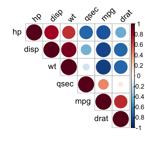
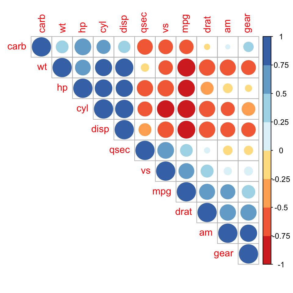
The function corrplot() takes the correlation matrix as the first argument. The second argument (type=“upper”) is used to display only the upper triangular of the correlation matrix.

library(corrplot)
corrplot(res, type = "upper", order = "hclust", 
         tl.col = "black", tl.srt = 45)
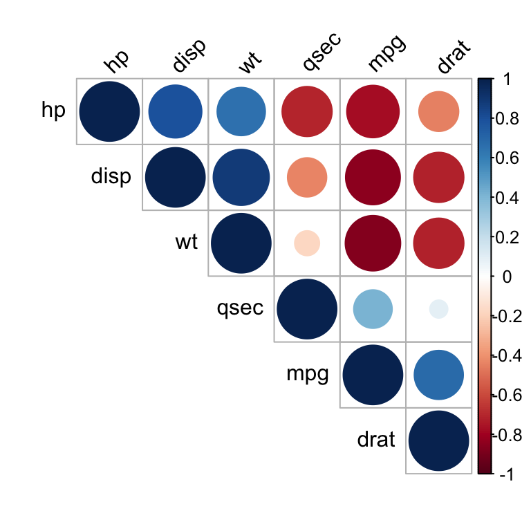
Correlation matrix - R software and statistics

Correlation matrix - R software and statistics

Positive correlations are displayed in blue and negative correlations in red color. Color intensity and the size of the circle are proportional to the correlation coefficients. In the right side of the correlogram, the legend color shows the correlation coefficients and the corresponding colors.


  • The correlation matrix is reordered according to the correlation coefficient using “hclust” method.
  • tl.col (for text label color) and tl.srt (for text label string rotation) are used to change text colors and rotations.
  • Possible values for the argument type are : “upper”, “lower”, “full”


Read more : visualize a correlation matrix using corrplot.

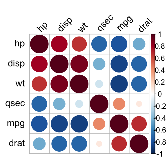
It’s also possible to combine correlogram with the significance test. We’ll use the result res.cor2 generated in the previous section with rcorr() function [in Hmisc package]:

# Insignificant correlation are crossed
corrplot(res2$r, type="upper", order="hclust", 
         p.mat = res2$P, sig.level = 0.01, insig = "blank")
# Insignificant correlations are leaved blank
corrplot(res2$r, type="upper", order="hclust", 
         p.mat = res2$P, sig.level = 0.01, insig = "blank")
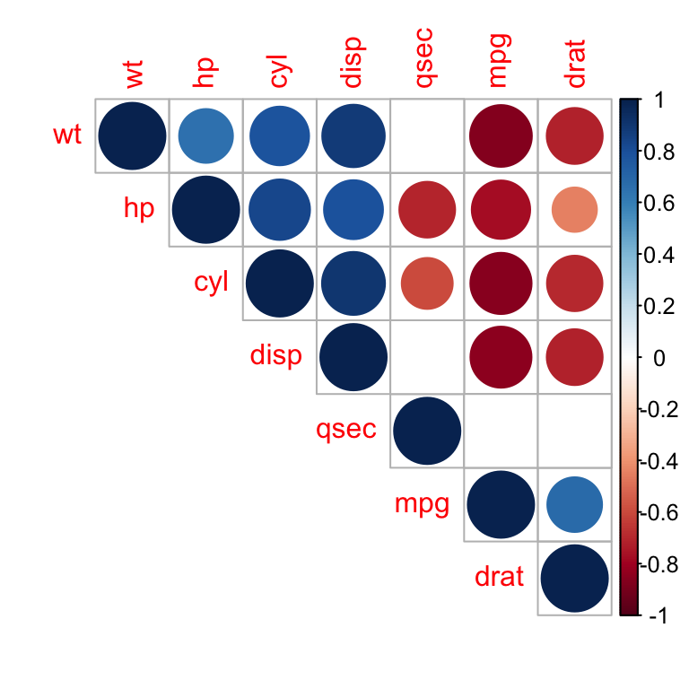
Correlation matrix - R software and statistics

Correlation matrix - R software and statistics

In the above plot, correlations with p-value > 0.01 are considered as insignificant. In this case the correlation coefficient values are leaved blank or crosses are added.

Use chart.Correlation(): Draw scatter plots

The function chart.Correlation()[ in the package PerformanceAnalytics], can be used to display a chart of a correlation matrix.

  • Install PerformanceAnalytics:
install.packages("PerformanceAnalytics")
  • Use chart.Correlation():
library("PerformanceAnalytics")
my_data <- mtcars[, c(1,3,4,5,6,7)]
chart.Correlation(my_data, histogram=TRUE, pch=19)
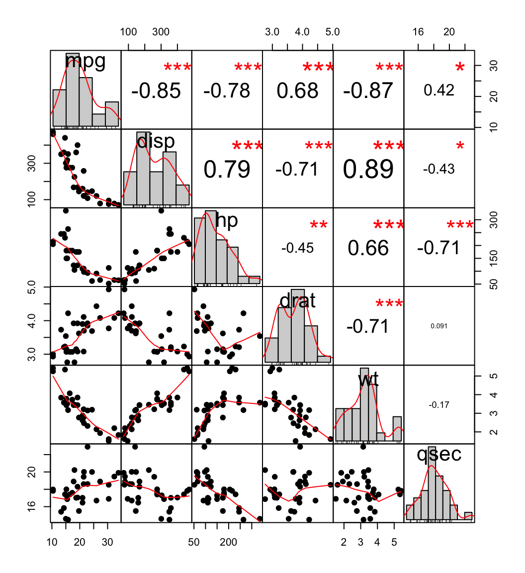
scatter plot, chart

scatter plot, chart


In the above plot:

  • The distribution of each variable is shown on the diagonal.
  • On the bottom of the diagonal : the bivariate scatter plots with a fitted line are displayed
  • On the top of the diagonal : the value of the correlation plus the significance level as stars
  • Each significance level is associated to a symbol : p-values(0, 0.001, 0.01, 0.05, 0.1, 1) <=> symbols(“***”, “**”, “*”, “.”, "“)


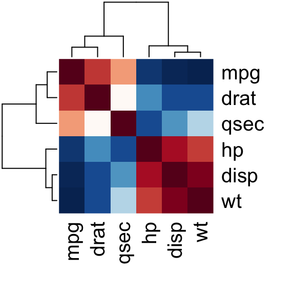
Use heatmap()

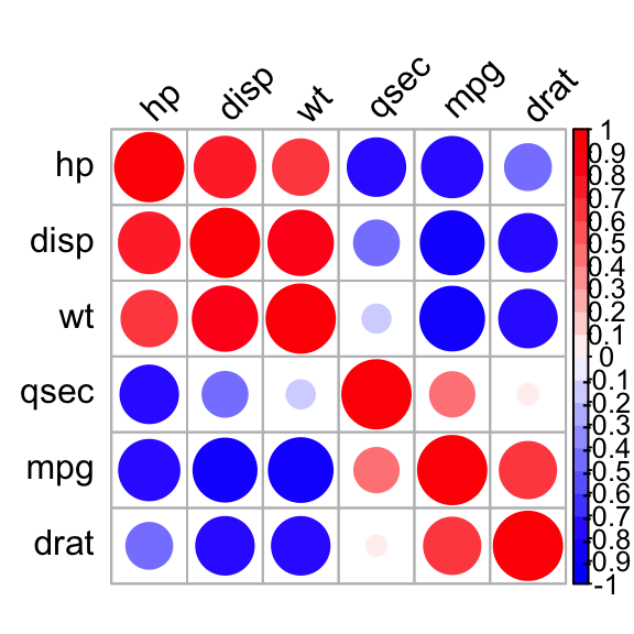
# Get some colors
col<- colorRampPalette(c("blue", "white", "red"))(20)
heatmap(x = res, col = col, symm = TRUE)
Heatmap of correlation matrix

Heatmap of correlation matrix


  • x : the correlation matrix to be plotted
  • col : color palettes
  • symm : logical indicating if x should be treated symmetrically; can only be true when x is a square matrix.


Online software to analyze and visualize a correlation matrix


A web application for computing and visualizing a correlation matrix is available here without any installation : online software for correlation matrix.


online software for correlation matrix, R software

(Designed by Freepik)

Take me to the correlation matrix calculator

The software can be used as follow :

  1. Go to the web application : correlation matrix calculator
  2. Upload a .txt tab or a CSV file containing your data (columns are variables). The supported file formats are described here. You can use the demo data available on the calculator web page by clicking on the corresponding link.
  3. After uploading, an overview of a part of your file is shown to check that the data are correctly imported. If the data are not correctly displayed, please make sure that the format of your file is OK here.
  4. Click on the ‘Analyze’ button and select at least 2 variables to calculate the correlation matrix. By default, all variables are selected. Please, deselect the columns containing texts. You can also select the correlation methods (Pearson, Spearman or Kendall). Default is the Pearson method.
  5. Click the OK button
  6. Results : the output of the software includes :
    • The correlation matrix
    • The visualization of the correlation matrix as a correlogram
    • A web link to export the results as .txt tab file

Note that, you can specify the alternative hypothesis to use for the correlation test by clicking on the button “Advanced options”.

Choose one of the 3 options :

  • Two-sided
  • Correlation < 0 for “less”
  • Correlation > 0 for “greater”
Default value is Two-sided.


Summarry


  • Use cor() function for simple correlation analysis
  • Use rcorr() function from Hmisc package to compute matrix of correlation coefficients and matrix of p-values in single step.
  • Use symnum(), corrplot()[from corrplot package], chart.Correlation() [from PerformanceAnalytics package], or heatmap() functions to visualize a correlation matrix.

Infos

This analysis has been performed using R software (ver. 3.2.4).


Elegant correlation table using xtable R package

$
0
0

Introduction

Correlation matrix analysis is an important method to find dependence between variables. Computing correlation matrix and drawing correlogram is explained here. The aim of this article is to show you how to get the lower and the upper triangular part of a correlation matrix. We will use also xtable R package to display a nice correlation table.


Elegant correlation table using xtable R package


Note that online software is also available here to compute correlation matrix and to plot a correlogram without any installation.

Correlation matrix analysis

The following R code computes a correlation matrix using mtcars data. Click here to read more.

mcor<-round(cor(mtcars),2)
mcor
       mpg   cyl  disp    hp  drat    wt  qsec    vs    am  gear  carb
mpg   1.00 -0.85 -0.85 -0.78  0.68 -0.87  0.42  0.66  0.60  0.48 -0.55
cyl  -0.85  1.00  0.90  0.83 -0.70  0.78 -0.59 -0.81 -0.52 -0.49  0.53
disp -0.85  0.90  1.00  0.79 -0.71  0.89 -0.43 -0.71 -0.59 -0.56  0.39
hp   -0.78  0.83  0.79  1.00 -0.45  0.66 -0.71 -0.72 -0.24 -0.13  0.75
drat  0.68 -0.70 -0.71 -0.45  1.00 -0.71  0.09  0.44  0.71  0.70 -0.09
wt   -0.87  0.78  0.89  0.66 -0.71  1.00 -0.17 -0.55 -0.69 -0.58  0.43
qsec  0.42 -0.59 -0.43 -0.71  0.09 -0.17  1.00  0.74 -0.23 -0.21 -0.66
vs    0.66 -0.81 -0.71 -0.72  0.44 -0.55  0.74  1.00  0.17  0.21 -0.57
am    0.60 -0.52 -0.59 -0.24  0.71 -0.69 -0.23  0.17  1.00  0.79  0.06
gear  0.48 -0.49 -0.56 -0.13  0.70 -0.58 -0.21  0.21  0.79  1.00  0.27
carb -0.55  0.53  0.39  0.75 -0.09  0.43 -0.66 -0.57  0.06  0.27  1.00

The result is a table of correlation coefficients between all possible pairs of variables.

Lower and upper triangular part of a correlation matrix

To get the lower or the upper part of a correlation matrix, the R function lower.tri() or upper.tri() can be used. The formats of the functions are :

lower.tri(x, diag = FALSE)
upper.tri(x, diag = FALSE)

- x : is the correlation matrix - diag : if TRUE the diagonal are not included in the result.

The two functions above, return a matrix of logicals which has the same size of a the correlation matrix. The entries is TRUE in the lower or upper triangle :

upper.tri(mcor)
       [,1]  [,2]  [,3]  [,4]  [,5]  [,6]  [,7]  [,8]  [,9] [,10] [,11]
 [1,] FALSE  TRUE  TRUE  TRUE  TRUE  TRUE  TRUE  TRUE  TRUE  TRUE  TRUE
 [2,] FALSE FALSE  TRUE  TRUE  TRUE  TRUE  TRUE  TRUE  TRUE  TRUE  TRUE
 [3,] FALSE FALSE FALSE  TRUE  TRUE  TRUE  TRUE  TRUE  TRUE  TRUE  TRUE
 [4,] FALSE FALSE FALSE FALSE  TRUE  TRUE  TRUE  TRUE  TRUE  TRUE  TRUE
 [5,] FALSE FALSE FALSE FALSE FALSE  TRUE  TRUE  TRUE  TRUE  TRUE  TRUE
 [6,] FALSE FALSE FALSE FALSE FALSE FALSE  TRUE  TRUE  TRUE  TRUE  TRUE
 [7,] FALSE FALSE FALSE FALSE FALSE FALSE FALSE  TRUE  TRUE  TRUE  TRUE
 [8,] FALSE FALSE FALSE FALSE FALSE FALSE FALSE FALSE  TRUE  TRUE  TRUE
 [9,] FALSE FALSE FALSE FALSE FALSE FALSE FALSE FALSE FALSE  TRUE  TRUE
[10,] FALSE FALSE FALSE FALSE FALSE FALSE FALSE FALSE FALSE FALSE  TRUE
[11,] FALSE FALSE FALSE FALSE FALSE FALSE FALSE FALSE FALSE FALSE FALSE
# Hide upper triangle
upper<-mcor
upper[upper.tri(mcor)]<-""
upper<-as.data.frame(upper)
upper
       mpg   cyl  disp    hp  drat    wt  qsec    vs   am gear carb
mpg      1                                                         
cyl  -0.85     1                                                   
disp -0.85   0.9     1                                             
hp   -0.78  0.83  0.79     1                                       
drat  0.68  -0.7 -0.71 -0.45     1                                 
wt   -0.87  0.78  0.89  0.66 -0.71     1                           
qsec  0.42 -0.59 -0.43 -0.71  0.09 -0.17     1                     
vs    0.66 -0.81 -0.71 -0.72  0.44 -0.55  0.74     1               
am     0.6 -0.52 -0.59 -0.24  0.71 -0.69 -0.23  0.17    1          
gear  0.48 -0.49 -0.56 -0.13   0.7 -0.58 -0.21  0.21 0.79    1     
carb -0.55  0.53  0.39  0.75 -0.09  0.43 -0.66 -0.57 0.06 0.27    1
#Hide lower triangle
lower<-mcor
lower[lower.tri(mcor, diag=TRUE)]<-""
lower<-as.data.frame(lower)
lower
     mpg   cyl  disp    hp  drat    wt  qsec    vs    am  gear  carb
mpg      -0.85 -0.85 -0.78  0.68 -0.87  0.42  0.66   0.6  0.48 -0.55
cyl              0.9  0.83  -0.7  0.78 -0.59 -0.81 -0.52 -0.49  0.53
disp                  0.79 -0.71  0.89 -0.43 -0.71 -0.59 -0.56  0.39
hp                         -0.45  0.66 -0.71 -0.72 -0.24 -0.13  0.75
drat                             -0.71  0.09  0.44  0.71   0.7 -0.09
wt                                     -0.17 -0.55 -0.69 -0.58  0.43
qsec                                          0.74 -0.23 -0.21 -0.66
vs                                                  0.17  0.21 -0.57
am                                                        0.79  0.06
gear                                                            0.27
carb                                                                

Use xtable R package to display nice correlation table in html format

library(xtable)
print(xtable(upper), type="html")
mpg cyl disp hp drat wt qsec vs am gear carb
mpg 1
cyl -0.85 1
disp -0.85 0.9 1
hp -0.78 0.83 0.79 1
drat 0.68 -0.7 -0.71 -0.45 1
wt -0.87 0.78 0.89 0.66 -0.71 1
qsec 0.42 -0.59 -0.43 -0.71 0.09 -0.17 1
vs 0.66 -0.81 -0.71 -0.72 0.44 -0.55 0.74 1
am 0.6 -0.52 -0.59 -0.24 0.71 -0.69 -0.23 0.17 1
gear 0.48 -0.49 -0.56 -0.13 0.7 -0.58 -0.21 0.21 0.79 1
carb -0.55 0.53 0.39 0.75 -0.09 0.43 -0.66 -0.57 0.06 0.27 1

Combine matrix of correlation coefficients and significance levels

Custom function corstars() is used to combine the correlation coefficients and the level of significance. The R code of the function is provided at the end of this article. It requires 2 packages :

corstars(mtcars[,1:7], result="html")
mpg cyl disp hp drat wt
mpg
cyl -0.85****
disp -0.85**** 0.90****
hp -0.78**** 0.83**** 0.79****
drat 0.68**** -0.70**** -0.71**** -0.45**
wt -0.87**** 0.78**** 0.89**** 0.66**** -0.71****
qsec 0.42* -0.59**** -0.43* -0.71**** 0.09 -0.17

p < .0001 ‘****’; p < .001 ‘’, p < .01 ’’, p < .05 ’

The code of corstars function (The code is adapted from the one posted on this forum and on this blog ):

# x is a matrix containing the data
# method : correlation method. "pearson"" or "spearman"" is supported
# removeTriangle : remove upper or lower triangle
# results :  if "html" or "latex"
  # the results will be displayed in html or latex format
corstars <-function(x, method=c("pearson", "spearman"), removeTriangle=c("upper", "lower"),
                     result=c("none", "html", "latex")){

    #Compute correlation matrix
    require(Hmisc)
    x <- as.matrix(x)
    correlation_matrix<-rcorr(x, type=method[1])
    R <- correlation_matrix$r # Matrix of correlation coeficients
    p <- correlation_matrix$P # Matrix of p-value 
    
    ## Define notions for significance levels; spacing is important.
    mystars <- ifelse(p < .001, "****", ifelse(p < .001, "*** ", ifelse(p < .01, "**  ", ifelse(p < .05, "*   ", ""))))
    
    ## trunctuate the correlation matrix to two decimal
    R <- format(round(cbind(rep(-1.11, ncol(x)), R), 2))[,-1]
    
    ## build a new matrix that includes the correlations with their apropriate stars
    Rnew <- matrix(paste(R, mystars, sep=""), ncol=ncol(x))
    diag(Rnew) <- paste(diag(R), "", sep="")
    rownames(Rnew) <- colnames(x)
    colnames(Rnew) <- paste(colnames(x), "", sep="")
    
    ## remove upper triangle of correlation matrix
    if(removeTriangle[1]=="upper"){
      Rnew <- as.matrix(Rnew)
      Rnew[upper.tri(Rnew, diag = TRUE)] <- ""
      Rnew <- as.data.frame(Rnew)
    }
    
    ## remove lower triangle of correlation matrix
    else if(removeTriangle[1]=="lower"){
      Rnew <- as.matrix(Rnew)
      Rnew[lower.tri(Rnew, diag = TRUE)] <- ""
      Rnew <- as.data.frame(Rnew)
    }
    
    ## remove last column and return the correlation matrix
    Rnew <- cbind(Rnew[1:length(Rnew)-1])
    if (result[1]=="none") return(Rnew)
    else{
      if(result[1]=="html") print(xtable(Rnew), type="html")
      else print(xtable(Rnew), type="latex") 
    }

} 

Conclusions

  • Use cor() function to compute correlation matrix.
  • Use lower.tri() and upper.tri() functions to get the lower or upper part of the correlation matrix
  • Use xtable R function to display a nice correlation matrix in latex or html format.

Infos

This analysis was performed using R (ver. 3.2.4).

Correlation Analyses in R

$
0
0


Previously, we described the essentials of R programming and provided quick start guides for importing data into R. Additionally, we described how to compute descriptive or summary statistics using R software.


This chapter contains articles for computing and visualizing correlation analyses in R. Recall that, correlation analysis is used to investigate the association between two or more variables. A simple example, is to evaluate whether there is a link between maternal age and child’s weight at birth.


Correlation Test Between Two Variables in R

Brief outline:

  • What is correlation test?
  • Methods for correlation analyses
  • Correlation formula
    • Pearson correlation formula
    • Spearman correlation formula
    • Kendall correlation formula
  • Compute correlation in R
    • R functions
    • Import your data into R
    • Visualize your data using scatter plots
    • Preliminary test to check the test assumptions
    • Pearson correlation test
    • Kendall rank correlation test
    • Spearman rank correlation coefficient
  • Interpret correlation coefficient

Read more: —>Correlation Test Between Two Variables in R.

Correlation Matrix: Analyze, Format and Visualize

Correlation matrix is used to analyze the correlation between multiple variables at the same time.

Brief outline:

  • What is correlation matrix?
  • Compute correlation matrix in R
    • R functions
    • Compute correlation matrix
    • Correlation matrix with significance levels (p-value)
    • A simple function to format the correlation matrix
    • Visualize correlation matrix
      • Use symnum() function: Symbolic number coding
      • Use corrplot() function: Draw a correlogram
      • Use chart.Correlation(): Draw scatter plots
      • Use heatmap()
scatter plot, chart

scatter plot, chart

Read more: —>Correlation Matrix: Analyze, Format and Visualize.

Visualize Correlation Matrix using Correlogram

Correlogram is a graph of correlation matrix. Useful to highlight the most correlated variables in a data table. In this plot, correlation coefficients are colored according to the value. Correlation matrix can be also reordered according to the degree of association between variables.

Brief outline:

  • Install R corrplot package
  • Data for correlation analysis
  • Computing correlation matrix
  • Correlogram : Visualizing the correlation matrix
    • Visualization methods
    • Types of correlogram layout
    • Reordering the correlation matrix
    • Changing the color of the correlogram
    • Changing the color and the rotation of text labels
    • Combining correlogram with the significance test
    • Customize the correlogram
library(corrplot)
library(RColorBrewer)
M <-cor(mtcars)
corrplot(M, type="upper", order="hclust",
         col=brewer.pal(n=8, name="RdYlBu"))

Read more: —>Visualize Correlation Matrix using Correlogram.

Elegant Correlation Table using xtable R Package

The aim of this article is to show you how to get the lower and the upper triangular part of a correlation matrix. We will use also xtable R package to display a nice correlation table.

Brief outline:

  • Correlation matrix analysis
  • Lower and upper triangular part of a correlation matrix
  • Use xtable R package to display nice correlation table in html format
  • Combine matrix of correlation coefficients and significance levels


Elegant correlation table using xtable R package

Read more: —>Elegant correlation table using xtable R package.

Correlation Matrix : An R Function to Do All You Need

The goal of this article is to provide you a custom R function, named rquery.cormat(), for calculating and visualizing easily a correlation matrix in a single line R code.

Brief outline:

  • Computing the correlation matrix using rquery.cormat()
    • Upper triangle of the correlation matrix
    • Full correlation matrix
    • Change the colors of the correlogram
    • Draw a heatmap
  • Format the correlation table
  • Description of rquery.cormat() function
source("http://www.sthda.com/upload/rquery_cormat.r")
mydata <- mtcars[, c(1,3,4,5,6,7)]
require("corrplot")
rquery.cormat(mydata)
$r
        hp  disp    wt  qsec  mpg drat
hp       1                            
disp  0.79     1                      
wt    0.66  0.89     1                
qsec -0.71 -0.43 -0.17     1          
mpg  -0.78 -0.85 -0.87  0.42    1     
drat -0.45 -0.71 -0.71 0.091 0.68    1

$p
          hp    disp      wt  qsec     mpg drat
hp         0                                   
disp 7.1e-08       0                           
wt   4.1e-05 1.2e-11       0                   
qsec 5.8e-06   0.013    0.34     0             
mpg  1.8e-07 9.4e-10 1.3e-10 0.017       0     
drat    0.01 5.3e-06 4.8e-06  0.62 1.8e-05    0

$sym
     hp disp wt qsec mpg drat
hp   1                       
disp ,  1                    
wt   ,  +    1               
qsec ,  .       1            
mpg  ,  +    +  .    1       
drat .  ,    ,       ,   1   
attr(,"legend")
[1] 0 ' ' 0.3 '.' 0.6 ',' 0.8 '+' 0.9 '*' 0.95 'B' 1

Read more: —>Correlation Matrix : An R Function to Do All You Need.

Infos

This analysis has been performed using R statistical software (ver. 3.2.4).

One-Sample Wilcoxon Signed Rank Test in R

$
0
0


What’s one-sample Wilcoxon signed rank test?


The one-sample Wilcoxon signed rank test is a non-parametric alternative to one-sample t-test when the data cannot be assumed to be normally distributed. It’s used to determine whether the median of the sample is equal to a known standard value (i.e. theoretical value).


Note that, the data should be distributed symmetrically around the median. In other words, there should be roughly the same number of values above and below the median.


One Sample Wilcoxon test

Research questions and statistical hypotheses

Typical research questions are:


  1. whether the median (\(m\)) of the sample is equal to the theoretical value (\(m_0\))?
  2. whether the median (\(m\)) of the sample is less than to the theoretical value (\(m_0\))?
  3. whether the median (\(m\)) of the sample is greater than to the theoretical value(\(m_0\))?


In statistics, we can define the corresponding null hypothesis (\(H_0\)) as follow:

  1. \(H_0: m = m_0\)
  2. \(H_0: m \leq m_0\)
  3. \(H_0: m \geq m_0\)

The corresponding alternative hypotheses (\(H_a\)) are as follow:

  1. \(H_a: m \ne m_0\) (different)
  2. \(H_a: m > m_0\) (greater)
  3. \(H_a: m < m_0\) (less)

Note that:

  • Hypotheses 1) are called two-tailed tests
  • Hypotheses 2) and 3) are called one-tailed tests

Visualize your data and compute one-sample Wilcoxon test in R

Install ggpubr R package for data visualization

You can draw R base graphs as described at this link: R base graphs. Here, we’ll use the ggpubr R package for an easy ggplot2-based data visualization

  • Install the latest version from GitHub as follow (recommended):
# Install
if(!require(devtools)) install.packages("devtools")
devtools::install_github("kassambara/ggpubr")
  • Or, install from CRAN as follow:
install.packages("ggpubr")

R function to compute one-sample Wilcoxon test

To perform one-sample Wilcoxon-test, the R function wilcox.test() can be used as follow:

wilcox.test(x, mu = 0, alternative = "two.sided")

  • x: a numeric vector containing your data values
  • mu: the theoretical mean/median value. Default is 0 but you can change it.
  • alternative: the alternative hypothesis. Allowed value is one of “two.sided” (default), “greater” or “less”.


Import your data into R

  1. Prepare your data as specified here: Best practices for preparing your data set for R

  2. Save your data in an external .txt tab or .csv files

  3. Import your data into R as follow:

# If .txt tab file, use this
my_data <- read.delim(file.choose())

# Or, if .csv file, use this
my_data <- read.csv(file.choose())

Here, we’ll use an example data set containing the weight of 10 mice.

We want to know, if the median weight of the mice differs from 25g?

set.seed(1234)
my_data <- data.frame(
  name = paste0(rep("M_", 10), 1:10),
  weight = round(rnorm(10, 20, 2), 1)
)

Check your data

# Print the first 10 rows of the data
head(my_data, 10)
   name weight
1   M_1   17.6
2   M_2   20.6
3   M_3   22.2
4   M_4   15.3
5   M_5   20.9
6   M_6   21.0
7   M_7   18.9
8   M_8   18.9
9   M_9   18.9
10 M_10   18.2
# Statistical summaries of weight
summary(my_data$weight)
   Min. 1st Qu.  Median    Mean 3rd Qu.    Max. 
  15.30   18.38   18.90   19.25   20.82   22.20 
  • Min.: the minimum value
  • 1st Qu.: The first quartile. 25% of values are lower than this.
  • Median: the median value. Half the values are lower; half are higher.
  • 3rd Qu.: the third quartile. 75% of values are higher than this.
  • Max.: the maximum value

Visualize your data using box plots

library(ggpubr)
ggboxplot(my_data$weight, 
          ylab = "Weight (g)", xlab = FALSE,
          ggtheme = theme_minimal())
One-Sample Wilcoxon Signed Rank Test in R

One-Sample Wilcoxon Signed Rank Test in R

Compute one-sample Wilcoxon test

We want to know, if the average weight of the mice differs from 25g (two-tailed test)?

# One-sample wilcoxon test
res <- wilcox.test(my_data$weight, mu = 25)

# Printing the results
res 

    Wilcoxon signed rank test with continuity correction

data:  my_data$weight
V = 0, p-value = 0.005793
alternative hypothesis: true location is not equal to 25
# print only the p-value
res$p.value
[1] 0.005793045

The p-value of the test is 0.005793, which is less than the significance level alpha = 0.05. We can reject the null hypothesis and conclude that the average weight of the mice is significantly different from 25g with a p-value = 0.005793.


Note that:

  • if you want to test whether the median weight of mice is less than 25g (one-tailed test), type this:
wilcox.test(my_data$weight, mu = 25,
              alternative = "less")
  • Or, if you want to test whether the median weight of mice is greater than 25g (one-tailed test), type this:
wilcox.test(my_data$weight, mu = 25,
              alternative = "greater")


Infos

This analysis has been performed using R software (ver. 3.2.4).

One-Sample T-test in R

$
0
0


What is one-sample t-test?


one-sample t-test is used to compare the mean of one sample to a known standard (or theoretical/hypothetical) mean (\(\mu\)).


Generally, the theoretical mean comes from:

  • a previous experiment. For example, compare whether the mean weight of mice differs from 200 mg, a value determined in a previous study.
  • or from an experiment where you have control and treatment conditions. If you express your data as “percent of control”, you can test whether the average value of treatment condition differs significantly from 100.

Note that, one-sample t-test can be used only, when the data are normally distributed . This can be checked using Shapiro-Wilk test .


One Sample t-test

Research questions and statistical hypotheses

Typical research questions are:


  1. whether the mean (\(m\)) of the sample is equal to the theoretical mean (\(\mu\))?
  2. whether the mean (\(m\)) of the sample is less than the theoretical mean (\(\mu\))?
  3. whether the mean (\(m\)) of the sample is greater than the theoretical mean (\(\mu\))?


In statistics, we can define the corresponding null hypothesis (\(H_0\)) as follow:

  1. \(H_0: m = \mu\)
  2. \(H_0: m \leq \mu\)
  3. \(H_0: m \geq \mu\)

The corresponding alternative hypotheses (\(H_a\)) are as follow:

  1. \(H_a: m \ne \mu\) (different)
  2. \(H_a: m > \mu\) (greater)
  3. \(H_a: m < \mu\) (less)

Note that:

  • Hypotheses 1) are called two-tailed tests
  • Hypotheses 2) and 3) are called one-tailed tests

Formula of one-sample t-test

The t-statistic can be calculated as follow:

\[ t = \frac{m-\mu}{s/\sqrt{n}} \]

where,

  • m is the sample mean
  • n is the sample size
  • s is the sample standard deviation with \(n-1\)degrees of freedom
  • \(\mu\) is the theoretical value

We can compute the p-value corresponding to the absolute value of the t-test statistics (|t|) for the degrees of freedom (df): \(df = n - 1\).

How to interpret the results?

If the p-value is inferior or equal to the significance level 0.05, we can reject the null hypothesis and accept the alternative hypothesis. In other words, we conclude that the sample mean is significantly different from the theoretical mean.

Visualize your data and compute one-sample t-test in R

Install ggpubr R package for data visualization

You can draw R base graps as described at this link: R base graphs. Here, we’ll use the ggpubr R package for an easy ggplot2-based data visualization

  • Install the latest version from GitHub as follow (recommended):
# Install
if(!require(devtools)) install.packages("devtools")
devtools::install_github("kassambara/ggpubr")
  • Or, install from CRAN as follow:
install.packages("ggpubr")

R function to compute one-sample t-test

To perform one-sample t-test, the R function t.test() can be used as follow:

t.test(x, mu = 0, alternative = "two.sided")

  • x: a numeric vector containing your data values
  • mu: the theoretical mean. Default is 0 but you can change it.
  • alternative: the alternative hypothesis. Allowed value is one of “two.sided” (default), “greater” or “less”.


Import your data into R

  1. Prepare your data as specified here: Best practices for preparing your data set for R

  2. Save your data in an external .txt tab or .csv files

  3. Import your data into R as follow:

# If .txt tab file, use this
my_data <- read.delim(file.choose())

# Or, if .csv file, use this
my_data <- read.csv(file.choose())

Here, we’ll use an example data set containing the weight of 10 mice.

We want to know, if the average weight of the mice differs from 25g?

set.seed(1234)
my_data <- data.frame(
  name = paste0(rep("M_", 10), 1:10),
  weight = round(rnorm(10, 20, 2), 1)
)

Check your data

# Print the first 10 rows of the data
head(my_data, 10)
   name weight
1   M_1   17.6
2   M_2   20.6
3   M_3   22.2
4   M_4   15.3
5   M_5   20.9
6   M_6   21.0
7   M_7   18.9
8   M_8   18.9
9   M_9   18.9
10 M_10   18.2
# Statistical summaries of weight
summary(my_data$weight)
   Min. 1st Qu.  Median    Mean 3rd Qu.    Max. 
  15.30   18.38   18.90   19.25   20.82   22.20 
  • Min.: the minimum value
  • 1st Qu.: The first quartile. 25% of values are lower than this.
  • Median: the median value. Half the values are lower; half are higher.
  • 3rd Qu.: the third quartile. 75% of values are higher than this.
  • Max.: the maximum value

Visualize your data using box plots

library(ggpubr)
ggboxplot(my_data$weight, 
          ylab = "Weight (g)", xlab = FALSE,
          ggtheme = theme_minimal())
One-Sample Student's T-test in R

One-Sample Student’s T-test in R

Preleminary test to check one-sample t-test assumptions

  1. Is this a large sample? - No, because n < 30.
  2. Since the sample size is not large enough (less than 30, central limit theorem), we need to check whether the data follow a normal distribution.

How to check the normality?

Read this article: Normality Test in R.

Briefly, it’s possible to use the Shapiro-Wilk normality test and to look at the normality plot.

  1. Shapiro-Wilk test:
    • Null hypothesis: the data are normally distributed
    • Alternative hypothesis: the data are not normally distributed
shapiro.test(my_data$weight) # => p-value = 0.6993

From the output, the p-value is greater than the significance level 0.05 implying that the distribution of the data are not significantly different from normal distribtion. In other words, we can assume the normality.

  • Visual inspection of the data normality using Q-Q plots (quantile-quantile plots). Q-Q plot draws the correlation between a given sample and the normal distribution.
library("ggpubr")
ggqqplot(my_data$weight, ylab = "Men's weight",
         ggtheme = theme_minimal())
One-Sample Student's T-test in R

One-Sample Student’s T-test in R

From the normality plots, we conclude that the data may come from normal distributions.

Note that, if the data are not normally distributed, it’s recommended to use the non parametric one-sample Wilcoxon rank test.

Compute one-sample t-test

We want to know, if the average weight of the mice differs from 25g (two-tailed test)?

# One-sample t-test
res <- t.test(my_data$weight, mu = 25)

# Printing the results
res 

    One Sample t-test

data:  my_data$weight
t = -9.0783, df = 9, p-value = 7.953e-06
alternative hypothesis: true mean is not equal to 25
95 percent confidence interval:
 17.8172 20.6828
sample estimates:
mean of x 
    19.25 

In the result above :

  • t is the t-test statistic value (t = -9.078),
  • df is the degrees of freedom (df= 9),
  • p-value is the significance level of the t-test (p-value = 7.95310^{-6}).
  • conf.int is the confidence interval of the mean at 95% (conf.int = [17.8172, 20.6828]);
  • sample estimates is he mean value of the sample (mean = 19.25).


Note that:

  • if you want to test whether the mean weight of mice is less than 25g (one-tailed test), type this:
t.test(my_data$weight, mu = 25,
              alternative = "less")
  • Or, if you want to test whether the mean weight of mice is greater than 25g (one-tailed test), type this:
t.test(my_data$weight, mu = 25,
              alternative = "greater")


Interpretation of the result

The p-value of the test is 7.95310^{-6}, which is less than the significance level alpha = 0.05. We can conclude that the mean weight of the mice is significantly different from 25g with a p-value = 7.95310^{-6}.

Access to the values returned by t.test() function

The result of t.test() function is a list containing the following components:


  • statistic: the value of the t test statistics
  • parameter: the degrees of freedom for the t test statistics
  • p.value: the p-value for the test
  • conf.int: a confidence interval for the mean appropriate to the specified alternative hypothesis.
  • estimate: the means of the two groups being compared (in the case of independent t test) or difference in means (in the case of paired t test).


The format of the R code to use for getting these values is as follow:

# printing the p-value
res$p.value
[1] 7.953383e-06
# printing the mean
res$estimate
mean of x 
    19.25 
# printing the confidence interval
res$conf.int
[1] 17.8172 20.6828
attr(,"conf.level")
[1] 0.95

Online one-sample t-test calculator

You can perform one-sample t-test, online, without any installation by clicking the following link:


Infos

This analysis has been performed using R software (ver. 3.2.4).
Unpaired Two-Samples T-test in R

$
0
0


What is unpaired two-samples t-test?


The unpaired two-samples t-test is used to compare the mean of two independent groups.


For example, suppose that we have measured the weight of 100 individuals: 50 women (group A) and 50 men (group B). We want to know if the mean weight of women (\(m_A\)) is significantly different from that of men (\(m_B\)).

In this case, we have two unrelated (i.e., independent or unpaired) groups of samples. Therefore, it’s possible to use an independent t-test to evaluate whether the means are different.

Note that, unpaired two-samples t-test can be used only under certain conditions:

  • when the two groups of samples (A and B), being compared, are normally distributed. This can be checked using Shapiro-Wilk test.
  • and when the variances of the two groups are equal. This can be checked using F-test.


Unpaired two-samples t-test

This article describes the formula of the independent t-test and provides pratical examples in R.

Research questions and statistical hypotheses

Typical research questions are:


  1. whether the mean of group A (\(m_A\)) is equal to the mean of group B (\(m_B\))?
  2. whether the mean of group A (\(m_A\)) is less than the mean of group B (\(m_B\))?
  3. whether the mean of group A (\(m_A\)) is greather than the mean of group B (\(m_B\))?


In statistics, we can define the corresponding null hypothesis (\(H_0\)) as follow:

  1. \(H_0: m_A = m_B\)
  2. \(H_0: m_A \leq m_B\)
  3. \(H_0: m_A \geq m_B\)

The corresponding alternative hypotheses (\(H_a\)) are as follow:

  1. \(H_a: m_A \ne m_B\) (different)
  2. \(H_a: m_A > m_B\) (greater)
  3. \(H_a: m_A < m_B\) (less)

Note that:

  • Hypotheses 1) are called two-tailed tests
  • Hypotheses 2) and 3) are called one-tailed tests

Formula of unpaired two-samples t-test

  1. Classical t-test:

If the variance of the two groups are equivalent (homoscedasticity), the t-test value, comparing the two samples (\(A\) and \(B\)), can be calculated as follow.

\[ t = \frac{m_A - m_B}{\sqrt{ \frac{S^2}{n_A} + \frac{S^2}{n_B} }} \]

where,

  • \(m_A\) and \(m_B\) represent the mean value of the group A and B, respectively.
  • \(n_A\) and \(n_B\) represent the sizes of the group A and B, respectively.
  • \(S^2\) is an estimator of the pooled variance of the two groups. It can be calculated as follow :

\[ S^2 = \frac{\sum{(x-m_A)^2}+\sum{(x-m_B)^2}}{n_A+n_B-2} \]

with degrees of freedom (df): \(df = n_A + n_B - 2\).

2.Welch t-statistic:

If the variances of the two groups being compared are different (heteroscedasticity), it’s possible to use the Welch t test, an adaptation of Student t-test.

Welch t-statistic is calculated as follow :

\[ t = \frac{m_A - m_B}{\sqrt{ \frac{S_A^2}{n_A} + \frac{S_B^2}{n_B} }} \]

where, \(S_A\) and \(S_B\) are the standard deviation of the the two groups A and B, respectively.

Unlike the classic Student’s t-test, Welch t-test formula involves the variance of each of the two groups (\(S_A^2\) and \(S_B^2\)) being compared. In other words, it does not use the pooled variance\(S\).

The degrees of freedom of Welch t-test is estimated as follow :

\[ df = (\frac{S_A^2}{n_A}+ \frac{S_B^2}{n_B^2}) / (\frac{S_A^4}{n_A^2(n_B-1)} + \frac{S_B^4}{n_B^2(n_B-1)} ) \]

A p-value can be computed for the corresponding absolute value of t-statistic (|t|).

Note that, the Welch t-test is considered as the safer one. Usually, the results of the classical t-test and the Welch t-test are very similar unless both the group sizes and the standard deviations are very different.

How to interpret the results?

If the p-value is inferior or equal to the significance level 0.05, we can reject the null hypothesis and accept the alternative hypothesis. In other words, we can conclude that the mean values of group A and B are significantly different.

Visualize your data and compute unpaired two-samples t-test in R

Install ggpubr R package for data visualization

You can draw R base graphs as described at this link: R base graphs. Here, we’ll use the ggpubr R package for an easy ggplot2-based data visualization

  • Install the latest version from GitHub as follow (recommended):
# Install
if(!require(devtools)) install.packages("devtools")
devtools::install_github("kassambara/ggpubr")
  • Or, install from CRAN as follow:
install.packages("ggpubr")

R function to compute unpaired two-samples t-test

To perform two-samples t-test comparing the means of two independent samples (x & y), the R function t.test() can be used as follow:

t.test(x, y, alternative = "two.sided", var.equal = FALSE)

  • x,y: numeric vectors
  • alternative: the alternative hypothesis. Allowed value is one of “two.sided” (default), “greater” or “less”.
  • var.equal: a logical variable indicating whether to treat the two variances as being equal. If TRUE then the pooled variance is used to estimate the variance otherwise the Welch test is used.


Import your data into R

  1. Prepare your data as specified here: Best practices for preparing your data set for R

  2. Save your data in an external .txt tab or .csv files

  3. Import your data into R as follow:

# If .txt tab file, use this
my_data <- read.delim(file.choose())

# Or, if .csv file, use this
my_data <- read.csv(file.choose())

Here, we’ll use an example data set, which contains the weight of 18 individuals (9 women and 9 men):

# Data in two numeric vectors
women_weight <- c(38.9, 61.2, 73.3, 21.8, 63.4, 64.6, 48.4, 48.8, 48.5)
men_weight <- c(67.8, 60, 63.4, 76, 89.4, 73.3, 67.3, 61.3, 62.4) 
# Create a data frame
my_data <- data.frame( 
                group = rep(c("Woman", "Man"), each = 9),
                weight = c(women_weight,  men_weight)
                )

We want to know, if the average women’s weight differs from the average men’s weight?

Check your data

# Print all data
print(my_data)
   group weight
1  Woman   38.9
2  Woman   61.2
3  Woman   73.3
4  Woman   21.8
5  Woman   63.4
6  Woman   64.6
7  Woman   48.4
8  Woman   48.8
9  Woman   48.5
10   Man   67.8
11   Man   60.0
12   Man   63.4
13   Man   76.0
14   Man   89.4
15   Man   73.3
16   Man   67.3
17   Man   61.3
18   Man   62.4

It’s possible to compute summary statistics (mean and sd) by groups. The dplyr package can be used.

  • To install dplyr package, type this:
install.packages("dplyr")
  • Compute summary statistics by groups:
library(dplyr)
group_by(my_data, group) %>%
  summarise(
    count = n(),
    mean = mean(weight, na.rm = TRUE),
    sd = sd(weight, na.rm = TRUE)
  )
Source: local data frame [2 x 4]

   group count     mean        sd
  (fctr) (int)    (dbl)     (dbl)
1    Man     9 68.98889  9.375426
2  Woman     9 52.10000 15.596714

Visualize your data using box plots

# Plot weight by group and color by group
library("ggpubr")
ggboxplot(my_data, x = "group", y = "weight", 
          color = "group", palette = c("#00AFBB", "#E7B800"),
        ylab = "Weight", xlab = "Groups")
Unpaired Two-Samples Student's T-test in R

Unpaired Two-Samples Student’s T-test in R

Preleminary test to check independent t-test assumptions

Assumption 1: Are the two samples independents?

Yes, since the samples from men and women are not related.

Assumtion 2: Are the data from each of the 2 groups follow a normal distribution?

Use Shapiro-Wilk normality test as described at: Normality Test in R. - Null hypothesis: the data are normally distributed - Alternative hypothesis: the data are not normally distributed

We’ll use the functions with() and shapiro.test() to compute Shapiro-Wilk test for each group of samples.

# Shapiro-Wilk normality test for Men's weights
with(my_data, shapiro.test(weight[group == "Man"]))# p = 0.1

# Shapiro-Wilk normality test for Women's weights
with(my_data, shapiro.test(weight[group == "Woman"])) # p = 0.6

From the output, the two p-values are greater than the significance level 0.05 implying that the distribution of the data are not significantly different from the normal distribution. In other words, we can assume the normality.

Note that, if the data are not normally distributed, it’s recommended to use the non parametric two-samples Wilcoxon rank test.

Assumption 3. Do the two populations have the same variances?

We’ll use F-test to test for homogeneity in variances. This can be performed with the function var.test() as follow:

res.ftest <- var.test(weight ~ group, data = my_data)
res.ftest

    F test to compare two variances

data:  weight by group
F = 0.36134, num df = 8, denom df = 8, p-value = 0.1714
alternative hypothesis: true ratio of variances is not equal to 1
95 percent confidence interval:
 0.08150656 1.60191315
sample estimates:
ratio of variances 
         0.3613398 

The p-value of F-test is p = 0.1713596. It’s greater than the significance level alpha = 0.05. In conclusion, there is no significant difference between the variances of the two sets of data. Therefore, we can use the classic t-test witch assume equality of the two variances.

Compute unpaired two-samples t-test

Question : Is there any significant difference between women and men weights?

1) Compute independent t-test - Method 1: The data are saved in two different numeric vectors.

# Compute t-test
res <- t.test(women_weight, men_weight, var.equal = TRUE)
res

    Two Sample t-test

data:  women_weight and men_weight
t = -2.7842, df = 16, p-value = 0.01327
alternative hypothesis: true difference in means is not equal to 0
95 percent confidence interval:
 -29.748019  -4.029759
sample estimates:
mean of x mean of y 
 52.10000  68.98889 

2) Compute independent t-test - Method 2: The data are saved in a data frame.

# Compute t-test
res <- t.test(weight ~ group, data = my_data, var.equal = TRUE)
res

    Two Sample t-test

data:  weight by group
t = 2.7842, df = 16, p-value = 0.01327
alternative hypothesis: true difference in means is not equal to 0
95 percent confidence interval:
  4.029759 29.748019
sample estimates:
  mean in group Man mean in group Woman 
           68.98889            52.10000 

As you can see, the two methods give the same results.


In the result above :

  • t is the t-test statistic value (t = 2.784),
  • df is the degrees of freedom (df= 16),
  • p-value is the significance level of the t-test (p-value = 0.01327).
  • conf.int is the confidence interval of the mean at 95% (conf.int = [4.0298, 29.748]);
  • sample estimates is he mean value of the sample (mean = 68.9888889, 52.1).


Note that:

  • if you want to test whether the average men’s weight is less than the average women’s weight, type this:
t.test(weight ~ group, data = my_data,
        var.equal = TRUE, alternative = "less")
  • Or, if you want to test whether the average men’s weight is greater than the average women’s weight, type this
t.test(weight ~ group, data = my_data,
        var.equal = TRUE, alternative = "greater")


Interpretation of the result

The p-value of the test is 0.01327, which is less than the significance level alpha = 0.05. We can conclude that men’s average weight is significantly different from women’s average weight with a p-value = 0.01327.

Access to the values returned by t.test() function

The result of t.test() function is a list containing the following components:


  • statistic: the value of the t test statistics
  • parameter: the degrees of freedom for the t test statistics
  • p.value: the p-value for the test
  • conf.int: a confidence interval for the mean appropriate to the specified alternative hypothesis.
  • estimate: the means of the two groups being compared (in the case of independent t test) or difference in means (in the case of paired t test).


The format of the R code to use for getting these values is as follow:

# printing the p-value
res$p.value
[1] 0.0132656
# printing the mean
res$estimate
  mean in group Man mean in group Woman 
           68.98889            52.10000 
# printing the confidence interval
res$conf.int
[1]  4.029759 29.748019
attr(,"conf.level")
[1] 0.95

Online unpaired two-samples t-test calculator

You can perform unpaired two-samples t-test, online, without any installation by clicking the following link:


See also

Infos

This analysis has been performed using R software (ver. 3.2.4).
Unpaired Two-Samples Wilcoxon Test in R

$
0
0


The unpaired two-samples Wilcoxon test (also known as Wilcoxon rank sum test or Mann-Whitney test) is a non-parametric alternative to the unpaired two-samples t-test, which can be used to compare two independent groups of samples. It’s used when your data are not normally distributed.


Unpaired two-samples wilcoxon test

This article describes how to compute two samples Wilcoxon test in R.

Visualize your data and compute Wilcoxon test in R

R function to compute Wilcoxon test

To perform two-samples Wilcoxon test comparing the means of two independent samples (x & y), the R function wilcox.test() can be used as follow:

wilcox.test(x, y, alternative = "two.sided")

  • x,y: numeric vectors
  • alternative: the alternative hypothesis. Allowed value is one of “two.sided” (default), “greater” or “less”.


Import your data into R

  1. Prepare your data as specified here: Best practices for preparing your data set for R

  2. Save your data in an external .txt tab or .csv files

  3. Import your data into R as follow:

# If .txt tab file, use this
my_data <- read.delim(file.choose())

# Or, if .csv file, use this
my_data <- read.csv(file.choose())

Here, we’ll use an example data set, which contains the weight of 18 individuals (9 women and 9 men):

# Data in two numeric vectors
women_weight <- c(38.9, 61.2, 73.3, 21.8, 63.4, 64.6, 48.4, 48.8, 48.5)
men_weight <- c(67.8, 60, 63.4, 76, 89.4, 73.3, 67.3, 61.3, 62.4) 
# Create a data frame
my_data <- data.frame( 
                group = rep(c("Woman", "Man"), each = 9),
                weight = c(women_weight,  men_weight)
                )

We want to know, if the median women’s weight differs from the median men’s weight?

Check your data

print(my_data)
   group weight
1  Woman   38.9
2  Woman   61.2
3  Woman   73.3
4  Woman   21.8
5  Woman   63.4
6  Woman   64.6
7  Woman   48.4
8  Woman   48.8
9  Woman   48.5
10   Man   67.8
11   Man   60.0
12   Man   63.4
13   Man   76.0
14   Man   89.4
15   Man   73.3
16   Man   67.3
17   Man   61.3
18   Man   62.4

It’s possible to compute summary statistics (median and interquartile range (IQR)) by groups. The dplyr package can be used.

  • To install dplyr package, type this:
install.packages("dplyr")
  • Compute summary statistics by groups:
library(dplyr)
group_by(my_data, group) %>%
  summarise(
    count = n(),
    median = median(weight, na.rm = TRUE),
    IQR = IQR(weight, na.rm = TRUE)
  )
Source: local data frame [2 x 4]

   group count median   IQR
  (fctr) (int)  (dbl) (dbl)
1    Man     9   67.3  10.9
2  Woman     9   48.8  15.0

Visualize your data using box plots

You can draw R base graphs as described at this link: R base graphs. Here, we’ll use the ggpubr R package for an easy ggplot2-based data visualization

  • Install the latest version of ggpubr from GitHub as follow (recommended):
# Install
if(!require(devtools)) install.packages("devtools")
devtools::install_github("kassambara/ggpubr")
  • Or, install from CRAN as follow:
install.packages("ggpubr")
  • Visualize your data:
# Plot weight by group and color by group
library("ggpubr")
ggboxplot(my_data, x = "group", y = "weight", 
          color = "group", palette = c("#00AFBB", "#E7B800"),
          ylab = "Weight", xlab = "Groups")
Unpaired Two-Samples Wilcoxon Test in R

Unpaired Two-Samples Wilcoxon Test in R

Compute unpaired two-samples Wilcoxon test

Question : Is there any significant difference between women and men weights?

1) Compute two-samples Wilcoxon test - Method 1: The data are saved in two different numeric vectors.

res <- wilcox.test(women_weight, men_weight)
res

    Wilcoxon rank sum test with continuity correction

data:  women_weight and men_weight
W = 15, p-value = 0.02712
alternative hypothesis: true location shift is not equal to 0

It will give a warning message, saying that “cannot compute exact p-value with tie”. It comes from the assumption of a Wilcoxon test that the responses are continuous. You can suppress this message by adding another argument exact = FALSE, but the result will be the same.

2) Compute two-samples Wilcoxon test - Method 2: The data are saved in a data frame.

res <- wilcox.test(weight ~ group, data = my_data,
                   exact = FALSE)
res

    Wilcoxon rank sum test with continuity correction

data:  weight by group
W = 66, p-value = 0.02712
alternative hypothesis: true location shift is not equal to 0
# Print the p-value only
res$p.value
[1] 0.02711657

As you can see, the two methods give the same results.

The p-value of the test is 0.02712, which is less than the significance level alpha = 0.05. We can conclude that men’s median weight is significantly different from women’s median weight with a p-value = 0.02712.


Note that:

  • if you want to test whether the median men’s weight is less than the median women’s weight, type this:
wilcox.test(weight ~ group, data = my_data, 
        exact = FALSE, alternative = "less")
  • Or, if you want to test whether the median men’s weight is greater than the median women’s weight, type this
wilcox.test(weight ~ group, data = my_data,
        exact = FALSE, alternative = "greater")


Online unpaired two-samples Wilcoxon test calculator

You can perform unpaired two-samples Wilcoxon test, online, without any installation by clicking the following link:


See also

Infos

This analysis has been performed using R software (ver. 3.2.4).

Paired Samples T-test in R

$
0
0


What is paired samples t-test?


The paired samples t-test is used to compare the means between two related groups of samples. In this case, you have two values (i.e., pair of values) for the same samples. This article describes how to compute paired samples t-test using R software.


As an example of data, 20 mice received a treatment X during 3 months. We want to know whether the treatment X has an impact on the weight of the mice.

To answer to this question, the weight of the 20 mice has been measured before and after the treatment. This gives us 20 sets of values before treatment and 20 sets of values after treatment from measuring twice the weight of the same mice.

In such situations, paired t-test can be used to compare the mean weights before and after treatment.

Paired t-test analysis is performed as follow:

  1. Calculate the difference (\(d\)) between each pair of value
  2. Compute the mean (\(m\)) and the standard deviation (\(s\)) of \(d\)
  3. Compare the average difference to 0. If there is any significant difference between the two pairs of samples, then the mean of d (\(m\)) is expected to be far from 0.

Paired t-test can be used only when the difference \(d\) is normally distributed. This can be checked using Shapiro-Wilk test.


Paired samples t test

Research questions and statistical hypotheses

Typical research questions are:


  1. whether the mean difference (\(m\)) is equal to 0?
  2. whether the mean difference (\(m\)) is less than 0?
  3. whether the mean difference (\(m\)) is greather than 0?


In statistics, we can define the corresponding null hypothesis (\(H_0\)) as follow:

  1. \(H_0: m = 0\)
  2. \(H_0: m \leq 0\)
  3. \(H_0: m \geq 0\)

The corresponding alternative hypotheses (\(H_a\)) are as follow:

  1. \(H_a: m \ne 0\) (different)
  2. \(H_a: m > 0\) (greater)
  3. \(H_a: m < 0\) (less)

Note that:

  • Hypotheses 1) are called two-tailed tests
  • Hypotheses 2) and 3) are called one-tailed tests

Formula of paired samples t-test

t-test statistisc value can be calculated using the following formula:

\[ t = \frac{m}{s/\sqrt{n}} \]

where,

  • m is the mean differences
  • n is the sample size (i.e., size of d).
  • s is the standard deviation of d

We can compute the p-value corresponding to the absolute value of the t-test statistics (|t|) for the degrees of freedom (df): \(df = n - 1\).

If the p-value is inferior or equal to 0.05, we can conclude that the difference between the two paired samples are significantly different.

Visualize your data and compute paired t-test in R

R function to compute paired t-test

To perform paired samples t-test comparing the means of two paired samples (x & y), the R function t.test() can be used as follow:

t.test(x, y, paired = TRUE, alternative = "two.sided")

  • x,y: numeric vectors
  • paired: a logical value specifying that we want to compute a paired t-test
  • alternative: the alternative hypothesis. Allowed value is one of “two.sided” (default), “greater” or “less”.


Import your data into R

  1. Prepare your data as specified here: Best practices for preparing your data set for R

  2. Save your data in an external .txt tab or .csv files

  3. Import your data into R as follow:

# If .txt tab file, use this
my_data <- read.delim(file.choose())

# Or, if .csv file, use this
my_data <- read.csv(file.choose())

Here, we’ll use an example data set, which contains the weight of 10 mice before and after the treatment.

# Data in two numeric vectors
# ++++++++++++++++++++++++++
# Weight of the mice before treatment
before <-c(200.1, 190.9, 192.7, 213, 241.4, 196.9, 172.2, 185.5, 205.2, 193.7)
# Weight of the mice after treatment
after <-c(392.9, 393.2, 345.1, 393, 434, 427.9, 422, 383.9, 392.3, 352.2)

# Create a data frame
my_data <- data.frame( 
                group = rep(c("before", "after"), each = 10),
                weight = c(before,  after)
                )

We want to know, if there is any significant difference in the mean weights after treatment?

Check your data

# Print all data
print(my_data)
    group weight
1  before  200.1
2  before  190.9
3  before  192.7
4  before  213.0
5  before  241.4
6  before  196.9
7  before  172.2
8  before  185.5
9  before  205.2
10 before  193.7
11  after  392.9
12  after  393.2
13  after  345.1
14  after  393.0
15  after  434.0
16  after  427.9
17  after  422.0
18  after  383.9
19  after  392.3
20  after  352.2

Compute summary statistics (mean and sd) by groups using the dplyr package.

  • To install dplyr package, type this:
install.packages("dplyr")
  • Compute summary statistics by groups:
library("dplyr")
group_by(my_data, group) %>%
  summarise(
    count = n(),
    mean = mean(weight, na.rm = TRUE),
    sd = sd(weight, na.rm = TRUE)
  )
Source: local data frame [2 x 4]

   group count   mean       sd
  (fctr) (int)  (dbl)    (dbl)
1  after    10 393.65 29.39801
2 before    10 199.16 18.47354

Visualize your data using box plots

To use R base graphs read this: R base graphs. Here, we’ll use the ggpubr R package for an easy ggplot2-based data visualization.

  • Install the latest version of ggpubr from GitHub as follow (recommended):
# Install
if(!require(devtools)) install.packages("devtools")
devtools::install_github("kassambara/ggpubr")
  • Or, install from CRAN as follow:
install.packages("ggpubr")
  • Visualize your data:
# Plot weight by group and color by group
library("ggpubr")
ggboxplot(my_data, x = "group", y = "weight", 
          color = "group", palette = c("#00AFBB", "#E7B800"),
          order = c("before", "after"),
          ylab = "Weight", xlab = "Groups")
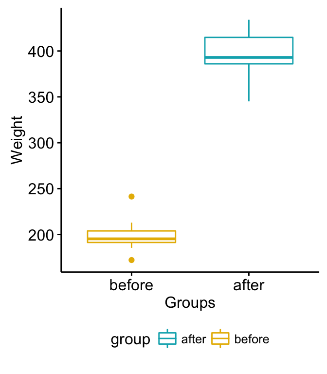
Paired Samples T-test in R

Paired Samples T-test in R

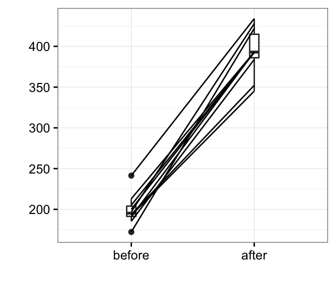
Box plots show you the increase, but lose the paired information. You can use the function plot.paired() [in pairedData package] to plot paired data (“before - after” plot).

  • Install pairedData package:
install.packages("PairedData")
  • Plot paired data:
# Subset weight data before treatment
before <- subset(my_data,  group == "before", weight,
                 drop = TRUE)
# subset weight data after treatment
after <- subset(my_data,  group == "after", weight,
                 drop = TRUE)
# Plot paired data
library(PairedData)
pd <- paired(before, after)
plot(pd, type = "profile") + theme_bw()
Paired Samples T-test in R

Paired Samples T-test in R

Preleminary test to check paired t-test assumptions

Assumption 1: Are the two samples paired?

Yes, since the data have been collected from measuring twice the weight of the same mice.

Assumption 2: Is this a large sample?

No, because n < 30. Since the sample size is not large enough (less than 30), we need to check whether the differences of the pairs follow a normal distribution.

How to check the normality?

Use Shapiro-Wilk normality test as described at: Normality Test in R.

  • Null hypothesis: the data are normally distributed
  • Alternative hypothesis: the data are not normally distributed
# compute the difference
d <- with(my_data, 
        weight[group == "before"] - weight[group == "after"])

# Shapiro-Wilk normality test for the differences
shapiro.test(d) # => p-value = 0.6141

From the output, the p-value is greater than the significance level 0.05 implying that the distribution of the differences (d) are not significantly different from normal distribution. In other words, we can assume the normality.

Note that, if the data are not normally distributed, it’s recommended to use the non parametric paired two-samples Wilcoxon test.

Compute paired samples t-test

Question : Is there any significant changes in the weights of mice after treatment?

1) Compute paired t-test - Method 1: The data are saved in two different numeric vectors.

# Compute t-test
res <- t.test(before, after, paired = TRUE)
res

    Paired t-test

data:  before and after
t = -20.883, df = 9, p-value = 6.2e-09
alternative hypothesis: true difference in means is not equal to 0
95 percent confidence interval:
 -215.5581 -173.4219
sample estimates:
mean of the differences 
                -194.49 

2) Compute paired t-test - Method 2: The data are saved in a data frame.

# Compute t-test
res <- t.test(weight ~ group, data = my_data, paired = TRUE)
res

    Paired t-test

data:  weight by group
t = 20.883, df = 9, p-value = 6.2e-09
alternative hypothesis: true difference in means is not equal to 0
95 percent confidence interval:
 173.4219 215.5581
sample estimates:
mean of the differences 
                 194.49 

As you can see, the two methods give the same results.


In the result above :

  • t is the t-test statistic value (t = 20.88),
  • df is the degrees of freedom (df= 9),
  • p-value is the significance level of the t-test (p-value = 6.210^{-9}).
  • conf.int is the confidence interval (conf.int) of the mean differences at 95% is also shown (conf.int= [173.42, 215.56])
  • sample estimates is the mean differences between pairs (mean = 194.49).


Note that:

  • if you want to test whether the average weight before treatment is less than the average weight after treatment, type this:
t.test(weight ~ group, data = my_data, paired = TRUE,
        alternative = "less")
  • Or, if you want to test whether the average weight before treatment is greater than the average weight after treatment, type this
t.test(weight ~ group, data = my_data, paired = TRUE,
       alternative = "greater")


Interpretation of the result

The p-value of the test is 6.210^{-9}, which is less than the significance level alpha = 0.05. We can then reject null hypothesis and conclude that the average weight of the mice before treatment is significantly different from the average weight after treatment with a p-value = 6.210^{-9}.

Access to the values returned by t.test() function

The result of t.test() function is a list containing the following components:


  • statistic: the value of the t test statistics
  • parameter: the degrees of freedom for the t test statistics
  • p.value: the p-value for the test
  • conf.int: a confidence interval for the mean appropriate to the specified alternative hypothesis.
  • estimate: the means of the two groups being compared (in the case of independent t test) or difference in means (in the case of paired t test).


The format of the R code to use for getting these values is as follow:

# printing the p-value
res$p.value
[1] 6.200298e-09
# printing the mean
res$estimate
mean of the differences 
                 194.49 
# printing the confidence interval
res$conf.int
[1] 173.4219 215.5581
attr(,"conf.level")
[1] 0.95

Online paired t-test calculator

You can perform paired-samples t-test, online, without any installation by clicking the following link:


Infos

This analysis has been performed using R software (ver. 3.2.4).

Paired Samples Wilcoxon Test in R

$
0
0


The paired samples Wilcoxon test (also known as Wilcoxon signed-rank test) is a non-parametric alternative to paired t-test used to compare paired data. It’s used when your data are not normally distributed. This tutorial describes how to compute paired samples Wilcoxon test in R.

Differences between paired samples should be distributed symmetrically around the median.


Paired samples wilcoxon test

Visualize your data and compute paired samples Wilcoxon test in R

R function

The R function wilcox.test() can be used as follow:

wilcox.test(x, y, paired = TRUE, alternative = "two.sided")

  • x,y: numeric vectors
  • paired: a logical value specifying that we want to compute a paired Wilcoxon test
  • alternative: the alternative hypothesis. Allowed value is one of “two.sided” (default), “greater” or “less”.


Import your data into R

  1. Prepare your data as specified here: Best practices for preparing your data set for R

  2. Save your data in an external .txt tab or .csv files

  3. Import your data into R as follow:

# If .txt tab file, use this
my_data <- read.delim(file.choose())

# Or, if .csv file, use this
my_data <- read.csv(file.choose())

Here, we’ll use an example data set, which contains the weight of 10 mice before and after the treatment.

# Data in two numeric vectors
# ++++++++++++++++++++++++++
# Weight of the mice before treatment
before <-c(200.1, 190.9, 192.7, 213, 241.4, 196.9, 172.2, 185.5, 205.2, 193.7)
# Weight of the mice after treatment
after <-c(392.9, 393.2, 345.1, 393, 434, 427.9, 422, 383.9, 392.3, 352.2)

# Create a data frame
my_data <- data.frame( 
                group = rep(c("before", "after"), each = 10),
                weight = c(before,  after)
                )

We want to know, if there is any significant difference in the median weights before and after treatment?

Check your data

# Print all data
print(my_data)
    group weight
1  before  200.1
2  before  190.9
3  before  192.7
4  before  213.0
5  before  241.4
6  before  196.9
7  before  172.2
8  before  185.5
9  before  205.2
10 before  193.7
11  after  392.9
12  after  393.2
13  after  345.1
14  after  393.0
15  after  434.0
16  after  427.9
17  after  422.0
18  after  383.9
19  after  392.3
20  after  352.2

Compute summary statistics (median and inter-quartile range (IQR)) by groups using the dplyr package can be used.

  • Install dplyr package:
install.packages("dplyr")
  • Compute summary statistics by groups:
library("dplyr")
group_by(my_data, group) %>%
  summarise(
    count = n(),
    median = median(weight, na.rm = TRUE),
    IQR = IQR(weight, na.rm = TRUE)
  )
Source: local data frame [2 x 4]

   group count median    IQR
  (fctr) (int)  (dbl)  (dbl)
1  after    10 392.95 28.800
2 before    10 195.30 12.575

Visualize your data using box plots

  • To use R base graphs read this: R base graphs. Here, we’ll use the ggpubr R package for an easy ggplot2-based data visualization.

  • Install the latest version of ggpubr from GitHub as follow (recommended):

# Install
if(!require(devtools)) install.packages("devtools")
devtools::install_github("kassambara/ggpubr")
  • Or, install from CRAN as follow:
install.packages("ggpubr")
  • Visualize your data:
# Plot weight by group and color by group
library("ggpubr")
ggboxplot(my_data, x = "group", y = "weight", 
          color = "group", palette = c("#00AFBB", "#E7B800"),
          order = c("before", "after"),
          ylab = "Weight", xlab = "Groups")
Paired Samples Wilcoxon Test in R

Paired Samples Wilcoxon Test in R

Box plots show you the increase, but lose the paired information. You can use the function plot.paired() [in pairedData package] to plot paired data (“before - after” plot).

  • Install pairedData package:
install.packages("PairedData")
  • Plot paired data:
# Subset weight data before treatment
before <- subset(my_data,  group == "before", weight,
                 drop = TRUE)
# subset weight data after treatment
after <- subset(my_data,  group == "after", weight,
                 drop = TRUE)
# Plot paired data
library(PairedData)
pd <- paired(before, after)
plot(pd, type = "profile") + theme_bw()
Paired Samples Wilcoxon Test in R

Paired Samples Wilcoxon Test in R

Compute paired-sample Wilcoxon test

Question : Is there any significant changes in the weights of mice before after treatment?

1) Compute paired Wilcoxon test - Method 1: The data are saved in two different numeric vectors.

res <- wilcox.test(before, after, paired = TRUE)
res

    Wilcoxon signed rank test

data:  before and after
V = 0, p-value = 0.001953
alternative hypothesis: true location shift is not equal to 0

2) Compute paired Wilcoxon-test - Method 2: The data are saved in a data frame.

# Compute t-test
res <- wilcox.test(weight ~ group, data = my_data, paired = TRUE)
res

    Wilcoxon signed rank test

data:  weight by group
V = 55, p-value = 0.001953
alternative hypothesis: true location shift is not equal to 0
# print only the p-value
res$p.value
[1] 0.001953125

As you can see, the two methods give the same results.

The p-value of the test is 0.001953, which is less than the significance level alpha = 0.05. We can conclude that the median weight of the mice before treatment is significantly different from the median weight after treatment with a p-value = 0.001953.


Note that:

  • if you want to test whether the median weight before treatment is less than the median weight after treatment, type this:
wilcox.test(weight ~ group, data = my_data, paired = TRUE,
        alternative = "less")
  • Or, if you want to test whether the median weight before treatment is greater than the median weight after treatment, type this
wilcox.test(weight ~ group, data = my_data, paired = TRUE,
       alternative = "greater")


Online paired-sample Wilcoxon test calculator

You can perform paired-sample Wilcoxon test, online, without any installation by clicking the following link:


Infos

This analysis has been performed using R software (ver. 3.2.4).
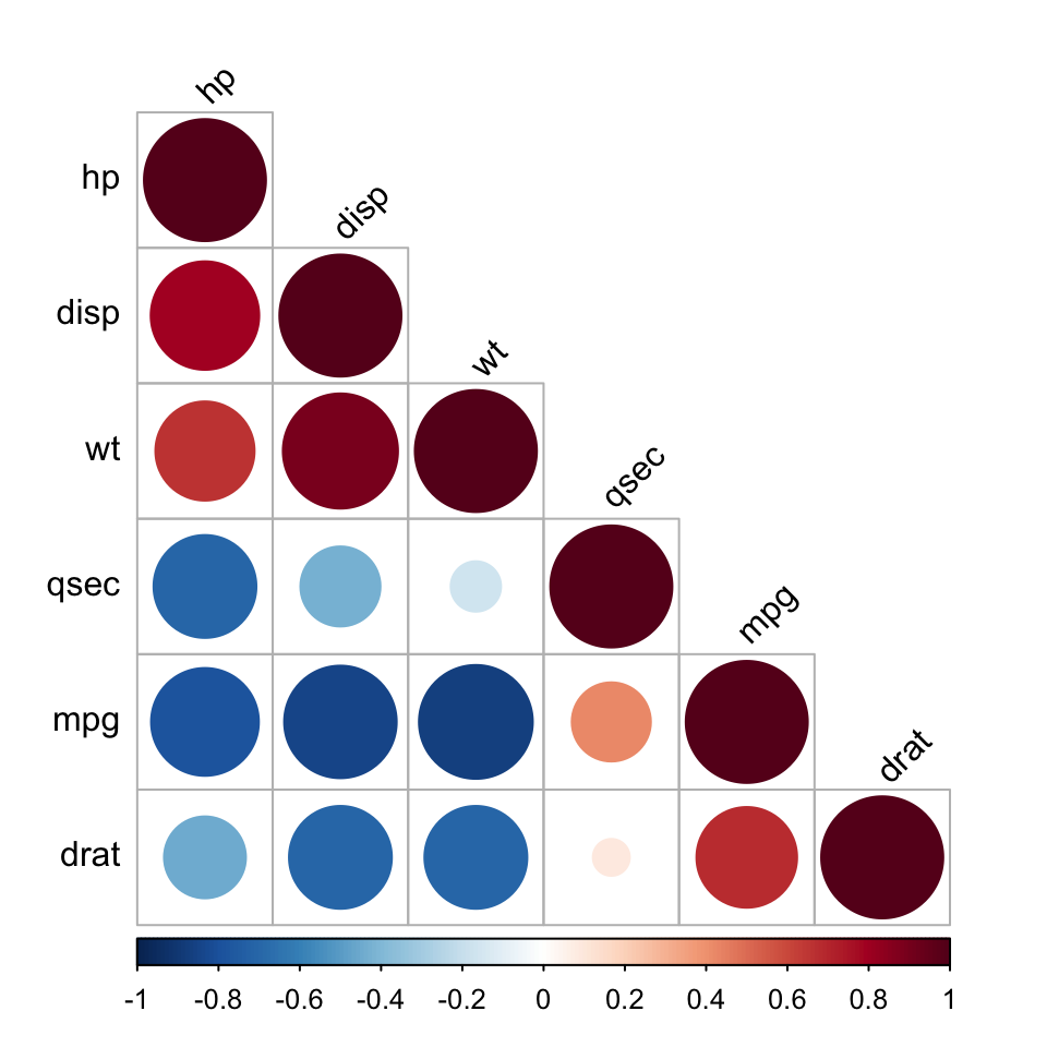
One-Way ANOVA Test in R

$
0
0


What is one-way ANOVA test?


The one-wayanalysis of variance (ANOVA), also known as one-factor ANOVA, is an extension of independent two-samples t-test for comparing means in a situation where there are more than two groups. In one-way ANOVA, the data is organized into several groups base on one single grouping variable (also called factor variable). This tutorial describes the basic principle of the one-wayANOVA test and provides practical anova test examples in R software.


ANOVA test hypotheses:

  • Null hypothesis: the means of the different groups are the same
  • Alternative hypothesis: At least one sample mean is not equal to the others.

Note that, if you have only two groups, you can use t-test. In this case the F-test and the t-test are equivalent.


One-Way ANOVA Test

Assumptions of ANOVA test

Here we describe the requirement for ANOVA test. ANOVA test can be applied only when:


  • The observations are obtained independently and randomly from the population defined by the factor levels
  • The data of each factor level are normally distributed.
  • These normal populations have a common variance. (Levene’s test can be used to check this.)


How one-way ANOVA test works?

Assume that we have 3 groups (A, B, C) to compare:

  1. Compute the common variance, which is called variance within samples (\(S^2_{within}\)) or residual variance.
  2. Compute the variance between sample means as follow:
    • Compute the mean of each group
    • Compute the variance between sample means (\(S^2_{between}\))
  3. Produce F-statistic as the ratio of \(S^2_{between}/S^2_{within}\).

Note that, a lower ratio (ratio < 1) indicates that there are no significant difference between the means of the samples being compared. However, a higher ratio implies that the variation among group means are significant.

Visualize your data and compute one-way ANOVA in R

Import your data into R

  1. Prepare your data as specified here: Best practices for preparing your data set for R

  2. Save your data in an external .txt tab or .csv files

  3. Import your data into R as follow:

# If .txt tab file, use this
my_data <- read.delim(file.choose())

# Or, if .csv file, use this
my_data <- read.csv(file.choose())

Here, we’ll use the built-in R data set named PlantGrowth. It contains the weight of plants obtained under a control and two different treatment conditions.

my_data <- PlantGrowth

Check your data

To have an idea of what the data look like, we use the the function sample_n()[in dplyr package]. The sample_n() function randomly picks a few of the observations in the data frame to print out:

# Show a random sample
set.seed(1234)
dplyr::sample_n(my_data, 10)
   weight group
19   4.32  trt1
18   4.89  trt1
29   5.80  trt2
24   5.50  trt2
17   6.03  trt1
1    4.17  ctrl
6    4.61  ctrl
16   3.83  trt1
12   4.17  trt1
15   5.87  trt1

In R terminology, the column “group” is called factor and the different categories (“ctr”, “trt1”, “trt2”) are named factor levels. The levels are ordered alphabetically.

# Show the levels
levels(my_data$group)
[1] "ctrl""trt1""trt2"

If the levels are not automatically in the correct order, re-order them as follow:

my_data$group <- ordered(my_data$group,
                         levels = c("ctrl", "trt1", "trt2"))

It’s possible to compute summary statistics (mean and sd) by groups using the dplyr package.

  • Compute summary statistics by groups - count, mean, sd:
library(dplyr)
group_by(my_data, group) %>%
  summarise(
    count = n(),
    mean = mean(weight, na.rm = TRUE),
    sd = sd(weight, na.rm = TRUE)
  )
Source: local data frame [3 x 4]

   group count  mean        sd
  (fctr) (int) (dbl)     (dbl)
1   ctrl    10 5.032 0.5830914
2   trt1    10 4.661 0.7936757
3   trt2    10 5.526 0.4425733

Visualize your data

  • To use R base graphs read this: R base graphs. Here, we’ll use the ggpubr R package for an easy ggplot2-based data visualization.

  • Install the latest version of ggpubr from GitHub as follow (recommended):

# Install
if(!require(devtools)) install.packages("devtools")
devtools::install_github("kassambara/ggpubr")
  • Or, install from CRAN as follow:
install.packages("ggpubr")
  • Visualize your data with ggpubr:
# Box plots
# ++++++++++++++++++++
# Plot weight by group and color by group
library("ggpubr")
ggboxplot(my_data, x = "group", y = "weight", 
          color = "group", palette = c("#00AFBB", "#E7B800", "#FC4E07"),
          order = c("ctrl", "trt1", "trt2"),
          ylab = "Weight", xlab = "Treatment")
One-way ANOVA Test in R

One-way ANOVA Test in R

# Mean plots
# ++++++++++++++++++++
# Plot weight by group
# Add error bars: mean_se
# (other values include: mean_sd, mean_ci, median_iqr, ....)
library("ggpubr")
ggline(my_data, x = "group", y = "weight", 
       add = c("mean_se", "jitter"), 
       order = c("ctrl", "trt1", "trt2"),
       ylab = "Weight", xlab = "Treatment")
One-way ANOVA Test in R

One-way ANOVA Test in R

If you still want to use R base graphs, type the following scripts:

# Box plot
boxplot(weight ~ group, data = my_data,
        xlab = "Treatment", ylab = "Weight",
        frame = FALSE, col = c("#00AFBB", "#E7B800", "#FC4E07"))

# plotmeans
library("gplots")
plotmeans(weight ~ group, data = my_data, frame = FALSE,
          xlab = "Treatment", ylab = "Weight",
          main="Mean Plot with 95% CI") 

Compute one-way ANOVA test

We want to know if there is any significant difference between the average weights of plants in the 3 experimental conditions.

The R function aov() can be used to answer to this question. The function summary.aov() is used to summarize the analysis of variance model.

# Compute the analysis of variance
res.aov <- aov(weight ~ group, data = my_data)
# Summary of the analysis
summary(res.aov)
            Df Sum Sq Mean Sq F value Pr(>F)  
group        2  3.766  1.8832   4.846 0.0159 *
Residuals   27 10.492  0.3886                 
---
Signif. codes:  0 '***' 0.001 '**' 0.01 '*' 0.05 '.' 0.1 ' ' 1

The output includes the columns F value and Pr(>F) corresponding to the p-value of the test.

Interpret the result of one-way ANOVA tests

As the p-value is less than the significance level 0.05, we can conclude that there are significant differences between the groups highlighted with “*" in the model summary.

Multiple pairwise-comparison between the means of groups

In one-way ANOVA test, a significant p-value indicates that some of the group means are different, but we don’t know which pairs of groups are different.

It’s possible to perform multiple pairwise-comparison, to determine if the mean difference between specific pairs of group are statistically significant.

Tukey multiple pairewise-comparisons

As the ANOVA test is significant, we can compute Tukey HSD (Tukey Honest Significant Differences, R function: TukeyHSD()) for performing multiple pairwise-comparison between the means of groups.

The function TukeyHD() takes the fitted ANOVA as an argument.

TukeyHSD(res.aov)
  Tukey multiple comparisons of means
    95% family-wise confidence level

Fit: aov(formula = weight ~ group, data = my_data)

$group
            diff        lwr       upr     p adj
trt1-ctrl -0.371 -1.0622161 0.3202161 0.3908711
trt2-ctrl  0.494 -0.1972161 1.1852161 0.1979960
trt2-trt1  0.865  0.1737839 1.5562161 0.0120064
  • diff: difference between means of the two groups
  • lwr, upr: the lower and the upper end point of the confidence interval at 95% (default)
  • p adj: p-value after adjustment for the multiple comparisons.

It can be seen from the output, that only the difference between trt2 and trt1 is significant with an adjusted p-value of 0.012.

Multiple comparisons using multcomp package

It’s possible to use the function glht() [in multcomp package] to perform multiple comparison procedures for an ANOVA. glht stands for general linear hypothesis tests. The simplified format is as follow:

glht(model, lincft)
  • model: a fitted model, for example an object returned by aov().
  • lincft(): a specification of the linear hypotheses to be tested. Multiple comparisons in ANOVA models are specified by objects returned from the function mcp().

Use glht() to perform multiple pairwise-comparisons for a one-way ANOVA:

library(multcomp)
summary(glht(res.aov, linfct = mcp(group = "Tukey")))

     Simultaneous Tests for General Linear Hypotheses

Multiple Comparisons of Means: Tukey Contrasts


Fit: aov(formula = weight ~ group, data = my_data)

Linear Hypotheses:
                 Estimate Std. Error t value Pr(>|t|)  
trt1 - ctrl == 0  -0.3710     0.2788  -1.331    0.391  
trt2 - ctrl == 0   0.4940     0.2788   1.772    0.198  
trt2 - trt1 == 0   0.8650     0.2788   3.103    0.012 *
---
Signif. codes:  0 '***' 0.001 '**' 0.01 '*' 0.05 '.' 0.1 ' ' 1
(Adjusted p values reported -- single-step method)

Pairewise t-test

The function pairewise.t.test() can be also used to calculate pairwise comparisons between group levels with corrections for multiple testing.

pairwise.t.test(my_data$weight, my_data$group,
                 p.adjust.method = "BH")

    Pairwise comparisons using t tests with pooled SD 

data:  my_data$weight and my_data$group 

     ctrl  trt1 
trt1 0.194 -    
trt2 0.132 0.013

P value adjustment method: BH 

The result is a table of p-values for the pairwise comparisons. Here, the p-values have been adjusted by the Benjamini-Hochberg method.

Check ANOVA assumptions: test validity?

The ANOVA test assumes that, the data are normally distributed and the variance across groups are homogeneous. We can check that with some diagnostic plots.

Check the homogeneity of variance assumption

The residuals versus fits plot can be used to check the homogeneity of variances.

In the plot below, there is no evident relationships between residuals and fitted values (the mean of each groups), which is good. So, we can assume the homogeneity of variances.

# 1. Homogeneity of variances
plot(res.aov, 1)
One-way ANOVA Test in R

One-way ANOVA Test in R

Points 17, 15, 4 are detected as outliers, which can severely affect normality and homogeneity of variance. It can be useful to remove outliers to meet the test assumptions.

It’s also possible to use Bartlett’s test or Levene’s test to check the homogeneity of variances.

We recommend Levene’s test, which is less sensitive to departures from normal distribution. The function leveneTest() [in car package] will be used:

library(car)
leveneTest(weight ~ group, data = my_data)
Levene's Test for Homogeneity of Variance (center = median)
      Df F value Pr(>F)
group  2  1.1192 0.3412
      27               

From the output above we can see that the p-value is not less than the significance level of 0.05. This means that there is no evidence to suggest that the variance across groups is statistically significantly different. Therefore, we can assume the homogeneity of variances in the different treatment groups.

Relaxing the homogeneity of variance assumption

The classical one-way ANOVA test requires an assumption of equal variances for all groups. In our example, the homogeneity of variance assumption turned out to be fine: the Levene test is not significant.

How do we save our ANOVA test, in a situation where the homogeneity of variance assumption is violated?

An alternative procedure (i.e.: Welch one-way test), that does not require that assumption have been implemented in the function oneway.test().

  • ANOVA test with no assumption of equal variances
oneway.test(weight ~ group, data = my_data)
  • Pairwise t-tests with no assumption of equal variances
pairwise.t.test(my_data$weight, my_data$group,
                 p.adjust.method = "BH", pool.sd = FALSE)

Check the normality assumption

Normality plot of residuals. In the plot below, the quantiles of the residuals are plotted against the quantiles of the normal distribution. A 45-degree reference line is also plotted.

The normal probability plot of residuals is used to check the assumption that the residuals are normally distributed. It should approximately follow a straight line.

# 2. Normality
plot(res.aov, 2)
One-way ANOVA Test in R

One-way ANOVA Test in R

As all the points fall approximately along this reference line, we can assume normality.

The conclusion above, is supported by the Shapiro-Wilk test on the ANOVA residuals (W = 0.96, p = 0.6) which finds no indication that normality is violated.

# Extract the residuals
aov_residuals <- residuals(object = res.aov )

# Run Shapiro-Wilk test
shapiro.test(x = aov_residuals )

    Shapiro-Wilk normality test

data:  aov_residuals
W = 0.96607, p-value = 0.4379

Non-parametric alternative to one-way ANOVA test

Note that, a non-parametric alternative to one-way ANOVA is Kruskal-Wallisrank sum test, which can be used when ANNOVA assumptions are not met.

kruskal.test(weight ~ group, data = my_data)

    Kruskal-Wallis rank sum test

data:  weight by group
Kruskal-Wallis chi-squared = 7.9882, df = 2, p-value = 0.01842

Summary


  1. Import your data from a .txt tab file: my_data <- read.delim(file.choose()). Here, we used my_data <- PlantGrowth.
  2. Visualize your data: ggpubr::ggboxplot(my_data, x = “group”, y = “weight”, color = “group”)
  3. Compute one-way ANOVA test: summary(aov(weight ~ group, data = my_data))
  4. Tukey multiple pairwise-comparisons: TukeyHSD(res.aov)


Infos

This analysis has been performed using R software (ver. 3.2.4).
Two-Way ANOVA Test in R

$
0
0


What is two-way ANOVA test?


Two-wayANOVA test is used to evaluate simultaneously the effect of two grouping variables (A and B) on a response variable.


The grouping variables are also known as factors. The different categories (groups) of a factor are called levels. The number of levels can vary between factors. The level combinations of factors are called cell.


  • When the sample sizes within cells are equal, we have the so-called balanced design. In this case the standard two-way ANOVA test can be applied.

  • When the sample sizes within each level of the independent variables are not the same (case of unbalanced designs), the ANOVA test should be handled differently.


This tutorial describes how to compute two-way ANOVA test in R software for balanced and unbalanced designs.


Two-Way ANOVA Test

Two-way ANOVA test hypotheses

  1. There is no difference in the means of factor A
  2. There is no difference in means of factor B
  3. There is no interaction between factors A and B

The alternative hypothesis for cases 1 and 2 is: the means are not equal.

The alternative hypothesis for case 3 is: there is an interaction between A and B.

Assumptions of two-way ANOVA test

Two-way ANOVA, like all ANOVA tests, assumes that the observations within each cell are normally distributed and have equal variances. We’ll show you how to check these assumptions after fitting ANOVA.

Compute two-way ANOVA test in R: balanced designs

Balanced designs correspond to the situation where we have equal sample sizes within levels of our independent grouping levels.

Import your data into R

  1. Prepare your data as specified here: Best practices for preparing your data set for R

  2. Save your data in an external .txt tab or .csv files

  3. Import your data into R as follow:

# If .txt tab file, use this
my_data <- read.delim(file.choose())

# Or, if .csv file, use this
my_data <- read.csv(file.choose())

Here, we’ll use the built-in R data set named ToothGrowth. It contains data from a study evaluating the effect of vitamin C on tooth growth in Guinea pigs. The experiment has been performed on 60 pigs, where each animal received one of three dose levels of vitamin C (0.5, 1, and 2 mg/day) by one of two delivery methods, (orange juice or ascorbic acid (a form of vitamin C and coded as VC). Tooth length was measured and a sample of the data is shown below.

# Store the data in the variable my_data
my_data <- ToothGrowth

Check your data

To get an idea of what the data look like, we display a random sample of the data using the function sample_n()[in dplyr package]. First, install dplyr if you don’t have it:

install.packages("dplyr")
# Show a random sample
set.seed(1234)
dplyr::sample_n(my_data, 10)
    len supp dose
38  9.4   OJ  0.5
36 10.0   OJ  0.5
37  8.2   OJ  0.5
50 27.3   OJ  1.0
59 29.4   OJ  2.0
1   4.2   VC  0.5
13 15.2   VC  1.0
56 30.9   OJ  2.0
27 26.7   VC  2.0
53 22.4   OJ  2.0
# Check the structure
str(my_data)
'data.frame':   60 obs. of  3 variables:
 $ len : num  4.2 11.5 7.3 5.8 6.4 10 11.2 11.2 5.2 7 ...
 $ supp: Factor w/ 2 levels "OJ","VC": 2 2 2 2 2 2 2 2 2 2 ...
 $ dose: num  0.5 0.5 0.5 0.5 0.5 0.5 0.5 0.5 0.5 0.5 ...

From the output above, R considers “dose” as a numeric variable. We’ll convert it as a factor variable (i.e., grouping variable) as follow.

# Convert dose as a factor and recode the levels
# as "D0.5", "D1", "D2"
my_data$dose <- factor(my_data$dose, 
                  levels = c(0.5, 1, 2),
                  labels = c("D0.5", "D1", "D2"))
head(my_data)
   len supp dose
1  4.2   VC D0.5
2 11.5   VC D0.5
3  7.3   VC D0.5
4  5.8   VC D0.5
5  6.4   VC D0.5
6 10.0   VC D0.5

Question: We want to know if tooth length depends on supp and dose.

  • Generate frequency tables:
table(my_data$supp, my_data$dose)
    
     D0.5 D1 D2
  OJ   10 10 10
  VC   10 10 10

We have 2X3 design cells with the factors being supp and dose and 10 subjects in each cell. Here, we have a balanced design. In the next sections I’ll describe how to analyse data from balanced designs, since this is the simplest case.

Visualize your data

Box plots and line plots can be used to visualize group differences:

  • Box plot to plot the data grouped by the combinations of the levels of the two factors.
  • Two-way interaction plot, which plots the mean (or other summary) of the response for two-way combinations of factors, thereby illustrating possible interactions.

  • To use R base graphs read this: R base graphs. Here, we’ll use the ggpubr R package for an easy ggplot2-based data visualization.

  • Install the latest version of ggpubr from GitHub as follow (recommended):

# Install
if(!require(devtools)) install.packages("devtools")
devtools::install_github("kassambara/ggpubr")
  • Or, install from CRAN as follow:
install.packages("ggpubr")
  • Visualize your data with ggpubr:
# Box plot with multiple groups
# +++++++++++++++++++++
# Plot tooth length ("len") by groups ("dose")
# Color box plot by a second group: "supp"
library("ggpubr")
ggboxplot(my_data, x = "dose", y = "len", color = "supp",
          palette = c("#00AFBB", "#E7B800"))
Two-Way ANOVA Test in R

Two-Way ANOVA Test in R

# Line plots with multiple groups
# +++++++++++++++++++++++
# Plot tooth length ("len") by groups ("dose")
# Color box plot by a second group: "supp"
# Add error bars: mean_se
# (other values include: mean_sd, mean_ci, median_iqr, ....)
library("ggpubr")
ggline(my_data, x = "dose", y = "len", color = "supp",
       add = c("mean_se", "dotplot"),
       palette = c("#00AFBB", "#E7B800"))
Two-Way ANOVA Test in R

Two-Way ANOVA Test in R

If you still want to use R base graphs, type the following scripts:

# Box plot with two factor variables
boxplot(len ~ supp * dose, data=my_data, frame = FALSE, 
        col = c("#00AFBB", "#E7B800"), ylab="Tooth Length")

# Two-way interaction plot
interaction.plot(x.factor = my_data$dose, trace.factor = my_data$supp, 
                 response = my_data$len, fun = mean, 
                 type = "b", legend = TRUE, 
                 xlab = "Dose", ylab="Tooth Length",
                 pch=c(1,19), col = c("#00AFBB", "#E7B800"))

Arguments used for the function interaction.plot():


  • x.factor: the factor to be plotted on x axis.
  • trace.factor: the factor to be plotted as lines
  • response: a numeric variable giving the response
  • type: the type of plot. Allowed values include p (for point only), l (for line only) and b (for both point and line).


Compute two-way ANOVA test

We want to know if tooth length depends on supp and dose.

The R function aov() can be used to answer this question. The function summary.aov() is used to summarize the analysis of variance model.

res.aov2 <- aov(len ~ supp + dose, data = my_data)
summary(res.aov2)
            Df Sum Sq Mean Sq F value   Pr(>F)    
supp         1  205.4   205.4   14.02 0.000429 ***
dose         2 2426.4  1213.2   82.81  < 2e-16 ***
Residuals   56  820.4    14.7                     
---
Signif. codes:  0 '***' 0.001 '**' 0.01 '*' 0.05 '.' 0.1 ' ' 1

The output includes the columns F value and Pr(>F) corresponding to the p-value of the test.

From the ANOVA table we can conclude that both supp and dose are statistically significant. dose is the most significant factor variable. These results would lead us to believe that changing delivery methods (supp) or the dose of vitamin C, will impact significantly the mean tooth length.

Not the above fitted model is called additive model. It makes an assumption that the two factor variables are independent. If you think that these two variables might interact to create an synergistic effect, replace the plus symbol (+) by an asterisk (*), as follow.

# Two-way ANOVA with interaction effect
# These two calls are equivalent
res.aov3 <- aov(len ~ supp * dose, data = my_data)
res.aov3 <- aov(len ~ supp + dose + supp:dose, data = my_data)
summary(res.aov3)
            Df Sum Sq Mean Sq F value   Pr(>F)    
supp         1  205.4   205.4  15.572 0.000231 ***
dose         2 2426.4  1213.2  92.000  < 2e-16 ***
supp:dose    2  108.3    54.2   4.107 0.021860 *  
Residuals   54  712.1    13.2                     
---
Signif. codes:  0 '***' 0.001 '**' 0.01 '*' 0.05 '.' 0.1 ' ' 1

It can be seen that the two main effects (supp and dose) are statistically significant, as well as their interaction.

Note that, in the situation where the interaction is not significant you should use the additive model.

Interpret the results

From the ANOVA results, you can conclude the following, based on the p-values and a significance level of 0.05:

  • the p-value of supp is 0.000429 (significant), which indicates that the levels of supp are associated with significant different tooth length.
  • the p-value of dose is < 2e-16 (significant), which indicates that the levels of dose are associated with significant different tooth length.
  • the p-value for the interaction between supp*dose is 0.02 (significant), which indicates that the relationships between dose and tooth length depends on the supp method.

Compute some summary statistics

  • Compute mean and SD by groups using dplyr R package:
require("dplyr")
group_by(my_data, supp, dose) %>%
  summarise(
    count = n(),
    mean = mean(len, na.rm = TRUE),
    sd = sd(len, na.rm = TRUE)
  )
Source: local data frame [6 x 5]
Groups: supp [?]

    supp   dose count  mean       sd
  (fctr) (fctr) (int) (dbl)    (dbl)
1     OJ   D0.5    10 13.23 4.459709
2     OJ     D1    10 22.70 3.910953
3     OJ     D2    10 26.06 2.655058
4     VC   D0.5    10  7.98 2.746634
5     VC     D1    10 16.77 2.515309
6     VC     D2    10 26.14 4.797731
  • It’s also possible to use the function model.tables() as follow:
model.tables(res.aov3, type="means", se = TRUE)

Multiple pairwise-comparison between the means of groups

In ANOVA test, a significant p-value indicates that some of the group means are different, but we don’t know which pairs of groups are different.

It’s possible to perform multiple pairwise-comparison, to determine if the mean difference between specific pairs of group are statistically significant.

Tukey multiple pairewise-comparisons

As the ANOVA test is significant, we can compute Tukey HSD (Tukey Honest Significant Differences, R function: TukeyHSD()) for performing multiple pairwise-comparison between the means of groups. The function TukeyHD() takes the fitted ANOVA as an argument.

We don’t need to perform the test for the “supp” variable because it has only two levels, which have been already proven to be significantly different by ANOVA test. Therefore, the Tukey HSD test will be done only for the factor variable “dose”.

TukeyHSD(res.aov3, which = "dose")
  Tukey multiple comparisons of means
    95% family-wise confidence level

Fit: aov(formula = len ~ supp + dose + supp:dose, data = my_data)

$dose
          diff       lwr       upr   p adj
D1-D0.5  9.130  6.362488 11.897512 0.0e+00
D2-D0.5 15.495 12.727488 18.262512 0.0e+00
D2-D1    6.365  3.597488  9.132512 2.7e-06
  • diff: difference between means of the two groups
  • lwr, upr: the lower and the upper end point of the confidence interval at 95% (default)
  • p adj: p-value after adjustment for the multiple comparisons.

It can be seen from the output, that all pairwise comparisons are significant with an adjusted p-value < 0.05.

Multiple comparisons using multcomp package

It’s possible to use the function glht() [in multcomp package] to perform multiple comparison procedures for an ANOVA. glht stands for general linear hypothesis tests. The simplified format is as follow:

glht(model, lincft)
  • model: a fitted model, for example an object returned by aov().
  • lincft(): a specification of the linear hypotheses to be tested. Multiple comparisons in ANOVA models are specified by objects returned from the function mcp().

Use glht() to perform multiple pairwise-comparisons:

library(multcomp)
summary(glht(res.aov2, linfct = mcp(dose = "Tukey")))

     Simultaneous Tests for General Linear Hypotheses

Multiple Comparisons of Means: Tukey Contrasts


Fit: aov(formula = len ~ supp + dose, data = my_data)

Linear Hypotheses:
               Estimate Std. Error t value Pr(>|t|)    
D1 - D0.5 == 0    9.130      1.210   7.543   <1e-05 ***
D2 - D0.5 == 0   15.495      1.210  12.802   <1e-05 ***
D2 - D1 == 0      6.365      1.210   5.259   <1e-05 ***
---
Signif. codes:  0 '***' 0.001 '**' 0.01 '*' 0.05 '.' 0.1 ' ' 1
(Adjusted p values reported -- single-step method)

Pairewise t-test

The function pairewise.t.test() can be also used to calculate pairwise comparisons between group levels with corrections for multiple testing.

pairwise.t.test(my_data$len, my_data$dose,
                p.adjust.method = "BH")

    Pairwise comparisons using t tests with pooled SD 

data:  my_data$len and my_data$dose 

   D0.5    D1     
D1 1.0e-08 -      
D2 4.4e-16 1.4e-05

P value adjustment method: BH 

Check ANOVA assumptions: test validity?

ANOVA assumes that the data are normally distributed and the variance across groups are homogeneous. We can check that with some diagnostic plots.

Check the homogeneity of variance assumption

The residuals versus fits plot is used to check the homogeneity of variances. In the plot below, there is no evident relationships between residuals and fitted values (the mean of each groups), which is good. So, we can assume the homogeneity of variances.

# 1. Homogeneity of variances
plot(res.aov3, 1)
Two-Way ANOVA Test in R

Two-Way ANOVA Test in R

Points 32 and 23 are detected as outliers, which can severely affect normality and homogeneity of variance. It can be useful to remove outliers to meet the test assumptions.

Use the Levene’s test to check the homogeneity of variances. The function leveneTest() [in car package] will be used:

library(car)
leveneTest(len ~ supp*dose, data = my_data)
Levene's Test for Homogeneity of Variance (center = median)
      Df F value Pr(>F)
group  5  1.7086 0.1484
      54               

From the output above we can see that the p-value is not less than the significance level of 0.05. This means that there is no evidence to suggest that the variance across groups is statistically significantly different. Therefore, we can assume the homogeneity of variances in the different treatment groups.

Check the normality assumpttion

Normality plot of the residuals. In the plot below, the quantiles of the residuals are plotted against the quantiles of the normal distribution. A 45-degree reference line is also plotted.

The normal probability plot of residuals is used to verify the assumption that the residuals are normally distributed.

The normal probability plot of the residuals should approximately follow a straight line.

# 2. Normality
plot(res.aov3, 2)
Two-Way ANOVA Test in R

Two-Way ANOVA Test in R

As all the points fall approximately along this reference line, we can assume normality.

The conclusion above, is supported by the Shapiro-Wilk test on the ANOVA residuals (W = 0.98, p = 0.5) which finds no indication that normality is violated.

# Extract the residuals
aov_residuals <- residuals(object = res.aov3)

# Run Shapiro-Wilk test
shapiro.test(x = aov_residuals )

    Shapiro-Wilk normality test

data:  aov_residuals
W = 0.98499, p-value = 0.6694

Compute two-way ANOVA test in R for unbalanced designs

An unbalanced design has unequal numbers of subjects in each group.

There are three fundamentally different ways to run an ANOVA in an unbalanced design. They are known as Type-I, Type-II and Type-III sums of squares. To keep things simple, note that The recommended method are the Type-III sums of squares.

The three methods give the same result when the design is balanced. However, when the design is unbalanced, they don’t give the same results.

The function Anova() [in car package] can be used to compute two-way ANOVA test for unbalanced designs.

First install the package on your computer. In R, type install.packages(“car”). Then:

library(car)
my_anova <- aov(len ~ supp * dose, data = my_data)
Anova(my_anova, type = "III")
Anova Table (Type III tests)

Response: len
             Sum Sq Df F value    Pr(>F)    
(Intercept) 1750.33  1 132.730 3.603e-16 ***
supp         137.81  1  10.450  0.002092 ** 
dose         885.26  2  33.565 3.363e-10 ***
supp:dose    108.32  2   4.107  0.021860 *  
Residuals    712.11 54                      
---
Signif. codes:  0 '***' 0.001 '**' 0.01 '*' 0.05 '.' 0.1 ' ' 1

Infos

This analysis has been performed using R software (ver. 3.2.4).

MANOVA Test in R: Multivariate Analysis of Variance

$
0
0


What is MANOVA test?


In the situation where there multiple response variables you can test them simultaneously using a multivariate analysis of variance (MANOVA). This article describes how to compute manova in R.


For example, we may conduct an experiment where we give two treatments (A and B) to two groups of mice, and we are interested in the weight and height of mice. In that case, the weight and height of mice are two dependent variables, and our hypothesis is that both together are affected by the difference in treatment. A multivariate analysis of variance could be used to test this hypothesis.


MANOVA Test

Asumptions of MANOVA

MANOVA can be used in certain conditions:

  • The dependent variables should be normally distribute within groups. The R function mshapiro.test( )[in the mvnormtest package] can be used to perform the Shapiro-Wilk test for multivariate normality. This is useful in the case of MANOVA, which assumes multivariate normality.

  • Homogeneity of variances across the range of predictors.

  • Linearity between all pairs of dependent variables, all pairs of covariates, and all dependent variable-covariate pairs in each cell

Interpretation of MANOVA

If the global multivariate test is significant, we conclude that the corresponding effect (treatment) is significant. In that case, the next question is to determine if the treatment affects only the weight, only the height or both. In other words, we want to identify the specific dependent variables that contributed to the significant global effect.

To answer this question, we can use one-way ANOVA (or univariate ANOVA) to examine separately each dependent variable.

Compute MANOVA in R

Import your data into R

  1. Prepare your data as specified here: Best practices for preparing your data set for R

  2. Save your data in an external .txt tab or .csv files

  3. Import your data into R as follow:

# If .txt tab file, use this
my_data <- read.delim(file.choose())

# Or, if .csv file, use this
my_data <- read.csv(file.choose())

Here, we’ll use iris data set:

# Store the data in the variable my_data
my_data <- iris

Check your data

The R code below display a random sample of our data using the function sample_n()[in dplyr package]. First, install dplyr if you don’t have it:

install.packages("dplyr")
# Show a random sample
set.seed(1234)
dplyr::sample_n(my_data, 10)
    Sepal.Length Sepal.Width Petal.Length Petal.Width    Species
94           5.0         2.3          3.3         1.0 versicolor
91           5.5         2.6          4.4         1.2 versicolor
93           5.8         2.6          4.0         1.2 versicolor
127          6.2         2.8          4.8         1.8  virginica
150          5.9         3.0          5.1         1.8  virginica
2            4.9         3.0          1.4         0.2     setosa
34           5.5         4.2          1.4         0.2     setosa
96           5.7         3.0          4.2         1.2 versicolor
74           6.1         2.8          4.7         1.2 versicolor
98           6.2         2.9          4.3         1.3 versicolor

Question: We want to know if there is any significant difference, in sepal and petal length, between the different species.

Compute MANOVA test

The function manova() can be used as follow:

sepl <- iris$Sepal.Length
petl <- iris$Petal.Length

# MANOVA test
res.man <- manova(cbind(Sepal.Length, Petal.Length) ~ Species, data = iris)
summary(res.man)
           Df Pillai approx F num Df den Df    Pr(>F)    
Species     2 0.9885   71.829      4    294 < 2.2e-16 ***
Residuals 147                                            
---
Signif. codes:  0 '***' 0.001 '**' 0.01 '*' 0.05 '.' 0.1 ' ' 1
# Look to see which differ
summary.aov(res.man)
 Response Sepal.Length :
             Df Sum Sq Mean Sq F value    Pr(>F)    
Species       2 63.212  31.606  119.26 < 2.2e-16 ***
Residuals   147 38.956   0.265                      
---
Signif. codes:  0 '***' 0.001 '**' 0.01 '*' 0.05 '.' 0.1 ' ' 1

 Response Petal.Length :
             Df Sum Sq Mean Sq F value    Pr(>F)    
Species       2 437.10 218.551  1180.2 < 2.2e-16 ***
Residuals   147  27.22   0.185                      
---
Signif. codes:  0 '***' 0.001 '**' 0.01 '*' 0.05 '.' 0.1 ' ' 1

From the output above, it can be seen that the two variables are highly significantly different among Species.

Infos

This analysis has been performed using R software (ver. 3.2.4).

Kruskal-Wallis Test in R

$
0
0


What is Kruskal-Wallis test?


Kruskal-Wallis test by rank is a non-parametric alternative to one-way ANOVA test, which extends the two-samples Wilcoxon test in the situation where there are more than two groups. It’s recommended when the assumptions of one-way ANOVA test are not met. This tutorial describes how to compute Kruskal-Wallis test in R software.


Kruskal Wallis Test

Visualize your data and compute Kruskal-Wallis test in R

Import your data into R

  1. Prepare your data as specified here: Best practices for preparing your data set for R

  2. Save your data in an external .txt tab or .csv files

  3. Import your data into R as follow:

# If .txt tab file, use this
my_data <- read.delim(file.choose())

# Or, if .csv file, use this
my_data <- read.csv(file.choose())

Here, we’ll use the built-in R data set named PlantGrowth. It contains the weight of plants obtained under a control and two different treatment conditions.

my_data <- PlantGrowth

Check your data

# print the head of the file
head(my_data)
  weight group
1   4.17  ctrl
2   5.58  ctrl
3   5.18  ctrl
4   6.11  ctrl
5   4.50  ctrl
6   4.61  ctrl

In R terminology, the column “group” is called factor and the different categories (“ctr”, “trt1”, “trt2”) are named factor levels. The levels are ordered alphabetically.

# Show the group levels
levels(my_data$group)
[1] "ctrl""trt1""trt2"

If the levels are not automatically in the correct order, re-order them as follow:

my_data$group <- ordered(my_data$group,
                         levels = c("ctrl", "trt1", "trt2"))

It’s possible to compute summary statistics by groups. The dplyr package can be used.

  • To install dplyr package, type this:
install.packages("dplyr")
  • Compute summary statistics by groups:
library(dplyr)
group_by(my_data, group) %>%
  summarise(
    count = n(),
    mean = mean(weight, na.rm = TRUE),
    sd = sd(weight, na.rm = TRUE),
    median = median(weight, na.rm = TRUE),
    IQR = IQR(weight, na.rm = TRUE)
  )
Source: local data frame [3 x 6]

   group count  mean        sd median    IQR
  (fctr) (int) (dbl)     (dbl)  (dbl)  (dbl)
1   ctrl    10 5.032 0.5830914  5.155 0.7425
2   trt1    10 4.661 0.7936757  4.550 0.6625
3   trt2    10 5.526 0.4425733  5.435 0.4675

Visualize the data using box plots

  • To use R base graphs read this: R base graphs. Here, we’ll use the ggpubr R package for an easy ggplot2-based data visualization.

  • Install the latest version of ggpubr from GitHub as follow (recommended):

# Install
if(!require(devtools)) install.packages("devtools")
devtools::install_github("kassambara/ggpubr")
  • Or, install from CRAN as follow:
install.packages("ggpubr")
  • Visualize your data with ggpubr:
# Box plots
# ++++++++++++++++++++
# Plot weight by group and color by group
library("ggpubr")
ggboxplot(my_data, x = "group", y = "weight", 
          color = "group", palette = c("#00AFBB", "#E7B800", "#FC4E07"),
          order = c("ctrl", "trt1", "trt2"),
          ylab = "Weight", xlab = "Treatment")
Kruskal-Wallis Test in R

Kruskal-Wallis Test in R

# Mean plots
# ++++++++++++++++++++
# Plot weight by group
# Add error bars: mean_se
# (other values include: mean_sd, mean_ci, median_iqr, ....)
library("ggpubr")
ggline(my_data, x = "group", y = "weight", 
       add = c("mean_se", "jitter"), 
       order = c("ctrl", "trt1", "trt2"),
       ylab = "Weight", xlab = "Treatment")
Kruskal-Wallis Test in R

Kruskal-Wallis Test in R

Compute Kruskal-Wallis test

We want to know if there is any significant difference between the average weights of plants in the 3 experimental conditions.

The test can be performed using the function kruskal.test() as follow:

kruskal.test(weight ~ group, data = my_data)

    Kruskal-Wallis rank sum test

data:  weight by group
Kruskal-Wallis chi-squared = 7.9882, df = 2, p-value = 0.01842

Interpret

As the p-value is less than the significance level 0.05, we can conclude that there are significant differences between the treatment groups.

Multiple pairwise-comparison between groups

From the output of the Kruskal-Wallis test, we know that there is a significant difference between groups, but we don’t know which pairs of groups are different.

It’s possible to use the function pairwise.wilcox.test() to calculate pairwise comparisons between group levels with corrections for multiple testing.

pairwise.wilcox.test(PlantGrowth$weight, PlantGrowth$group,
                 p.adjust.method = "BH")

    Pairwise comparisons using Wilcoxon rank sum test 

data:  PlantGrowth$weight and PlantGrowth$group 

     ctrl  trt1 
trt1 0.199 -    
trt2 0.095 0.027

P value adjustment method: BH 

The pairwise comparison shows that, only trt1 and trt2 are significantly different (p < 0.05).

Infos

This analysis has been performed using R software (ver. 3.2.4).
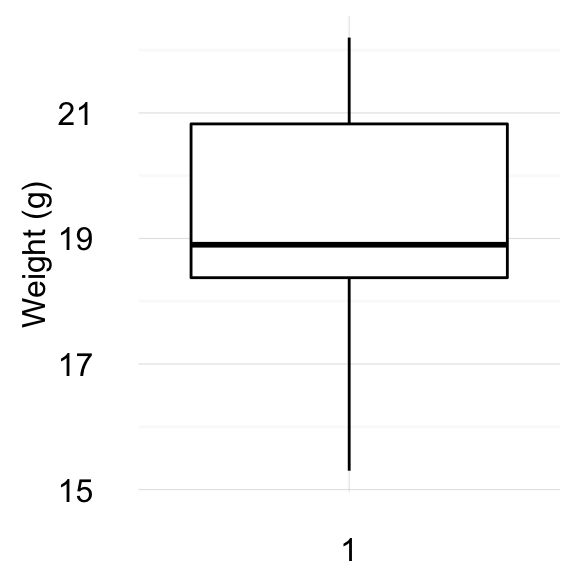
Comparing Means in R

$
0
0


Previously, we described the essentials of R programming and provided quick start guides for importing data into R. Additionally, we described how to compute descriptive or summary statistics and correlation analysis using R software.


This chapter contains articles describing statistical tests to use for comparing means. These tests include:

  • T-test
  • Wilcoxon test
  • ANOVA test and
  • Kruskal-Wallis test


2 Comparing one-sample mean to a standard known mean

2.1 One-sample T-test (parametric)

  • What is one-sample t-test?
  • Research questions and statistical hypotheses
  • Formula of one-sample t-test
  • Visualize your data and compute one-sample t-test in R
    • R function to compute one-sample t-test
    • Visualize your data using box plots
    • Preliminary test to check one-sample t-test assumptions
    • Compute one-sample t-test
    • Interpretation of the result


One Sample t-test

Read more: —>One-Sample T-test.

2.2 One-sample Wilcoxon test (non-parametric)

  • What’s one-sample Wilcoxon signed rank test?
  • Research questions and statistical hypotheses
  • Visualize your data and compute one-sample Wilcoxon test in R
    • R function to compute one-sample Wilcoxon test
    • Visualize your data using box plots
    • Compute one-sample Wilcoxon test


One Sample Wilcoxon test

Read more: —>One-Sample Wilcoxon Test (non-parametric).

3 Comparing the means of two independent groups

3.1 Unpaired two samples t-test (parametric)

  • What is unpaired two-samples t-test?
  • Research questions and statistical hypotheses
  • Formula of unpaired two-samples t-test
  • Visualize your data and compute unpaired two-samples t-test in R
    • R function to compute unpaired two-samples t-test
    • Visualize your data using box plots
    • Preliminary test to check independent t-test assumptions
    • Compute unpaired two-samples t-test
  • Interpretation of the result


Unpaired two-samples t-test

Read more: —>Unpaired Two Samples T-test (parametric).

3.2 Unpaired two-samples Wilcoxon test (non-parametric)

  • R function to compute Wilcoxon test
  • Visualize your data using box plots
  • Compute unpaired two-samples Wilcoxon test


Unpaired two-samples wilcoxon test

Read more: —>Unpaired Two-Samples Wilcoxon Test (non-parametric).

4 Comparing the means of paired samples

4.1 Paired samples t-test (parametric)


Paired samples t test

Read more: —>Paired Samples T-test (parametric).

4.2 Paired samples Wilcoxon test (non-parametric)


Paired samples wilcoxon test

Read more: —>Paired Samples Wilcoxon Test (non-parametric).

5 Comparing the means of more than two groups

5.1 One-way ANOVA test

An extension of independent two-samples t-test for comparing means in a situation where there are more than two groups.

  • What is one-way ANOVA test?
  • Assumptions of ANOVA test
  • How one-way ANOVA test works?
  • Visualize your data and compute one-way ANOVA in R
    • Visualize your data
    • Compute one-way ANOVA test
    • Interpret the result of one-way ANOVA tests
    • Multiple pairwise-comparison between the means of groups
      • Tukey multiple pairewise-comparisons
      • Multiple comparisons using multcomp package
      • Pairwise t-test
    • Check ANOVA assumptions: test validity?
      • Check the homogeneity of variance assumption
      • Relaxing the homogeneity of variance assumption
      • Check the normality assumption
    • Non-parametric alternative to one-way ANOVA test


One-Way ANOVA Test

Read more: —>One-Way ANOVA Test in R.

5.2 Two-Way ANOVA test

  • What is two-way ANOVA test?
  • Two-way ANOVA test hypotheses
  • Assumptions of two-way ANOVA test
  • Compute two-way ANOVA test in R: balanced designs
    • Visualize your data
    • Compute two-way ANOVA test
    • Interpret the results
    • Compute some summary statistics
    • Multiple pairwise-comparison between the means of groups
      • Tukey multiple pairewise-comparisons
      • Multiple comparisons using multcomp package
      • Pairwise t-test
    • Check ANOVA assumptions: test validity?
      • Check the homogeneity of variance assumption
    • Check the normality assumption
  • Compute two-way ANOVA test in R for unbalanced designs


Two-Way ANOVA Test

Read more: —>Two-Way ANOVA Test in R.

6 MANOVA test: Multivariate analysis of variance

  • What is MANOVA test?
  • Assumptions of MANOVA
  • Interpretation of MANOVA
  • Compute MANOVA in R


MANOVA Test

Read more: —>MANOVA Test in R: Multivariate Analysis of Variance.

7 Kruskal-Wallis test

  • What is Kruskal-Wallis test?
  • Visualize your data and compute Kruskal-Wallis test in R
    • Visualize the data using box plots
    • Compute Kruskal-Wallis test
    • Multiple pairwise-comparison between groups


Kruskal Wallis Test

Read more: —>Kruskal-Wallis Test in R (non parametric alternative to one-way ANOVA).

9 Infos

This analysis has been performed using R statistical software (ver. 3.2.4).

Correlation matrix : An R function to do all you need

$
0
0


Correlation matrix analysis is very useful to study dependences or associations between variables. This article provides a custom R function, rquery.cormat(), for calculating and visualizing easily acorrelation matrix.The result is a list containing, the correlation coefficient tables and the p-values of the correlations. In the result, the variables are reordered according to the level of the correlation which can help to quickly identify the most associated variables. A graph is also generated to visualize the correlation matrix using a correlogram or a heatmap.

Prerequisites

The rquery.cormat function requires the installation of corrplot package. Before proceeding, install it using he following R code :

install.packages("corrplot")

To use the rquery.cormat function, you can source it as follow :

source("http://www.sthda.com/upload/rquery_cormat.r")

The R code of rquery.cormat function is provided at the end of this document.

Example of data

The mtcars data is used in the following examples :

mydata <- mtcars[, c(1,3,4,5,6,7)]
head(mydata)
                   mpg disp  hp drat    wt  qsec
Mazda RX4         21.0  160 110 3.90 2.620 16.46
Mazda RX4 Wag     21.0  160 110 3.90 2.875 17.02
Datsun 710        22.8  108  93 3.85 2.320 18.61
Hornet 4 Drive    21.4  258 110 3.08 3.215 19.44
Hornet Sportabout 18.7  360 175 3.15 3.440 17.02
Valiant           18.1  225 105 2.76 3.460 20.22

Computing the correlation matrix

rquery.cormat(mydata)
$r
        hp  disp    wt  qsec  mpg drat
hp       1                            
disp  0.79     1                      
wt    0.66  0.89     1                
qsec -0.71 -0.43 -0.17     1          
mpg  -0.78 -0.85 -0.87  0.42    1     
drat -0.45 -0.71 -0.71 0.091 0.68    1

$p
          hp    disp      wt  qsec     mpg drat
hp         0                                   
disp 7.1e-08       0                           
wt   4.1e-05 1.2e-11       0                   
qsec 5.8e-06   0.013    0.34     0             
mpg  1.8e-07 9.4e-10 1.3e-10 0.017       0     
drat    0.01 5.3e-06 4.8e-06  0.62 1.8e-05    0

$sym
     hp disp wt qsec mpg drat
hp   1                       
disp ,  1                    
wt   ,  +    1               
qsec ,  .       1            
mpg  ,  +    +  .    1       
drat .  ,    ,       ,   1   
attr(,"legend")
[1] 0 ' ' 0.3 '.' 0.6 ',' 0.8 '+' 0.9 '*' 0.95 'B' 1
Correlogram, Heatmap

Correlogram, Heatmap


The result of rquery.cormat function is a list containing the following components :

  • r : The table of correlation coefficients
  • p : Table of p-values corresponding to the significance levels of the correlations
  • sym : A representation of the correlation matrix in which coefficients are replaced by symbols according to the strength of the dependence. For more description, see this article: Visualize correlation matrix using symnum function

  • In the generated graph, negative correlations are in blue and positive ones in red color.


Note that in the result above, only the lower triangle of the correlation matrix is shown by default. You can use the following R script to get the upper triangle or the full correlation matrix.

Upper triangle of the correlation matrix

rquery.cormat(mydata, type="upper")
$r
     hp disp   wt  qsec   mpg  drat
hp    1 0.79 0.66 -0.71 -0.78 -0.45
disp       1 0.89 -0.43 -0.85 -0.71
wt              1 -0.17 -0.87 -0.71
qsec                  1  0.42 0.091
mpg                         1  0.68
drat                              1

$p
     hp    disp      wt    qsec     mpg    drat
hp    0 7.1e-08 4.1e-05 5.8e-06 1.8e-07    0.01
disp          0 1.2e-11   0.013 9.4e-10 5.3e-06
wt                    0    0.34 1.3e-10 4.8e-06
qsec                          0   0.017    0.62
mpg                                   0 1.8e-05
drat                                          0

$sym
     hp disp wt qsec mpg drat
hp   1  ,    ,  ,    ,   .   
disp    1    +  .    +   ,   
wt           1       +   ,   
qsec            1    .       
mpg                  1   ,   
drat                     1   
attr(,"legend")
[1] 0 ' ' 0.3 '.' 0.6 ',' 0.8 '+' 0.9 '*' 0.95 'B' 1

Full correlation matrix

rquery.cormat(mydata, type="full")
$r
        hp  disp    wt   qsec   mpg   drat
hp    1.00  0.79  0.66 -0.710 -0.78 -0.450
disp  0.79  1.00  0.89 -0.430 -0.85 -0.710
wt    0.66  0.89  1.00 -0.170 -0.87 -0.710
qsec -0.71 -0.43 -0.17  1.000  0.42  0.091
mpg  -0.78 -0.85 -0.87  0.420  1.00  0.680
drat -0.45 -0.71 -0.71  0.091  0.68  1.000

$p
          hp    disp      wt    qsec     mpg    drat
hp   0.0e+00 7.1e-08 4.1e-05 5.8e-06 1.8e-07 1.0e-02
disp 7.1e-08 0.0e+00 1.2e-11 1.3e-02 9.4e-10 5.3e-06
wt   4.1e-05 1.2e-11 0.0e+00 3.4e-01 1.3e-10 4.8e-06
qsec 5.8e-06 1.3e-02 3.4e-01 0.0e+00 1.7e-02 6.2e-01
mpg  1.8e-07 9.4e-10 1.3e-10 1.7e-02 0.0e+00 1.8e-05
drat 1.0e-02 5.3e-06 4.8e-06 6.2e-01 1.8e-05 0.0e+00

$sym
     hp disp wt qsec mpg drat
hp   1                       
disp ,  1                    
wt   ,  +    1               
qsec ,  .       1            
mpg  ,  +    +  .    1       
drat .  ,    ,       ,   1   
attr(,"legend")
[1] 0 ' ' 0.3 '.' 0.6 ',' 0.8 '+' 0.9 '*' 0.95 'B' 1

Change the colors of the correlogram

col<- colorRampPalette(c("blue", "white", "red"))(20)
cormat<-rquery.cormat(mydata, type="full", col=col)

Draw a heatmap

cormat<-rquery.cormat(mydata, graphType="heatmap")


To calculate the correlation matrix without plotting the graph, you can use the following R script :

rquery.cormat(mydata, graph=FALSE)


Format the correlation table

The R code below can be used to format the correlation matrix into a table of four columns containing :

  • The names of rows/columns
  • The correlation coefficients
  • The p-values

For this end, use the argument : type=“flatten”

rquery.cormat(mydata, type="flatten", graph=FALSE)
$r
    row column    cor       p
1    hp   disp  0.790 7.1e-08
2    hp     wt  0.660 4.1e-05
3  disp     wt  0.890 1.2e-11
4    hp   qsec -0.710 5.8e-06
5  disp   qsec -0.430 1.3e-02
6    wt   qsec -0.170 3.4e-01
7    hp    mpg -0.780 1.8e-07
8  disp    mpg -0.850 9.4e-10
9    wt    mpg -0.870 1.3e-10
10 qsec    mpg  0.420 1.7e-02
11   hp   drat -0.450 1.0e-02
12 disp   drat -0.710 5.3e-06
13   wt   drat -0.710 4.8e-06
14 qsec   drat  0.091 6.2e-01
15  mpg   drat  0.680 1.8e-05

$p
NULL

$sym
NULL

Description of rquery.cormat function

A simplified format of the function is :

rquery.cormat(x, type=c('lower', 'upper', 'full', 'flatten'),
              graph=TRUE, graphType=c("correlogram", "heatmap"),
              col=NULL, ...)

Description of the arguments:

  • x : matrix of data values
  • type : Possible values are “lower” (default), “upper”, “full” or “flatten”. It displays the lower or upper triangular of the matrix, full or flatten matrix.
  • graph : if TRUE, a correlogram or heatmap is generated to visualize the correlation matrix.
  • graphType : Type of graphs. Possible values are “correlogram” or “heatmap”.
  • col: colors to use for the correlogram or the heatmap.
  • : Further arguments to be passed to cor() or cor.test() function.

R code of the rquery.cormat function:

#+++++++++++++++++++++++++
# Computing of correlation matrix
#+++++++++++++++++++++++++
# Required package : corrplot

# x : matrix
# type: possible values are "lower" (default), "upper", "full" or "flatten";
  #display lower or upper triangular of the matrix, full  or flatten matrix.
# graph : if TRUE, a correlogram or heatmap is plotted
# graphType : possible values are "correlogram" or "heatmap"
# col: colors to use for the correlogram
# ... : Further arguments to be passed to cor or cor.test function

# Result is a list including the following components :
  # r : correlation matrix, p :  p-values
  # sym : Symbolic number coding of the correlation matrix
rquery.cormat<-function(x,
                        type=c('lower', 'upper', 'full', 'flatten'),
                        graph=TRUE,
                        graphType=c("correlogram", "heatmap"),
                        col=NULL, ...)
{
  library(corrplot)
  # Helper functions
  #+++++++++++++++++
  # Compute the matrix of correlation p-values
  cor.pmat <- function(x, ...) {
    mat <- as.matrix(x)
    n <- ncol(mat)
    p.mat<- matrix(NA, n, n)
    diag(p.mat) <- 0
    for (i in 1:(n - 1)) {
      for (j in (i + 1):n) {
        tmp <- cor.test(mat[, i], mat[, j], ...)
        p.mat[i, j] <- p.mat[j, i] <- tmp$p.value
      }
    }
    colnames(p.mat) <- rownames(p.mat) <- colnames(mat)
    p.mat
  }
  # Get lower triangle of the matrix
  getLower.tri<-function(mat){
    upper<-mat
    upper[upper.tri(mat)]<-""
    mat<-as.data.frame(upper)
    mat
  }
  # Get upper triangle of the matrix
  getUpper.tri<-function(mat){
    lt<-mat
    lt[lower.tri(mat)]<-""
    mat<-as.data.frame(lt)
    mat
  }
  # Get flatten matrix
  flattenCorrMatrix <- function(cormat, pmat) {
    ut <- upper.tri(cormat)
    data.frame(
      row = rownames(cormat)[row(cormat)[ut]],
      column = rownames(cormat)[col(cormat)[ut]],
      cor  =(cormat)[ut],
      p = pmat[ut]
    )
  }
  # Define color
  if (is.null(col)) {
    col <- colorRampPalette(
            c("#67001F", "#B2182B", "#D6604D", "#F4A582",
              "#FDDBC7", "#FFFFFF", "#D1E5F0", "#92C5DE", 
             "#4393C3", "#2166AC", "#053061"))(200)
    col<-rev(col)
  }
  
  # Correlation matrix
  cormat<-signif(cor(x, use = "complete.obs", ...),2)
  pmat<-signif(cor.pmat(x, ...),2)
  # Reorder correlation matrix
  ord<-corrMatOrder(cormat, order="hclust")
  cormat<-cormat[ord, ord]
  pmat<-pmat[ord, ord]
  # Replace correlation coeff by symbols
  sym<-symnum(cormat, abbr.colnames=FALSE)
  # Correlogram
  if(graph & graphType[1]=="correlogram"){
    corrplot(cormat, type=ifelse(type[1]=="flatten", "lower", type[1]),
             tl.col="black", tl.srt=45,col=col,...)
  }
  else if(graphType[1]=="heatmap")
    heatmap(cormat, col=col, symm=TRUE)
  # Get lower/upper triangle
  if(type[1]=="lower"){
    cormat<-getLower.tri(cormat)
    pmat<-getLower.tri(pmat)
  }
  else if(type[1]=="upper"){
    cormat<-getUpper.tri(cormat)
    pmat<-getUpper.tri(pmat)
    sym=t(sym)
  }
  else if(type[1]=="flatten"){
    cormat<-flattenCorrMatrix(cormat, pmat)
    pmat=NULL
    sym=NULL
  }
  list(r=cormat, p=pmat, sym=sym)
}

Infos

This analysis has been performed using R (ver. 3.2.4).


Comparing Variances in R

F-Test: Compare Two Variances in R

$
0
0


What is F-test?


F-test is used to assess whether the variances of two populations (A and B) are equal.


F-Test in R: Compare Two Sample Variances

When to you use F-test?

Comparing two variances is useful in several cases, including:

  • When you want to perform a two samples t-test to check the equality of the variances of the two samples

  • When you want to compare the variability of a new measurement method to an old one. Does the new method reduce the variability of the measure?

Research questions and statistical hypotheses

Typical research questions are:


  1. whether the variance of group A (\(\sigma^2_A\)) is equal to the variance of group B (\(\sigma^2_B\))?
  2. whether the variance of group A (\(\sigma^2_A\)) is less than the variance of group B (\(\sigma^2_B\))?
  3. whether the variance of group A (\(\sigma^2_A\)) is greather than the variance of group B (\(\sigma^2_B\))?


In statistics, we can define the corresponding null hypothesis (\(H_0\)) as follow:

  1. \(H_0: \sigma^2_A = \sigma^2_B\)
  2. \(H_0: \sigma^2_A \leq \sigma^2_B\)
  3. \(H_0: \sigma^2_A \geq \sigma^2_B\)

The corresponding alternative hypotheses (\(H_a\)) are as follow:

  1. \(H_a: \sigma^2_A \ne \sigma^2_B\) (different)
  2. \(H_a: \sigma^2_A > \sigma^2_B\) (greater)
  3. \(H_a: \sigma^2_A < \sigma^2_B\) (less)

Note that:

  • Hypotheses 1) are called two-tailed tests
  • Hypotheses 2) and 3) are called one-tailed tests

Formula of F-test

The test statistic can be obtained by computing the ratio of the two variances \(S_A^2\) and \(S_B^2\).

\[F = \frac{S_A^2}{S_B^2}\]

The degrees of freedom are \(n_A - 1\) (for the numerator) and \(n_B - 1\) (for the denominator).

Note that, the more this ratio deviates from 1, the stronger the evidence for unequal population variances.

Note that, the F-test requires the two samples to be normally distributed.

Compute F-test in R

R function

The R function var.test() can be used to compare two variances as follow:

# Method 1
var.test(values ~ groups, data, 
         alternative = "two.sided")

# or Method 2
var.test(x, y, alternative = "two.sided")

  • x,y: numeric vectors
  • alternative: the alternative hypothesis. Allowed value is one of “two.sided” (default), “greater” or “less”.


Import and check your data into R

To import your data, use the following R code:

# If .txt tab file, use this
my_data <- read.delim(file.choose())

# Or, if .csv file, use this
my_data <- read.csv(file.choose())

Here, we’ll use the built-in R data set named ToothGrowth:

# Store the data in the variable my_data
my_data <- ToothGrowth

To have an idea of what the data look like, we start by displaying a random sample of 10 rows using the function sample_n()[in dplyr package]:

library("dplyr")
sample_n(my_data, 10)
    len supp dose
50 27.3   OJ  1.0
18 14.5   VC  1.0
41 19.7   OJ  1.0
10  7.0   VC  0.5
42 23.3   OJ  1.0
23 33.9   VC  2.0
28 21.5   VC  2.0
9   5.2   VC  0.5
25 26.4   VC  2.0
59 29.4   OJ  2.0

We want to test the equality of variances between the two groups OJ and VC in the column “supp”.

Preleminary test to check F-test assumptions

F-test is very sensitive to departure from the normal assumption. You need to check whether the data is normally distributed before using the F-test.

Shapiro-Wilk test can be used to test whether the normal assumption holds. It’s also possible to use Q-Q plot (quantile-quantile plot) to graphically evaluate the normality of a variable. Q-Q plot draws the correlation between a given sample and the normal distribution.

If there is doubt about normality, the better choice is to use Levene’s test or Fligner-Killeen test, which are less sensitive to departure from normal assumption.

Compute F-test

# F-test
res.ftest <- var.test(len ~ supp, data = my_data)
res.ftest

    F test to compare two variances

data:  len by supp
F = 0.6386, num df = 29, denom df = 29, p-value = 0.2331
alternative hypothesis: true ratio of variances is not equal to 1
95 percent confidence interval:
 0.3039488 1.3416857
sample estimates:
ratio of variances 
         0.6385951 

Interpretation of the result

The p-value of F-test is p = 0.2331433 which is less than the significance level 0.05. In conclusion, there is no significant difference between the two variances.

Access to the values returned by var.test() function

The function var.test() returns a list containing the following components:


  • statistic: the value of the F test statistic.
  • parameter: the degrees of the freedom of the F distribution of the test statistic.
  • p.value: the p-value of the test.
  • conf.int: a confidence interval for the ratio of the population variances.
  • estimate: the ratio of the sample variances


The format of the R code to use for getting these values is as follow:

# ratio of variances
res.ftest$estimate
ratio of variances 
         0.6385951 
# p-value of the test
res.ftest$p.value
[1] 0.2331433

Infos

This analysis has been performed using R software (ver. 3.2.4).
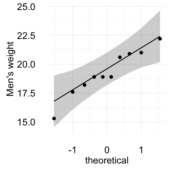
Compare Multiple Sample Variances in R

$
0
0


This article describes statistical tests for comparing the variances of two or more samples. Equal variances across samples is called homogeneity of variances.

Some statistical tests, such as two independent samples T-test and ANOVA test, assume that variances are equal across groups. The Bartlett’s test, Levene’s test or Fligner-Killeen’s test can be used to verify that assumption.


Compare Multiple Sample Variances in R

Statistical tests for comparing variances

There are many solutions to test for the equality (homogeneity) of variance across groups, including:

  • F-test: Compare the variances of two samples. The data must be normally distributed.

  • Bartlett’s test: Compare the variances of k samples, where k can be more than two samples. The data must be normally distributed. The Levene test is an alternative to the Bartlett test that is less sensitive to departures from normality.

  • Levene’s test: Compare the variances of k samples, where k can be more than two samples. It’s an alternative to the Bartlett’s test that is less sensitive to departures from normality.

  • Fligner-Killeen test: a non-parametric test which is very robust against departures from normality.


The F-test has been described in our previous article: F-test to compare equality of two variances. In the present article, we’ll describe the tests for comparing more than two variances.


Statistical hypotheses

For all these tests (Bartlett’s test, Levene’s test or Fligner-Killeen’s test),

  • the null hypothesis is that all populations variances are equal;
  • the alternative hypothesis is that at least two of them differ.

Import and check your data into R

To import your data, use the following R code:

# If .txt tab file, use this
my_data <- read.delim(file.choose())

# Or, if .csv file, use this
my_data <- read.csv(file.choose())

Here, we’ll use ToothGrowth and PlantGrowth data sets:

# Load the data
data(ToothGrowth)

data(PlantGrowth)

To have an idea of what the data look like, we start by displaying a random sample of 10 rows using the function sample_n()[in dplyr package]. First, install dplyr package if you don’t have it: install.packages(“dplyr”).

Show 10 random rows:

set.seed(123)
# Show PlantGrowth
dplyr::sample_n(PlantGrowth, 10)
   weight group
24   5.50  trt2
12   4.17  trt1
25   5.37  trt2
26   5.29  trt2
2    5.58  ctrl
14   3.59  trt1
22   5.12  trt2
13   4.41  trt1
11   4.81  trt1
21   6.31  trt2
# PlantGrowth data structure
str(PlantGrowth)
'data.frame':   30 obs. of  2 variables:
 $ weight: num  4.17 5.58 5.18 6.11 4.5 4.61 5.17 4.53 5.33 5.14 ...
 $ group : Factor w/ 3 levels "ctrl","trt1",..: 1 1 1 1 1 1 1 1 1 1 ...
# Show ToothGrowth
dplyr::sample_n(ToothGrowth, 10)
    len supp dose
28 21.5   VC  2.0
40  9.7   OJ  0.5
34  9.7   OJ  0.5
6  10.0   VC  0.5
51 25.5   OJ  2.0
14 17.3   VC  1.0
3   7.3   VC  0.5
18 14.5   VC  1.0
50 27.3   OJ  1.0
46 25.2   OJ  1.0
# ToothGrowth data structure
str(ToothGrowth)
'data.frame':   60 obs. of  3 variables:
 $ len : num  4.2 11.5 7.3 5.8 6.4 10 11.2 11.2 5.2 7 ...
 $ supp: Factor w/ 2 levels "OJ","VC": 2 2 2 2 2 2 2 2 2 2 ...
 $ dose: num  0.5 0.5 0.5 0.5 0.5 0.5 0.5 0.5 0.5 0.5 ...

Note that, R considers the column “dose” [in ToothGrowth data set] as a numeric vector. We want to convert it as a grouping variable (factor).

ToothGrowth$dose <- as.factor(ToothGrowth$dose)

We want to test the equality of variances between groups.

Compute Bartlett’s test in R


Bartlett’s test is used for testing homogeneity of variances in k samples, where k can be more than two. It’s adapted for normally distributed data. The Levene test, described in the next section, is a more robust alternative to the Bartlett test when the distributions of the data are non-normal.


The R function bartlett.test() can be used to compute Barlett’s test. The simplified format is as follow:

bartlett.test(formula, data)
  • formula: a formula of the form values ~ groups
  • data: a matrix or data frame

The function returns a list containing the following component:


  • statistic: Bartlett’s K-squared test statistic
  • parameter: the degrees of freedom of the approximate chi-squared distribution of the test statistic.
  • p.value: the p-value of the test


To perform the test, we’ll use the PlantGrowth data set, which contains the weight of plants obtained under 3 treatment groups.

  • Bartlett’s test with one independent variable:
res <- bartlett.test(weight ~ group, data = PlantGrowth)
res

    Bartlett test of homogeneity of variances

data:  weight by group
Bartlett's K-squared = 2.8786, df = 2, p-value = 0.2371

From the output, it can be seen that the p-value of 0.2370968 is not less than the significance level of 0.05. This means that there is no evidence to suggest that the variance in plant growth is statistically significantly different for the three treatment groups.

  • Bartlett’s test with multiple independent variables: the interaction() function must be used to collapse multiple factors into a single variable containing all combinations of the factors.
bartlett.test(len ~ interaction(supp,dose), data=ToothGrowth)

    Bartlett test of homogeneity of variances

data:  len by interaction(supp, dose)
Bartlett's K-squared = 6.9273, df = 5, p-value = 0.2261

Compute Levene’s test in R

As mentioned above, Levene’s test is an alternative to Bartlett’s test when the data is not normally distributed.

The function leveneTest() [in car package] can be used.

library(car)
# Levene's test with one independent variable
leveneTest(weight ~ group, data = PlantGrowth)
Levene's Test for Homogeneity of Variance (center = median)
      Df F value Pr(>F)
group  2  1.1192 0.3412
      27               
# Levene's test with multiple independent variables
leveneTest(len ~ supp*dose, data = ToothGrowth)
Levene's Test for Homogeneity of Variance (center = median)
      Df F value Pr(>F)
group  5  1.7086 0.1484
      54               

Compute Fligner-Killeen test in R

The Fligner-Killeen test is one of the many tests for homogeneity of variances which is most robust against departures from normality.

The R function fligner.test() can be used to compute the test:

fligner.test(weight ~ group, data = PlantGrowth)

    Fligner-Killeen test of homogeneity of variances

data:  weight by group
Fligner-Killeen:med chi-squared = 2.3499, df = 2, p-value = 0.3088

Infos

This analysis has been performed using R software (ver. 3.2.4).
Comparing Proportions in R

One-Proportion Z-Test in R

$
0
0


What is one-proportion Z-test?


The One proportionZ-test is used to compare an observed proportion to a theoretical one, when there are only two categories. This article describes the basics of one-proportion z-test and provides practical examples using R software.


For example, we have a population of mice containing half male and have female (p = 0.5 = 50%). Some of these mice (n = 160) have developed a spontaneous cancer, including 95 male and 65 female.

We want to know, whether the cancer affects more male than female?

In this setting:

  • the number of successes (male with cancer) is 95
  • The observed proportion (\(p_o\)) of male is 95/160
  • The observed proportion (\(q\)) of female is \(1 - p_o\)
  • The expected proportion (\(p_e\)) of male is 0.5 (50%)
  • The number of observations (\(n\)) is 160


One Proportion Z-Test in R

Research questions and statistical hypotheses

Typical research questions are:


  1. whether the observed proportion of male (\(p_o\)) is equal to the expected proportion (\(p_e\))?
  2. whether the observed proportion of male (\(p_o\)) is less than the expected proportion (\(p_e\))?
  3. whether the observed proportion of male (\(p\)) is greater than the expected proportion (\(p_e\))?


In statistics, we can define the corresponding null hypothesis (\(H_0\)) as follow:

  1. \(H_0: p_o = p_e\)
  2. \(H_0: p_o \leq p_e\)
  3. \(H_0: p_o \geq p_e\)

The corresponding alternative hypotheses (\(H_a\)) are as follow:

  1. \(H_a: p_o \ne p_e\) (different)
  2. \(H_a: p_o > p_e\) (greater)
  3. \(H_a: p_o < p_e\) (less)

Note that:

  • Hypotheses 1) are called two-tailed tests
  • Hypotheses 2) and 3) are called one-tailed tests

Formula of the test statistic

The test statistic (also known as z-test) can be calculated as follow:

\[ z = \frac{p_o-p_e}{\sqrt{p_oq/n}} \]

where,

  • \(p_o\) is the observed proportion
  • \(q = 1-p_o\)
  • \(p_e\) is the expected proportion
  • \(n\) is the sample size
  • if \(|z| < 1.96\), then the difference is not significant at 5%
  • if \(|z| \geq 1.96\), then the difference is significant at 5%
  • The significance level (p-value) corresponding to the z-statistic can be read in the z-table. We’ll see how to compute it in R.

The confidence interval of \(p_o\) at 95% is defined as follow:

\[ p_o \pm 1.96\sqrt{\frac{p_oq}{n}} \]

Note that, the formula of z-statistic is valid only when sample size (\(n\)) is large enough. \(np_o\) and \(nq\) should be \(\geq\) 5. For example, if \(p_o = 0.1\), then \(n\) should be at least 50.

Compute one proportion z-test in R

R functions: binom.test() & prop.test()

The R functions binom.test() and prop.test() can be used to perform one-proportion test:

  • binom.test(): compute exact binomial test. Recommended when sample size is small
  • prop.test(): can be used when sample size is large ( N > 30). It uses a normal approximation to binomial

The syntax of the two functions are exactly the same. The simplified format is as follow:

binom.test(x, n, p = 0.5, alternative = "two.sided")

prop.test(x, n, p = NULL, alternative = "two.sided",
          correct = TRUE)

  • x: the number of of successes
  • n: the total number of trials
  • p: the probability to test against.
  • correct: a logical indicating whether Yates’ continuity correction should be applied where possible.


Note that, by default, the function prop.test() used the Yates continuity correction, which is really important if either the expected successes or failures is < 5. If you don’t want the correction, use the additional argument correct = FALSE in prop.test() function. The default value is TRUE. (This option must be set to FALSE to make the test mathematically equivalent to the uncorrected z-test of a proportion.)

Compute one-proportion z-test

We want to know, whether the cancer affects more male than female?

We’ll use the function prop.test()

res <- prop.test(x = 95, n = 160, p = 0.5, 
                 correct = FALSE)

# Printing the results
res 

    1-sample proportions test without continuity correction

data:  95 out of 160, null probability 0.5
X-squared = 5.625, df = 1, p-value = 0.01771
alternative hypothesis: true p is not equal to 0.5
95 percent confidence interval:
 0.5163169 0.6667870
sample estimates:
      p 
0.59375 

The function returns:

  • the value of Pearson’s chi-squared test statistic.
  • a p-value
  • a 95% confidence intervals
  • an estimated probability of success (the proportion of male with cancer)


Note that:

  • if you want to test whether the proportion of male with cancer is less than 0.5 (one-tailed test), type this:
prop.test(x = 95, n = 160, p = 0.5, correct = FALSE,
           alternative = "less")
  • Or, if you want to test whether the proportion of male with cancer is greater than 0.5 (one-tailed test), type this:
prop.test(x = 95, n = 160, p = 0.5, correct = FALSE,
              alternative = "greater")


Interpretation of the result

The p-value of the test is 0.01771, which is less than the significance level alpha = 0.05. We can conclude that the proportion of male with cancer is significantly different from 0.5 with a p-value = 0.01771.

Access to the values returned by prop.test()

The result of prop.test() function is a list containing the following components:


  • statistic: the number of successes
  • parameter: the number of trials
  • p.value: the p-value of the test
  • conf.int: a confidence interval for the probability of success.
  • estimate: the estimated probability of success.


The format of the R code to use for getting these values is as follow:

# printing the p-value
res$p.value
[1] 0.01770607
# printing the mean
res$estimate
      p 
0.59375 
# printing the confidence interval
res$conf.int
[1] 0.5163169 0.6667870
attr(,"conf.level")
[1] 0.95

Infos

This analysis has been performed using R software (ver. 3.2.4).
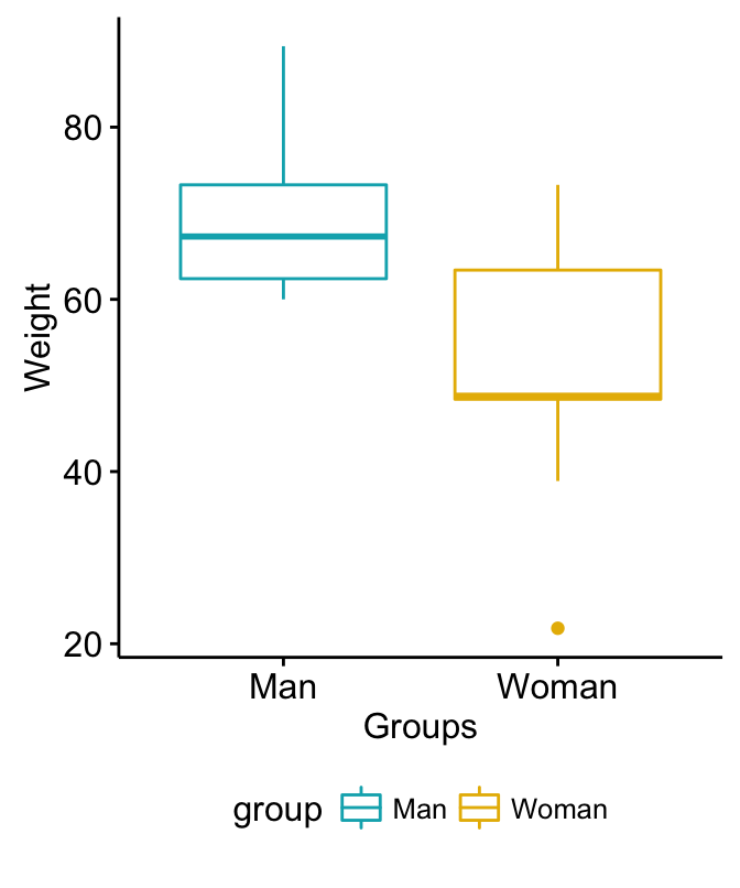
Viewing all 183 articles
Browse latest View live


<script src="https://jsc.adskeeper.com/r/s/rssing.com.1596347.js" async> </script>