Quantcast
Channel: Easy Guides
Viewing all 183 articles
Browse latest View live

Two-Proportions Z-Test in R

$
0
0


What is two-proportions z-test?


The two-proportionsz-test is used to compare two observed proportions. This article describes the basics of two-proportions *z-test and provides pratical examples using R sfoftware**.


For example, we have two groups of individuals:

  • Group A with lung cancer: n = 500
  • Group B, healthy individuals: n = 500

The number of smokers in each group is as follow:

  • Group A with lung cancer: n = 500, 490 smokers, \(p_A = 490/500 = 98%\)
  • Group B, healthy individuals: n = 500, 400 smokers, \(p_B = 400/500 = 80%\)

In this setting:

  • The overall proportion of smokers is \(p = frac{(490 + 400)}{500 + 500} = 89%\)
  • The overall proportion of non-smokers is \(q = 1-p = 11%\)

We want to know, whether the proportions of smokers are the same in the two groups of individuals?


Two Proportions Z-Test in R

Research questions and statistical hypotheses

Typical research questions are:


  1. whether the observed proportion of smokers in group A (\(p_A\)) is equal to the observed proportion of smokers in group (\(p_B\))?
  2. whether the observed proportion of smokers in group A (\(p_A\)) is less than the observed proportion of smokers in group (\(p_B\))?
  3. whether the observed proportion of smokers in group A (\(p_A\)) is greater than the observed proportion of smokers in group (\(p_B\))?


In statistics, we can define the corresponding null hypothesis (\(H_0\)) as follow:

  1. \(H_0: p_A = p_B\)
  2. \(H_0: p_A \leq p_B\)
  3. \(H_0: p_A \geq p_B\)

The corresponding alternative hypotheses (\(H_a\)) are as follow:

  1. \(H_a: p_A \ne p_B\) (different)
  2. \(H_a: p_A > p_B\) (greater)
  3. \(H_a: p_A < p_B\) (less)

Note that:

  • Hypotheses 1) are called two-tailed tests
  • Hypotheses 2) and 3) are called one-tailed tests

Formula of the test statistic

Case of large sample sizes

The test statistic (also known as z-test) can be calculated as follow:

\[ z = \frac{p_A-p_B}{\sqrt{pq/n_A+pq/n_B}} \]

where,

  • \(p_A\) is the proportion observed in group A with size \(n_A\)
  • \(p_B\) is the proportion observed in group B with size \(n_B\)
  • \(p\) and \(q\) are the overall proportions
  • if \(|z| < 1.96\), then the difference is not significant at 5%
  • if \(|z| \geq 1.96\), then the difference is significant at 5%
  • The significance level (p-value) corresponding to the z-statistic can be read in the z-table. We’ll see how to compute it in R.

Note that, the formula of z-statistic is valid only when sample size (\(n\)) is large enough. \(n_Ap\), \(n_Aq\), \(n_Bp\) and \(n_Bq\) should be \(\geq\) 5.

Case of small sample sizes

The Fisher Exact probability test is an excellent non-parametric technique for comparing proportions, when the two independent samples are small in size.

Compute two-proportions z-test in R

R functions: prop.test()

The R functions prop.test() can be used as follow:

prop.test(x, n, p = NULL, alternative = "two.sided",
          correct = TRUE)

  • x: a vector of counts of successes
  • n: a vector of count trials
  • alternative: a character string specifying the alternative hypothesis
  • correct: a logical indicating whether Yates’ continuity correction should be applied where possible


Note that, by default, the function prop.test() used the Yates continuity correction, which is really important if either the expected successes or failures is < 5. If you don’t want the correction, use the additional argument correct = FALSE in prop.test() function. The default value is TRUE. (This option must be set to FALSE to make the test mathematically equivalent to the uncorrected z-test of a proportion.)

Compute two-proportions z-test

We want to know, whether the proportions of smokers are the same in the two groups of individuals?

res <- prop.test(x = c(490, 400), n = c(500, 500))

# Printing the results
res 

    2-sample test for equality of proportions with continuity correction

data:  c(490, 400) out of c(500, 500)
X-squared = 80.909, df = 1, p-value < 2.2e-16
alternative hypothesis: two.sided
95 percent confidence interval:
 0.1408536 0.2191464
sample estimates:
prop 1 prop 2 
  0.98   0.80 

The function returns:

  • the value of Pearson’s chi-squared test statistic.
  • a p-value
  • a 95% confidence intervals
  • an estimated probability of success (the proportion of smokers in the two groups)


Note that:

  • if you want to test whether the observed proportion of smokers in group A (\(p_A\)) is less than the observed proportion of smokers in group (\(p_B\)), type this:
prop.test(x = c(490, 400), n = c(500, 500),
           alternative = "less")
  • Or, if you want to test whether the observed proportion of smokers in group A (\(p_A\)) is greater than the observed proportion of smokers in group (\(p_B\)), type this:
prop.test(x = c(490, 400), n = c(500, 500),
              alternative = "greater")


Interpretation of the result

The p-value of the test is 2.36310^{-19}, which is less than the significance level alpha = 0.05. We can conclude that the proportion of smokers is significantly different in the two groups with a p-value = 2.36310^{-19}.

Note that, for 2 x 2 table, the standard chi-square test in chisq.test() is exactly equivalent to prop.test() but it works with data in matrix form.

Access to the values returned by prop.test() function

The result of prop.test() function is a list containing the following components:


  • statistic: the number of successes
  • parameter: the number of trials
  • p.value: the p-value of the test
  • conf.int: a confidence interval for the probability of success.
  • estimate: the estimated probability of success.


The format of the R code to use for getting these values is as follow:

# printing the p-value
res$p.value
[1] 2.363439e-19
# printing the mean
res$estimate
prop 1 prop 2 
  0.98   0.80 
# printing the confidence interval
res$conf.int
[1] 0.1408536 0.2191464
attr(,"conf.level")
[1] 0.95

Infos

This analysis has been performed using R software (ver. 3.2.4).


Chi-square Goodness of Fit Test in R

$
0
0


What is chi-square goodness of fit test?


The chi-squaregoodness of fit test is used to compare the observed distribution to an expected distribution, in a situation where we have two or more categories in a discrete data. In other words, it compares multiple observed proportions to expected probabilities.


Chi-square Goodness of Fit test in R

Example data and questions

For example, we collected wild tulips and found that 81 were red, 50 were yellow and 27 were white.

  1. Question 1:

Are these colors equally common?

If these colors were equally distributed, the expected proportion would be 1/3 for each of the color.

  1. Question 2:

Suppose that, in the region where you collected the data, the ratio of red, yellow and white tulip is 3:2:1 (3+2+1 = 6). This means that the expected proportion is:

  • 3/6 (= 1/2) for red
  • 2/6 ( = 1/3) for yellow
  • 1/6 for white

We want to know, if there is any significant difference between the observed proportions and the expected proportions.

Statistical hypotheses

  • Null hypothesis (\(H_0\)): There is no significant difference between the observed and the expected value.
  • Alternative hypothesis (\(H_a\)): There is a significant difference between the observed and the expected value.

R function: chisq.test()

The R function chisq.test() can be used as follow:

chisq.test(x, p)

  • x: a numeric vector
  • p: a vector of probabilities of the same length of x.


Answer to Q1: Are the colors equally common?

tulip <- c(81, 50, 27)
res <- chisq.test(tulip, p = c(1/3, 1/3, 1/3))
res

    Chi-squared test for given probabilities

data:  tulip
X-squared = 27.886, df = 2, p-value = 8.803e-07

The function returns: the value of chi-square test statistic (“X-squared”) and a a p-value.


The p-value of the test is 8.80310^{-7}, which is less than the significance level alpha = 0.05. We can conclude that the colors are significantly not commonly distributed with a p-value = 8.80310^{-7}.

Note that, the chi-square test should be used only when all calculated expected values are greater than 5.

# Access to the expected values
res$expected
[1] 52.66667 52.66667 52.66667

Answer to Q2 comparing observed to expected proportions

tulip <- c(81, 50, 27)
res <- chisq.test(tulip, p = c(1/2, 1/3, 1/6))
res

    Chi-squared test for given probabilities

data:  tulip
X-squared = 0.20253, df = 2, p-value = 0.9037

The p-value of the test is 0.9037, which is greater than the significance level alpha = 0.05. We can conclude that the observed proportions are not significantly different from the expected proportions.

Access to the values returned by chisq.test() function

The result of chisq.test() function is a list containing the following components:


  • statistic: the value the chi-squared test statistic.
  • parameter: the degrees of freedom
  • p.value: the p-value of the test
  • observed: the observed count
  • expected: the expected count


The format of the R code to use for getting these values is as follow:

# printing the p-value
res$p.value
[1] 0.9036928
# printing the mean
res$estimate
NULL

Infos

This analysis has been performed using R software (ver. 3.2.4).

Chi-Square Test of Independence in R

$
0
0


What is chi-square test of independence?


The chi-square test of independence is used to analyze the frequency table (i.e. contengency table) formed by two categorical variables. The chi-square test evaluates whether there is a significant association between the categories of the two variables. This article describes the basics of chi-square test and provides practical examples using R software.


Chi-Square Test of Independence in R

Data format: Contingency tables

We’ll use housetasks data sets from STHDA: http://www.sthda.com/sthda/RDoc/data/housetasks.txt.

# Import the data
file_path <- "http://www.sthda.com/sthda/RDoc/data/housetasks.txt"
housetasks <- read.delim(file_path, row.names = 1)
# head(housetasks)

An image of the data is displayed below:

Data format correspondence analysis

Data format correspondence analysis


The data is a contingency table containing 13 housetasks and their distribution in the couple:

  • rows are the different tasks
  • values are the frequencies of the tasks done :
  • by the wife only
  • alternatively
  • by the husband only
  • or jointly


Graphical display of contengency tables

Contingency table can be visualized using the function balloonplot() [in gplots package]. This function draws a graphical matrix where each cell contains a dot whose size reflects the relative magnitude of the corresponding component.

To execute the R code below, you should install the package gplots: install.packages(“gplots”).

library("gplots")
# 1. convert the data as a table
dt <- as.table(as.matrix(housetasks))
# 2. Graph
balloonplot(t(dt), main ="housetasks", xlab ="", ylab="",
            label = FALSE, show.margins = FALSE)
Chi-Square Test of Independence in R

Chi-Square Test of Independence in R

Note that, row and column sums are printed by default in the bottom and right margins, respectively. These values can be hidden using the argument show.margins = FALSE.

Chi-square test basics

Chi-square test examines whether rows and columns of a contingency table are statistically significantly associated.

  • Null hypothesis (H0): the row and the column variables of the contingency table are independent.
  • Alternative hypothesis (H1): row and column variables are dependent

For each cell of the table, we have to calculate the expected value under null hypothesis.

For a given cell, the expected value is calculated as follow:


\[ e = \frac{row.sum * col.sum}{grand.total} \]


The Chi-square statistic is calculated as follow:


\[ \chi^2 = \sum{\frac{(o - e)^2}{e}} \]

  • o is the observed value
  • e is the expected value


This calculated Chi-square statistic is compared to the critical value (obtained from statistical tables) with \(df = (r - 1)(c - 1)\) degrees of freedom and p = 0.05.

  • r is the number of rows in the contingency table
  • c is the number of column in the contingency table

If the calculated Chi-square statistic is greater than the critical value, then we must conclude that the row and the column variables are not independent of each other. This implies that they are significantly associated.

Note that, Chi-square test should only be applied when the expected frequency of any cell is at least 5.

Compute chi-square test in R

Chi-square statistic can be easily computed using the function chisq.test() as follow:

chisq <- chisq.test(housetasks)
chisq

    Pearson's Chi-squared test

data:  housetasks
X-squared = 1944.5, df = 36, p-value < 2.2e-16

In our example, the row and the column variables are statistically significantly associated (p-value = 0).

The observed and the expected counts can be extracted from the result of the test as follow:

# Observed counts
chisq$observed
           Wife Alternating Husband Jointly
Laundry     156          14       2       4
Main_meal   124          20       5       4
Dinner       77          11       7      13
Breakfeast   82          36      15       7
Tidying      53          11       1      57
Dishes       32          24       4      53
Shopping     33          23       9      55
Official     12          46      23      15
Driving      10          51      75       3
Finances     13          13      21      66
Insurance     8           1      53      77
Repairs       0           3     160       2
Holidays      0           1       6     153
# Expected counts
round(chisq$expected,2)
            Wife Alternating Husband Jointly
Laundry    60.55       25.63   38.45   51.37
Main_meal  52.64       22.28   33.42   44.65
Dinner     37.16       15.73   23.59   31.52
Breakfeast 48.17       20.39   30.58   40.86
Tidying    41.97       17.77   26.65   35.61
Dishes     38.88       16.46   24.69   32.98
Shopping   41.28       17.48   26.22   35.02
Official   33.03       13.98   20.97   28.02
Driving    47.82       20.24   30.37   40.57
Finances   38.88       16.46   24.69   32.98
Insurance  47.82       20.24   30.37   40.57
Repairs    56.77       24.03   36.05   48.16
Holidays   55.05       23.30   34.95   46.70

Nature of the dependence between the row and the column variables

As mentioned above the total Chi-square statistic is 1944.456196.

If you want to know the most contributing cells to the total Chi-square score, you just have to calculate the Chi-square statistic for each cell:

\[ r = \frac{o - e}{\sqrt{e}} \]

The above formula returns the so-called Pearson residuals (r) for each cell (or standardized residuals)

Cells with the highest absolute standardized residuals contribute the most to the total Chi-square score.

Pearson residuals can be easily extracted from the output of the function chisq.test():

round(chisq$residuals, 3)
             Wife Alternating Husband Jointly
Laundry    12.266      -2.298  -5.878  -6.609
Main_meal   9.836      -0.484  -4.917  -6.084
Dinner      6.537      -1.192  -3.416  -3.299
Breakfeast  4.875       3.457  -2.818  -5.297
Tidying     1.702      -1.606  -4.969   3.585
Dishes     -1.103       1.859  -4.163   3.486
Shopping   -1.289       1.321  -3.362   3.376
Official   -3.659       8.563   0.443  -2.459
Driving    -5.469       6.836   8.100  -5.898
Finances   -4.150      -0.852  -0.742   5.750
Insurance  -5.758      -4.277   4.107   5.720
Repairs    -7.534      -4.290  20.646  -6.651
Holidays   -7.419      -4.620  -4.897  15.556

Let’s visualize Pearson residuals using the package corrplot:

library(corrplot)
corrplot(chisq$residuals, is.cor = FALSE)
Chi-Square Test of Independence in R

Chi-Square Test of Independence in R

For a given cell, the size of the circle is proportional to the amount of the cell contribution.

The sign of the standardized residuals is also very important to interpret the association between rows and columns as explained in the block below.


  1. Positive residuals are in blue. Positive values in cells specify an attraction (positive association) between the corresponding row and column variables.
  • In the image above, it’s evident that there are an association between the column Wife and the rows Laundry, Main_meal.
  • There is a strong positive association between the column Husband and the row Repair
  1. Negative residuals are in red. This implies a repulsion (negative association) between the corresponding row and column variables. For example the column Wife are negatively associated (~ “not associated”) with the row Repairs. There is a repulsion between the column Husband and, the rows Laundry and Main_meal


The contribution (in %) of a given cell to the total Chi-square score is calculated as follow:


\[ contrib = \frac{r^2}{\chi^2} \]


  • r is the residual of the cell
# Contibution in percentage (%)
contrib <- 100*chisq$residuals^2/chisq$statistic
round(contrib, 3)
            Wife Alternating Husband Jointly
Laundry    7.738       0.272   1.777   2.246
Main_meal  4.976       0.012   1.243   1.903
Dinner     2.197       0.073   0.600   0.560
Breakfeast 1.222       0.615   0.408   1.443
Tidying    0.149       0.133   1.270   0.661
Dishes     0.063       0.178   0.891   0.625
Shopping   0.085       0.090   0.581   0.586
Official   0.688       3.771   0.010   0.311
Driving    1.538       2.403   3.374   1.789
Finances   0.886       0.037   0.028   1.700
Insurance  1.705       0.941   0.868   1.683
Repairs    2.919       0.947  21.921   2.275
Holidays   2.831       1.098   1.233  12.445
# Visualize the contribution
corrplot(contrib, is.cor = FALSE)
Chi-Square Test of Independence in R

Chi-Square Test of Independence in R

The relative contribution of each cell to the total Chi-square score give some indication of the nature of the dependency between rows and columns of the contingency table.

It can be seen that:

  1. The column “Wife” is strongly associated with Laundry, Main_meal, Dinner
  2. The column “Husband” is strongly associated with the row Repairs
  3. The column jointly is frequently associated with the row Holidays

From the image above, it can be seen that the most contributing cells to the Chi-square are Wife/Laundry (7.74%), Wife/Main_meal (4.98%), Husband/Repairs (21.9%), Jointly/Holidays (12.44%).

These cells contribute about 47.06% to the total Chi-square score and thus account for most of the difference between expected and observed values.

This confirms the earlier visual interpretation of the data. As stated earlier, visual interpretation may be complex when the contingency table is very large. In this case, the contribution of one cell to the total Chi-square score becomes a useful way of establishing the nature of dependency.

Access to the values returned by chisq.test() function

The result of chisq.test() function is a list containing the following components:


  • statistic: the value the chi-squared test statistic.
  • parameter: the degrees of freedom
  • p.value: the p-value of the test
  • observed: the observed count
  • expected: the expected count


The format of the R code to use for getting these values is as follow:

# printing the p-value
chisq$p.value
# printing the mean
chisq$estimate

Infos

This analysis has been performed using R software (ver. 3.2.4).

RQuery

$
0
0

Introduction


RQuery, the simplified R code!
RQuery is a set of R functions allowing you to do your statistical and graphics analysis, quickly and easily. It requires no special knowledge of programming in R. You just have to follow the various tutorials on it to answer your specific needs. It is therefore well suited for a beginner in R programming. RQuery functions can be used directly in R console by sourcing the rquery.r file.
With Rquery, you will be able, in the most cases, to do complex analysis with only one R command line. RQuery is also associated with an executable GUI. It can also be used online without installing anything on your own machine.


This page presents some of RQuery features. RQuery is multiplatform and thus works well on Windows, Mac and Linux.

Rss

Graphic generated by RQuery


Preparing and Reshaping Data in R for Easier Analyses

$
0
0


Previously, we described the essentials of R programming and provided quick start guides for importing data into R. The next crucial step is to set your data into a consistent data structure for easier analyses. Here, you’ll learn modern conventions for preparing and reshapingdata in order to facilitate analyses in R.


Importing data into R


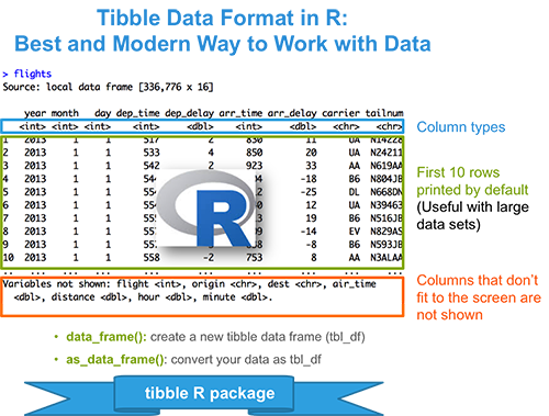
  1. Tibble Data Format in R: Best and Modern Way to Work with your Data
  • Installing and loading tibble package: type install.packages(“tibble”) for installing and library(“tibble”) for loading.
  • Create a new tibble: data_frame(x = rnorm(100), y = rnorm(100)).
  • Convert your data as a tibble: as_data_frame(iris)
  • Advantages of tibbles compared to data frames: nice printing methods for large data sets, specification of column types.


tibble data format: tbl_df

Read more: Tibble Data Format in R: Best and Modern Way to Work with your Data

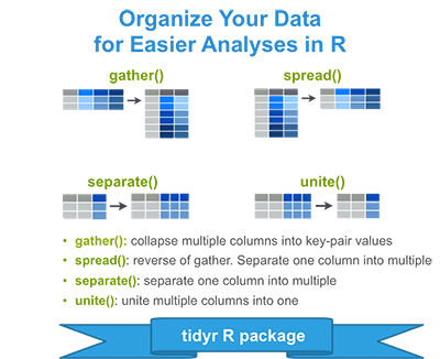
  1. Tidyr: crucial Step Reshaping Data with R for Easier Analyses
  • What is a tidy data set?: a data structure convention where each column is a variable and each row an observation
  • Reshaping data using tidyr package
    • Installing and loading tidyr: type install.packages(“tidyr”) for installing and library(“tidyr”) for loading.
    • Example data sets: USArrests
    • gather(): collapse columns into rows
    • spread(): spread two columns into multiple columns
    • unite(): Unite multiple columns into one
    • separate(): separate one column into multiple
    • %>%: Chaining multiple operations


Tidyr: crucial Step Reshaping Data with R for Easier Analyses

Read more: Tidyr: crucial Step Reshaping Data with R for Easier Analyses


Bar plot of Group Means with Individual Observations

$
0
0


ggpubr is great for data visualization and very easy to use for non-“R programmer”. It makes easy to simply produce an elegant ggplot2-based graphs. Read more about ggpubr: ggpubr .

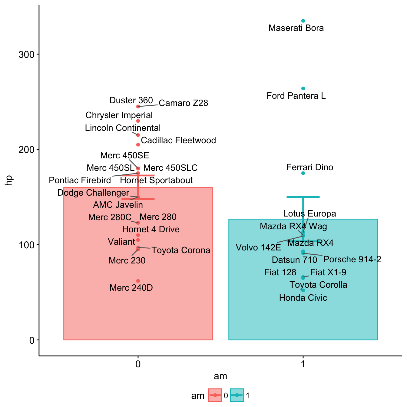
Here we demonstrate how to plot easily a barplot of group means +/- standard error with individual observations.

Example data sets

d <- as.data.frame(mtcars[, c("am", "hp")])
d$rowname <- rownames(d)
head(d)
##                   am  hp           rowname
## Mazda RX4          1 110         Mazda RX4
## Mazda RX4 Wag      1 110     Mazda RX4 Wag
## Datsun 710         1  93        Datsun 710
## Hornet 4 Drive     0 110    Hornet 4 Drive
## Hornet Sportabout  0 175 Hornet Sportabout
## Valiant            0 105           Valiant

Install ggpubr

The latest version of ggpubr can be installed as follow:

# Install ggpubr
if(!require(devtools)) install.packages("devtools")
devtools::install_github("kassambara/ggpubr")

Bar plot of group means with individual informations

  • Plot y = “hp” by groups x = “am”
  • Add mean +/- standard error and individual points: add = c(“mean_se”, “point”). Allowed values are one or the combination of: “none”, “dotplot”, “jitter”, “boxplot”, “point”, “mean”, “mean_se”, “mean_sd”, “mean_ci”, “mean_range”, “median”, “median_iqr”, “median_mad”, “median_range”.
  • Color and fill by groups: color = “am”, fill = “am”
  • Add row names as labels.
library(ggpubr)
# Bar plot of group means + points
ggbarplot(d, x = "am", y = "hp",
          add = c("mean_se", "point"),
          color = "am", fill = "am", alpha = 0.5)+ 
  ggrepel::geom_text_repel(aes(label = rowname))
Bar plot of Group Means with Individual Observations

Bar plot of Group Means with Individual Observations

Assessing clustering tendency: A vital issue - Unsupervised Machine Learning

$
0
0


Clustering algorithms, including partitioning methods (K-means, PAM, CLARA and FANNY) and hierarchical clustering, are used to split the dataset into groups or clusters of similar objects.

Before applying any clustering method on the dataset, a natural question is:

Does the dataset contains any inherent clusters?

A big issue, in unsupervised machine learning, is that clustering methods will return clusters even if the data does not contain any clusters. In other words, if you blindly apply a clustering analysis on a dataset, it will divide the data into clusters because that is what it supposed to do.

Therefore before choosing a clustering approach, the analyst has to decide whether the dataset contains meaningful clusters (i.e nonrandom structures) or not. If yes, then how many clusters are there. This process is defined as the assessing of clustering tendency or the feasibility of the clustering analysis.


In this chapter:

  • We describe why we should evaluate the clustering tendency (i.e., clusterability) before applying any cluster analysis on a dataset.
  • We describe statistical and visual methods for assessing the clustering tendency
  • R lab sections containing many examples are also provided for computing clustering tendency and visualizing clusters


1 Required packages

The following R packages are required in this chapter:

  • factoextra for data visualization
  • clustertend for assessing clustering tendency
  • seriation for visually assessment of cluster tendency
  1. factoextra can be installed as follow:
if(!require(devtools)) install.packages("devtools")
devtools::install_github("kassambara/factoextra")
  1. Install clustertend and seriation:
install.packages("clustertend")
install.packages("seriation")
  1. Load required packages:
library(factoextra)
library(clustertend)
library(seriation)

2 Data preparation

We’ll use two datasets: the built-in R dataset faithful and a simulated dataset.

2.1 faithful dataset

faithful dataset contains the waiting time between eruptions and the duration of the eruption for the Old Faithful geyser in Yellowstone National Park (Wyoming, USA).

# Load the data
data("faithful")
df <- faithful
head(df)
##   eruptions waiting
## 1     3.600      79
## 2     1.800      54
## 3     3.333      74
## 4     2.283      62
## 5     4.533      85
## 6     2.883      55

An illustration of the data can be drawn using ggplot2 package as follow:

library("ggplot2")
ggplot(df, aes(x=eruptions, y=waiting)) +
  geom_point() +  # Scatter plot
  geom_density_2d() # Add 2d density estimation

2.2 Random uniformly distributed dataset

The R code below generates a random uniform data with the same dimension as the faithful dataset. The function runif(n, min, max) is used for generating uniform distribution on the interval from min to max.

# Generate random dataset
set.seed(123)
n <- nrow(df)

random_df <- data.frame(
  x = runif(nrow(df), min(df$eruptions), max(df$eruptions)),
  y = runif(nrow(df), min(df$waiting), max(df$waiting)))

# Plot the data
ggplot(random_df, aes(x, y)) + geom_point()


Note that for a given real dataset, random uniform data can be generated in a single line function call as follow:

random_df <- apply(df, 2, 
                function(x, n){runif(n, min(x), (max(x)))}, n)


3 Why assessing clustering tendency?

As shown above, we know that faithful dataset contains 2 real clusters. However the randomly generated dataset doesn’t contain any meaningful clusters.

The R code below computes k-means clustering and/or hierarchical clustering on the two datasets. The function fviz_cluster() and fviz_dend() [in factoextra] will be used to visualize the results.

library(factoextra)
set.seed(123)
# K-means on faithful dataset
km.res1 <- kmeans(df, 2)
fviz_cluster(list(data = df, cluster = km.res1$cluster),
             frame.type = "norm", geom = "point", stand = FALSE)

# K-means on the random dataset
km.res2 <- kmeans(random_df, 2)
fviz_cluster(list(data = random_df, cluster = km.res2$cluster),
             frame.type = "norm", geom = "point", stand = FALSE)

# Hierarchical clustering on the random dataset
fviz_dend(hclust(dist(random_df)), k = 2,  cex = 0.5)

It can be seen that, k-means algorithm and hierarchical clustering impose a classification on the random uniformly distributed dataset even if there are no meaningful clusters present in it.

Clustering tendency assessment methods are used to avoid this issue.

4 Methods for assessing clustering tendency

Clustering tendency assessment determines whether a given dataset contains meaningful clusters (i.e., non-random structure).

In this section, we’ll describe two methods for determining the clustering tendency: i) a statistical (Hopkins statistic) and ii) a visual methods (Visual Assessment of cluster Tendency (VAT) algorithm).

4.1 Hopkins statistic

Hopkins statistic is used to assess the clustering tendency of a dataset by measuring the probability that a given dataset is generated by a uniform data distribution. In other words it tests the spatial randomness of the data.

4.1.1 Algorithm

Let D be a real dataset. The Hopkins statistic can be calculated as follow:


  1. Sample uniformly \(n\) points (\(p_1\),…, \(p_n\)) from D.
  2. For each point \(p_i \in D\), find it’s nearest neighbor \(p_j\); then compute the distance between \(p_i\) and \(p_j\) and denote it as \(x_i = dist(p_i, p_j)\)
  3. Generate a simulated dataset (\(random_D\)) drawn from a random uniform distribution with \(n\) points (\(q_1\),…, \(q_n\)) and the same variation as the original real dataset D.
  4. For each point \(q_i \in random_D\), find it’s nearest neighbor \(q_j\) in D; then compute the distance between \(q_i\) and \(q_j\) and denote it \(y_i = dist(q_i, q_j)\)
  5. Calculate the Hopkins statistic (H) as the mean nearest neighbor distance in the random dataset divided by the sum of the mean nearest neighbor distances in the real and across the simulated dataset.

The formula is defined as follow:

\[H = \frac{\sum\limits_{i=1}^ny_i}{\sum\limits_{i=1}^nx_i + \sum\limits_{i=1}^ny_i}\]


A value of H about 0.5 means that \(\sum\limits_{i=1}^ny_i\) and \(\sum\limits_{i=1}^nx_i\) are close to each other, and thus the data D is uniformly distributed.

The null and the alternative hypotheses are defined as follow:

  • Null hypothesis: the dataset D is uniformly distributed (i.e., no meaningful clusters)
  • Alternative hypothesis: the dataset D is not uniformly distributed (i.e., contains meaningful clusters)

If the value of Hopkins statistic is close to zero, then we can reject the null hypothesis and conclude that the dataset D is significantly a clusterable data.

4.1.2 R function for computing Hopkins statistic

The function hopkins() [in clustertend package] can be used to statistically evaluate clustering tendency in R. The simplified format is:

hopkins(data, n, byrow = F, header = F)

  • data: a data frame or matrix
  • n: the number of points to be selected from the data
  • byrow: logical value. If FALSE (default), the variables is taken by columns, otherwise the variables is taken by rows
  • header: logical. If FALSE (the default) the first column (or row) will be deleted in the calculation


library(clustertend)
# Compute Hopkins statistic for faithful dataset
set.seed(123)
hopkins(faithful, n = nrow(faithful)-1)
## $H
## [1] 0.1588201
# Compute Hopkins statistic for a random dataset
set.seed(123)
hopkins(random_df, n = nrow(random_df)-1)
## $H
## [1] 0.5388899

It can be seen that faithful dataset is highly clusterable (the H value = 0.15 which is far below the threshold 0.5). However the random_df dataset is not clusterable (\(H = 0.53\))

4.2 VAT: Visual Assessment of cluster Tendency

The visual assessment of cluster tendency (VAT) has been originally described by Bezdek and Hathaway (2002). This approach can be used to visually inspect the clustering tendency of the dataset.

4.2.1 VAT Algorithm

The algorithm of VAT is as follow:


  1. Compute the dissimilarity (DM) matrix between the objects in the dataset using Euclidean distance measure
  2. Reorder the DM so that similar objects are close to one another. This process create an ordered dissimilarity matrix (ODM)
  3. The ODM is displayed as an ordered dissimilarity image (ODI), which is the visual output of VAT


4.2.2 R functions for VAT

We start by scaling the data using the function scale(). Next we compute the dissimilarity matrix between observations using the function dist(). finally the function dissplot() [in the package seriation] is used to display an ordered dissimilarity image.

The R code below computes VAT algorithm for the faithful dataset

library("seriation")
# faithful data: ordered dissimilarity image
df_scaled <- scale(faithful)
df_dist <- dist(df_scaled) 
dissplot(df_dist)

The gray level is proportional to the value of the dissimilarity between observations: pure black if \(dist(x_i, x_j) = 0\) and pure white if \(dist(x_i, x_j) = 1\). Objects belonging to the same cluster are displayed in consecutive order.

The VAT detects the clustering tendency in a visual form by counting the number of square shaped dark blocks along the diagonal in a VAT image.

The figure above suggests two clusters represented by two well-formed black blocks.

The same analysis can be done with the random dataset:

# faithful data: ordered dissimilarity image
random_df_scaled <- scale(random_df)
random_df_dist <- dist(random_df_scaled) 
dissplot(random_df_dist)

It can be seen that the random_df dataset doesn’t contain any evident clusters.

Now, we can perform k-means on faithful dataset and add cluster labels on the dissimilarity plot:

set.seed(123)
km.res <- kmeans(scale(faithful), 2)
dissplot(df_dist, labels = km.res$cluster)

After showing that the data is clusterable, the next step is to determine the number of optimal clusters in the data. This will be described in the next chapter.

5 A single function for Hopkins statistic and VAT

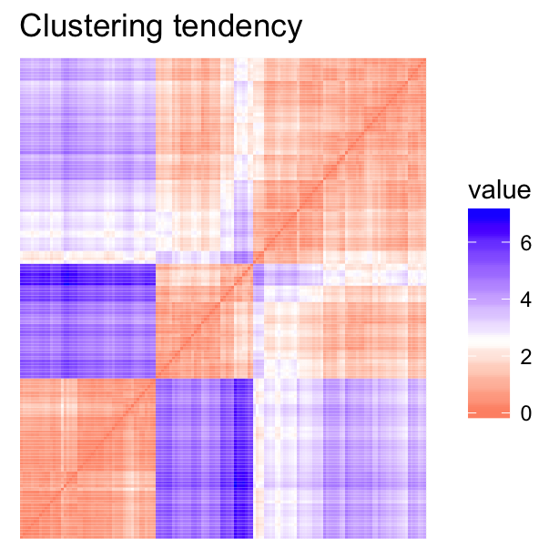
The function get_clust_tendency() [in factoextra package] can be used to compute Hopkins statistic and provides also an ordered dissimilarity image using ggplot2, in a single function call. The ordering of dissimilarity matrix is done using hierarchical clustering.

# Cluster tendency
clustend <- get_clust_tendency(scale(faithful), 100)
# Hopkins statistic
clustend$hopkins_stat
## [1] 0.1482683
# Customize the plot
clustend$plot + 
  scale_fill_gradient(low = "steelblue", high = "white")

6 Infos

This analysis has been performed using R software (ver. 3.2.4)

Hybrid hierarchical k-means clustering for optimizing clustering outputs - Unsupervised Machine Learning

$
0
0


Clustering algorithms are used to split a dataset into several groups (i.e clusters), so that the objects in the same group are as similar as possible and the objects in different groups are as dissimilar as possible.

The most popular clustering algorithms are:

However, each of these two standard clustering methods has its limitations. K-means clustering requires the user to specify the number of clusters in advance and selects initial centroids randomly. Agglomerative hierarchical clustering is good at identifying small clusters but not large ones.

In this article, we document hybrid approaches for easily mixing the best of k-means clustering and hierarchical clustering.

1 How this article is organized

We’ll start by demonstrating why we should combine k-means and hierarcical clustering. An application is provided using R software.

Finally, we’ll provide an easy to use R function (in factoextra package) for computing hybrid hierachical k-means clustering.

2 Required R packages

We’ll use the R package factoextra which is very helpful for simplifying clustering workflows and for visualizing clusters using ggplot2 plotting system

Install factoextra package as follow:

if(!require(devtools)) install.packages("devtools")
devtools::install_github("kassambara/factoextra")

Load the package:

library(factoextra)

3 Data preparation

We’ll use USArrest dataset and we start by scaling the data:

# Load the data
data(USArrests)
# Scale the data
df <- scale(USArrests)
head(df)
##                Murder   Assault   UrbanPop         Rape
## Alabama    1.24256408 0.7828393 -0.5209066 -0.003416473
## Alaska     0.50786248 1.1068225 -1.2117642  2.484202941
## Arizona    0.07163341 1.4788032  0.9989801  1.042878388
## Arkansas   0.23234938 0.2308680 -1.0735927 -0.184916602
## California 0.27826823 1.2628144  1.7589234  2.067820292
## Colorado   0.02571456 0.3988593  0.8608085  1.864967207

If you want to understand why the data are scaled before the analysis, then you should read this section: Distances and scaling.

4 R function for clustering analyses

We’ll use the function eclust() [in factoextra] which provides several advantages as described in the previous chapter: Visual Enhancement of Clustering Analysis.

eclust() stands for enhanced clustering. It simplifies the workflow of clustering analysis and, it can be used for computing hierarchical clustering and partititioning clustering in a single line function call.

4.1 Example of k-means clustering

We’ll split the data into 4 clusters using k-means clustering as follow:

library("factoextra")
# K-means clustering
km.res <- eclust(df, "kmeans", k = 4,
                 nstart = 25, graph = FALSE)
# k-means group number of each observation
head(km.res$cluster, 15)
##     Alabama      Alaska     Arizona    Arkansas  California    Colorado 
##           4           3           3           4           3           3 
## Connecticut    Delaware     Florida     Georgia      Hawaii       Idaho 
##           2           2           3           4           2           1 
##    Illinois     Indiana        Iowa 
##           3           2           1
# Visualize k-means clusters
fviz_cluster(km.res,  frame.type = "norm", frame.level = 0.68)

# Visualize the silhouette of clusters
fviz_silhouette(km.res)
##   cluster size ave.sil.width
## 1       1   13          0.37
## 2       2   16          0.34
## 3       3   13          0.27
## 4       4    8          0.39

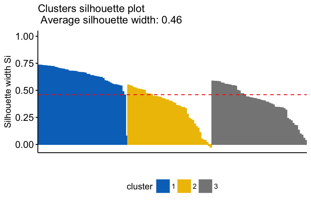
Note that, silhouette coefficient measures how well an observation is clustered and it estimates the average distance between clusters (i.e, the average silhouette width). Observations with negative silhouette are probably placed in the wrong cluster. Read more here: cluster validation statistics

Samples with negative silhouette coefficient:

# Silhouette width of observation
sil <- km.res$silinfo$widths[, 1:3]
# Objects with negative silhouette
neg_sil_index <- which(sil[, 'sil_width'] < 0)
sil[neg_sil_index, , drop = FALSE]
##          cluster neighbor   sil_width
## Missouri       3        2 -0.07318144

Read more about k-means clustering: K-means clustering

4.2 Example of hierarchical clustering

# Enhanced hierarchical clustering
res.hc <- eclust(df, "hclust", k = 4,
                method = "ward.D2", graph = FALSE) 
head(res.hc$cluster, 15)
##     Alabama      Alaska     Arizona    Arkansas  California    Colorado 
##           1           2           2           3           2           2 
## Connecticut    Delaware     Florida     Georgia      Hawaii       Idaho 
##           3           3           2           1           3           4 
##    Illinois     Indiana        Iowa 
##           2           3           4
# Dendrogram
fviz_dend(res.hc, rect = TRUE, show_labels = TRUE, cex = 0.5) 

# Visualize the silhouette of clusters
fviz_silhouette(res.hc)
##   cluster size ave.sil.width
## 1       1    7          0.46
## 2       2   12          0.29
## 3       3   19          0.26
## 4       4   12          0.43

It can be seen that three samples have negative silhouette coefficient indicating that they are not in the right cluster. These samples are:

# Silhouette width of observation
sil <- res.hc$silinfo$widths[, 1:3]
# Objects with negative silhouette
neg_sil_index <- which(sil[, 'sil_width'] < 0)
sil[neg_sil_index, , drop = FALSE]
##          cluster neighbor   sil_width
## Kentucky       3        4 -0.06459230
## Arkansas       3        1 -0.08467352

Read more about hierarchical clustering: Hierarchical clustering

5 Combining hierarchical clustering and k-means

5.1 Why?

Recall that, in k-means algorithm, a random set of observations are chosen as the initial centers.

The final k-means clustering solution is very sensitive to this initial random selection of cluster centers. The result might be (slightly) different each time you compute k-means.

To avoid this, a solution is to use an hybrid approach by combining the hierarchical clustering and the k-means methods. This process is named hybrid hierarchical k-means clustering (hkmeans).

5.2 How ?

The procedure is as follow:

  1. Compute hierarchical clustering and cut the tree into k-clusters
  2. compute the center (i.e the mean) of each cluster
  3. Compute k-means by using the set of cluster centers (defined in step 3) as the initial cluster centers

Note that, k-means algorithm will improve the initial partitioning generated at the step 2 of the algorithm. Hence, the initial partitioning can be slightly different from the final partitioning obtained in the step 4.

5.3 R codes

5.3.1 Compute hierarchical clustering and cut the tree into k-clusters:

res.hc <- eclust(df, "hclust", k = 4,
                method = "ward.D2", graph = FALSE) 
grp <- res.hc$cluster

5.3.2 Compute the centers of clusters defined by hierarchical clustering:

Cluster centers are defined as the means of variables in clusters. The function aggregate() can be used to compute the mean per group in a data frame.

# Compute cluster centers
clus.centers <- aggregate(df, list(grp), mean)
clus.centers
##   Group.1     Murder    Assault   UrbanPop        Rape
## 1       1  1.5803956  0.9662584 -0.7775109  0.04844071
## 2       2  0.7298036  1.1188219  0.7571799  1.32135653
## 3       3 -0.3621789 -0.3444705  0.3953887 -0.21863180
## 4       4 -1.0782511 -1.1370610 -0.9296640 -1.00344660
# Remove the first column
clus.centers <- clus.centers[, -1]
clus.centers
##       Murder    Assault   UrbanPop        Rape
## 1  1.5803956  0.9662584 -0.7775109  0.04844071
## 2  0.7298036  1.1188219  0.7571799  1.32135653
## 3 -0.3621789 -0.3444705  0.3953887 -0.21863180
## 4 -1.0782511 -1.1370610 -0.9296640 -1.00344660

5.3.3 K-means clustering using hierarchical clustering defined cluster-centers

km.res2 <- eclust(df, "kmeans", k = clus.centers, graph = FALSE)
fviz_silhouette(km.res2)
##   cluster size ave.sil.width
## 1       1    8          0.39
## 2       2   13          0.27
## 3       3   16          0.34
## 4       4   13          0.37

5.3.4 Compare the results of hierarchical clustering and hybrid approach

The R code below compares the initial clusters defined using only hierarchical clustering and the final ones defined using hierarchical clustering + k-means:

# res.hc$cluster: Initial clusters defined using hierarchical clustering
# km.res2$cluster: Final clusters defined using k-means
table(km.res2$cluster, res.hc$cluster)
##    
##      1  2  3  4
##   1  7  0  1  0
##   2  0 12  1  0
##   3  0  0 16  0
##   4  0  0  1 12

It can be seen that, 3 of the observations defined as belonging to cluster 3 by hierarchical clustering has been reclassified to cluster 1, 2, and 4 in the final solution defined by k-means clustering.

The difference can be easily visualized using the function fviz_dend() [in factoextra]. The labels are colored using k-means clusters:

fviz_dend(res.hc, k = 4, 
          k_colors = c("black", "red",  "blue", "green3"),
          label_cols =  km.res2$cluster[res.hc$order], cex = 0.6)

It can be seen that the hierarchical clustering result has been improved by the k-means algorithm.

5.3.5 Compare the results of standard k-means clustering and hybrid approach

# Final clusters defined using hierarchical k-means clustering
km.clust <- km.res$cluster

# Standard k-means clustering
set.seed(123)
res.km <- kmeans(df, centers = 4, iter.max = 100)


# comparison
table(km.clust, res.km$cluster)
##         
## km.clust  1  2  3  4
##        1 13  0  0  0
##        2  0 16  0  0
##        3  0  0 13  0
##        4  0  0  0  8

In our current example, there was no further improvement of the k-means clustering result by the hybrid approach. An improvement might be observed using another dataset.

5.4 hkmeans(): Easy-to-use function for hybrid hierarchical k-means clustering

The function hkmeans() [in factoextra] can be used to compute easily the hybrid approach of k-means on hierarchical clustering. The format of the result is similar to the one provided by the standard kmeans() function.

# Compute hierarchical k-means clustering
res.hk <-hkmeans(df, 4)
# Elements returned by hkmeans()
names(res.hk)
##  [1] "cluster""centers""totss""withinss"    
##  [5] "tot.withinss""betweenss""size""iter"        
##  [9] "ifault""data""hclust"
# Print the results
res.hk
## Hierarchical K-means clustering with 4 clusters of sizes 8, 13, 16, 13
## 
## Cluster means:
##       Murder    Assault   UrbanPop        Rape
## 1  1.4118898  0.8743346 -0.8145211  0.01927104
## 2  0.6950701  1.0394414  0.7226370  1.27693964
## 3 -0.4894375 -0.3826001  0.5758298 -0.26165379
## 4 -0.9615407 -1.1066010 -0.9301069 -0.96676331
## 
## Clustering vector:
##        Alabama         Alaska        Arizona       Arkansas     California 
##              1              2              2              1              2 
##       Colorado    Connecticut       Delaware        Florida        Georgia 
##              2              3              3              2              1 
##         Hawaii          Idaho       Illinois        Indiana           Iowa 
##              3              4              2              3              4 
##         Kansas       Kentucky      Louisiana          Maine       Maryland 
##              3              4              1              4              2 
##  Massachusetts       Michigan      Minnesota    Mississippi       Missouri 
##              3              2              4              1              2 
##        Montana       Nebraska         Nevada  New Hampshire     New Jersey 
##              4              4              2              4              3 
##     New Mexico       New York North Carolina   North Dakota           Ohio 
##              2              2              1              4              3 
##       Oklahoma         Oregon   Pennsylvania   Rhode Island South Carolina 
##              3              3              3              3              1 
##   South Dakota      Tennessee          Texas           Utah        Vermont 
##              4              1              2              3              4 
##       Virginia     Washington  West Virginia      Wisconsin        Wyoming 
##              3              3              4              4              3 
## 
## Within cluster sum of squares by cluster:
## [1]  8.316061 19.922437 16.212213 11.952463
##  (between_SS / total_SS =  71.2 %)
## 
## Available components:
## 
##  [1] "cluster""centers""totss""withinss"    
##  [5] "tot.withinss""betweenss""size""iter"        
##  [9] "ifault""data""hclust"
# Visualize the tree
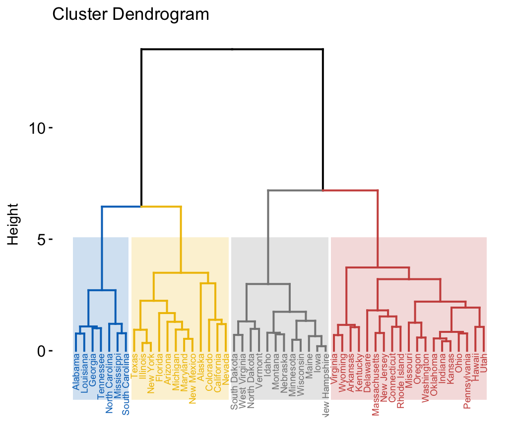
fviz_dend(res.hk, cex = 0.6, rect = TRUE)

# Visualize the hkmeans final clusters
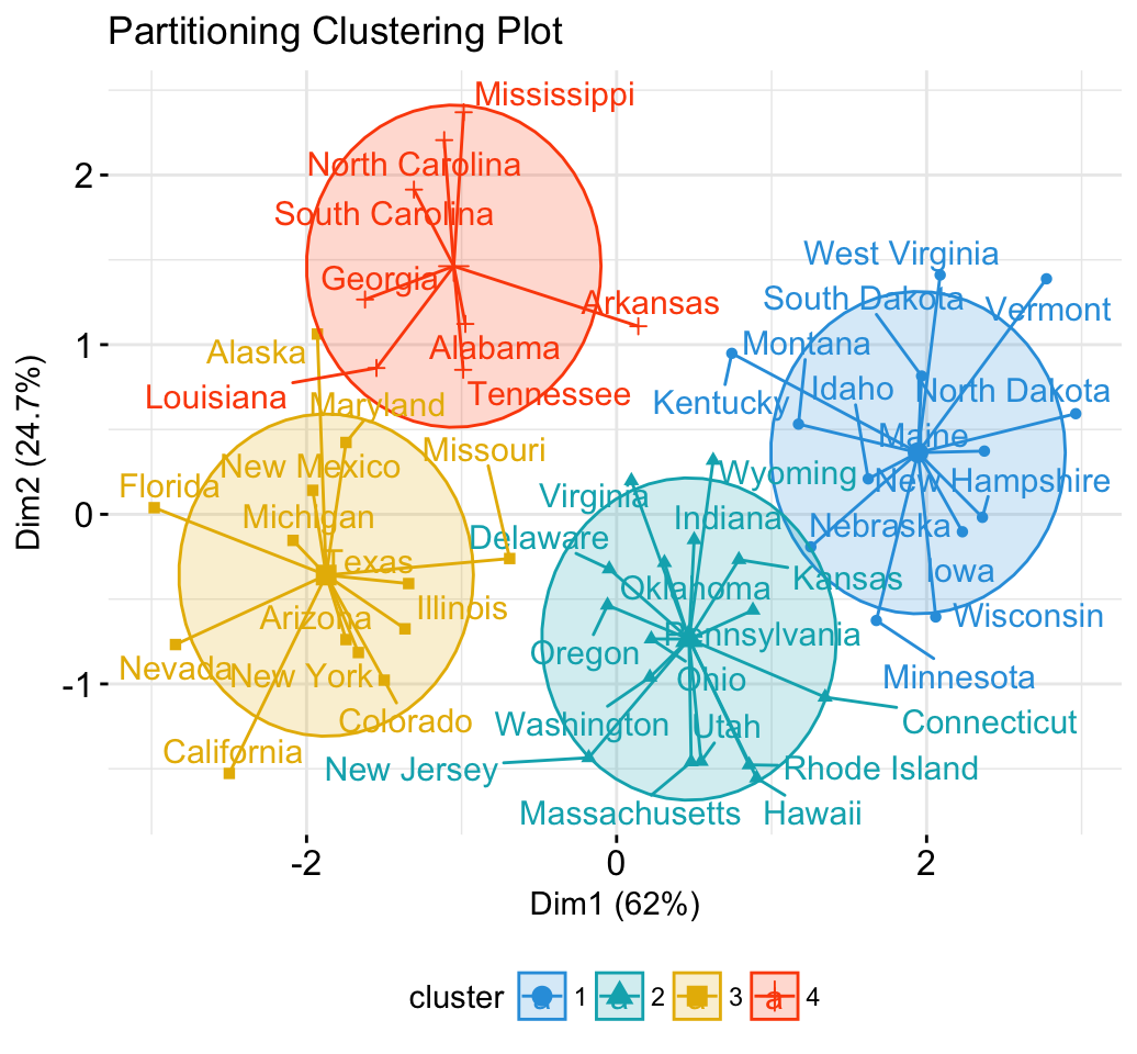
fviz_cluster(res.hk, frame.type = "norm", frame.level = 0.68)

6 Infos

This analysis has been performed using R software (ver. 3.2.4)


Survival Analysis Basics

$
0
0


Survival analysis corresponds to a set of statistical approaches used to investigate the time it takes for an event of interest to occur.

Survival analysis is used in a variety of field such as:

  • Cancer studies for patients survival time analyses,
  • Sociology for “event-history analysis”,
  • and in engineering for “failure-time analysis”.

In cancer studies, typical research questions are like:

  • What is the impact of certain clinical characteristics on patient’s survival
  • What is the probability that an individual survives 3 years?
  • Are there differences in survival between groups of patients?

Objectives

The aim of this chapter is to describe the basic concepts of survival analysis. In cancer studies, most of survival analyses use the following methods:

  • Kaplan-Meier plots to visualize survival curves
  • Log-rank test to compare the survival curves of two or more groups
  • Cox proportional hazards regression to describe the effect of variables on survival. The Cox model is discussed in the next chapter: Cox proportional hazards model.

Here, we’ll start by explaining the essential concepts of survival analysis, including:

  • how to generate and interpret survival curves,
  • and how to quantify and test survival differences between two or more groups of patients.

Then, we’ll continue by describing multivariate analysis using Cox proportional hazards model.

Basic concepts

Here, we start by defining fundamental terms of survival analysis including:

  • Survival time and event
  • Censoring
  • Survival function and hazard function

Survival time and type of events in cancer studies

There are different types of events, including:

  • Relapse
  • Progression
  • Death

The time from ‘response to treatment’ (complete remission) to the occurrence of the event of interest is commonly called survival time (or time to event).

The two most important measures in cancer studies include: i) the time to death; and ii) the relapse-free survival time, which corresponds to the time between response to treatment and recurrence of the disease. It’s also known as disease-free survival time and event-free survival time.

Censoring

As mentioned above, survival analysis focuses on the expected duration of time until occurrence of an event of interest (relapse or death). However, the event may not be observed for some individuals within the study time period, producing the so-called censored observations.

Censoring may arise in the following ways:

  1. a patient has not (yet) experienced the event of interest, such as relapse or death, within the study time period;
  2. a patient is lost to follow-up during the study period;
  3. a patient experiences a different event that makes further follow-up impossible.

This type of censoring, named right censoring, is handled in survival analysis.

Survival and hazard functions

Two related probabilities are used to describe survival data: the survival probability and the hazard probability.

The survival probability, also known as the survivor function \(S(t)\), is the probability that an individual survives from the time origin (e.g. diagnosis of cancer) to a specified future time t.

The hazard, denoted by \(h(t)\), is the probability that an individual who is under observation at a time t has an event at that time.

Note that, in contrast to the survivor function, which focuses on not having an event, the hazard function focuses on the event occurring.

Kaplan-Meier survival estimate

The Kaplan-Meier (KM) method is a non-parametric method used to estimate the survival probability from observed survival times (Kaplan and Meier, 1958).

The survival probability at time \(t_i\), \(S(t_i)\), is calculated as follow:

\[S(t_i) = S(t_{i-1})(1-\frac{d_i}{n_i})\]

Where,

  • \(S(t_{i-1})\) = the probability of being alive at \(t_{i-1}\)
  • \(n_i\) = the number of patients alive just before \(t_i\)
  • \(d_i\) = the number of events at \(t_i\)
  • \(t_0\) = 0, \(S(0)\) = 1

The estimated probability (\(S(t)\)) is a step function that changes value only at the time of each event. It’s also possible to compute confidence intervals for the survival probability.

The KM survival curve, a plot of the KM survival probability against time, provides a useful summary of the data that can be used to estimate measures such as median survival time.

Survival analysis in R

Install and load required R package

We’ll use two R packages:

  • survival for computing survival analyses
  • survminer for summarizing and visualizing the results of survival analysis

  • Install the packages

install.packages(c("survival", "survminer"))
  • Load the packages
library("survival")
library("survminer")

Example data sets

We’ll use the lung cancer data available in the survival package.

data("lung")
head(lung)
  inst time status age sex ph.ecog ph.karno pat.karno meal.cal wt.loss
1    3  306      2  74   1       1       90       100     1175      NA
2    3  455      2  68   1       0       90        90     1225      15
3    3 1010      1  56   1       0       90        90       NA      15
4    5  210      2  57   1       1       90        60     1150      11
5    1  883      2  60   1       0      100        90       NA       0
6   12 1022      1  74   1       1       50        80      513       0
  • inst: Institution code
  • time: Survival time in days
  • status: censoring status 1=censored, 2=dead
  • age: Age in years
  • sex: Male=1 Female=2
  • ph.ecog: ECOG performance score (0=good 5=dead)
  • ph.karno: Karnofsky performance score (bad=0-good=100) rated by physician
  • pat.karno: Karnofsky performance score as rated by patient
  • meal.cal: Calories consumed at meals
  • wt.loss: Weight loss in last six months

Compute survival curves: survfit()

We want to compute the survival probability by sex.

The function survfit() [in survival package] can be used to compute kaplan-Meier survival estimate. Its main arguments include:

  • a survival object created using the function Surv()
  • and the data set containing the variables.

To compute survival curves, type this:

fit <- survfit(Surv(time, status) ~ sex, data = lung)
print(fit)
Call: survfit(formula = Surv(time, status) ~ sex, data = lung)

        n events median 0.95LCL 0.95UCL
sex=1 138    112    270     212     310
sex=2  90     53    426     348     550

By default, the function print() shows a short summary of the survival curves. It prints the number of observations, number of events, the median survival and the confidence limits for the median.

If you want to display a more complete summary of the survival curves, type this:

# Summary of survival curves
summary(fit)

# Access to the sort summary table
summary(fit)$table

Access to the value returned by survfit()

The function survfit() returns a list of variables, including the following components:


  • n: total number of subjects in each curve.
  • time: the time points on the curve.
  • n.risk: the number of subjects at risk at time t
  • n.event: the number of events that occurred at time t.
  • n.censor: the number of censored subjects, who exit the risk set, without an event, at time t.
  • lower,upper: lower and upper confidence limits for the curve, respectively.
  • strata: indicates stratification of curve estimation. If strata is not NULL, there are multiple curves in the result. The levels of strata (a factor) are the labels for the curves.

The components can be accessed as follow:

d <- data.frame(time = fit$time,
                  n.risk = fit$n.risk,
                  n.event = fit$n.event,
                  n.censor = fit$n.censor,
                  surv = fit$surv,
                  upper = fit$upper,
                  lower = fit$lower
                  )
head(d)
  time n.risk n.event n.censor      surv     upper     lower
1   11    138       3        0 0.9782609 1.0000000 0.9542301
2   12    135       1        0 0.9710145 0.9994124 0.9434235
3   13    134       2        0 0.9565217 0.9911586 0.9230952
4   15    132       1        0 0.9492754 0.9866017 0.9133612
5   26    131       1        0 0.9420290 0.9818365 0.9038355
6   30    130       1        0 0.9347826 0.9768989 0.8944820

Visualize survival curves

We’ll use the function ggsurvplot() [in Survminer R package] to produce the survival curves for the two groups of subjects.

It’s also possible to show:

  • the 95% confidence limits of the survivor function using the argument conf.int = TRUE.
  • the number and/or the percentage of individuals at risk by time using the option risk.table. Allowed values for risk.table include:
    • TRUE or FALSE specifying whether to show or not the risk table. Default is FALSE.
    • “absolute” or “percentage”: to show the absolute number and the percentage of subjects at risk by time, respectively. Use “abs_pct” to show both absolute number and percentage.
  • the p-value of the Log-Rank test comparing the groups using pval = TRUE.
  • horizontal/vertical line at median survival using the argument surv.median.line. Allowed values include one of c(“none”, “hv”, “h”, “v”). v: vertical, h:horizontal.
# Change color, linetype by strata, risk.table color by strata
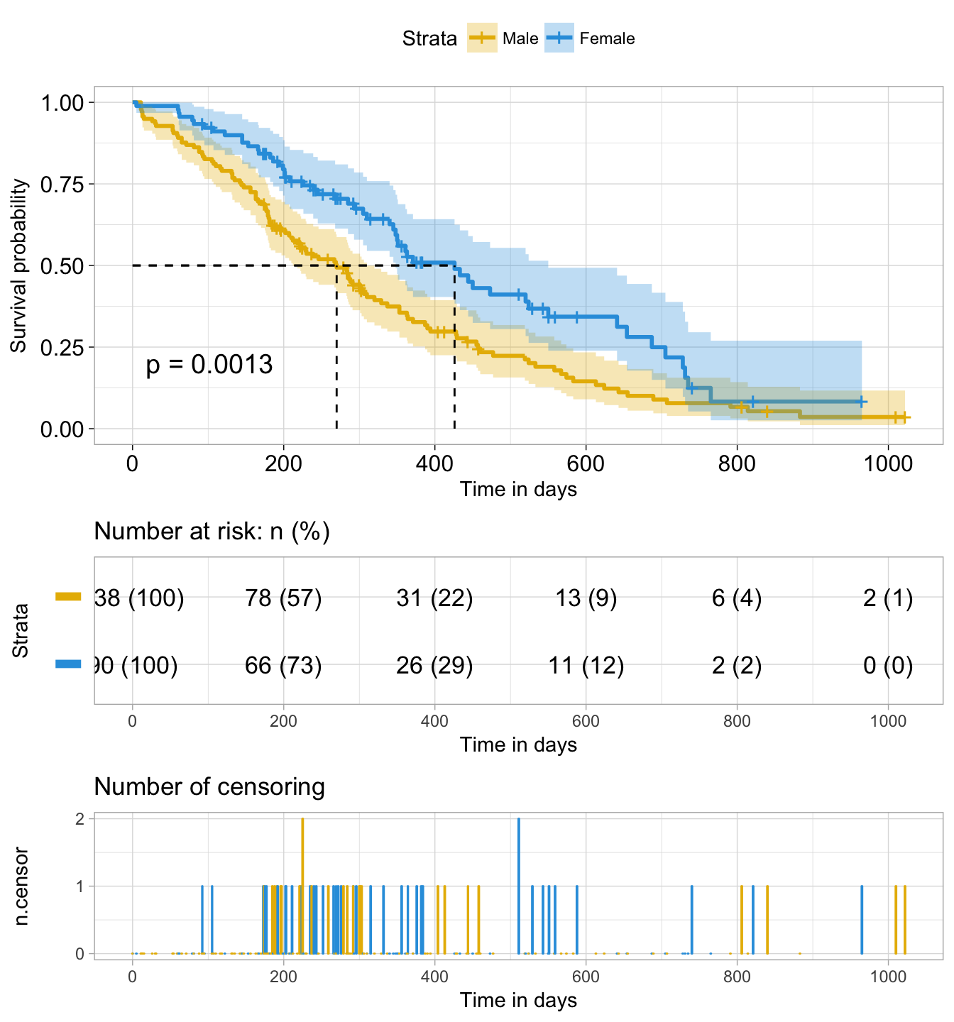
ggsurvplot(fit,
          pval = TRUE, conf.int = TRUE,
          risk.table = TRUE, # Add risk table
          risk.table.col = "strata", # Change risk table color by groups
          linetype = "strata", # Change line type by groups
          surv.median.line = "hv", # Specify median survival
          ggtheme = theme_bw(), # Change ggplot2 theme
          palette = c("#E7B800", "#2E9FDF"))
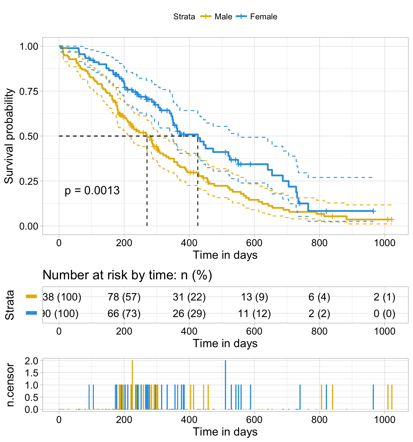
Survival Analysis

Survival Analysis

The plot can be further customized using the following arguments:

  • conf.int.style = “step” to change the style of confidence interval bands.
  • xlab to change the x axis label.
  • break.time.by = 200 break x axis in time intervals by 200.
  • risk.table = “abs_pct”to show both absolute number and percentage of individuals at risk.
  • risk.table.y.text.col = TRUE and risk.table.y.text = FALSE to provide bars instead of names in text annotations of the legend of risk table.
  • ncensor.plot = TRUE to plot the number of censored subjects at time t. As suggested by Marcin Kosinski, This is a good additional feedback to survival curves, so that one could realize: how do survival curves look like, what is the number of risk set AND what is the cause that the risk set become smaller: is it caused by events or by censored events?
  • legend.labs to change the legend labels.
ggsurvplot(
   fit,                     # survfit object with calculated statistics.
   pval = TRUE,             # show p-value of log-rank test.
   conf.int = TRUE,         # show confidence intervals for 
                            # point estimaes of survival curves.
   conf.int.style = "step",  # customize style of confidence intervals
   xlab = "Time in days",   # customize X axis label.
   break.time.by = 200,     # break X axis in time intervals by 200.
   ggtheme = theme_light(), # customize plot and risk table with a theme.
   risk.table = "abs_pct",  # absolute number and percentage at risk.
  risk.table.y.text.col = T,# colour risk table text annotations.
  risk.table.y.text = FALSE,# show bars instead of names in text annotations
                            # in legend of risk table.
  ncensor.plot = TRUE,      # plot the number of censored subjects at time t
  surv.median.line = "hv",  # add the median survival pointer.
  legend.labs = 
    c("Male", "Female"),    # change legend labels.
  palette = 
    c("#E7B800", "#2E9FDF") # custom color palettes.
)
Survival Analysis

Survival Analysis

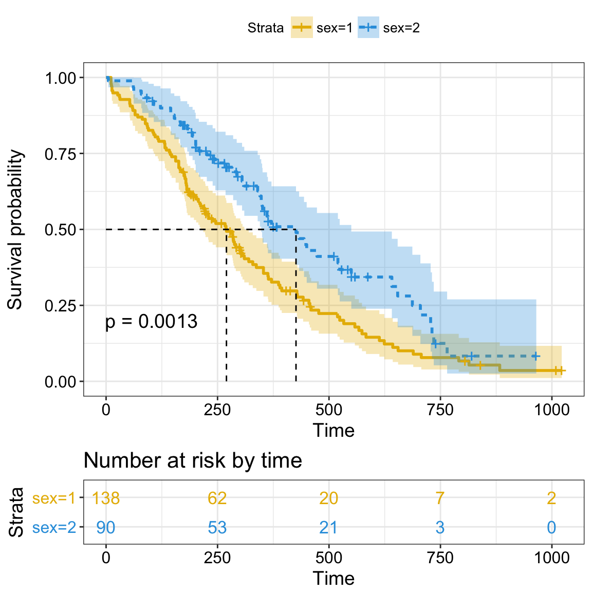
The Kaplan-Meier plot can be interpreted as follow:


The horizontal axis (x-axis) represents time in days, and the vertical axis (y-axis) shows the probability of surviving or the proportion of people surviving. The lines represent survival curves of the two groups. A vertical drop in the curves indicates an event. The vertical tick mark on the curves means that a patient was censored at this time.

  • At time zero, the survival probability is 1.0 (or 100% of the participants are alive).
  • At time 250, the probability of survival is approximately 0.55 (or 55%) for sex=1 and 0.75 (or 75%) for sex=2.
  • The median survival is approximately 270 days for sex=1 and 426 days for sex=2, suggesting a good survival for sex=2 compared to sex=1


The median survival times for each group can be obtained using the code below:

summary(fit)$table
      records n.max n.start events   *rmean *se(rmean) median 0.95LCL 0.95UCL
sex=1     138   138     138    112 325.0663   22.59845    270     212     310
sex=2      90    90      90     53 458.2757   33.78530    426     348     550

The median survival times for each group represent the time at which the survival probability, S(t), is 0.5.

The median survival time for sex=1 (Male group) is 270 days, as opposed to 426 days for sex=2 (Female). There appears to be a survival advantage for female with lung cancer compare to male. However, to evaluate whether this difference is statistically significant requires a formal statistical test, a subject that is discussed in the next sections.

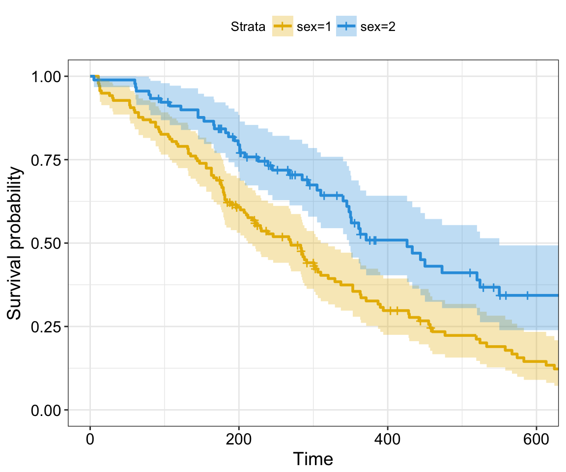
Note that, the confidence limits are wide at the tail of the curves, making meaningful interpretations difficult. This can be explained by the fact that, in practice, there are usually patients who are lost to follow-up or alive at the end of follow-up. Thus, it may be sensible to shorten plots before the end of follow-up on the x-axis (Pocock et al, 2002).

The survival curves can be shorten using the argument xlim as follow:

ggsurvplot(fit,
          conf.int = TRUE,
          risk.table.col = "strata", # Change risk table color by groups
          ggtheme = theme_bw(), # Change ggplot2 theme
          palette = c("#E7B800", "#2E9FDF"),
          xlim = c(0, 600))
Survival Analysis

Survival Analysis


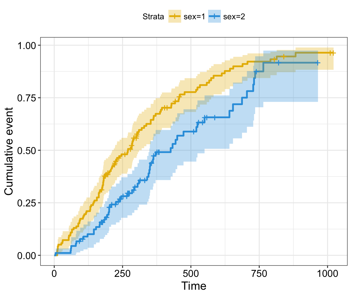
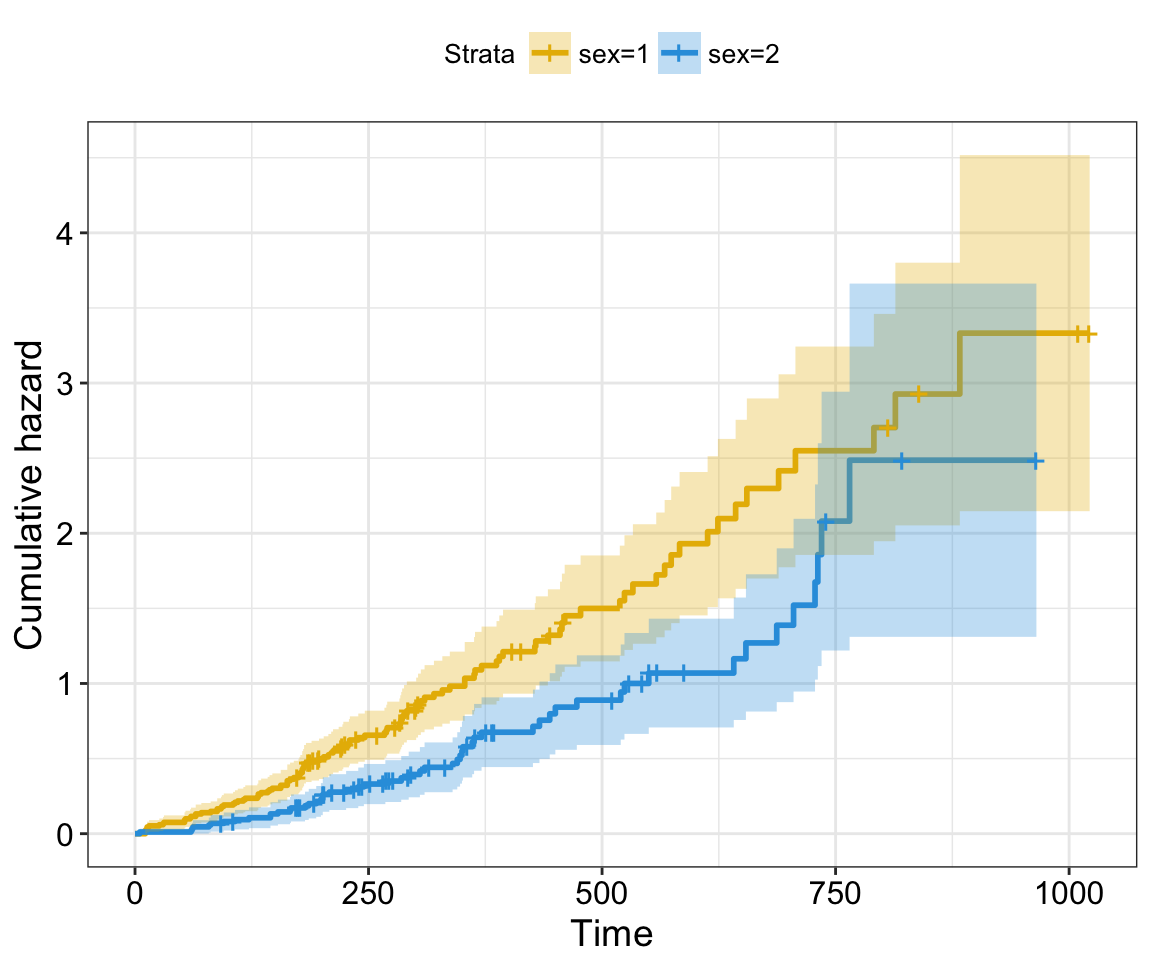
Note that, three often used transformations can be specified using the argument fun:

  • “log”: log transformation of the survivor function,
  • “event”: plots cumulative events (f(y) = 1-y). It’s also known as the cumulative incidence,
  • “cumhaz” plots the cumulative hazard function (f(y) = -log(y))


For example, to plot cumulative events, type this:

ggsurvplot(fit,
          conf.int = TRUE,
          risk.table.col = "strata", # Change risk table color by groups
          ggtheme = theme_bw(), # Change ggplot2 theme
          palette = c("#E7B800", "#2E9FDF"),
          fun = "event")
Survival Analysis

Survival Analysis

The cummulative hazard is commonly used to estimate the hazard probability. It’s defined as \(H(t) = -log(survival function) = -log(S(t))\). The cumulative hazard (\(H(t)\)) can be interpreted as the cumulative force of mortality. In other words, it corresponds to the number of events that would be expected for each individual by time t if the event were a repeatable process.

To plot cumulative hazard, type this:

ggsurvplot(fit,
          conf.int = TRUE,
          risk.table.col = "strata", # Change risk table color by groups
          ggtheme = theme_bw(), # Change ggplot2 theme
          palette = c("#E7B800", "#2E9FDF"),
          fun = "cumhaz")
Survival Analysis

Survival Analysis

Kaplan-Meier life table: summary of survival curves

As mentioned above, you can use the function summary() to have a complete summary of survival curves:

summary(fit)

It’s also possible to use the function surv_summary() [in survminer package] to get a summary of survival curves. Compared to the default summary() function, surv_summary() creates a data frame containing a nice summary from survfit results.

res.sum <- surv_summary(fit)
head(res.sum)
  time n.risk n.event n.censor      surv    std.err     upper     lower strata sex
1   11    138       3        0 0.9782609 0.01268978 1.0000000 0.9542301  sex=1   1
2   12    135       1        0 0.9710145 0.01470747 0.9994124 0.9434235  sex=1   1
3   13    134       2        0 0.9565217 0.01814885 0.9911586 0.9230952  sex=1   1
4   15    132       1        0 0.9492754 0.01967768 0.9866017 0.9133612  sex=1   1
5   26    131       1        0 0.9420290 0.02111708 0.9818365 0.9038355  sex=1   1
6   30    130       1        0 0.9347826 0.02248469 0.9768989 0.8944820  sex=1   1

The function surv_summary() returns a data frame with the following columns:

  • time: the time points at which the curve has a step.
  • n.risk: the number of subjects at risk at t.
  • n.event: the number of events that occur at time t.
  • n.censor: number of censored events.
  • surv: estimate of survival probability.
  • std.err: standard error of survival.
  • upper: upper end of confidence interval
  • lower: lower end of confidence interval
  • strata: indicates stratification of curve estimation. The levels of strata (a factor) are the labels for the curves.

In a situation, where survival curves have been fitted with one or more variables, surv_summary object contains extra columns representing the variables. This makes it possible to facet the output of ggsurvplot by strata or by some combinations of factors.

surv_summary object has also an attribute named ‘table’ containing information about the survival curves, including medians of survival with confidence intervals, as well as, the total number of subjects and the number of event in each curve. To get access to the attribute ‘table’, type this:

attr(res.sum, "table")

Log-Rank test comparing survival curves: survdiff()

The log-rank test is the most widely used method of comparing two or more survival curves. The null hypothesis is that there is no difference in survival between the two groups. The log rank test is a non-parametric test, which makes no assumptions about the survival distributions. Essentially, the log rank test compares the observed number of events in each group to what would be expected if the null hypothesis were true (i.e., if the survival curves were identical). The log rank statistic is approximately distributed as a chi-square test statistic.

The function survdiff() [in survival package] can be used to compute log-rank test comparing two or more survival curves.

survdiff() can be used as follow:

surv_diff <- survdiff(Surv(time, status) ~ sex, data = lung)
surv_diff
Call:
survdiff(formula = Surv(time, status) ~ sex, data = lung)

        N Observed Expected (O-E)^2/E (O-E)^2/V
sex=1 138      112     91.6      4.55      10.3
sex=2  90       53     73.4      5.68      10.3

 Chisq= 10.3  on 1 degrees of freedom, p= 0.00131 

The function returns a list of components, including:

  • n: the number of subjects in each group.
  • obs: the weighted observed number of events in each group.
  • exp: the weighted expected number of events in each group.
  • chisq: the chisquare statistic for a test of equality.
  • strata: optionally, the number of subjects contained in each stratum.

The log rank test for difference in survival gives a p-value of p = 0.0013, indicating that the sex groups differ significantly in survival.

Fit complex survival curves

In this section, we’ll compute survival curves using the combination of multiple factors. Next, we’ll facet the output of ggsurvplot() by a combination of factors

  1. Fit (complex) survival curves using colon data sets
require("survival")
fit2 <- survfit( Surv(time, status) ~ sex + rx + adhere,
                data = colon )
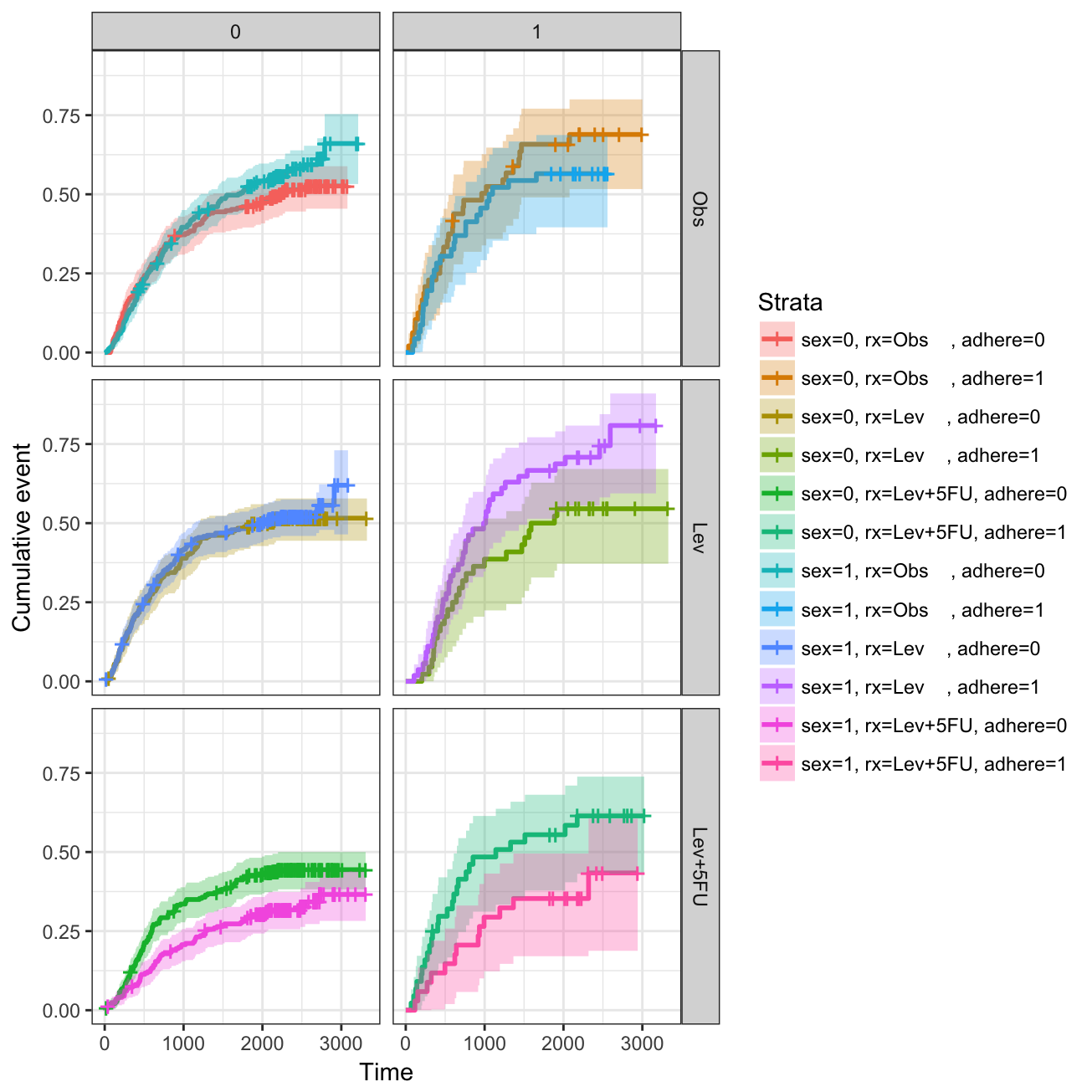
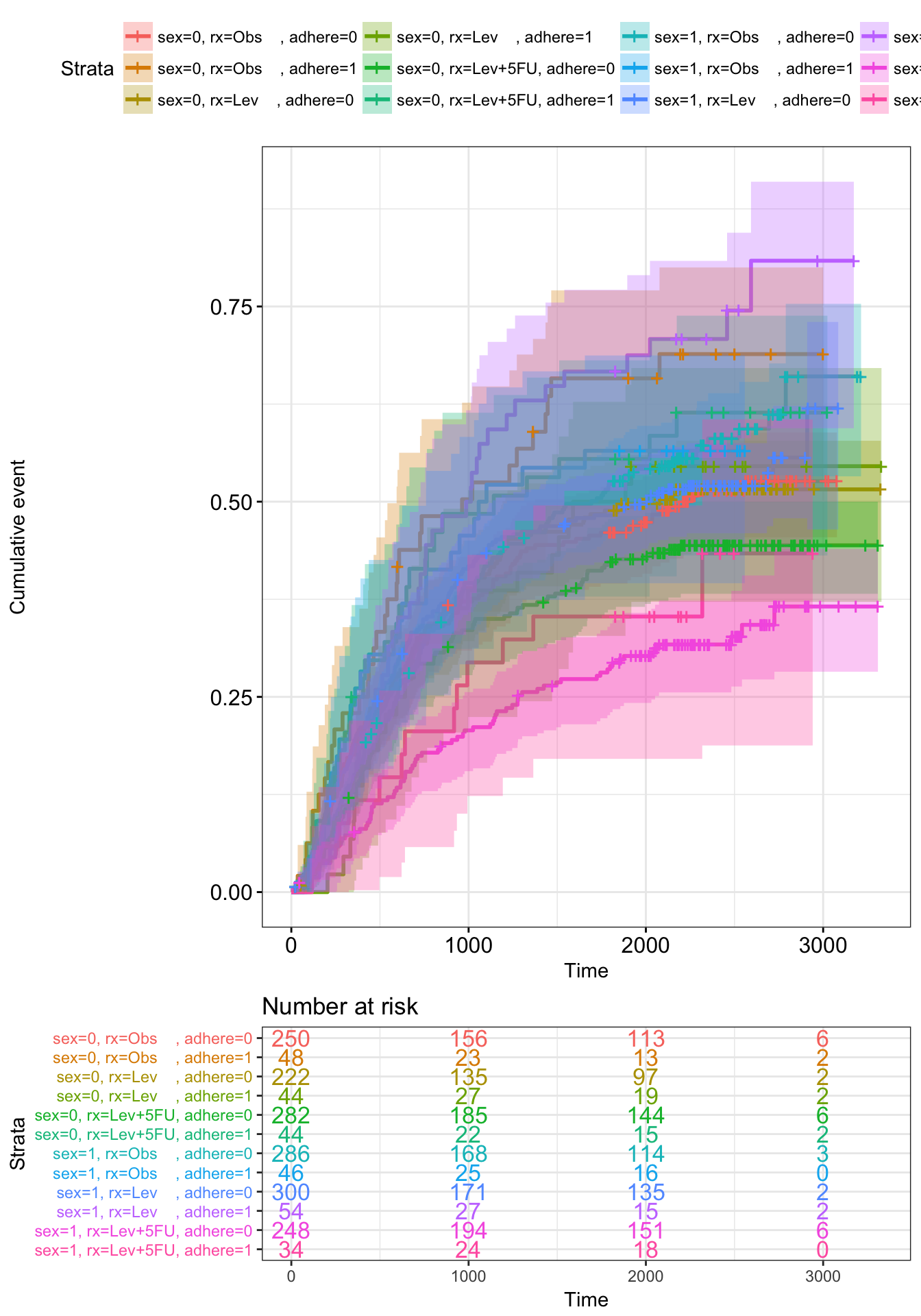
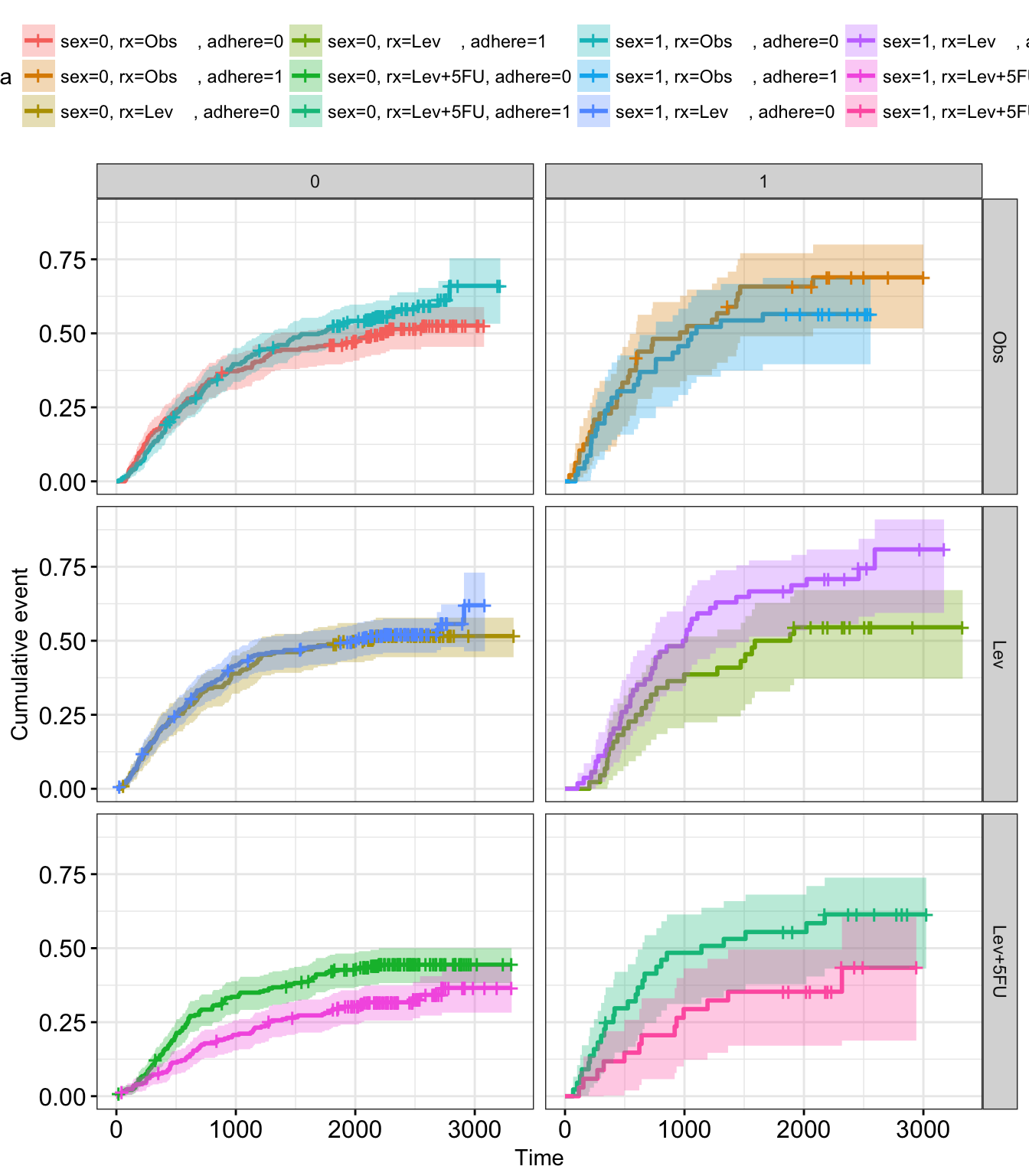
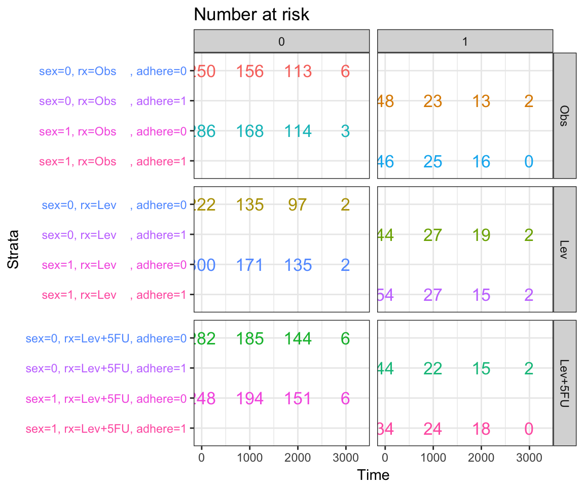
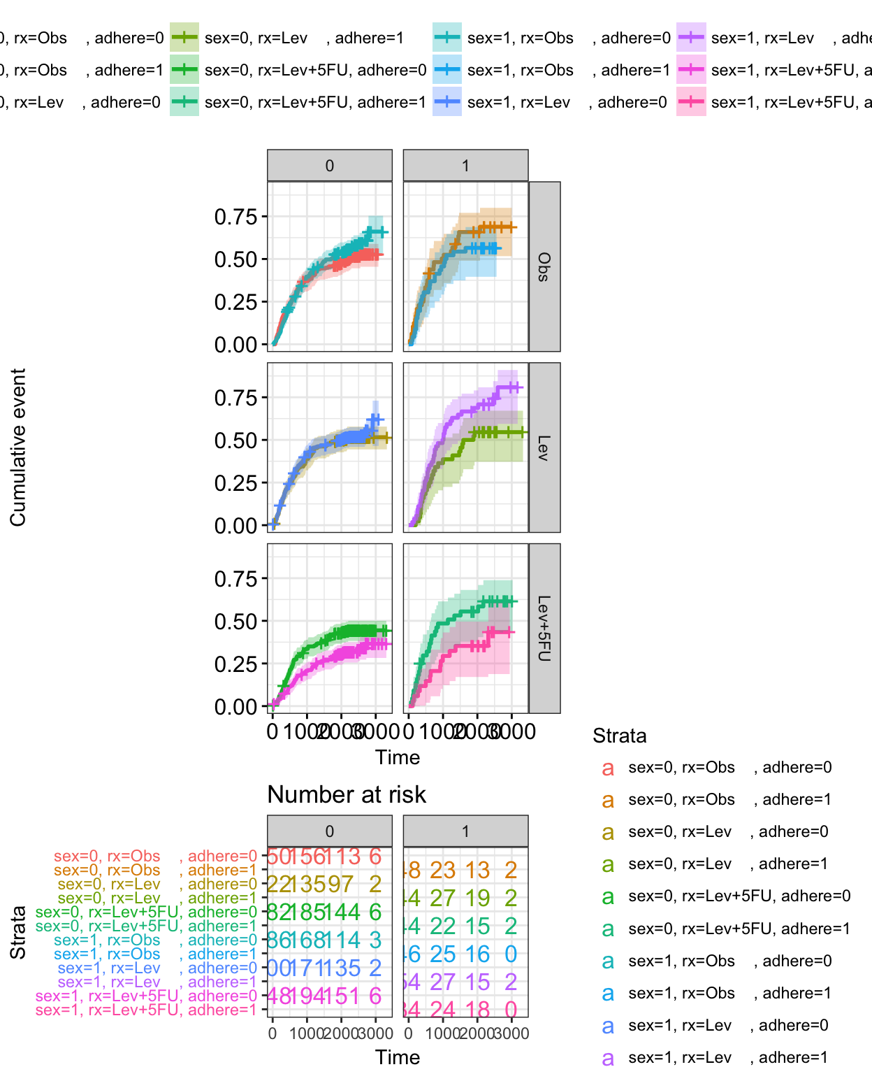
  1. Visualize the output using survminer. The plot below shows survival curves by the sex variable faceted according to the values of rx & adhere.
# Plot survival curves by sex and facet by rx and adhere
ggsurv <- ggsurvplot(fit2, fun = "event", conf.int = TRUE,
                     ggtheme = theme_bw())
   
ggsurv$plot +theme_bw() + 
  theme (legend.position = "right")+
  facet_grid(rx ~ adhere)
Survival Analysis

Survival Analysis

Summary

Survival analysis is a set of statistical approaches for data analysis where the outcome variable of interest is time until an event occurs.

Survival data are generally described and modeled in terms of two related functions:

  • the survivor function representing the probability that an individual survives from the time of origin to some time beyond time t. It’s usually estimated by the Kaplan-Meier method. The logrank test may be used to test for differences between survival curves for groups, such as treatment arms.

  • The hazard function gives the instantaneous potential of having an event at a time, given survival up to that time. It is used primarily as a diagnostic tool or for specifying a mathematical model for survival analysis.

In this article, we demonstrate how to perform and visualize survival analyses using the combination of two R packages: survival (for the analysis) and survminer (for the visualization).

References

  • Clark TG, Bradburn MJ, Love SB and Altman DG. Survival Analysis Part I: Basic concepts and first analyses. British Journal of Cancer (2003) 89, 232 – 238
  • Kaplan EL, Meier P (1958) Nonparametric estimation from incomplete observations. J Am Stat Assoc 53: 457–481.
  • Pocock S, Clayton TC, Altman DG (2002) Survival plots of time-to-event outcomes in clinical trials: good practice and pitfalls. Lancet 359: 1686– 1689.

Infos

This analysis has been performed using R software (ver. 3.3.2).

Cox Proportional-Hazards Model

$
0
0


The Cox proportional-hazards model (Cox, 1972) is essentially a regression model commonly used statistical in medical research for investigating the association between the survival time of patients and one or more predictor variables.

In the previous chapter (survival analysis basics), we described the basic concepts of survival analyses and methods for analyzing and summarizing survival data, including:

  • the definition of hazard and survival functions,
  • the construction of Kaplan-Meier survival curves for different patient groups
  • the logrank test for comparing two or more survival curves

The above mentioned methods - Kaplan-Meier curves and logrank tests - are examples of univariate analysis. They describe the survival according to one factor under investigation, but ignore the impact of any others.

Additionally, Kaplan-Meier curves and logrank tests are useful only when the predictor variable is categorical (e.g.: treatment A vs treatment B; males vs females). They don’t work easily for quantitative predictors such as gene expression, weight, or age.

An alternative method is the Cox proportional hazards regression analysis, which works for both quantitative predictor variables and for categorical variables. Furthermore, the Cox regression model extends survival analysis methods to assess simultaneously the effect of several risk factors on survival time.

In this article, we’ll describe the Cox regression model and provide practical examples using R software.

The need for multivariate statistical modeling

In clinical investigations, there are many situations, where several known quantities (known as covariates), potentially affect patient prognosis.

For instance, suppose two groups of patients are compared: those with and those without a specific genotype. If one of the groups also contains older individuals, any difference in survival may be attributable to genotype or age or indeed both. Hence, when investigating survival in relation to any one factor, it is often desirable to adjust for the impact of others.

Statistical model is a frequently used tool that allows to analyze survival with respect to several factors simultaneously. Additionally, statistical model provides the effect size for each factor.

The cox proportional-hazards model is one of the most important methods used for modelling survival analysis data. The next section introduces the basics of the Cox regression model.

Basics of the Cox proportional hazards model

The purpose of the model is to evaluate simultaneously the effect of several factors on survival. In other words, it allows us to examine how specified factors influence the rate of a particular event happening (e.g., infection, death) at a particular point in time. This rate is commonly referred as the hazard rate. Predictor variables (or factors) are usually termed covariates in the survival-analysis literature.

The Cox model is expressed by the hazard function denoted by h(t). Briefly, the hazard function can be interpreted as the risk of dying at time t. It can be estimated as follow:

\[ h(t) = h_0(t) \times exp(b_1x_1 + b_2x_2 + ... + b_px_p) \]

where,

  • t represents the survival time
  • \(h(t)\) is the hazard function determined by a set of p covariates (\(x_1, x_2, ..., x_p\))
  • the coefficients (\(b_1, b_2, ..., b_p\)) measure the impact (i.e., the effect size) of covariates.
  • the term \(h_0\) is called the baseline hazard. It corresponds to the value of the hazard if all the \(x_i\) are equal to zero (the quantity exp(0) equals 1). The ‘t’ in h(t) reminds us that the hazard may vary over time.

The Cox model can be written as a multiple linear regression of the logarithm of the hazard on the variables \(x_i\), with the baseline hazard being an ‘intercept’ term that varies with time.

The quantities \(exp(b_i)\) are called hazard ratios (HR). A value of \(b_i\) greater than zero, or equivalently a hazard ratio greater than one, indicates that as the value of the \(i^{th}\) covariate increases, the event hazard increases and thus the length of survival decreases.

Put another way, a hazard ratio above 1 indicates a covariate that is positively associated with the event probability, and thus negatively associated with the length of survival.

In summary,

  • HR = 1: No effect
  • HR < 1: Reduction in the hazard
  • HR > 1: Increase in Hazard

Note that in cancer studies:

  • A covariate with hazard ratio > 1 (i.e.: b > 0) is called bad prognostic factor
  • A covariate with hazard ratio < 1 (i.e.: b < 0) is called good prognostic factor


A key assumption of the Cox model is that the hazard curves for the groups of observations (or patients) should be proportional and cannot cross.

Consider two patients k and k’ that differ in their x-values. The corresponding hazard function can be simply written as follow

  • Hazard function for the patient k:

\[ h_k(t) = h_0(t)e^{\sum\limits_{i=1}^n{\beta x}} \]

  • Hazard function for the patient k’:

\[ h_{k'}(t) = h_0(t)e^{\sum\limits_{i=1}^n{\beta x'}} \]

  • The hazard ratio for these two patients [\(\frac{h_k(t)}{h_{k'}(t)} = \frac{h_0(t)e^{\sum\limits_{i=1}^n{\beta x}}}{h_0(t)e^{\sum\limits_{i=1}^n{\beta x'}}} = \frac{e^{\sum\limits_{i=1}^n{\beta x}}}{e^{\sum\limits_{i=1}^n{\beta x'}}}\)] is independent of time t.

Consequently, the Cox model is a proportional-hazards model: the hazard of the event in any group is a constant multiple of the hazard in any other. This assumption implies that, as mentioned above, the hazard curves for the groups should be proportional and cannot cross.

In other words, if an individual has a risk of death at some initial time point that is twice as high as that of another individual, then at all later times the risk of death remains twice as high.

This assumption of proportional hazards should be tested. We’ll discuss methods for assessing proportionality in the next article in this series: Cox Model Assumptions.

Compute the Cox model in R

Install and load required R package

We’ll use two R packages:

  • survival for computing survival analyses
  • survminer for visualizing survival analysis results

  • Install the packages

install.packages(c("survival", "survminer"))
  • Load the packages
library("survival")
library("survminer")

R function to compute the Cox model: coxph()

The function coxph()[in survival package] can be used to compute the Cox proportional hazards regression model in R.

The simplified format is as follow:

coxph(formula, data, method)

  • formula: is linear model with a survival object as the response variable. Survival object is created using the function Surv() as follow: Surv(time, event).
  • data: a data frame containing the variables
  • method: is used to specify how to handle ties. The default is ‘efron’. Other options are ‘breslow’ and ‘exact’. The default ‘efron’ is generally preferred to the once-popular “breslow” method. The “exact” method is much more computationally intensive.


Example data sets

We’ll use the lung cancer data in the survival R package.

data("lung")
head(lung)
  inst time status age sex ph.ecog ph.karno pat.karno meal.cal wt.loss
1    3  306      2  74   1       1       90       100     1175      NA
2    3  455      2  68   1       0       90        90     1225      15
3    3 1010      1  56   1       0       90        90       NA      15
4    5  210      2  57   1       1       90        60     1150      11
5    1  883      2  60   1       0      100        90       NA       0
6   12 1022      1  74   1       1       50        80      513       0
  • inst: Institution code
  • time: Survival time in days
  • status: censoring status 1=censored, 2=dead
  • age: Age in years
  • sex: Male=1 Female=2
  • ph.ecog: ECOG performance score (0=good 5=dead)
  • ph.karno: Karnofsky performance score (bad=0-good=100) rated by physician
  • pat.karno: Karnofsky performance score as rated by patient
  • meal.cal: Calories consumed at meals
  • wt.loss: Weight loss in last six months

Compute the Cox model

We’ll fit the Cox regression using the following covariates: age, sex, ph.ecog and wt.loss.

We start by computing univariate Cox analyses for all these variables; then we’ll fit multivariate cox analyses using two variables to describe how the factors jointly impact on survival.

Univariate Cox regression

Univariate Cox analyses can be computed as follow:

res.cox <- coxph(Surv(time, status) ~ sex, data = lung)
res.cox
Call:
coxph(formula = Surv(time, status) ~ sex, data = lung)

      coef exp(coef) se(coef)     z      p
sex -0.531     0.588    0.167 -3.18 0.0015

Likelihood ratio test=10.6  on 1 df, p=0.00111
n= 228, number of events= 165 

The function summary() for Cox models produces a more complete report:

summary(res.cox)
Call:
coxph(formula = Surv(time, status) ~ sex, data = lung)

  n= 228, number of events= 165 

       coef exp(coef) se(coef)      z Pr(>|z|)   
sex -0.5310    0.5880   0.1672 -3.176  0.00149 **
---
Signif. codes:  0 '***' 0.001 '**' 0.01 '*' 0.05 '.' 0.1 ' ' 1

    exp(coef) exp(-coef) lower .95 upper .95
sex     0.588      1.701    0.4237     0.816

Concordance= 0.579  (se = 0.022 )
Rsquare= 0.046   (max possible= 0.999 )
Likelihood ratio test= 10.63  on 1 df,   p=0.001111
Wald test            = 10.09  on 1 df,   p=0.001491
Score (logrank) test = 10.33  on 1 df,   p=0.001312

The Cox regression results can be interpreted as follow:

  1. Statistical significance. The column marked “z” gives the Wald statistic value. It corresponds to the ratio of each regression coefficient to its standard error (z = coef/se(coef)). The wald statistic evaluates, whether the beta (\(\beta\)) coefficient of a given variable is statistically significantly different from 0. From the output above, we can conclude that the variable sex have highly statistically significant coefficients.

  2. The regression coefficients. The second feature to note in the Cox model results is the the sign of the regression coefficients (coef). A positive sign means that the hazard (risk of death) is higher, and thus the prognosis worse, for subjects with higher values of that variable. The variable sex is encoded as a numeric vector. 1: male, 2: female. The R summary for the Cox model gives the hazard ratio (HR) for the second group relative to the first group, that is, female versus male. The beta coefficient for sex = -0.53 indicates that females have lower risk of death (lower survival rates) than males, in these data.

  3. Hazard ratios. The exponentiated coefficients (exp(coef) = exp(-0.53) = 0.59), also known as hazard ratios, give the effect size of covariates. For example, being female (sex=2) reduces the hazard by a factor of 0.59, or 41%. Being female is associated with good prognostic.

  4. Confidence intervals of the hazard ratios. The summary output also gives upper and lower 95% confidence intervals for the hazard ratio (exp(coef)), lower 95% bound = 0.4237, upper 95% bound = 0.816.

  5. Global statistical significance of the model. Finally, the output gives p-values for three alternative tests for overall significance of the model: The likelihood-ratio test, Wald test, and score logrank statistics. These three methods are asymptotically equivalent. For large enough N, they will give similar results. For small N, they may differ somewhat. The Likelihood ratio test has better behavior for small sample sizes, so it is generally preferred.

To apply the univariate coxph function to multiple covariates at once, type this:

covariates <- c("age", "sex",  "ph.karno", "ph.ecog", "wt.loss")
univ_formulas <- sapply(covariates,
                        function(x) as.formula(paste('Surv(time, status)~', x)))
                        
univ_models <- lapply( univ_formulas, function(x){coxph(x, data = lung)})

# Extract data 
univ_results <- lapply(univ_models,
                       function(x){ 
                          x <- summary(x)
                          p.value<-signif(x$wald["pvalue"], digits=2)
                          wald.test<-signif(x$wald["test"], digits=2)
                          beta<-signif(x$coef[1], digits=2);#coeficient beta
                          HR <-signif(x$coef[2], digits=2);#exp(beta)
                          HR.confint.lower <- signif(x$conf.int[,"lower .95"], 2)
                          HR.confint.upper <- signif(x$conf.int[,"upper .95"],2)
                          HR <- paste0(HR, " (", 
                                       HR.confint.lower, "-", HR.confint.upper, ")")
                          res<-c(beta, HR, wald.test, p.value)
                          names(res)<-c("beta", "HR (95% CI for HR)", "wald.test", 
                                        "p.value")
                          return(res)
                          #return(exp(cbind(coef(x),confint(x))))
                         })
res <- t(as.data.frame(univ_results, check.names = FALSE))
as.data.frame(res)
           beta HR (95% CI for HR) wald.test p.value
age       0.019            1 (1-1)       4.1   0.042
sex       -0.53   0.59 (0.42-0.82)        10  0.0015
ph.karno -0.016      0.98 (0.97-1)       7.9   0.005
ph.ecog    0.48        1.6 (1.3-2)        18 2.7e-05
wt.loss  0.0013         1 (0.99-1)      0.05    0.83

The output above shows the regression beta coefficients, the effect sizes (given as hazard ratios) and statistical significance for each of the variables in relation to overall survival. Each factor is assessed through separate univariate Cox regressions.


From the output above,

  • The variables sex, age and ph.ecog have highly statistically significant coefficients, while the coefficient for ph.karno is not significant.

  • age and ph.ecog have positive beta coefficients, while sex has a negative coefficient. Thus, older age and higher ph.ecog are associated with poorer survival, whereas being female (sex=2) is associated with better survival.


Now, we want to describe how the factors jointly impact on survival. To answer to this question, we’ll perform a multivariate Cox regression analysis. As the variable ph.karno is not significant in the univariate Cox analysis, we’ll skip it in the multivariate analysis. We’ll include the 3 factors (sex, age and ph.ecog) into the multivariate model.

Multivariate Cox regression analysis

A Cox regression of time to death on the time-constant covariates is specified as follow:

res.cox <- coxph(Surv(time, status) ~ age + sex + ph.ecog, data =  lung)
summary(res.cox)
Call:
coxph(formula = Surv(time, status) ~ age + sex + ph.ecog, data = lung)

  n= 227, number of events= 164 
   (1 observation deleted due to missingness)

             coef exp(coef)  se(coef)      z Pr(>|z|)    
age      0.011067  1.011128  0.009267  1.194 0.232416    
sex     -0.552612  0.575445  0.167739 -3.294 0.000986 ***
ph.ecog  0.463728  1.589991  0.113577  4.083 4.45e-05 ***
---
Signif. codes:  0 '***' 0.001 '**' 0.01 '*' 0.05 '.' 0.1 ' ' 1

        exp(coef) exp(-coef) lower .95 upper .95
age        1.0111     0.9890    0.9929    1.0297
sex        0.5754     1.7378    0.4142    0.7994
ph.ecog    1.5900     0.6289    1.2727    1.9864

Concordance= 0.637  (se = 0.026 )
Rsquare= 0.126   (max possible= 0.999 )
Likelihood ratio test= 30.5  on 3 df,   p=1.083e-06
Wald test            = 29.93  on 3 df,   p=1.428e-06
Score (logrank) test = 30.5  on 3 df,   p=1.083e-06

The p-value for all three overall tests (likelihood, Wald, and score) are significant, indicating that the model is significant. These tests evaluate the omnibus null hypothesis that all of the betas (\(\beta\)) are 0. In the above example, the test statistics are in close agreement, and the omnibus null hypothesis is soundly rejected.

In the multivariate Cox analysis, the covariates sex and ph.ecog remain significant (p < 0.05). However, the covariate age fails to be significant (p = 0.23, which is grater than 0.05).

The p-value for sex is 0.000986, with a hazard ratio HR = exp(coef) = 0.58, indicating a strong relationship between the patients’ sex and decreased risk of death. The hazard ratios of covariates are interpretable as multiplicative effects on the hazard. For example, holding the other covariates constant, being female (sex=2) reduces the hazard by a factor of 0.58, or 42%. We conclude that, being female is associated with good prognostic.

Similarly, the p-value for ph.ecog is 4.45e-05, with a hazard ratio HR = 1.59, indicating a strong relationship between the ph.ecog value and increased risk of death. Holding the other covariates constant, a higher value of ph.ecog is associated with a poor survival.

By contrast, the p-value for age is now p=0.23. The hazard ratio HR = exp(coef) = 1.01, with a 95% confidence interval of 0.99 to 1.03. Because the confidence interval for HR includes 1, these results indicate that age makes a smaller contribution to the difference in the HR after adjusting for the ph.ecog values and patient’s sex, and only trend toward significance. For example, holding the other covariates constant, an additional year of age induce daily hazard of death by a factor of exp(beta) = 1.01, or 1%, which is not a significant contribution.

Visualizing the estimated distribution of survival times

Having fit a Cox model to the data, it’s possible to visualize the predicted survival proportion at any given point in time for a particular risk group. The function survfit() estimates the survival proportion, by default at the mean values of covariates.

# Plot the baseline survival function
ggsurvplot(survfit(res.cox), color = "#2E9FDF",
           ggtheme = theme_minimal())
Cox Proportional-Hazards Model

Cox Proportional-Hazards Model

We may wish to display how estimated survival depends upon the value of a covariate of interest.

Consider that, we want to assess the impact of the sex on the estimated survival probability. In this case, we construct a new data frame with two rows, one for each value of sex; the other covariates are fixed to their average values (if they are continuous variables) or to their lowest level (if they are discrete variables). For a dummy covariate, the average value is the proportion coded 1 in the data set. This data frame is passed to survfit() via the newdata argument:

# Create the new data  
sex_df <- with(lung,
               data.frame(sex = c(1, 2), 
                          age = rep(mean(age, na.rm = TRUE), 2),
                          ph.ecog = c(1, 1)
                          )
               )
sex_df
  sex      age ph.ecog
1   1 62.44737       1
2   2 62.44737       1
# Survival curves
fit <- survfit(res.cox, newdata = sex_df)
ggsurvplot(fit, conf.int = TRUE, legend.labs=c("Sex=1", "Sex=2"),
           ggtheme = theme_minimal())
Cox Proportional-Hazards Model

Cox Proportional-Hazards Model

Summary

In this article, we described the Cox regression model for assessing simultaneously the relationship between multiple risk factors and patient’s survival time. We demonstrated how to compute the Cox model using the survival package. Additionally, we described how to visualize the results of the analysis using the survminer package.

References

  • Cox DR (1972). Regression models and life tables (with discussion). J R Statist Soc B 34: 187–220
  • MJ Bradburn, TG Clark, SB Love and DG Altman. Survival Analysis Part II: Multivariate data analysis – an introduction to concepts and methods. British Journal of Cancer (2003) 89, 431 – 436

Infos

This analysis has been performed using R software (ver. 3.3.2).

Cox Model Assumptions

$
0
0


Previously, we described the basic methods for analyzing survival data, as well as, the Cox proportional hazards methods to deal with the situation where several factors impact on the survival process.

In the current article, we continue the series by describing methods to evaluate the validity of the Cox model assumptions.

Note that, when used inappropriately, statistical models may give rise to misleading conclusions. Therefore, it’s important to check that a given model is an appropriate representation of the data.


Diagnostics for the Cox model

The Cox proportional hazards model makes sevral assumptions. Thus, it is important to assess whether a fitted Cox regression model adequately describes the data.

Here, we’ll disscuss three types of diagonostics for the Cox model:

  • Testing the proportional hazards assumption.
  • Examining influential observations (or outliers).
  • Detecting nonlinearity in relationship between the log hazard and the covariates.

In order to check these model assumptions, Residuals method are used. The common residuals for the Cox model include:

  • Schoenfeld residuals to check the proportional hazards assumption
  • Martingale residual to assess nonlinearity
  • Deviance residual (symmetric transformation of the Martinguale residuals), to examine influential observations

Assessing the validy of a Cox model in R

Installing and loading required R packages

We’ll use two R packages:

  • survival for computing survival analyses
  • survminer for visualizing survival analysis results

  • Install the packages

install.packages(c("survival", "survminer"))
  • Load the packages
library("survival")
library("survminer")

Computing a Cox model

We’ll use the lung data sets and the coxph() function in the survival package.

To compute a Cox model, type this:

library("survival")
res.cox <- coxph(Surv(time, status) ~ age + sex + wt.loss, data =  lung)
res.cox
Call:
coxph(formula = Surv(time, status) ~ age + sex + wt.loss, data = lung)

            coef exp(coef) se(coef)     z      p
age      0.02009   1.02029  0.00966  2.08 0.0377
sex     -0.52103   0.59391  0.17435 -2.99 0.0028
wt.loss  0.00076   1.00076  0.00619  0.12 0.9024

Likelihood ratio test=14.7  on 3 df, p=0.00212
n= 214, number of events= 152 
   (14 observations deleted due to missingness)

Testing proportional Hazards assumption

The proportional hazards (PH) assumption can be checked using statistical tests and graphical diagnostics based on the scaled Schoenfeld residuals.

In principle, the Schoenfeld residuals are independent of time. A plot that shows a non-random pattern against time is evidence of violation of the PH assumption.

The function cox.zph() [in the survival package] provides a convenient solution to test the proportional hazards assumption for each covariate included in a Cox refression model fit.

For each covariate, the function cox.zph() correlates the corresponding set of scaled Schoenfeld residuals with time, to test for independence between residuals and time. Additionally, it performs a global test for the model as a whole.

The proportional hazard assumption is supported by a non-significant relationship between residuals and time, and refuted by a significant relationship.

To illustrate the test, we start by computing a Cox regression model using the lung data set [in survival package]:

library("survival")
res.cox <- coxph(Surv(time, status) ~ age + sex + wt.loss, data =  lung)
res.cox
Call:
coxph(formula = Surv(time, status) ~ age + sex + wt.loss, data = lung)

            coef exp(coef) se(coef)     z      p
age      0.02009   1.02029  0.00966  2.08 0.0377
sex     -0.52103   0.59391  0.17435 -2.99 0.0028
wt.loss  0.00076   1.00076  0.00619  0.12 0.9024

Likelihood ratio test=14.7  on 3 df, p=0.00212
n= 214, number of events= 152 
   (14 observations deleted due to missingness)

To test for the proportional-hazards (PH) assumption, type this:

test.ph <- cox.zph(res.cox)
test.ph
            rho chisq     p
age     -0.0483 0.378 0.538
sex      0.1265 2.349 0.125
wt.loss  0.0126 0.024 0.877
GLOBAL       NA 2.846 0.416

From the output above, the test is not statistically significant for each of the covariates, and the global test is also not statistically significant. Therefore, we can assume the proportional hazards.

It’s possible to do a graphical diagnostic using the function ggcoxzph() [in the survminer package], which produces, for each covariate, graphs of the scaled Schoenfeld residuals against the transformed time.

ggcoxzph(test.ph)
Cox Model Assumptions

Cox Model Assumptions

In the figure above, the solid line is a smoothing spline fit to the plot, with the dashed lines representing a +/- 2-standard-error band around the fit.

Note that, systematic departures from a horizontal line are indicative of non-proportional hazards, since proportional hazards assumes that estimates \(\beta_1, \beta_2, \beta_3\) do not vary much over time.

From the graphical inspection, there is no pattern with time. The assumption of proportional hazards appears to be supported for the covariates sex (which is, recall, a two-level factor, accounting for the two bands in the graph), wt.loss and age.

Another graphical methods for checking proportional hazards is to plot log(-log(S(t))) vs. t or log(t) and look for parallelism. This can be done only for categorical covariates.

A violations of proportional hazards assumption can be resolved by:

  • Adding covariate*time interaction
  • Stratification

Stratification is usefull for “nuisance” confounders, where you do not care to estimate the effect. You cannot examine the effects of the stratification variable (John Fox & Sanford Weisberg).

To read more about how to accomodate with non-proportional hazards, read the following articles:

Testing influential observations

To test influential observations or outliers, we can visualize either:

  • the deviance residuals or
  • the dfbeta values

The function ggcoxdiagnostics()[in survminer package] provides a convenient solution for checkind influential observations. The simplified format is as follow:

ggcoxdiagnostics(fit, type = , linear.predictions = TRUE)

  • fit: an object of class coxph.object
  • type: the type of residuals to present on Y axis. Allowed values include one of c(“martingale”, “deviance”, “score”, “schoenfeld”, “dfbeta”, “dfbetas”, “scaledsch”, “partial”).
  • linear.predictions: a logical value indicating whether to show linear predictions for observations (TRUE) or just indexed of observations (FALSE) on X axis.


Specifying the argument type = “dfbeta”, plots the estimated changes in the regression coefficients upon deleting each observation in turn; likewise, type=“dfbetas” produces the estimated changes in the coefficients divided by their standard errors.

For example:

ggcoxdiagnostics(res.cox, type = "dfbeta",
                 linear.predictions = FALSE, ggtheme = theme_bw())
Cox Model Assumptions

Cox Model Assumptions

(Index plots of dfbeta for the Cox regression of time to death on age, sex and wt.loss)

The above index plots show that comparing the magnitudes of the largest dfbeta values to the regression coefficients suggests that none of the observations is terribly influential individually, even though some of the dfbeta values for age and wt.loss are large compared with the others.

It’s also possible to check outliers by visualizing the deviance residuals. The deviance residual is a normalized transform of the martingale residual. These residuals should be roughtly symmetrically distributed about zero with a standard deviation of 1.

  • Positive values correspond to individuals that “died too soon” compared to expected survival times.
  • Negative values correspond to individual that “lived too long”.
  • Very large or small values are outliers, which are poorly predicted by the model.

Example of deviance residuals:

ggcoxdiagnostics(res.cox, type = "deviance",
                 linear.predictions = FALSE, ggtheme = theme_bw())
Cox Model Assumptions

Cox Model Assumptions

The pattern looks fairly symmetric around 0.

Testing non linearity

Often, we assume that continuous covariates have a linear form. However, this assumption should be checked.

Plotting the Martingale residuals against continuous covariates is a common approach used to detect nonlinearity or, in other words, to assess the functional form of a covariate. For a given continuous covariate, patterns in the plot may suggest that the variable is not properly fit.

Nonlinearity is not an issue for categorical variables, so we only examine plots of martingale residuals and partial residuals against a continuous variable.

Martingale residuals may present any value in the range (-INF, +1):

  • A value of martinguale residuals near 1 represents individuals that “died too soon”,
  • and large negative values correspond to individuals that “lived too long”.

To assess the functional form of a continuous variable in a Cox proportional hazards model, we’ll use the function ggcoxfunctional() [in the survminer R package].

The function ggcoxfunctional() displays graphs of continuous covariates against martingale residuals of null cox proportional hazards model. This might help to properly choose the functional form of continuous variable in the Cox model. Fitted lines with lowess function should be linear to satisfy the Cox proportional hazards model assumptions.

For example, to assess the functional forme of age, type this:

ggcoxfunctional(Surv(time, status) ~ age + log(age) + sqrt(age), data = lung)
Cox Model Assumptions

Cox Model Assumptions

It appears that, nonlinearity is slightly here.

Summary

We described how to assess the valididy of the Cox model assumptions using the survival and survminer packages.

Infos

This analysis has been performed using R software (ver. 3.3.2).

R packages

$
0
0


In this section, you’ll find R packages developed by STHDA for easy data analyses.


factoextra

factoextra let you extract and create ggplot2-based elegant visualizations of multivariate data analyse results, including PCA, CA, MCA, MFA, HMFA and clustering methods.

Overview >>
factoextra Site Link >>

survminer

survminer provides functions for facilitating survival analysis and visualization.

Overview >>
survminer Site Link >>

Releases: v0.2.4 |

ggpubr

The default plots generated by ggplot2 requires some formatting before we can send them for publication. To customize a ggplot, the syntax is opaque and this raises the level of difficulty for researchers with no advanced R programming skills. ggpubr provides some easy-to-use functions for creating and customizing ‘ggplot2’- based publication ready plots.

Overview >>
ggpubr Site Link >>


Infos

This analysis has been performed using R software (ver. 3.3.2)

survminer 0.2.4

$
0
0


I’m very pleased to announce survminer 0.2.4. It comes with many new features and minor changes.

Install survminer with:

install.packages("survminer")

To load the package, type this:

library(survminer)


New features

  • New function surv_summary() for creating data frame containing a nice summary of survival curves (#64).
  • It’s possible now to facet the output of ggsurvplot() by one or more factors (#64).
  • Now, ggsurvplot() can be used to plot cox model (#67).
  • New functions added for determining and visualizing the optimal cutpoint of continuous variables for survival analyses:
    • surv_cutpoint(): Determine the optimal cutpoint for each variable using ‘maxstat’. Methods defined for surv_cutpoint object are summary(), print() and plot().
    • surv_categorize(): Divide each variable values based on the cutpoint returned by surv_cutpoint() (#41).
  • New argument ‘ncensor.plot’ added to ggsurvplot(). A logical value. If TRUE, the number of censored subjects at time t is plotted. Default is FALSE (#18).

Minor changes

  • New argument ‘conf.int.style’ added in ggsurvplot() for changing the style of confidence interval bands.
  • Now, ggsurvplot() plots a stepped confidence interval when conf.int = TRUE (#65).
  • ggsurvplot() updated for compatibility with the future version of ggplot2 (v2.2.0) (#68)
  • ylab is now automatically adapted according to the value of the argument fun. For example, if fun = “event”, then ylab will be “Cumulative event”.
  • In ggsurvplot(), linetypes can now be adjusted by variables used to fit survival curves (#46)
  • In ggsurvplot(), the argument risk.table can be either a logical value (TRUE|FALSE) or a string (“absolute”, “percentage”). If risk.table = “absolute”, ggsurvplot() displays the absolute number of subjects at risk. If risk.table = “percentage”, the percentage at risk is displayed. Use “abs_pct” to show both the absolute number and the percentage of subjects at risk. (#70).
  • New argument surv.median.line in ggsurvplot(): character vector for drawing a horizontal/vertical line at median (50%) survival. Allowed values include one of c(“none”, “hv”, “h”, “v”). v: vertical, h:horizontal (#61).
  • Now, the default theme of ggcoxdiagnostics() is ggplot2::theme_bw().

Bug fixes

It also includes numerous bug fixes as described in the release notes: v0.2.3 and v0.2.4

Summary of survival curves

Compared to the default summary() function, the surv_summary() function [in survminer] creates a data frame containing a nice summary from survfit results.

# Fit survival curves
require("survival")
fit <- survfit(Surv(time, status) ~ sex, data = lung)

# Summarize
library("survminer")
res.sum <- surv_summary(fit)
head(res.sum)
##   time n.risk n.event n.censor      surv    std.err     upper     lower
## 1   11    138       3        0 0.9782609 0.01268978 1.0000000 0.9542301
## 2   12    135       1        0 0.9710145 0.01470747 0.9994124 0.9434235
## 3   13    134       2        0 0.9565217 0.01814885 0.9911586 0.9230952
## 4   15    132       1        0 0.9492754 0.01967768 0.9866017 0.9133612
## 5   26    131       1        0 0.9420290 0.02111708 0.9818365 0.9038355
## 6   30    130       1        0 0.9347826 0.02248469 0.9768989 0.8944820
##   strata sex
## 1  sex=1   1
## 2  sex=1   1
## 3  sex=1   1
## 4  sex=1   1
## 5  sex=1   1
## 6  sex=1   1
# Information about the survival curves
attr(res.sum, "table")
##       records n.max n.start events   *rmean *se(rmean) median 0.95LCL
## sex=1     138   138     138    112 325.0663   22.59845    270     212
## sex=2      90    90      90     53 458.2757   33.78530    426     348
##       0.95UCL
## sex=1     310
## sex=2     550

Plot survival curves

ggsurvplot(
   fit,                     # survfit object with calculated statistics.
   pval = TRUE,             # show p-value of log-rank test.
   conf.int = TRUE,         # show confidence intervals for 
                            # point estimaes of survival curves.
   #conf.int.style = "step",  # customize style of confidence intervals
   xlab = "Time in days",   # customize X axis label.
   break.time.by = 200,     # break X axis in time intervals by 200.
   ggtheme = theme_light(), # customize plot and risk table with a theme.
   risk.table = "abs_pct",  # absolute number and percentage at risk.
  risk.table.y.text.col = T,# colour risk table text annotations.
  risk.table.y.text = FALSE,# show bars instead of names in text annotations
                            # in legend of risk table.
  ncensor.plot = TRUE,      # plot the number of censored subjects at time t
  surv.median.line = "hv",  # add the median survival pointer.
  legend.labs = 
    c("Male", "Female"),    # change legend labels.
  palette = 
    c("#E7B800", "#2E9FDF") # custom color palettes.
)
survminer

survminer

Determine the optimal cutpoint for continuous variables

The survminer package determines the optimal cutpoint for one or multiple continuous variables at once, using the maximally selected rank statistics from the ‘maxstat’ R package. To learn more, read this: M. Kosiński. R-ADDICT November 2016. Determine optimal cutpoints for numerical variables in survival plots.

Here, we’ll use the myeloma data sets [in the survminer package]. It contains survival data and some gene expression data obtained from multiple myeloma patients.

# 0. Load some data
data(myeloma)
head(myeloma[, 1:8])
##          molecular_group chr1q21_status treatment event  time   CCND1
## GSM50986      Cyclin D-1       3 copies       TT2     0 69.24  9908.4
## GSM50988      Cyclin D-2       2 copies       TT2     0 66.43 16698.8
## GSM50989           MMSET       2 copies       TT2     0 66.50   294.5
## GSM50990           MMSET       3 copies       TT2     1 42.67   241.9
## GSM50991             MAF                  TT2     0 65.00   472.6
## GSM50992    Hyperdiploid       2 copies       TT2     0 65.20   664.1
##          CRIM1 DEPDC1
## GSM50986 420.9  523.5
## GSM50988  52.0   21.1
## GSM50989 617.9  192.9
## GSM50990  11.9  184.7
## GSM50991  38.8  212.0
## GSM50992  16.9  341.6
# 1. Determine the optimal cutpoint of variables
res.cut <- surv_cutpoint(myeloma, time = "time", event = "event",
   variables = c("DEPDC1", "WHSC1", "CRIM1"))

summary(res.cut)
##        cutpoint statistic
## DEPDC1    279.8  4.275452
## WHSC1    3205.6  3.361330
## CRIM1      82.3  1.968317
# 2. Plot cutpoint for DEPDC1
# palette = "npg" (nature publishing group), see ?ggpubr::ggpar
plot(res.cut, "DEPDC1", palette = "npg")
## $DEPDC1
survminer

survminer

# 3. Categorize variables
res.cat <- surv_categorize(res.cut)
head(res.cat)
##           time event DEPDC1 WHSC1 CRIM1
## GSM50986 69.24     0   high   low  high
## GSM50988 66.43     0    low   low   low
## GSM50989 66.50     0    low  high  high
## GSM50990 42.67     1    low  high   low
## GSM50991 65.00     0    low   low   low
## GSM50992 65.20     0   high   low   low
# 4. Fit survival curves and visualize
library("survival")
fit <- survfit(Surv(time, event) ~DEPDC1, data = res.cat)
ggsurvplot(fit, risk.table = TRUE, conf.int = TRUE)
survminer

survminer

Facet the output of ggsurvplot()

In this section, we’ll compute survival curves using the combination of multiple factors. Next, we’ll factet the output of ggsurvplot() by a combination of factors

  1. Fit (complex) survival curves using colon data sets
require("survival")
fit2 <- survfit( Surv(time, status) ~ sex + rx + adhere,
                data = colon )
  1. Visualize the output using survminer
ggsurv <- ggsurvplot(fit2, fun = "event", conf.int = TRUE,
  risk.table = TRUE, risk.table.col="strata", 
  ggtheme = theme_bw())

ggsurv
survminer

survminer

  1. Faceting survival curves. The plot below shows survival curves by the sex variable faceted according to the values of rx & adhere.
curv_facet <- ggsurv$plot + facet_grid(rx ~ adhere)
curv_facet
survminer

survminer

  1. Facetting risk tables: Generate risk table for each facet plot item
ggsurv$table + facet_grid(rx ~ adhere, scales = "free")+
 theme(legend.position = "none")
survminer

survminer

  1. Generate risk table for each facet columns
tbl_facet <- ggsurv$table + facet_grid(.~ adhere, scales = "free")
tbl_facet + theme(legend.position = "none")
survminer

survminer

# Arrange faceted survival curves and risk tables
g2 <- ggplotGrob(curv_facet)
g3 <- ggplotGrob(tbl_facet)
min_ncol <- min(ncol(g2), ncol(g3))
g <- gridExtra::rbind.gtable(g2[, 1:min_ncol], g3[, 1:min_ncol], size="last")
g$widths <- grid::unit.pmax(g2$widths, g3$widths)
grid::grid.newpage()
grid::grid.draw(g)
survminer

survminer

Infos

This analysis has been performed using R software (ver. 3.3.2).
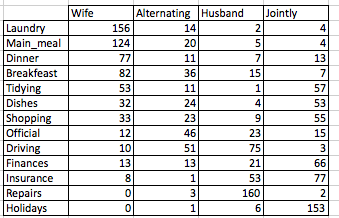
Survival Analysis

$
0
0


Survival analysis corresponds to a set of statistical methods for investigating the time it takes for an event of interest to occur.


In this chapter, we start by describing how to fit survival curves and how to perform logrank tests comparing the survival time of two or more groups of individuals. We continue by demonstrating how to assess simultaneously the impact of multiple risk factors on the survival time using the Cox regression model. Finally, we describe how to check the validy Cox model assumptions.


Survival analysis toolkits in R

We’ll use two R packages for survival data analysis and visualization :

  1. the survival package for survival analyses,
  2. and the survminer package for ggplot2-based elegant visualization of survival analysis results

For survival analyses, the following function [in survival package] will be used:

  • Surv() to create a survival object
  • survfit() to fit survival curves (Kaplan-Meier estimates)
  • survdiff() to perform log-rank test comparing survival curves
  • coxph() to compute the Cox proportional hazards model

For the visualization, we’ll use the following function available in the survminer package:

  • ggsurvplot() for visualizing survival curves
  • ggcoxzph(), ggcoxdiagnostics() and ggcoxfunctional() for checking the Cox model assumptions.

These two packages can be installed as follow:

install.packages("survival")
install.packages("survminer")

Survival analysis basics: curves and logrank tests

Survival analysis

Survival analysis

  • Objectives
  • Basic concepts
    • Survival time and type of events in cancer studies
    • Censoring
    • Survival and hazard functions
    • Kaplan-Meier survival estimate
  • Survival analysis in R
    • Install and load required R package
    • Example data sets
    • Compute survival curves: survfit()
    • Access to the value returned by survfit()
    • Visualize survival curves
    • Kaplan-Meier life table: summary of survival curves
    • Log-Rank test comparing survival curves: survdiff()
    • Fit complex survival curves

Read more –>Survival Analysis Basics: Curves and Logrank Tests

Cox proportional hazards model

  • The need for multivariate statistical modeling
  • Basics of the Cox proportional hazards model
  • Compute the Cox model in R
    • Install and load required R package
    • R function to compute the Cox model: coxph()
    • Example data sets
    • Compute the Cox model
    • Visualizing the estimated distribution of survival times

Read more –>Cox Proportional Hazards Model.

Cox model assumptions

  • Diagnostics for the Cox model
  • Assessing the validy of a Cox model in R
    • Installing and loading required R packages
    • Computing a Cox model
    • Testing proportional Hazards assumption
    • Testing influential observations
    • Testing non linearity

Read more –>Cox Model Assumptions.

Infos

This analysis has been performed using R software (ver. 3.3.2).
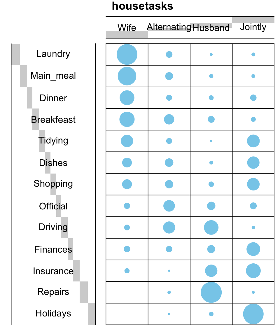
Practical Guide to Cluster Analysis in R - Book

$
0
0

Introduction

Large amounts of data are collected every day from satellite images, bio-medical, security, marketing, web search, geo-spatial or other automatic equipment. Mining knowledge from these big data far exceeds human’s abilities.

Clustering is one of the important data mining methods for discovering knowledge in multidimensional data. The goal of clustering is to identify pattern or groups of similar objects within a data set of interest.

In the litterature, it is referred as “pattern recognition” or “unsupervised machine learning” - “unsupervised” because we are not guided by a priori ideas of which variables or samples belong in which clusters. “Learning” because the machine algorithm “learns” how to cluster.

Cluster analysis is popular in many fields, including:

  • In cancer research for classifying patients into subgroups according their gene expression profile. This can be useful for identifying the molecular profile of patients with good or bad prognostic, as well as for understanding the disease.

  • In marketing for market segmentation by identifying subgroups of customers with similar profiles and who might be receptive to a particular form of advertising.

  • In City-planning for identifying groups of houses according to their type, value and location.


This book provides a practical guide to unsupervised machine learning or cluster analysis using R software. Additionally, we developped an R package named factoextra to create, easily, a ggplot2-based elegant plots of cluster analysis results. Factoextra official online documentation: http://www.sthda.com/english/rpkgs/factoextra


clustering book cover

Preview of the first 38 pages of the book: Practical Guide to Cluster Analysis in R (preview).

Preview

Download the ebook through payhip:

payhip

Order a physical copy from amazon:

Amazon

Key features of this book

Although there are several good books on unsupervised machine learning/clustering and related topics, we felt that many of them are either too high-level, theoretical or too advanced. Our goal was to write a practical guide to cluster analysis, elegant visualization and interpretation.

The main parts of the book include:

  • distance measures,
  • partitioning clustering,
  • hierarchical clustering,
  • cluster validation methods, as well as,
  • advanced clustering methods such as fuzzy clustering, density-based clustering and model-based clustering.

The book presents the basic principles of these tasks and provide many examples in R. This book offers solid guidance in data mining for students and researchers.

Key features:

  • Covers clustering algorithm and implementation
  • Key mathematical concepts are presented
  • Short, self-contained chapters with practical examples. This means that, you don’t need to read the different chapters in sequence.

At the end of each chapter, we present R lab sections in which we systematically work through applications of the various methods discussed in that chapter.


How this book is organized?

clustering plan

This book contains 5 parts. Part I (Chapter 1 - 3) provides a quick introduction to R (chapter 1) and presents required R packages and data format (Chapter 2) for clustering analysis and visualization.

The classification of objects, into clusters, requires some methods for measuring the distance or the (dis)similarity between the objects. Chapter 3 covers the common distance measures used for assessing similarity between observations.

Part II starts with partitioning clustering methods, which include:

  • K-means clustering (Chapter 4),
  • K-Medoids or PAM (partitioning around medoids) algorithm (Chapter 5) and
  • CLARA algorithms (Chapter 6).

Partitioning clustering approaches subdivide the data sets into a set of k groups, where k is the number of groups pre-specified by the analyst.

cluster analysis in R

cluster analysis in R

In Part III, we consider agglomerative hierarchical clustering method, which is an alternative approach to partitionning clustering for identifying groups in a data set. It does not require to pre-specify the number of clusters to be generated. The result of hierarchical clustering is a tree-based representation of the objects, which is also known as dendrogram (see the figure below).

In this part, we describe how to compute, visualize, interpret and compare dendrograms:

  • Agglomerative clustering (Chapter 7)
    • Algorithm and steps
    • Verify the cluster tree
    • Cut the dendrogram into different groups
  • Compare dendrograms (Chapter 8)
    • Visual comparison of two dendrograms
    • Correlation matrix between a list of dendrograms
  • Visualize dendrograms (Chapter 9)
    • Case of small data sets
    • Case of dendrogram with large data sets: zoom, sub-tree, PDF
    • Customize dendrograms using dendextend
  • Heatmap: static and interactive (Chapter 10)
    • R base heat maps
    • Pretty heat maps
    • Interactive heat maps
    • Complex heatmap
    • Real application: gene expression data


In this section, you will learn how to generate and interpret the following plots.

  • Standard dendrogram with filled rectangle around clusters:
cluster analysis in R

cluster analysis in R


  • Compare two dendrograms:
cluster analysis in R

cluster analysis in R


  • Heatmap:
cluster analysis in R

cluster analysis in R


Part IV describes clustering validation and evaluation strategies, which consists of measuring the goodness of clustering results. Before applying any clustering algorithm to a data set, the first thing to do is to assess the clustering tendency. That is, whether applying clustering is suitable for the data. If yes, then how many clusters are there. Next, you can perform hierarchical clustering or partitioning clustering (with a pre-specified number of clusters). Finally, you can use a number of measures, described in this chapter, to evaluate the goodness of the clustering results.

The different chapters included in part IV are organized as follow:

  • Assessing clustering tendency (Chapter 11)

  • Determining the optimal number of clusters (Chapter 12)

  • Cluster validation statistics (Chapter 13)

  • Choosing the best clustering algorithms (Chapter 14)

  • Computing p-value for hierarchical clustering (Chapter 15)

In this section, you’ll learn how to create and interpret the plots hereafter.

  • Visual assessment of clustering tendency (left panel): Clustering tendency is detected in a visual form by counting the number of square shaped dark blocks along the diagonal in the image.
  • Determine the optimal number of clusters (right panel) in a data set using the gap statistics.
cluster analysis in Rcluster analysis in R

cluster analysis in R

  • Cluster validation using the silhouette coefficient (Si): A value of Si close to 1 indicates that the object is well clustered. A value of Si close to -1 indicates that the object is poorly clustered. The figure below shows the silhouette plot of a k-means clustering.
cluster analysis in R

cluster analysis in R

Part V presents advanced clustering methods, including:

  • Hierarchical k-means clustering (Chapter 16)
  • Fuzzy clustering (Chapter 17)
  • Model-based clustering (Chapter 18)
  • DBSCAN: Density-Based Clustering (Chapter 19)

The hierarchical k-means clustering is an hybrid approach for improving k-means results.

In Fuzzy clustering, items can be a member of more than one cluster. Each item has a set of membership coefficients corresponding to the degree of being in a given cluster.

In model-based clustering, the data are viewed as coming from a distribution that is mixture of two ore more clusters. It finds best fit of models to data and estimates the number of clusters.

The density-based clustering (DBSCAN is a partitioning method that has been introduced in Ester et al. (1996). It can find out clusters of different shapes and sizes from data containing noise and outliers.

cluster analysis in R

cluster analysis in R


Text mining and word cloud fundamentals in R : 5 simple steps you should know

$
0
0

Text mining methods allow us to highlight the most frequently used keywords in a paragraph of texts. One can create a word cloud, also referred as text cloud or tag cloud, which is a visual representation of text data.

The procedure of creating word clouds is very simple in R if you know the different steps to execute. The text mining package (tm) and the word cloud generator package (wordcloud) are available in R for helping us to analyze texts and to quickly visualize the keywords as a word cloud.

In this article, we’ll describe, step by step, how to generate word clouds using the R software.

word cloud and text mining, I have a dream speech from Martin luther king

word cloud and text mining, I have a dream speech from Martin luther king


3 reasons you should use word clouds to present your text data

  1. Word clouds add simplicity and clarity. The most used keywords stand out better in a word cloud
  2. Word clouds are a potent communication tool. They are easy to understand, to be shared and are impactful
  3. Word clouds are visually engaging than a table data

Who is using word clouds ?

  • Researchers : for reporting qualitative data
  • Marketers : for highlighting the needs and pain points of customers
  • Educators : to support essential issues
  • Politicians and journalists
  • social media sites : to collect, analyze and share user sentiments

The 5 main steps to create word clouds in R

Step 1: Create a text file

In the following examples, I’ll process the “I have a dream speech” from “Martin Luther King” but you can use any text you want :

  • Copy and paste the text in a plain text file (e.g : ml.txt)
  • Save the file

Note that, the text should be saved in a plain text (.txt) file format using your favorite text editor.

Step 2 : Install and load the required packages

Type the R code below, to install and load the required packages:

# Install
install.packages("tm")  # for text mining
install.packages("SnowballC") # for text stemming
install.packages("wordcloud") # word-cloud generator 
install.packages("RColorBrewer") # color palettes
# Load
library("tm")
library("SnowballC")
library("wordcloud")
library("RColorBrewer")

Step 3 : Text mining

load the text

The text is loaded using Corpus() function from text mining (tm) package. Corpus is a list of a document (in our case, we only have one document).

  1. We start by importing the text file created in Step 1

To import the file saved locally in your computer, type the following R code. You will be asked to choose the text file interactively.

text <- readLines(file.choose())

In the example below, I’ll load a .txt file hosted on STHDA website:

# Read the text file from internet
filePath <- "http://www.sthda.com/sthda/RDoc/example-files/martin-luther-king-i-have-a-dream-speech.txt"
text <- readLines(filePath)
  1. Load the data as a corpus
# Load the data as a corpus
docs <- Corpus(VectorSource(text))

VectorSource() function creates a corpus of character vectors

  1. Inspect the content of the document
inspect(docs)

Text transformation

Transformation is performed using tm_map() function to replace, for example, special characters from the text.

Replacing “/”, “@” and “|” with space:

toSpace <- content_transformer(function (x , pattern ) gsub(pattern, "", x))
docs <- tm_map(docs, toSpace, "/")
docs <- tm_map(docs, toSpace, "@")
docs <- tm_map(docs, toSpace, "\\|")

Cleaning the text

the tm_map() function is used to remove unnecessary white space, to convert the text to lower case, to remove common stopwords like ‘the’, “we”.

The information value of ‘stopwords’ is near zero due to the fact that they are so common in a language. Removing this kind of words is useful before further analyses. For ‘stopwords’, supported languages are danish, dutch, english, finnish, french, german, hungarian, italian, norwegian, portuguese, russian, spanish and swedish. Language names are case sensitive.

I’ll also show you how to make your own list of stopwords to remove from the text.

You could also remove numbers and punctuation with removeNumbers and removePunctuation arguments.

Another important preprocessing step is to make a text stemming which reduces words to their root form. In other words, this process removes suffixes from words to make it simple and to get the common origin. For example, a stemming process reduces the words “moving”, “moved” and “movement” to the root word, “move”.

Note that, text stemming require the package ‘SnowballC’.

The R code below can be used to clean your text :

# Convert the text to lower case
docs <- tm_map(docs, content_transformer(tolower))
# Remove numbers
docs <- tm_map(docs, removeNumbers)
# Remove english common stopwords
docs <- tm_map(docs, removeWords, stopwords("english"))
# Remove your own stop word
# specify your stopwords as a character vector
docs <- tm_map(docs, removeWords, c("blabla1", "blabla2")) 
# Remove punctuations
docs <- tm_map(docs, removePunctuation)
# Eliminate extra white spaces
docs <- tm_map(docs, stripWhitespace)
# Text stemming
# docs <- tm_map(docs, stemDocument)

Step 4 : Build a term-document matrix

Document matrix is a table containing the frequency of the words. Column names are words and row names are documents. The function TermDocumentMatrix() from text mining package can be used as follow :

dtm <- TermDocumentMatrix(docs)
m <- as.matrix(dtm)
v <- sort(rowSums(m),decreasing=TRUE)
d <- data.frame(word = names(v),freq=v)
head(d, 10)
             word freq
will         will   17
freedom   freedom   13
ring         ring   12
day           day   11
dream       dream   11
let           let   11
every       every    9
able         able    8
one           one    8
together together    7

Step 5 : Generate the Word cloud

The importance of words can be illustrated as a word cloud as follow :

set.seed(1234)
wordcloud(words = d$word, freq = d$freq, min.freq = 1,
          max.words=200, random.order=FALSE, rot.per=0.35, 
          colors=brewer.pal(8, "Dark2"))
word cloud and text mining, I have a dream speech from Martin Luther King

word cloud and text mining, I have a dream speech from Martin Luther King

The above word cloud clearly shows that “Will”, “freedom”, “dream”, “day” and “together” are the five most important words in the “I have a dream speech” from Martin Luther King.

Arguments of the word cloud generator function :


  • words : the words to be plotted
  • freq : their frequencies
  • min.freq : words with frequency below min.freq will not be plotted
  • max.words : maximum number of words to be plotted
  • random.order : plot words in random order. If false, they will be plotted in decreasing frequency
  • rot.per : proportion words with 90 degree rotation (vertical text)
  • colors : color words from least to most frequent. Use, for example, colors =“black” for single color.


Go further

Explore frequent terms and their associations

You can have a look at the frequent terms in the term-document matrix as follow. In the example below we want to find words that occur at least four times :

findFreqTerms(dtm, lowfreq = 4)
 [1] "able""day""dream""every""faith""free""freedom""let""mountain""nation"  
[11] "one""ring""shall""together""will"

You can analyze the association between frequent terms (i.e., terms which correlate) using findAssocs() function. The R code below identifies which words are associated with “freedom” in I have a dream speech :

findAssocs(dtm, terms = "freedom", corlimit = 0.3)
$freedom
         let         ring  mississippi mountainside        stone        every     mountain        state 
        0.89         0.86         0.34         0.34         0.34         0.32         0.32         0.32 

The frequency table of words

head(d, 10)
             word freq
will         will   17
freedom   freedom   13
ring         ring   12
day           day   11
dream       dream   11
let           let   11
every       every    9
able         able    8
one           one    8
together together    7

Plot word frequencies

The frequency of the first 10 frequent words are plotted :

barplot(d[1:10,]$freq, las = 2, names.arg = d[1:10,]$word,
        col ="lightblue", main ="Most frequent words",
        ylab = "Word frequencies")
word cloud and text mining

word cloud and text mining

Infos

This analysis has been performed using R (ver. 3.3.2).

Factoextra R Package: Easy Multivariate Data Analyses and Elegant Visualization

$
0
0


factoextra is an R package making easy to extract and visualize the output of exploratory multivariate data analyses, including:

  1. Principal Component Analysis (PCA), which is used to summarize the information contained in a continuous (i.e, quantitative) multivariate data by reducing the dimensionality of the data without loosing important information.

  2. Correspondence Analysis (CA), which is an extension of the principal component analysis suited to analyse a large contingency table formed by two qualitative variables (or categorical data).

  3. Multiple Correspondence Analysis (MCA), which is an adaptation of CA to a data table containing more than two categorical variables.

  4. Multiple Factor Analysis (MFA) dedicated to datasets where variables are organized into groups (qualitative and/or quantitative variables).

  5. Hierarchical Multiple Factor Analysis (HMFA): An extension of MFA in a situation where the data are organized into a hierarchical structure.

  6. Factor Analysis of Mixed Data (FAMD), a particular case of the MFA, dedicated to analyze a data set containing both quantitative and qualitative variables.

There are a number of R packages implementing principal component methods. These packages include: FactoMineR, ade4, stats, ca, MASS and ExPosition.

However, the result is presented differently according to the used packages. To help in the interpretation and in the visualization of multivariate analysis - such as cluster analysis and dimensionality reduction analysis - we developed an easy-to-use R package named factoextra.


  • The R package factoextra has flexible and easy-to-use methods to extract quickly, in a human readable standard data format, the analysis results from the different packages mentioned above.

  • It produces a ggplot2-based elegant data visualization with less typing.

  • It contains also many functions facilitating clustering analysis and visualization.


We’ll use i) the FactoMineR package (Sebastien Le, et al., 2008) to compute PCA, (M)CA, FAMD, MFA and HCPC; ii) and the factoextra package for extracting and visualizing the results.

FactoMineR is a great and my favorite package for computing principal component methods in R. It’s very easy to use and very well documented. The official website is available at: http://factominer.free.fr/. Thanks to François Husson for his impressive work.

The figure below shows methods, which outputs can be visualized using the factoextra package. The official online documentation is available at: http://www.sthda.com/english/rpkgs/factoextra.

multivariate analysis, factoextra, cluster, r, pca


Why using factoextra?

  1. The factoextra R package can handle the results of PCA, CA, MCA, MFA, FAMD and HMFA from several packages, for extracting and visualizing the most important information contained in your data.

  2. After PCA, CA, MCA, MFA, FAMD and HMFA, the most important row/column elements can be highlighted using :
  • their cos2 values corresponding to their quality of representation on the factor map
  • their contributions to the definition of the principal dimensions.

If you want to do this, the factoextra package provides a convenient solution.

  1. PCA and (M)CA are used sometimes for prediction problems : one can predict the coordinates of new supplementary variables (quantitative and qualitative) and supplementary individuals using the information provided by the previously performed PCA or (M)CA. This can be done easily using the FactoMineR package.

If you want to make predictions with PCA/MCA and to visualize the position of the supplementary variables/individuals on the factor map using ggplot2: then factoextra can help you. It’s quick, write less and do more…

  1. Several functions from different packages - FactoMineR, ade4, ExPosition, stats - are available in R for performing PCA, CA or MCA. However, The components of the output vary from package to package.

No matter the package you decided to use, factoextra can give you a human understandable output.

Installing FactoMineR

The FactoMineR package can be installed and loaded as follow:

# Install
install.packages("FactoMineR")

# Load
library("FactoMineR")

Installing and loading factoextra

  • factoextra can be installed from CRAN as follow:
install.packages("factoextra")
  • Or, install the latest version from Github
if(!require(devtools)) install.packages("devtools")
devtools::install_github("kassambara/factoextra")
  • Load factoextra as follow :
library("factoextra")

Main functions in the factoextra package

See the online documentation (http://www.sthda.com/english/rpkgs/factoextra) for a complete list.

Visualizing dimension reduction analysis outputs

FunctionsDescription
fviz_eig (or fviz_eigenvalue)Extract and visualize the eigenvalues/variances of dimensions.
fviz_pcaGraph of individuals/variables from the output of Principal Component Analysis (PCA).
fviz_caGraph of column/row variables from the output of Correspondence Analysis (CA).
fviz_mcaGraph of individuals/variables from the output of Multiple Correspondence Analysis (MCA).
fviz_mfaGraph of individuals/variables from the output of Multiple Factor Analysis (MFA).
fviz_famdGraph of individuals/variables from the output of Factor Analysis of Mixed Data (FAMD).
fviz_hmfaGraph of individuals/variables from the output of Hierarchical Multiple Factor Analysis (HMFA).
fviz_ellipsesDraw confidence ellipses around the categories.
fviz_cos2Visualize the quality of representation of the row/column variable from the results of PCA, CA, MCA functions.
fviz_contribVisualize the contributions of row/column elements from the results of PCA, CA, MCA functions.

Extracting data from dimension reduction analysis outputs

FunctionsDescription
get_eigenvalueExtract and visualize the eigenvalues/variances of dimensions.
get_pcaExtract all the results (coordinates, squared cosine, contributions) for the active individuals/variables from Principal Component Analysis (PCA) outputs.
get_caExtract all the results (coordinates, squared cosine, contributions) for the active column/row variables from Correspondence Analysis outputs.
get_mcaExtract results from Multiple Correspondence Analysis outputs.
get_mfaExtract results from Multiple Factor Analysis outputs.
get_famdExtract results from Factor Analysis of Mixed Data outputs.
get_hmfaExtract results from Hierarchical Multiple Factor Analysis outputs.
facto_summarizeSubset and summarize the output of factor analyses.

Clustering analysis and visualization

FunctionsDescription
dist(fviz_dist, get_dist)Enhanced Distance Matrix Computation and Visualization.
get_clust_tendencyAssessing Clustering Tendency.
fviz_nbclust(fviz_gap_stat)Determining and Visualizing the Optimal Number of Clusters.
fviz_dendEnhanced Visualization of Dendrogram
fviz_clusterVisualize Clustering Results
fviz_mclustVisualize Model-based Clustering Results
fviz_silhouetteVisualize Silhouette Information from Clustering.
hcutComputes Hierarchical Clustering and Cut the Tree
hkmeans (hkmeans_tree, print.hkmeans)Hierarchical k-means clustering.
eclustVisual enhancement of clustering analysis

Dimension reduction and factoextra

As depicted in the figure below, the type of analysis to be performed depends on the data set formats and structures.

dimension reduction and factoextra

In this section we start by illustrating classical methods - such as PCA, CA and MCA - for analyzing a data set containing continuous variables, contingency table and qualitative variables, respectively.

We continue by discussing advanced methods - such as FAMD, MFA and HMFA - for analyzing a data set containing a mix of variables (qualitatives & quantitatives) organized or not into groups.

Finally, we show how to perform hierarchical clustering on principal components (HCPC), which useful for performing clustering with a data set containing only qualitative variables or with a mixed data of qualitative and quantitative variables.

Principal component analysis

  • Data: decathlon2 [in factoextra package]
  • PCA function: FactoMineR::PCA()
  • Visualization factoextra::fviz_pca()

Read more about computing and interpreting principal component analysis at: Principal Component Analysis (PCA).

  1. Loading data
library("factoextra")
data("decathlon2")
df <- decathlon2[1:23, 1:10]
  1. Principal component analysis
library("FactoMineR")
res.pca <- PCA(df,  graph = FALSE)
  1. Extract and visualize eigenvalues/variances:
# Extract eigenvalues/variances
get_eig(res.pca)
##        eigenvalue variance.percent cumulative.variance.percent
## Dim.1   4.1242133        41.242133                    41.24213
## Dim.2   1.8385309        18.385309                    59.62744
## Dim.3   1.2391403        12.391403                    72.01885
## Dim.4   0.8194402         8.194402                    80.21325
## Dim.5   0.7015528         7.015528                    87.22878
## Dim.6   0.4228828         4.228828                    91.45760
## Dim.7   0.3025817         3.025817                    94.48342
## Dim.8   0.2744700         2.744700                    97.22812
## Dim.9   0.1552169         1.552169                    98.78029
## Dim.10  0.1219710         1.219710                   100.00000
# Visualize eigenvalues/variances
fviz_screeplot(res.pca, addlabels = TRUE, ylim = c(0, 50))
factoextra

factoextra

4.Extract and visualize results for variables:

# Extract the results for variables
var <- get_pca_var(res.pca)
var
## Principal Component Analysis Results for variables
##  ===================================================
##   Name       Description
## 1 "$coord""Coordinates for the variables"
## 2 "$cor""Correlations between variables and dimensions"
## 3 "$cos2""Cos2 for the variables"
## 4 "$contrib""contributions of the variables"
# Coordinates of variables
head(var$coord)
##                   Dim.1       Dim.2      Dim.3       Dim.4      Dim.5
## X100m        -0.8506257 -0.17939806  0.3015564  0.03357320 -0.1944440
## Long.jump     0.7941806  0.28085695 -0.1905465 -0.11538956  0.2331567
## Shot.put      0.7339127  0.08540412  0.5175978  0.12846837 -0.2488129
## High.jump     0.6100840 -0.46521415  0.3300852  0.14455012  0.4027002
## X400m        -0.7016034  0.29017826  0.2835329  0.43082552  0.1039085
## X110m.hurdle -0.7641252 -0.02474081  0.4488873 -0.01689589  0.2242200
# Contribution of variables
head(var$contrib)
##                  Dim.1      Dim.2     Dim.3       Dim.4     Dim.5
## X100m        17.544293  1.7505098  7.338659  0.13755240  5.389252
## Long.jump    15.293168  4.2904162  2.930094  1.62485936  7.748815
## Shot.put     13.060137  0.3967224 21.620432  2.01407269  8.824401
## High.jump     9.024811 11.7715838  8.792888  2.54987951 23.115504
## X400m        11.935544  4.5799296  6.487636 22.65090599  1.539012
## X110m.hurdle 14.157544  0.0332933 16.261261  0.03483735  7.166193
# Graph of variables: default plot
fviz_pca_var(res.pca, col.var = "black")
factoextra

factoextra

It’s possible to control variable colors using their contributions (“contrib”) to the principal axes:

# Control variable colors using their contributions
fviz_pca_var(res.pca, col.var="contrib",
             gradient.cols = c("#00AFBB", "#E7B800", "#FC4E07"),
             repel = TRUE # Avoid text overlapping
             )
factoextra

factoextra

  1. Variable contributions to the principal axes:
# Contributions of variables to PC1
fviz_contrib(res.pca, choice = "var", axes = 1, top = 10)

# Contributions of variables to PC2
fviz_contrib(res.pca, choice = "var", axes = 2, top = 10)
factoextrafactoextra

factoextra

  1. Extract and visualize results for individuals:
# Extract the results for individuals
ind <- get_pca_ind(res.pca)
ind
## Principal Component Analysis Results for individuals
##  ===================================================
##   Name       Description
## 1 "$coord""Coordinates for the individuals"
## 2 "$cos2""Cos2 for the individuals"
## 3 "$contrib""contributions of the individuals"
# Coordinates of individuals
head(ind$coord)
##                Dim.1      Dim.2      Dim.3       Dim.4       Dim.5
## SEBRLE     0.1955047  1.5890567  0.6424912  0.08389652  1.16829387
## CLAY       0.8078795  2.4748137 -1.3873827  1.29838232 -0.82498206
## BERNARD   -1.3591340  1.6480950  0.2005584 -1.96409420  0.08419345
## YURKOV    -0.8889532 -0.4426067  2.5295843  0.71290837  0.40782264
## ZSIVOCZKY -0.1081216 -2.0688377 -1.3342591 -0.10152796 -0.20145217
## McMULLEN   0.1212195 -1.0139102 -0.8625170  1.34164291  1.62151286
# Graph of individuals
# 1. Use repel = TRUE to avoid overplotting
# 2. Control automatically the color of individuals using the cos2
    # cos2 = the quality of the individuals on the factor map
    # Use points only
# 3. Use gradient color
fviz_pca_ind(res.pca, col.ind = "cos2",
             gradient.cols = c("#00AFBB", "#E7B800", "#FC4E07"),
             repel = TRUE # Avoid text overlapping (slow if many points)
             )
factoextra

factoextra

# Biplot of individuals and variables
fviz_pca_biplot(res.pca, repel = TRUE)
factoextra

factoextra

  1. Color individuals by groups:
# Compute PCA on the iris data set
# The variable Species (index = 5) is removed
# before PCA analysis
iris.pca <- PCA(iris[,-5], graph = FALSE)

# Visualize
# Use habillage to specify groups for coloring
fviz_pca_ind(iris.pca,
             label = "none", # hide individual labels
             habillage = iris$Species, # color by groups
             palette = c("#00AFBB", "#E7B800", "#FC4E07"),
             addEllipses = TRUE # Concentration ellipses
             )
factoextra

factoextra

Correspondence analysis

  • Data: housetasks [in factoextra]
  • CA function FactoMineR::CA()
  • Visualize with factoextra::fviz_ca()

Read more about computing and interpreting correspondence analysis at: Correspondence Analysis (CA).

  • Compute CA:
 # Loading data
data("housetasks")

 # Computing CA
library("FactoMineR")
res.ca <- CA(housetasks, graph = FALSE)
  • Extract results for row/column variables:
# Result for row variables
get_ca_row(res.ca)

# Result for column variables
get_ca_col(res.ca)
  • Biplot of rows and columns
fviz_ca_biplot(res.ca, repel = TRUE)
factoextra

factoextra

To visualize only row points or column points, type this:

# Graph of row points
fviz_ca_row(res.ca, repel = TRUE)

# Graph of column points
fviz_ca_col(res.ca)

# Visualize row contributions on axes 1
fviz_contrib(res.ca, choice ="row", axes = 1)

# Visualize column contributions on axes 1
fviz_contrib(res.ca, choice ="col", axes = 1)

Multiple correspondence analysis

  • Data: poison [in factoextra]
  • MCA function FactoMineR::MCA()
  • Visualization factoextra::fviz_mca()

Read more about computing and interpreting multiple correspondence analysis at: Multiple Correspondence Analysis (MCA).

  1. Computing MCA:
library(FactoMineR)
data(poison)
res.mca <- MCA(poison, quanti.sup = 1:2,
              quali.sup = 3:4, graph=FALSE)
  1. Extract results for variables and individuals:
# Extract the results for variable categories
get_mca_var(res.mca)

# Extract the results for individuals
get_mca_ind(res.mca)
  1. Contribution of variables and individuals to the principal axes:
# Visualize variable categorie contributions on axes 1
fviz_contrib(res.mca, choice ="var", axes = 1)

# Visualize individual contributions on axes 1
# select the top 20
fviz_contrib(res.mca, choice ="ind", axes = 1, top = 20)
  1. Graph of individuals
# Color by groups
# Add concentration ellipses
# Use repel = TRUE to avoid overplotting
grp <- as.factor(poison[, "Vomiting"])
fviz_mca_ind(res.mca,  habillage = grp,
             addEllipses = TRUE, repel = TRUE)
factoextra

factoextra

  1. Graph of variable categories:
fviz_mca_var(res.mca, repel = TRUE)
factoextra

factoextra

  1. Biplot of individuals and variables:
fviz_mca_biplot(res.mca, repel = TRUE)
factoextra

factoextra

Advanced methods

The factoextra R package has also functions that support the visualization of advanced methods such:

Cluster analysis and factoextra

To learn more about cluster analysis, you can refer to the book available at: Practical Guide to Cluster Analysis in R

clustering book cover

The main parts of the book include:

  • distance measures,
  • partitioning clustering,
  • hierarchical clustering,
  • cluster validation methods, as well as,
  • advanced clustering methods such as fuzzy clustering, density-based clustering and model-based clustering.

The book presents the basic principles of these tasks and provide many examples in R. It offers solid guidance in data mining for students and researchers.

Partitioning clustering

Partitioning cluster analysis

# 1. Loading and preparing data
data("USArrests")
df <- scale(USArrests)

# 2. Compute k-means
set.seed(123)
km.res <- kmeans(scale(USArrests), 4, nstart = 25)

# 3. Visualize
library("factoextra")
fviz_cluster(km.res, data = df,
             palette = c("#00AFBB","#2E9FDF", "#E7B800", "#FC4E07"),
             ggtheme = theme_minimal(),
             main = "Partitioning Clustering Plot"
             )
factoextra

factoextra


Hierarchical clustering

Hierarchical clustering

library("factoextra")
# Compute hierarchical clustering and cut into 4 clusters
res <- hcut(USArrests, k = 4, stand = TRUE)

# Visualize
fviz_dend(res, rect = TRUE, cex = 0.5,
          k_colors = c("#00AFBB","#2E9FDF", "#E7B800", "#FC4E07"))
factoextra

factoextra


Determine the optimal number of clusters

# Optimal number of clusters for k-means
library("factoextra")
my_data <- scale(USArrests)
fviz_nbclust(my_data, kmeans, method = "gap_stat")
factoextra

factoextra

Acknoweledgment

I would like to thank Fabian Mundt for his active contributions to factoextra.

We sincerely thank all developers for their efforts behind the packages that factoextra depends on, namely, ggplot2 (Hadley Wickham, Springer-Verlag New York, 2009), FactoMineR (Sebastien Le et al., Journal of Statistical Software, 2008), dendextend (Tal Galili, Bioinformatics, 2015), cluster (Martin Maechler et al., 2016) and more …..

References

  • H. Wickham (2009). ggplot2: Elegant Graphics for Data Analysis. Springer-Verlag New York.
  • Maechler, M., Rousseeuw, P., Struyf, A., Hubert, M., Hornik, K.(2016). cluster: Cluster Analysis Basics and Extensions. R package version 2.0.5.
  • Sebastien Le, Julie Josse, Francois Husson (2008). FactoMineR: An R Package for Multivariate Analysis. Journal of Statistical Software, 25(1), 1-18. 10.18637/jss.v025.i01
  • Tal Galili (2015). dendextend: an R package for visualizing, adjusting, and comparing trees of hierarchical clustering. Bioinformatics. DOI: 10.1093/bioinformatics/btv428

Infos

This analysis has been performed using R software (ver. 3.3.2) and factoextra (ver. 1.0.4.999)

survminer 0.3.0

$
0
0


I’m very pleased to announce that survminer 0.3.0 is now available on CRAN. survminer makes it easy to create elegant and informative survival curves. It includes also functions for summarizing and inspecting graphically the Cox proportional hazards model assumptions.

This is a big release and a special thanks goes to Marcin Kosiński and Przemysław Biecek for their great works in actively improving and adding new features to the survminer package. The official online documentation is available at http://www.sthda.com/english/rpkgs/survminer/.


Release notes

In this post, we present only the most important changes in v0.3.0. See the release notes for a complete list.

New arguments in ggsurvplot()

  • data: Now, it’s recommended to specify the data used to compute survival curves (#142). This will avoid the error generated when trying to use the ggsurvplot() function inside another functions (@zzawadz, #125).

  • cumevents and cumcensor: logical value for displaying the cumulative number of events table (#117) and the cumulative number of censored subjects table (#155), respectively.

  • tables.theme for changing the theme of the tables under the main plot.

  • pval.method and log.rank.weights: New possibilities to compare survival curves. Functionality based on survMisc::comp (@MarcinKosinski, #17). Read also the following blog post on R-Addict website: Comparing (Fancy) Survival Curves with Weighted Log-rank Tests.

New functions

  • pairwise_survdiff() for pairwise comparisons of survival curves (#97).

  • arrange_ggsurvplots() to arrange multiple ggsurvplots on the same page (#66)

Thanks to the work of Przemysław Biecek, survminer 0.3.0 has received four new functions:

  • ggsurvevents() to plot the distribution of event’s times (@pbiecek, #116).

  • ggcoxadjustedcurves() to plot adjusted survival curves for Cox proportional hazards model (@pbiecek, #133&@markdanese, #67).

  • ggforest() to draw a forest plot (i.e. graphical summary) for the Cox model (@pbiecek, #114).

  • ggcompetingrisks() to plot the cumulative incidence curves for competing risks (@pbiecek, #168).

Installing and loading survminer

Install the latest developmental version from GitHub:

if(!require(devtools)) install.packages("devtools")
devtools::install_github("kassambara/survminer", build_vignettes = TRUE)

Or, install the latest release from CRAN as follow:

install.packages("survminer")

To load survminer in R, type this:

library("survminer")

Survival curves

New arguments displaying supplementary survival tables - cumulative events & censored subjects - under the main survival curves:


  • risk.table = TRUE: Displays the risk table
  • cumevents = TRUE: Displays the cumulative number of events table.
  • cumcensor = TRUE: Displays the cumulative number of censoring table.
  • tables.height = 0.25: Numeric value (in [0 - 1]) to adjust the height of all tables under the main survival plot.


# Fit survival curves
require("survival")
fit <- survfit(Surv(time, status) ~ sex, data = lung)

# Plot informative survival curves
library("survminer")
ggsurvplot(fit, data = lung,
           title = "Survival Curves",
           pval = TRUE, pval.method = TRUE,    # Add p-value &  method name
           surv.median.line = "hv",            # Add median survival lines
           legend.title = "Sex",               # Change legend titles
           legend.labs = c("Male", "female"),  # Change legend labels
           palette = "jco",                    # Use JCO journal color palette
           risk.table = TRUE,                  # Add No at risk table
           cumevents = TRUE,                   # Add cumulative No of events table
           tables.height = 0.15,               # Specify tables height
           tables.theme = theme_cleantable(),  # Clean theme for tables
           tables.y.text = FALSE               # Hide tables y axis text
)
survminer

survminer

Cumulative events and censored tables are good additional feedback to survival curves, so that one could realize: what is the number of risk set AND what is the cause that the risk set become smaller: is it caused by events or by censored events?

Arranging multiple ggsurvplots on the same page

The function arrange_ggsurvplots() [in survminer] can be used to arrange multiple ggsurvplots on the same page.

# List of ggsurvplots
splots <- list()
splots[[1]] <- ggsurvplot(fit, data = lung,
                          risk.table = TRUE,
                          tables.y.text = FALSE,
                          ggtheme = theme_light())

splots[[2]] <- ggsurvplot(fit, data = lung,
                          risk.table = TRUE,
                          tables.y.text = FALSE,
                          ggtheme = theme_grey())

# Arrange multiple ggsurvplots and print the output
arrange_ggsurvplots(splots, print = TRUE,
  ncol = 2, nrow = 1, risk.table.height = 0.25)
survminer

survminer


If you want to save the output into a pdf, type this:

# Arrange and save into pdf file
res <- arrange_ggsurvplots(splots, print = FALSE)
ggsave("myfile.pdf", res)

Distribution of events’ times

The function ggsurvevents() [in survminer] calculates and plots the distribution for events (both status = 0 and status = 1). It helps to notice when censoring is more common (@pbiecek, #116). This is an alternative to cumulative events and censored tables, described in the previous section.

For example in colon dataset, as illustrated below, censoring occur mostly after the 6’th year:

require("survival")
surv <- Surv(colon$time, colon$status)
ggsurvevents(surv)
survminer

survminer

Adjusted survival curves for Cox model

Adjusted survival curves show how a selected factor influences survival estimated from a cox model. If you want read more about why we need to adjust survival curves, see this document: Adjusted survival curves.

Briefly, in clinical investigations, there are many situations, where several known factors, potentially affect patient prognosis. For example, suppose two groups of patients are compared: those with and those without a specific genotype. If one of the groups also contains older individuals, any difference in survival may be attributable to genotype or age or indeed both. Hence, when investigating survival in relation to any one factor, it is often desirable to adjust for the impact of others.

The cox proportional-hazards model is one of the most important methods used for modelling survival analysis data.

Here, we present the function ggcoxadjustedcurves() [in survminer] for plotting adjusted survival curves for cox proportional hazards model. The ggcoxadjustedcurves() function models the risks due to the confounders as described in the section 5.2 of this article: Terry M Therneau (2015); Adjusted survival curves. Briefly, the key idea is to predict survival for all individuals in the cohort, and then take the average of the predicted curves by groups of interest (for example, sex, age, genotype groups, etc.).

# Data preparation and computing cox model
library(survival)
lung$sex <- factor(lung$sex, levels = c(1,2),
                   labels = c("Male", "Female"))
res.cox <- coxph(Surv(time, status) ~ sex + age + ph.ecog, data =  lung)

# Plot the baseline survival function
# with showing all individual predicted surv. curves
ggcoxadjustedcurves(res.cox, data = lung,
                    individual.curves = TRUE)
survminer

survminer

# Adjusted survival curves for the variable "sex"
ggcoxadjustedcurves(res.cox, data = lung,
                   variable  = lung[, "sex"],   # Variable of interest
                   legend.title = "Sex",        # Change legend title
                   palette = "npg",             # nature publishing group color palettes
                   curv.size = 2                # Change line size
                   )
survminer

survminer

Graphical summary of Cox model

The function ggforest() [in survminer] can be used to create a graphical summary of a Cox model, also known as forest plot. For each covariate, it displays the hazard ratio (HR) and the 95% confidence intervals of the HR. By default, covariates with significant p-value are highlighted in red.

# Fit a Cox model
library(survival)
res.cox <- coxph(Surv(time, status) ~ sex + age + ph.ecog, data =  lung)
res.cox
## Call:
## coxph(formula = Surv(time, status) ~ sex + age + ph.ecog, data = lung)
##
##               coef exp(coef) se(coef)     z       p
## sexFemale -0.55261   0.57544  0.16774 -3.29 0.00099
## age        0.01107   1.01113  0.00927  1.19 0.23242
## ph.ecog    0.46373   1.58999  0.11358  4.08 4.4e-05
##
## Likelihood ratio test=30.5  on 3 df, p=1.08e-06
## n= 227, number of events= 164
##    (1 observation deleted due to missingness)
# Create a forest plot
ggforest(res.cox)
survminer

survminer

Pairwise comparisons for survival curves

When you compare three or more survival curves at once, the function survdiff() [in survival package] returns a global p-value whether to reject or not the null hypothesis.

With this, you know that a difference exists between groups, but you don’t know where. You can’t know until you test each combination.

Therefore, we implemented the function pairwise_survdiff() [in survminer]. It calculates pairwise comparisons between group levels with corrections for multiple testing.

  • Multiple survival curves with global p-value:
library("survival")
library("survminer")
# Survival curves with global p-value
data(myeloma)
fit2 <- survfit(Surv(time, event) ~ molecular_group, data = myeloma)
ggsurvplot(fit2, data = myeloma,
           legend.title = "Molecular Group",
           legend.labs = levels(myeloma$molecular_group),
           legend = "right",
           pval = TRUE, palette = "lancet")
survminer

survminer


  • Pairwise survdiff:
# Pairwise survdiff
res <- pairwise_survdiff(Surv(time, event) ~ molecular_group,
     data = myeloma)
res
##
##  Pairwise comparisons using Log-Rank test
##
## data:  myeloma and molecular_group
##
##                  Cyclin D-1 Cyclin D-2 Hyperdiploid Low bone disease MAF   MMSET
## Cyclin D-2       0.723      -          -            -                -     -
## Hyperdiploid     0.328      0.103      -            -                -     -
## Low bone disease 0.644      0.447      0.723        -                -     -
## MAF              0.943      0.723      0.103        0.523            -     -
## MMSET            0.103      0.038      0.527        0.485            0.038 -
## Proliferation    0.723      0.988      0.103        0.485            0.644 0.062
##
## P value adjustment method: BH
  • Symbolic number coding:
# Symbolic number coding
symnum(res$p.value, cutpoints = c(0, 0.0001, 0.001, 0.01, 0.05, 0.1, 1),
   symbols = c("****", "***", "**", "*", "+", ""),
   abbr.colnames = FALSE, na = "")
##                  Cyclin D-1 Cyclin D-2 Hyperdiploid Low bone disease MAF MMSET
## Cyclin D-2
## Hyperdiploid
## Low bone disease
## MAF
## MMSET                       *                                        *
## Proliferation                                                            +
## attr(,"legend")
## [1] 0 '****' 1e-04 '***' 0.001 '**' 0.01 '*' 0.05 '+' 0.1 ' ' 1 \t    ## NA: ''

Visualizing competing risk analysis

Competing risk events refer to a situation where an individual (patient) is at risk of more than one mutually exclusive event, such as death from different causes, and the occurrence of one of these will prevent any other event from ever happening.

For example, when studying relapse in patients who underwent HSCT (Hematopoietic stem cell transplantation), transplant related mortality is a competing risk event and the cumulative incidence function (CIF) must be calculated by appropriate accounting.

A ‘competing risks’ analysis is implemented in the R package cmprsk. Here, we provide the ggcompetingrisks() function [in survminer] to plot the results using ggplot2-based elegant data visualization.

# Create a demo data set
#%%%%%%%%%%%%%%%%%%%%%%%%%%%%%%%%%%%
set.seed(2)
failure_time <- rexp(100)
status <- factor(sample(0:2, 100, replace=TRUE), 0:2,
                 c('no event', 'death', 'progression'))
disease <- factor(sample(1:3,  100,replace=TRUE), 1:3,
                  c('BRCA','LUNG','OV'))

# Cumulative Incidence Function
#%%%%%%%%%%%%%%%%%%%%%%%%%%%%%%
require(cmprsk)
fit3 <- cuminc(ftime = failure_time, fstatus = status,
              group = disease)

# Visualize
#%%%%%%%%%%%%%%%%%%%%%%%%%%%%%
ggcompetingrisks(fit3, palette = "Dark2",
                 legend = "top",
                 ggtheme = theme_bw())
survminer

survminer

The ggcometingrisks() function has also support for multi-state survival objects (type = “mstate”), where the status variable can have multiple levels. The first of these will stand for censoring, and the others for various event types, e.g., causes of death.

# Data preparation
df <- data.frame(time = failure_time, status = status,
                 group = disease)

# Fit multi-state survival
library(survival)
fit5 <- survfit(Surv(time, status, type = "mstate") ~ group, data = df)
ggcompetingrisks(fit5, palette = "jco")
survminer

survminer

Infos

This analysis has been performed using R software (ver. 3.3.2).
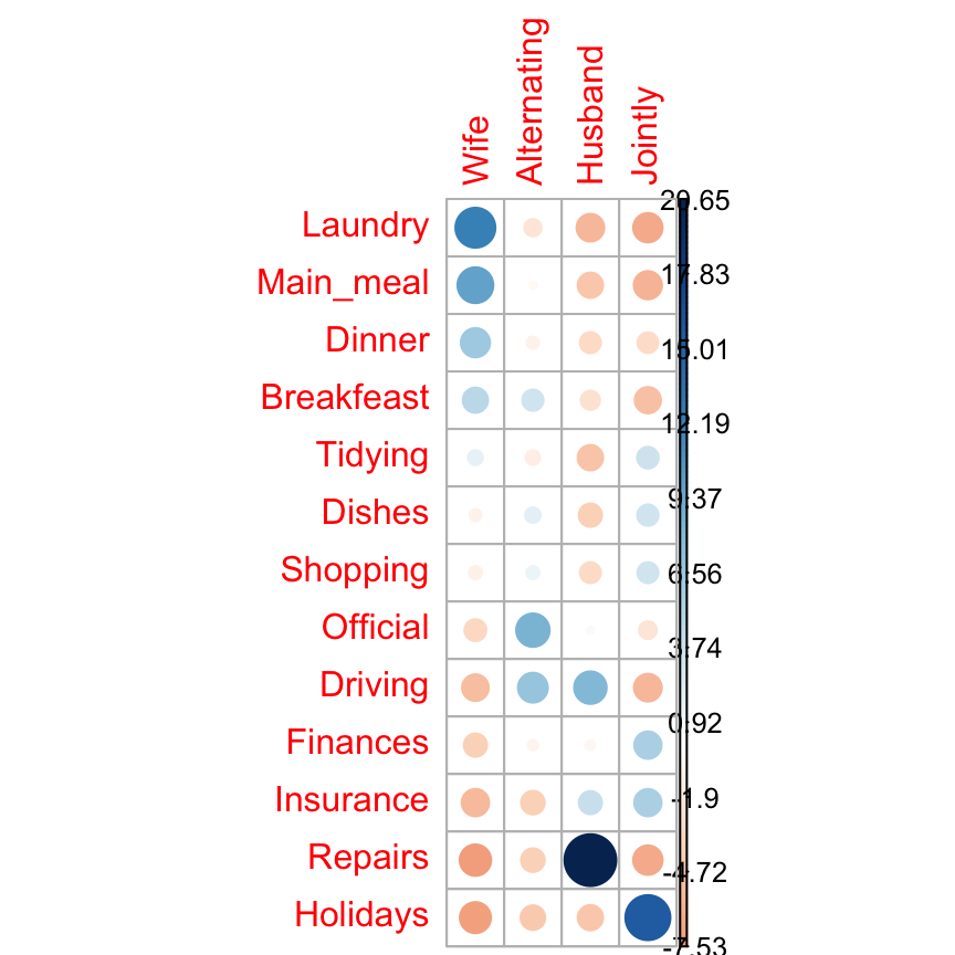
Survminer Cheatsheet to Create Easily Survival Plots

$
0
0


We recently released the survminer verion 0.3, which includes many new features to help in visualizing and sumarizingsurvival analysis results.

In this article, we present a cheatsheet for survminer, created by Przemysław Biecek, and provide an overview of main functions.

survminer cheatsheet

The cheatsheet can be downloaded from STHDA and from Rstudio. It contains selected important functions, such as:

  • ggsurvplot() for plotting survival curves
  • ggcoxzph() and ggcoxdiagnostics() for assessing the assumtions of the Cox model
  • ggforest() and ggcoxadjustedcurves() for summarizing a Cox model

Additional functions, that you might find helpful, are briefly described in the next section.

survminer cheatsheet

survminer overview

The main functions, in the package, are organized in different categories as follow.

Survival Curves
  • ggsurvplot(): Draws survival curves with the ‘number at risk’ table, the cumulative number of events table and the cumulative number of censored subjects table.

  • arrange_ggsurvplots(): Arranges multiple ggsurvplots on the same page.

  • ggsurvevents(): Plots the distribution of event’s times.

  • surv_summary(): Summary of a survival curve. Compared to the default summary() function, surv_summary() creates a data frame containing a nice summary from survfit results.

  • surv_cutpoint(): Determines the optimal cutpoint for one or multiple continuous variables at once. Provides a value of a cutpoint that correspond to the most significant relation with survival.

  • pairwise_survdiff(): Multiple comparisons of survival curves. Calculate pairwise comparisons between group levels with corrections for multiple testing.


Diagnostics of Cox Model
  • ggcoxzph(): Graphical test of proportional hazards. Displays a graph of the scaled Schoenfeld residuals, along with a smooth curve using ggplot2. Wrapper around plot.cox.zph().

  • ggcoxdiagnostics(): Displays diagnostics graphs presenting goodness of Cox Proportional Hazards Model fit.

  • ggcoxfunctional(): Displays graphs of continuous explanatory variable against martingale residuals of null cox proportional hazards model. It helps to properly choose the functional form of continuous variable in cox model.


Summary of Cox Model
  • ggforest(): Draws forest plot for CoxPH model.

  • ggcoxadjustedcurves(): Plots adjusted survival curves for coxph model.


Competing Risks
  • ggcompetingrisks(): Plots cumulative incidence curves for competing risks.


Find out more at http://www.sthda.com/english/rpkgs/survminer/, and check out the documentation and usage examples of each of the functions in survminer package.

Infos

This analysis has been performed using R software (ver. 3.3.2).
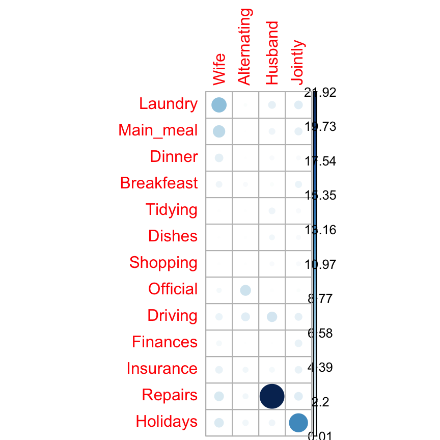
fastqcr: An R Package Facilitating Quality Controls of Sequencing Data for Large Numbers of Samples

$
0
0


Introduction

High throughput sequencing data can contain hundreds of millions of sequences (also known as reads).

The raw sequencing reads may contain PCR primers, adaptors, low quality bases, duplicates and other contaminants coming from the experimental protocols. As these may affect the results of downstream analysis, it’s essential to perform some quality control (QC) checks to ensure that the raw data looks good and there are no problems in your data.

The FastQC tool, written by Simon Andrews at the Babraham Institute, is the most widely used tool to perform quality control for high throughput sequence data. To learn more about the FastQC tool, see this Video Tuorial.

It produces, for each sample, an html report and a ‘zip’ file, which contains a file called fastqc_data.txt and summary.txt.

If you have hundreds of samples, you’re not going to open up each HTML page. You need some way of looking at these data in aggregate.

Therefore, we developed the fastqcr R package, which contains helper functions to easily and automatically parse, aggregate and analyze FastQC reports for large numbers of samples.

Additionally, the fastqcr package provides a convenient solution for building a multi-QC report and a one-sample FastQC report with the result interpretations. The online documentation is available at: http://www.sthda.com/english/rpkgs/fastqcr/.

Examples of QC reports, generated automatically by the fastqcr R package, include:

Main functions in the fastqcr package

In this article, we’ll demonstrate how to perform a quality control of sequencing data. We start by describing how to install and use the FastQC tool. Finally, we’ll describe the fastqcr R package to easily aggregate and analyze FastQC reports for large numbers of samples.


Contents:


Installation and loading fastqcr

  • fastqcr can be installed from CRAN as follow:
install.packages("fastqcr")
  • Or, install the latest version from GitHub:
if(!require(devtools)) install.packages("devtools")
devtools::install_github("kassambara/fastqcr")
  • Load fastqcr:
library("fastqcr")

Quick Start

library(fastqcr)

# Aggregating Multiple FastQC Reports into a Data Frame 
#%%%%%%%%%%%%%%%%%%%%%%%%%%%%%%%%%%%%%%%%%%%%%%%%%%%%%

# Demo QC directory containing zipped FASTQC reports
qc.dir <- system.file("fastqc_results", package = "fastqcr")
qc <- qc_aggregate(qc.dir)
qc

# Inspecting QC Problems
#%%%%%%%%%%%%%%%%%%%%%%%%%%%%%%%%%%%%%%%%%%%%%%%%%%%%%

# See which modules failed in the most samples
qc_fails(qc, "module")
# Or, see which samples failed the most
qc_fails(qc, "sample")

# Building Multi QC Reports
#%%%%%%%%%%%%%%%%%%%%%%%%%%%%%%%%%%%%%%%%%%%%%%%%%%%%%
qc_report(qc.dir, result.file = "multi-qc-report" )

# Building One-Sample QC Reports (+ Interpretation)
#%%%%%%%%%%%%%%%%%%%%%%%%%%%%%%%%%%%%%%%%%%%%%%%%%%%%%
qc.file <- system.file("fastqc_results", "S1_fastqc.zip", package = "fastqcr")
qc_report(qc.file, result.file = "one-sample-report",
          interpret = TRUE)

Main Functions

1) Installing and Running FastQC

  • fastqc_install(): Install the latest version of FastQC tool on Unix systems (MAC OSX and Linux)

  • fastqc(): Run the FastQC tool from R.

2) Aggregating and Summarizing Multiple FastQC Reports

  • qc <- qc_aggregate(): Aggregate multiple FastQC reports into a data frame.

  • summary(qc): Generates a summary of qc_aggregate.

  • qc_stats(qc): General statistics of FastQC reports.

3) Inspecting Problems

  • qc_fails(qc): Displays samples or modules that failed.

  • qc_warns(qc): Displays samples or modules that warned.

  • qc_problems(qc): Union of qc_fails() and qc_warns(). Display which samples or modules that failed or warned.

4) Importing and Plotting FastQC Reports

  • qc_read(): Read FastQC data into R.

  • qc_plot(qc): Plot FastQC data

5) Building One-Sample and Multi-QC Reports

  • qc_report(): Create an HTML file containing FastQC reports of one or multiple files. Inputs can be either a directory containing multiple FastQC reports or a single sample FastQC report.

6) Others

  • qc_unzip(): Unzip all zipped files in the qc.dir directory.

Installing FastQC from R

You can install automatically the FastQC tool from R as follow:

fastqc_install()

Running FastQC from R

The supported file formats by FastQC include:

  • FASTQ
  • gzip compressed FASTQ

Suppose that your working directory is organized as follow:

  • home
    • Documents
      • FASTQ

where, FASTQ is the directory containing your FASTQ files, for which you want to perform the quality control check.

To run FastQC from R, type this:

fastqc(fq.dir = "~/Documents/FASTQ", # FASTQ files directory
       qc.dir = "~/Documents/FASTQC", # Results direcory
       threads = 4                    # Number of threads
       )

FastQC Reports

For each sample, FastQC performs a series of tests called analysis modules.

These modules include:

  • Basic Statistics,
  • Per base sequence quality,
  • Per tile sequence quality
  • Per sequence quality scores,
  • Per base sequence content,
  • Per sequence GC content,
  • Per base N content,
  • Sequence Length Distribution,
  • Sequence Duplication Levels,
  • Overrepresented sequences,
  • Adapter Content
  • Kmer content

The interpretation of these modules are provided in the official documentation of the FastQC tool.

Aggregating Reports

Here, we provide an R function qc_aggregate() to walk the FastQC result directory, find all the FASTQC zipped output folders, read the fastqc_data.txt and the summary.txt files, and aggregate the information into a data frame.

The fastqc_data.txt file contains the raw data and statistics while the summary.txt file summarizes which tests have been passed.

In the example below, we’ll use a demo FastQC output directory available in the fastqcr package.

library(fastqcr)
# Demo QC dir
qc.dir <- system.file("fastqc_results", package = "fastqcr")
qc.dir
## [1] "/Library/Frameworks/R.framework/Versions/3.3/Resources/library/fastqcr/fastqc_results"
# List of files in the directory
list.files(qc.dir)
## [1] "S1_fastqc.zip""S2_fastqc.zip""S3_fastqc.zip""S4_fastqc.zip""S5_fastqc.zip"

The demo QC directory contains five zipped folders corresponding to the FastQC output for 5 samples.

Aggregating FastQC reports:

qc <- qc_aggregate(qc.dir)
qc

The aggregated report looks like this:

samplemodulestatustot.seqseq.lengthpct.gcpct.dup
S4Per tile sequence qualityPASS6725534135-764919.89
S3Per base sequence qualityPASS6725534135-764922.14
S3Per base N contentPASS6725534135-764922.14
S5Per base sequence contentFAIL6501196235-764818.15
S2Sequence Duplication LevelsPASS5029958735-764815.70
S1Per base sequence contentFAIL5029958735-764817.24
S1Overrepresented sequencesPASS5029958735-764817.24
S3Basic StatisticsPASS6725534135-764922.14
S1Basic StatisticsPASS5029958735-764817.24
S4Overrepresented sequencesPASS6725534135-764919.89

Column names:

  • sample: sample names
  • module: fastqc modules
  • status: fastqc module status for each sample
  • tot.seq: total sequences (i.e.: the number of reads)
  • seq.length: sequence length
  • pct.gc: percentage of GC content
  • pct.dup: percentage of duplicate reads

The table shows, for each sample, the names of tested FastQC modules, the status of the test, as well as, some general statistics including the number of reads, the length of reads, the percentage of GC content and the percentage of duplicate reads.

Once you have the aggregated data you can use the dplyr package to easily inspect modules that failed or warned in samples. For example, the following R code shows samples with warnings and/or failures:

library(dplyr)
qc %>%
  select(sample, module, status) %>%    
  filter(status %in% c("WARN", "FAIL")) %>%
  arrange(sample)
samplemodulestatus
S1Per base sequence contentFAIL
S1Per sequence GC contentWARN
S1Sequence Length DistributionWARN
S2Per base sequence contentFAIL
S2Per sequence GC contentWARN
S2Sequence Length DistributionWARN
S3Per base sequence contentFAIL
S3Per sequence GC contentFAIL
S3Sequence Length DistributionWARN
S4Per base sequence contentFAIL
S4Per sequence GC contentFAIL
S4Sequence Length DistributionWARN
S5Per base sequence contentFAIL
S5Per sequence GC contentWARN
S5Sequence Length DistributionWARN

In the next section, we’ll describe some easy-to-use functions, available in the fastqcr package, for analyzing the aggregated data.

Summarizing Reports

We start by presenting a summary and general statistics of the aggregated data.

QC Summary

  • R function: summary()
  • Input data: aggregated data from qc_aggregate()
# Summary of qc
summary(qc)
modulenb_samplesnb_failnb_passnb_warnfailedwarned
Adapter Content5050NANA
Basic Statistics5050NANA
Kmer Content5050NANA
Overrepresented sequences5050NANA
Per base N content5050NANA
Per base sequence content5500S1, S2, S3, S4, S5NA
Per base sequence quality5050NANA
Per sequence GC content5203S3, S4S1, S2, S5
Per sequence quality scores5050NANA
Per tile sequence quality5050NANA
Sequence Duplication Levels5050NANA
Sequence Length Distribution5005NAS1, S2, S3, S4, S5

Column names:

  • module: fastqc modules
  • nb_samples: the number of samples tested
  • nb_pass, nb_fail, nb_warn: the number of samples that passed, failed and warned, respectively.
  • failed, warned: the name of samples that failed and warned, respectively.

The table shows, for each FastQC module, the number and the name of samples that failed or warned.

General statistics

  • R function: qc_stats()
  • Input data: aggregated data from qc_aggregate()
qc_stats(qc)
samplepct.duppct.gctot.seqseq.length
S117.24485029958735-76
S215.70485029958735-76
S322.14496725534135-76
S419.89496725534135-76
S518.15486501196235-76

Column names:

  • pct.dup: the percentage of duplicate reads,
  • pct.gc: the percentage of GC content,
  • tot.seq: total sequences or the number of reads and
  • seq.length: sequence length or the length of reads.

The table shows, for each sample, some general statistics such as the total number of reads, the length of reads, the percentage of GC content and the percentage of duplicate reads

Inspecting Problems

Once you’ve got this aggregated data, it’s easy to figure out what (if anything) is wrong with your data.

1) R functions. You can inspect problems per either modules or samples using the following R functions:

  • qc_fails(qc): Displays samples or modules that failed.
  • qc_warns(qc): Displays samples or modules that warned.
  • qc_problems(qc): Union of qc_fails() and qc_warns(). Display which samples or modules that failed or warned.

2) Input data: aggregated data from qc_aggregate()

3) Output data: Returns samples or FastQC modules with failures or warnings. By default, these functions return a compact output format. If you want a stretched format, specify the argument compact = FALSE.

The format and the interpretation of the outputs depend on the additional argument element, which value is one of c(“sample”, “module”).

  • If element = “sample” (default), results are samples with failed and/or warned modules. The results contain the following columns:
    • sample (sample names),
    • nb_problems (the number of modules with problems),
    • module (the name of modules with problems).
  • If element = “module”, results are modules that failed and/or warned in the most samples. The results contain the following columns:
    • module (the name of module with problems),
    • nb_problems (the number of samples with problems),
    • sample (the name of samples with problems)

Per Module Problems

  • Modules that failed in the most samples:
# See which module failed in the most samples
qc_fails(qc, "module")
modulenb_problemssample
Per base sequence content5S1, S2, S3, S4, S5
Per sequence GC content2S3, S4

For each module, the number of problems (failures) and the name of samples, that failed, are shown.

  • Modules that warned in the most samples:
# See which module warned in the most samples
qc_warns(qc, "module")
modulenb_problemssample
Sequence Length Distribution5S1, S2, S3, S4, S5
Per sequence GC content3S1, S2, S5
  • Modules that failed or warned: Union of qc_fails() and qc_warns()
# See which modules failed or warned.
qc_problems(qc, "module")
modulenb_problemssample
Per base sequence content5S1, S2, S3, S4, S5
Per sequence GC content5S1, S2, S3, S4, S5
Sequence Length Distribution5S1, S2, S3, S4, S5

The output above is in a compact format. For a stretched format, type this:

qc_problems(qc, "module", compact = FALSE)
modulenb_problemssamplestatus
Per base sequence content5S1FAIL
Per base sequence content5S2FAIL
Per base sequence content5S3FAIL
Per base sequence content5S4FAIL
Per base sequence content5S5FAIL
Per sequence GC content5S3FAIL
Per sequence GC content5S4FAIL
Per sequence GC content5S1WARN
Per sequence GC content5S2WARN
Per sequence GC content5S5WARN
Sequence Length Distribution5S1WARN
Sequence Length Distribution5S2WARN
Sequence Length Distribution5S3WARN
Sequence Length Distribution5S4WARN
Sequence Length Distribution5S5WARN

In the the stretched format each row correspond to a unique sample. Additionally, the status of each module is specified.

It’s also possible to display problems for one or more specified modules. For example,

qc_problems(qc, "module",  name = "Per sequence GC content")
modulenb_problemssamplestatus
Per sequence GC content5S3FAIL
Per sequence GC content5S4FAIL
Per sequence GC content5S1WARN
Per sequence GC content5S2WARN
Per sequence GC content5S5WARN

Note that, partial matching of name is allowed. For example, name = “Per sequence GC content” equates to name = “GC content”.

qc_problems(qc, "module",  name = "GC content")

Per Sample Problems

  • Samples with one or more failed modules
# See which samples had one or more failed modules
qc_fails(qc, "sample")
samplenb_problemsmodule
S32Per base sequence content, Per sequence GC content
S42Per base sequence content, Per sequence GC content
S11Per base sequence content
S21Per base sequence content
S51Per base sequence content

For each sample, the number of problems (failures) and the name of modules, that failed, are shown.

  • Samples with failed or warned modules:
# See which samples had one or more module with failure or warning
qc_problems(qc, "sample", compact = FALSE)
samplenb_problemsmodulestatus
S13Per base sequence contentFAIL
S13Per sequence GC contentWARN
S13Sequence Length DistributionWARN
S23Per base sequence contentFAIL
S23Per sequence GC contentWARN
S23Sequence Length DistributionWARN
S33Per base sequence contentFAIL
S33Per sequence GC contentFAIL
S33Sequence Length DistributionWARN
S43Per base sequence contentFAIL
S43Per sequence GC contentFAIL
S43Sequence Length DistributionWARN
S53Per base sequence contentFAIL
S53Per sequence GC contentWARN
S53Sequence Length DistributionWARN

To specify the name of a sample of interest, type this:

qc_problems(qc, "sample", name = "S1")
samplenb_problemsmodulestatus
S13Per base sequence contentFAIL
S13Per sequence GC contentWARN
S13Sequence Length DistributionWARN

Building an HTML Report

The function qc_report() can be used to build a report of FastQC outputs. It creates an HTML file containing FastQC reports of one or multiple samples.

Inputs can be either a directory containing multiple FastQC reports or a single sample FastQC report.

Create a Multi-QC Report

We’ll build a multi-qc report for the following demo QC directory:

# Demo QC Directory
qc.dir <- system.file("fastqc_results", package = "fastqcr")
qc.dir
## [1] "/Library/Frameworks/R.framework/Versions/3.3/Resources/library/fastqcr/fastqc_results"
# Build a report
qc_report(qc.dir, result.file = "~/Desktop/multi-qc-result",
          experiment = "Exome sequencing of colon cancer cell lines")

An example of report is available at: fastqcr multi-qc report

Create a One-Sample Report

We’ll build a report for the following demo QC file:

 qc.file <- system.file("fastqc_results", "S1_fastqc.zip", package = "fastqcr")
qc.file
## [1] "/Library/Frameworks/R.framework/Versions/3.3/Resources/library/fastqcr/fastqc_results/S1_fastqc.zip"
  • One-Sample QC report with plot interpretations:
 qc_report(qc.file, result.file = "one-sample-report-with-interpretation",
   interpret = TRUE)

An example of report is available at: One sample QC report with interpretation

  • One-Sample QC report without plot interpretations:
 qc_report(qc.file, result.file = "one-sample-report",
   interpret = FALSE)

An example of report is available at: One sample QC report without interpretation

Importing and Plotting a FastQC QC Report

We’ll visualize the output for sample 1:

# Demo file
qc.file <- system.file("fastqc_results", "S1_fastqc.zip",  package = "fastqcr")
qc.file
## [1] "/Library/Frameworks/R.framework/Versions/3.3/Resources/library/fastqcr/fastqc_results/S1_fastqc.zip"

We start by reading the output using the function qc_read(), which returns a list of tibbles containing the data for specified modules:

# Read all modules
qc <- qc_read(qc.file)
# Elements contained in the qc object
names(qc)
##  [1] "summary""basic_statistics""per_base_sequence_quality""per_tile_sequence_quality"    
##  [5] "per_sequence_quality_scores""per_base_sequence_content""per_sequence_gc_content""per_base_n_content"           
##  [9] "sequence_length_distribution""sequence_duplication_levels""overrepresented_sequences""adapter_content"              
## [13] "kmer_content""total_deduplicated_percentage"

The function qc_plot() is used to visualized the data of a specified module. Allowed values for the argument modules include one or the combination of:

  • “Summary”,
  • “Basic Statistics”,
  • “Per base sequence quality”,
  • “Per sequence quality scores”,
  • “Per base sequence content”,
  • “Per sequence GC content”,
  • “Per base N content”,
  • “Sequence Length Distribution”,
  • “Sequence Duplication Levels”,
  • “Overrepresented sequences”,
  • “Adapter Content”
qc_plot(qc, "Per sequence GC content")

qc_plot(qc, "Per base sequence quality")

qc_plot(qc, "Per sequence quality scores")

qc_plot(qc, "Per base sequence content")

qc_plot(qc, "Sequence duplication levels")
fastqcrfastqcrfastqcrfastqcrfastqcr

fastqcr

Interpreting FastQC Reports

  • Summary shows a summary of the modules which were tested, and the status of the test results:
    • normal results (PASS),
    • slightly abnormal (WARN: warning)
    • or very unusual (FAIL: failure).

Some experiments may be expected to produce libraries which are biased in particular ways. You should treat the summary evaluations therefore as pointers to where you should concentrate your attention and understand why your library may not look normal.

qc_plot(qc, "summary")
statusmodulesample
PASSBasic StatisticsS1.fastq
PASSPer base sequence qualityS1.fastq
PASSPer tile sequence qualityS1.fastq
PASSPer sequence quality scoresS1.fastq
FAILPer base sequence contentS1.fastq
WARNPer sequence GC contentS1.fastq
PASSPer base N contentS1.fastq
WARNSequence Length DistributionS1.fastq
PASSSequence Duplication LevelsS1.fastq
PASSOverrepresented sequencesS1.fastq
PASSAdapter ContentS1.fastq
PASSKmer ContentS1.fastq
  • Basic statistics shows basic data metrics such as:
    • Total sequences: the number of reads (total sequences),
    • Sequence length: the length of reads (minimum - maximum)
    • %GC: GC content
qc_plot(qc, "Basic statistics")
MeasureValue
FilenameS1.fastq
File typeConventional base calls
EncodingSanger / Illumina 1.9
Total Sequences50299587
Sequences flagged as poor quality0
Sequence length35-76
%GC48
  • Per base sequence quality plot depicts the quality scores across all bases at each position in the reads. The background color delimits 3 different zones: very good quality (green), reasonable quality (orange) and poor quality (red). A good sample will have qualities all above 28:
qc_plot(qc, "Per base sequence quality")
fastqcr

fastqcr

Problems:

  • warning if the median for any base is less than 25.
  • failure if the median for any base is less than 20.

Common reasons for problems:

  • Degradation of (sequencing chemistry) quality over the duration of long runs. Remedy: Quality trimming.

  • Short loss of quality earlier in the run, which then recovers to produce later good quality sequence. Can be explained by a transient problem with the run (bubbles in the flowcell for example). In these cases trimming is not advisable as it will remove later good sequence, but you might want to consider masking bases during subsequent mapping or assembly.

  • Library with reads of varying length. Warning or error is generated because of very low coverage for a given base range. Before committing to any action, check how many sequences were responsible for triggering an error by looking at the sequence length distribution module results.

  • Per sequence quality scores plot shows the frequencies of quality scores in a sample. It allows you to see if a subset of your sequences have low quality values. If the reads are of good quality, the peak on the plot should be shifted to the right as far as possible (quality > 27).
qc_plot(qc, "Per sequence quality scores")
fastqcr

fastqcr

Problems:

  • warning if the most frequently observed mean quality is below 27 - this equates to a 0.2% error rate.
  • failure if the most frequently observed mean quality is below 20 - this equates to a 1% error rate.

Common reasons for problems:

General loss of quality within a run. Remedy: For long runs this may be alleviated through quality trimming.

  • Per base sequence content shows the four nucleotides’ proportions for each position. In a random library you expect no nucleotide bias and the lines should be almost parallel with each other. In a good sequence composition, the difference between A and T, or G and C is < 10% in any position.
qc_plot(qc, "Per base sequence content")
fastqcr

fastqcr

It’s worth noting that some types of library will always produce biased sequence composition, normally at the start of the read. For example, in RNA-Seq data, it is common to have bias at the beginning of the reads. This occurs during RNA-Seq library preparation, when “random” primers are annealed to the start of sequences. These primers are not truly random, and it leads to a variation at the beginning of the reads. We can remove these primers using a trim adaptors tool.

Problems:

  • warning if the difference between A and T, or G and C is greater than 10% in any position.
  • failure if the difference between A and T, or G and C is greater than 20% in any position.

Common reasons for problems:

  • Overrepresented sequences: adapter dimers or rRNA

  • Biased selection of random primers for RNA-seq. Nearly all RNA-Seq libraries will fail this module because of this bias, but this is not a problem which can be fixed by processing, and it doesn’t seem to adversely affect the ability to measure expression.

  • Biased composition libraries: Some libraries are inherently biased in their sequence composition. For example, library treated with sodium bisulphite, which will then converted most of the cytosines to thymines, meaning that the base composition will be almost devoid of cytosines and will thus trigger an error, despite this being entirely normal for that type of library.

  • Library which has been aggressively adapter trimmed.

  • Per sequence GC content plot displays GC distribution over all sequences. In a random library you expect a roughly normal GC content distribution. An unusually sharped or shifted distribution could indicate a contamination or some systematic biases:
qc_plot(qc, "Per sequence GC content")
fastqcr

fastqcr

You can generate the theoretical GC content curves files using an R package called fastqcTheoreticalGC written by Mike Love.

  • Per base N content. If a sequencer is unable to make a base call with sufficient confidence then it will normally substitute an N rather than a conventional base call. This module plots out the percentage of base calls at each position for which an N was called.
qc_plot(qc, "Per base N content")
fastqcr

fastqcr

Problems:

  • warning if any position shows an N content of >5%.
  • failure if any position shows an N content of >20%.

Common reasons for problems:

  • General loss of quality.
  • Very biased sequence composition in the library.
  • Sequence length distribution module reports if all sequences have the same length or not. For some sequencing platforms it is entirely normal to have different read lengths so warnings here can be ignored. In many cases this will produce a simple graph showing a peak only at one size. This module will raise an error if any of the sequences have zero length.
qc_plot(qc, "Sequence length distribution")
fastqcr

fastqcr

  • Sequence duplication levels. This module counts the degree of duplication for every sequence in a library and creates a plot showing the relative number of sequences with different degrees of duplication. A high level of duplication is more likely to indicate some kind of enrichment bias (eg PCR over amplification).
qc_plot(qc, "Sequence duplication levels")
fastqcr

fastqcr

Problems:

  • warning if non-unique sequences make up more than 20% of the total.
  • failure if non-unique sequences make up more than 50% of the total.

Common reasons for problems:

  • Technical duplicates arising from PCR artifacts

  • Biological duplicates which are natural collisions where different copies of exactly the same sequence are randomly selected.

In RNA-seq data, duplication levels can reach even 40%. Nevertheless, while analyzing transcriptome sequencing data, we should not remove these duplicates because we do not know whether they represent PCR duplicates or high gene expression of our samples.

  • Overrepresented sequences section gives information about primer or adaptor contaminations. Finding that a single sequence is very overrepresented in the set either means that it is highly biologically significant, or indicates that the library is contaminated, or not as diverse as you expected. This module lists all of the sequence which make up more than 0.1% of the total.
qc_plot(qc, "Overrepresented sequences")
fastqcr

fastqcr

Problems:

  • warning if any sequence is found to represent more than 0.1% of the total.
  • failure if any sequence is found to represent more than 1% of the total.

Common reasons for problems:

small RNA libraries where sequences are not subjected to random fragmentation, and the same sequence may naturally be present in a significant proportion of the library.

  • Adapter content module checks the presence of read-through adapter sequences. It is useful to know if your library contains a significant amount of adapter in order to be able to assess whether you need to adapter trim or not.
qc_plot(qc, "Adapter content")
fastqcr

fastqcr

Problems:

  • warning if any sequence is present in more than 5% of all reads.
  • failure if any sequence is present in more than 10% of all reads.

A warning or failure means that the sequences will need to be adapter trimmed before proceeding with any downstream analysis.

  • K-mer content
qc_plot(qc, "Kmer content")
fastqcr

fastqcr

Infos

This analysis has been performed using R software (ver. 3.3.2).

Viewing all 183 articles
Browse latest View live