Previously, we described the essentials of R programming and provided quick start guides for importing data into R.
Here, well describe how to create pie charts in R. The R base function pie() can be used for this.
Pleleminary tasks
Launch RStudio as described here: Running RStudio and setting up your working directory
Prepare your data as described here: Best practices for preparing your data and save it in an external .txt tab or .csv files
Import your data into R as described here: Fast reading of data from txt|csv files into R: readr package.
Create some data
df <- data.frame(
  group = c("Male", "Female", "Child"),
  value = c(25, 25, 50)
  )

df
## group value
## 1 Male 25
## 2 Female 25
## 3 Child 50Create basic pie charts: pie()
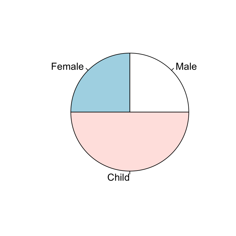
The function pie() can be used to draw a pie chart.
pie(x, labels = names(x), radius = 0.8)- x: a vector of non-negative numerical quantities. The values in x are displayed as the areas of pie slices.
- labels: character strings giving names for the slices.
- radius: radius of the pie circle. If the character strings labeling the slices are long it may be necessary to use a smaller radius.
pie(df$value, labels = df$group, radius = 1)
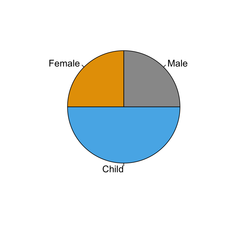
# Change colors
pie(df$value, labels = df$group, radius = 1,
    col = c("#999999", "#E69F00", "#56B4E9"))
Create 3D pie charts: plotix::pie3D()
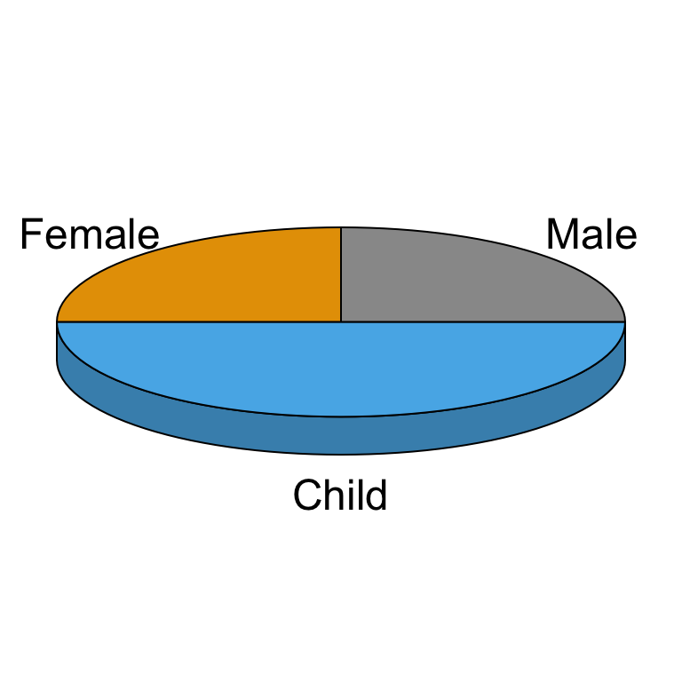
Te function pie3D()[in plotrix package] can be used to draw a 3D pie chart.
Install plotrix package:
install.packages("plotrix")Use pie3D():
# 3D pie chart
library("plotrix")
pie3D(df$value, labels = df$group, radius = 1.5,
      col = c("#999999", "#E69F00", "#56B4E9"))
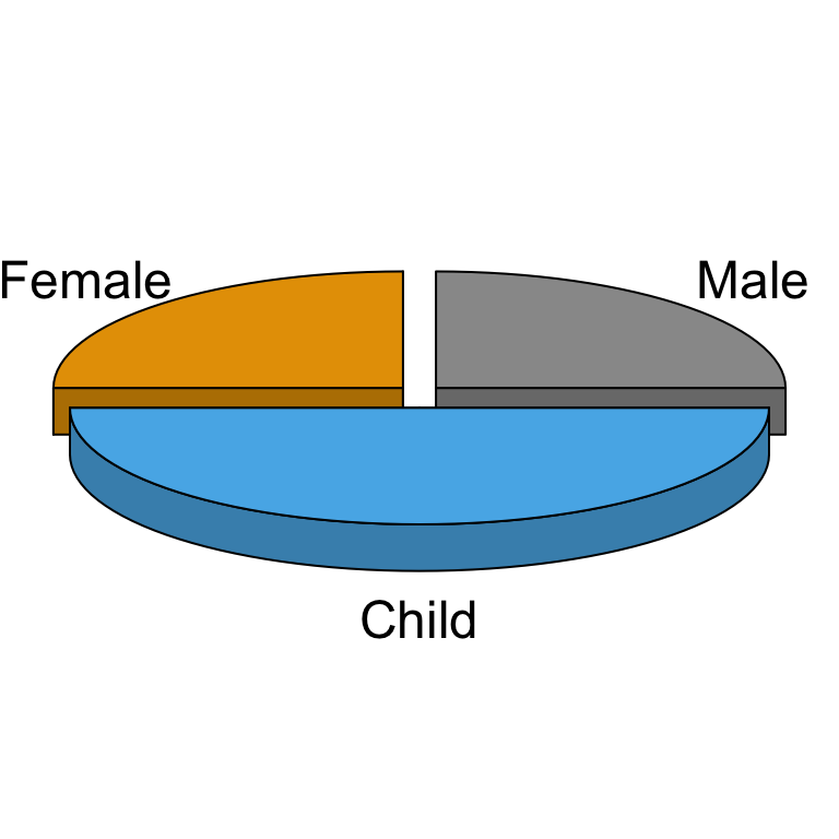
# Explode the pie chart
pie3D(df$value, labels = df$group, radius = 1.5,
      col = c("#999999", "#E69F00", "#56B4E9"),
      explode = 0.1)
See also
Infos
This analysis has been performed using R statistical software (ver. 3.2.4).